


The BK Hacken logo is the official crest of Bollklubben Hacken, a Swedish professional football club based in the Hisingen district of Gothenburg. Founded on August 2, 1940, the club carries the nickname “Getingarna” (The Wasps), and its badge reflects that identity through a yellow and black color scheme that has become one of the most recognizable in Swedish football.
The emblem sits within the broader tradition of Scandinavian football branding, where club crests tend to favor clean lines, shield-based layouts, and strong ties to local identity. BK Hacken’s current crest was introduced in 2012. The club has gone through at least two documented logo versions since 2000, each one tightening the design and bringing it closer to modern standards.
BK Hacken competes in the Allsvenskan, Sweden’s top football division, and won their first-ever league title in 2022. The badge appeared on every jersey, banner, and piece of fan merchandise during that historic season. It plays its home matches at Bravida Arena in Gothenburg.
What Is the BK Hacken Logo?
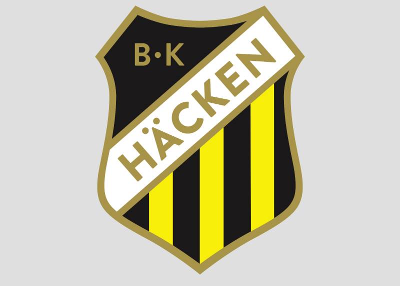
The BK Hacken logo is a shield-shaped emblem featuring the club’s name, a yellow and black color scheme, and graphic elements that tie it to Gothenburg football. It was introduced in its current form in 2012. The crest functions as a combination mark, blending text and symbolic graphics within a unified badge.
Here’s what defines it at a technical level:
- Design Type: Combination mark (shield emblem with integrated text and graphic elements)
- Primary Elements: Shield shape, club name lettering, yellow and black color blocking, football-related graphics
- Official Introduction Date: 2012 (current version)
- Designer/Agency: Not publicly credited to a specific designer or agency
- Trademark Status: Registered as part of Bollklubben Hacken’s club identity through the Swedish Football Association
- Color Palette: Yellow (#FFFF00), Black (#000000), with white (#FFFFFF) accents
- Usage Context: Match kits, fan merchandise, Bravida Arena signage, social media profiles, Allsvenskan broadcasts, and UEFA competition materials
What makes understanding a logo like this one interesting is how much identity it packs into a relatively simple shield. Nothing about it screams complexity. But the choices, from the shape down to the hue of yellow, are deliberate.
How Has the BK Hacken Logo Evolved Over Time?
The BK Hacken badge has gone through a handful of changes since the club was founded in 1940. Early versions were basic, almost crude by today’s standards. The two most documented versions date from 2000 and 2012, each one marking a clear shift in design thinking.
What’s consistent? The yellow and black. Always there. Always front and center.
Early BK Hacken Crest (1940s-1990s)
Years Active: Approximately 1940 through the late 1990s
The original badges were simple affairs. Basic shapes, limited color work, and a focus on readability over style. That was normal for Swedish football clubs at the time.
Most clubs in Division 3 or Division 4 didn’t invest heavily in graphic identity. A functional badge that could be stitched onto a kit was enough.
The early Hacken crests stuck with the club’s yellow and black palette but kept things stripped back. No gradients. No complex layering. Just a clean identifier that told you which team was on the pitch.
Think about it this way: these were crests made for a club that started as a group of teenagers on the island of Hisingen who just wanted to play organized football.
BK Hacken Logo (2000-2011)
Years Active: 2000-2011
This version refined the overall shape and introduced slightly more detail. The shield outline became more defined. Text placement got cleaner.
By this period, Hacken was bouncing between Allsvenskan and Superettan. The club needed a crest that could hold up on television broadcasts and printed materials.
The typography was adjusted to feel more professional, and the badge started looking less like a local club patch and more like something belonging to a competitive Swedish football team.
Color-wise, it stayed faithful to yellow and black. But the execution was tighter. Cleaner edges, better balance between text and graphic space.
Current BK Hacken Logo (2012-Present)
Years Active: 2012 to present
The 2012 redesign is what most fans know today. And it arrived at the right time. Hacken finished second in the Allsvenskan that year, their best-ever league result at the time.
The current version shows more sophistication. The shield outline feels more deliberate. Graphic elements are sharper. The whole thing scales well, whether it’s on a 20-pixel social media icon or a stadium banner.
That adaptability matters more than people think. A crest that looks fine on a jersey but turns into a blurry mess at small sizes is a real problem in modern sports branding.
Hacken’s 2012 version solved that problem. The design respects visual hierarchy well, keeping the club name and primary colors readable at any scale.
What Do the Design Elements of the BK Hacken Logo Mean?

Every piece of the BK Hacken crest carries purpose. The shield communicates strength and protection. The yellow-and-black combination ties directly to the “Getingarna” (Wasps) nickname. Even the text arrangement follows a logic rooted in how football badges have worked for decades across Scandinavia.
Let’s break it down.
Why Did BK Hacken Choose These Specific Colors?
Yellow and black. The Wasps. It’s that straightforward.
The nickname “Getingarna” came naturally from the club’s color choices, and the psychology behind those colors actually works well for a sports brand.
Yellow (#FFFF00): Signals energy, optimism, and visibility. On a football pitch, yellow kits stand out immediately. From a color theory perspective, yellow is one of the most attention-grabbing hues in the spectrum.
Black (#000000): Represents authority, power, and determination. It grounds the energy of yellow and adds a serious edge. The contrast between these two colors is about as high as it gets, which makes the badge pop at a distance.
White (#FFFFFF): Used as an accent to separate elements and improve readability. White keeps the text legible against both the yellow and black areas of the crest.
The combination makes this logo easy to spot in a crowded Allsvenskan landscape. Most rival clubs (IFK Goteborg with blue and white, GAIS with green and black, Orgryte IS with red and white) use completely different palettes, so there’s zero confusion on match days.
What Typography Style Is Used in the BK Hacken Logo?

The lettering in the BK Hacken badge uses a bold, custom sans-serif style. It’s thick, highly legible, and built for visibility at small sizes.
No thin strokes. No decorative serifs. The font choice is purely functional.
This fits the broader trend in Scandinavian football badges, where readability wins over decoration. The text sits within the shield shape and follows a curved or angled arrangement to fit the badge geometry.
Took me a while to appreciate how tricky that is. Fitting text into a shield without it looking cramped or awkward requires careful attention to letter spacing and overall proportion.
What Are the Hidden Meanings in the BK Hacken Logo?
There’s no elaborate Easter egg tucked into the crest. But there are deliberate choices worth noting.
The shield itself references a long tradition of heraldic design in European football badges. It connects Hacken to a broader identity beyond just Hisingen.
The yellow-and-black wasp connection is the most obvious layer of meaning. Whether it was intentional from day one or grew into its significance over time, the shape choices within the badge reinforce the idea of a compact, aggressive, focused team.
Honestly, the best “hidden meaning” is how the simplicity itself communicates. A clean, no-frills badge says: we don’t need to overcompensate. We let the football do the talking.
How Does the BK Hacken Logo Compare to Competitor Logos?

Gothenburg is one of Sweden’s most competitive football cities, with four major clubs sharing the same market. BK Hacken’s badge stands apart because of its color scheme and its relative modernity.
IFK Goteborg’s logo uses blue and white with a more traditional, ornate crest design. It’s a badge with decades of European glory behind it.
GAIS and Orgryte IS both carry older, more heritage-heavy crests that lean into historical design patterns. Their badges feel like they’ve been around longer because, well, they have.
BK Hacken’s 2012 version feels newer. Cleaner. More ready for digital platforms. If you compare all four Gothenburg club badges side by side, Hacken’s reads the best at thumbnail size. That’s not an accident.
Across the broader Allsvenskan, clubs like Malmo FF and Hammarby IF have also modernized their crests in recent years. But Hacken’s yellow-and-black identity gives it a unique spot. No other Allsvenskan club uses that exact color pairing as aggressively.
What Are the Technical Specifications of the BK Hacken Logo?
If you’re working with the BK Hacken badge in any design context, here are the specs you need to know.
Official Color Codes
- Primary Color: Yellow – Hex: #FFFF00, RGB: (255, 255, 0), CMYK: (0, 0, 100, 0)
- Secondary Color: Black – Hex: #000000, RGB: (0, 0, 0), CMYK: (0, 0, 0, 100)
- Accent Color: White – Hex: #FFFFFF, RGB: (255, 255, 255), CMYK: (0, 0, 0, 0)
Dimensions and Proportions
The badge uses a shield-based aspect ratio. Most official renderings maintain a roughly vertical orientation, slightly taller than wide.
The logo is available in vector formats (SVG, AI, EPS) for scalable reproduction. For raster uses, PNG files with transparent backgrounds are the standard.
Minimum size requirements aren’t publicly documented, but from a practical standpoint, the badge stays readable down to about 32 pixels wide. Below that, you lose the text detail.
Clear space around the logo should generally match the width of the “BK” text within the badge. That keeps it from feeling cramped against other elements in a layout.
What Cultural Impact Has the BK Hacken Logo Had?
For a club that spent most of its history bouncing between divisions, the BK Hacken badge has taken on surprising cultural weight in recent years. Winning the 2022 Allsvenskan title changed everything.
Suddenly, that yellow and black shield was everywhere. On scarves. On graffiti walls in Hisingen. On national television as the championship was clinched away at IFK Goteborg’s stadium.
The logo represents an underdog story. Hacken wasn’t supposed to be a title contender. They started as kids playing on Hisingen while IFK Goteborg, Orgryte, and GAIS dominated the city’s football identity for decades.
Now, the badge carries championship pedigree. And multiple Svenska Cupen trophies. That shifts how people see a logo. It’s no longer just a club crest. It’s a reminder of what consistent work and patience can produce.
How Does the BK Hacken Logo Fit Into the Overall Brand Identity?

The badge is the anchor of everything BK Hacken does visually. Kit designs, social media content, stadium signage, matchday programs, youth academy branding. It all connects back to the crest.
The yellow-and-black palette extends beyond the logo into every touchpoint. Brand guidelines for football clubs like Hacken typically dictate how the badge appears across print and digital formats, making sure the colors, spacing, and proportions stay consistent.
Bravida Arena itself reflects the club colors. The seating, the signage, the merch shop. Everything is coordinated.
The club’s nickname, “Getingarna,” provides a secondary brand layer. It gives the marketing team something to play with beyond just the crest itself. Wasp imagery, the sting metaphor, the black-and-yellow stripes on the kits. All of that connects back to a single, coherent identity.
There’s a storytelling element too. A club that rose from Hisingen’s hedgerows (the name “Hacken” references the Swedish word for hedge) to become Swedish champions. The logo carries all of that baggage, whether someone knows the history or not.
How Should the BK Hacken Logo Be Used?
Like most football club badges, the BK Hacken logo comes with usage expectations. Here’s what to keep in mind.
Do:
- Use the logo at a size where the text and graphic details remain legible
- Maintain the original color scheme when reproducing the badge on official materials
- Keep adequate clear space around the crest so it doesn’t get lost in busy layouts
- Use vector files (SVG, AI) for print and large-format applications to avoid quality loss
Don’t:
- Stretch or distort the badge out of its original proportions
- Change the official colors without authorization from the club
- Place the logo on backgrounds that reduce readability (yellow backgrounds are especially tricky)
- Use low-resolution versions for print work, as DPI requirements for professional printing demand high-quality source files
Official logo assets can typically be sourced through BK Hacken’s media department or the club’s official website at bkhacken.se. For commercial use, licensing agreements through the club or the Swedish Football Association may be required.
The badge is protected as part of the club’s intellectual property. Using it commercially without permission, whether on merchandise, in advertising, or in modified form, could create legal issues. If you’re a fan making non-commercial content, most clubs are relaxed about it. But if money is changing hands, get the proper clearance first.
FAQ on The BK Hacken Logo
What does the BK Hacken logo look like?
The BK Hacken crest is a shield-shaped emblem featuring yellow and black colors, the club’s full name, and football-related graphics. It’s a combination mark designed for the Allsvenskan club based in Gothenburg’s Hisingen district.
The current version has been in use since 2012.
When was the BK Hacken badge first created?
The club was founded on August 2, 1940, and had a basic crest from the start. The most documented versions date from 2000 and 2012. Early designs were simple, using limited shapes and flat color.
What colors are in the BK Hacken emblem?
Yellow (#FFFF00) and black (#000000) are the primary club colors, with white (#FFFFFF) as an accent. These tie directly to the nickname “Getingarna” (The Wasps).
The yellow-and-black pairing creates high visual contrast, making the badge easy to spot on kits and merchandise.
Why are BK Hacken’s colors yellow and black?
The colors reflect the club’s wasp identity. Yellow signals energy and visibility on the pitch, while black adds weight and authority. Together, they form a complementary pairing that stands out across all Allsvenskan broadcasts and printed materials.
What type of design is the BK Hacken logo?
It’s a combination mark. The badge blends a shield shape, custom lettering, and graphic elements into one crest. This follows the standard approach for Swedish football club emblems, where text and imagery share space inside a unified form.
Has the BK Hacken crest changed over the years?
Yes. The logo went through multiple updates. Early versions were basic and functional. The 2000 revision tightened the outline and improved text placement. The 2012 redesign brought sharper details and better digital adaptability.
Each change kept the yellow and black identity intact.
What font is used in the BK Hacken logo?
The badge uses a bold, custom typeface with sans-serif characteristics. It prioritizes readability at small sizes over decorative style. The lettering follows the shield’s curved geometry, fitting cleanly within the badge shape.
Where can I download the BK Hacken logo?
Official assets are available through BK Hacken’s website at bkhacken.se. Vector files in SVG and AI formats can also be found on logo archive sites. For any commercial use, you’ll need licensing clearance from the club or the Swedish Football Association.
What does the BK Hacken shield shape represent?
The shield references a long tradition of heraldic design in European football. It communicates protection, strength, and club pride. Most Gothenburg teams, including IFK Goteborg and Orgryte IS, also use shield-based crests, so it fits the regional pattern.
Can I use the BK Hacken logo for my own project?
For personal, non-commercial use like fan content, most clubs don’t raise issues. Commercial use is different. The Bollklubben Hacken badge is protected intellectual property. You’ll need permission from the club’s media department before putting it on anything you sell.
Always check the club’s terms before reproducing the Bravida Arena team’s crest in any paid context.
Conclusion
The BK Hacken logo tells the story of a Gothenburg football club that grew from a group of teenagers on Hisingen into Allsvenskan champions. Every detail in the crest, from its shield layout to the yellow and black color palette, supports that identity.
The 2012 redesign gave the badge the flexibility it needed for modern digital platforms and merchandise. It scales well. It reads clean at any size.
For fans of Getingarna, the badge is more than a club emblem. It’s proof that consistent work, smart branding, and a clear visual identity can carry a team from the lower divisions to the top of Swedish football.

Renowned for his expertise in logo design and visual branding, Bogdan has developed a multitude of logos for various clients.
His skills extend to creating posters, vector illustrations, business cards, and brochures. Additionally, Bogdan's UI kits were featured on marketplaces like Visual Hierarchy and UI8.
He also wrote in the past years on sites like Design Your Way, WebDesignerDepot, WPDean, Designmodo, Speckyboy, Slider Revolution, and more.
- Beautiful Fonts Similar to Poppins You Should Try - 22 October 2026
- Website Redesign: How to Improve Your Website without Losing SEO Rankings - 22 October 2026
- The Coda Logo History, Colors, Font, And Meaning - 20 October 2026

Bogdan Sandu is a seasoned designer who has been designing websites since 2008. Renowned for his expertise in logo design and visual branding, Bogdan has developed a multitude of logos for various clients. His skills extend to creating posters, vector illustrations, business cards, and brochures. Additionally, Bogdan's UI kits were featured on marketplaces like Visual Hierarchy and UI8. He also wrote in the past years on sites like Design Your Way, WebDesignerDepot, WPDean, Designmodo, Speckyboy, Slider Revolution, and more.
You Might Also Like


