


The Hammarby IF logo is one of Swedish football’s most recognizable club emblems. It belongs to Hammarby Idrottsforening, a multi-sport club based in Stockholm’s Sodermalm district, founded in 1889.
Few football badges carry as much local identity as this one. The crest ties directly to the club’s rowing origins on Hammarby Sjo, and it’s been refined several times since. The current version, shaped in the late 1970s by illustrator Borje Dorch, is a registered trademark in Sweden.
Hammarby IF has gone through roughly four to five major badge iterations since the late 1800s. The green and white striped flag at the center has stayed constant through all of them, which says a lot about how seriously the club treats its visual roots.
Within the broader picture of Allsvenskan club branding (and Scandinavian sports identity as a whole), the Hammarby badge sits comfortably among the most emotionally charged. It’s not just a logo in the corporate sense. For Bajen fans, it’s closer to a family crest.
What Is the Hammarby IF Logo?
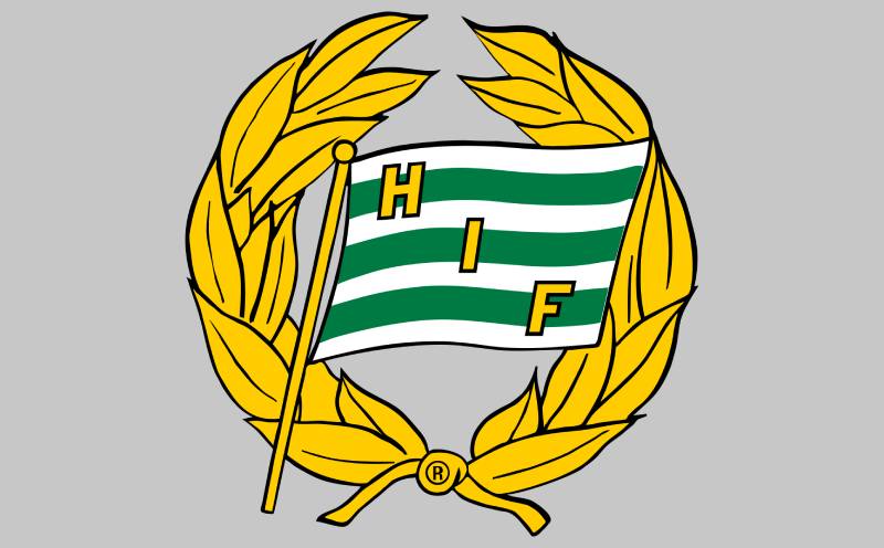
The Hammarby IF logo is an emblem-style crest featuring a green-and-white striped flag surrounded by a golden laurel wreath, with the letters “H,” “I,” and “F” displayed on the flag. The current version was finalized in the late 1970s by Swedish illustrator Borje Dorch, and it symbolizes the club’s rowing heritage, hope, and athletic achievement.
Here’s a breakdown of the badge’s core attributes:
- Design Type: Emblem (flag enclosed in a wreath)
- Primary Elements: A stylized flag with horizontal green and white stripes, the initials “HIF” in bold lettering, and a laurel wreath in gold/yellow framing the flag
- Official Introduction Date: The current form dates to the late 1970s. The original flag symbol traces back to 1889
- Designer: Borje Dorch, a Swedish illustrator and journalist, gave the wreath its final form in the early 1970s. The trademark was registered soon after
- Trademark Status: Registered with the Swedish Patent and Registration Office under trademark number 165 056, with the registered trademark symbol visible at the wreath’s base
- Color Palette: Green (#007A43), White (#FFFFFF), and Gold/Yellow for the wreath. Black is sometimes used as a background color
- Usage Context: Match kits, stadium signage at Tele2 Arena (now called 3 Arena), official merchandise, digital platforms, broadcast overlays, fan art, and promotional materials
How Has the Hammarby IF Logo Evolved Over Time?
The Hammarby IF badge has gone through a gradual but steady transformation since 1889. It started as a simple rowing flag, picked up a shield format briefly, gained its laurel wreath in the 1920s, and reached its current refined state in the late 1970s.
Each change was small, almost cautious. The club never threw out what came before. They just kept adding layers.
The Original Rowing Flag (1889 – circa 1917)
- Years Active: 1889 to approximately 1917
- Design Description: A white flag with three green horizontal stripes. Initially it had two stripes, but a third was added after the club discovered that Goteborgs Roddforening already used a two-stripe green-and-white flag
- Color Scheme: Green and white
- Designer: Created by the founding rowers of Hammarby Roddforening
- Context: The rowing club needed a flag that would stand out from competitors. Two Stockholm clubs already used blue and red stripes on white backgrounds, so Hammarby’s rowers picked green because it represented “hope”
- Key Changes from Previous: This was the first badge, so no predecessor existed
- Cultural Significance: Set the foundation for the club’s green-and-white identity that continues to this day. The flag was a direct product of Sodermalm’s working-class rowing culture
The Shield Badge (circa 1910s)
- Years Active: Briefly during the 1910s
- Design Description: The green-and-white stripes appeared in a shield or crest format for a short period. The exact reason for this shift remains unclear
- Color Scheme: Green and white, consistent with the original flag
- Designer: Unknown
- Context: Around this time, many European sports clubs were adopting shield-shaped badges. Hammarby briefly followed this trend
- Key Changes from Previous: The stripes moved from a flag shape into a shield outline
- Cultural Significance: Short-lived but interesting. By 1917, the club returned to the flag as its primary symbol
The Flag with Laurel Wreath (1920s – 1940s)
- Years Active: Early 1920s to the 1940s
- Design Description: The Hammarby Veterans Society (Sallskapet Hammarby-Veteranerna), formed in 1917, introduced a laurel wreath. In the early 1920s, this wreath was combined with the original flag to form the basic structure of the modern crest. The wreath was initially a fully closed circle
- Color Scheme: Green, white, and yellow/gold (for the wreath)
- Designer: Attributed to the Veterans Society’s collaborative effort
- Context: As Hammarby grew from a local rowing club into a proper multi-sport organization, a more polished badge became necessary
- Key Changes from Previous: Addition of the golden laurel wreath around the flag. This was the birth of the emblem format still used today
- Cultural Significance: The laurel wreath brought associations with victory and tradition. It gave the badge a sense of gravitas that a plain flag couldn’t achieve on its own
The Open-Top Wreath Revision (1940s – late 1970s)
- Years Active: Approximately the 1940s through the late 1970s
- Design Description: At some point in the 1940s (the exact date is unclear), the wreath gained an opening at the top. This gave it a more dynamic, less rigid appearance
- Color Scheme: Green, white, and gold/yellow
- Designer: Unknown for this specific modification
- Context: A subtle tweak that modernized the look without changing the overall structure
- Key Changes from Previous: The wreath went from a closed circle to an open-top design
- Cultural Significance: This made the badge feel less static. It also set the stage for Borje Dorch’s later refinements
The Borje Dorch Finalized Crest (Late 1970s – Present)
- Years Active: Late 1970s to present
- Design Description: Borje Dorch, a Swedish illustrator known for his bold ink work, gave the wreath its final “finish.” His confident, spontaneous brush strokes in black ink shaped the leaves and flag into the version fans recognize today. After the design was completed, it was registered as a trademark and the “R” symbol was added at the wreath’s base
- Color Scheme: Green (#007A43), White (#FFFFFF), Gold/Yellow (wreath)
- Designer: Borje Dorch (1929-2004)
- Context: The late 1970s were also when Hammarby switched its football kit from black-and-yellow (inherited from the 1918 merger with Johanneshovs IF) back to green and white. The badge finalization and the kit color change were part of the same identity reclamation
- Key Changes from Previous: Refined leaf detailing, sharper flag rendering, and trademark registration
- Cultural Significance: This is the version that Bajen fans tattoo on their arms. It coincided with the rise of organized supporter culture at Hammarby in the 1970s, so it became deeply connected to the fan movement
What Do the Design Elements of the Hammarby IF Logo Mean?

Every part of the Hammarby IF crest carries specific meaning tied to the club’s origins. The green-and-white striped flag at the center is the oldest element, rooted in Stockholm’s 19th-century rowing community.
The golden wreath around the flag represents athletic victory and tradition. And the “HIF” lettering directly identifies the club by its initials.
Together, these elements tell a story about a working-class sports club from Sodermalm that never abandoned its roots, even as it grew into one of Sweden’s biggest football clubs.
Why Did Hammarby IF Choose These Specific Colors?
Green was chosen in 1889 because other Stockholm rowing clubs had already claimed blue and red. It’s that simple. The Hammarby rowers picked green because it symbolized hope, and it was available.
White served as the base color for the flag’s stripes and created clean contrast against the green.
Gold/yellow arrived later with the laurel wreath in the 1920s. It adds a layer of prestige and connects to classic imagery of victory and competition.
Here’s the color breakdown:
- Green: Hex #007A43. RGB approximately (0, 122, 67). Symbolizes hope, growth, and Sodermalm’s working-class resilience. Green is commonly linked to vitality in color psychology, which aligns perfectly with a club that has always prided itself on grit
- White: Hex #FFFFFF. Represents purity and clarity. It provides the balance needed against the deep green, keeping the flag readable at any size
- Gold/Yellow: Used for the laurel wreath. Represents achievement and tradition. It separates the wreath visually from the flag’s green-and-white core
The combination of green, white, and gold is a strong color palette that works across merchandise, broadcast graphics, and stadium signage without losing impact.
What Typography Style Is Used in the Hammarby IF Logo?

The letters “H,” “I,” and “F” on the flag use a bold, custom-drawn style. They’re not pulled from a standard font family.
Borje Dorch’s ink work gave the lettering a hand-crafted quality that you just can’t get from a digital typeface. The strokes are confident but slightly irregular, which adds character.
Readability holds up well across applications, from small jersey badges to massive stadium banners. The bold weight and clear spacing between the three letters help with that.
The typography hasn’t changed significantly since Dorch’s version. And honestly, there’s no reason it should. It works.
What Are the Hidden Meanings in the Hammarby IF Logo?
The three green stripes on the flag carry a direct historical purpose. They were created to distinguish Hammarby from other Swedish rowing clubs. But fans have attached additional meaning over the decades, reading them as representing unity, strength, and community.
The open-top wreath (introduced in the 1940s) gives the badge a sense of upward movement. Whether that was intentional or just an aesthetic choice is hard to say.
The registered trademark symbol at the bottom of the wreath is a practical addition. But it also signals that this isn’t just a design. It’s protected intellectual property with legal weight behind it.
How Does the Hammarby IF Logo Compare to Competitor Logos?

Within Swedish football, Hammarby’s badge sits alongside crests from rivals like Djurgardens IF and AIK (both Stockholm clubs) and other Allsvenskan sides like Malmo FF and IFK Goteborg.
Most Allsvenskan clubs use some form of emblem or shield-based crest. Hammarby’s flag-and-wreath format is actually unusual in that context. It doesn’t look like a typical football badge.
AIK uses a triangular shield in black and yellow. Djurgarden opts for a traditional round badge. Hammarby’s design stands apart because of the flag element, which directly references the club’s rowing past rather than football specifically.
Compared to other European football crests, Hammarby’s badge is more in line with traditional Scandinavian sports club identity than, say, a Premier League club or a Bundesliga side. It’s got that older, heritage-heavy feel. Think more along the lines of clubs like Celtic or Athletic Bilbao, where the badge is deeply tied to regional pride and working-class identity.
The green-and-white color scheme also puts it in the company of clubs worldwide that use similar palettes, though Hammarby’s specific shade of green (#007A43) is darker and earthier than what you see on most green logos in professional sports.
What Are the Technical Specifications of the Hammarby IF Logo?
Official Color Codes
- Primary Color (Green): Hex: #007A43, RGB: approximately (0, 122, 67), CMYK: approximately (100, 0, 45, 52)
- Secondary Color (White): Hex: #FFFFFF, RGB: (255, 255, 255), CMYK: (0, 0, 0, 0)
- Accent Color (Gold/Yellow): Used in the wreath. Exact hex varies by reproduction, but typically falls in the #DAA520 to #FFD700 range
Dimensions and Proportions
The badge is roughly circular due to the wreath, but the flag inside creates a rectangular focal point at the center. The aspect ratio of the overall crest is close to 1:1.
For print applications, a minimum reproduction size should keep the “HIF” lettering legible. At very small sizes (under 20mm), the wreath detail can become muddy, so simplified versions may be necessary.
The club maintains clear space requirements around the badge to prevent visual clutter. The logo should always have breathing room, never be placed hard against other graphic elements or text.
Official vector graphics files (SVG, AI, EPS) are available through the club and various logo databases. These scale without losing quality, which matters for everything from social media avatars to massive stadium banners. For bitmap formats like PNG, resolution should be at least 300 DPI for print use.
What Cultural Impact Has the Hammarby IF Logo Had?
The Hammarby badge is one of the most tattooed sports logos in Sweden. That alone tells you something about how deeply it connects with its fanbase.
Bajen fans have the highest average attendance in the Nordic countries. When 25,000+ people hold up scarves and flags bearing that green-and-white crest every matchday, the cultural weight is hard to overstate.
The badge shows up in street art around Sodermalm, on stickers across Stockholm, and in fan-made merchandise that ranges from professional quality to DIY punk aesthetic. It crosses age groups, economic backgrounds, and even political lines (though Hammarby’s fanbase historically leans left).
Beyond football, the crest represents the broader Hammarby IF organization, which includes bandy, handball, and other sports. It’s a neighborhood symbol as much as a sports badge.
How Does the Hammarby IF Logo Fit Into the Overall Brand Identity?
The Hammarby IF crest sits at the center of a larger identity system that includes the club’s green-and-white kit colors, the Tele2 Arena (now 3 Arena) matchday experience, the “Bajen” nickname, and a supporter culture that dates back to the 1970s.
Every touchpoint connects back to the badge. The kit features it on the chest. The stadium signage repeats it. Merchandise uses it as the anchor design. Even the club’s digital presence, across their website and social media, treats the crest as the primary visual identifier.
The club’s brand guidelines govern how the logo can be used, making sure the colors stay accurate and the proportions don’t get distorted. This consistency matters when you’re dealing with everything from broadcast graphics to fan scarves.
The relationship between the badge and the supporter identity is probably the strongest brand connection in the whole system. Bajen fans don’t just wear the logo. They genuinely own it emotionally. The crest functions both as a formal club mark and as a grassroots symbol of Stockholm’s south side.
How Should the Hammarby IF Logo Be Used?
Official usage guidelines include:
- Always maintain the correct color values (green #007A43, white #FFFFFF, gold for the wreath)
- Never stretch, rotate, or distort the badge. It should always appear in its original proportions
- Keep adequate clear space around the logo. Don’t crowd it with other design elements
- Use the full-color version whenever possible. Monochrome or single-color versions should only be used when printing limitations require it
- Don’t alter the wreath, flag, or lettering independently. The badge works as a complete unit
Where to access official logo files:
- The club’s official website (hammarbyfotboll.se) provides brand assets
- Vector files in SVG and AI formats are available through various logo databases for reference purposes
- PNG files should be sourced at high resolution (300 DPI minimum for print)
Licensing and trademark information:
- The Hammarby IF logo is a registered trademark (number 165 056) with the Swedish Patent and Registration Office
- Commercial use requires explicit written permission from Hammarby IF
- Fan-created content is generally tolerated for personal, non-commercial purposes, but mass production or sale of unlicensed merchandise using the badge is not allowed
- Media outlets can use the logo for editorial and news purposes under standard fair use principles
FAQ on The Hammarby IF Logo
What does the Hammarby IF logo look like?
The Hammarby IF crest features a green-and-white striped flag inside a golden laurel wreath. The letters “H,” “I,” and “F” sit on the flag in bold custom lettering.
It’s an emblem-style badge, not a shield. That makes it unusual among Swedish football club emblems.
What do the colors in the Hammarby IF logo mean?
Green represents hope. The Hammarby rowers chose it in 1889 because blue and red were already taken by competing Stockholm rowing clubs.
White provides clean contrast. Gold in the wreath adds a layer of tradition and athletic prestige to the overall color scheme.
Who designed the current Hammarby IF badge?
Swedish illustrator Borje Dorch finalized the current wreath design in the early 1970s. His ink brush strokes gave the laurel leaves and flag their distinctive hand-drawn quality.
The badge was then registered as a trademark with the Swedish Patent and Registration Office.
When was the Hammarby IF logo first created?
The original flag symbol dates to 1889, when Hammarby Roddforening was founded in Sodermalm, Stockholm. It started as a simple white flag with green horizontal stripes.
The wreath was added in the 1920s. Dorch completed the modern version roughly 50 years later.
What is the history behind the Hammarby IF emblem?
It began with rowers on Hammarby Sjo who needed a club flag. A shield version appeared briefly in the 1910s before the flag returned.
The Hammarby Veterans Society introduced the laurel wreath in the early 1920s. The open-top wreath design came in the 1940s.
What font is used in the Hammarby IF logo?
The “HIF” letters use a custom hand-drawn style, not a standard font family. Borje Dorch created them with confident ink strokes that give the lettering a personal, slightly irregular feel.
This hand-crafted approach keeps the badge looking authentic rather than corporate.
Can I download the Hammarby IF logo for personal use?
Yes, for non-commercial purposes. The club’s official website and various logo databases offer the crest in vector formats like SVG and AI.
Commercial use requires written permission from Hammarby IF. The badge is a registered trademark, so selling unlicensed merchandise is not allowed.
How does the Hammarby IF logo compare to other Allsvenskan logos?
Most Allsvenskan team badges use shield or circular formats. Hammarby’s flag-and-wreath design is distinctly different.
Rivals like AIK and Djurgarden IF go with more traditional crest shapes. Hammarby’s emblem leans harder on its pre-football rowing heritage, which sets it apart in the league.
Why does the Hammarby IF logo have a laurel wreath?
The golden laurel wreath was introduced by the Hammarby Veterans Society around 1917-1920. It symbolizes victory and athletic achievement, borrowing from classical Greek and Roman imagery.
The wreath was originally a closed circle. It gained its open top sometime in the 1940s.
Is the Hammarby IF logo trademarked?
Yes. The Hammarby IF visual identity is registered under trademark number 165 056 with Sweden’s Patent and Registration Office. The small “R” symbol at the wreath’s base confirms this.
The club enforces its trademark rights against unauthorized commercial reproductions of the Hammarby football club emblem.
Conclusion
The Hammarby IF logo is more than a football badge. It’s a piece of Stockholm sports history that traces back to rowers on Hammarby Sjo in 1889.
From a simple green-and-white flag to a trademarked emblem with Borje Dorch’s hand-drawn wreath, the Hammarby Fotboll crest has kept its core identity intact across every redesign.
That kind of consistency is rare in Allsvenskan branding. Most clubs have overhauled their look multiple times. Hammarby just kept refining.
For Bajen fans filling the stands at 3 Arena every matchday, the green and white badge on their chest represents Sodermalm, working-class roots, and over a century of Swedish football culture. It does its job well.

Renowned for his expertise in logo design and visual branding, Bogdan has developed a multitude of logos for various clients.
His skills extend to creating posters, vector illustrations, business cards, and brochures. Additionally, Bogdan's UI kits were featured on marketplaces like Visual Hierarchy and UI8.
He also wrote in the past years on sites like Design Your Way, WebDesignerDepot, WPDean, Designmodo, Speckyboy, Slider Revolution, and more.
- Canva vs PowerPoint: Which Is Better for Presentations? - 22 September 2026
- How to Install Fonts on Mac (Step-by-Step Guide) - 20 September 2026
- From Mockup to Code: How AI-Augmented Development Speeds Up the Design Handoff - 19 September 2026

Bogdan Sandu is a seasoned designer who has been designing websites since 2008. Renowned for his expertise in logo design and visual branding, Bogdan has developed a multitude of logos for various clients. His skills extend to creating posters, vector illustrations, business cards, and brochures. Additionally, Bogdan's UI kits were featured on marketplaces like Visual Hierarchy and UI8. He also wrote in the past years on sites like Design Your Way, WebDesignerDepot, WPDean, Designmodo, Speckyboy, Slider Revolution, and more.
You Might Also Like


