


The IFK Norrkoping logo is one of the most recognizable crests in Swedish football. It belongs to Idrottsforeningen Kamraterna Norrkoping, a professional club founded on May 29, 1897, in the city of Norrkoping. The badge sits within a broader tradition of Scandinavian sports branding that values heritage, simplicity, and strong local identity.
Within Swedish football, few clubs carry the weight of history the way Norrkoping does. Thirteen national championship titles. Six cup wins. A golden era in the 1940s that produced legends like Gunnar Nordahl and Nils Liedholm. The logo reflects all of that, quietly and without fuss.
The current version of the crest has been in use since 2000, though its core design draws from elements established decades earlier. The badge features a blue shield with gold trim, a white diagonal stripe carrying the club name, and the distinctive four-pointed IFK star. No one designer is publicly credited with the modern iteration. The club has gone through a handful of logo updates since its founding, but the basic shape and structure have remained consistent for a long time.
What Is the IFK Norrkoping Logo?

The IFK Norrkoping logo is a shield-shaped emblem featuring the letters “IFK” in white on a blue background, crossed by a white diagonal stripe bearing “Norrkoping,” and topped with a gold-trimmed four-pointed comrade star. It has been in its current form since around 2000.
Design Type: Emblem (shield-based crest)
Primary Elements: Blue shield, white diagonal stripe, “IFK” lettering, four-pointed comrade star, gold border trim
Official Introduction Date: The current version has been active since approximately 2000. The original badge dates back to the club’s early years following its 1897 founding.
Designer/Agency: No publicly credited designer or agency for the current crest. The design follows the broader IFK society’s visual standards established in the late 19th century.
Trademark Status: The logo is a registered trademark of IFK Norrkoping. It is protected under Swedish intellectual property law and cannot be used commercially without the club’s permission.
Color Palette: Blue (#00539F), White (#FFFFFF), Gold (#9A8348)
Usage Context: Match kits, official merchandise, club website, stadium signage, press materials, digital platforms, and social media channels
How Has the IFK Norrkoping Logo Evolved Over Time?
The IFK Norrkoping badge has gone through a few changes since the club’s founding in 1897, but honestly, the shifts have been subtle. The core idea, a blue shield with a white stripe and the IFK star, has stayed remarkably consistent compared to most European football clubs.
Each update mostly refined the details rather than starting over from scratch.
Early IFK Norrkoping Badge (1897-1920s)
Years Active: 1897 to roughly the 1920s
When IFK Norrkoping was established, it adopted the standard symbols of the broader Idrottsforeningen Kamraterna movement. That meant blue and white as club colors, along with a simple shield shape.
Early versions were rough. Think hand-drawn crests on match programs and banners. Nothing standardized. The blue and white colors were chosen to represent innocence and loyalty, according to writings from the IFK society in 1899.
There was no formal branding process back then. Your mileage may vary on finding exact images from this period, but the bones of the crest were already there.
Mid-Century IFK Norrkoping Crest (1920s-1960s)
Years Active: Approximately 1924 through the 1960s
This period coincided with IFK Norrkoping joining the Allsvenskan. The badge became more formalized. The shield outline sharpened up. The four-pointed comrade star, shared across all IFK member clubs, became a permanent fixture at the top of the crest.
The white diagonal stripe across the shield also solidified during this era. Gold accents started appearing, probably reflecting the club’s growing trophy cabinet. Five championships in the 1940s alone will do that to a crest.
The design during this time was functional. It needed to work on jerseys, on paper, and on flags waving at Idrottsparken. No vector graphics or digital tools. Just ink and thread.
Late 20th Century Refinement (1960s-2000)
Years Active: 1960s through 2000
As Swedish football professionalized, so did the visual identities of its clubs. IFK Norrkoping cleaned up the linework on the shield. The gold border became more defined. The lettering got tighter.
But the club never did a dramatic rebrand. No swoopy modern update. No dropping the shield for a wordmark. They kept the same basic structure, which, looking back, was the right call.
Clubs that chase trends with their badges tend to lose something. Norrkoping held firm.
Current IFK Norrkoping Logo (2000-Present)
Years Active: 2000 to present
The version used today is a polished evolution of everything that came before. The blue shield is cleaner. The gold trim is sharper. The four-pointed star sits prominently above the shield’s distinctive top with its three peaks and two rounded curves.
The white diagonal stripe still carries “Norrkoping” across the face of the shield. “IFK” remains in the upper portion. It all works together without feeling cluttered.
This version was designed to hold up in digital spaces, on merchandise, and on broadcast graphics. It does its job well.
What Do the Design Elements of the IFK Norrkoping Logo Mean?
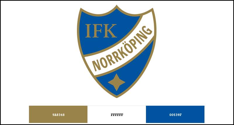
Every piece of the IFK Norrkoping crest carries meaning. The shield represents tradition and protection. The four-pointed star signals membership in the IFK society. And the diagonal stripe adds both the club name and a sense of forward motion.
None of this is accidental. Swedish football crests from this era were built to communicate identity at a glance.
Why Did IFK Norrkoping Choose These Specific Colors?
The blue (#00539F) comes from the broader IFK society’s tradition. All IFK member clubs use blue and white, dating back to the 1890s. These colors were said to symbolize loyalty and purity.
Blue does a lot of heavy lifting in sports branding. It reads as trustworthy and stable. If you look at collections of blue logos across industries, you will see why so many organizations default to it.
White (#FFFFFF) provides the contrast needed for the diagonal stripe and lettering. Without it, the shield would be a solid blue mass with no visual hierarchy.
Gold (#9A8348) was added as an accent, representing achievement and prestige. For a club with thirteen league titles, gold feels earned, not decorative. The psychology behind color choices in branding tells us gold signals excellence, and Norrkoping has the trophy cabinet to back it up.
What Typography Style Is Used in the IFK Norrkoping Logo?
The typography in the crest is a custom sans-serif style. Clean, uppercase lettering. No serifs, no flourishes.
The “IFK” text in the upper shield is bold and compact. “Norrkoping” across the diagonal stripe is narrower and more elongated, which helps it fit the angled space without looking cramped.
Readability was clearly a priority. At small sizes, like on a jersey chest or a broadcast scoreline, the text holds up. That is the mark of good typographic hierarchy in badge design.
What Are the Hidden Meanings in the IFK Norrkoping Logo?
The four-pointed comrade star is probably the most loaded symbol in the crest. It is shared across all IFK clubs and represents camaraderie and sporting excellence. Not every viewer would know that, but it is baked into the design’s DNA.
The shield’s distinctive top profile, with three peaks and two rounded sections between them, is a standard IFK shape. It ties Norrkoping visually to sibling clubs like IFK Goteborg.
The diagonal stripe is not just decorative. It adds movement to an otherwise static shield shape. And it carries the club’s geographic identity directly across the face of the badge, which is a clever bit of design.
How Does the IFK Norrkoping Logo Compare to Competitor Logos?

Among Swedish Allsvenskan clubs, IFK Norrkoping sits in the “traditional emblem” camp. It shares design DNA with IFK Goteborg due to their shared IFK society roots. But it has its own distinct color weight and proportions.
Wait, I should note the difference here. Goteborg’s crest also uses blue and white, but the overall composition and stripe treatment differ enough that you would not confuse them at a distance.
Malmo FF takes a totally different approach. Their sky-blue color and circular badge shape contrast sharply with Norrkoping’s angular, shield-based look. Hammarby IF uses green and white with a more illustrative style that leans into their neighborhood identity.
Then you have clubs like BK Hacken, whose crest is simpler and more modern. Norrkoping’s badge looks more classic by comparison. That is not a knock on either approach. Just different philosophies.
If you compare across European football more broadly, Norrkoping’s crest has similarities to other traditional Scandinavian club badges. It lacks the elaborate detail you might find in German or Spanish crests. Look at something like the Borussia Dortmund logo or a La Liga club like Athletic Bilbao, and you will see how much more ornate those designs get. Norrkoping keeps things tighter.
What Are the Technical Specifications of the IFK Norrkoping Logo?
Official Color Codes
Blue
Hex: #00539F | RGB: (0, 83, 159) | CMYK: (100, 48, 0, 38) | Pantone: 2145 C (approximate)
White
Hex: #FFFFFF | RGB: (255, 255, 255) | CMYK: (0, 0, 0, 0) | Pantone: 7436 C (approximate)
Gold
Hex: #9A8348 | RGB: (154, 131, 72) | CMYK: (0, 15, 53, 40) | Pantone: 4505 C (approximate)
Dimensions and Proportions
The SVG source file measures nominally 290 x 341 pixels, giving it an aspect ratio of roughly 0.85:1 (slightly taller than wide). The file size sits at about 8 KB in SVG format.
For print applications, a minimum DPI of 300 is recommended. Clear space around the badge should be at least equal to the height of the comrade star on all sides, though specific official guidelines from the club are not publicly available.
The badge works well at small sizes because of its bold shapes and high contrast between the blue field and white elements. That is the benefit of keeping a crest simple. Complicated badges fall apart when you shrink them down to a favicon or social media avatar.
What Cultural Impact Has the IFK Norrkoping Logo Had?
In Norrkoping, the badge is more than a sports graphic. It is a city symbol. The club has been part of the community since 1897, which means multiple generations have grown up seeing that blue shield on jerseys, scarves, and storefronts.
The nickname “Peking” (referring to the club) adds another layer of local identity that sits alongside the crest.
During the 2015 championship run, the first league title in 26 years, the logo was everywhere. It became a rallying point for a city that had waited a long time. That kind of emotional weight is something no redesign can manufacture. You just have to earn it over time.
The four-pointed star also ties into the wider IFK movement, connecting Norrkoping fans to a network of 164 member clubs across Sweden. It is a shared visual language that goes beyond a single team.
How Does the IFK Norrkoping Logo Fit Into the Overall Brand Identity?
The crest is the anchor of everything visual about IFK Norrkoping. The club’s brand guidelines extend the blue, white, and gold color palette across all touchpoints. Kits, stadium signage, digital presence, and merchandise all pull from the same core identity.
PlatinumCars Arena, the home ground, carries the club colors throughout. Match day programs, social media assets, and press materials all reference the badge directly.
The partnership with Adidas for kit manufacturing means the badge sits alongside the three-stripe branding on jerseys. The 2023 home kit, for example, was primarily white with blue accents and gold trim, directly echoing the crest’s palette.
It all hangs together. That consistency is what makes a sports brand feel real rather than assembled from random parts.
How Should the IFK Norrkoping Logo Be Used?
Official usage guidelines from IFK Norrkoping require that the badge be reproduced accurately and without modification. You should not stretch, rotate, recolor, or add effects to the crest. The clear space requirements need to be respected in all applications.
Where to access official logos: The club’s official website (ifknorrkoping.se) is the primary source for approved logo files. Third-party sites like Brandfetch and SportsLogos.net host reference versions, but for commercial use, you need to go through the club directly.
Licensing: Any commercial use of the IFK Norrkoping logo requires written permission from the club. This includes merchandise, promotional materials, and media applications. Fan-created content for non-commercial purposes is generally tolerated, but the club retains all rights.
Trademark protection: The badge is a registered trademark. Using it without authorization for commercial gain can result in legal action under Swedish trademark law. If you are a designer or vendor looking to produce licensed goods, contact the club’s commercial department first. Always.
FAQ on The IFK Norrkoping Logo
What does the IFK Norrkoping logo look like?
The IFK Norrkoping logo is a blue shield with gold trim, a white diagonal stripe carrying the club name, and the “IFK” lettering above it. A four-pointed comrade star sits at the top of the crest.
What do the colors in the IFK Norrkoping badge mean?
Blue represents loyalty and trust. White stands for purity. Gold signals achievement and prestige.
These team colors trace back to the broader IFK society, established in the 1890s. Every IFK member club in Sweden shares the blue and white tradition.
When was the current IFK Norrkoping crest introduced?
The current version has been active since around 2000. But the basic structure, a blue shield with a white stripe and the IFK star, goes back decades earlier. The club itself was founded on May 29, 1897, in Norrkoping.
Who designed the IFK Norrkoping logo?
No specific designer or agency is publicly credited. The badge follows the visual standards of the Idrottsforeningen Kamraterna society. Its design evolved gradually through internal club decisions rather than a single commissioned rebrand.
What is the four-pointed star in the IFK Norrkoping emblem?
That is the IFK comrade star. It appears on all clubs within the Idrottsforeningen Kamraterna network across Sweden.
The star represents sporting fellowship and distinction. It connects Norrkoping to 164 other IFK member clubs.
What are the official color codes of the IFK Norrkoping logo?
Blue is #00539F. White is #FFFFFF. Gold is #9A8348.
These hex values are approximations based on the club crest as rendered digitally. The closest Pantone matches are 2145 C for blue and 4505 C for gold.
How has the IFK Norrkoping logo changed over time?
The badge has seen minor refinements since 1897 but no dramatic overhaul. The Allsvenskan team logo kept its shield shape, diagonal stripe, and comrade star throughout every update. Linework and gold accents got cleaner over the decades.
Can I use the IFK Norrkoping logo for my own project?
Not without permission. The badge is a registered trademark of IFK Norrkoping.
Commercial use requires written approval from the club. Fan content for non-commercial purposes is generally tolerated, but the club holds all rights under Swedish trademark law.
What font is used in the IFK Norrkoping crest?
The lettering is a custom sans-serif style. Bold, uppercase, and built for readability at small sizes. “IFK” appears compact in the upper shield. “Norrkoping” stretches across the diagonal stripe in a narrower weight.
How does the IFK Norrkoping logo compare to other Swedish football crests?
It shares the IFK shield structure with clubs like IFK Goteborg. But the gold accents and specific proportions set it apart.
Compared to Malmo FF’s circular badge or Hammarby’s green crest, the Norrkoping football club emblem looks more traditional and angular. Different clubs, different approaches.
Conclusion
The IFK Norrkoping logo is a case study in how a football club crest can stay relevant without constant reinvention. Blue shield, gold trim, white stripe, comrade star. That formula has worked since 1897.
It ties the club to the Allsvenskan’s history and to the wider Idrottsforeningen Kamraterna network across Sweden.
The badge carries thirteen Swedish championship titles, a fierce Norrkoping football heritage, and a city’s identity all within a simple emblem. Few Nordic football club emblems manage that kind of weight with so little clutter.
Good club logo design does not need to shout. Sometimes it just needs to hold steady while everything else changes around it.

Renowned for his expertise in logo design and visual branding, Bogdan has developed a multitude of logos for various clients.
His skills extend to creating posters, vector illustrations, business cards, and brochures. Additionally, Bogdan's UI kits were featured on marketplaces like Visual Hierarchy and UI8.
He also wrote in the past years on sites like Design Your Way, WebDesignerDepot, WPDean, Designmodo, Speckyboy, Slider Revolution, and more.
- Beautiful Fonts Similar to Poppins You Should Try - 22 October 2026
- Website Redesign: How to Improve Your Website without Losing SEO Rankings - 22 October 2026
- The Coda Logo History, Colors, Font, And Meaning - 20 October 2026

Bogdan Sandu is a seasoned designer who has been designing websites since 2008. Renowned for his expertise in logo design and visual branding, Bogdan has developed a multitude of logos for various clients. His skills extend to creating posters, vector illustrations, business cards, and brochures. Additionally, Bogdan's UI kits were featured on marketplaces like Visual Hierarchy and UI8. He also wrote in the past years on sites like Design Your Way, WebDesignerDepot, WPDean, Designmodo, Speckyboy, Slider Revolution, and more.
You Might Also Like


