

The Lamborghini logo represents Italian luxury automotive excellence through its charging bull emblem within a shield. This iconic design serves as the visual identity for Automobili Lamborghini S.p.A., one of the world’s most recognized supercar manufacturers.
Founded by Ferruccio Lamborghini in 1963, the company established operations in Sant’Agata Bolognese, Italy. The brand has undergone seven major logo iterations since its inception, with the current version introduced in 2024. Each design maintains core elements while adapting to contemporary brand positioning.
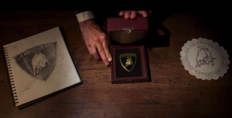
The logo functions as both a symbol of luxury and a reflection of founder heritage. Ferruccio Lamborghini chose the bull to represent his Taurus zodiac sign and passion for Spanish bullfighting. The original design emerged from collaboration with graphic designer Paolo Rambaldi, who established the foundation for decades of brand identity evolution.
What is the Lamborghini Logo?
The Lamborghini logo features a charging bull positioned within a shield, accompanied by the brand name in uppercase lettering. Introduced in 1963, the design was created by Paolo Rambaldi in collaboration with founder Ferruccio Lamborghini. The emblem uses gold and black colors, with the bull representing power, aggression, and performance characteristics of the luxury sports cars.
Design Type: Combination mark (emblem with wordmark)
Primary Elements:
- Golden charging bull in fighting stance
- Shield-shaped background
- “LAMBORGHINI” wordmark at shield top
- Black backdrop with gold accents
Official Introduction Date: 1963
Designer/Agency: Paolo Rambaldi (graphic designer working with Ferruccio Lamborghini)
Trademark Status: Registered under Automobili Lamborghini S.p.A. with multiple trademark protections including U.S. Registration Number 3312082
Color Palette:
- Black: #000000
- Gold: #D8A016
- Dark Yellow: #BC8314
Usage Context: The logo appears on all Lamborghini vehicles (hood, steering wheel, wheels), marketing materials, dealership signage, official merchandise, digital platforms, and corporate communications. The 2024 update separated the bull from the shield for digital applications while maintaining the complete version for physical branding.
How Has the Lamborghini Logo Evolved Over Time?
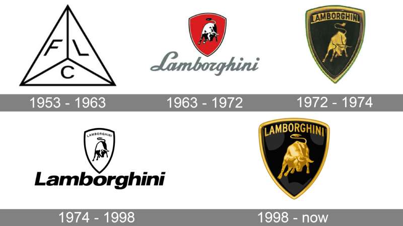
Lamborghini’s visual identity transformed from industrial simplicity to luxury sophistication across seven decades. The logo progression reflects ownership changes, market positioning shifts, and design philosophy evolution while maintaining the charging bull as its central element throughout automotive history.
Original Lamborghini Tractori Logo (1948-1963)
Years Active: 1948-1963
Design Description: Geometric triangle divided into three sections, each containing a single letter (F, L, C) in white text on black backgrounds
Color Scheme: Monochromatic black and white
Designer: Created in-house for Lamborghini Trattori (tractor manufacturing company)
Context: Ferruccio Lamborghini operated as a tractor manufacturer before entering the luxury sports car market. The letters represented “Ferruccio Lamborghini Cento” (Cento being the founder’s hometown).
Key Changes from Previous: First official company mark
Cultural Significance: Established industrial manufacturing credibility in post-World War II Italy
First Automobili Lamborghini Logo (1963-1972)
Years Active: 1963-1972
Design Description: Black bull in charging stance positioned on a red shield with black border, cursive “Lamborghini” script below the emblem
Color Scheme: Red shield, black bull, black script text
Designer: Paolo Rambaldi (graphic designer)
Context: Ferruccio Lamborghini entered the luxury sports car market to compete with Ferrari after experiencing dissatisfaction with existing Italian sports cars. The logo coincided with the company’s founding in Sant’Agata Bolognese.
Key Changes from Previous: Complete rebrand from triangular mark to heraldic shield with bull symbol
Cultural Significance: The red background referenced Bologna’s regional colors. The bull represented Ferruccio’s Taurus zodiac sign and passion for Spanish bullfighting.
Classic Gold and Black Logo (1972-1974)
Years Active: 1972-1974
Design Description: Golden bull on black shield background with “LAMBORGHINI” wordmark in bold sans-serif uppercase letters inside the shield above the bull
Color Scheme: Gold bull and text, black background, gold shield outline
Designer: Internal design team refinement
Context: Brand maturation period as Lamborghini established itself as a serious Ferrari competitor
Key Changes from Previous: Eliminated red color in favor of gold and black palette, moved wordmark inside shield, changed from script to sans-serif font, refined bull’s muscular detail
Cultural Significance: Gold and black became synonymous with Lamborghini luxury positioning, distinguishing the brand from Ferrari’s red and Porsche’s silver
Simplified Monochrome Version (1974-1998)
Years Active: 1974-1998
Design Description: Black and white version with bull silhouette inside shield outline, “Lamborghini” wordmark placed outside and below the shield in italicized bold typography
Color Scheme: Black and white only
Designer: Neue Helvetica-based font adaptation
Context: This 24-year period marked financial difficulties and multiple ownership changes including Chrysler’s 1987 acquisition
Key Changes from Previous: Eliminated gold color, moved wordmark outside shield, simplified bull to basic silhouette
Cultural Significance: Cost-reduction era maintained brand recognition through simplified design during turbulent ownership transitions
Dimensional Revival Logo (1998-2023)
Years Active: 1998-2023
Design Description: Three-dimensional golden bull with muscular detail, gradient gold coloring on black shield, “LAMBORGHINI” wordmark at shield top in refined sans-serif uppercase
Color Scheme: Gradient gold (#FED260 to #BC8314), black (#000000)
Designer: KMS Team (German design agency commissioned by Audi)
Context: Audi AG acquired Lamborghini in 1998, investing resources to revitalize the brand and modernize its visual identity
Key Changes from Previous: Restored gold coloring, added three-dimensional effects and gradients, returned wordmark inside shield, enhanced bull musculature and detail
Cultural Significance: Marked Lamborghini’s renaissance under Volkswagen Group ownership with models like Gallardo and Murcielago establishing modern supercar dominance
Current Minimalist Logo (2024-Present)
Years Active: 2024-present
Design Description: Flattened gold bull with reduced detail, thinner shield outline, refined wordmark with expanded letter spacing, softer gold hue
Color Scheme: Muted gold, black, white accent
Designer: Internal Lamborghini design team under Direzione Cor Tauri brand strategy
Context: Logo update coincides with Lamborghini’s sustainability and electrification strategy focused on hybrid and electric powertrains
Key Changes from Previous: Eliminated gradient effects, reduced bull detail, thinner shield borders, bull separated from shield for digital applications, softer gold tone
Cultural Significance: Reflects contemporary design trends toward minimalist design and digital-first branding while maintaining heritage elements
What Do the Design Elements of the Lamborghini Logo Mean?
The charging bull represents raw power, determination, and aggressive performance aligned with high-speed supercars. Ferruccio Lamborghini selected this symbol based on his Taurus zodiac sign and admiration for Spanish bullfighting culture, particularly after visiting Don Eduardo Miura’s bull ranch in Seville, Spain.
Why Does the Logo Feature a Bull?
The bull carries multiple layers of meaning within Lamborghini’s brand identity.
Ferruccio Lamborghini was born under the Taurus zodiac sign (April 28, 1916), making the bull his astrological symbol. When graphic designer Paolo Rambaldi asked about his defining characteristics, Ferruccio responded “I’m tamugno (stubborn) like a bull” in local dialect.
The charging stance reflects bullfighting traditions. Ferruccio witnessed bullfights in Spain and became captivated by the animals’ power and intensity.
Many Lamborghini models carry bull-related names: Miura (famous fighting bull breeder), Murcielago (legendary bull that survived 24 sword strikes), Islero (bull that killed matador Manolete), Diablo (ferocious bull), and Aventador (fighting bull awarded trophy in 1993).
Why Did Lamborghini Choose These Specific Colors?
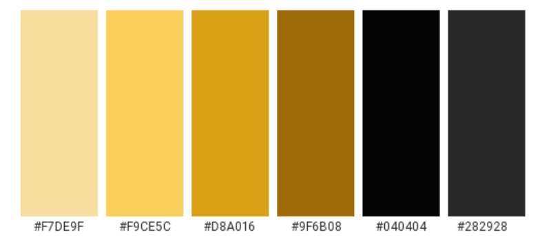
Black (#000000)
Black communicates luxury, sophistication, and elegance in automotive branding.
The color represents power, mystery, and exclusivity within the supercar segment. Black creates contrast that makes the gold bull prominent and immediately recognizable. Color psychology associates black with prestige and timelessness.
Gold (#D8A016)
Gold symbolizes wealth, success, and premium quality in luxury markets.
The color choice establishes Lamborghini as an aspirational brand. Gold references precious metals and championship trophies, suggesting victory and achievement. The complementary color scheme of gold on black creates maximum visual impact and memorability.
Dark Yellow/Accent Gold (#BC8314)
This shade adds depth and dimension to the logo’s gold elements.
Used for gradient effects in the 1998-2023 version, darker gold creates shadows and three-dimensional appearance. The color variation maintains the luxury positioning while adding technical sophistication to the design.
What Typography Style Is Used in the Lamborghini Logo?
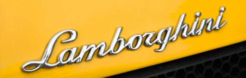
The current wordmark uses a custom sans-serif typeface with wide letter spacing and bold weight.
The original 1963-1972 logo featured cursive script reflecting automotive design trends of the 1960s. The 1972 redesign introduced bold sans-serif capitals, conveying strength and modernity. Font characteristics include uppercase-only lettering, extended character width, uniform stroke weight, and minimal kerning between letters.
The typographic hierarchy places the wordmark at the shield’s top, creating visual hierarchy that guides viewers from brand name to bull symbol. The 2024 version expanded letter spacing further for improved digital readability.
What Are the Hidden Meanings in the Lamborghini Logo?
The shield shape references heraldic traditions and European coat of arms designs, suggesting nobility and heritage.
The bull’s non-classical pose breaks traditional heraldic rules where animals appear in profile. This “irregularity” creates dynamic movement and forward momentum, reflecting innovation and boundary-pushing philosophy.
The logo’s similarity to Ferrari’s prancing horse was intentional. Ferruccio Lamborghini challenged Ferrari directly after Enzo Ferrari dismissed his mechanical suggestions. The visual parallel serves as automotive rivalry symbolism rather than imitation.
Designer Paolo Rambaldi incorporated the bull’s muscular definition to mirror the mechanical sophistication and engineering precision inside Lamborghini engines. Every curve and line suggests controlled aggression and performance capability.
How Does the Lamborghini Logo Compare to Competitor Logos?
Lamborghini’s bull distinguishes itself through aggressive positioning and gold-black color scheme within the Italian luxury sports car segment. While Ferrari uses a prancing horse on yellow, Porsche features a horse on a complex crest, and Maserati displays a trident, Lamborghini’s charging bull communicates raw power rather than elegance or nautical heritage.
Design Philosophy Comparison:
Ferrari’s logo emphasizes racing heritage and speed through a leaping horse silhouette on bright yellow (Modena city colors). The design projects lightness and agility.
Porsche incorporates Stuttgart’s coat of arms with detailed elements including a rampant horse, antlers, and red-black stripes. The complexity suggests tradition and engineering precision.
Maserati uses Neptune’s trident from Bologna’s Piazza Maggiore fountain, representing mastery over the seas (metaphorically, roads). The design emphasizes Italian artistry.
Bugatti features red on white with founder Ettore Bugatti’s initials, projecting French luxury and founder personality.
Lamborghini’s bull in fighting stance projects confrontation, challenge, and uncompromising power. The black-gold palette differs from Ferrari’s yellow, Porsche’s gold-red-black, and Maserati’s blue-red, establishing unique visual territory.
What Are the Technical Specifications of the Lamborghini Logo?
Official Color Codes:
Primary Color: Black
Secondary Color: Gold
- Hex: #D8A016
- RGB: (216, 160, 22)
- CMYK: (0, 26, 90, 15)
- Pantone: PMS 7555 C
Accent Color: Bright Gold
- Hex: #FED260
- RGB: (254, 210, 96)
- CMYK: (0, 17, 62, 0)
- Pantone: PMS 121 C
Accent Color: Dark Yellow
- Hex: #BC8314
- RGB: (188, 131, 20)
- CMYK: (0, 30, 89, 26)
- Pantone: PMS 1245 C
Dimensions and Proportions:
Aspect Ratio: Approximately 1:1.2 (width to height)
Minimum Size Requirements:
- Print: 15mm width minimum
- Digital: 32 pixels width minimum for full logo
- Digital icon: 16 pixels for bull symbol only
Clear Space Specifications: Minimum clear space equals the height of the letter “L” in “LAMBORGHINI” on all sides of the logo
Official Usage Guidelines:
- Logo must maintain original proportions (no stretching or distortion)
- Color variations limited to full-color gold/black, all-black, all-white, or reversed versions
- Unauthorized modifications, rotations, or effects prohibited
- Wordmark and symbol separation only permitted in approved digital contexts
- Background colors must provide adequate contrast (minimum 4.5:1 ratio)
What Cultural Impact Has the Lamborghini Logo Had?
The raging bull became a universal symbol of automotive aspiration and extreme performance across global popular culture.
The logo appears in music videos, luxury lifestyle imagery, video games, and movies as shorthand for wealth and speed.
Hip-hop culture particularly embraced Lamborghini as status symbolism, with artists referencing the brand in thousands of songs. The logo’s recognition rivals Ferrari’s in markets where supercar ownership remains aspirational rather than accessible, functioning as pure luxury signaling beyond its automotive context.
How Does the Lamborghini Logo Fit Into Overall Brand Identity?
The logo anchors Lamborghini’s complete brand architecture including vehicle design language, dealership environments, merchandise, and digital presence. Sharp angles in the bull’s form mirror the angular design elements found in Lamborghini car bodies, creating unity across touchpoints.
The black-gold palette extends to showroom interiors, corporate communications, and product launches. Digital platforms separate the bull from the shield for app icons and social media profiles, demonstrating logo flexibility within strict brand guidelines.
The charging bull reinforces the “Driving Humans Beyond” brand mission statement introduced under the Direzione Cor Tauri strategy, connecting visual identity to corporate philosophy.
How Should the Lamborghini Logo Be Used?
Official Usage Guidelines:
Only use official logo files from Lamborghini’s press center or authorized sources. Never recreate or modify the logo manually.
Maintain minimum clear space around the logo equal to the height of one letter from the wordmark.
Use approved color versions only: full-color (gold and black), single-color black, single-color white, or reversed versions.
Do not:
- Stretch, distort, or change proportions
- Rotate or tilt the logo
- Add effects (shadows, glows, outlines)
- Change colors or apply gradients not in official specifications
- Place logo on busy backgrounds that reduce legibility
- Separate elements except in approved digital icon contexts
- Use outdated logo versions
Where to Access Official Logos:
Official high-resolution logo files: Lamborghini Media Center (media.lamborghini.com) requires registration for press and commercial use
Licensed merchandise: Contact Automobili Lamborghini Licensing Department for product licensing
Personal/editorial use: Request permission through official channels for non-commercial projects
Licensing Information:
The Lamborghini logo is registered trademark property of Automobili Lamborghini S.p.A. Commercial use requires formal licensing agreements. Editorial and journalistic use permitted under fair use provisions with proper attribution. Merchandise, apparel, and product applications require licensing fees and approval processes.
Trademark Protection Details:
U.S. Trademark Registration Number 3312082 covers “AUTOMOBILI LAMBORGHINI” word mark and bull design. Multiple international trademark registrations protect the logo across 150+ countries. Lamborghini actively enforces trademark rights against infringement, as demonstrated in cases against unauthorized use of bull imagery in automotive contexts.
FAQ About the Lamborghini Logo
When was the Lamborghini logo created?
The iconic Lamborghini bull logo was created in 1963 when Ferruccio Lamborghini founded Automobili Lamborghini S.p.A. in Sant’Agata Bolognese, Italy. The original design featured a black bull on a red shield with the brand name in script lettering below the emblem.
Who designed the Lamborghini logo?
Paolo Rambaldi, a local Italian graphic designer, created the Lamborghini logo in collaboration with founder Ferruccio Lamborghini. Rambaldi asked Ferruccio about his defining characteristics, and the founder responded that he was “stubborn like a bull,” inspiring the central design element combined with his Taurus zodiac sign.
What do the colors in the Lamborghini logo mean?
Black represents luxury, power, sophistication, and exclusivity in the automotive luxury segment. Gold symbolizes wealth, success, premium quality, and achievement. The color combination creates maximum visual impact and positions Lamborghini as an aspirational brand. The original 1963 version used red for Bologna regional connection, but gold-black became permanent in 1972.
How many times has the Lamborghini logo been redesigned?
The Lamborghini logo has undergone seven major redesigns: the original tractor company triangle (1948-1963), first automotive bull on red (1963-1972), gold-black version (1972-1974), simplified monochrome (1974-1998), dimensional revival (1998-2023), and current minimalist version (2024-present). Each maintained the bull symbol while adapting color, detail, and typography.
Where can I download the official Lamborghini logo?
Official high-resolution Lamborghini logos are available through the Lamborghini Media Center at media.lamborghini.com, which requires registration. Commercial use requires licensing permission from Automobili Lamborghini S.p.A. Unauthorized downloads from third-party websites may contain outdated or modified versions that violate trademark protections. Always use official sources for legitimate projects.
Is the Lamborghini logo trademarked?
Yes, the Lamborghini logo is extensively trademarked. U.S. Trademark Registration Number 3312082 protects the “AUTOMOBILI LAMBORGHINI” word mark and bull design. The company maintains over 123 active trademark registrations worldwide covering the bull symbol, shield design, wordmark variations, and color palette. Unauthorized commercial use constitutes trademark infringement subject to legal action.
What font is used in the Lamborghini logo?
The Lamborghini logo uses a custom sans-serif typeface created specifically for the brand. Earlier versions (1972-1998) resembled Neue Helvetica Paneuropean 83 Extended Heavy Oblique. For similar aesthetics, designers reference Fjalla One, Lato, or Molengo for the modern sans-serif style. The 1963-1972 script version used custom cursive lettering. La Macchina font approximates the brand aesthetic for unofficial projects.
Why did Lamborghini choose a bull for their logo?
Ferruccio Lamborghini chose the bull for three primary reasons: his Taurus zodiac sign (born April 28, 1916), his passion for Spanish bullfighting after visiting Don Eduardo Miura’s bull ranch in Seville, and his self-described stubborn personality like a fighting bull. The symbol also challenged Ferrari’s prancing horse, establishing Lamborghini as a fierce competitor in the luxury sports car market.
Conclusion
The Lamborghini logo represents six decades of Italian automotive excellence through its charging bull emblem within a shield design. Created by Paolo Rambaldi and Ferruccio Lamborghini in 1963, the logo communicates power, luxury, and uncompromising performance.
Key attributes define the emblem: the gold-and-black color scheme symbolizing wealth and sophistication, the bull representing Taurus zodiac heritage and bullfighting passion, the shield shape suggesting nobility and protection, and the sans-serif wordmark projecting modern strength. Technical specifications include precise color codes (#000000 black, #D8A016 gold) and protected trademark status across 150+ countries.
The logo positions Lamborghini uniquely within luxury automotive branding, distinguishing the marque from Ferrari’s prancing horse and Porsche’s complex crest. Through seven major redesigns, the core bull symbol remained constant while adapting to contemporary design trends, most recently embracing minimalism in the 2024 update.
Looking forward, the logo will anchor Lamborghini’s electrification strategy and sustainability commitment under the Direzione Cor Tauri program. The separated bull element enables digital-first applications while maintaining heritage recognition. As Lamborghini transitions toward hybrid and electric powertrains, the charging bull continues symbolizing the relentless forward momentum that defined Ferruccio Lamborghini’s original vision in Sant’Agata Bolognese.

Renowned for his expertise in logo design and visual branding, Bogdan has developed a multitude of logos for various clients.
His skills extend to creating posters, vector illustrations, business cards, and brochures. Additionally, Bogdan's UI kits were featured on marketplaces like Visual Hierarchy and UI8.
He also wrote in the past years on sites like Design Your Way, WebDesignerDepot, WPDean, Designmodo, Speckyboy, Slider Revolution, and more.
- The Coda Logo History, Colors, Font, And Meaning - 20 October 2026
- How Can Designers Turn AI Image Prompts Into Polished Visuals? A Practical Workflow - 20 October 2026
- Top Military and Defense UI/UX Design Services Companies: A 2026 Buyer’s Guide - 19 October 2026

Bogdan Sandu is a seasoned designer who has been designing websites since 2008. Renowned for his expertise in logo design and visual branding, Bogdan has developed a multitude of logos for various clients. His skills extend to creating posters, vector illustrations, business cards, and brochures. Additionally, Bogdan's UI kits were featured on marketplaces like Visual Hierarchy and UI8. He also wrote in the past years on sites like Design Your Way, WebDesignerDepot, WPDean, Designmodo, Speckyboy, Slider Revolution, and more.
You Might Also Like


