


The Enfusion logo is the visual identity of a Chicago-based fintech company that builds cloud-native investment management software. It is a clean, lowercase wordmark set in purple and black. The mark sits at the intersection of financial services and SaaS technology, two sectors where trust and clarity carry real weight.
Enfusion was founded in the late 1990s and grew through the 2000s as a platform serving hedge funds and asset managers. The company went public on the NYSE in October 2021 under the ticker ENFN. In 2022, agency 50,000feet led a full rebrand that included a new logomark, refreshed color palette, and updated typography. The current logo reflects that work.
Branding in fintech is tricky. You need to look technical enough for portfolio managers but approachable enough for a sales deck. Enfusion’s mark walks that line. And it has gone through a few iterations since its early startup days, though the core lowercase wordmark has stayed consistent.
What Is the Enfusion Logo?
The Enfusion logo is a lowercase wordmark rendered in a custom sans-serif font featuring geometric letterforms, circular dot accents, and ligature details. It was redesigned in 2022 by the Chicago-based agency 50,000feet. The purple and black color scheme signals sophistication and authority within the investment management software space.
Here is a breakdown of its main attributes:
- Design Type: Wordmark (logotype). No separate icon or symbol, just the company name styled as the mark itself.
- Primary Elements: Lowercase letterforms with distinctive circular features, dot accents, and subtle ligatures between certain characters. The geometric construction gives it a structured, data-driven feel.
- Official Introduction Date: The current version launched in early 2022 as part of the 50,000feet rebrand. The original logo dates back to the company’s founding.
- Designer/Agency: 50,000feet, a Chicago-based brand consultancy specializing in B2B and financial services clients.
- Trademark Status: Enfusion is a registered trademark. The ENFN ticker was listed on the NYSE from October 2021 until delisting in April 2025 following the Clearwater Analytics acquisition.
- Color Palette: Purple (primary) and Black (secondary). These two colors make up the full logo color scheme.
- Usage Context: The logo appears across Enfusion’s SaaS platform interface, client portals, marketing materials, conference displays, trading dashboards, and investor relations documentation.
How Has the Enfusion Logo Evolved Over Time?
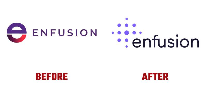
Enfusion’s visual identity has gone through a few stages. The original mark launched with the company’s founding, then got refined as the business grew from a small startup into an enterprise SaaS provider serving hundreds of institutional clients.
The biggest shift happened in 2022 when 50,000feet overhauled the entire brand system. But even before that, smaller tweaks kept the logo looking current across digital platforms.
Original Enfusion Logo (Late 1990s to Mid-2010s)
Years Active: Approximately 1997 through the mid-2010s.
The first logo was straightforward. It prioritized readability and software reliability, which made sense for a company selling to hedge fund operations teams who cared more about uptime than aesthetics.
The early color scheme leaned into blues and grays, standard picks for fintech at the time. Nothing flashy. It did the job.
This version reflected the company’s bootstrapped roots. Enfusion was not spending big on branding back then. The focus was building the platform and signing clients.
Transitional Enfusion Logo (Mid-2010s to 2022)
Years Active: Mid-2010s through early 2022.
As Enfusion raised significant growth equity (including a major round from FTV Capital in 2017 and $150 million from ICONIQ Growth in 2021), the brand started getting more attention.
The logo during this period saw refinements to its letterforms and spacing. The company was growing fast and preparing for its IPO. Looking polished mattered more now.
By the time Enfusion hit the NYSE in October 2021, the visual identity needed to match the scale of the business. That set the stage for the full rebrand.
Current Enfusion Logo (2022 to Present)
Years Active: 2022 onward.
50,000feet delivered a complete visual identity overhaul. New logomark, new palette, new typography elements, new photography direction.
The current wordmark uses all lowercase letters with a modern geometric construction. Circular shapes within the letterforms give it personality without sacrificing professionalism. The purple and black scheme replaced the older blue tones.
This version was built for digital-first applications. It works at small sizes on mobile trading apps and scales up for conference booths. The 2025 acquisition by Clearwater Analytics has raised questions about future brand integration, but the Enfusion mark remains in use.
What Do the Design Elements of the Enfusion Logo Mean?
Every piece of the Enfusion logo ties back to the company’s position in investment management technology. The geometric precision of the letterforms mirrors the data-driven, systematic approach Enfusion takes with its software.
The lowercase styling is a deliberate choice. It reads as modern and approachable rather than stiff or corporate. Plenty of fintech companies have moved toward this kind of treatment in recent years.
Why Did Enfusion Choose These Specific Colors?
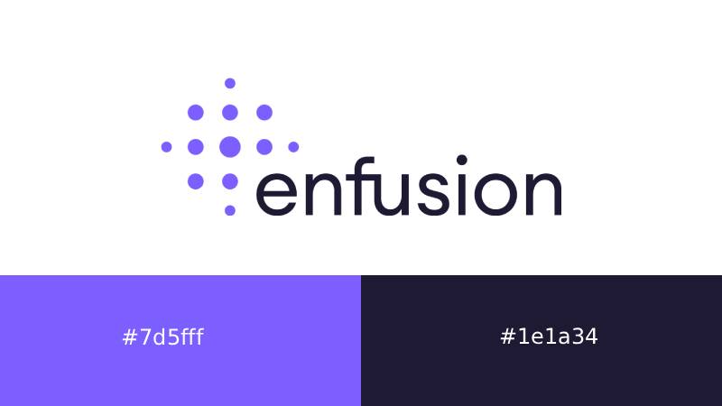
The Enfusion logo uses two colors: purple and black.
Purple (Primary): Purple is unusual in financial technology branding, and that is exactly the point. Most fintech companies default to blue (trust, stability, the usual). Purple signals creativity, sophistication, and a break from convention. It suggests Enfusion sees itself differently from the pack. The psychology behind color choices in branding matters here. Purple carries associations with luxury, imagination, and premium quality.
Black (Secondary): Black adds authority and weight. It grounds the purple and keeps the overall look from feeling too playful. In practice, black shows up in single-color applications, compliance documents, and situations where color printing is limited.
The combination stands out against competitors who lean heavily on blue in their logos. It is a differentiator in a crowded market where many brands look the same. You can also find companies using purple in their logos across other industries, but it remains rare in fintech specifically.
What Typography Style Is Used in the Enfusion Logo?
The Enfusion wordmark uses a custom sans-serif font designed to feel technical and clean.
The letterforms have geometric bases with distinctive circular dots and subtle ligatures. Everything is lowercase, which softens the look compared to all-caps alternatives. The x-height is relatively tall, improving readability at small sizes on screens.
Careful kerning keeps the letter spacing even across the wordmark. This matters when the logo shows up on everything from a 16-pixel favicon to a 10-foot wide trade show banner.
What Are the Hidden Meanings in the Enfusion Logo?
The circular elements within certain letterforms (like the dots and rounded shapes) reference connectivity and data flow. That aligns with Enfusion’s core product, which unifies front, middle, and back-office investment operations on a single data set.
The lowercase treatment subtly communicates accessibility. Enfusion sells to institutional investors, but the brand avoids looking intimidating. It is an interesting tension, and I think 50,000feet handled it well.
There is also a sense of unity in how the letters flow together. The ligatures connect characters in a way that suggests integration, which is literally what the software does.
How Does the Enfusion Logo Compare to Competitor Logos?
Investment management software is a space where visual branding tends to blend together. Blue wordmarks, conservative fonts, abstract symbols. You have seen it a hundred times.
Enfusion’s purple palette breaks from that pattern. Look at competitors like Salesforce’s logo (blue cloud), Workday’s logo (orange and warm tones), or the FactSet logo (blue and green). Most play it safe with trustworthy blues or friendly greens.
Enfusion went a different direction. The purple is bold for this sector. And the all-lowercase geometric wordmark feels more like a modern tech company logo than a traditional financial services mark. That was probably the goal.
Companies like BlackLine (orange and dark), Plaid (black and minimal), and the Stripe logo (purple gradient) share some overlap in trying to look modern and tech-forward. But Enfusion’s specific combination of purple, black, and geometric sans-serif typography gives it a unique spot in the fintech branding landscape.
What Are the Technical Specifications of the Enfusion Logo?
Official Color Codes
- Primary Color: Purple – This is the dominant brand color. Purple communicates creativity and sophistication. Exact RGB and CMYK values should be sourced from Enfusion’s official brand guidelines document, as third-party color extractions can vary.
- Secondary Color: Black – Hex: #000000, RGB: (0, 0, 0), CMYK: (0, 0, 0, 100). Used for single-color applications and text.
Dimensions and Proportions
The Enfusion logo has specific sizing requirements to keep it legible across all contexts.
Minimum size for digital: 16 pixels in height. This keeps the wordmark readable on mobile trading dashboards and web interfaces.
Minimum size for print: 0.5 inches wide. Fund administration documents and compliance paperwork need the logo to hold up at small sizes.
DPI requirements: Print materials need 300 DPI minimum. Digital applications use 72 DPI for web-based portfolio management platforms.
Clear space rules dictate that no other visual elements crowd the logo. This is standard practice for maintaining visual hierarchy and brand consistency across all touchpoints.
The logo is distributed in vector graphics formats (SVG, EPS, PDF) for scalable applications and raster formats (PNG) for web use.
What Cultural Impact Has the Enfusion Logo Had?
Let’s be real. Enfusion is not Nike or Apple. Its logo does not have mainstream cultural recognition.
But within the investment management technology community, the 2022 rebrand got noticed. The purple palette was a conversation starter at industry conferences. When every other booth is blue and gray, purple stands out.
The 50,000feet rebrand was even shortlisted for a Transform Award for Best Visual Identity in the financial services category. That kind of industry recognition matters in B2B, where brand credibility directly affects sales cycles.
The Clearwater Analytics acquisition in 2025 adds another layer. The Enfusion brand now exists within a larger corporate structure, and how (or whether) it persists will be an interesting case study in post-acquisition brand management.
How Does the Enfusion Logo Fit Into the Overall Brand Identity?

The logo is just one piece. Enfusion’s full brand system includes the wordmark, the purple and black color palette, the custom typeface, photography direction, and specific layout rules defined in their brand style guide.
Everything connects. The geometric precision of the logo carries through to how data visualizations look on the platform. The purple shows up in UI elements, marketing emails, and event materials. Consistency across all these touchpoints is what makes a brand system actually work.
Enfusion’s brand also ties into its market positioning. The company serves hedge funds, asset managers, and institutional investors. The visual identity needs to say “we are serious about your data” while also saying “we are not stuck in 2005.” The current system does that.
How Should the Enfusion Logo Be Used?
Usage Do’s
- Always use official logo files from Enfusion’s brand portal or authorized distribution channels.
- Maintain required clear space around the logo. No other elements should crowd it.
- Use approved color variations only. The full-color purple and black version, a single-color black version, and a reversed white version for dark backgrounds.
- Keep the logo at or above minimum size requirements (16px digital, 0.5″ print).
Usage Don’ts
- Do not stretch, rotate, skew, or distort the logo in any way.
- Do not change the logo colors to anything outside the approved palette.
- Do not add effects like drop shadows, outlines, or gradients to the logo.
- Do not recreate the wordmark using a different font. The custom letterforms are part of the trademark.
- Do not place the logo on busy backgrounds that reduce legibility or contrast.
Where to Access Official Logo Files
Official Enfusion logo files have been available through the company’s brand portal and through authorized partner channels. Following the Clearwater Analytics acquisition, access may route through Clearwater’s corporate brand resources. Investment management firms and fund services partners typically get approved versions through client portals.
Trademark Protection
The Enfusion name and logo are protected trademarks. Unauthorized use, modification, or reproduction without permission is not allowed. This includes creating derivative logos or using the Enfusion mark in ways that imply endorsement or partnership without a formal agreement. Standard stuff, but worth noting if you are working with the brand in any capacity.
FAQ on The Enfusion Logo
What does the Enfusion logo look like?
The Enfusion logo is an all-lowercase wordmark set in a custom sans-serif typeface. It uses a purple and black color scheme with geometric letterforms, circular dot accents, and ligatures. No separate icon or symbol accompanies it.
Who designed the current Enfusion logo?
Chicago-based agency 50,000feet designed the current version in 2022. The project included a full brand refresh with a new logomark, updated color palette, and redesigned website to support Enfusion’s position as a cloud-native investment management platform.
What colors are in the Enfusion logo?
Purple and black. That is the full palette.
Purple serves as the primary brand color, signaling creativity and sophistication. Black adds authority. The combination is unusual in fintech, where most competitors stick to blue.
What font does the Enfusion logo use?
The logo uses a custom sans-serif font with geometric construction. Distinctive features include circular shapes, dot elements, and subtle ligatures between characters. It was built specifically for the brand, not pulled from a standard font library.
When was Enfusion founded?
Sources vary. Some list the founding year as 1997, others as 2006. The company is headquartered in Chicago and built a SaaS platform for hedge funds and asset managers before going public on the NYSE in October 2021.
Can I download the Enfusion logo in SVG or PNG format?
Official logo files are available through Enfusion’s brand portal for authorized partners. Third-party sites offer vector and raster downloads, but always verify you are using the approved version that matches current brand guidelines.
What happened to Enfusion after the Clearwater Analytics acquisition?
Clearwater Analytics acquired Enfusion in April 2025 for approximately $1.5 billion. The ENFN ticker was delisted from the NYSE. The Enfusion brand identity remains active, though future integration with Clearwater’s corporate branding is expected.
What is the minimum size for the Enfusion logo?
Digital applications require a 16-pixel height minimum. Print materials need at least 0.5-inch width.
These specs keep the wordmark readable across trading dashboards, mobile apps, and fund administration documents.
How does the Enfusion logo compare to other fintech logos?
Most investment management software brands use blue. Enfusion’s purple palette breaks from that pattern. The lowercase geometric wordmark feels closer to modern tech branding than traditional financial services design, giving it a distinct look in the sector.
What does the Enfusion logo symbolize?
The geometric precision reflects Enfusion’s data-driven approach to portfolio management software. Circular elements within the letterforms suggest connectivity and integration, which maps directly to the platform’s goal of unifying front, middle, and back-office operations.
Conclusion
The Enfusion logo is a case study in how fintech brands can stand out without abandoning professionalism. Purple and black, lowercase geometry, custom letterforms. It all works together.
50,000feet built a visual identity system that holds up across trading dashboards, investor presentations, and mobile interfaces. That kind of scalability matters when your clients manage billions.
With the Clearwater Analytics acquisition reshaping the company’s future, the Enfusion brand mark enters a new chapter. Whether it survives as a standalone identity or gets folded into something bigger, the 2022 rebrand proved that corporate branding in asset management software does not have to look like everything else.

Renowned for his expertise in logo design and visual branding, Bogdan has developed a multitude of logos for various clients.
His skills extend to creating posters, vector illustrations, business cards, and brochures. Additionally, Bogdan's UI kits were featured on marketplaces like Visual Hierarchy and UI8.
He also wrote in the past years on sites like Design Your Way, WebDesignerDepot, WPDean, Designmodo, Speckyboy, Slider Revolution, and more.
- The Windsurf Logo History, Colors, Font, And Meaning - 10 October 2026
- How to Remove Background From Product Photos (No Photoshop) - 10 October 2026
- How Designers can Build a Stronger Online Creative Identity - 9 October 2026

Bogdan Sandu is a seasoned designer who has been designing websites since 2008. Renowned for his expertise in logo design and visual branding, Bogdan has developed a multitude of logos for various clients. His skills extend to creating posters, vector illustrations, business cards, and brochures. Additionally, Bogdan's UI kits were featured on marketplaces like Visual Hierarchy and UI8. He also wrote in the past years on sites like Design Your Way, WebDesignerDepot, WPDean, Designmodo, Speckyboy, Slider Revolution, and more.
You Might Also Like


