Bodoni’s razor-thin hairlines crack under digital pressure. That’s the brutal truth about using this 18th-century icon for modern projects. But you’re not stuck with mediocre…
That ornate, medieval lettering on diplomas and wedding invitations catches your eye every time. But tracking down the right blackletter typeface when you need it?…
Futura defined geometric sans serif design in 1927, but licensing costs and limited web availability push designers toward alternatives. Finding fonts similar to Futura means understanding what…
Century Gothic stopped being just another geometric sans-serif the moment you realized its licensing costs were eating your budget. Or maybe the font just feels…
Proxima Nova costs money. That’s the problem. You need a clean, professional sans-serif typeface for your project, but licensing fees don’t fit the budget. Or…
Minion Pro disappeared from your design toolkit the moment your Adobe subscription lapsed. Now you’re staring at a layout that suddenly looks wrong with Times…
Rockwell’s geometric slab serif structure has dominated headlines and branding for decades, but licensing costs and overuse push designers toward fresh alternatives. Finding fonts similar…
Trajan dominates movie posters and luxury branding, but overuse has dulled its impact. Designers need fresh alternatives that capture the same classical authority without triggering…
Times New Roman dominated office documents and academic papers for decades, but it’s far from your only option. If you need fonts similar to Times…
You’ve been staring at that Avenir license price for five minutes. The fonts similar to Avenir you need exist, and some cost nothing. Avenir’s clean…
Lato’s clean lines and warm personality have made it a web design staple, but relying on a single typeface limits your creative options. Whether you’re…
Ever been in a design meeting and felt completely lost when someone mentioned kerning or started rambling about CMYK values? You’re not alone. The world…
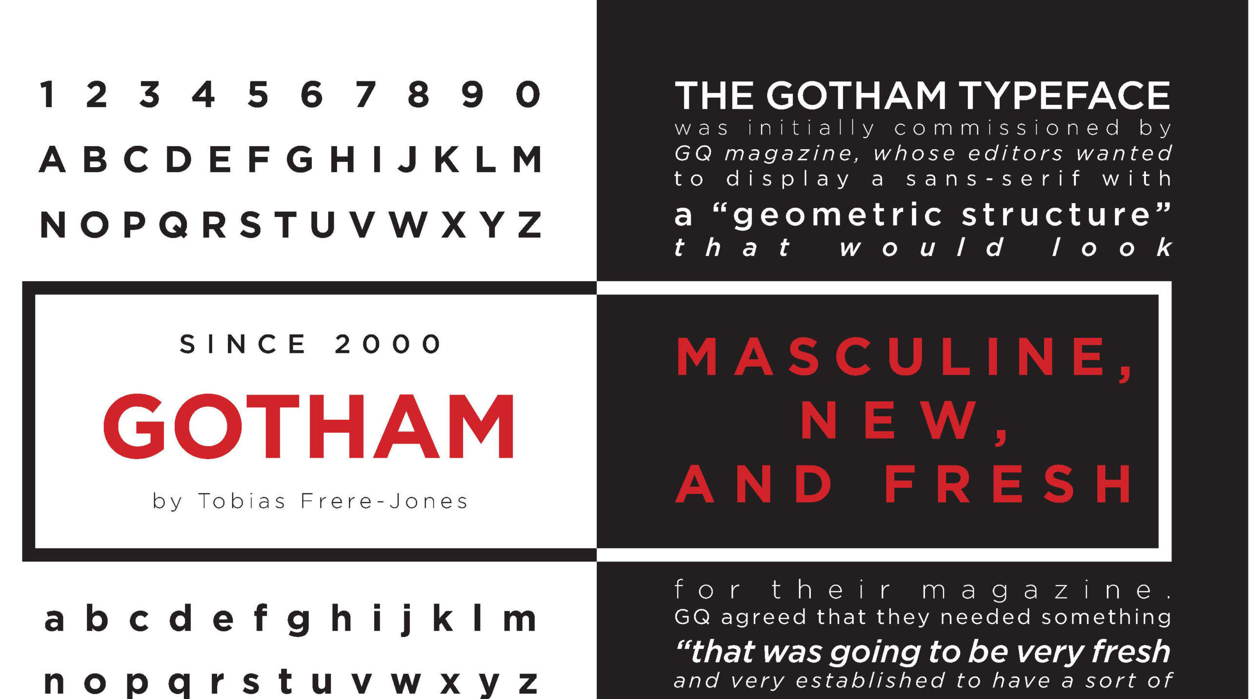
Gotham’s licensing costs push many designers toward alternatives that deliver similar geometric precision without the premium price tag. Whether you need a free option for…
Helvetica costs money, and sometimes you need something different anyway. Whether you’re designing a website, building a brand identity, or just tired of seeing the…
Helvetica’s neutrality makes it one of the most versatile typefaces in design, but pairing it correctly separates amateur work from professional execution. Finding fonts that…
Ford uses 2 distinct typefaces depending on context: a custom script logotype for the Blue Oval emblem, and Antenna (a licensed sans-serif) for corporate communications,…
Evernote uses Inter as its default UI font, a neo-grotesque sans-serif font designed by Rasmus Andersson. Evernote adopted Inter in January 2024 as part of…
Those flowing, whiplash curves aren’t just pretty decoration. They’re visual echoes of a movement that transformed design forever. Art nouveau fonts capture the organic elegance…
MLA format uses Times New Roman at 12-point size as its standard recommended typeface. It’s a transitional serif font with moderate stroke contrast and bracketed…
A cover letter should use a clean, readable font set between 10 and 12 points. The most widely recommended options are Calibri, Arial, Times New…
Microsoft Office uses Aptos, a neo-grotesque sans-serif font commissioned by Microsoft and designed by type designer Steve Matteson. Microsoft adopted Aptos in 2023 as the…
Walk past any vintage cinema and you’ll notice something beyond the glowing marquee. The letters themselves tell a story. Movie theater fonts shaped how audiences…
Lato sits in your Google Fonts library waiting to do something interesting, but pairing it wrong turns clean design into visual chaos. This humanist sans-serif…
Asana uses Proxima Nova as its primary UI and product font, a geometric sans-serif font designed by Mark Simonson of Mark Simonson Studio. Asana confirmed…
Comics use a range of purpose-built display typefaces designed to mimic hand lettering, with CC Wild Words (by Comicraft) and fonts from Blambot being the…
Skype’s original logo used Arial Rounded MT Bold, a commercial sans-serif font designed by Robin Nicholas and Patricia Saunders, published by Monotype in 1993. For…
APA format does not require a single font. The APA Publication Manual (7th edition) lists 6 approved typefaces, all chosen for legibility and accessibility. Times…
WhatsApp uses Helvetica Neue for its logo wordmark, a neo-grotesque sans-serif font published by Linotype and originally designed by Max Miedinger and Eduard Hoffmann. For…
The Friends logo uses a custom-designed handwritten typeface created specifically for the show. The closest publicly available recreation of it is Gabriel Weiss’ Friends Font,…
The Eras Tour promotional materials use Pistilli Roman, a high-contrast Didone serif font originally designed by Herb Lubalin and John Pistilli in 1964. For the…