


Raw numbers bore people. Charts make them pay attention.
Learning how to make a graph in Canva transforms spreadsheet data into visuals that actually communicate something. No design degree required.
Canva’s drag-and-drop chart builder handles bar graphs, pie charts, line graphs, and 30+ other chart types. Five minutes. Zero learning curve.
This guide walks through the complete process: selecting chart types, importing data from Google Sheets or Excel, customizing colors and labels, and exporting in PNG, PDF, or presentation formats.
By the end, you’ll create professional data visualizations for reports, infographics, and social media posts.
How to Make a Graph in Canva
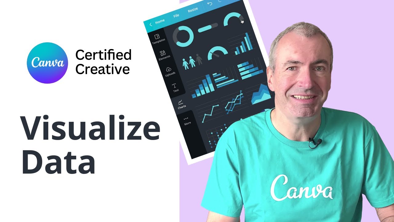
Making a graph in Canva is the process of creating visual data representations using the platform’s built-in chart builder and customization tools.
You need this when preparing business reports, school presentations, social media infographics, or any project requiring data visualization.
This guide covers 8 steps. Takes about 5-10 minutes. Beginner-friendly.
If you’re new to the platform, understanding what Canva is helps before jumping in.
Prerequisites
Before you start, make sure you have:
- Canva account (free or Pro version)
- Web browser (Chrome, Firefox, Safari, Edge) or Canva desktop/mobile app
- Data to visualize (spreadsheet values or manual input)
- 5-10 minutes of time
- Basic drag-and-drop familiarity
Pro users get access to Brand Kit colors and additional chart templates. Free accounts work fine for most graph types.
Step One: How Do You Create a New Design in Canva?
Click “Create a design” from the homepage, then select a template size or enter custom dimensions for your canvas where the graph will appear.
Action
- Homepage: Click the purple “Create a design” button (top right corner)
- Size selection: Choose Presentation (1920x1080px), Instagram Post (1080x1080px), or Custom size
- Result: Blank canvas opens in the Canva editor
Purpose
Canvas dimensions affect how your graph displays. Presentation sizes work best for reports. Square formats suit social media posts.
Need to switch orientation later? Learn how to change to landscape in Canva without starting over.
Step Two: Where Do You Find the Charts Feature in Canva?
Access the chart tool through the left sidebar by clicking Elements and scrolling to Charts, or go to Apps and select Charts directly.
Action
- Elements tab: Click Elements (left panel) > scroll down > find “Charts” section
- Alternative path: Apps > Charts (if not visible in Elements)
- Search shortcut: Type “charts” in the search bar for faster access
Purpose
Canva offers 30+ interactive chart options in this section. Bar graphs, pie charts, line graphs, histograms, scatter plots, and more.
The Elements panel also contains shapes, icons, and frames. Worth exploring if you plan to make an infographic in Canva around your data.
Step Three: Which Chart Type Should You Select for Your Data?

Click on the chart style that matches your data structure. Categorical comparisons need bar charts. Trends over time need line charts. Parts of a whole need pie charts.
Chart Options Available
- Bar chart: Compare quantities across categories
- Line chart: Show trends and changes over time
- Pie chart: Display percentages and proportions
- Donut chart: Similar to pie, with center space for labels
- Histogram: Distribution of continuous data
- Scatter plot: Correlations between two variables
- Bubble chart: Three-dimensional data comparisons
- Radar chart: Multiple variables on circular axes
- Area chart: Volume and cumulative totals
- Funnel chart: Stage-based progression (sales pipelines)
Matching Data to Chart Type
Sales by region? Bar chart. Monthly revenue growth? Line graph. Market share breakdown? Pie chart.
Wrong chart selection makes data confusing. A pie chart showing 47 categories becomes unreadable. Bar charts handle large category counts better.
Understanding visual hierarchy principles helps when deciding which data points deserve the most attention in your visualization.
Purpose
Each chart type communicates differently. Choosing correctly ensures your audience grasps the insight immediately without second-guessing the numbers.
Step Four: How Do You Add Your Data to the Graph?

Double-click the chart to open the data table editor, then enter values manually or paste directly from Google Sheets or Excel.
Action
- Open editor: Double-click chart > Edit button appears > click to expand data table
- Manual entry: Type values directly into cells, press Tab to move between fields
- Spreadsheet import: Copy cells from Google Sheets/Excel > paste into Canva’s table (Ctrl+V / Cmd+V)
- Connected apps: Link data from Salesforce, HubSpot, or Google Analytics via Apps panel
Purpose
Accurate data input determines your chart’s usefulness. The graph updates automatically as you change values.
Working with complex datasets? You might also need to make a table in Canva alongside your chart for detailed breakdowns.
Step Five: How Do You Customize Graph Colors and Styles?

Select the chart, click the color tile on the toolbar, then pick colors from the palette or enter hex codes for precise brand matching.
Action
- Color selection: Click chart > select color tile (toolbar) > choose from swatches or custom colors
- Bar spacing: Chart Settings > adjust slider for gap width between bars
- Corner roundness: Settings > Roundness slider (keep under 8 for readability)
- Brand Kit colors: Pro users access saved brand colors directly in the color panel
Purpose
Colors affect comprehension. High contrast between bars makes comparisons easier.
Understanding basic color theory helps when choosing schemes that don’t clash or confuse viewers.
Consistent colors across all visuals strengthen brand recognition. Canva Pro users can save custom color palettes for repeated use.
Step Six: How Do You Edit Labels, Legends, and Axis Settings?
Open Chart Settings panel to toggle labels, legends, gridlines, and customize axis titles with specific min/max values.
Action
- Labels: Chart Settings > Labels dropdown > show/hide category names
- Legend: Toggle on/off, position (top, bottom, left, right)
- Axis titles: X Axis / Y Axis dropdown > add title (128 character limit)
- Axis range: Set minimum and maximum values, adjust increment size
- Gridlines: Settings > toggle Gridlines switch on/off
Purpose
Labels provide context. Without them, readers guess what each bar or slice represents.
Axis ranges matter. Auto-scaling sometimes exaggerates small differences. Manual ranges give honest proportions.
Step Seven: How Do You Format Data Values for Clarity?
Click a column in the data table, select the Data type dropdown, then add prefixes, suffixes, and decimal precision for professional number display.
Action
- Data type: Select column > Data type dropdown > choose Number or Text
- Prefix: Add symbols before values ($, EUR, #)
- Suffix: Add symbols after values (%, units, kg)
- Decimal places: Set precision (0 for whole numbers, 2 for currency)
Purpose
Raw numbers confuse audiences. “$50,000” reads faster than “50000”. Percentage symbols eliminate ambiguity about what 0.45 actually means.
Step Eight: How Do You Download or Share Your Graph?
Click Share (top right), select Download, choose your file format, then save locally or share via link, social media, or embed code.
Action
- Download path: Share > Download > select format
- Format options: PNG (transparent background), JPEG (smaller file), PDF (print-ready), MP4 (animated charts)
- Direct share: Share > Copy link, or post to social platforms
- Embed: Share > Embed > copy code for websites
Purpose
Format choice depends on destination. PNG for presentations. PDF for print. MP4 for animated bar chart races.
Need your chart in a slide deck? Learn how to save Canva as PDF or convert Canva to Google Slides for easy integration.
Verification
Before finalizing, run through this checklist:
- Data accuracy: Compare chart values against source spreadsheet
- Label correctness: Verify category names match intended meaning
- Color accessibility: Run colorblind check (Canva offers this in chart settings)
- Axis proportions: Confirm ranges don’t mislead or exaggerate trends
- Preview: Check appearance on different screen sizes
Troubleshooting
Data Not Displaying After Paste
Issue: Copied spreadsheet data appears blank or garbled.
Solution: Remove blank rows from source file, ensure column headers exist, paste into fresh chart element.
Chart Colors Not Updating
Issue: Clicking color swatches doesn’t change bar/slice colors.
Solution: Select the specific chart element first (not the whole chart), check if Brand Kit restrictions override manual selections.
Charts Section Missing from Elements
Issue: Can’t find Charts when scrolling through Elements panel.
Solution: Go to Apps > Charts instead. Or type “Charts” in the search bar.
Axis Labels Overlapping
Issue: Long category names overlap and become unreadable.
Solution: Shorten labels, increase chart width, or switch to horizontal bar chart (row chart) for more label space.
Related Processes
After mastering graph creation, these tutorials expand your Canva data visualization skills:
- How to make a pie chart in Canva (detailed breakdown of circular charts)
- How to make a presentation in Canva (embed charts into slide decks)
- How to group in Canva (combine chart with labels as single element)
- How to change background color on Canva (improve chart visibility)
- How to make a brand kit in Canva (save chart colors for consistency)
FAQ on How To Make A Graph In Canva
Can You Make a Graph in Canva for Free?
Yes. Canva’s free account includes access to bar charts, pie charts, line graphs, and most chart types. Pro subscribers get additional templates and Brand Kit integration for custom color palettes.
What Types of Charts Can You Create in Canva?
Canva offers 30+ chart options: bar graphs, line charts, pie charts, donut charts, histograms, scatter plots, bubble charts, radar charts, area charts, and funnel charts. Each serves different data visualization needs.
How Do You Import Data from Google Sheets to Canva?
Copy your cells in Google Sheets (Ctrl+C), double-click your Canva chart to open the data table, then paste (Ctrl+V). Canva auto-populates values. You can also connect Google Sheets directly through the Apps panel.
Can You Animate a Graph in Canva?
Yes. Select your chart, click Animate in the toolbar, choose an animation style. Bar chart race animations show data changes over time. Export as MP4 to preserve motion in your final file.
How Do You Change Bar Colors in a Canva Chart?
Click the chart, select the color tile on the toolbar, pick from swatches or enter hex codes. Each data series can have different colors. Pro users access saved brand colors automatically.
Why Is My Chart Data Not Showing Correctly?
Common causes: blank rows in source data, missing column headers, or incompatible formatting. Remove empty cells from your spreadsheet, ensure headers exist, then re-paste into a fresh chart element.
Can You Download Canva Charts as PNG or PDF?
Yes. Click Share, then Download. Choose PNG for transparent backgrounds, PDF for print-ready files, or JPEG for smaller file sizes. MP4 works for animated charts.
How Do You Add Labels and Legends to a Canva Graph?
Open Chart Settings (click the chart, then Settings). Toggle Labels on/off, position the Legend (top, bottom, left, right), and add axis titles. Each title supports up to 128 characters.
Is Canva Better Than Excel for Making Charts?
Depends on your goal. Excel handles complex calculations and large datasets better. Canva produces more visually polished charts faster. For presentations and social media, Canva wins. For financial analysis, stick with Excel.
Can You Edit a Canva Chart After Downloading?
Downloaded files (PNG, PDF) become static images. To edit later, return to your saved Canva project. The original remains editable in your account indefinitely. Always keep source files accessible.
Conclusion
Knowing how to make a graph in Canva adds a practical skill to your toolkit. Data without visuals gets ignored.
You now have the steps: access the Charts feature, select the right chart type, input your data, customize colors and labels, format values, and export.
The entire process takes minutes. No complex software. No steep learning curve.
Canva’s chart customization options handle everything from simple bar graphs to animated chart races. Axis settings, gridlines, legends, and data labels give you control over how information displays.
Start with your next report or social media post. Apply what you learned. The best way to remember these steps is to use them immediately.

Renowned for his expertise in logo design and visual branding, Bogdan has developed a multitude of logos for various clients.
His skills extend to creating posters, vector illustrations, business cards, and brochures. Additionally, Bogdan's UI kits were featured on marketplaces like Visual Hierarchy and UI8.
He also wrote in the past years on sites like Design Your Way, WebDesignerDepot, WPDean, Designmodo, Speckyboy, Slider Revolution, and more.
- Jujutsu Kaisen Font Generator - 12 October 2026
- The Windsurf Logo History, Colors, Font, And Meaning - 10 October 2026
- How to Remove Background From Product Photos (No Photoshop) - 10 October 2026

Bogdan Sandu is a seasoned designer who has been designing websites since 2008. Renowned for his expertise in logo design and visual branding, Bogdan has developed a multitude of logos for various clients. His skills extend to creating posters, vector illustrations, business cards, and brochures. Additionally, Bogdan's UI kits were featured on marketplaces like Visual Hierarchy and UI8. He also wrote in the past years on sites like Design Your Way, WebDesignerDepot, WPDean, Designmodo, Speckyboy, Slider Revolution, and more.
You Might Also Like


