


Most people spend more time staring at a blank canvas than actually designing.
Learning how to make an infographic in Canva cuts that friction down to almost nothing. The platform gives you templates, icons, charts, and a drag-and-drop editor in one place, so the design process stays focused on your content rather than the tools.
Canva hosts over 160 million infographics created by its users. That kind of adoption tells you the infographic creation process here is approachable for non-designers and experienced creators alike.
This guide covers everything from setting up your canvas dimensions and choosing the right infographic template to adding data visualizations, exporting your file, and publishing it to the right channels.
What Is a Canva Infographic?

A Canva infographic is a visual data presentation built inside Canva’s drag-and-drop editor, combining text, icons, charts, and images on a structured layout. It’s template-based by design, which separates it from vector-native tools like Adobe Illustrator where you start from scratch.
Users have created 160 million infographics on Canva to date, according to Canva’s own platform data. That number makes more sense when you consider the tool removes the technical barrier that stops most non-designers from producing visual content creation at all.
Good typography, consistent color, and clean layout structure are what separate a forgettable infographic from one that actually gets shared. Canva gives you the controls to handle all three, even without a design background.
Types of Infographics You Can Build in Canva
Canva supports 5 core infographic formats, each serving a different content goal.
| Type | Best For | Common Use Case |
|---|---|---|
| Statistical | Data-heavy topics | Survey results, research findings |
| Process | Step-by-step flows | Onboarding guides, how-to content |
| Timeline | Chronological events | Company history, project milestones |
| Comparison | Side-by-side analysis | Product comparisons, option reviews |
| Informational | Explaining concepts | Educational content, explainer pieces |
Picking the wrong type before you start is one of the most common mistakes. A timeline template forces a linear reading order. A statistical layout prioritizes numbers. Know which one fits your content before you open a template.
Free vs. Pro: What Each Account Unlocks for Infographic Design
Free plan: Access to 610,000+ templates, basic elements library, PNG and PDF export, and limited stock photos.
Pro plan ($15/month as of 2025): Brand kit with saved colors and fonts, background remover, premium icon sets, SVG export, and full Getty Images library access.
For most infographic work, the free plan covers a lot. The brand kit is the main reason to upgrade if you’re producing infographics regularly for a business. Without it, you’re manually matching hex codes every single time, and that gets old fast.
Canva has 21 million paid subscribers out of 260 million total users (Canva, 2025), which tells you most people are building solid work on the free tier.
What Do You Need Before Starting an Infographic in Canva?

Starting inside Canva before you’ve sorted your content is the fastest way to waste two hours. The design is the last step, not the first.
Infographics drive up to 650% more engagement than plain text (Visme, 2025), but only when the content structure is solid. A well-designed layout cannot fix a poorly organized message.
Content and Goal Prep
Define one message. Your infographic should communicate a single clear point. If you can’t summarize it in one sentence, you’re trying to fit two infographics into one.
Gather all data, statistics, or process steps before touching Canva. Having to pause mid-design to hunt for a stat breaks your visual flow and usually leads to rushed layout decisions.
Rough out a content hierarchy first:
- Main headline (the single takeaway)
- 3-5 supporting sections or data points
- Source line or CTA at the bottom
Audience and Distribution Channel
Where the infographic will live determines the canvas size before you open Canva. A Pinterest infographic at 1000x3000px looks completely different from a LinkedIn post at 1200x627px.
Ask yourself before you start:
- Is this for a blog post, social media, or print?
- What device will most viewers use to read it?
- Does it need to match existing brand colors and fonts?
If you’re producing this for a business, pull your brand hex codes and font names before opening Canva. Hunting for them mid-design costs more time than you’d expect.
How Do You Set Up a New Infographic Project in Canva?

Canva’s default infographic canvas is 800x2000px, sized for standard web and blog use. Research across 150 popular infographics puts the average height closer to 5000px (Venngage, 2024), so don’t treat the default as a ceiling.
Starting a New File
Open Canva via browser (canva.com) or the desktop app. The desktop app is more stable for complex infographic layouts with many layered elements.
Type “infographic” in the search bar on the homepage. Canva loads pre-sized templates immediately. This is faster than navigating through Create a Design menus.
To create a custom canvas: go to File > Resize or Custom Size, enter your dimensions, and confirm. Canva creates a new blank or converts your current file.
Recommended Canvas Dimensions by Distribution Channel
| Channel | Recommended Size | Format |
|---|---|---|
| Blog / Web | 800 × 2000 px (min) | PNG |
| 1000 × 3000 px | PNG | |
| 1200 × 627 px | PNG | |
| Print (A4) | 2480 × 3508 px at 300 DPI | PDF Print |
If you’re unsure about DPI and why it matters for print output, the short version is this: screen uses 72-96 DPI, print needs 300 DPI, and designing at the wrong resolution means a blurry printed result.
Starting From a Template vs. a Blank Canvas
Template: Faster to start, visual hierarchy already set, good for first-time infographic creators.
Blank canvas: More control, better for strong brand consistency, slower if you’re unfamiliar with layout principles like visual hierarchy and alignment.
Most experienced Canva users start from a template and strip it back to just the structure they want. That’s genuinely faster than starting blank and more flexible than keeping the template as-is.
How Do You Choose and Customize an Infographic Template in Canva?
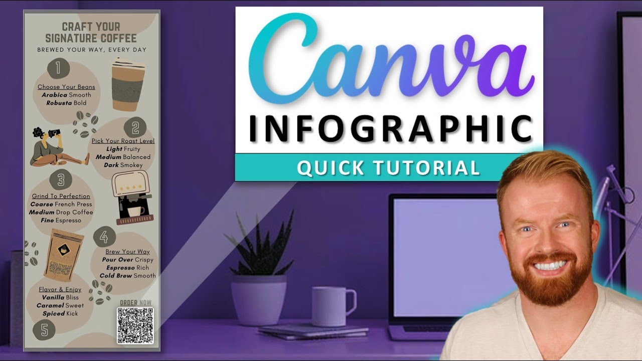
Canva’s template library has 610,000+ designs. Scrolling through all of them is not a strategy. Filter by infographic type and style first, then narrow from there.
HubSpot data shows 30% of marketers share infographics as part of their content strategy. Templates that match your brand closely from the start reduce the customization time significantly.
Filtering and Selecting a Template
After searching “infographic,” use the left panel to filter by:
- Style: Minimal, bold, illustrated, corporate
- Color: Match your brand palette before committing to a template
- Layout type: Timeline, stats, process flow, comparison
Pick a template whose layout matches your content structure, not just one that looks nice. A beautifully styled timeline template is useless if your content is statistical data.
How to Apply Brand Colors to a Canva Template
Pro accounts use the Brand Kit to apply saved colors instantly across the entire design. Free accounts need to input hex codes manually per element.
Manual method: click any colored element, open the color picker, and type your hex code directly. Canva saves recent colors in the palette row, which speeds up repeat use within the same session.
If you’re working with analogous colors for a cohesive look, or want to build a palette from scratch, Canva’s eyedropper tool pulls colors directly from any uploaded image, including your logo.
Font Pairing Rules Inside Canva
Canva’s font library has 1,000+ options. More choices does not mean better results.
Stick to 2 fonts maximum per infographic: one display font for headlines, one body font for supporting text. Mixing 3 or more fonts in a single design is the fastest way to make it look amateur, regardless of how good the individual fonts are.
A reliable combination: pair a bold sans-serif font for headlines with a readable serif font for body text. Or use two weights of the same typeface, which is the safest option for beginners. If you want more structured guidance on combinations, a font pairing generator can shortcut the decision entirely.
How Do You Add and Format Text in a Canva Infographic?
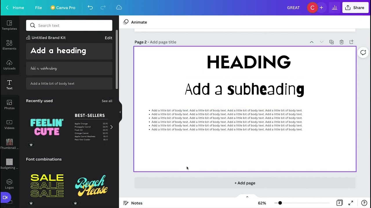
Text does most of the communication work in an infographic. Poor sizing, weak contrast, or too much copy kills readability before the design even gets a chance.
61% of consumers say infographics are the most effective format for information retention (DemandSage, 2025). That only holds true when the text hierarchy is clear.
Font Size Hierarchy for Infographics
Use these size ranges as starting points, then adjust based on your canvas dimensions:
- Title / Main headline: 48-72pt
- Section headers: 24-32pt
- Body text: 14-18pt
- Captions and source lines: 10-12pt
The gap between sizes matters as much as the sizes themselves. A title at 48pt and a section header at 44pt read as the same level of importance. Keep clear jumps between each tier.
Understanding typographic hierarchy properly, including how leading and tracking affect spacing, helps you control density in text-heavy infographic sections.
Text Contrast and Accessibility
Minimum contrast ratio for readable text: 4.5:1 against the background color (WCAG 2.1 standard).
Canva doesn’t have a built-in contrast checker, so use an external color contrast checker before finalizing. White text on a light background and dark text on a dark background are the two most common mistakes in infographic design.
The saturation level of your background color affects how much contrast you actually need. High-saturation backgrounds often require white text. Low-saturation or muted backgrounds usually work with both light and dark text, depending on the specific hue.
Text Effects: Curved, Shaped, and Layered
Canva’s Effects panel (click any text box, then select “Effects”) includes curved text, shadow, lift, and hollow styles. These work well for accent elements, not body copy.
Curved text is useful for circular data visualizations or icon labels. Using it on paragraph text creates readability problems at small sizes. Keep effects limited to headline elements only.
How Do You Add Icons, Images, and Graphics to a Canva Infographic?

Canva’s Elements library holds 3 million+ icons, illustrations, and graphics. The challenge is not finding assets. It’s picking assets that look like they belong in the same design.
Visual consistency is a graphic design principle that directly affects how professional an infographic looks. Mixing flat icons with 3D illustrations in the same layout creates visual noise, not variety.
How to Keep Icon Styles Consistent Across an Infographic
Search for your first icon, note the style (flat, outline, filled, or illustrated), and use that exact same style for every other icon in the design.
Practical filter method:
- Search your icon term in Elements
- Click any result you like
- Select “See more by this creator” to browse a consistent set
Pro elements are marked with a crown icon in the top-right corner. Free plan users can still build fully consistent infographics using only the free icon sets, which are extensive. Canva has added significantly to the free library since 2023.
Uploading and Using Your Own Brand Assets
Go to the Uploads tab in the left panel to add your own images, logos, or brand graphics. Canva accepts PNG, JPG, SVG (Pro), PDF, and MP4 file types.
For a logo upload, always use a PNG with a transparent background. Uploading a JPEG logo drops a white box behind it, which breaks any background color you’ve set. If you’re wondering about the difference between file types for logos and icons, vector graphics scale without quality loss while bitmap formats like JPEG degrade when resized. That distinction matters when your infographic will be displayed at multiple sizes.
Canva’s stock photo library includes Getty Images integration on Pro. Free users have access to a smaller but usable set. For most infographic work, icons and illustrations carry more visual weight than photos anyway.
How Do You Add Charts and Data Visualizations in Canva?
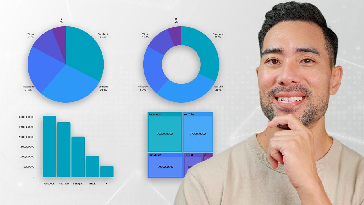
Canva’s chart tool is found under Elements > Charts. It supports 12 chart types including bar, line, pie, donut, scatter plot, and progress bars. Data goes into a built-in spreadsheet panel, not an external file.
Charts and data visualizations are the most-used visual content type, with 52% of marketers prioritizing them over all other formats (Venngage, 2023). For infographics specifically, a poorly built chart undermines credibility faster than almost anything else in the design.
Using Canva’s Native Chart Tool
Click any chart type to insert it. A data panel opens on the right where you enter values, labels, and axis titles directly.
Customization options per chart:
- Bar and line charts: axis labels, grid lines, colors per data series
- Pie and donut charts: segment colors, percentage labels, legend placement
- Progress bars: fill color, background color, percentage display
Key limitation: Canva charts are static. There is no live data connection on the standard plan. Canva for Teams includes basic Google Sheets sync, but it’s limited in 2025 compared to tools like Datawrapper.
When to Use an External Chart Tool Instead
Canva’s chart builder works fine for simple datasets with 5-10 data points. For anything more complex, consider building the chart in Datawrapper or Google Charts, exporting as a PNG, and importing into your Canva canvas.
This is especially true for line charts with multiple data series, maps, or any chart where precise data labeling matters. Canva’s label placement controls are still limited compared to dedicated data visualization tools.
The tradeoff: external charts take more steps but give you cleaner output. Native Canva charts are faster but less flexible. For most blog infographics, native charts are enough. For anything going into a report or presentation, the extra step is worth it. Understanding color theory helps when assigning chart colors, since adjacent bars or segments need enough contrast to read as separate without creating visual conflict across the full infographic palette. Use a RGB to HEX converter if you need to match chart colors precisely to your existing palette values.
How Do You Organize Layout and Visual Hierarchy in a Canva Infographic?

Layout structure is what separates a readable infographic from a confusing one. Visual hierarchy tells the reader where to look first, what comes next, and where to stop.
Infographics are 30 times more likely to be read than a written article, according to DemandSage (2025). That stat only holds when the focal point is clear and the reading order is intentional.
Using Canva’s Grid and Guides for Precise Alignment
Enable rulers and guides via View > Rulers and Guides. Drag lines from the ruler edges to create horizontal and vertical reference points across your canvas.
Canva’s alignment toolbar appears when you select any element. Use it to:
- Align left, center, or right relative to the canvas or to other selected elements
- Distribute spacing evenly across 3+ selected elements
- Snap elements to grid when moved (enabled under View > Snap to Grid)
For complex infographic layouts, guides are more reliable than snap-to-grid alone. They create fixed reference lines that don’t shift when you add new elements.
How Layering Affects Visual Hierarchy in Canva
Layering order: Elements higher in the layer stack appear in front. Background fills go at the bottom. Text and icons go on top.
Access layers via Position > Layer order in the right panel. Drag items up or down to control overlap. This matters most when placing text over images or icons over colored section blocks.
Grouping keeps related elements locked together. Select multiple items and press Cmd/Ctrl+G to group. This prevents accidental misalignment when moving entire infographic sections.
Reading Flow and Content Placement
Most readers follow an F-pattern or Z-pattern when scanning visual content. Place the most important data point at the top, supporting sections in the middle, and source citations at the bottom.
The proximity of elements signals relationships. Items placed close together read as a group. Items spaced far apart read as separate topics. Use this intentionally rather than placing elements by feel.
White space is not empty space. It gives sections room to breathe and helps the reader’s eye move from one section to the next without confusion. Overcrowding an infographic is the single most common layout mistake.
How Do You Use Canva’s Background and Color Controls for Infographics?

Background choice affects every other element in the design. A dark background changes your entire color palette requirements. A photographic background competes with icons and text.
Visme data shows colored infographics have an 80% motivation rate among readers and are 39% more memorable than black-and-white designs (2025). Color decisions matter more than most first-time infographic creators expect.
Setting and Customizing the Background
Click any empty area of the canvas to open background options in the right panel. Canva offers 5 background types:
- Solid color: Clean, minimal. Best for text-heavy infographics.
- Gradient: Adds depth. Works well for section dividers. See gradient design principles before applying.
- Image: Use sparingly. High risk of creating contrast problems with overlaid text.
- Pattern: Subtle patterns work. Loud patterns destroy readability.
- Transparent: Exports with no background, for web overlays (PNG only).
The 60-30-10 rule applies to infographic color distribution: 60% base color (usually neutral), 30% secondary color, 10% accent (Visme, 2025). Stick to 3 colors maximum for a first infographic.
Building and Saving a Color Palette in Canva
Canva Pro users save custom palettes in the Brand Kit. Free users build a session palette using the color panel’s “Document colors” row, which remembers the last 20 colors used.
Use the eyedropper to sample colors from an uploaded image or logo. This is the fastest way to build a palette that matches existing brand assets. A color palette generator can also extract palettes from any uploaded image before you start designing.
Understanding the difference between RGB and CMYK matters if your infographic will be printed. Canva defaults to RGB for screen. PDF Print export gives you CMYK output for print work, but only on Pro accounts.
Color Contrast and Accessibility
Minimum readable contrast: 4.5:1 for normal text, 3:1 for large text (WCAG 2.1 standard).
High-saturation backgrounds require white or very light text. Low-saturation backgrounds usually work with either. Monochrome color schemes sidestep the contrast problem entirely and are worth considering if your brand color palette is complex.
About 8% of men have some form of color vision deficiency (National Eye Institute). Avoid relying solely on red-green color distinctions in charts and data sections of your infographic.
How Do You Review and Finalize an Infographic in Canva Before Exporting?
Reviewing your own design after hours of working on it is genuinely hard. Your eye stops seeing errors. Build a checklist and follow it before touching the export button.
43% of marketers say creating consistent quality visual content is their biggest challenge (DemandSage, 2025). A structured review process directly addresses that problem.
Content and Accuracy Review
Run Canva’s spell checker first: Tools > Spell Check. It catches typos but misses contextual errors, so manual reading is still needed after.
Check every data point against your source material. A wrong statistic in an infographic gets shared and cited, so errors compound. Verify source citations appear as small caption text at the bottom of the design.
HubSpot’s content team, which produces hundreds of infographics annually, uses a 2-person review process where one reviewer checks design consistency and a second checks data accuracy independently. The two checks rarely overlap.
Visual and Alignment Check
Step 1: Zoom to 100% and scan each section from top to bottom.
Step 2: Check that icon styles are consistent throughout (all flat, all outline, or all filled).
Step 3: Verify text contrast against backgrounds in every section, not just the first one.
Step 4: Use Canva’s Present mode (top right) to preview the full infographic at screen size before exporting.
Getting Feedback Before Export
Share a review link via Share > Get Feedback. This sends a view-only link that accepts comments without giving edit access.
Ask your reviewer one specific question: “Can you tell me the main point of this infographic in one sentence?” If they can’t, the message isn’t clear enough. That’s a content problem, not a design problem, and it’s faster to fix before export than after distribution.
How Do You Export a Canva Infographic?
Export format determines how the infographic looks in its final context. The wrong format produces blurry, oversized, or color-shifted output.
Canva supports 6 export formats for infographics, each suited to a different use case (Canva, 2024).
| Format | Best For | Notes |
|---|---|---|
| PNG (standard) | Web, social, blog | Supports transparency |
| PNG (2x) | Retina displays | 2× file size, sharper on HDPI screens |
| PDF Print | Print at 300 DPI | Pro only for CMYK output |
| PDF Standard | Email, presentations | 96 DPI, smaller file |
| SVG | Scalable web use | Pro only |
| MP4 | Animated infographics | Requires animated elements |
PNG vs. PDF: Which Format to Use and When
PNG: Default choice for any infographic going online. Supports transparency, maintains sharp text at any size, and compresses without quality loss.
PDF Print: Required for print output. Uses 300 DPI and (on Pro) CMYK color rendering. Do not use PDF Standard for print. The resolution difference is significant.
A JPEG export is fine for photo-heavy infographics where file size matters more than transparency. It’s a lossy format, so text edges can soften slightly at high compression ratios.
How to Export a Transparent Background Infographic from Canva
Select PNG as your export format. Check the “Transparent background” box in the export panel. This option requires the canvas background to be removed or set to none first.
Pro accounts get a compression slider (0.5x to 3x). For web infographics, 1x compression with no background is standard. After export, run the file through TinyPNG to reduce file size further without visual quality loss. A typical 800x2000px infographic compresses from around 800KB to under 300KB without noticeable degradation.
How Do You Share or Publish a Canva Infographic?
Instagram and LinkedIn are the top 2 social platforms for infographic distribution, according to DemandSage (2025). How you share determines whether the infographic keeps its visual integrity or gets compressed into noise.
Infographics are shared on social media 3 times more than other content types (DemandSage, 2025). Distribution channel choice directly affects how many people actually see the work you’ve built.
Direct Social Publishing from Canva
Canva’s one-click social publishing connects to Instagram, Facebook, Pinterest, LinkedIn, and Twitter/X directly from the Share menu.
Each platform compresses images differently on upload. Pinterest preserves infographic quality better than most platforms and offers long-term discoverability since it functions as a visual search engine. Pinterest engagement grew from 3.08% in January 2024 to 5.26% in January 2025 (Buffer, 2025), making it worth including in any infographic distribution plan.
Platform-specific tip: For LinkedIn, upload the infographic as a document post (PDF) rather than an image post. Document posts get carouselled by LinkedIn’s algorithm and consistently outperform static image posts for reach on that platform.
Embedding a Canva Infographic on a Website
Go to Share > Embed. Canva generates an iframe embed code that displays the infographic at its original dimensions.
The embed option works well for Webflow and standalone HTML pages. WordPress handles iframes inconsistently depending on the theme and security settings. For WordPress, downloading as PNG and uploading via the media library is more reliable.
Before uploading to any CMS, name your file descriptively. “blue-infographic-final-v3.png” tells search engines nothing. “how-to-make-an-infographic-in-canva-steps.png” does. File naming is part of image SEO and costs nothing to get right.
Sharing for Internal Review vs. Public Distribution
Canva’s share link modes give you 3 access levels:
- View only: Client or stakeholder review, no edit access
- Can comment: Adds feedback annotations without editing
- Can edit: Full collaboration for team projects
For client work, always send a view-only link first. Sending an edit link to the wrong person and having them accidentally move elements around in a near-finished design is a real and frustrating problem. Ask before you share.
If you want to go further with Canva beyond infographics, the platform supports a wide range of additional projects including flyers, graphs, presentations, and logos. Each follows the same core workflow you’ve already learned here.
FAQ on How To Make An Infographic In Canva
Is Canva free for making infographics?
Yes. The free plan gives you access to 610,000+ templates, basic elements, and PNG or PDF export. Canva Pro unlocks the brand kit, premium icons, SVG export, and background removal. Most infographic work is achievable without paying.
What is the best canvas size for an infographic in Canva?
The default is 800x2000px, which works well for blogs and web use. Pinterest performs better at 1000x3000px. For print output, use 2480x3508px at 300 DPI. Match your size to your distribution channel before you start.
How long does it take to make an infographic in Canva?
A simple infographic using a pre-built template takes 30 to 60 minutes. Complex designs with custom charts and multiple data sections take 2 to 3 hours. Having your content and data ready before opening Canva cuts that time significantly.
Can I add charts and data visualizations in Canva?
Yes. Go to Elements > Charts to insert bar, pie, line, donut, scatter, and progress bar charts. Data is entered directly into Canva’s built-in spreadsheet panel. Charts are static on the standard plan. Canva for Teams adds basic Google Sheets sync.
What file format should I export my Canva infographic as?
PNG is the standard choice for web, social media, and blog use. Use PDF Print for physical print output. SVG is available on Pro for scalable web graphics. JPEG works when file size matters more than transparency support.
Can I use my own fonts and brand colors in Canva?
Pro users can upload custom fonts via the Brand Kit and save hex codes for instant palette application. Free users input hex codes manually per element. Canva saves recent colors in the session palette, which speeds up repeat use within the same design.
How do I remove the background from a Canva infographic export?
Select PNG as your export format and tick the “Transparent background” checkbox before downloading. The canvas background must be removed or set to none first. This feature is available on both free and Pro accounts for PNG exports.
What types of infographics can I make in Canva?
Canva supports five main formats: statistical, process, timeline, comparison, and informational infographics. Each has dedicated templates in the library. Search by type in the template panel to filter results. Picking the right format before designing prevents layout rework later.
How do I share a Canva infographic with a client or team?
Use Share > Get Feedback to send a view-only comment link without granting edit access. For team collaboration, share with “Can edit” permissions. For public distribution, Canva generates a direct embed code or one-click publish to LinkedIn, Pinterest, and Instagram.
Is Canva better than other infographic tools like Piktochart or Venngage?
Canva has a broader design scope and a larger template library than both. Piktochart and Venngage are more focused on data-heavy infographic creation with stronger chart controls. For general visual content creation, Canva’s drag-and-drop editor and asset library are hard to beat at the free tier.
Conclusion
This conclusion is for an article presenting the full infographic design process inside Canva, from canvas setup to final export.
The workflow is straightforward once you understand how each step connects. Canvas dimensions, template customization, data visualization, layout structure, and distribution channel all depend on decisions made before you start designing.
Get those right, and the rest follows.
Canva’s drag-and-drop editor handles the technical side. Your job is the content hierarchy and color palette. Keep icon styles consistent, limit fonts to two, and export at the right resolution for your platform.
65% of brands now use infographics in their content strategy. Visual content creation at this level is no longer optional for teams that want their information to reach and stick with an audience.

Renowned for his expertise in logo design and visual branding, Bogdan has developed a multitude of logos for various clients.
His skills extend to creating posters, vector illustrations, business cards, and brochures. Additionally, Bogdan's UI kits were featured on marketplaces like Visual Hierarchy and UI8.
He also wrote in the past years on sites like Design Your Way, WebDesignerDepot, WPDean, Designmodo, Speckyboy, Slider Revolution, and more.
- Versatile Work Sans Font Pairing for Every Project - 16 September 2026
- Organize Digital Files Like a Pro Before Your Next Client Handoff - 16 September 2026
- How to Set Up a Digital Menu Board: Hardware to Layout - 15 September 2026

Bogdan Sandu is a seasoned designer who has been designing websites since 2008. Renowned for his expertise in logo design and visual branding, Bogdan has developed a multitude of logos for various clients. His skills extend to creating posters, vector illustrations, business cards, and brochures. Additionally, Bogdan's UI kits were featured on marketplaces like Visual Hierarchy and UI8. He also wrote in the past years on sites like Design Your Way, WebDesignerDepot, WPDean, Designmodo, Speckyboy, Slider Revolution, and more.
You Might Also Like


