

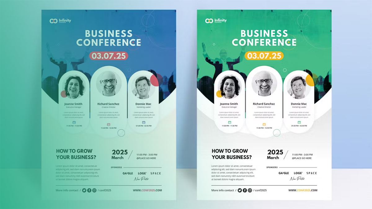
Making a flyer for an event is the process of designing a promotional document that communicates event details to potential attendees using design software or online tools.
Users need this when promoting concerts, fundraisers, conferences, community gatherings, or any public event requiring print or digital distribution.
This guide covers 7 steps requiring 20-45 minutes and basic computer skills with design software access.
The process involves setting up document dimensions, arranging event information with proper visual hierarchy, selecting appropriate typography, and exporting files for print or digital use.
Most event flyers use standard flyer sizes (8.5×11 inches or A4) with 300 DPI for print quality.
Prerequisites
Before starting, gather these materials and verify software access.
Required Software (choose one):
- Adobe Photoshop CC 2024
- Canva Free or Pro
- Microsoft Publisher 2024
- Adobe InDesign CC 2024
Event Information Needed:
- Event title and tagline
- Date, time, location (venue name and address)
- Event description (50-150 words)
- Contact details (phone, email, website)
- Registration or ticket information
Visual Assets:
- Logo files (PNG or vector format)
- Event images or graphics (minimum 1500×1500 pixels at 300 DPI)
- Brand colors (hex codes or RGB values for digital, CMYK for print)
Skill Level: Beginner to intermediate
Time Estimate: 20-45 minutes depending on software familiarity and design complexity
Output Requirements: PDF for print at 300 DPI or PNG/JPEG for digital at 72 DPI
Step 1: How Do You Set Up the Document with Correct Dimensions?
Proper document setup prevents quality issues and ensures your flyer prints correctly or displays properly on screens.
Adobe Photoshop:

- File > New > Document
- Width: 8.5 inches, Height: 11 inches
- Resolution: 300 pixels/inch (print) or 72 pixels/inch (digital)
- Color Mode: CMYK Color (print) or RGB Color (digital)
- Background Contents: White
Canva:

- Create a design > Custom size
- Enter 8.5 x 11 in (or 2550 x 3300 px for print quality)
- Canva automatically handles resolution and color mode
Microsoft Publisher:
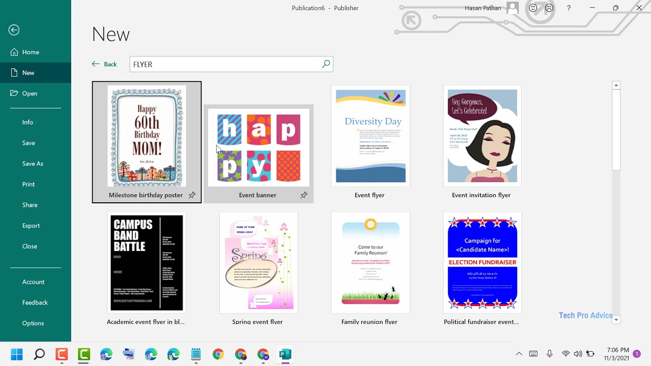
- File > New > Blank Page Sizes
- Select Letter (Portrait) 8.5 x 11 in
- Publisher defaults to print-ready settings
Adobe InDesign:

- File > New > Document
- Width: 8.5 in, Height: 11 in
- Facing Pages: unchecked
- Bleed: 0.125 in (if printing professionally)
Setting correct DPI (dots per inch) at the start ensures images remain sharp.
Print flyers require 300 DPI while digital versions need only 72 DPI.
Purpose: Starting with accurate dimensions and color mode prevents pixelation, color shifts, and sizing errors during final output.
Step 2: Where Do You Add Event Title and Essential Information?
The event title and key details form the focal point of your flyer and must appear in a clear hierarchy.
Text Tool Activation:
- Photoshop: Type Tool (T)
- Canva: Text button (left sidebar)
- Publisher: Insert > Text Box
- InDesign: Type Tool (T)
Title Placement and Sizing:
Position the event title in the upper third of the flyer for maximum visibility.
Set title size between 36-72pt depending on title length and available space.
Use sans-serif fonts for modern events or serif fonts for formal occasions.
Information Hierarchy:
- Event Title: 48-72pt, bold weight
- Date and Time: 24-36pt, medium weight
- Location: 18-24pt, regular weight
- Description: 12-16pt, regular weight
- Contact Info: 10-14pt, light or regular weight
Text Alignment Options:
Center alignment works for formal events and symmetrical layouts.
Left alignment suits text-heavy flyers with multiple details.
Right alignment creates visual interest but reduces readability for long text blocks.
Apply typographic hierarchy by varying font size, weight, and spacing between text elements.
Maintain at least 1.5x line spacing (leading) for body text to prevent crowding.
Purpose: Structured information hierarchy guides readers through essential details in order of importance, ensuring critical event information registers first.
Step 3: How Do You Select and Place Images or Graphics?
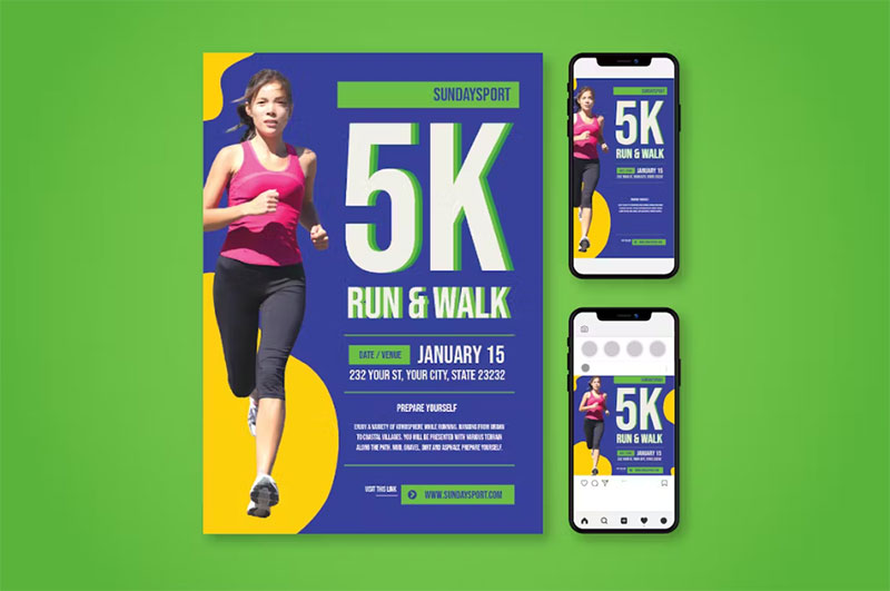
Images add visual appeal and context to your event flyer, but quality and placement matter significantly.
Image Import Process:
Photoshop: File > Place Embedded > Select image file
Canva: Elements > Uploads > Upload files
Publisher: Insert > Pictures > This Device
InDesign: File > Place > Select image file
Image Quality Requirements:
Print flyers need images at minimum 300 DPI at actual size.
A 4×6 inch image area requires 1200×1800 pixels minimum (4 inches x 300 DPI).
Digital flyers accept 72 DPI but higher resolution (150 DPI) looks sharper on high-density screens.
Sizing and Positioning:
Click and drag image corners while holding Shift (maintains scale and proportion).
Position images in the top half or background for maximum impact without covering text.
Use the rule of thirds – place focal points at intersection points of a 3×3 grid.
Image Resolution Verification:
Photoshop: Image > Image Size (check Dimensions and Resolution fields)
Check for pixelation by zooming to 100% view – images should appear sharp, not blurry or blocky.
Low-resolution warning signs include visible pixel squares or blurred edges when zoomed in.
Background Images:
Reduce opacity to 20-40% if using images behind text.
Apply slight blur (Gaussian Blur 2-5px) to background images so text remains readable.
Ensure sufficient contrast between background images and overlaid text – use dark text on light backgrounds or vice versa.
Purpose: High-quality images create professional appearance and visual interest while poor resolution damages credibility and printability.
Step 4: What Typography Settings Create Readable Event Details?
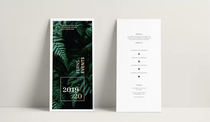
Font selection and spacing settings control how quickly readers absorb event information.
Font Selection Criteria:
Limit your design to 2-3 font families maximum (pairing fonts strategically).
Choose one typeface for headlines and another for body text.
Sans-serif fonts (Arial, Helvetica, Montserrat) suit modern, casual events.
Serif fonts (Garamond, Times New Roman, Playfair Display) fit formal, traditional events.
Display fonts work for event titles but avoid them for body text.
Check best fonts for flyers for proven combinations.
Size Specifications:
- Headlines: 36-72pt
- Subheadings: 24-36pt
- Body text: 12-16pt
- Fine print (contact info): 10-14pt
Spacing and Alignment:
Set line spacing (leading) to 120-150% of font size (14pt font needs 16.8-21pt leading).
Apply tracking adjustments: +20 to +50 for headlines (increases letter spacing), -10 to 0 for body text.
Adjust kerning manually between letter pairs like “AV,” “To,” or “We” that appear too far apart.
Use baseline alignment to line up text elements horizontally across the page.
Readability Checks:
Text smaller than 10pt becomes difficult to read at arm’s length.
All-caps text reduces reading speed – use only for short headlines (5 words or fewer).
Avoid light font weights (100-300) on small text (under 16pt).
Test print at actual size to verify text remains legible – what looks clear on screen may blur in print.
Purpose: Proper typography settings ensure readers can quickly scan and comprehend event details without eye strain or confusion.
Step 5: How Do You Apply Color Scheme and Branding Elements?
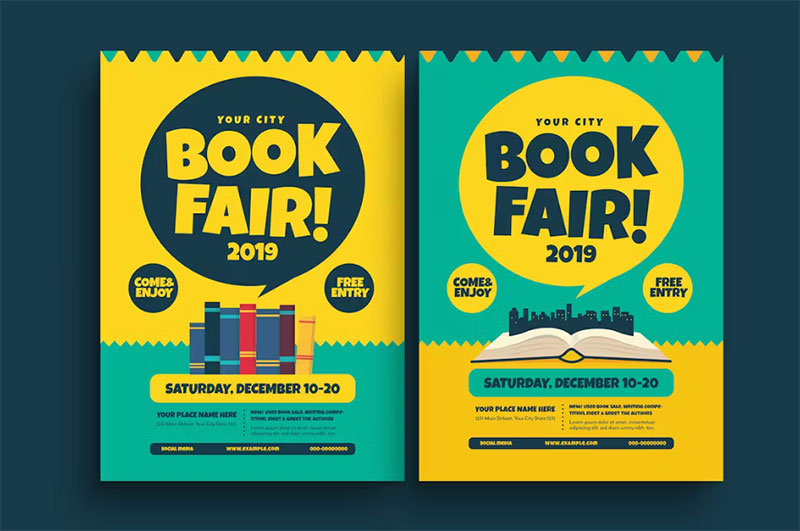
Color choices affect mood, brand recognition, and information clarity across your event flyer.
Color Selection Methods:
Access color pickers: Eyedropper Tool (Photoshop/InDesign), color palette selector (Canva), or Format > Colors (Publisher).
Input exact values: hex codes (#FF5733), RGB values (255, 87, 51), or CMYK percentages (0, 66, 80, 0).
Print projects require CMYK color mode while digital flyers use RGB mode.
Brand Color Application:
Place brand colors from brand guidelines in prominent areas: headers, accent bars, backgrounds.
Maintain color consistency by saving custom colors in your software’s color swatches panel.
Use Pantone colors if printing professionally for exact color matching across print runs.
Color Scheme Structures:
Monochrome colors (one hue with varied saturation) create sophisticated, unified designs.
Analogous colors (3 adjacent hues on color wheel) produce harmonious, cohesive looks.
Complementary color schemes (opposite hues) generate high visual impact and energy.
Understanding color theory helps you choose combinations that evoke appropriate emotions.
Contrast Verification:
Text must contrast sufficiently with backgrounds – minimum 4.5:1 ratio for normal text, 3:1 for large text (18pt+).
Test by converting design to grayscale (Image > Adjustments > Desaturate in Photoshop) – if text disappears, contrast is insufficient.
Dark text on light backgrounds or light text on dark backgrounds both work – avoid mid-tone combinations like gray text on beige.
Logo and Branding Placement:
Position logos in top corners or bottom center where they won’t compete with event title.
Maintain minimum clear space around logos (typically logo height x 0.25 on all sides).
Use vector graphics (.AI, .EPS, .SVG) for logos when possible – they scale without quality loss.
Bitmap logos (.PNG, .JPG) require minimum 300 DPI at placed size.
Color Psychology Considerations:
Color psychology influences how audiences perceive your event type and tone.
Blue conveys trust and professionalism (corporate events, conferences).
Red creates urgency and excitement (sales events, concerts).
Green suggests growth and wellness (health fairs, environmental events).
Purpose: Strategic color application strengthens brand recognition, sets appropriate mood, and ensures text remains readable across all viewing conditions.
Step 6: Where Do You Include Call-to-Action and Contact Information?
Call-to-action elements and contact details convert flyer viewers into event attendees.
CTA Placement Guidelines:
Position primary CTA in bottom third of flyer where readers naturally finish scanning.
Use emphasis techniques: button shapes, contrasting background colors, or border boxes around CTAs.
Place secondary CTAs (social media, website) near contact information section.
CTA Text Formulas:
Action verbs + benefit: “Register Now and Save 20%”
Urgency indicators: “Limited Seats Available” or “Early Bird Ends May 15”
Direct instructions: “Scan QR Code to RSVP” or “Visit EventName.com/tickets”
Keep CTA text under 5 words for maximum impact.
Contact Detail Formatting:
List contact information in bottom right or bottom center using 10-14pt font size.
Standard Contact Elements:
- Website URL (clickable for digital flyers)
- Email address
- Phone number with area code
- Physical address (if venue isn’t listed elsewhere)
- Social media handles with icons
QR Code Integration:
Generate QR codes linking to registration pages, websites, or ticket platforms.
Size QR codes 1×1 inch minimum (smaller codes fail to scan reliably).
Place QR codes in bottom corners with “Scan to Register” or “Scan for Details” labels.
Test QR codes with multiple devices before finalizing design.
White Space Application:
Surround CTA elements with white space (empty areas) equal to at least 50% of CTA element size.
Avoid placing text or graphics within 0.25 inches of CTA buttons – isolation increases visibility.
Purpose: Clear calls-to-action with accessible contact information remove friction between interest and registration, directly increasing event attendance.
Step 7: How Do You Export the Flyer for Print or Digital Use?
Export settings determine whether your final flyer maintains quality across different distribution methods.
Print Export Process:
Adobe Photoshop:
- File > Save As
- Format: Photoshop PDF (preserves layers) or TIFF (flattened)
- PDF Options: High Quality Print preset
- Compression: None or ZIP (lossless)
Canva:
- Share button > Download
- File type: PDF Print (300 DPI) or PNG (high resolution)
- Flatten PDF to single page if needed
Microsoft Publisher:
- File > Export > Create PDF/XPS
- Optimize for: Standard (publishing online and printing)
- Options: Check “ISO 19005-1 compliant (PDF/A)”
Adobe InDesign:
- File > Export
- Format: Adobe PDF (Print)
- Preset: High Quality Print or Press Quality
Digital Export Process:
For Web/Email (smaller file sizes):
- File > Export or Save for Web
- Format: PNG-24 (graphics with transparency) or JPEG (photographs, no transparency)
- Resolution: 72 DPI
- Quality: 80-90% for JPEG
For Social Media:
- Instagram: 1080x1350px (4:5 ratio)
- Facebook: 1200x1500px
- Twitter: 1200x675px
Resize original design to match platform specifications before exporting.
Quality Settings Summary:
Print: PDF format, CMYK color, 300 DPI, no compression
Digital display: PNG or JPEG, RGB color, 72-150 DPI, moderate compression
Email attachments: JPEG, RGB, 72 DPI, 1-2 MB maximum file size
File Naming Convention:
EventName_Flyer_Print_MMDDYY.pdf
EventName_Flyer_Digital_MMDDYY.png
Include version numbers if creating multiple revisions (v1, v2, v3).
Pre-Export Checklist:
Spell-check all text using built-in tools (F7 in most programs).
Verify all links or QR codes function correctly.
Confirm resolution meets requirements for intended use.
Check file size – print files typically 5-50 MB, digital files under 5 MB.
Purpose: Proper export settings preserve design quality while optimizing file size for specific distribution channels, preventing pixelation or color shifts.
Verification
Check all text for spelling errors using spell-check tool (F7 in Photoshop, automatic in Canva).
Verify date, time, location accuracy against source materials – cross-reference with event confirmation emails or calendars.
Confirm image resolution meets requirements by checking Image Size dialog: 300 DPI for print, 72+ DPI for digital.
Test print one copy on actual printer using final paper stock, or view digital version at 100% zoom on calibrated monitor.
Review color accuracy on calibrated monitor or test print – colors shift between screen and print.
Measure physical dimensions with ruler if printing professionally – ensure 8.5×11 inch output with no unexpected scaling.
Ask colleague or friend to review for typos and clarity – fresh eyes catch errors you’ve overlooked.
Verify all contact information works: test phone numbers, click email links, visit URLs.
Troubleshooting
Issue: Images appear pixelated or blurry in final output
Solution: Image > Image Size > Verify resolution shows 300 DPI minimum for print dimensions. Replace low-resolution images with high-resolution versions (minimum 1500×1500 pixels for 5×5 inch area). Avoid enlarging small images beyond 110% of original size.
Issue: Text appears too small to read when printed
Solution: Select text layer > Character panel > Set minimum 10pt for body text, 18pt+ for headlines. Print test at actual size (not scaled) to verify legibility at arm’s length. Increase font spacing if letters appear cramped.
Issue: Colors look different in print versus screen
Solution: Edit > Convert to Profile > Select CMYK Color for print files (Image > Mode > CMYK Color in Photoshop). Request test print from printer with actual ink and paper. Use Pantone color matching system for brand colors requiring exact matches. RGB colors always appear brighter on screens than CMYK prints.
Issue: PDF file size too large for email (over 10 MB)
Solution: File > Save As > PDF > Reduce file size option. Compress images to 150 DPI instead of 300 DPI for email distribution (still acceptable for most viewing). Flatten layers before exporting. Convert to JPEG format at 85% quality if PDF remains too large.
Issue: Design elements not aligned properly
Solution: View > Rulers (Ctrl+R) to display measurement guides. Drag guides from rulers to create alignment references. Use software alignment tools: Align Left, Align Center, Distribute Horizontally. Enable Snap to Grid (View > Snap) for precise positioning.
Issue: Text difficult to read over background image
Solution: Add semi-transparent rectangle (black at 40-60% opacity) between background image and text. Apply drop shadow to text: Layer > Layer Style > Drop Shadow (2-4px distance, 50-75% opacity). Increase text weight from Regular to Bold or Semibold. Darken or lighten background image by 30-50%.
Issue: Fonts missing when opening file on different computer
Solution: Photoshop: Type > Rasterize Type Layer (converts text to image, but text becomes uneditable). InDesign: File > Package (collects all fonts and links). Canva: Fonts automatically embedded in downloads. Publisher: File > Pack and Go > Include fonts. Send font files separately if client needs to edit (verify font licensing allows this).
Issue: Flyer prints with white border around edges
Solution: Add 0.125 inch bleed beyond trim marks (extend background colors/images past page edge). Set printer to Borderless or Full Bleed mode. Check Page Setup > Paper Size matches actual document size (8.5×11). Verify printer margins set to 0.
Software-Specific Considerations
Adobe Photoshop
Best for photo-heavy flyers requiring extensive image manipulation and color correction.
Raster-based software means every element consists of pixels – requires 300 DPI for print quality.
Typical file size: 50-200 MB for letter-size flyer with multiple high-resolution images.
Advantages: Advanced photo editing, precise color control, layer effects, extensive filter library.
Limitations: Text editing less robust than InDesign, large file sizes, steeper learning curve.
Canva
Cloud-based platform with drag-and-drop interface and thousands of pre-made templates.
Automatic export optimization handles resolution and color mode conversions.
Free version limits: 5 GB storage, access to standard templates and 100+ free fonts.
Pro version adds: custom brand fonts, brand kit with saved colors/logos, background remover, resize tool for multiple formats.
Advantages: Templates accelerate design process, no software installation, collaboration features, mobile app access.
Limitations: Limited customization compared to professional software, requires internet connection, template designs may appear generic.
Adobe InDesign
Professional print design software built for layouts, brochures, and multi-page documents.
Supports both vector and raster graphics with automatic image linking.
Package feature (File > Package) bundles all fonts and images into single folder for printer delivery.
Advantages: Professional print preparation, master pages for consistent layouts, advanced typography elements, GREP styles for formatting.
Limitations: Subscription required, complex interface for beginners, not ideal for photo editing.
Microsoft Publisher
Windows-only desktop application with template library included in Microsoft Office suite.
Built-in print design templates for flyers, brochures, business cards.
Export options: PDF, PNG, JPEG, or send directly to commercial printer.
Print service integration connects to Office Depot, FedEx Office, or local print shops.
Advantages: Included with Office subscription, familiar Microsoft interface, template variety, affordable.
Limitations: Windows-only, fewer professional features than InDesign, limited photo editing, less precise color control.
Related Processes
After creating your event flyer, consider these connected tasks:
Creating a poster for larger display: Poster sizes range from 11×17 to 24×36 inches and require adjusted typography and simplified layouts for distance viewing.
Designing social media graphics: Resize your flyer design for Instagram (1080x1080px), Facebook events (1920x1080px), and Twitter (1024x512px) to maintain consistent branding across promotional channels.
Creating a flyer in Photoshop specifically: Photoshop offers advanced layer effects, adjustment layers, and masking tools for complex photo-based flyers.
Converting between formats: Export source files to different platforms – save Photoshop PSD as Canva template or export InDesign INDD to PDF for editing in other programs.
Understanding what makes a flyer effective: Study flyer design principles including information hierarchy, visual flow, and audience targeting for promotional materials.
Professional printing preparation: Learn about bleed margins, trim marks, color profiles, and file packaging when sending designs to commercial printers.
Applying graphic design principles: Study balance, proximity, repetition, and unity to create more cohesive, professional designs.
Exploring design movements: Minimalist design, Swiss design, and contemporary styles influence modern flyer aesthetics and layout approaches.
FAQ on How To Make A Flyer For An Event
What size should an event flyer be?
Standard event flyers use 8.5×11 inches (letter size) or A4 (8.3×11.7 inches) for easy printing and distribution.
Flyer sizes can also include 5.5×8.5 inches (half-letter) for compact handouts or 11×17 inches for poster-style promotional materials requiring larger visibility.
What software is best for making event flyers?
Adobe Photoshop excels at photo-heavy designs, Canva offers beginner-friendly templates, Adobe InDesign handles professional print design, and Microsoft Publisher provides accessible tools for Windows users.
Choose based on your skill level and output requirements (print versus digital distribution).
What information must appear on an event flyer?
Include event title, date, time, location (venue name and address), brief description, ticket or registration details, and contact information.
Add call-to-action elements like “Register Now” or QR codes linking to ticket platforms for maximum conversion.
How do I choose fonts for my event flyer?
Limit designs to 2-3 font families maximum.
Use sans-serif fonts for modern events, serif fonts for formal occasions, and check best fonts for flyers for proven combinations that maintain readability.
What DPI should I use for printing flyers?
Print flyers require 300 DPI minimum at actual size to prevent pixelation and ensure sharp text.
Digital flyers need only 72 DPI for screen display, though 150 DPI produces sharper results on high-resolution monitors and mobile devices.
How much does it cost to print event flyers?
Professional printing costs vary from $0.10-$0.50 per flyer depending on quantity, paper quality, and color options.
The cost to print a flyer decreases with bulk orders – 1000 copies typically cost less per unit than 100 copies.
Should I use RGB or CMYK color mode?
Use CMYK color mode for printed flyers to match commercial printing processes and prevent color shifts.
Digital flyers distributed via email or social media require RGB color mode, which displays brighter colors on screens than CMYK equivalents.
What image resolution do I need for flyers?
Images need 300 DPI at placed size for print quality – a 4×6 inch image area requires minimum 1200×1800 pixels.
Digital flyers accept 72-150 DPI, but higher resolution prevents quality loss when viewers zoom in.
How do I make text readable on background images?
Add semi-transparent rectangles (black at 40-60% opacity) between background and text, apply drop shadows to text, or increase font weight to bold.
Ensure sufficient contrast with minimum 4.5:1 ratio between text and background colors.
Can I create an event flyer for free?
Canva offers free accounts with basic templates and design tools, sufficient for simple event flyers.
GIMP and Google Slides provide free alternatives to paid software, though they lack advanced features found in Adobe Photoshop or InDesign for professional promotional materials.
Conclusion
Learning how to make a flyer for an event equips you with skills to create professional promotional materials that drive attendance and engagement.
The process combines technical knowledge (resolution settings, color modes, export formats) with creative decisions about layout design, typography, and visual hierarchy.
Success depends on proper software selection, whether using Adobe Photoshop for image-heavy designs, Canva for template-based workflows, or InDesign for professional print production.
Remember that effective event marketing requires attention to details: accurate event information, readable font sizes, sufficient contrast, and clear calls-to-action.
Test your designs through actual prints or digital previews before final distribution.
Apply graphic design principles like balance, contrast, and white space to create flyers that capture attention and communicate effectively across both print and digital channels.

Renowned for his expertise in logo design and visual branding, Bogdan has developed a multitude of logos for various clients.
His skills extend to creating posters, vector illustrations, business cards, and brochures. Additionally, Bogdan's UI kits were featured on marketplaces like Visual Hierarchy and UI8.
He also wrote in the past years on sites like Design Your Way, WebDesignerDepot, WPDean, Designmodo, Speckyboy, Slider Revolution, and more.
- The Cursor Logo History, Colors, Font, And Meaning - 24 September 2026
- Top 7 Web Design Subscription Services That Replace Full-Time Hires - 24 September 2026
- Canva vs PowerPoint: Which Is Better for Presentations? - 22 September 2026

Bogdan Sandu is a seasoned designer who has been designing websites since 2008. Renowned for his expertise in logo design and visual branding, Bogdan has developed a multitude of logos for various clients. His skills extend to creating posters, vector illustrations, business cards, and brochures. Additionally, Bogdan's UI kits were featured on marketplaces like Visual Hierarchy and UI8. He also wrote in the past years on sites like Design Your Way, WebDesignerDepot, WPDean, Designmodo, Speckyboy, Slider Revolution, and more.
You Might Also Like


