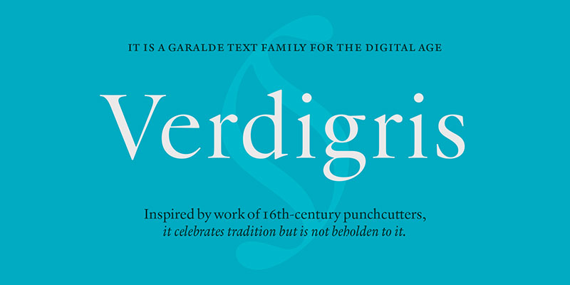
Most printed books use serif fonts for body text, with Garamond, Baskerville, Caslon, and Minion Pro being the most common choices across traditional publishing. The…
The Harry Potter book series (US editions) uses Adobe Garamond for body text, set at 12-point size. This is a classic serif font designed by…
Eurostile’s squared letterforms and retro-futuristic aesthetic have dominated tech branding and gaming interfaces since 1962. But licensing costs, overuse, and limited weight options send designers…
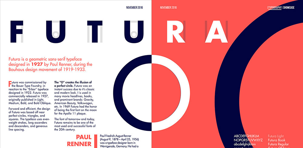
Futura looks stunning on its own, but pair it wrong and your design falls flat. This geometric sans serif typeface demands thoughtful companions. The clean…
There is no single font the Bible is written in. The answer changes depending on the edition, the century, and the publisher. Historically, the Gutenberg…
Your logo fonts speak before your designs ever do. Fashion fonts determine whether brands read as haute couture or fast fashion, luxury or accessible, timeless…
US street signs use Highway Gothic, a sans-serif typeface developed by the Federal Highway Administration (FHWA) and formally called the Standard Alphabets for Traffic Control…
Most sports jerseys use bold, condensed athletic typefaces – either custom fonts built specifically for a team or well-known display fonts like Varsity, Jersey M54,…
Autumn color palettes do more than capture falling leaves and pumpkin patches. They set moods, drive conversions, and separate memorable designs from forgettable ones. The…
Screenplays are written in Courier 12pt, a monospaced slab serif typeface originally designed for IBM typewriters in 1955. Most professional screenwriting software defaults to this…
Blue shows up everywhere because it works. From corporate logos to social media interfaces, designers reach for blue when trust matters. But not all blues…
Doctors most commonly use Arial, a neo-grotesque sans-serif font designed by Robin Nicholas and Patricia Saunders at Monotype Typography in 1982. Arial is the default…
Most diplomas use blackletter typefaces like Old English Text MT for the institution name, paired with a classic serif font like Garamond or Times New…
Wrong colors on a choropleth map don’t just look bad, they actively lie to your audience. Map color palettes determine whether someone reads your data…
Lawyers most commonly use Times New Roman, Century Schoolbook, and Garamond for legal documents. The choice depends on the jurisdiction, the document type, and whether…
There is no single font the military uses across all branches and contexts. Different branches, different purposes, and different documents each follow their own typography…
The wrong font can make a banner invisible, even at full size. Whether you’re designing for a trade show display, a vinyl outdoor sign, or…
As of 2025, Walmart uses a custom sans-serif font called Everyday Sans across its stores, digital platforms, and marketing materials. Everyday Sans is a proprietary…
Bluey uses Hello Headline, a bold rounded display typeface designed by Veneta Rangelova and published by DearType, as the primary font across its title cards,…
NASA uses Helvetica as its primary typeface for body text, communications, and signage. The agency adopted Helvetica in 1976 as part of a sweeping identity…
Coca-Cola’s logo uses a hand-lettered script typeface rooted in Spencerian penmanship, drawn by hand in 1885 by Frank Mason Robinson, bookkeeper to Coca-Cola’s inventor John…
SpongeBob SquarePants uses 2 distinct fonts across its logo and episode cards. The “SpongeBob” portion of the title logo is set in a custom hand-lettered…
LEGO’s current brand typeface is LEGO Typewell, a fully custom sans-serif font co-designed by Colophon Foundry and Interbrand, introduced in April 2024 as part of…
Print ads still command 82% consumer trust while digital struggles with ad blockers and declining engagement rates. Despite widespread assumptions about traditional media’s demise, print…
Graphic design statistics reveal a creative industry worth over $43 billion globally, yet most professionals struggle to understand their market position. While freelance designers chase…
Every click, swipe, and interaction tells a story about user behavior that smart designers can’t afford to ignore. The world of UI design statistics reveals…
The wrong paper finish can ruin a print that looked perfect on screen. Choosing between matte vs glossy paper affects color accuracy, glare, ink absorption,…
UX design statistics reveal a startling reality: companies lose $1.4 trillion annually due to poor user experiences. Yet organizations investing in user experience research see…
The wrong paper stock can ruin a perfectly good print job. It is one of those decisions that gets made last and matters most. Choosing…
From a simple graphic design platform to a $3 billion revenue giant, Canva’s meteoric rise has reshaped the creative software market. These Canva statistics reveal…