

The Audi Logo History, Colors, Font, and Meaning
Imagine cruising down an open highway, the quiet hum of the engine beneath you, glinting metal catching the sun.
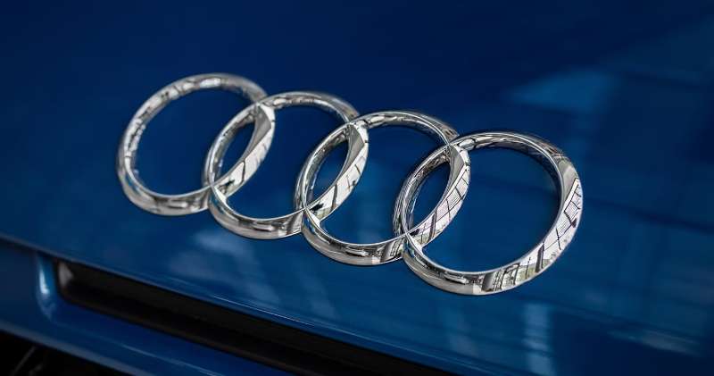
Now, picture that iconic symbol leading the way—the Audi logo. It’s not just a set of interlocked rings; it’s a statement, a piece of history.
This emblem, recognized worldwide, goes beyond mere aesthetics; it’s a beacon of innovation and luxury.
As a web designer, I’m fascinated by the power of branding and how a simple symbol can encapsulate the essence of a brand so vividly.
You’re here, so you’re curious. You want to delve into the crux of what makes the Audi logo so significant.
Together, we’re going to unpack the layers—from logo evolution to design aesthetics, from the depths of its brand identity to the trademark symbol it’s become.
By the time we’re done, you’ll grasp how the Audi rings symbolize more than an automaker’s pride. You’ll understand their impact on brand recognition and the secrets behind crafting an emblem for the ages.
- History check? Got it.
- Meaning exploration? You bet.
- Design analysis? Oh, yes.
Stay with me, and let’s decode the story behind the circles.
The Meaning Behind the Audi Logo
Symbolism and Philosophy
We’ve all seen those four intertwined rings, right? They’re more than just a pretty picture. Each ring represents one of the four founding companies of Auto Union, Audi’s precursor.
So those rings? They’re a beacon of unity, of collaboration, and of the power of synergy. Kind of poetic, isn’t it?
Reflecting Audi’s Core Values
Look closely, and you’ll see Audi’s principles embedded in those rings. Progress through technology. Sophistication. Excellence. The rings are a promise, a commitment to deliver on these values. They don’t just stand for Audi; they stand for what Audi stands for.
The History of the Audi Logo
The Birth of the Four Rings
Back in the 1930s, when the automobile world was still quite young, four companies – Audi, DKW, Horch, and Wanderer – decided to join forces. They formed Auto Union, and the four rings were born. Since then, they’ve been a symbol of unity and strength.
The Audi Logo Evolution
The logo has evolved over the years, but the core concept – the four rings – has remained unchanged. It’s like they say – don’t fix it if it ain’t broke. The rings have stood the test of time, and they’ve become iconic. They represent Audi’s legacy, its history, and its promise for the future.
The Colors of the Audi Logo
The Power of Black and Silver
The Audi logo primarily uses black and silver colors. Black stands for elegance, power, and sophistication, while silver signifies perfection, creativity, and modernity. Together, they create a powerful image that reflects Audi’s commitment to excellence and innovation.
Psychology Behind the Colors
Colors speak volumes, and the choice of black and silver in the Audi logo is no different. Black exudes power and elegance, while silver screams modernity and innovation. A perfect blend for a company that’s all about pushing the boundaries of what’s possible in the automotive world.
The Font Used in the Audi Logo
Simplicity and Elegance
The font used in the Audi logo is a customized typeface, but it carries the essence of the Univers typeface. It’s simple, it’s sleek, and it’s elegant. Just like Audi.
Reflecting Brand Identity
The choice of typeface is not accidental. It’s a reflection of Audi’s brand identity – modern, innovative, and sophisticated. The clean lines and minimalist design echo Audi’s commitment to quality and precision.
The Impact of the Audi Logo

A Global Icon
The logo is instantly recognizable, a global symbol of luxury and high-performance automobiles. It has become synonymous with innovation and quality, a testament to the power of good design and strong brand identity.
Influence on Brand Perception
It’s not just a logo; it’s a symbol of trust, of quality, and of excellence. When people see those four rings, they think of a company that’s committed to pushing the boundaries, to being the best in the business. It’s a powerful tool in shaping how people perceive the Audi brand.
The Audi Logo in Popular Culture

Cameos in Movies and TV
Ever spotted those four rings in a movie or a TV show? Chances are, you have. The Audi logo has made numerous appearances in popular culture, further cementing its place as a global icon.
Audi and Motorsport
If you’re a fan of motorsport, you’ve probably seen the Audi logo zipping past on the racetrack. Audi’s involvement in motorsport has been substantial, and the four rings have become a symbol of speed, performance, and innovation in the racing world.
The Future of the Audi Logo
Adaptation to Modern Aesthetics
As the world changes, so does design. The logo has undergone subtle changes over the years to keep up with modern aesthetics, and this trend is likely to continue. But one thing’s for sure – those four rings are here to stay.
A Symbol of Sustainability
With Audi making strides in electric vehicle technology, the logo might also come to symbolize sustainability and eco-friendliness in the near future. Those four rings could very well become a beacon for green technology in the automotive world.
And there you have it – a deep dive into the logo. It’s more than just a pretty picture, isn’t it? It’s a symbol of unity, of progress, of excellence. It’s a testament to Audi’s past, a reflection of its present, and a promise for its future.
FAQ On The Audi Logo
What does the Audi logo represent?
The interlocked rings of the Audi logo—it’s a nod to unity and strength. Represents four pioneering companies – Audi, DKW, Horch, and Wanderer, joining forces. It’s not just a branding icon; it’s a historical handshake, sealed in metal and time.
How has the Audi emblem evolved over the years?
Oh, it’s been a journey. Once signifying individual companies, the rings evolved. From a 3D look to a flat design, the Audi emblem mirrors the brand’s push for sleek, futuristic luxury. The essence remains, but the style? It adapts, staying fresh yet timeless.
Why are there four rings in the Audi logo?
Four rings for four founders – simple as that. Each ring symbolizes one of the founding companies of the Auto Union. It’s a tribute to the merger that gave birth to what Audi is today—synonymous with German luxury automakers standing united.
Is the Audi logo related to the Olympics symbol?
Nope, no connection to the Olympics here. Pure coincidence! The Audi rings stem from automotive history, not athletics. It’s all about the union in the auto industry, not global sports. The resemblance is there, but the origins? Totally different worlds.
What do the colors in the Audi logo mean?
Let’s talk minimalism—black and silver, that’s it. Nothing flashy, just understated elegance. Silver for sophistication, innovation, modernity. Black for power and prestige. The Audi branding sticks to the roots—class and quality, no extra frills needed.
Can the Audi logo change in the future?
Change is the only constant, right? Sure, the Audi logo has room to evolve. But it’ll likely stick to its corporate identity, maybe tweak the shades, the dimensions. Always though, with a mindful nod to its legacy. That’s the art of iconic car logos—evolve, don’t erase.
What is the story behind the creation of the Audi logo?
It started back in 1932. Four companies with thirst for change. They come together, birth the Auto Union. And what symbolizes their pact? The rings, intertwined and strong.
A simple yet powerful testament to collaboration and ambition. That Audi badge history—it resonates, doesn’t it?
Is it legal for other brands to use the Audi logo?
Absolutely not, no way. That logo? It’s protected—trademark symbol through and through. The Audi rings signify more than a car manufacturer insignia; they’re the face of the brand. Misuse is a no-go. They guard it fiercely, as they should!
What are the official usage guidelines for the Audi logo?
Guidelines are crystal clear: stick to the branding guidelines. Respect the proportions, the colors. Don’t mess around with it.
Their visual identity elements are strict because maintaining the brand’s appearance—spotless. It’s a science, keeping that trademark symbol consistent.
Which models feature a different version of the Audi logo?
Interestingly, you won’t find much variation. All models pretty much rock the same logo.
Why mess with perfection, eh? Though, some limited editions or special series might have a unique twist—ensuring that slick brand recognition of theirs stays on point, across the board.
Conclusion
Alright, let’s wrap this up. We’ve circled around the Audi logo, dipped into its brand identity, and traced the pathway from its conception to the powerhouse emblem we know today. Distilled from history, these four rings stand as a testament to pioneering spirits and German ingenuity—a blend of heritage and forward-thinking.
We get it now, right? Why it’s more than just metal and marketing. It’s a promise, a signature, from the luxury vehicle maker to its audience. And, to be honest, it’s a designer’s dream—such a clean, iconic visual identity to work with.
- We’ve checked off the branding box,
- Unraveled the logo evolution thread,
- And even debunked a couple of myths.
It’s clear; whether it adorns a showroom car or flashes across a website banner, it speaks volumes without so much as a whisper. Stands tall, those Audi rings, without rival, without needing to shout. Here’s to the silent strength of a well-crafted emblem.
Crafting closes. Reality resumes. But those rings, they keep rolling, don’t they?
If you liked this article about the Audi logo, you should check out this article about the Lamborghini logo.
There are also similar articles discussing the Bentley logo, the Hyundai logo, the Jeep logo, and the Cadillac logo.
And let’s not forget about articles on the Jaguar logo, the Chrysler logo, the Maserati logo, and the Dodge logo.
Bogdan Sandu, a seasoned designer with 15 years of diverse experience, has been designing websites since 2008.
Renowned for his expertise in logo design and visual branding, Bogdan has developed a multitude of logos for various clients.
His skills extend to creating posters, vector illustrations, business cards, and brochures. Additionally, Bogdan's UI kits were featured on marketplaces like Visual Hierarchy and UI8.
Latest posts by Bogdan Sandu (see all)
- The EA Logo History, Colors, Font, And Meaning - 25 April 2024
- Nature Color Palettes Inspired by the Outdoors - 25 April 2024
- The Epic Games Logo History, Colors, Font, And Meaning - 24 April 2024