


The Vogue logo stands as one of the most recognized marks in fashion publishing. Its elegant letterforms have graced magazine covers since the late 1800s, becoming shorthand for style itself.
Conde Nast owns this publication, which launched in 1892 as a weekly society paper in New York City. The logo has gone through subtle refinements over 130 years. Still, it keeps the same basic DNA.
The current wordmark uses a custom serif font inspired by Didot typefaces. It reads as both classic and modern, which is tricky to pull off. Most fashion magazines try for this balance and fail.
What Is the Vogue Logo?
The Vogue logo is a wordmark featuring the brand name in an elegant serif typeface with high contrast between thick and thin strokes. Introduced in its recognizable modern form during the mid-20th century, this design communicates luxury, sophistication, and editorial authority in fashion publishing.
Design Attributes
- Design Type: Wordmark (text-only logo)
- Primary Elements: Custom serif typography with distinct letterforms, particularly the stylized “V” and “G”
- Official Introduction Date: 1892 (original), with the modern refined version emerging through the 20th century
- Designer/Agency: Various art directors have refined it over decades
- Trademark Status: Registered trademark of Conde Nast Publications
- Color Palette: Primarily black (#000000) on white, though cover treatments vary
- Usage Context: Magazine mastheads, digital platforms, merchandise, brand partnerships, runway events
How Has the Vogue Logo Evolved Over Time?

The Vogue logo began as an ornate Victorian design in 1892. It shifted toward cleaner lines by the 1910s.
The mid-century brought the streamlined version we recognize today. Each decade added subtle tweaks without losing the core identity.
Original Vogue Logo (1892-1900s)
- Years Active: 1892 to early 1900s
- Design Description: Decorative Victorian lettering with ornamental flourishes and elaborate serifs
- Color Scheme: Black ink on cream paper stock
- Designer: Original art department under founder Arthur Baldwin Turnure
- Context: Launched as a society gazette for New York’s upper class. The ornate styling matched Gilded Age aesthetics.
- Cultural Significance: Positioned the publication as upscale reading material for wealthy socialites
Early 20th Century Refinement (1900s-1940s)
- Years Active: 1900s through 1940s
- Design Description: Simplified letterforms moving away from Victorian excess. Cleaner serifs with reduced ornamentation.
- Color Scheme: Black remained standard, but covers began experimenting with color treatments
- Context: Conde Nast acquired the publication in 1909 and shifted focus toward fashion coverage
- Key Changes from Previous: Dropped heavy flourishes. Adopted more readable, modern letterforms influenced by Art Deco movements.
- Cultural Significance: Reflected the broader shift toward modernism in design
Mid-Century Modern Era (1950s-1980s)
- Years Active: 1950s through 1980s
- Design Description: The classic high-contrast serif we associate with the brand today. Elegant Didot-inspired letterforms with dramatic thick-thin variation.
- Color Scheme: Black wordmark with increasingly bold cover color experiments
- Designer: Various art directors including Alexander Liberman
- Context: Post-war fashion boom. The magazine became the industry’s definitive voice.
- Key Changes from Previous: Locked in the signature look. Letter spacing tightened. The “O” became more geometric.
- Cultural Significance: This version cemented Vogue as synonymous with high fashion authority
Contemporary Digital Adaptation (1990s-Present)
- Years Active: 1990s to present
- Design Description: Same essential wordmark optimized for digital display. Subtle refinements for screen legibility.
- Color Scheme: Black primary, with regional editions using unique color treatments
- Context: Anna Wintour’s tenure as editor-in-chief brought renewed focus on brand consistency
- Key Changes from Previous: Minor optical adjustments for web and mobile. Vector optimization for various applications.
- Cultural Significance: Maintained relevance while countless competitors rebranded completely
What Do the Design Elements of the Vogue Logo Mean?

Every part of this wordmark serves a purpose. The high-contrast serif letters suggest tradition and luxury.
The tight kerning creates visual cohesion. Each letter relates to the next like models walking in formation.
There’s no icon or symbol because the name itself carries enough weight. That confidence says something.
Why Did Vogue Choose These Specific Colors?
Black communicates sophistication without trying too hard. It photographs well and reproduces cleanly across print and digital.
The hex code is pure black (#000000). No warm or cool bias.
This neutrality lets cover photography take center stage. The logo frames without competing.
From a color psychology standpoint, black signals authority and exclusivity. Fashion thrives on both.
What Typography Style Is Used in the Vogue Logo?
The typeface draws heavily from Didot, a French serif dating to the 18th century.
High contrast between thick verticals and hairline horizontals defines this style. It looks fragile but commands attention.
The custom version adds slight modifications. The “V” has a distinctive angle. The “G” features a unique spur.
These details make the mark ownable and harder to replicate.
What Are the Hidden Meanings in the Vogue Logo?
Honestly, there are no secret messages here. The design is straightforward in its intentions.
Some point to the symmetry of the letters, but that’s just good balance in action.
The real meaning lives in what the design avoids. No trendiness. No gimmicks. Just confident restraint.
That discipline is the message.
How Does the Vogue Logo Compare to Competitor Logos?
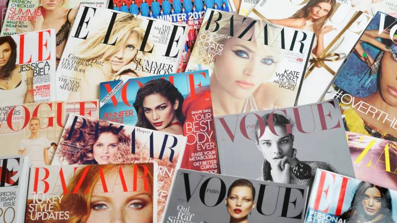
Most fashion magazines lean on similar territory. Serif wordmarks dominate this space for good reason.
Harper’s Bazaar uses a heavier serif with more geometric construction. Elle goes bolder and more condensed.
Vogue sits in the middle, balancing elegance with readability. It’s neither the most dramatic nor the most minimal.
Compared to brands like Chanel or Louis Vuitton, the Vogue logo shares that same appreciation for classic French-inspired type. These fashion houses and publications draw from a shared visual language.
Against Prada or Balenciaga, Vogue feels warmer. Those brands favor colder, more architectural lettering.
What Are the Technical Specifications of the Vogue Logo?
Official Color Codes
- Primary Color: Black
- Hex: #000000
- RGB: (0, 0, 0)
- CMYK: (0, 0, 0, 100)
- Pantone: Black 6 C
- Secondary Color: White (background/reversed applications)
- Hex: #FFFFFF
- RGB: (255, 255, 255)
- CMYK: (0, 0, 0, 0)
Dimensions and Proportions
- Aspect Ratio: Approximately 4:1 (width to height)
- Minimum Size Requirements: 0.75 inches for print, 120 pixels for digital
- Clear Space: Minimum of the height of the “O” on all sides
- File Formats: Available in vector graphics (AI, EPS, SVG) and raster formats for various uses
What Cultural Impact Has the Vogue Logo Had?

This logo transcends magazine publishing. It represents an entire industry’s aspirational ceiling.
Appearing on a Vogue cover (and beneath that logo) signals arrival. Designers, models, and celebrities measure success by this benchmark.
The wordmark shows up in films, television, and art as visual shorthand for fashion credibility. Everyone recognizes it instantly.
Anna Wintour turned the brand into a cultural institution during her tenure. The logo became inseparable from that power.
How Does the Vogue Logo Fit Into the Overall Brand Identity?
The logo anchors a broader system. Every Vogue touchpoint references these core design elements.
International editions maintain the wordmark but adapt surrounding elements for regional markets. British Vogue, Vogue Italia, and Vogue Paris all use the same masthead.
Sub-brands like Teen Vogue and Vogue Living modify the treatment slightly. They keep the family resemblance while signaling different audiences.
The company’s brand guidelines specify exact usage rules. Photography styles, color treatments, and layout grids all relate back to what the logo establishes.
How Should the Vogue Logo Be Used?
Official Usage Guidelines
- Do: Maintain clear space around the logo
- Do: Use official vector files for reproduction
- Do: Keep the logo in its original proportions
- Don’t: Stretch, rotate, or distort the wordmark
- Don’t: Add effects like shadows or outlines
- Don’t: Place over busy backgrounds without sufficient contrast
Licensing and Trademark Information
Conde Nast holds exclusive trademark rights globally. Unauthorized commercial use triggers legal action.
Partnership inquiries go through official brand licensing channels. The company protects this mark aggressively.
For press and editorial reference, standard fair-use principles apply. But merchandising requires explicit approval.
FAQ on The Vogue Logo
What Font Is Used in the Vogue Logo?
The Vogue logo uses a custom font inspired by Didot, a classic French typeface from the 18th century.
High contrast between thick and thin strokes defines this style. The magazine’s version includes subtle modifications that make it unique.
Who Designed the Vogue Logo?
No single designer gets credit. The logo evolved through contributions from various art directors at Conde Nast over 130 years.
Alexander Liberman shaped much of the mid-century look. But it’s really a collaborative effort spanning generations of editorial design teams.
When Was the Vogue Logo First Created?
Arthur Baldwin Turnure founded the magazine in 1892. The original masthead featured ornate Victorian lettering common to that era.
The modern version emerged gradually through the 20th century. It’s been remarkably stable since the 1950s.
What Does the Vogue Logo Symbolize?
The wordmark represents luxury fashion publishing at its highest level. Those elegant serifs communicate tradition, authority, and sophistication.
There’s no hidden icon or symbol. The name itself carries enough weight in the fashion industry.
Has the Vogue Logo Changed Over the Years?
Yes, but subtly. The Victorian original looked completely different from today’s clean wordmark.
Each decade brought refinements. Dropped flourishes here, tightened spacing there. The core identity stayed intact while details evolved with graphic design movements.
Why Is the Vogue Logo So Recognizable?
Consistency matters. The magazine has used essentially the same masthead design for decades while competitors constantly rebranded.
Strong visual hierarchy helps too. That bold wordmark dominates every cover, creating instant recognition worldwide.
What Colors Appear in the Vogue Logo?
The standard logo is black. Pure, simple, authoritative.
Cover treatments vary wildly though. You’ll see white, metallics, and bold colors depending on the photography underneath. The wordmark adapts while staying recognizable.
Is the Vogue Logo Protected by Trademark?
Absolutely. Conde Nast holds global trademark rights and defends them aggressively.
The company pursues unauthorized commercial use. This protection extends to all international editions including British Vogue, Vogue Paris, and Vogue Italia.
Can I Use the Vogue Logo in My Work?
Not without permission. Commercial use requires licensing through official Conde Nast channels.
Editorial and educational fair use exists, but merchandising is off-limits. Check their brand style guide requirements before attempting any usage.
What Makes the Vogue Logo Timeless?
Restraint. The design avoids trends that would date it quickly.
Good logo design principles show here. Simple forms, classic proportions, and confident execution create something that works across any decade. Fashion changes constantly, but this masthead endures.
Conclusion
The Vogue logo remains a benchmark in fashion magazine branding. Its Didot-inspired letterforms have defined luxury publishing for over a century.
What makes it work? Restraint and consistency. The masthead design never chases trends.
Anna Wintour’s era strengthened this visual identity further. The wordmark now appears at Fashion Week events, the Met Gala, and across Vogue Runway platforms worldwide.
Few editorial logos achieve this level of recognition. Harper’s Bazaar and Elle compete, but neither matches Vogue’s cultural reach.
The lesson for designers is clear. Iconic fonts and minimalist design choices create lasting brand marks. Confident simplicity beats constant reinvention every time.

Renowned for his expertise in logo design and visual branding, Bogdan has developed a multitude of logos for various clients.
His skills extend to creating posters, vector illustrations, business cards, and brochures. Additionally, Bogdan's UI kits were featured on marketplaces like Visual Hierarchy and UI8.
He also wrote in the past years on sites like Design Your Way, WebDesignerDepot, WPDean, Designmodo, Speckyboy, Slider Revolution, and more.
- Jujutsu Kaisen Font Generator - 12 October 2026
- The Windsurf Logo History, Colors, Font, And Meaning - 10 October 2026
- How to Remove Background From Product Photos (No Photoshop) - 10 October 2026

Bogdan Sandu is a seasoned designer who has been designing websites since 2008. Renowned for his expertise in logo design and visual branding, Bogdan has developed a multitude of logos for various clients. His skills extend to creating posters, vector illustrations, business cards, and brochures. Additionally, Bogdan's UI kits were featured on marketplaces like Visual Hierarchy and UI8. He also wrote in the past years on sites like Design Your Way, WebDesignerDepot, WPDean, Designmodo, Speckyboy, Slider Revolution, and more.
You Might Also Like
