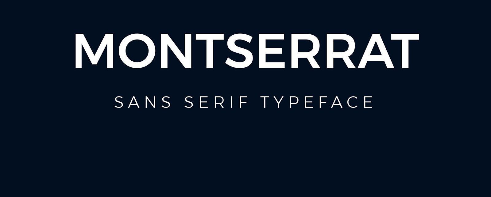
Montserrat’s clean geometric lines made it a web design staple, but overuse dulls its impact.
Fonts similar to Montserrat offer fresh alternatives without sacrificing the modern sans-serif aesthetic that made it popular. Whether you need something with more personality for branding, better readability for body text, or simply want to stand out from the Montserrat-saturated web, countless alternatives deliver geometric precision with unique character.
This guide explores 20 carefully selected typefaces that share Montserrat’s DNA. You’ll discover both premium options and free Google Fonts alternatives.
Each option includes technical specifications, licensing details, and direct comparisons showing exactly how it differs from Montserrat. From Proxima Nova’s refined elegance to Poppins’ international versatility, you’ll find the perfect match for your next project.
Fonts Similar To Montserrat
| Font Name | Primary Use Context | Key Attributes | Design Character |
|---|---|---|---|
| Proxima Nova | Corporate branding, web applications | Geometric structure, humanist warmth | Balanced professional appearance |
| Gotham | Editorial content, high-end branding | Architectural forms, industrial heritage | Strong authority presence |
| Avenir | Luxury brands, minimalist design | Pure geometric construction, refined | Elegant simplicity |
| Raleway | Modern websites, digital interfaces | Thin weights emphasis, elegant proportions | Contemporary sophistication |
| Roboto | Android apps, Google ecosystem | Mechanical skeleton, friendly curves | Technical friendliness |
| Open Sans | Body text, accessible interfaces | Neutral appearance, high legibility | Universal readability |
| Poppins | Headings, contemporary branding | Circular geometry, Devanagari influence | Youthful energy |
| Helvetica Neue | Apple products, Swiss design tradition | Improved metrics, refined neutrality | Timeless precision |
| Nunito | Friendly interfaces, educational content | Rounded terminals, balanced curves | Approachable warmth |
| Lato | Corporate communications, web content | Semi-rounded details, stability | Professional reliability |
| Futura | Historic modernism, high fashion | Pure geometric shapes, Bauhaus legacy | Avant-garde heritage |
| Source Sans Pro | Adobe products, technical documentation | OpenType features, screen optimization | Functional clarity |
| TT Norms Pro | Modern branding, digital products | Soft geometry, contemporary proportions | Clean modernity |
| TT Commons Pro | Universal applications, flexible systems | Extended family, versatile weights | Systematic adaptability |
Proxima Nova
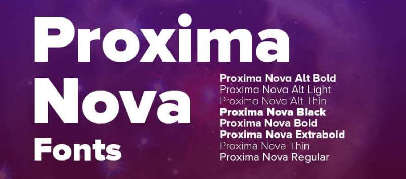
Proxima Nova bridges traditional grotesque design with modern geometric proportions. Created by Mark Simonson in 2005, it expanded from the discontinued Proxima Sans into a comprehensive family now spanning 80 fonts across multiple widths and scripts.
Core Characteristics
The typeface combines humanistic proportions with geometric structure.
Vertical strokes exceed horizontal thickness, creating subtle optical weight variation. The design sits between Futura’s rigid geometry and Akzidenz Grotesk’s functional neutrality. Distinctive characteristics include balanced letterforms, open counters, and carefully adjusted character proportions that work across display and text applications.
Use Cases
Corporate branding and digital interfaces
Web typography with extensive language support (Greek, Cyrillic, Vietnamese, Arabic, Thai)
Print design requiring multiple weight variations
Applications needing both condensed and wide width options
Technical Specifications
- Weights: 8 (Thin through Black)
- Widths: 5 (Extra Condensed, Condensed, Normal, Wide, Extra Wide)
- Total fonts: 80 across all variations
- Format support: OTF, TTF, Web fonts
- Character count: 1,453+ per font
- OpenType features: Small caps, ligatures, old style figures, tabular numerals
- License: Commercial (Adobe Fonts, Mark Simonson Studio)
Comparison to Montserrat
Both share geometric sans-serif foundations with similar weight ranges. Proxima Nova offers more width variations (five versus Montserrat’s standard width). Montserrat leans toward taller letterforms while Proxima Nova maintains broader proportions. Proxima Nova includes extensive language support beyond Latin scripts. The x-height ratio differs slightly, with Montserrat featuring more consistent geometric circles in characters like “o.”
Best For
Professional branding projects requiring extensive font families
Websites needing multilingual support
Corporate identity systems demanding both display and body text flexibility
Projects transitioning from Gotham or Helvetica alternatives
Gotham
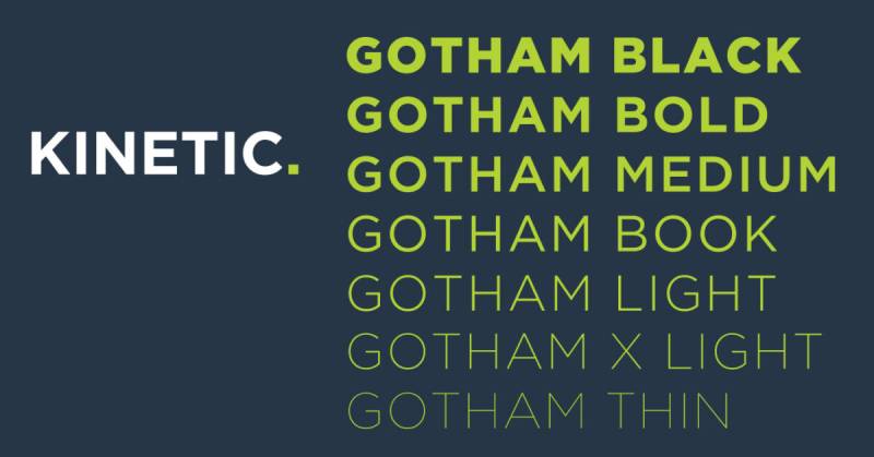
Tobias Frere-Jones designed Gotham in 2000 for GQ magazine, drawing inspiration from mid-century architectural lettering found throughout Manhattan. The typeface gained recognition during Barack Obama’s 2008 presidential campaign and remains a staple in contemporary branding.
Core Characteristics
Geometric sans-serif with industrial American vernacular roots.
Characters feature low crossbars on A, R, and P, creating a stocky, authoritative appearance. The design references painted signage, enamel signs, and bronze building numbers from early 20th century New York. Letterforms balance geometric precision with subtle humanist touches, avoiding pure mathematical construction.
Use Cases
Political campaigns and governmental branding
Corporate identity systems
Editorial design for magazines and publications
Architectural signage and wayfinding
Technical Specifications
- Weights: 8 (Thin through Black)
- Widths: 4 (Normal, Narrow, Extra Narrow, Condensed)
- Total fonts: 132+ styles
- Format support: Desktop, web, app licenses
- Language support: Latin, Greek, Cyrillic (added 2015)
- Special versions: Gotham Rounded, Gotham Screensmart
- License: Commercial (Hoefler & Co.)
- Designer: Tobias Frere-Jones with Jonathan Hoefler
Comparison to Montserrat
Both feature geometric structures but Gotham emphasizes industrial authenticity while Montserrat references Buenos Aires signage. Gotham’s lowercase crossbars sit distinctly lower than Montserrat’s more balanced positioning. Gotham offers four width variations compared to Montserrat’s single standard width. Character terminals in Gotham are more squared while Montserrat maintains rounder endings. Both serve similar corporate and editorial applications.
Best For
Brand identities requiring authoritative presence
Campaign materials and political messaging
Professional presentations and corporate communications
Projects replacing Proxima Nova or requiring American aesthetic
Avenir
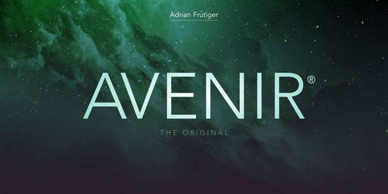
Adrian Frutiger released Avenir in 1988 through Linotype, creating what he called his finest work. The French word meaning “future” signals its inspiration from 1920s geometric typefaces, though Frutiger humanized the rigid geometric forms of predecessors like Futura.
Core Characteristics
Geometric sans-serif with organic humanist touches.
Vertical strokes slightly heavier than horizontals. The “o” isn’t a perfect circle but optically corrected for better readability. Ascenders are subtly shortened. Unlike pure geometric faces, Avenir features a two-story ‘a’ and ‘t’ with a curl at the bottom, referencing traditional typographic forms while maintaining modern appearance.
Use Cases
Corporate branding (Amsterdam city identity, Bloomberg)
Airport wayfinding systems (Dallas Fort Worth, Hong Kong International)
App interfaces (Snapchat, Disney+)
Print and digital publishing requiring extended text readability
Technical Specifications
- Weights: 8 (Ultra Light, Thin, Light, Regular, Medium, Demi Bold, Bold, Heavy)
- Widths: 2 (Normal, Condensed)
- Total fonts: 32 (Avenir Next version)
- Format support: OTF, TTF, system font (macOS, iOS since Mountain Lion)
- OpenType features: Small caps, text figures, ligatures, subscript/superscript
- Language support: Extended Latin, Greek, Cyrillic, Hebrew, Arabic variants
- License: Commercial (Linotype/Monotype)
- Designer: Adrian Frutiger, expanded by Akira Kobayashi
Comparison to Montserrat
Avenir predates Montserrat by 26 years but shares geometric DNA. Avenir’s humanist adjustments create warmer text color versus Montserrat’s more uniform geometric structure. Both work well for body text, but Avenir includes more extensive OpenType features. Avenir Next offers eight weights while Montserrat provides nine. Character widths differ slightly, with Avenir maintaining more traditional proportions. System font availability gives Avenir advantage in native applications.
Best For
Projects requiring timeless, organic geometric aesthetic
Extended text applications needing superior readability
Branding systems for public institutions
Designs transitioning from Futura while improving legibility
Raleway
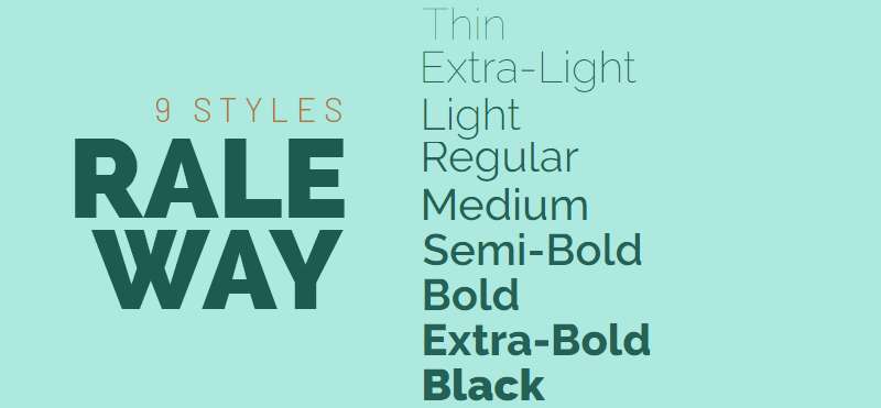
Matt McInerney originally designed Raleway as a single Thin weight. Pablo Impallari and Rodrigo Fuenzalida expanded it to nine weights in 2012, with italics added in 2013. The League of Moveable Type released it under open-source licensing.
Core Characteristics
Elegant neo-grotesque sans-serif with geometric influences.
The distinctive “W” stands out with unique construction (though stylistic alternates provide more conventional options). Clean lines and balanced letterforms work across display and text uses. Features both old style and lining numerals, standard and discretionary ligatures, complete diacritic set, and stylistic alternates inspired by geometric sans-serifs.
Use Cases
Headlines and large typography where elegance matters
Modern branding requiring refined aesthetic
Web design prioritizing clean, readable typography
Display applications showcasing character personality
Technical Specifications
- Weights: 9 (Thin, Extra Light, Light, Regular, Medium, Semi-Bold, Bold, Extra Bold, Black)
- Styles: 18 total (each weight plus italic)
- Format support: TTF, WOFF, WOFF2, OTF
- Character count: 195+ glyphs per font
- Language support: 105 Latin languages, 60 Cyrillic languages
- OpenType features: Multiple stylistic sets, ligatures, alternates, small caps
- License: SIL Open Font License (free for commercial use)
- Platform: Google Fonts, League of Moveable Type
Comparison to Montserrat
Both offer extensive weight ranges (nine weights each) and geometric foundations. Raleway’s neo-grotesque DNA creates slightly more refined, elegant character than Montserrat’s robust Buenos Aires signage inspiration. Raleway’s distinctive W requires consideration in branding applications while Montserrat maintains more neutral letterforms throughout. Both available through Google Fonts with similar file format support. Stylistic alternate options give Raleway more flexibility for different design contexts.
Best For
Luxury branding and premium product marketing
Editorial design requiring sophisticated typography
Headline treatments where personality enhances message
Budget-conscious projects needing premium aesthetic
Roboto

Christian Robertson designed Roboto in 2011 as Android’s system font, replacing Droid Sans with a neo-grotesque approach. Google extensively redesigned it in 2014 for Android 5.0 “Lollipop,” expanding weights and refining details throughout the character set.
Core Characteristics
Neo-grotesque sans-serif with mechanical skeleton and friendly curves.
The design balances geometric forms with humanist touches, creating approachable technology aesthetic. Letterforms feature slightly wider proportions than condensed counterparts. Punctuation and details shifted from round to square in 2014 redesign. Vertical strokes slightly heavier than horizontals. Large x-height optimized for screen readability.
Use Cases
Android app development and UI design
Web interfaces prioritizing readability
Digital products needing comprehensive font system
Projects requiring extensive weight options
Technical Specifications
- Weights: 6 (Thin, Light, Regular, Medium, Bold, Black) plus variable font axis
- Styles: 12 (weights plus obliques, not true italics)
- Family variants: Roboto, Roboto Condensed, Roboto Slab, Roboto Mono, Roboto Flex, Roboto Serif
- Format support: TTF, WOFF, WOFF2, variable font
- Character count: 800+ glyphs per weight
- Language support: Extended Latin, Greek, Cyrillic
- License: Apache License (Roboto), SIL OFL (most variants)
- Platform: Google Fonts, Android system
Comparison to Montserrat
Roboto’s mechanical precision contrasts with Montserrat’s warmer signage inspiration. Both feature similar weight ranges but Roboto includes condensed and monospace variants. Roboto’s oblique styles differ from Montserrat’s true italics. Screen optimization makes Roboto preferred for UI work while Montserrat excels in branding. Character width and proportions vary, with Roboto maintaining narrower default spacing. System font status gives Roboto performance advantages on Android platforms.
Best For
Mobile app interfaces and Android development
Website body text requiring excellent screen legibility
Digital product design needing comprehensive type system
Projects prioritizing technical readability over personality
Open Sans
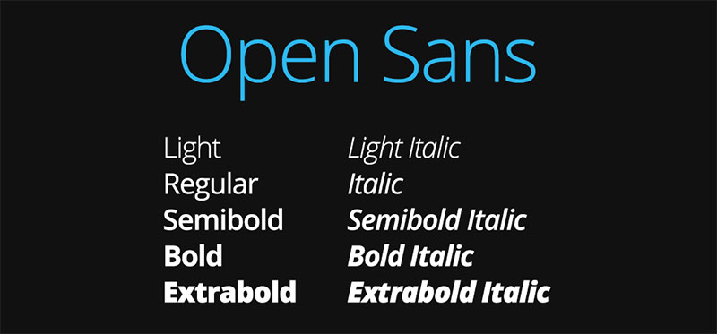
Steve Matteson designed Open Sans through Ascender Corporation, later commissioned by Google. Released in 2010 and updated in 2011, it became one of the most widely used fonts on the web with over 18 million website implementations.
Core Characteristics
Humanist sans-serif optimized for screen readability and cross-platform consistency.
Neutral appearance with open apertures and upright stress. Wide character proportions improve legibility at small sizes. Features slightly taller lowercase than many competitors. Clean, straightforward design avoids stylistic flourishes. Open counters prevent character confusion at low resolutions. Includes both normal and condensed width options.
Use Cases
Body text for websites and digital applications
User interfaces requiring neutral, readable typography
Long-form content and article layouts
Cross-platform documents needing consistent rendering
Technical Specifications
- Weights: 5 (Light, Regular, Semi-Bold, Bold, Extra Bold)
- Styles: 10 (weights plus italics)
- Widths: 2 (Normal, Condensed)
- Format support: TTF, WOFF, WOFF2
- Character count: 900+ including Cyrillic and Greek
- Language support: Extended Latin, Greek, Cyrillic
- License: Apache License 2.0 (free for commercial use)
- Platform: Google Fonts
- Designer: Steve Matteson (Ascender)
Comparison to Montserrat
Open Sans prioritizes neutrality and readability while Montserrat offers more character and personality. Open Sans features wider proportions and larger x-height compared to Montserrat’s more balanced geometric structure. Both provide similar weight ranges but Open Sans includes condensed variants. Character terminals differ, with Open Sans using more traditional endings versus Montserrat’s geometric precision. Open Sans dominates body text applications while Montserrat serves both display and text equally well.
Best For
Website body text requiring maximum readability
Professional documents needing universal compatibility
UI design where neutrality enhances usability
Projects replacing Arial or Helvetica with modern alternative
Poppins
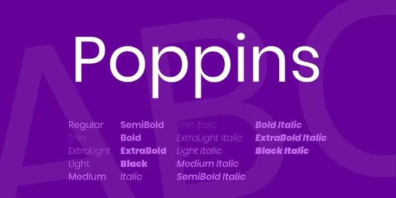
Indian Type Foundry designed Poppins as a geometric sans-serif supporting both Latin and Devanagari scripts. The rounded, open letterforms create versatile, approachable typography suitable for international projects.
Core Characteristics
Geometric sans-serif with rounded terminals and open apertures.
Clean, modern design with circular forms and balanced proportions. Monolinear stroke weight creates consistent texture. Characters feature slightly rounded endings softening geometric rigidity. Large x-height improves readability at smaller sizes. Open counters in letters like “e” and “a” enhance legibility. The design maintains geometric purity while adding subtle warmth.
Use Cases
Branding requiring modern, friendly aesthetic
Web design targeting international audiences
Mobile apps needing clean, readable interface typography
Editorial design combining headlines and body text
Technical Specifications
- Weights: 9 (Thin, Extra Light, Light, Regular, Medium, Semi-Bold, Bold, Extra Bold, Black)
- Styles: 18 (weights plus italics)
- Format support: TTF, WOFF, WOFF2, variable font
- Character support: Latin and Devanagari scripts
- Language support: Wide range including international markets
- License: SIL Open Font License
- Platform: Google Fonts
- Designer: Indian Type Foundry
Comparison to Montserrat
Both offer geometric foundations with nine weight options. Poppins features more pronounced circular forms while Montserrat maintains slightly squared proportions. Rounded terminals give Poppins softer appearance versus Montserrat’s crisp geometric endings. Poppins includes Devanagari script support, expanding language coverage beyond Montserrat’s Latin focus. Character spacing and proportions differ slightly, with Poppins appearing more open. Both work well for display and body text applications.
Best For
International branding projects requiring script flexibility
Contemporary web design emphasizing approachability
App interfaces needing friendly, modern typography
Projects replacing geometric faces while adding warmth
Helvetica Neue
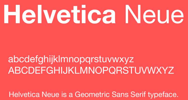
Helvetica Neue represents the refined evolution of Max Miedinger’s original 1957 Helvetica design. D. Stempel AG released this rationalized version in 1983, expanding the family with improved consistency across weights and widths.
Core Characteristics
Neo-grotesque sans-serif with improved optical consistency across weights.
Neutral, clean letterforms with minimal stylistic detail. Tight spacing creates efficient text color. Uniform stroke weights with subtle optical corrections. Characters feature closed apertures and high x-height. Rationalized design system ensures predictable weight progression. The evolution corrected inconsistencies present in original Helvetica while maintaining its essential neutrality.
Use Cases
Corporate branding requiring timeless neutrality
Editorial design and magazine layouts
Government and institutional communications
Product packaging and label design
Technical Specifications
- Weights: Multiple (varies by version, typically Ultra Light through Black)
- Widths: Multiple (Condensed, Normal, Extended)
- Format support: OTF, TTF
- License: Commercial (Linotype/Monotype)
- Character support: Extended Latin, Greek, Cyrillic
- System availability: macOS, iOS (pre-San Francisco)
- Variants: Helvetica Neue Condensed, Extended
Comparison to Montserrat
Helvetica Neue represents Swiss rationalism while Montserrat draws from Buenos Aires vernacular. Both feature clean, geometric structures but Helvetica Neue maintains tighter spacing and more closed apertures. Montserrat offers warmer, more open character than Helvetica Neue’s neutral precision. Commercial licensing distinguishes Helvetica Neue from Montserrat’s free availability. Weight progression differs, with Helvetica Neue providing more systematic optical sizing. Character terminals show greater distinction, with Montserrat’s geometric approach versus Helvetica Neue’s refined grotesque details.
Best For
Professional branding requiring established credibility
Corporate communications demanding neutral voice
Projects specifically requiring Helvetica aesthetic
Design systems prioritizing systematic consistency
Nunito

Vernon Adams originally created Nunito in 2011 with three weights. Jacques Le Bailly expanded it to seven weights plus italics in 2017, adding the non-rounded Nunito Sans variant. The rounded sans-serif combines approachable personality with functional readability.
Core Characteristics
Rounded sans-serif with friendly, humanist proportions.
Terminal rounded endings soften geometric structure. Large x-height improves legibility across sizes. Balanced letterforms work for display and text applications. Open counters enhance readability. Monolinear stroke weight creates even texture. The design balances geometric foundation with organic warmth through rounded terminals and subtle humanist details.
Use Cases
User interfaces requiring friendly, approachable typography
Branding for consumer-focused products
Children’s content and educational materials
Web design prioritizing warmth and readability
Technical Specifications
- Weights: 7 (Light, Regular, Medium, Semi-Bold, Bold, Extra Bold, Black)
- Styles: 14 (weights plus italics)
- Family variants: Nunito (rounded), Nunito Sans (non-rounded)
- Format support: TTF, WOFF, WOFF2, OTF
- License: SIL Open Font License
- Platform: Google Fonts
- Designer: Vernon Adams, expanded by Jacques Le Bailly
- Character support: Extended Latin
Comparison to Montserrat
Nunito’s rounded terminals create distinctly softer appearance than Montserrat’s geometric precision. Both serve display and text applications but Nunito projects more friendliness while Montserrat maintains professional neutrality. Weight ranges differ (seven versus nine), with Montserrat offering more granular options. Nunito Sans variant provides alternative to rounded version while Montserrat maintains single geometric approach. Character construction varies, with Nunito’s humanist touches contrasting Montserrat’s consistent geometric structure.
Best For
Consumer brand identities requiring approachable personality
Educational platforms and children’s applications
UI design emphasizing friendly user experience
Projects transitioning from geometric faces while adding warmth
Lato

Łukasz Dziedzic designed Lato in 2010, releasing it through Google Fonts. The name means “summer” in Polish. The semi-rounded sans-serif balances warmth with professional clarity, making it one of the most popular fonts for web applications.
Core Characteristics
Humanist sans-serif with semi-rounded details.
Slightly rounded corners soften letterforms without full rounded terminals. Classical proportions with modern details. Open apertures and generous spacing improve legibility. Tall x-height optimized for screen readability. Characters maintain traditional forms with contemporary refinement. Strong structure supports both display and extended text applications.
Use Cases
Website body text and long-form content
Corporate communications requiring warmth
Presentation materials and slide decks
Marketing materials blending professionalism with approachability
Technical Specifications
- Weights: 5 standard (Thin, Light, Regular, Bold, Black)
- Styles: 10 (weights plus italics)
- Complete family: 16 fonts on Google Fonts, 32 total
- Format support: TTF, WOFF, WOFF2, OTF
- Character support: ISO-Adobe, extended Latin, Central European
- Language support: Baltic, Romanian, Turkish
- License: SIL Open Font License
- Platform: Google Fonts
- Designer: Łukasz Dziedzic
Comparison to Montserrat
Both combine geometric foundations with humanist refinements but Lato emphasizes warmer, more traditional proportions. Lato’s semi-rounded details create softer appearance than Montserrat’s crisp geometric structure. Weight offerings differ, with Montserrat providing nine weights versus Lato’s five standard weights. Character construction varies, with Lato maintaining more classical sans-serif traditions while Montserrat references architectural signage. Both excel in web applications but serve different aesthetic needs.
Best For
Website typography requiring extended readability
Corporate branding balancing warmth and professionalism
Multilingual projects needing broad language support
Presentations and materials requiring versatile type system
Futura

Paul Renner designed Futura in 1927, released by Bauer Type Foundry. This geometric sans-serif became the definitive expression of Bauhaus design principles, influencing countless typefaces including Montserrat itself.
Core Characteristics
Pure geometric sans-serif based on circles, triangles, and squares.
Letterforms constructed from simple geometric shapes. Perfect circles form “o” and related characters. Single-story lowercase “a” and geometric “g” reflect strict geometric principles. Minimal stroke weight variation creates monolinear appearance. High art deco influence with rationalist Bauhaus philosophy. The design represents modernist ideals of form following function.
Use Cases
Luxury branding requiring elegant minimalism
Editorial design and magazine layouts
Poster design and display typography
Projects requiring timeless modernist aesthetic
Technical Specifications
- Weights: Varies by version (typically Light, Book, Medium, Bold, Heavy)
- Widths: Normal, Condensed
- Format support: OTF, TTF
- License: Commercial (various distributors)
- Historical significance: Original 1927 design
- Language support: Extended Latin
- Variants: Multiple versions from different foundries
Comparison to Montserrat
Montserrat draws direct inspiration from Futura’s geometric principles but adds humanist refinements. Futura maintains pure geometric construction while Montserrat incorporates optical corrections for improved readability. Character proportions differ, with Futura’s strict geometry versus Montserrat’s more balanced approach. Both share single-story “a” and geometric foundations but Montserrat softens Futura’s rigidity. Weight progression varies, with modern Montserrat offering more weights than many Futura versions.
Best For
Projects requiring authentic modernist aesthetic
Luxury and fashion branding
Historical or period-appropriate design work
Display applications where geometric purity enhances message
Source Sans Pro
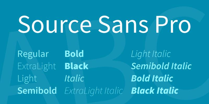
Paul D. Hunt designed Source Sans Pro for Adobe in 2012, releasing it as Adobe’s first open-source typeface family. The humanist sans-serif was specifically optimized for screen readability and user interfaces.
Core Characteristics
Humanist sans-serif with large x-height and open apertures.
Characters feature subtle stroke weight variation adding warmth to geometric foundation. Open counters and generous spacing improve legibility at small sizes. Traditional proportions balanced with contemporary details. Multiple weights provide comprehensive typographic system. Design specifically addresses screen rendering challenges while maintaining print quality.
Use Cases
User interface design and digital products
Website body text and long-form content
Technical documentation and software interfaces
Corporate communications requiring readable, professional typography
Technical Specifications
- Weights: 6 (Extra Light, Light, Regular, Semi-Bold, Bold, Black)
- Styles: 12 (weights plus italics)
- Format support: OTF, TTF, WOFF, WOFF2, variable font
- Character count: Extensive including fractions, ligatures
- Language support: Extended Latin, Greek, Cyrillic, Vietnamese
- OpenType features: Ligatures, tabular figures, fractions
- License: SIL Open Font License
- Platform: Adobe Fonts, Google Fonts
- Designer: Paul D. Hunt (Adobe)
Comparison to Montserrat
Source Sans Pro emphasizes readable functionality while Montserrat balances display and text applications. Both offer similar weight ranges but Source Sans Pro includes more extensive OpenType features. Character construction differs, with Source Sans Pro’s humanist proportions versus Montserrat’s geometric foundation. Source Sans Pro’s large x-height creates different text color than Montserrat’s more balanced proportions. Both work well for digital applications but serve different aesthetic priorities.
Best For
Software interfaces and application design
Technical documentation requiring extended readability
Digital products prioritizing user experience
Projects replacing system fonts with modern alternatives
JUST Sans
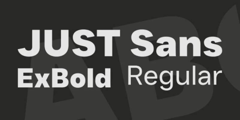
JUST Sans represents contemporary geometric minimalism, though specific designer attribution remains limited in available documentation. The typeface emphasizes clean geometry and straightforward communication.
Core Characteristics
Clean geometric sans-serif with minimal stylistic variation.
Straightforward letterforms with consistent stroke weights. Open apertures and balanced proportions. Characters maintain geometric foundation with subtle humanist adjustments. Neutral design suitable for wide range of applications. The aesthetic prioritizes clarity and modern simplicity over decorative elements.
Use Cases
Modern branding requiring clean aesthetic
Web design emphasizing minimalism
Editorial applications needing straightforward typography
Corporate communications prioritizing clarity
Technical Specifications
- Available weights: Multiple (specific count varies by source)
- Format support: Web fonts, desktop formats
- Design approach: Geometric sans-serif
- Aesthetic: Minimalist, contemporary
- Applications: Print and digital
Comparison to Montserrat
Both emphasize geometric foundations and clean letterforms. JUST Sans maintains more neutral character while Montserrat offers slightly more personality through its Buenos Aires signage inspiration. Weight ranges and availability differ based on licensing options. Character construction similarities suggest both serve similar contemporary design needs. Both work across display and text applications with geometric precision.
Best For
Contemporary branding projects
Minimalist design applications
Digital interfaces requiring clean typography
Projects prioritizing geometric clarity
Focus Grotesk
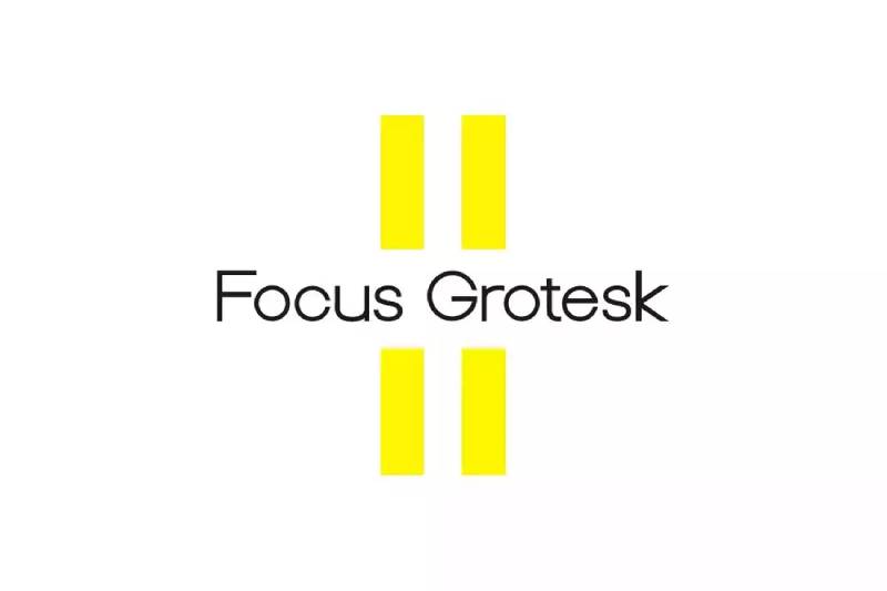
Focus Grotesk represents modern grotesk traditions with contemporary refinements, designed for digital and print applications requiring neutral, functional typography.
Core Characteristics
Neo-grotesk sans-serif with refined, contemporary proportions.
Characters feature balanced letterforms with subtle optical corrections. Clean construction with minimal decorative elements. Open apertures improve readability. Consistent stroke weights create even texture. The design updates traditional grotesk principles for modern applications while maintaining essential neutrality.
Use Cases
Editorial design and magazine layouts
Corporate branding requiring professional neutrality
Web typography prioritizing readability
Marketing materials needing versatile type system
Technical Specifications
- Design classification: Neo-grotesk sans-serif
- Aesthetic approach: Contemporary, neutral
- Format support: Digital and print formats
- Applications: Editorial, branding, web
Comparison to Montserrat
Both offer contemporary sans-serif solutions but Focus Grotesk leans toward neo-grotesk traditions while Montserrat emphasizes geometric construction. Character proportions differ, with Focus Grotesk maintaining more traditional grotesk letterforms. Both serve professional applications but address different stylistic needs. Weight availability and specific character details vary based on family offerings.
Best For
Editorial projects requiring neutral typography
Corporate identity systems
Professional communications
Web applications prioritizing function over personality
Exensa Grotesk
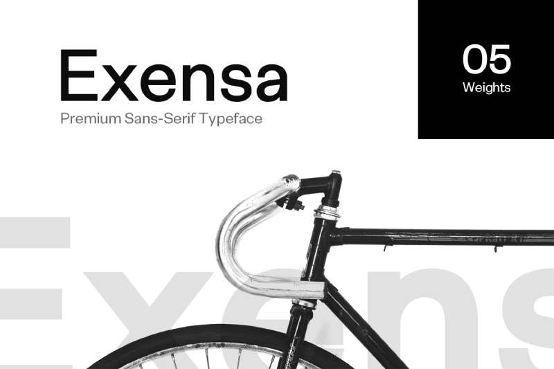
Jean P. Johnson designed Exensa Grotesk for Fontastica (Designova), drawing inspiration from Swiss Design principles. The authentic sans-serif maintains elegant proportions while providing versatile weight options.
Core Characteristics
Swiss-inspired sans-serif with refined proportions.
Clean letterforms reference Swiss typographic traditions. Balanced character construction with consistent stroke weights. Modern interpretation of classic grotesk principles. Characters feature open apertures and clear geometric structure. Premium quality with attention to spacing and kerning details. The design combines Swiss rationalism with contemporary refinement.
Use Cases
Headlines and display typography
Editorial page content
Brand identity systems
Web design requiring elegant sans-serif
Technical Specifications
- Weights: 5 (Light, Regular, Bold, Extra Bold, Black)
- Styles: 10 (weights plus italics)
- Format support: OTF, TTF, WOFF, WOFF2, EOT, SVG
- Character count: 303 glyphs (version 2.0)
- Language support: Western European, Central European
- Designer: Jean P. Johnson
- Foundry: Fontastica (Designova)
- License: Commercial
Comparison to Montserrat
Both provide comprehensive weight ranges and Swiss design influences. Exensa Grotesk emphasizes refined elegance while Montserrat references urban architectural lettering. Character construction similarities reflect shared geometric foundations. Weight offerings nearly identical (five versus nine weights). Both serve headline and body text applications. Licensing differs, with Exensa Grotesk requiring commercial purchase versus Montserrat’s free availability.
Best For
Projects requiring Swiss design aesthetic
Professional brand identities
Editorial applications needing refined typography
Web design emphasizing elegant sans-serif
TT Norms Pro
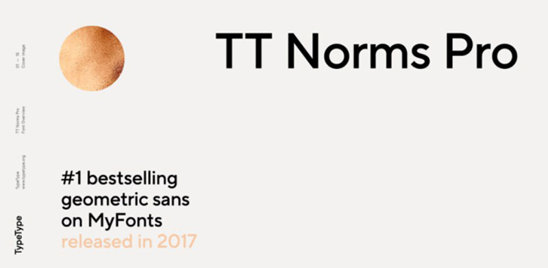
TypeType foundry developed TT Norms Pro as a versatile geometric sans-serif supporting extensive language coverage and comprehensive weight options.
Core Characteristics
Geometric sans-serif with humanist refinements and extended language support.
Balanced letterforms combine geometric precision with readable proportions. Open apertures and generous spacing. Characters feature consistent construction with optical corrections for improved legibility. Contemporary design suitable for branding and interface applications. The family provides comprehensive typographic system with multiple weights and styles.
Use Cases
Brand identity systems
User interface design
Editorial applications
Multilingual projects
Technical Specifications
- Design classification: Geometric sans-serif
- Foundry: TypeType
- Language support: Extended (multiple scripts)
- Weight range: Comprehensive family
- Format support: Modern font formats
- License: Commercial (TypeType)
Comparison to Montserrat
Both offer geometric foundations with comprehensive weight ranges. TT Norms Pro provides more extensive language support through TypeType’s multilingual focus. Character construction similarities suggest parallel design goals. Both serve contemporary branding and interface needs. Licensing requirements differ, with TT Norms Pro requiring commercial licensing. Weight offerings and specific character details vary based on family specifications.
Best For
Multilingual brand systems
Interface design projects
Contemporary branding applications
Projects requiring comprehensive type families
TT Commons Pro
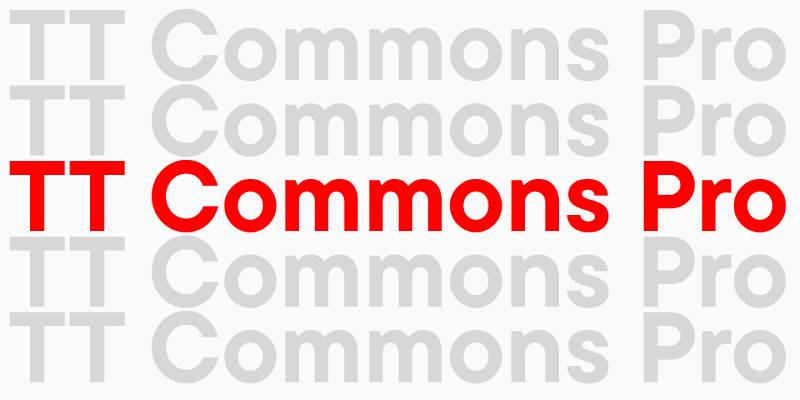
TypeType created TT Commons Pro as a universal sans-serif addressing diverse typographic needs across languages and applications. The design emphasizes versatility and functional clarity.
Core Characteristics
Universal sans-serif with balanced, neutral design.
Characters feature minimal contrast and geometric foundations. Closed apertures create distinct character from more open alternatives. Traditional proportions adapted for contemporary applications. Comprehensive weight range supports diverse hierarchy needs. The design prioritizes versatility across multiple contexts and languages.
Use Cases
Corporate branding systems
Editorial design
Interface typography
Multilingual communications
Technical Specifications
- Design classification: Universal sans-serif
- Foundry: TypeType
- Aesthetic: Neutral, versatile
- Language support: Extended coverage
- Weight range: Comprehensive
- License: Commercial (TypeType)
Comparison to Montserrat
Both provide versatile sans-serif solutions for contemporary needs. TT Commons Pro emphasizes universal neutrality while Montserrat offers more character through signage inspiration. Character apertures differ, with TT Commons Pro featuring more closed construction. Both serve similar application ranges but address different aesthetic priorities. Language support varies, with TT Commons Pro potentially offering broader script coverage.
Best For
Corporate identity requiring neutral voice
Multilingual projects
Editorial applications needing versatile typography
Projects prioritizing functional clarity
Celesta
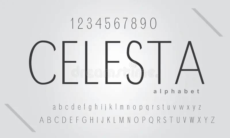
Celesta offers contemporary typographic solutions, though comprehensive technical documentation remains limited in readily accessible sources. The typeface appears designed for modern applications.
Core Characteristics
Modern typeface design with contemporary proportions.
Characters emphasize clean construction and functional readability. The aesthetic aligns with current design trends while maintaining practical application versatility. Specific design features require additional documentation for detailed technical analysis.
Use Cases
Modern branding projects
Contemporary design applications
Digital media
Editorial design
Technical Specifications
Technical specifications require additional source documentation for comprehensive details. The typeface supports modern font formats and contemporary design applications.
Comparison to Montserrat
Both address contemporary design needs with modern proportions. Specific character construction details require detailed specimen comparison. Application ranges likely overlap in modern branding and digital design contexts. Weight offerings and technical features require additional verification for accurate comparison.
Best For
Contemporary design projects
Modern branding applications
Digital design work
Projects requiring current aesthetic
Herz
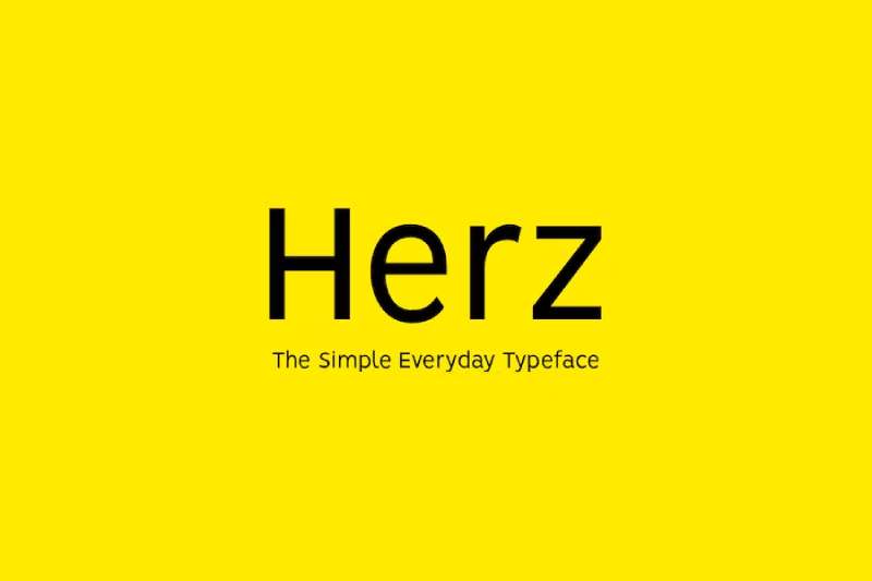
Herz represents specialized typographic design, though comprehensive public documentation remains limited. The typeface addresses specific design needs within contemporary typography.
Core Characteristics
Specialized typeface with distinctive design approach.
Characters feature unique construction addressing particular design requirements. The aesthetic differs from standard geometric sans-serifs while maintaining functional readability. Specific design features and technical specifications require additional source documentation.
Use Cases
Specialized design projects
Distinctive branding applications
Projects requiring unique typographic voice
Designs prioritizing character over neutrality
Technical Specifications
Comprehensive technical specifications require additional source documentation. The typeface supports modern applications with contemporary font format compatibility.
Comparison to Montserrat
Comparison requires detailed specimen analysis for accurate character construction evaluation. Both serve contemporary design needs but likely address different aesthetic priorities. Application contexts may vary based on specific design requirements and character personality differences.
Best For
Projects requiring distinctive typography
Specialized branding applications
Designs prioritizing unique character
Applications where personality enhances message
FAQ on Fonts Similar To Montserrat
What free fonts look most like Montserrat?
Raleway, Poppins, and Nunito offer the closest match on Google Fonts. Raleway shares geometric proportions with elegant letterforms. Poppins provides similar weight ranges with rounded terminals. Nunito adds friendly warmth while maintaining comparable structure and readability across applications.
Is Proxima Nova better than Montserrat?
Proxima Nova offers more width variations (five versus one) and extensive language support including Greek, Cyrillic, and Vietnamese. It provides 80 fonts total with refined optical adjustments. However, it requires commercial licensing while Montserrat remains free, making “better” dependent on project budget and specific requirements.
Can I use Gotham instead of Montserrat?
Yes, but expect notable differences. Gotham features distinctly lower crossbars on A, R, and P, creating stockier appearance. It offers four width variations and industrial aesthetic rooted in Manhattan architectural lettering. Commercial licensing required. Both work for branding but serve different stylistic needs.
Which font pairs well with Montserrat alternatives?
Pairing fonts requires contrast. Combine geometric alternatives like Raleway or Poppins with serif body text such as Merriweather or Lora. Use the geometric face for headlines and the serif for body content. This creates clear visual hierarchy while maintaining readability across digital and print applications.
What’s the difference between Avenir and Montserrat?
Avenir predates Montserrat by 26 years with more humanist refinements. Vertical strokes are heavier than horizontals in Avenir. The “o” isn’t a perfect circle. Avenir includes extensive OpenType features and ships as a system font on macOS/iOS, offering performance advantages for native applications.
Are there Montserrat alternatives for body text?
Open Sans, Lato, and Source Sans Pro excel at body text applications. Open Sans provides maximum readability with neutral appearance. Lato balances warmth with professional clarity. Source Sans Pro offers large x-height and open apertures specifically optimized for screen rendering and extended reading.
Which Montserrat alternative works best for mobile apps?
Roboto dominates mobile interfaces as Android’s system font. It includes 800+ glyphs, multiple family variants (Condensed, Mono, Slab), and optimized screen rendering. Inter provides excellent alternative with better spacing than neo-grotesque competitors. Both offer free licensing and comprehensive weight ranges for UI hierarchy.
How do I choose between similar geometric fonts?
Evaluate weight range, licensing costs, language support, and character personality. Test fonts at actual implementation sizes. Consider kerning quality and OpenType features. Match font characteristics to brand personality. Free alternatives work for most projects, while premium options offer refinement and extensive families.
What makes Futura different from modern alternatives?
Futura maintains pure geometric construction from 1927 Bauhaus principles. Perfect circles form “o” and related characters. Modern alternatives like Montserrat add optical corrections for improved readability. Futura represents historical authenticity while contemporary fonts balance geometry with functional legibility. Choose Futura for period-appropriate or luxury applications.
Can I replace Helvetica with these Montserrat alternatives?
Partially. Helvetica represents neo-grotesque traditions with tighter spacing and closed apertures. Montserrat alternatives lean geometric with more open construction. For Helvetica replacements, consider Inter, Roboto, or Open Sans rather than geometric options. These maintain similar neutrality and proportions while offering free font licensing and modern features.
Conclusion
Fonts similar to Montserrat span from premium powerhouses like Proxima Nova to accessible Google Fonts alternatives. Each brings distinct personality while maintaining the geometric foundations that make modern sans-serifs work across digital and print.
Your choice depends on specific project requirements. Budget constraints point toward Raleway or Poppins. Multilingual needs favor Source Sans Pro or Avenir Next.
Corporate branding might demand Gotham’s authority or Helvetica Neue’s neutrality.
The best typeface matches your message. Test candidates at actual implementation sizes with real content. Consider tracking, leading, and font weight combinations.
Strong typography establishes brand guidelines and creates memorable graphic design work. The alternatives presented here provide solid foundations for any contemporary project.
If you enjoyed reading this article about fonts similar to Montserrat, you should check out these articles with fonts similar to Gotham, Calibri, Trajan, Rockwell, Baskerville, Oswald, and Brandon Grotesk.

Renowned for his expertise in logo design and visual branding, Bogdan has developed a multitude of logos for various clients.
His skills extend to creating posters, vector illustrations, business cards, and brochures. Additionally, Bogdan's UI kits were featured on marketplaces like Visual Hierarchy and UI8.
He also wrote in the past years on sites like Design Your Way, WebDesignerDepot, WPDean, Designmodo, Speckyboy, Slider Revolution, and more.
- Best Visual Regression Testing Tools for Web and App Design in 2026 - 13 October 2026
- Jujutsu Kaisen Font Generator - 12 October 2026
- The Windsurf Logo History, Colors, Font, And Meaning - 10 October 2026

Bogdan Sandu is a seasoned designer who has been designing websites since 2008. Renowned for his expertise in logo design and visual branding, Bogdan has developed a multitude of logos for various clients. His skills extend to creating posters, vector illustrations, business cards, and brochures. Additionally, Bogdan's UI kits were featured on marketplaces like Visual Hierarchy and UI8. He also wrote in the past years on sites like Design Your Way, WebDesignerDepot, WPDean, Designmodo, Speckyboy, Slider Revolution, and more.
You Might Also Like