


Since 1857, The Atlantic magazine covers have done something most publications only dream about. They start conversations that last for years.
From Ta-Nehisi Coates’ reparations essay to the typography-free October 2024 issue illustrated by Justin Metz, the magazine’s cover art has consistently pushed editorial design forward. Some of these covers broke single-day traffic records. Others won ASME awards. A few changed public policy.
This article breaks down the most notable Atlantic covers, looking at the art direction, the cover stories behind them, and why each one mattered. Whether you’re interested in magazine cover design, editorial illustration, or just the history of one of America’s longest-running publications, you’ll find something worth your time here.
The Atlantic Magazine Covers
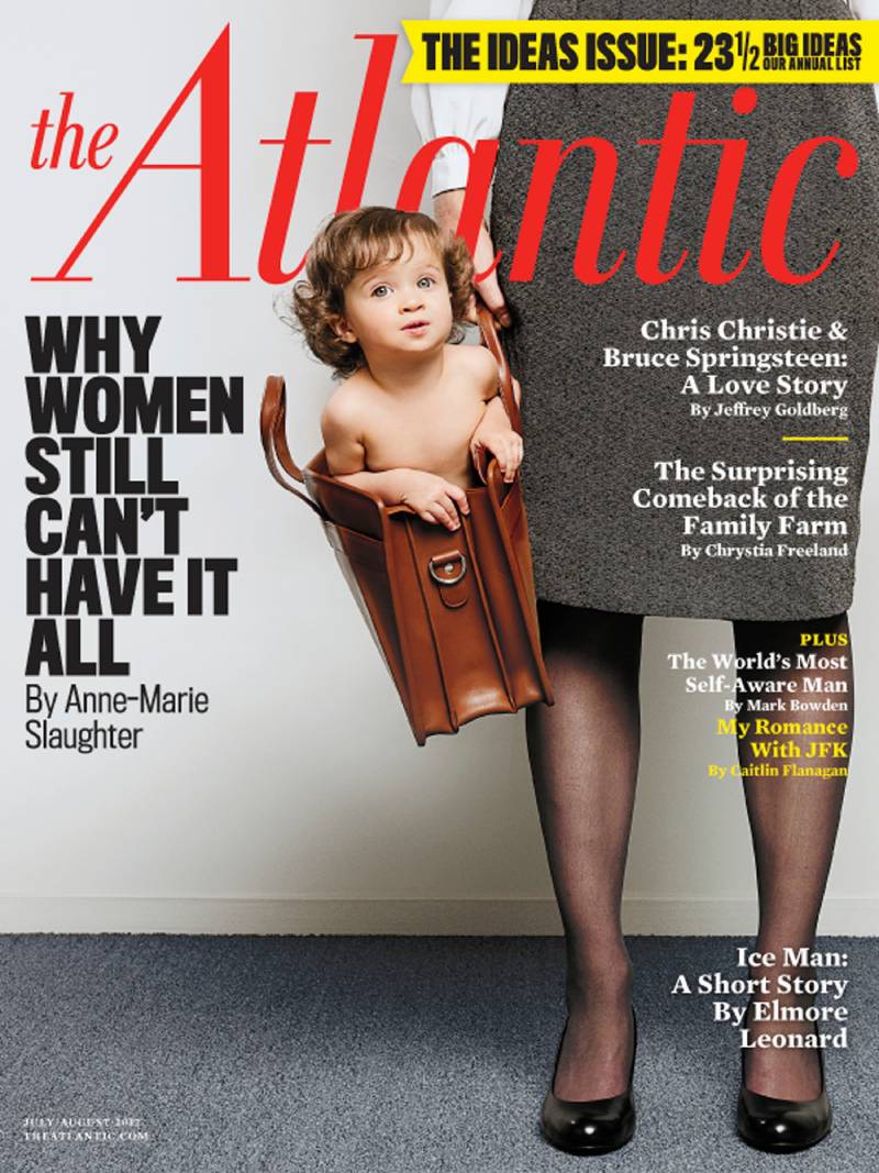
“Why Women Still Can’t Have It All” (July/August 2012)
Issue Date and Theme
Published in the July/August 2012 issue. The theme tackled whether women can successfully balance a high-powered career and family life. At the time, this was already a tired debate. But Anne-Marie Slaughter, a Princeton professor and former State Department official, made it feel urgent again.
Cover Art and Visual Description
The cover featured a stark, text-heavy design with the bold headline front and center. A baby dangling from a briefcase handle became one of the most talked-about editorial images of the decade. The typography choices leaned heavily on simplicity, letting the provocative title do the heavy lifting.
Artist or Photographer
Art directed by the magazine’s in-house design team under Creative Director Darhil Crooks.
Cover Story Summary
Slaughter argued that women in top positions face structural barriers that make true work-life balance nearly impossible. She wrote from personal experience, having left her State Department role to be closer to her teenage sons in New Jersey.
The piece hit a nerve. It became the most-read article in the magazine’s entire history at the time, attracting over a million online readers within days.
Why This Cover Stands Out
It reignited a national conversation about feminism, workplace policy, and institutional barriers for women. The cover story led to Slaughter’s 2015 book Unfinished Business and shifted public discourse around parental leave and flexible work.
Design and Layout Choices
The cover line was deliberately provocative. The art direction used a clean layout with strong visual hierarchy, making sure the headline was impossible to ignore on the newsstand. No clutter. Just a sharp message and a single arresting image.
“A Case for Reparations” (June 2014)

Issue Date and Theme
June 2014 issue. Writer Ta-Nehisi Coates spent two years reporting this 16,000-word essay on slavery, housing discrimination, and the economic plunder of Black Americans.
Cover Art and Visual Description
The cover went with a close-up photographic portrait approach, creating an immediate sense of intimacy and gravity. The design was paired with serif font headlines that gave the cover a classic, authoritative weight.
Artist or Photographer
Creative Director Darhil Crooks led the design, with associate art director Jackie Lay contributing to the multimedia rollout. The Atlantic also produced two mini-documentaries and interactive maps to accompany the print cover story.
Cover Story Summary
Coates traced the systemic economic exploitation of Black Americans from slavery through Jim Crow to federally backed redlining practices in Chicago. The article focused on Clyde Ross, a man who fought predatory housing contracts in the 1960s.
It set a single-day traffic record for The Atlantic’s website. New York University’s Arthur L. Carter Journalism Institute later named it the “Top Work of Journalism of the Decade.”
Why This Cover Stands Out
This cover brought reparations back into mainstream political conversation. Five years after publication, Coates testified before the U.S. House of Representatives on the issue. The article also inspired Damon Lindelof’s 2019 HBO series Watchmen.
Design and Layout Choices
The layout prioritized the story’s weight with minimal distraction. The entire June issue trailer was devoted to this single article, a first for the magazine. Everything about the presentation signaled that this was a defining moment for the publication.
“Is Google Making Us Stupid?” (July/August 2008)

Issue Date and Theme
July/August 2008 issue. Nicholas Carr’s six-page cover story asked whether the internet was changing how our brains process information.
Cover Art and Visual Description
The cover illustration was created by Guy Billout. The artwork leaned into a slightly surreal, conceptual style. It was a departure from photographic covers, relying on illustration to communicate an abstract idea about cognition and technology.
Artist or Photographer
Illustrator Guy Billout, known for his surrealist editorial work.
Cover Story Summary
Carr argued that constant internet browsing was eroding our ability to read deeply and think carefully. He compared the shift to becoming a “guy on a Jet Ski” rather than a deep-sea diver in information.
The essay was later expanded into his 2010 book The Shallows, which was a Pulitzer Prize finalist.
Why This Cover Stands Out
This was one of the earliest mainstream pieces to question the cognitive cost of digital life. It sparked a massive debate, with responses from neuroscientists, tech executives, and media critics. Even Google’s own chief economist weighed in.
Design and Layout Choices
The emphasis was placed on the provocative question in the headline. The editorial illustration style helped set a more thoughtful, intellectual tone compared to the typical newsstand cover.
October 2024 Trump Cover

Issue Date and Theme
October 2024 issue, focusing on the threats posed by a potential second Trump term. This cover accompanied reporting by Anne Applebaum, Tim Alberta, and several other Atlantic staff writers.
Cover Art and Visual Description
A dark, dystopian illustration showing a circus wagon heading toward the Capitol. A caged elephant (the Republican Party symbol) sat behind bars. A raven perched in a dead tree. The entire scene drew from the visual language of Ray Bradbury’s Something Wicked This Way Comes and Stephen King paperback covers.
Most remarkable: no headline. No cover lines. Just the illustration, a date, and The Atlantic’s logo. This was the first time in the magazine’s 167-year history that a cover appeared without any body text or typographic elements beyond the masthead.
Artist or Photographer
Illustrator Justin Metz, who does extensive editorial illustration work.
Cover Story Summary
The issue contained multiple articles examining what a second Trump presidency might look like, including coverage of antidemocratic actions and the Republican politicians who supported them.
Why This Cover Stands Out
It won the ASME 2025 Best Cover Award from the American Society of Magazine Editors. The cover generated massive debate online, with supporters and critics reading completely different meanings into the same image. That is what good editorial illustration does.
Design and Layout Choices
Removing all text was a radical choice for any print design product, let alone one with 167 years of tradition. The decision placed total trust in the illustration’s ability to communicate the cover story’s mood without a single word of support. The contrast between the dark palette and the lone bright elements created a clear focal point.
“Impeach” (March 2019)

Issue Date and Theme
March 2019 issue. Editor Yoni Appelbaum made the case that Congress should begin impeachment proceedings against Donald Trump.
Cover Art and Visual Description
The cover used a single bold word, “IMPEACH,” set against a clean background. No photographs, no complex illustrations. Just the word. This kind of minimalist design choice takes confidence.
Artist or Photographer
Designed in-house by The Atlantic’s art team, with the typographic treatment doing all the work.
Cover Story Summary
Appelbaum argued that impeachment was a constitutional duty, not just a political weapon. He called it “time for Congress to judge the president’s fitness to serve.” The article traced historical precedent and laid out why delay would be more damaging than action.
Why This Cover Stands Out
The single-word cover was a bold editorial statement. It placed The Atlantic firmly in the political conversation and generated both praise and backlash. Only the third time the magazine had endorsed or directly opposed a sitting president in its history at that point.
Design and Layout Choices
Pure typographic hierarchy in action. No distractions. The oversized word created immediate impact through scale and proportion alone. The white space around the headline amplified its intensity.
“If Trump Wins” Special Issue (2024)
Issue Date and Theme
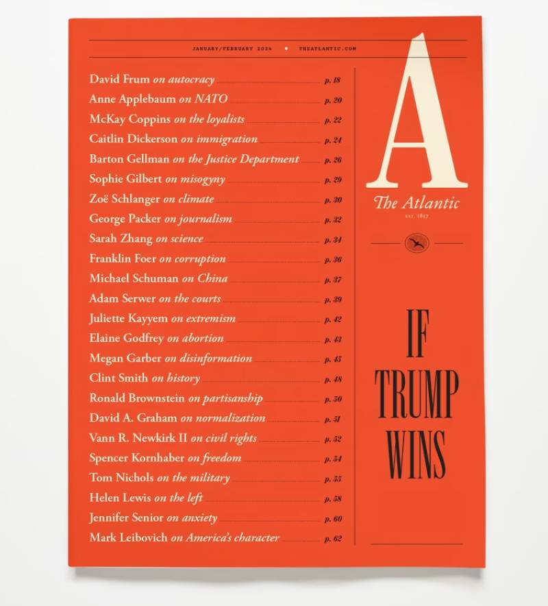
Published in early 2024 as a special multi-article issue. Twenty-four writers contributed articles imagining what a second Trump term would mean for American institutions.
Cover Art and Visual Description
The cover used a bold typographic approach with the phrase “If Trump Wins” set prominently against a striking background. The layout kept the visual alignment tight and direct.
Artist or Photographer
The Atlantic’s in-house design team, focusing on type-driven cover design.
Cover Story Summary
Each of the 24 articles explored a different aspect of a potential second Trump presidency. Topics ranged from foreign policy to civil liberties to the structure of government itself. The issue was designed as a comprehensive warning document.
Why This Cover Stands Out
A 24-article special issue is unusual for any publication. The scale of the effort itself made headlines. It was both a journalistic project and a design challenge, requiring the cover to signal the scope of what was inside.
Design and Layout Choices
The design team had to communicate “comprehensive” without overwhelming the cover. They solved it by keeping the cover text minimal while letting the interior spread carry the complexity. A smart use of balance between cover simplicity and interior depth.
“The Secret Shame of Middle-Class Americans” (May 2016)
Issue Date and Theme
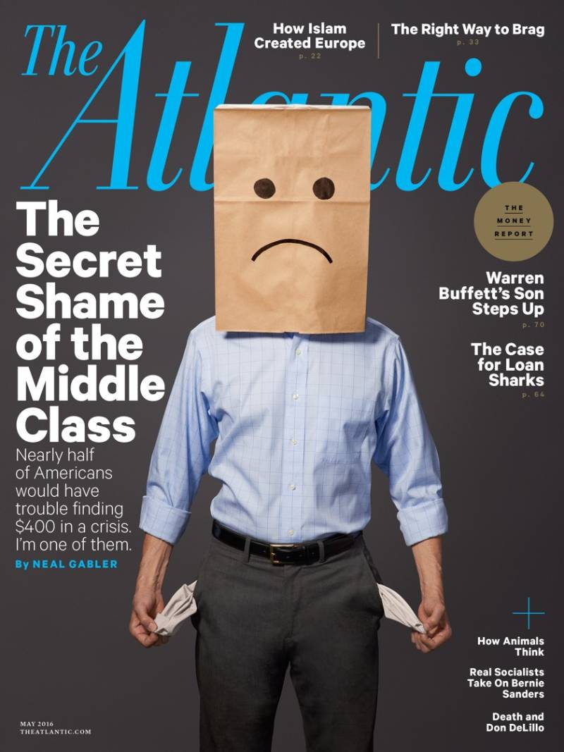
May 2016 issue. Writer Neal Gabler opened up about his own financial fragility, tying it to a Federal Reserve finding that 47% of Americans couldn’t cover a $400 emergency.
Cover Art and Visual Description
The cover design focused on the emotional weight of the story, with a subdued color palette that reflected the shame and anxiety of the subject matter. Clean, no-nonsense editorial design.
Artist or Photographer
Designed by The Atlantic’s art direction team under their standard editorial process.
Cover Story Summary
Gabler admitted he was among the nearly half of Americans who would struggle with a $400 surprise expense. He traced his own financial mistakes, from Brooklyn real estate decisions to private school tuition, while connecting them to broader middle-class economic trends.
The article generated over 3,000 comments and nearly 250,000 social media shares.
Why This Cover Stands Out
Personal confession combined with hard economic data. It turned a Federal Reserve statistic into something readers could feel. The vulnerability of a successful writer admitting he was broke gave the numbers a human face.
Design and Layout Choices
The cover relied on the power of the headline rather than dramatic imagery. The art team used understated design choices to match the story’s tone of quiet desperation. Sometimes restraint communicates more than spectacle.
“As We May Think” (July 1945)

Issue Date and Theme
July 1945 issue. Vannevar Bush, then director of the Office of Scientific Research and Development, published a speculative essay about the future of information technology.
Cover Art and Visual Description
The 1945 cover followed the classic mid-century Atlantic Monthly format. Simple, text-forward, with a traditional masthead design typical of the era’s literary magazines. The typeface was formal and restrained.
Artist or Photographer
Standard Atlantic Monthly editorial design team of the 1940s. Cover art from this era prioritized the table of contents and author names over visual spectacle.
Cover Story Summary
Bush described a hypothetical device called the “Memex,” a desk-sized machine that could store and link vast amounts of information through associative trails. He predicted that future researchers would need tools to manage the growing flood of knowledge.
The essay directly inspired Douglas Engelbart (inventor of the computer mouse and hypertext concepts) and Ted Nelson (who coined the term “hypertext”). It’s often cited as the conceptual blueprint for the modern internet.
Why This Cover Stands Out
Few magazine cover stories have had this kind of lasting real-world impact. Published just as World War II was ending, the article imagined how wartime technology could be redirected toward knowledge and science. It essentially predicted the web, decades before it existed.
Design and Layout Choices
The cover’s simplicity was characteristic of 1940s graphic design movements. No flashy illustration was needed. The strength of the author’s name and the Atlantic Monthly brand carried the issue.
“My Family’s Slave” (June 2017)

Issue Date and Theme
June 2017 issue. Pulitzer Prize-winning journalist Alex Tizon wrote about Eudocia Tomas Pulido, a Filipino woman who lived with his family for 56 years as an unpaid servant. Tizon died suddenly in March 2017, before learning his story had been selected as the cover piece.
Cover Art and Visual Description
The cover featured a haunting portrait photograph of Eudocia “Lola” Pulido taken by Alan Berner of The Seattle Times. The image was direct and unflinching. No digital manipulation or complex gradient effects. Just a face staring back at the reader, demanding acknowledgment.
Artist or Photographer
Photographer Alan Berner, staff photographer at The Seattle Times.
Cover Story Summary
Tizon revealed how his family brought Pulido from the Philippines to the United States in the 1960s. She cooked, cleaned, and raised the children without pay for decades. His parents were cruel to her. The article was both confessional memoir and investigation into modern slavery.
It became the most-read digital article of 2017, receiving nearly 58 million minutes of engaged reading time according to Chartbeat. That’s triple the second-place story for the entire year, across all publications.
Why This Cover Stands Out
The combination of an author who died before publication, a story about modern slavery within a middle-class American family, and the global debate it triggered made this one of the most talked-about magazine covers of the decade. The Atlantic itself called it a return to the publication’s abolitionist roots.
Design and Layout Choices
The portrait-driven cover placed Lola’s face as the undeniable framing device. There was no way to look at the cover without seeing a real person. That was the point. The design team used monochrome colors to strip away distraction and keep the focus on Lola’s expression.
The Atlantic Monthly, Volume 1, Issue 1 (November 1857)

Issue Date and Theme
November 1857. The founding issue of what was then called The Atlantic Monthly, published in Boston by Moses Dresser Phillips and Francis H. Underwood.
Cover Art and Visual Description
The first cover was entirely typographic. No photographs, no illustrations. Just the magazine title, issue details, and a list of contents set in period-appropriate serif typography. The design reflected mid-19th century publishing standards, where a magazine’s credibility came from its contributors, not its imagery.
Artist or Photographer
No individual artist credited. The cover was a product of the printing practices of Phillips, Sampson & Company.
Cover Story Summary
The inaugural issue featured contributions from some of the most prominent American writers of the era, including Ralph Waldo Emerson, Henry Wadsworth Longfellow, Oliver Wendell Holmes Sr., and Harriet Beecher Stowe. The magazine was founded with an explicitly abolitionist mission alongside its literary ambitions.
Why This Cover Stands Out
This is where it all started. A dinner party at the Parker House Hotel in Boston led to a magazine that has been published continuously for over 165 years. The founding issue set the tone for a publication that would balance politics, literature, and cultural commentary for more than a century and a half.
The roster of founders reads like a 19th-century American literature syllabus. That alone makes this cover historically significant, even if the anatomy of the magazine cover was just text on paper.
Design and Layout Choices
All text. No images. The design trusted the names of its contributors and the reputation of its purpose to sell copies. A purely display font-driven approach that now serves as a fascinating time capsule of Victorian-era print publishing aesthetics. The grid system was basic but functional, reflecting the production limitations of the time.
FAQ on The Atlantic Magazine Covers
What is The Atlantic magazine known for?
The Atlantic is an American publication founded in 1857 in Boston. It covers politics, culture, technology, and society through long-form journalism and editorial commentary. Its magazine covers frequently feature award-winning illustration and photography tied to major cover stories.
Who designs The Atlantic magazine covers?
The Atlantic’s in-house art direction team handles most cover design work. Notable contributors include Creative Director Darhil Crooks and illustrator Justin Metz, who created the ASME-winning October 2024 cover. Outside illustrators and photographers are regularly commissioned.
What was the most-read Atlantic cover story ever?
Anne-Marie Slaughter’s “Why Women Still Can’t Have It All” from the July/August 2012 issue held that record initially. Alex Tizon’s “My Family’s Slave” (June 2017) later became the most-read digital article of that year, with 58 million minutes of engaged reading time.
How often does The Atlantic publish new issues?
The Atlantic publishes 10 issues per year as of 2003. It was originally a monthly publication called The Atlantic Monthly. In 2024, editor Jeffrey Goldberg announced a return to monthly print publishing, betting on the lasting appeal of physical magazines.
What is the standard Atlantic magazine cover size?
The Atlantic follows a standard magazine cover size close to 8 x 10.75 inches, which is typical for American newsstand publications. Digital editions adapt these dimensions for tablet and mobile screens while keeping the same cover art and layout.
Who owns The Atlantic?
Laurene Powell Jobs’ Emerson Collective acquired a majority stake in 2017. Before that, David G. Bradley owned the publication from 1999. Jeffrey Goldberg serves as editor-in-chief. The magazine is headquartered in Washington, D.C.
Has The Atlantic ever won awards for its cover design?
Yes. The Atlantic won the ASME 2025 Best Cover Award from the American Society of Magazine Editors for its October 2024 issue. The magazine has also received multiple National Magazine Awards for its editorial content and art direction over the years.
What made the October 2024 Atlantic cover unique?
It was the first cover in The Atlantic’s 167-year history with no headline or body text. Illustrator Justin Metz created a dystopian circus scene inspired by Ray Bradbury and Stephen King paperback aesthetics. Only the masthead and date appeared.
Where can I find archived Atlantic magazine covers?
The Atlantic’s website hosts a full digital archive going back to its 1857 founding issue. Third-party sites like Coverjunkie and EBSCO’s Atlantic Magazine Archive (covering 1857-2014) also catalog historical covers. Back issues are available on eBay and Magzter.
What are some iconic Atlantic cover stories besides politics?
Nicholas Carr’s “Is Google Making Us Stupid?” (2008) tackled technology and cognition. Vannevar Bush’s “As We May Think” (1945) predicted hypertext and the internet. Neal Gabler’s “The Secret Shame” (2016) explored middle-class financial fragility through personal confession.
Conclusion
The Atlantic magazine covers tell a story that goes beyond newsstand appeal. Each one reflects a specific moment in American culture, politics, or public debate, backed by deliberate creative direction and editorial risk-taking.
What separates these covers from most publications is the willingness to break format. A 167-year-old magazine dropping all text from its cover? That takes nerve. A personal confession about financial shame on the front page? That takes trust in readers.
The combination of strong cover illustration, sharp art direction, and long-form journalism gives The Atlantic a visual identity that few competitors can match. Publications like Time Magazine and The New Yorker play in the same space, but The Atlantic’s approach to storytelling through cover design remains distinct.
If you’re studying editorial design or magazine publishing, these covers are worth your attention.

Renowned for his expertise in logo design and visual branding, Bogdan has developed a multitude of logos for various clients.
His skills extend to creating posters, vector illustrations, business cards, and brochures. Additionally, Bogdan's UI kits were featured on marketplaces like Visual Hierarchy and UI8.
He also wrote in the past years on sites like Design Your Way, WebDesignerDepot, WPDean, Designmodo, Speckyboy, Slider Revolution, and more.
- Jujutsu Kaisen Font Generator - 12 October 2026
- The Windsurf Logo History, Colors, Font, And Meaning - 10 October 2026
- How to Remove Background From Product Photos (No Photoshop) - 10 October 2026

Bogdan Sandu is a seasoned designer who has been designing websites since 2008. Renowned for his expertise in logo design and visual branding, Bogdan has developed a multitude of logos for various clients. His skills extend to creating posters, vector illustrations, business cards, and brochures. Additionally, Bogdan's UI kits were featured on marketplaces like Visual Hierarchy and UI8. He also wrote in the past years on sites like Design Your Way, WebDesignerDepot, WPDean, Designmodo, Speckyboy, Slider Revolution, and more.
You Might Also Like


