The Nebius logo represents one of Europe’s most ambitious AI infrastructure companies. A visual identity built for the cloud computing age.
Nebius emerged from Yandex’s international operations in 2022, establishing itself as an independent entity headquartered in Amsterdam. The company focuses on GPU cloud services and machine learning platforms.
The current logo debuted alongside the company’s public launch. It features a clean wordmark design that signals technical sophistication without unnecessary complexity. As a visual symbol for the brand, it needed to work across digital platforms, investor presentations, and developer documentation.
Nebius has maintained one primary logo version since its founding. The company trades on NASDAQ under the ticker NBIS.
What Is the Nebius Logo?
The Nebius logo is a custom wordmark featuring the company name in a geometric sans-serif typeface. Introduced in 2022 during the company’s spin-off from Yandex, it uses a deep purple color palette that distinguishes Nebius within the AI infrastructure sector.
Design Attributes:
- Design Type: Wordmark (text-based logo without accompanying symbol)
- Primary Elements: Custom letterforms spelling “nebius” in lowercase
- Official Introduction: 2022
- Designer/Agency: Not publicly disclosed
- Trademark Status: Registered trademark of Nebius Group N.V.
- Color Palette: Primary purple (#6B4EFF approximate), white for reversed applications
- Usage Context: Corporate website, cloud platform interface, NASDAQ listings, press materials, developer documentation, and partnership announcements
How Has the Nebius Logo Evolved Over Time?
The Nebius logo has remained consistent since the company’s founding. Unlike established tech brands with decades of visual history, Nebius launched with a fully formed identity.
This single-version approach reflects the company’s recent establishment. No major redesigns have occurred.
The brand emerged already refined, skipping the typical startup-to-enterprise visual evolution many technology companies experience.
Original Nebius Logo (2022-Present)
- Years Active: 2022 to present
- Design Description: Lowercase wordmark with rounded geometric letterforms. The letters have consistent stroke widths and subtle curves at terminals.
- Color Scheme: Deep purple primary, white secondary for dark backgrounds
- Designer: Agency not publicly credited
- Context: Created for the company’s independence from Yandex and subsequent NASDAQ listing. The identity needed to signal fresh beginnings while projecting enterprise credibility.
- Key Changes from Previous: Not applicable. This is the founding logo.
- Cultural Significance: Represents European ambition in AI infrastructure, a sector dominated by American and Chinese players. The purple color choice deliberately avoids the blues and greens saturating tech branding.
What Do the Design Elements of the Nebius Logo Mean?
The Nebius logo communicates through restraint. Every element serves the message of technical capability without visual noise.
Lowercase letters suggest approachability. The geometric forms hint at precision engineering.
Purple coloring positions the brand as creative yet authoritative. It’s a deliberate departure from typical cloud computing visuals.
Why Did Nebius Choose These Specific Colors?
Purple carries weight in how colors affect perception. It bridges the gap between warm and cool, energy and calm.
The specific shade Nebius uses leans toward violet. This suggests innovation and forward thinking.
Most AI companies default to blue (trust, stability) or green (growth, eco-friendliness). Nebius went purple to stand apart in a crowded field.
Color Specifications:
- Primary Purple: Approximate Hex #6B4EFF. Conveys creativity, ambition, and technological sophistication. Creates instant recognition against competitor palettes.
- White: Used for reversed logo applications on dark backgrounds and within the cloud platform interface.
What Typography Style Is Used in the Nebius Logo?
The wordmark uses a custom sans-serif letterform design. No serifs, no decorative elements.
Stroke widths stay uniform throughout. This creates visual consistency across different sizes.
The lowercase treatment feels modern and accessible. It avoids the corporate stiffness of all-caps alternatives. Rounded terminals soften the geometric foundation.
What Are the Hidden Meanings in the Nebius Logo?
The name “Nebius” derives from “nebula.” Cosmic associations connect to cloud computing concepts.
There’s no hidden symbol or clever negative space trick. The design philosophy appears straightforward.
Sometimes the most effective approach skips visual puzzles entirely. The logo lets the name do the conceptual work while the lettering style handles brand personality.
How Does the Nebius Logo Compare to Competitor Logos?

The AI infrastructure space has visual patterns. Blues dominate. Abstract symbols appear frequently. Nebius breaks both conventions.
Companies like CoreWeave and Lambda use wordmarks too, but with different color strategies.
Together AI and Cerebras take varied approaches to symbolism.
Comparative Analysis:
- vs. CoreWeave: Both use wordmarks, but CoreWeave opts for bolder, more angular letterforms. Nebius feels softer.
- vs. Lambda: Lambda’s logo incorporates the Greek letter symbol. Nebius stays purely typographic.
- vs. Scale AI: Scale uses a geometric mark alongside text. Nebius commits fully to the wordmark approach.
- vs. Anthropic: Both companies favor simplicity, though Anthropic’s identity feels more stark and minimal.
The purple positioning gives Nebius immediate differentiation. You won’t confuse it with the sea of blue tech logos.
What Are the Technical Specifications of the Nebius Logo?
Official Color Codes:
- Primary Purple:
- Hex: #6B4EFF (approximate, official codes not publicly released)
- RGB values: Approximately (107, 78, 255)
- CMYK conversion: Varies by print process
- Pantone match: Not publicly specified
- Secondary (White):
- Hex: #FFFFFF
- RGB: (255, 255, 255)
- Used for reversed applications
Dimensions and Proportions:
- Aspect Ratio: Horizontal wordmark, approximately 4:1 width to height
- Minimum Size: Specific requirements not publicly documented
- Clear Space: Standard practice suggests maintaining space equal to the height of the “n” on all sides
- File Formats: Available in vector formats for scalable reproduction
What Cultural Impact Has the Nebius Logo Had?
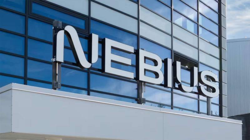
Nebius operates in a specialized B2B sector. Consumer recognition remains limited compared to household tech brands.
Within AI infrastructure circles, the logo signals serious European competition. It represents billions in investment and thousands of GPUs.
The NASDAQ listing brought broader visibility. Financial media and tech publications regularly feature the identity now. For the developer community and enterprise clients, it marks a credible alternative to American hyperscalers.
How Does the Nebius Logo Fit Into the Overall Brand Identity?

The logo anchors a broader visual system. It connects to the company’s website, cloud platform interface, and investor materials.
Purple carries through the entire brand experience. From documentation to dashboards, the color creates consistency.
The wordmark works alongside supporting brand guideline elements like iconography and data visualization styles. Everything ladders up to the same message: sophisticated AI infrastructure with European roots.
Typography choices on the website echo the logo’s geometric qualities. Generous negative space in layouts reinforces the clean, uncluttered positioning.
How Should the Nebius Logo Be Used?
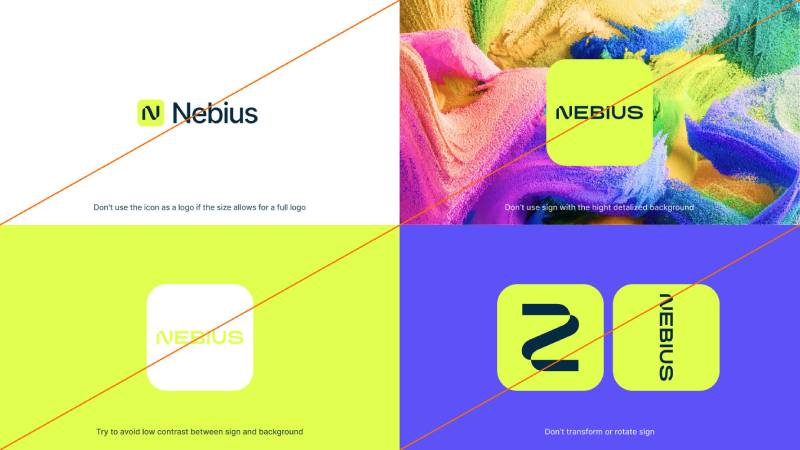
Recommended Practices:
- Maintain the original aspect ratio when scaling
- Use the purple version on light backgrounds
- Use the white version on dark or purple backgrounds
- Keep adequate clear space around the wordmark
- Never stretch, distort, or rotate the logo
- Avoid placing on busy photographic backgrounds
Where to Access Official Assets:
- Nebius press kit and media resources on the official website
- NASDAQ company profile page
- Official partnership and integration documentation
Licensing Information:
- The Nebius logo is a registered trademark
- Usage requires permission for commercial applications outside editorial coverage
- Partners receive approved assets through official channels
- Media organizations may use for news coverage under standard fair use principles
Trademark Protection:
- Registered under Nebius Group N.V. in the Netherlands
- Protected across major markets where the company operates
- Unauthorized reproduction or modification prohibited
FAQ on The Nebius Logo
What Does the Nebius Logo Look Like?
The Nebius logo is a lowercase wordmark in deep purple. No icon, no symbol. Just the company name in a geometric typeface.
The letters feature uniform stroke widths and rounded terminals. Clean and modern. It works across digital platforms, from the cloud computing interface to investor presentations.
What Colors Are Used in the Nebius Logo?
Purple dominates the Nebius brand identity. The primary hue sits around #6B4EFF.
White serves as the secondary color for reversed applications. This color palette separates Nebius from competitors who default to blues and greens in AI infrastructure branding.
Who Designed the Nebius Logo?
The designer or agency behind the Nebius visual identity hasn’t been publicly credited. This isn’t unusual for tech companies.
The logo launched in 2022 alongside the company’s spin-off from Yandex. Arkady Volozh led this transition as the company established its Amsterdam headquarters.
When Was the Nebius Logo Created?
The official Nebius logo debuted in 2022. That’s when the company became independent from Yandex’s international operations.
It has remained unchanged since. No redesigns, no major updates. The brand launched with a fully developed corporate identity system from day one.
What Font Is Used in the Nebius Logo?
Nebius uses a custom font for its wordmark. It’s not a commercially available typeface.
The letterforms show geometric characteristics with consistent tracking throughout. Rounded corners soften the overall appearance while maintaining technical precision expected in GPU cloud branding.
Can I Download the Nebius Logo?
Official Nebius logo files are available through their press kit. Check the company’s media resources page.
You’ll find logo PNG and logo SVG formats for different uses. Always follow their usage guidelines. The trademark belongs to Nebius Group N.V. in the Netherlands.
What Does the Name Nebius Mean?
Nebius derives from “nebula.” The cosmic reference connects to cloud computing concepts, which fits an AI infrastructure company.
The name suggests vast scale and interconnected systems. It’s a fitting choice for a company building machine learning platforms and GPU cloud services for NVIDIA hardware.
Has the Nebius Logo Changed Since Launch?
No. The Nebius company logo has stayed consistent since 2022.
Unlike established brands with decades of visual history, Nebius skipped the typical startup evolution. One version, no iterations. The minimalist design approach proved durable from the start.
What File Formats Is the Nebius Logo Available In?
Standard formats include SVG for scalability and PNG for quick use. Vector files maintain quality at any size.
High resolution versions work for print applications. Lower DPI versions suit web and digital contexts. The press kit typically covers common specification needs.
Is the Nebius Logo Trademarked?
Yes. The Nebius logo is a registered trademark under Nebius Group N.V.
Protection covers major markets where the company operates. The NASDAQ-listed company maintains standard intellectual property protections. Unauthorized use or modification is prohibited under trademark law.
Conclusion
The Nebius logo represents a deliberate approach to tech startup identity. Purple wordmark, geometric letterforms, zero clutter.
It works. The brand consistency across their platform, press materials, and NASDAQ presence shows thoughtful execution.
For a European tech company competing against American hyperscalers, standing out matters. The color choice alone separates Nebius from the blue-dominated AI infrastructure crowd.
Whether you need official brand assets for partnership materials or just want to understand modern logo design principles in action, Nebius offers a clean case study. Simple, scalable, and built to last.

Renowned for his expertise in logo design and visual branding, Bogdan has developed a multitude of logos for various clients.
His skills extend to creating posters, vector illustrations, business cards, and brochures. Additionally, Bogdan's UI kits were featured on marketplaces like Visual Hierarchy and UI8.
He also wrote in the past years on sites like Design Your Way, WebDesignerDepot, WPDean, Designmodo, Speckyboy, Slider Revolution, and more.
- Best Visual Regression Testing Tools for Web and App Design in 2026 - 13 October 2026
- Jujutsu Kaisen Font Generator - 12 October 2026
- The Windsurf Logo History, Colors, Font, And Meaning - 10 October 2026

Bogdan Sandu is a seasoned designer who has been designing websites since 2008. Renowned for his expertise in logo design and visual branding, Bogdan has developed a multitude of logos for various clients. His skills extend to creating posters, vector illustrations, business cards, and brochures. Additionally, Bogdan's UI kits were featured on marketplaces like Visual Hierarchy and UI8. He also wrote in the past years on sites like Design Your Way, WebDesignerDepot, WPDean, Designmodo, Speckyboy, Slider Revolution, and more.
You Might Also Like