


A perfect design can produce a terrible print. The gap between the two almost always comes down to color separations for screen printing.
Separation is the step that turns a multi-color artwork file into individual ink layers, each assigned to its own screen. Skip it, rush it, or get it wrong, and the press has nothing clean to work from.
This guide covers every part of the process, from the four main separation methods and the software behind them, to film positive output, registration, dark garment requirements, common mistakes, and what separations actually cost.
Whether you run a print shop or prepare artwork for one, what follows gives you a clear, practical picture of how color separation works and where it breaks down.
What is Color Separation for Screen Printing
Color separation for screen printing is the process of splitting a multi-color design into individual single-color layers, each printed through its own screen. Every separated color becomes one ink pass on the press.
Without separation, you simply cannot reproduce a multi-color design on a garment or substrate. The press has no way to handle more than one color at a time.
Think of it as the translation step. Your design exists as a full-color digital file. The press only understands one color per screen. Separation bridges that gap.
This is one of the more nuanced areas of graphic design terminology that crosses into production. It sits at the intersection of art and print manufacturing.
One thing that catches people off guard: this process differs completely from digital printing, where no separation is needed at all. Screen printing requires physical screens, physical ink layers, and precise sequencing. That physical reality is what makes separation so critical.
The screen printing segment held 56% of the custom t-shirt printing market in 2024, according to Grand View Research, largely because of the color vibrancy and ink thickness that only this method delivers on dark apparel.
Types of Color Separation Methods
There is no single separation method that works for every design. The artwork type, garment color, and desired result all determine which approach is right.
Spot Color Separation
Best for: flat, solid artwork with clearly defined color areas.
Each color in the design is isolated as its own solid channel. No blending, no halftone dots involved. You pull a red, a blue, a yellow as separate flat layers.
- Works best with vector graphics, where color areas are mathematically clean
- Color count directly matches the number of screens needed
- Lowest setup complexity of all methods
- Pantone matching is straightforward here
Most simple logo work and text-based designs fall into this category. It’s the default starting point for anyone new to screen printing separations.
Simulated Process Separation
Simulated process uses a limited set of custom-mixed spot color inks layered with halftone dot patterns to mimic full-color photographic results. Standard simulated process builds use 6 to 10 color channels, according to production guides from Extreme Screen Prints.
This method is almost exclusively used on dark garments where standard CMYK falls completely flat. The translucent inks layer on top of each other to blend colors optically.
It’s the most technically demanding separation type. Getting the halftone angles wrong, or stacking ink channels in the wrong order, ruins the result. But when it works, you get photorealistic prints that hold up through wash cycles.
Index Color Separation
How it works: the design gets converted to a grid of solid-colored pixels, each square printed as a pure ink dot with no halftone toning involved.
Index separation is underused in most shops, which is a mistake. It handles photographic images well at lower mesh counts, and it can be done faster than simulated process in many cases.
- No halftone dots, which means no moire risk
- Works best at 55 to 65 LPI output
- Struggles with fine detail and smooth gradients
Halftone Separation
Halftone separation uses varying dot sizes to simulate gradients and tonal shifts using solid ink. The dot pattern tricks the eye into seeing shades that the ink itself cannot produce.
The angle of each halftone screen matters a lot. Standard angles typically run cyan at 15 degrees, magenta at 75, yellow at 90, and black at 45. Incorrect angles cause moire patterns, which are the wavy interference patterns that make a print look visually broken.
| Method | Best Artwork Type | Garment Color | Complexity |
| Spot Color | Flat vector graphics, logos | Light or dark | Low |
| Simulated Process | Photography, gradients | Dark fabrics | High |
| Index | Photos, pixel art | Light or dark | Medium |
| Halftone | Tonal artwork, gradients | Light fabrics | Medium |
How Color Separation Works Technically
The process starts with artwork evaluation. Before any software work begins, you assess whether the file is vector or raster, check the resolution, and identify how many distinct colors exist in the design.
Raster images need a minimum of 300 DPI for clean halftone output. Below that, the halftone dots lose their crisp edges and the final print looks soft.
Photoshop vs. Illustrator Workflows
The software choice matters and depends on the artwork type.
Adobe Photoshop handles raster-based separations through its Channels panel. Each color gets isolated into its own alpha channel, which eventually outputs as a separate film positive. Simulated process work almost always runs through Photoshop.
Adobe Illustrator is the tool for spot color separations on vector artwork. Colors live as individual fill layers, and swapping them to Pantone values is straightforward. Illustrator handles the crisp, hard edges that vector spot work needs.
Trapping Explained
Trapping is a slight intentional overlap between adjacent color areas. It prevents visible white gaps from appearing between colors when the press runs slightly out of alignment during production.
- Typical trap values: 0.25 to 1 point depending on press tolerance
- Applied in the separation file, not on press
- Skipping traps on tight-registration designs is one of the most common prepress mistakes
Trapping connects directly to registration accuracy downstream. Better trapping built into the separation means more tolerance for minor press variation during a print run.
Output: Film Positives
Each separated color channel outputs as a film positive, a transparent sheet with dense black ink showing only the areas where that color will print. The film positives are then used to burn the emulsion-coated screens via UV exposure.
The screen printing market was valued at USD 4.5 billion in 2024 and is projected to reach USD 11.2 billion by 2030 at a 16.4% CAGR, according to Research and Markets. Most of that volume depends entirely on accurate color separation upstream.
Software Used for Color Separations
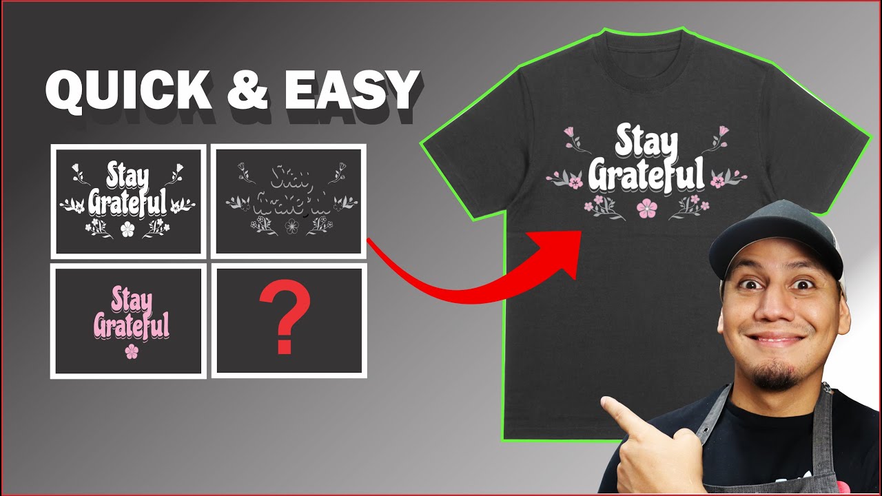
The right tool depends on what you’re separating and how much throughput your shop handles. I’ve seen shops lose hours weekly because they were using the wrong software for their artwork type.
| Software | Primary Use | Best For |
| Adobe Photoshop | Raster separations, simulated process | High-volume shops, complex photography |
| Adobe Illustrator | Spot color separations, vector art | Logo work, flat designs |
| Separation Studio | Dedicated separation workflow | Production shops, speed and consistency |
| UltraSeps | Simulated process, channel generation | Photorealistic garment printing |
| AccuRIP | Film positive output via RIP processing | Inkjet-based film printing |
Separation Studio by Freehand Graphics stands out as the most widely adopted dedicated separation tool in production environments. It integrates directly with Photoshop and handles spot, simulated process, and halftone generation without needing to rebuild a workflow from scratch.
AccuRIP is not a separation tool on its own. It is RIP (Raster Image Processor) software that takes your already-separated files and translates them into precise halftone output for inkjet film printers. Mixing up these two functions is a common point of confusion for shops new to the process.
Free alternatives exist but they involve real trade-offs in output density control and halftone accuracy. For occasional low-volume work, they are fine. For any serious production run, dedicated software pays for itself quickly.
Color Counts and Ink Limitations
Every color in a separation equals one screen, one setup step, and one additional pass on the press. Color count is not just a design choice. It is a production and cost variable.
Press Capacity by Type
Manual presses typically max out at 4 to 6 colors. Automatic presses can handle 8 to 12 or more color stations, though running at maximum station count increases registration difficulty significantly.
More colors mean more alignment steps. As Pulse Merch notes in their production documentation, each additional screen introduces another opportunity for slight misregistration that compounds across the full run.
Reducing Color Count Without Losing Design Integrity
Experienced separators reduce color counts by identifying colors that are close enough in hue and saturation to merge without visible difference in the final print.
- Merging two similar blues into one screen saves an entire setup
- Halftone tinting a single color can create the illusion of two shades
- Removing colors that only appear in tiny areas of a design
- Using the garment color itself as a design element instead of printing it
The underbase white on dark garments counts as one of those colors. On a 6-color press, if white takes slot one, you only have 5 remaining color slots for the actual design. That constraint shapes the entire separation strategy before any software work begins.
Spot Colors vs. Process Colors
Spot colors are pre-mixed inks matched to a specific color standard, typically Pantone. Each spot color gets its own screen and prints as a solid, opaque layer.
Process color printing uses CMYK halftone dots to build colors optically. It can reproduce almost any color from just four screens. But process color on dark garments without modification produces dull, washed-out results because the inks are semi-transparent.
Most garment screen printing uses spot colors or simulated process rather than true CMYK. The opacity of plastisol ink and the texture of fabric make standard CMYK process printing a poor fit for most apparel applications.
Film Positives and Their Role in Separation Output
A film positive is a transparent sheet with solid black ink showing each individual color layer from the separation. No film positive, no screen. It is the physical output that makes the separation usable in production.
How Film Positives Get Made
Two main output methods exist in most shops today.
Inkjet output with RIP software: an inkjet printer loaded with black film ink prints onto clear transparency film. The RIP software converts the halftone data into precise dot output at the correct LPI and angle. AccuRIP is the most commonly used RIP in this workflow.
Direct-to-screen (DTS) systems skip the film entirely. The separated file gets output directly onto the emulsion-coated screen using inkjet or laser imaging. This removes the film variable and tightens registration across color channels. Higher setup cost, but significant accuracy gain.
Density Requirements
Film density is the single most overlooked variable in separation output. Ink density on the film needs to read at a minimum optical density of 3.5 to 4.0 on a densitometer for clean screen exposure. Below that, UV light bleeds through the film during exposure and hardens emulsion that should remain open.
- Low-density film: partial screen exposure, pinholes in stencil, ink bleeds during print
- Correct density: clean hard edges, full ink deposit, crisp halftone dots
- Cause: wrong ink type for the film printer, clogged heads, or incorrect RIP settings
Most shops that complain about blurry prints or color bleeding trace the problem back to film density. It is rarely the press. Checking density before burning screens saves a lot of wasted emulsion and press time.
Registration Marks on Film
Every film positive in a multi-color separation must carry identical registration marks, typically crosshairs or target circles, placed outside the print area. These marks align all color films to each other and then to the screen during tape-up or pin registration on press.
Printing without consistent registration marks across all film positives makes accurate color registration nearly impossible, especially past 4 colors. It is one of the non-negotiable technical requirements in multi-color screen printing separation output.
Registration in Multi-Color Separations
Registration is the process of aligning every color channel in a separation so all ink layers land exactly where they should on the substrate. Get it wrong and the print looks like a blurry mess, even if the separation itself was perfect.
M&R Printing Equipment, one of the leading press manufacturers in North America, identifies three root causes for registration failures: art and prepress issues, mechanical press problems, and printing technique. All three can be traced back to decisions made during the separation stage.
Registration Marks and Their Placement
Standard placement: crosshairs or target circles outside the print area, on all four sides of the image, identical position on every film positive in the set.
The marks have one job. They give the press operator a fixed reference point to align each screen before the run begins. If a single film in the set has marks placed even slightly differently than the others, the alignment breaks down.
- Pin registration systems use physical alignment pins for repeatable accuracy
- Tape-up registration relies on manual visual alignment under a light table
- Direct-to-screen systems embed registration data digitally, removing human error from this step
How Trapping Supports Registration Accuracy
Trapping and registration work together. Trapping adds a slight overlap between adjacent color areas in the separation file. When minor registration shifts happen on press, that overlap prevents visible white gaps from forming between colors.
Without trapping on a tight 6-color design: a 0.5mm press shift creates a white gap that reads as a print defect to the customer.
With trapping built in: that same 0.5mm shift falls within the overlap zone and the print looks clean.
The practical trap value varies. Tight presses with well-tensioned screens can get away with 0.25 to 0.5 points. Shops running older equipment or printing on stretch fabrics like performance wear typically need 1 to 3 points of trap to stay safe.
Manual vs. Automatic Press Registration
Automatic presses hold tighter registration tolerances than manual setups, largely because the pallet indexing is mechanical and consistent rather than operator-dependent.
| Press Type | Registration Tolerance | Color Count Ceiling | Operator Dependency |
| Manual | +/- 1 to 2mm typical | 4 to 6 colors | High |
| Automatic | +/- 0.25 to 0.5mm | 8 to 12+ colors | Low |
For simulated process separations with 8 or more colors, automatic press equipment is essentially a requirement. The tolerance stack-up across 8 manual registration steps makes consistent results very difficult to achieve at production volume.
Color Separation for Dark vs. Light Garments
The garment color changes the entire separation strategy. Light and dark substrates are not just different shades. They require fundamentally different approaches to ink layering, color channel setup, and file construction.
Light Garments
Light garments are straightforward. Semi-transparent inks print directly onto the fabric and the white substrate acts as the base, making colors appear naturally bright without any additional layer underneath.
- Spot colors print with full vibrancy without an underbase
- Halftone separations read cleanly against the white background
- CMYK process color works reasonably well on white or near-white fabrics
- Color count can stay lower, which reduces setup cost
Understanding basic color theory helps here. On a white substrate, subtractive color mixing applies. The ink absorbs certain wavelengths and reflects others, producing the color you see. That only works when the background is neutral.
Dark Garments and the Underbase Requirement
Dark garments require a white underbase layer before any color prints. Without it, semi-transparent inks absorb into the dark fabric and the colors shift, dull out, or disappear entirely.
Underbase mesh count: typically 110 to 160, depending on detail level and ink type.
Flash cure between layers: the underbase gets flashed with heat to gel before top colors print. Skipping the flash causes wet ink transfer between screens, which ruins the print.
The underbase also adds one color to the total count. A 5-color design on a dark shirt becomes a 6-color job. That affects press selection, pricing, and production time before a single top color gets loaded.
Simulated Process on Dark Substrates
Simulated process separation is almost exclusively a dark-garment technique. On light garments, standard spot or halftone separations achieve similar results with far less complexity.
The separation builds an underbase white channel first, then stacks translucent halftone color layers on top in the correct sequence. Ink order matters. Printing a dark color over a light one produces a different optical result than the reverse, and the separation file has to account for that planned stacking order from the start.
Most simulated process separations on dark garments use 6 to 10 ink channels, including the underbase. That range covers most photorealistic and gradient-heavy designs without pushing into color counts that strain typical automatic press setups.
Common Color Separation Mistakes and How to Fix Them
Most bad prints trace back to prepress, not the press itself. The separation file is where things go wrong first.
Patches Elite, a garment decoration resource, notes that errors in artwork validation and color channel setup are among the most consistent causes of reprints and wasted production time in screen printing operations.
Low-Resolution Artwork
The problem: raster artwork submitted below 300 DPI at final print size produces soft, anti-aliased edges on film positives. Those soft edges expose poorly during screen burning and result in broken halftone dots and ink bleed on press.
The fix is straightforward: require 300 DPI minimum at the actual print dimensions before separation begins. A logo that looks sharp at 72 DPI on screen will look terrible at 300 DPI once you zoom in and check it properly.
Clients almost always submit low-res files pulled from websites. Catching this before separation starts saves everyone time. Trying to fix it after the fact with upscaling software rarely produces usable results for halftone work.
Incorrect Halftone Angles
Halftone angle errors produce moire patterns, the wavy optical interference effect that makes a print look visually broken and unprofessional.
- Cyan: 15 degrees
- Magenta: 75 degrees
- Yellow: 90 degrees
- Black: 45 degrees
Deviating from these standard angles without understanding the relationship between them is the fastest way to create moire. Some printers use non-standard angles intentionally for creative effects, but that requires knowing exactly what you are doing and testing before committing to a full run.
Missing Trapping on Complex Designs
Skipping trap values on designs with adjacent color areas is a common mistake, especially among designers who come from digital backgrounds where trapping is never needed.
The result shows up on press as thin white lines between colors wherever minor registration variation occurs. It looks like the design was not aligned, even when the press registration is actually fine. Adding even a 0.5-point trap in the separation file eliminates most of these gap issues entirely.
Too Many Colors in Simulated Process
Overbuilding a simulated process separation with 12 or more ink channels does not always improve the print. Past a certain point, adding channels introduces more registration risk than color accuracy gain.
Experienced separators reduce color counts by merging channels with overlapping tonal ranges. This works because the halftone dot interactions between fewer, well-chosen colors often produce cleaner blends than adding more channels with small, competing tonal differences.
Pricing Color Separation Services
Separation pricing varies widely based on method complexity, color count, and whether the work is done in-house or sent to a specialist. Knowing the ranges helps when quoting jobs or evaluating vendor invoices.
Typical Pricing Ranges by Separation Type
Raygun Printing, a New York-based screen print shop, publishes their 2024 pricing at $15 per color for standard film positive output on spot color separations, with Pantone matching adding $10 per color on top.
Simulated process separations run significantly higher because of the labor involved in building and refining each channel.
| Separation Type | Typical Price Range | What Drives the Cost |
| Spot color (per color) | $10 to $30 | Color count, Pantone matching |
| Simulated process (per job) | $75 to $250+ | Artwork complexity, channel count |
| Index separation (per job) | $50 to $150 | Image detail, revision rounds |
| Rush turnaround (add-on) | 25% to 100% of base price | Delivery timeline |
In-House vs. Outsourced Separations
Shops that do their own separations in-house trade upfront software and training costs for long-term per-job savings and faster turnaround. Shops that outsource pay more per job but avoid that initial investment and can focus on press time.
When outsourcing makes sense:
- Low separation volume (fewer than 10 complex jobs per month)
- No in-house designer with separation-specific training
- One-off photorealistic jobs outside the shop’s usual work
When in-house separation pays off:
- High volume of repeating job types
- Need for same-day turnaround on press
- Control over revision cycles without waiting on an outside vendor
Dedicated separation software like Separation Studio runs around $300 to $600 depending on the license tier. At $75 to $150 per outsourced simulated process job, it pays for itself after just a few jobs if the volume is consistent. The math changes if simulated process work is rare in a given shop’s workflow.
What Affects Final Pricing
Artwork quality at submission is the single biggest variable. Clean vector-based artwork with clearly defined color areas takes far less time to separate than complex raster photography with dozens of transitional tones.
A well-prepared file with a clear color palette and documented Pantone references can cut separation time by 30 to 50 percent compared to a poorly prepared equivalent. That difference shows up directly in the invoice. Shops that educate clients on file preparation requirements consistently report fewer revision rounds and lower per-job separation costs over time.
FAQ on Color Separations For Screen Printing
What is color separation in screen printing?
Color separation splits a multi-color design into individual single-color layers. Each layer prints through its own screen, one ink pass at a time. Without separation, a multi-color design cannot be reproduced on a garment or substrate using a screen printing press.
How many colors can you separate for screen printing?
Manual presses typically handle 4 to 6 colors. Automatic presses support 8 to 12 or more. Each color requires a separate screen, so higher color counts increase setup cost, registration complexity, and production time significantly.
What is the difference between spot color and simulated process separation?
Spot color separation isolates flat, solid color areas, one screen per color. Simulated process uses halftone dot patterns and layered translucent inks to reproduce photographic or gradient-heavy designs, primarily on dark garments.
What software is used for color separations?
Adobe Photoshop handles raster and simulated process separations. Adobe Illustrator works best for vector spot color work. Dedicated tools like Separation Studio and UltraSeps are widely used in production shops for faster, more consistent output.
What resolution does artwork need for screen printing separations?
Raster artwork must be at least 300 DPI at the final print size. Below that, halftone dots lose their crisp edges during film output, which causes soft prints, blurry edges, and ink bleed during the press run.
Why do dark garments need an underbase?
Semi-transparent inks cannot overpower a dark fabric color on their own. A white underbase layer, printed and flash-cured first, gives top colors a neutral surface to sit on, producing accurate, vibrant results instead of dull, muted ones.
What causes moire patterns in screen printing?
Moire patterns appear when halftone screens are set to incorrect angles. Standard angles are cyan at 15 degrees, magenta at 75, yellow at 90, and black at 45. Deviating from these without intentional purpose creates visible optical interference in the final print.
What is a film positive in screen printing?
A film positive is a transparent sheet printed with dense black ink showing one color layer from the separation. It is placed over an emulsion-coated screen and exposed to UV light to burn the stencil used for printing that color.
What is color trapping and why does it matter?
Trapping adds a slight overlap between adjacent color areas in the separation file. It prevents white gaps from appearing between colors when minor registration shifts occur on press. Standard trap values range from 0.25 to 3 points depending on press tolerance.
How much does color separation for screen printing cost?
Spot color separations typically run $10 to $30 per color. Simulated process jobs cost $75 to $250 or more depending on complexity. Rush turnaround adds 25 to 100 percent on top of the base price, depending on the shop’s timeline.
Conclusion
This conclusion is for an article presenting color separations for screen printing as a technical process where every decision upstream affects what lands on the garment.
The separation method you choose, whether spot color, simulated process, index, or halftone, determines your ink layering, screen count, and press requirements before production begins.
Film positive density, halftone angles, trapping, and underbase setup are not optional details. They are the variables that separate a clean print run from a costly reprint.
Artwork quality at submission drives everything else. Clean files with accurate ink channels and correct mesh count planning reduce revision rounds and keep production on schedule.
Get the color separation process right and the press becomes predictable. Get it wrong and no amount of press adjustment fixes what the prepress stage broke.

Renowned for his expertise in logo design and visual branding, Bogdan has developed a multitude of logos for various clients.
His skills extend to creating posters, vector illustrations, business cards, and brochures. Additionally, Bogdan's UI kits were featured on marketplaces like Visual Hierarchy and UI8.
He also wrote in the past years on sites like Design Your Way, WebDesignerDepot, WPDean, Designmodo, Speckyboy, Slider Revolution, and more.
- The Cursor Logo History, Colors, Font, And Meaning - 24 September 2026
- Top 7 Web Design Subscription Services That Replace Full-Time Hires - 24 September 2026
- Canva vs PowerPoint: Which Is Better for Presentations? - 22 September 2026

Bogdan Sandu is a seasoned designer who has been designing websites since 2008. Renowned for his expertise in logo design and visual branding, Bogdan has developed a multitude of logos for various clients. His skills extend to creating posters, vector illustrations, business cards, and brochures. Additionally, Bogdan's UI kits were featured on marketplaces like Visual Hierarchy and UI8. He also wrote in the past years on sites like Design Your Way, WebDesignerDepot, WPDean, Designmodo, Speckyboy, Slider Revolution, and more.
You Might Also Like


