The McDonald’s logo stands as one of the most recognized corporate symbols on the planet. Those golden arches have become shorthand for fast food itself.
As a logo, it functions beyond simple brand identification. It triggers instant recognition across cultures, languages, and generations.
McDonald’s Corporation launched in 1955 under Ray Kroc’s franchising vision. The company has cycled through roughly 10 logo variations since then.
The current version dates back to 2006. It features the standalone golden arches without additional text in many applications. Simple. Clean. Unmistakable.
What Is the McDonald’s Logo?

The McDonald’s logo consists of two golden arches forming the letter “M” against various backgrounds. Introduced in its modern form during the 1960s, the design was created by Jim Schindler based on the architectural arches of early restaurant buildings. It symbolizes the brand’s welcoming, family-friendly positioning.
Design Type: Combination mark (symbol with optional wordmark)
Primary Elements: Two connected golden arches creating an “M” shape
Official Introduction Date: 1962 (arches as logo element), refined through 1968 and 2006
Designer: Jim Schindler (logo adaptation), Stanley Meston (original architectural arches)
Trademark Status: Registered trademark globally, one of the most protected corporate symbols worldwide
Color Palette:
- Golden Yellow: #FFC72C
- McDonald’s Red: #DA291C
- White: #FFFFFF
Usage Context: Restaurant signage, packaging, digital platforms, merchandise, advertising campaigns, mobile applications
How Has the McDonald’s Logo Evolved Over Time?

The McDonald’s logo has transformed from a simple restaurant name into a global symbol. Major redesigns occurred in 1961, 1968, 1975, and 2006. Each change reflected shifting brand strategy and design trends.
Original McDonald’s Logo (1940-1948)
Years Active: 1940-1948
Design Description: Simple text reading “McDonald’s Famous Barbecue” in a basic serif font. No arches. No golden color. Just straightforward restaurant signage.
Color Scheme: Black text on light backgrounds
Designer: Unknown (likely local sign maker)
Context: The McDonald brothers ran a barbecue drive-in in San Bernardino, California. Branding wasn’t a priority yet.
Cultural Significance: Represents the humble beginnings before the franchise explosion.
Speedee Era Logo (1948-1961)
Years Active: 1948-1961
Design Description: Featured “Speedee,” a chef character with a hamburger head. The name changed to “McDonald’s Famous Hamburgers.”
Color Scheme: Red, white, and yellow introduced
Designer: Unknown
Context: The brothers streamlined their menu to focus on hamburgers. Speedee represented quick service.
Key Changes: First mascot introduced, hamburger focus established
Cultural Significance: Set the foundation for character-based marketing that would later include Ronald McDonald.
Single Arch Logo (1961)
Years Active: 1961 (transitional)
Design Description: A single golden arch appeared alongside the restaurant name. This reflected the actual architecture of the buildings.
Color Scheme: Golden yellow arch, red background elements
Designer: Based on Stanley Meston’s architectural design
Context: Ray Kroc was expanding the franchise nationally. The distinctive building shape needed translation into print.
Cultural Significance: Bridge between architecture and brand identity.
Golden Arches Logo (1962-1968)
Years Active: 1962-1968
Design Description: Two arches overlapped to form the “M” shape. A line cut through the center horizontally.
Color Scheme: Golden yellow on red
Designer: Jim Schindler
Context: Head of construction and engineering, Schindler saw how the arches looked from an angle and proposed the overlapping design.
Key Changes: First appearance of the iconic “M” formation
Cultural Significance: Birth of the modern McDonald’s visual identity.
Refined Golden Arches (1968-2006)
Years Active: 1968-2006
Design Description: Cleaner “M” without the horizontal line. “McDonald’s” wordmark positioned below in a custom typeface.
Color Scheme: Golden yellow arches, red background, white text
Designer: Internal design team
Context: Brand standardization across thousands of locations required a cleaner, more reproducible design.
Key Changes: Horizontal line removed, proportions refined
Cultural Significance: The version most people over 30 grew up recognizing.
Current McDonald’s Logo (2006-Present)
Years Active: 2006-present
Design Description: Simplified golden arches often used alone. When text appears, it uses a clean sans-serif font.
Color Scheme: Golden yellow (#FFC72C), sometimes paired with green for eco-friendly messaging
Designer: Heye & Partner (Germany)
Context: Part of the “I’m Lovin’ It” rebrand. The company wanted a more modern, confident look.
Key Changes: Arches can stand alone without text, green backgrounds introduced in some markets
Cultural Significance: Reflects minimalist design trends and the brand’s confidence that the symbol needs no explanation.
What Do the Design Elements of the McDonald’s Logo Mean?

The golden arches carry meaning beyond their “M” shape. They originally mirrored the physical architecture of McDonald’s restaurants.
Over time, they’ve become associated with consistency, comfort, and accessibility.
The arches suggest doorways or entry points. Some interpret them as welcoming arms.
Why Did McDonald’s Choose These Specific Colors?
Understanding color psychology explains McDonald’s palette choices.
Golden Yellow (#FFC72C)
- Symbolic meaning: Happiness, optimism, hunger stimulation
- Psychological impact: Attracts attention, creates warmth, associated with french fries
- Brand connection: Suggests golden, crispy food quality
You’ll find similar approaches among other yellow logos across industries.
McDonald’s Red (#DA291C)
- Symbolic meaning: Energy, excitement, appetite stimulation
- Psychological impact: Creates urgency, increases heart rate, hard to ignore
- Brand connection: Fast service, hot food, passion
This follows patterns seen in many red logos, especially in food service.
The red and yellow combination isn’t accidental. Fast food brands figured out decades ago that these colors together stimulate hunger.
What Typography Style Is Used in the McDonald’s Logo?
McDonald’s uses a custom typography called “Lovin’ Sans” in current materials.
It’s rounded and friendly. Not too corporate. Not too casual.
Earlier versions used heavier, bolder letterforms. The current approach feels more approachable.
Readability works at any size. From highway billboards to mobile app icons, the text remains clear.
What Are the Hidden Meanings in the McDonald’s Logo?
Design consultant Louis Cheskin allegedly told McDonald’s in the 1960s that the arches resembled a pair of nourishing breasts.
Freudian? Maybe. But the company kept the design.
More practically, the psychology of shapes suggests arches and curves feel welcoming. Soft. Safe for families.
The “M” obviously stands for McDonald’s. But the shape also suggests mountains, stability, and upward growth. Or two fries standing up. Depends who you ask.
How Does the McDonald’s Logo Compare to Competitor Logos?

Among fast food logos, McDonald’s golden arches stand apart through pure simplicity. Where Burger King uses a burger bun, Wendy’s features a character, and KFC shows Colonel Sanders, McDonald’s needs only geometry.
This minimalism creates versatility. The arches work on any background, at any size.
Competitors rely on more complex imagery. Taco Bell’s bell. Arby’s hat. Pizza Hut’s roof shape.
McDonald’s achieved something rare. The logo transcended branding to become a cultural symbol.
You can spot those arches from a mile away on a highway. That’s intentional. And unmatched.
What Are the Technical Specifications of the McDonald’s Logo?
Official Color Codes:
Golden Yellow (Primary)
McDonald’s Red (Secondary)
- Hex: #DA291C
- RGB: (218, 41, 28)
- CMYK: (0, 81, 87, 15)
- Pantone: 485 C
Dimensions and Proportions:
- Aspect ratio: Approximately 1:1 for the arches symbol alone
- Minimum size: 0.5 inches (12.7mm) for print applications
- Clear space: Minimum spacing equal to the height of one arch leg on all sides
- The arches follow specific geometric curves, not freehand shapes
Modern implementations use vector graphics for infinite scalability.
What Cultural Impact Has the McDonald’s Logo Had?
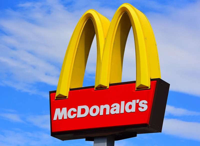
The golden arches appear in more places than any government flag. That’s not exaggeration.
McDonald’s operates in over 100 countries. The logo has become shorthand for American capitalism, globalization, and fast food culture itself.
It shows up in art. Pop culture references. Political commentary. Documentaries about food systems.
Love it or hate it, you recognize it. That’s the point.
How Does the McDonald’s Logo Fit Into the Overall Brand Identity?
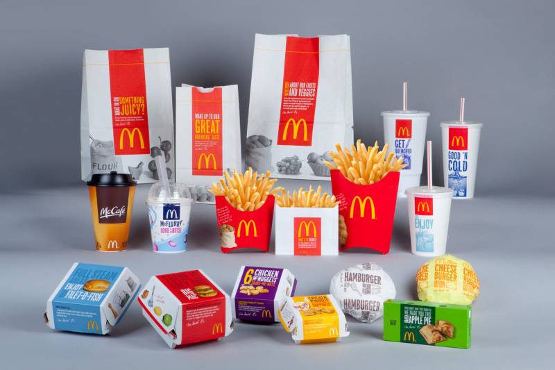
The logo anchors everything McDonald’s does visually. Packaging features the arches. Uniforms reference the colors.
Store architecture still nods to those original arch-shaped buildings.
Ronald McDonald, the Happy Meal box, the “I’m Lovin’ It” jingle. All connect back to that golden “M.”
The company’s brand guidelines run hundreds of pages. Every detail specified. Every color matched exactly.
Consistency built this brand. The logo makes that consistency instantly visible.
How Should the McDonald’s Logo Be Used?
Official Usage Guidelines:
- Never stretch or distort the arches
- Maintain minimum clear space around the logo
- Use only approved color combinations
- Don’t add effects like shadows or gradients to the official mark
- Never recreate the logo from memory. Use official files
Where to Access Official Logos:
McDonald’s provides assets to franchisees and approved partners through internal brand portals. Public access is restricted.
Licensing Information:
Unauthorized use is strictly prohibited. The golden arches are among the most aggressively protected trademarks globally.
Trademark Protection:
McDonald’s has sued companies for using similar arch shapes, the prefix “Mc,” and anything resembling their color combination in food service contexts.
They don’t play around with brand protection. Decades of legal precedent backs them up.
FAQ on The McDonald’s Logo
What Do the Golden Arches Represent in the McDonald’s Logo?
The golden arches originally represented the architectural design of early McDonald’s restaurants.
Over time, they became a symbol of consistency, fast service, and American fast food culture.
The two arches form an “M” shape. They suggest welcome, warmth, and accessibility to families worldwide.
Who Designed the McDonald’s Logo?
Jim Schindler created the overlapping arches concept in 1962. He worked as McDonald’s head of construction.
The original building arches came from architect Stanley Meston in 1953.
Ray Kroc recognized their marketing potential and pushed for brand identity standardization across all franchise locations.
When Was the McDonald’s Logo Created?
The first McDonald’s logo appeared in 1940. Simple text. Nothing fancy.
The iconic golden arches joined the brand identity in 1961.
The current refined version launched in 2006. That’s over 60 years of logo evolution from barbecue stand to global symbol.
Why Is the McDonald’s Logo Yellow and Red?
Yellow and red stimulate appetite. That’s not an accident.
The color theory behind fast food branding shows these colors grab attention and create urgency.
Yellow suggests happiness and golden fries. Red triggers excitement and hunger. Together, they’re nearly impossible to ignore on a highway.
Has the McDonald’s Logo Changed Over Time?
Yes. Roughly 10 times since 1940.
Major shifts include dropping the Speedee mascot, introducing the arches, and recent moves toward white space and simplicity.
The logo history reflects broader design trends. From detailed illustrations to clean geometric shapes.
What Font Does McDonald’s Use in Their Logo?
McDonald’s uses a custom typeface called Lovin’ Sans for current branding materials.
It’s rounded and friendly. Approachable without being childish.
Earlier versions featured heavier, bolder letterforms. The typography elements evolved alongside the arches themselves.
Is the McDonald’s Logo Trademarked?
Absolutely. It’s one of the most protected trademark symbols on Earth.
McDonald’s aggressively defends the golden arches, the “Mc” prefix, and even similar color combinations in food service.
Unauthorized use triggers immediate legal action. They’ve built decades of case law around brand protection.
Why Is the McDonald’s Logo So Recognizable?
Simplicity matters. The arches work at any size, on any background.
Consistent repetition across 40,000 locations burned it into global consciousness.
The visual identity appears more places than most national flags. Decades of advertising spending didn’t hurt either.
What Is the Meaning Behind the M in the McDonald’s Logo?
The “M” stands for McDonald’s. Obviously.
But the shape carries deeper associations. Some see welcoming doorways. Others see stability and upward growth.
Design consultant Louis Cheskin famously suggested maternal, nurturing symbolism. The company kept quiet on that interpretation.
How Much Is the McDonald’s Logo Worth?
The McDonald’s brand value exceeds $200 billion. The logo anchors that entire identity.
Separating logo worth from overall brand recognition proves tricky.
What’s clear: those two golden arches generate more instant recognition than almost any corporate symbol ever created. Priceless, really.
Conclusion
The McDonald’s logo proves that simple shapes can carry enormous meaning. Two golden arches became a global symbol recognized across every continent.
What started as restaurant architecture evolved into one of the most valuable corporate logos in history.
The design follows core logo design principles. Clean geometry. Strategic color choices. Instant recognition at any scale.
Ray Kroc understood something fundamental about brand recognition. Consistency builds trust. And trust builds empires.
Those arches aren’t just a logo anymore. They’re a cultural landmark.

Renowned for his expertise in logo design and visual branding, Bogdan has developed a multitude of logos for various clients.
His skills extend to creating posters, vector illustrations, business cards, and brochures. Additionally, Bogdan's UI kits were featured on marketplaces like Visual Hierarchy and UI8.
He also wrote in the past years on sites like Design Your Way, WebDesignerDepot, WPDean, Designmodo, Speckyboy, Slider Revolution, and more.
- How to Install Fonts on Mac (Step-by-Step Guide) - 20 September 2026
- From Mockup to Code: How AI-Augmented Development Speeds Up the Design Handoff - 19 September 2026
- The Beehiiv Logo History, Colors, Font, And Meaning - 18 September 2026

Bogdan Sandu is a seasoned designer who has been designing websites since 2008. Renowned for his expertise in logo design and visual branding, Bogdan has developed a multitude of logos for various clients. His skills extend to creating posters, vector illustrations, business cards, and brochures. Additionally, Bogdan's UI kits were featured on marketplaces like Visual Hierarchy and UI8. He also wrote in the past years on sites like Design Your Way, WebDesignerDepot, WPDean, Designmodo, Speckyboy, Slider Revolution, and more.
You Might Also Like