Minion Pro disappeared from your design toolkit the moment your Adobe subscription lapsed. Now you’re staring at a layout that suddenly looks wrong with Times New Roman filling the gaps.
Finding fonts similar to Minion Pro matters because this elegant serif drives readability in countless books, magazines, and corporate documents. When you need alternatives (whether for budget, licensing, or creative reasons), you want options that deliver the same sophisticated body text performance.
This guide covers 20 professional serif alternatives to Minion Pro. You’ll discover free options like Crimson Text and Alegreya alongside premium choices such as Adobe Garamond and GT Sectra.
Each typeface entry includes specific characteristics, ideal applications, and pairing fonts recommendations. Some excel in editorial design, others shine in book typography, and several work perfectly for professional documents requiring classic elegance without Minion’s licensing requirements.
Fonts Similar To Minion Pro
| Font Name | Classification & Style | Optimal Use Cases | Distinctive Attributes |
|---|---|---|---|
| Crimson Text | Old-style serif inspired by classic Garamond tradition | Digital publishing, long-form content, academic materials | Open-source availability, optimized screen rendering |
| Alegreya | Contemporary humanist serif with calligraphic influences | Literature, editorial design, extended reading experiences | Dynamic rhythm, distinctive personality, multiple weights |
| Adobe Garamond | Renaissance revival based on 16th-century letterforms | Professional publications, literary works, corporate communications | Historical authenticity, refined proportions, elegant italic |
| Adobe Caslon | Transitional serif rooted in 18th-century British typography | Traditional print, institutional materials, heritage branding | Colonial-era aesthetic, moderate stroke contrast, timeless appeal |
| Sabon | Old-style serif designed for cross-platform uniformity | Book typography, magazines, multilingual typesetting | Identical dimensions across technologies, neutral character |
| Garamond | Classic old-style serif with numerous interpretations | Universal text applications, book interiors, formal documents | Widespread availability, excellent readability, economic spacing |
| Lyon Text | Contemporary Scotch Roman revival with sturdy construction | Newspapers, magazines, high-volume text environments | Sharp serifs, compact spacing, excellent small-size performance |
| Galliard | Old-style serif based on 16th-century French punches | Literary publishing, fine typography, classical compositions | Hand-cut character, warm appearance, generous x-height |
| Harriet | Modern didone serif with contemporary refinement | Fashion editorial, luxury branding, sophisticated layouts | High stroke contrast, geometric precision, stylish aesthetic |
| Freight Display Pro | Display-optimized serif with architectural presence | Headlines, display typography, branding applications | Robust letterforms, bracketed serifs, commanding presence |
| Solitas Serif | Contemporary text serif with humanist proportions | Corporate identity, professional documents, UI typography | Clean construction, modern sensibility, functional clarity |
| URW Garamond | Digital interpretation of classic Garamond letterforms | Cost-effective publishing, general documentation, web typography | Accessible licensing, reliable rendering, traditional proportions |
| Vollkorn | Open-source serif optimized for digital reading | Web content, digital publications, screen-focused applications | Screen-optimized metrics, free availability, sturdy design |
| Alice | Fairytale-inspired serif with delicate characteristics | Children’s literature, storybooks, whimsical projects | Playful personality, gentle curves, narrative character |
| Average | Minimalist slab serif with geometric foundation | Modern documents, straightforward layouts, technical content | Simplicity, neutral expression, utilitarian approach |
| Roboto Slab | Mechanical slab serif designed for digital interfaces | Websites, mobile applications, UI components | Grotesque structure, technological aesthetic, screen optimization |
| TT Ramillas | Contemporary serif with architectural precision | Branding systems, editorial design, premium publications | Extended weight range, sophisticated details, versatile family |
| TT Tricks | Modern grotesque serif with innovative construction | Contemporary branding, editorial projects, creative layouts | Unconventional details, expressive character, distinctive serifs |
| GT Sectra | High-contrast didone with dramatic characteristics | Fashion publications, luxury contexts, artistic applications | Extreme stroke modulation, elegant refinement, dramatic impact |
| Baskerville | Transitional serif bridging old-style and modern traditions | Academic publications, formal correspondence, classical settings | Increased contrast, vertical stress, refined letterforms |
Crimson Text
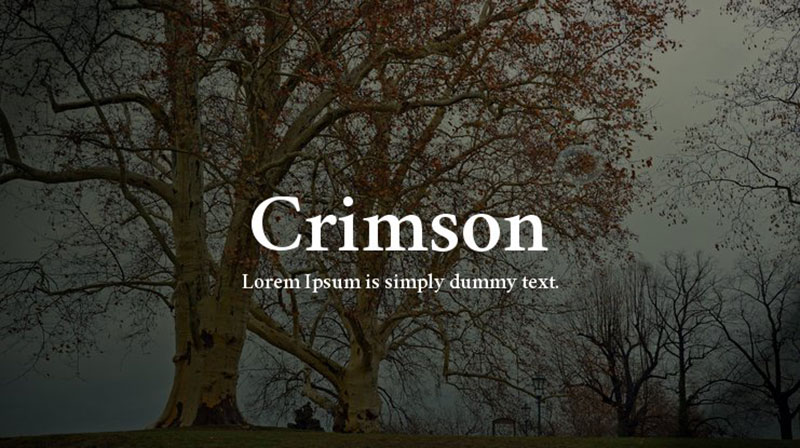
Crimson Text stands as a free alternative to Minion Pro, inspired by Renaissance-era oldstyle serif fonts and designed for book production. Created by Sebastian Kosch in 2010, this typeface draws influence from designers like Jan Tschichold and Robert Slimbach.
What It Is
Free typeface available through Google Fonts library with Garalde characteristics, bracketed serifs, and moderate stroke weight variation between thick and thin elements.
The design exhibits warm humanist qualities with low contrast letterforms.
Key Features
- Renaissance-inspired proportions with calligraphic elements
- Six weights from regular to bold (Roman and Italic each)
- Small caps, oldstyle figures, and mathematical characters included
- Long ascenders and descenders creating graceful text flow
Typography Characteristics
High contrast letterforms combined with balanced spacing create readable body text at various sizes.
The italics show distinct calligraphic influence with elegant swashes. Moderate x-height maintains clarity in dense passages.
Character spacing optimized for comfortable extended reading in both print and screen formats.
Best Applications
Literary publications and lengthy manuscripts benefit from Crimson Text’s readability.
Academic papers, editorial content, and professional documents work well with this typeface. Website body text gains classical sophistication without licensing fees.
Font Pairing Options
Pairs effectively with humanist sans-serif faces for hierarchical distinction.
Works alongside script fonts for invitation designs. Combines with display fonts for magazine layouts requiring typographic hierarchy.
Licensing
SIL Open Font License permits free use across personal and commercial projects.
No restrictions for web embedding, modification, or distribution. Available through Google Fonts with no authentication required.
Alegreya

Alegreya delivers dynamic rhythm for literature while maintaining contemporary sensibility. Juan Pablo del Peral created this award-winning typeface family specifically for long-form reading experiences.
What It Is
Humanist serif font family with calligraphic roots, chosen as one of 53 “Fonts of the Decade” at ATypI Letter2 competition in 2011.
Space-efficient design concealed behind expansive appearance and loose spacing.
Key Features
- Varied rhythm through alternating thick and thin strokes
- True italics with cursive-like flowing strokes (not merely slanted romans)
- Bold weights remain strong while Black weights push experimental boundaries
- Small caps available as companion family
Short serifs combined with long serifs on specific letters like ‘C’, ‘T’, and ‘r’ create open reading texture.
Typography Characteristics
Calligraphic feeling throughout conveys movement without sacrificing legibility.
Dynamic stroke contrast mimics human handwriting patterns. Extensive character set supports multilingual projects with accented characters and diacritical marks.
The weight range allows all cuts to function in text with sufficient differentiation for emphasis.
Best Applications
Novel settings and literary magazines capitalize on Alegreya’s varied rhythm.
Lifestyle website body copy gains personality while maintaining professional appearance. Packaging design benefits from heavier weights without texture loss.
Book interiors for fiction and poetry showcase the typeface’s calligraphic heritage.
Font Pairing Options
Alegreya Sans provides designed companion for same-family system consistency.
Combines with geometric sans-serifs for modern editorial layouts. Works with slab serif fonts for attention-grabbing headlines above body text.
Licensing
SIL Open Font License through Google Fonts for libre version.
Professional version available from Huerta Tipográfica with extended character sets. Both versions cleared for commercial applications.
Adobe Garamond
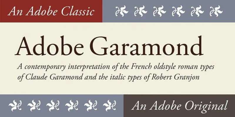
Adobe Garamond represents Robert Slimbach’s authentic revival of Claude Garamond’s 16th-century Renaissance types. Released in 1989, this became a foundational typeface for desktop publishing’s modern era.
What It Is
Old-style serif typeface from Adobe Originals program based on roman types by Garamond and italic forms by Robert Granjon.
Digital interpretation balancing historical authenticity with contemporary technical requirements. Features three weights (regular, semibold, bold) each with matching italics.
Key Features
- Low contrast between thick and thin strokes with diagonal stress
- Bracketed serifs with slight flare adding ornamental touches
- Humanistic proportions create organic, warm appearance
- Small bowl on lowercase ‘a’ and small eye on lowercase ‘e’
Based on larger parangonne size specimens rather than typical text sizes.
Typography Characteristics
Exceptional readability particularly in extended text passages and small point sizes.
Balanced spacing and moderate stroke weight variation suit both print and digital formats. Even color across the page without capitals standing out excessively.
Mature, restrained design compared to aggressive ITC Garamond interpretations.
Best Applications
Book design and publishing where legibility across extended reading matters most.
Academic journals and research papers requiring professional authority. Corporate communications needing timeless sophistication.
Magazine body text and editorial articles benefit from refined elegance.
Font Pairing Options
Works alongside sans-serif fonts like Proxima Nova or Gill Sans for clean hierarchy.
Combines with Europa or Myriad Pro for corporate identity systems. Pairs with Futura PT for modernist aesthetic contrast.
Licensing
Available through Adobe Fonts subscription for sync and web use.
Desktop licensing through MyFonts and Fonts.com with tiered user counts. Cleared for both personal and commercial applications through Adobe ecosystem.
Adobe Caslon
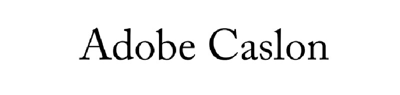
Adobe Caslon revives William Caslon’s influential 18th-century English types with Carol Twombly’s careful digital interpretation. This 1990 release captured the warmth of Caslon’s text sizes while adding comprehensive OpenType features.
What It Is
Old-style serif revival based on Caslon specimen pages from 1734 to 1770, adapted for modern typesetting technology.
Six-style family with regular, italic, semibold, semibold italic, bold, and bold italic cuts. Member of Adobe Originals collection designed for professional publishing.
Key Features
- Scooped-out apex on capital ‘A’ as identifying characteristic
- Capital ‘C’ with two full serifs following Caslon’s original design
- Swashed lowercase ‘v’ and ‘w’ in italic variants
- ‘Th’ ligature available to solve spacing issues between these letters
Widely splayed ‘T’ creates distinctive character pattern.
Typography Characteristics
Moderate contrast between thick and thin strokes maintains readability across sizes.
Short ascenders and descenders allow tighter line spacing without character collision. Bracketed serifs with slight calligraphic influence from Baroque period.
Sturdy letterforms perform reliably in text sizes from 6 to 14 points.
Softness suggesting letterpress squash adds robustness for body text despite modern printing processes.
Best Applications
Magazine articles and journal interiors benefit from Caslon’s universal versatility.
Used extensively in The New Yorker for body text. Book publishing for both fiction and non-fiction where traditional appearance supports content.
University branding (official typeface for University of Virginia and USC).
Font Pairing Options
Combines with Brandon Grotesque or Effra for contemporary sans-serif balance.
Works alongside Myriad Pro or Museo Sans for digital applications. Pairs with GT Walsheim for fashion and lifestyle editorial layouts.
Licensing
Available through Adobe Fonts subscription and Typekit service.
Desktop, webfont, and electronic document licenses through Fonts.com and Fontspring. Different license types accommodate various commercial applications and user counts.
Sabon

Sabon uniquely solved technological constraints by working identically across Linotype, Monotype, and hand-set foundry type. Jan Tschichold designed this beloved 1967 typeface based on Claude Garamond’s letterforms and types attributed to Jacques Sabon.
What It Is
Serif typeface created to maintain identical appearance across three different metal typesetting technologies of the 1960s.
Based on Garamond’s work with capitals derived from 1592 Konrad Berner Frankfurt specimen. Named after Jacques Sabon, a Frankfurt punchcutter who brought Garamond matrices to the city.
Key Features
- Designed to work on Linotype, Monotype, and foundry systems with matching appearance
- Moderate x-height with classical oldstyle proportions
- Elegant italics with appropriate slant and character
- Comprehensive weights suitable for text and display purposes
Technology-agnostic design allowed consistent branding across different printing methods.
Typography Characteristics
Oldstyle serif construction with diagonal stress and moderate stroke contrast.
Refined letterforms balance between Garamond’s elegance and practical typesetting demands. Clear, distinct characters prevent confusion in body text settings.
Even texture across the page supports extended reading without visual fatigue.
Best Applications
Book typography where Garamond alternatives with broader weight range help.
Corporate communications requiring professional gravitas with classical roots. Publishing houses favoring traditional typography with modern versatility.
Long documents and reports benefit from Sabon’s clarity at text sizes.
Font Pairing Options
Works with geometric sans-serifs for clean modernist layouts.
Combines with humanist sans faces for editorial magazine design. Pairs effectively with other Garamond-inspired types when family variety needed for visual hierarchy.
Licensing
Available through major foundries including Linotype, Monotype, and others.
Desktop and web licensing varies by distributor. Commercial use permissions included with proper license purchase through established type vendors.
Garamond

Garamond encompasses numerous interpretations of Claude Garamond’s 16th-century French Renaissance types. This classification includes many distinct versions, each capturing different aspects of the original punchcutter’s work.
What It Is
Family name covering multiple revivals and interpretations of types cut by Claude Garamond between 1530 and 1561.
Old-style serif category characterized by humanistic qualities, diagonal stress, and modest stroke weight variation. Different versions show significant design differences despite shared heritage.
Key Features
- Small bowl on lowercase ‘a’ across most versions
- Small eye on lowercase ‘e’ as characteristic element
- Low contrast between thick and thin strokes
- Diagonal stress following pen angle conventions
Each revival interprets original specimens differently based on designer choices and available source material.
Typography Characteristics
Among most legible serif typefaces for print applications.
Humanist construction creates warm, organic reading experience. Excellent economy of space makes Garamond ink-efficient choice for high-volume printing.
Moderate x-height balanced with generous counters maintains clarity at small sizes.
Best Applications
Book interiors and lengthy publications where readability drives decisions.
Academic journals and scholarly papers requiring professional typography. Corporate reports benefiting from space efficiency without compromising legibility.
Fine printing projects seeking historical authenticity and classical refinement.
Font Pairing Options
Pairs naturally with Renaissance-inspired italics for period-appropriate designs.
Combines with modern sans-serifs to bridge historical and contemporary aesthetics. Works alongside other oldstyle serifs when multiple text faces needed for complex documents.
Licensing
Varies dramatically by specific version and foundry.
Adobe Garamond, EB Garamond (free), Stempel Garamond, and others each have distinct licensing terms. Check specific version for accurate usage permissions and commercial rights.
Lyon Text
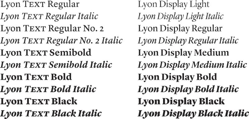
Lyon Text balances contemporary sensibility with classical serif tradition. Kai Bernau created this text-optimized family for robust performance across diverse media and sizes.
What It Is
Modern text serif family designed specifically for editorial and publishing applications requiring versatility.
Multi-weight system with carefully calibrated optical sizes for different point ranges. Part of larger Lyon superfamily including display and deck variants.
Key Features
- Multiple optical sizes optimize for specific reading contexts
- Extended weight range from light to bold
- Sturdy construction maintains clarity in challenging printing conditions
- Contemporary interpretation of classical serif principles
Generous x-height paired with open counters improves small-size legibility.
Typography Characteristics
Strong horizontal stress guides eye smoothly across lines of text.
Moderate stroke contrast prevents visual fatigue during extended reading. Crisp details hold definition when printed at small sizes or displayed on screens.
Rational construction allows mixing weights within same text block without texture disruption.
Best Applications
Newspaper body text and editorial content requiring workhorse reliability.
Magazine features balancing readability with typographic character. Digital publishing platforms where screen rendering quality matters.
Annual reports and corporate publications needing professional polish.
Font Pairing Options
Pairs with geometric sans-serifs for clean, modern editorial layouts.
Works alongside companion Lyon Display for size-specific optimization. Combines with contemporary grotesques for technology and business communications.
Licensing
Commercial licensing through type foundries specializing in editorial faces.
Desktop and webfont licenses available with various user tiers. Professional publishing often requires extended licenses for high-circulation applications.
Galliard

Galliard revives Robert Granjon’s 16th-century types through Matthew Carter’s skilled interpretation. This ITC release from 1978 captured the warmth and liveliness of Granjon’s influential Renaissance typography.
What It Is
Old-style serif typeface based on types cut by Robert Granjon around 1570 in Paris.
Designed by Matthew Carter for International Typeface Corporation with multiple weights and styles. Name references 16th-century lively dance form matching typeface’s spirited character.
Key Features
- Energetic italics with pronounced slope and flourish
- Slightly informal character compared to more reserved Garamond interpretations
- Rich weight range from regular through ultra-bold
- Swash capitals and alternate characters add versatility
Distinctive ‘g’ with characteristic loop shape identifies Granjon influence.
Typography Characteristics
Lively rhythm throughout maintains reader engagement in lengthy texts.
More personality than typical oldstyle revivals while retaining classical elegance. Robust construction handles various printing conditions and reproduction methods.
Strong color on page creates presence without excessive contrast or weight.
Best Applications
Book design where personality matters alongside readability.
Magazine and journal typography seeking warmth beyond neutral text faces. Packaging and branding applications requiring classical sophistication with approachability.
Wedding invitations and formal documents benefiting from swash alternates.
Font Pairing Options
Combines with sans-serif fonts for balanced hierarchy in editorial design.
Works with geometric or humanist sans faces depending on desired aesthetic. Pairs with other oldstyle serifs when multiple text weights needed for complex layouts.
Licensing
Available through ITC and licensed distributors worldwide.
Desktop licenses typically include full weight range and OpenType features. Web embedding and app licenses available separately through MyFonts and similar vendors.
Harriet
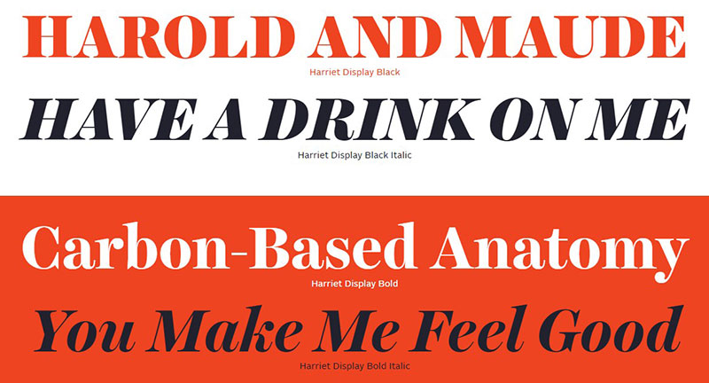
Harriet brings personal warmth to text typography through Jackson Cavanaugh’s design for Okay Type foundry. This contemporary serif family balances quirkiness with serious reading functionality.
What It Is
Modern text serif with distinctive personality designed for editorial and publishing contexts.
Multi-weight family with matching italics featuring unconventional details within professional framework. Released as part of Okay Type’s collection of characterful text faces.
Key Features
- Idiosyncratic details create memorable character without compromising legibility
- Extended weight range suitable for text and display applications
- True-drawn italics with personality distinct from roman cuts
- Open counters and generous spacing improve readability
Slightly compressed proportions improve space efficiency in layouts.
Typography Characteristics
Contemporary take on transitional serif construction with personal touches.
Moderate contrast creates comfortable texture for body text. Unusual details in specific letterforms add visual interest without disrupting reading flow.
Sturdy weights maintain clarity at smaller sizes while display cuts show refinement.
Best Applications
Magazine features and editorial content wanting distinct voice.
Brand communications requiring approachable sophistication. Book design for contemporary fiction and creative non-fiction.
Digital platforms where personality differentiates content from competitors.
Font Pairing Options
Works with geometric sans-serifs for contemporary editorial layouts.
Pairs with grotesques for technology and startup branding. Combines with script fonts for wedding and lifestyle applications.
Licensing
Commercial licensing through Okay Type foundry.
Desktop and webfont options with tiered pricing based on pageviews or users. Extended licenses available for high-traffic websites and large organizations.
Freight Display Pro

Freight Display Pro optimizes Joshua Darden’s Freight family specifically for headline and large-size applications. This display variant emphasizes refined details that emerge at larger scales.
What It Is
Display-optimized serif typeface designed for headlines, subheads, and large-format typography.
Part of Freight superfamily including text-optimized versions for comprehensive typographic systems. Features delicate details and higher contrast appropriate for display sizes.
Key Features
- Refined stroke contrast suitable for display applications
- Delicate serifs and fine details visible at large sizes
- Multiple weights from light through black
- Ball terminals and distinctive letterform details
Optical sizing ensures details work effectively at intended scale ranges.
Typography Characteristics
Higher stroke contrast than text versions creates elegant appearance at display sizes.
Fine details in terminals and serifs add sophistication visible in headlines. Slightly condensed proportions improve headline fit without appearing squeezed.
Elegant curves and balanced proportions create polished aesthetic.
Best Applications
Magazine headlines and editorial display typography.
Packaging design for premium products requiring refined elegance. Poster design and large-format print where details showcase at scale.
Website headers and hero sections needing typographic distinction.
Font Pairing Options
Pairs naturally with Freight Text Pro for same-family system.
Works alongside humanist sans-serifs for balanced hierarchy. Combines with slab serif fonts for eclectic editorial treatments.
Licensing
Commercial licensing through GarageFonts and authorized distributors.
Desktop licenses scaled by user count. Web licensing based on monthly pageviews with annual renewal model.
Solitas Serif
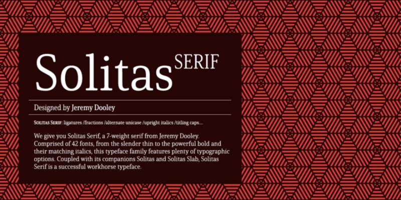
Solitas Serif offers warm, approachable serif typography with contemporary sensibility. This typeface family balances friendliness with professional functionality for diverse applications.
What It Is
Contemporary serif family designed for readability with personable character.
Modern interpretation of traditional serif construction with softer, more approachable details. Multi-weight system supports text and display hierarchy needs.
Key Features
- Warm, friendly character without sacrificing professional appearance
- Generous x-height improves legibility across media
- Multiple weights from light through bold with matching italics
- Open apertures and counters enhance clarity
Slightly rounded terminals soften overall appearance.
Typography Characteristics
Moderate stroke contrast maintains readability without appearing flat.
Contemporary proportions suit both print and digital applications. Even color across weights allows mixing within same design without texture conflicts.
Friendly details prevent overly formal or cold appearance in body text.
Best Applications
Brand communications requiring approachable professionalism.
Website body text balancing readability with personality. Marketing materials and collateral seeking warmth without informality.
Editorial content for lifestyle, wellness, and human-centered topics.
Font Pairing Options
Works with geometric sans-serifs for clean modern layouts.
Pairs with humanist sans faces for cohesive brand systems. Combines with display fonts for editorial magazines and publications.
Licensing
Commercial licensing through contemporary type foundries.
Desktop and web options with standard tiered pricing. App embedding and electronic publication licenses available separately.
URW Garamond
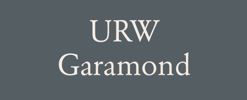
URW Garamond delivers free alternative to commercial Garamond interpretations. This digitization captures essential Garamond characteristics while offering broad accessibility through open licensing.
What It Is
Free Garamond interpretation from URW Type Foundry available for commercial use.
Digital revival of Renaissance Garamond types with focus on accessibility and practical application. Multiple weights and styles provide typographic flexibility.
Key Features
- Essential Garamond characteristics without licensing fees
- Multiple weights suitable for text and display purposes
- Extended character set supports multiple languages
- OpenType features include ligatures and oldstyle figures
Free availability removes licensing barriers for budget-conscious projects.
Typography Characteristics
Classical oldstyle proportions with diagonal stress and modest contrast.
Readable at text sizes while maintaining elegance at larger scales. Balanced letterforms create even texture across extended passages.
Similar warmth and organic quality to commercial Garamond versions.
Best Applications
Independent publishing projects with limited typography budgets.
Student work and educational materials requiring professional appearance. Non-profit communications and volunteer-driven design projects.
Prototyping and mockups before committing to commercial font licenses.
Font Pairing Options
Combines with free sans-serifs like Open Sans or Roboto for complete systems.
Works alongside other free oldstyle serifs when variety needed. Pairs with condensed sans faces for space-efficient layouts.
Licensing
Free for commercial use through URW++ Type Foundry.
Available through Google Fonts and similar distribution platforms. No usage restrictions or attribution requirements in most contexts.
Vollkorn

Vollkorn provides robust free serif alternative with strong Germanic character. Friedrich Althausen designed this typeface specifically for screen readability while maintaining print quality.
What It Is
Free serif typeface optimized for body text in both digital and print applications.
Named from German word meaning “wholegrain,” suggesting substantial, hearty character. Available through Google Fonts with regular updates and improvements.
Key Features
- Dark, sturdy weights maintain screen readability
- Slightly condensed proportions improve space efficiency
- Multiple weights from regular through black
- Clear letterforms prevent confusion between similar characters
Germanic proportions create distinctive appearance among free serifs.
Typography Characteristics
Higher x-height than many classical serifs improves small-size legibility.
Strong, even color on page creates robust text texture. Moderate contrast suitable for various rendering conditions and print processes.
Generous spacing prevents crowding while maintaining efficient line length.
Best Applications
Website body text requiring free, reliable serif option.
Independent book publishing seeking professional appearance without costs. Blog articles and long-form digital content prioritizing readability.
Print-on-demand projects where licensing fees affect profit margins.
Font Pairing Options
Works with modern sans-serifs for clean digital interfaces.
Pairs with geometric faces for contemporary editorial design. Combines with other Google Fonts for completely free typography systems.
Licensing
SIL Open Font License through Google Fonts allows unrestricted use.
Free for personal and commercial projects without attribution requirements. Web embedding and modification permitted under open license terms.
Alice

Alice offers delicate, feminine serif typography with fairy-tale charm. This free typeface balances whimsical details with functional readability for specific aesthetic contexts.
What It Is
Free serif typeface from Google Fonts with storybook-inspired character.
Single weight design featuring refined details and elegant proportions. Named and styled to evoke Alice in Wonderland’s literary charm.
Key Features
- Delicate serifs with refined, graceful curves
- High contrast between thick and thin strokes
- Distinctive uppercase characters with personality
- Fairy-tale aesthetic without sacrificing legibility
Limited to single weight constrains versatility but focuses design intent.
Typography Characteristics
Transitional serif construction with vertical stress and elegant terminals.
Higher contrast creates refined appearance at medium to large sizes. Slightly condensed letterforms maintain readability while appearing delicate.
Distinctive personality makes Alice memorable in appropriate contexts.
Best Applications
Children’s book design and literary projects with whimsical themes.
Wedding invitations and stationery requiring romantic elegance. Boutique branding for feminine-focused products and services.
Editorial headers and pull quotes adding personality to layouts.
Font Pairing Options
Combines with simple sans-serifs to let Alice’s character show.
Works alongside script fonts for wedding and invitation design. Pairs with geometric faces for contrast between delicate and sturdy elements.
Licensing
Free through Google Fonts under SIL Open Font License.
No restrictions for personal or commercial applications. Web use and modification permitted without fees or attribution.
Average

Average delivers straightforward serif typography without pretension. This free Google Font provides basic serif functionality for projects requiring simple, readable text faces.
What It Is
Free serif typeface designed for utilitarian body text applications.
Single weight offering from Google Fonts emphasizing readability over personality. Name reflects intent: average, dependable serif typography for everyday use.
Key Features
- Clear, unadorned letterforms prioritize function
- Moderate x-height balances legibility with traditional proportions
- Even spacing creates consistent texture
- Simple serif treatment without decorative flourishes
Limited to single weight simplifies selection but restricts hierarchy options.
Typography Characteristics
Traditional serif construction with modest stroke contrast.
Neutral character works across diverse content types without imposing style. Reliable rendering across platforms and browsers maintains consistency.
Balanced proportions prevent visual fatigue in body text.
Best Applications
Basic website body text requiring free serif option.
Simple documents and reports where typography remains invisible. Blog posts and articles prioritizing content over typographic expression.
Prototyping and wireframes testing serif layout before final font selection.
Font Pairing Options
Works with any sans-serif for straightforward hierarchy.
Combines with more characterful display faces for editorial layouts. Pairs with geometric or grotesque sans for utilitarian design systems.
Licensing
SIL Open Font License through Google Fonts permits unrestricted use.
Free for commercial and personal projects without fees. Web embedding included with Google Fonts hosting infrastructure.
Roboto Slab
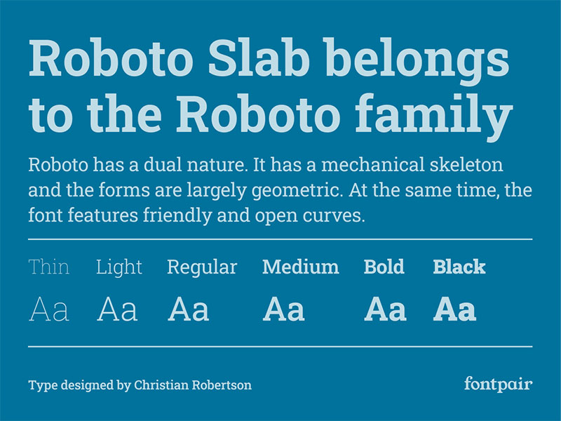
Roboto Slab brings geometric precision to slab serif typography. Christian Robertson designed this mechanistic serif as companion to ubiquitous Roboto sans-serif family.
What It Is
Geometric slab serif typeface designed as serif companion to Roboto sans family.
Commissioned by Google for Android operating system and expanded to Google Fonts. Mechanical construction contrasts with humanist warmth of traditional serifs.
Key Features
- Geometric letter construction with consistent stroke weights
- Slab serifs without bracketing create contemporary appearance
- Variable font technology allows precise weight adjustment
- Extended weight range from thin through black
Matches Roboto sans proportions for seamless family pairing.
Typography Characteristics
Low stroke contrast creates even, mechanical texture.
Geometric shapes based on circles and rectangles rather than calligraphic forms. Slightly condensed proportions improve screen display density.
Clear, distinct letterforms prevent confusion in UI contexts.
Best Applications
Digital interfaces requiring serif option matching Roboto sans.
Technology and software company branding seeking modern serif presence. Website body text for contemporary, tech-forward organizations.
App typography where slab serifs improve hierarchy without traditional appearance.
Font Pairing Options
Designed specifically to pair with Roboto sans family.
Works with other geometric sans faces for cohesive modern systems. Combines with script fonts for unexpected contrast in contemporary design.
Licensing
Apache License 2.0 through Google Fonts allows unrestricted use.
Free for commercial projects without fees or attribution requirements. Variable font format enables precise weight customization without multiple files.
TT Ramillas
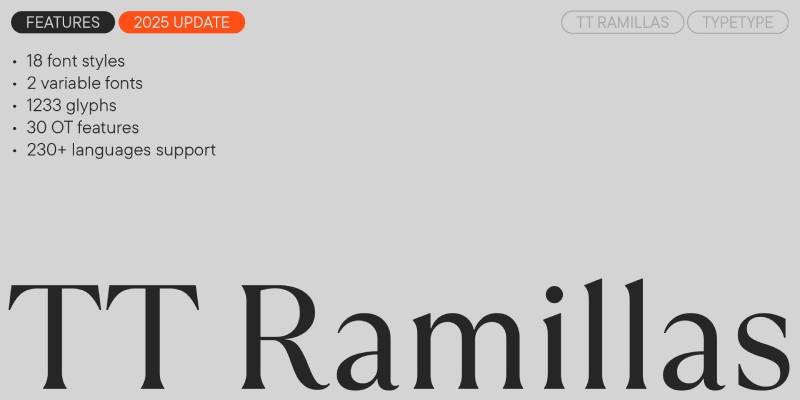
TT Ramillas blends antique elegance with contemporary functionality. This TypeType foundry release balances historical inspiration with modern technical requirements.
What It Is
Contemporary serif family inspired by antique letterforms and classical typography.
Multi-weight system with extensive character sets and OpenType features. Designed for editorial and branding applications requiring both elegance and versatility.
Key Features
- Classical proportions updated for contemporary applications
- Extended weight range from thin through black
- Rich OpenType feature set includes alternates and ligatures
- Multiple stylistic sets offer design flexibility
Large character set supports extensive language coverage.
Typography Characteristics
Moderate stroke contrast creates refined text texture.
Classical serif construction with contemporary spacing and proportions. Even color across weights facilitates mixing within single design.
Slightly humanist influence adds warmth to otherwise formal structure.
Best Applications
Editorial design for upscale magazines and publications.
Luxury brand communications requiring classical sophistication. Book design balancing traditional aesthetics with modern readability.
Corporate identity systems needing versatile, professional serif family.
Font Pairing Options
Works with grotesque sans-serifs for contemporary editorial layouts.
Pairs with geometric faces for luxury branding applications. Combines with other serif families when extensive style variety needed.
Licensing
Commercial licensing through TypeType foundry.
Desktop and web licenses with tiered pricing based on usage. Extended licenses for large organizations and high-traffic websites available separately.
TT Tricks
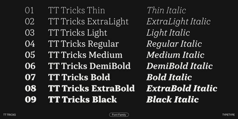
TT Tricks offers playful elegance with unexpected personality. This TypeType family balances quirky details with professional functionality for distinctive branding applications.
What It Is
Contemporary serif family with distinctive character and unconventional details.
Multi-weight system designed for branding and editorial contexts wanting memorable typography. Features unique letterform solutions that distinguish from conventional serifs.
Key Features
- Unconventional letterform details create memorable identity
- Multiple weights maintain character across weight range
- Extensive OpenType features include stylistic alternates
- True-drawn italics with distinct personality
Quirky details integrated thoughtfully to avoid gimmicky appearance.
Typography Characteristics
Moderate contrast with unexpected terminal treatments and stroke endings.
Contemporary construction with antique influences creating hybrid aesthetic. Clear, readable letterforms despite unconventional details.
Even spacing maintains professional appearance across applications.
Best Applications
Brand identity requiring distinctive, memorable typography.
Editorial design for lifestyle and culture publications. Packaging for creative, youth-focused products and services.
Website headers and hero sections needing typographic personality.
Font Pairing Options
Works with simple, neutral sans-serifs to let Tricks’ character show.
Pairs with geometric faces for balance between playful and serious. Combines with slab serif fonts for eclectic editorial treatments.
Licensing
Commercial licensing through TypeType foundry and distributors.
Desktop licenses include full OpenType feature access. Web and app embedding available through separate license tiers.
GT Sectra
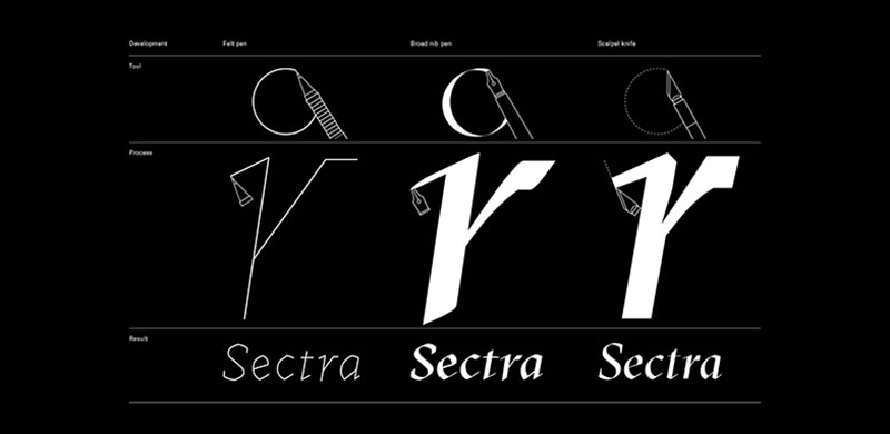
GT Sectra delivers sharp elegance through Grilli Type’s contemporary serif design. This family balances refined details with robust functionality across editorial applications.
What It Is
Contemporary serif family from Swiss foundry Grilli Type emphasizing elegance and functionality.
Multi-weight system with display and text variants optimized for specific size ranges. Features sharp details and refined proportions for upscale applications.
Key Features
- Sharp, refined serifs with contemporary treatment
- Display and text optical sizes optimize for different scales
- Extended weight range with matching italics
- Premium construction quality throughout weight range
Swiss design sensibility emphasizes precision and restraint.
Typography Characteristics
High stroke contrast creates elegant, refined appearance.
Sharp terminals and crisp details reward large-size display use. Text variants slightly sturdier for extended reading functionality.
Contemporary proportions suit both print and screen applications.
Best Applications
Fashion and luxury brand editorial content.
Premium magazine design emphasizing typographic sophistication. High-end packaging and collateral materials.
Website hero sections and headers requiring elegant impact.
Font Pairing Options
Works with neutral grotesque sans-serifs for Swiss-style layouts.
Pairs with geometric faces for fashion and beauty applications. Combines with other premium serifs when extensive style variety required.
Licensing
Commercial licensing through Grilli Type foundry.
Desktop and web licenses with premium pricing reflecting quality. Extended licenses for large organizations and broadcasting available separately.
Baskerville
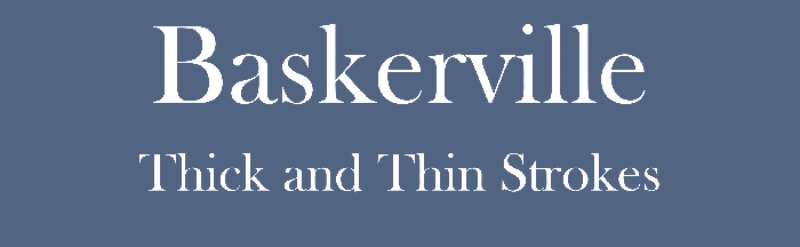
Baskerville represents transitional typography bridging old-style and modern serif classifications. John Baskerville created original types in 1757, with numerous revivals capturing different aspects of his revolutionary work.
What It Is
Transitional serif typeface falling between classical faces like Caslon and modern serifs like Didot.
Multiple interpretations exist from various foundries, each emphasizing different aspects of Baskerville’s original designs. Features increased stroke contrast and more vertical stress than oldstyle predecessors.
Key Features
- Higher contrast than oldstyle serifs with sharper serifs
- More vertical axis in rounded letters compared to Caslon
- More circular rounded strokes create regular appearance
- Refined, elegant character with improved legibility
Original used by Baskerville to print folio Bible in 1763.
Typography Characteristics
Transitional construction bridges humanist warmth and rational modernism.
Sharper serifs and increased contrast create refined text texture. More regular character shapes improve consistency across letterforms.
Moderate x-height balanced with elegant proportions.
Best Applications
Book typography requiring refined elegance without excessive formality.
Academic publishing and scholarly journals. Corporate communications balancing tradition with accessibility.
Print applications where Baskerville’s crisp details reproduce well.
Font Pairing Options
Works with transitional and geometric sans-serifs for period-appropriate combinations.
Pairs with humanist sans faces for balanced contemporary layouts. Combines with script fonts for wedding and formal invitation design.
Licensing
Varies by specific revival and foundry.
Some versions available free (Libre Baskerville through Google Fonts). Commercial versions from Monotype, Linotype, and others require paid licenses with various terms.
FAQ on Fonts Similar To Minion Pro
What is the closest free font to Minion Pro?
Crimson Text offers the closest match through Google Fonts. Sebastian Kosch designed it with Renaissance-era proportions similar to Minion’s elegant body text characteristics.
Both share oldstyle serif construction with moderate stroke contrast and humanist warmth.
Can I use Garamond instead of Minion Pro?
Adobe Garamond works as a viable substitute for most applications. Both derive from Renaissance typography with similar readability and classical elegance.
Garamond’s smaller x-height and lighter weight create slightly different text texture than Minion.
What font does Adobe use instead of Minion now?
Adobe still maintains Minion Pro in their font library through Adobe Fonts subscription. For alternatives, they offer Adobe Garamond and Adobe Caslon as comparable oldstyle serif options.
Many designers now choose variable fonts for greater flexibility.
Is Baskerville similar to Minion Pro?
Baskerville differs as a transitional serif while Minion follows oldstyle construction. Baskerville features higher stroke contrast and more vertical stress than Minion’s diagonal axis.
Both work well for book typography despite structural differences.
What Google Font looks like Minion Pro?
Crimson Text and Alegreya come closest among free Google Fonts. EB Garamond also shares similar Renaissance-inspired proportions and classical elegance.
Libre Baskerville offers transitional alternative if slightly different character acceptable.
Why is Minion Pro so popular for books?
Minion Pro’s optical sizing optimizes readability across different point sizes. Robert Slimbach designed multiple variants specifically for caption, text, subhead, and display purposes.
Excellent kerning and extensive character sets support professional book production.
Can I pair Minion Pro alternatives with sans-serif fonts?
Most Minion alternatives pair effectively with humanist sans-serifs like Myriad or Gill Sans. Crimson Text works with Open Sans, while Adobe Garamond combines well with Proxima Nova.
Match x-height proportions for harmonious pairing results.
What’s better for print: Minion Pro or Garamond?
Both excel in print applications with excellent legibility. Minion’s optical sizing gives advantage for varied text sizes, while Garamond’s space efficiency benefits high-volume printing.
Choice depends on specific project requirements and available licensing options.
Are there Minion Pro alternatives for web design?
Alegreya, Crimson Text, and Vollkorn perform well as web fonts through Google Fonts. Premium options include Lyon Text and GT Sectra for high-end editorial websites.
Screen-optimized typography requires adequate font spacing and leading adjustments.
How do I choose between Minion Pro alternatives?
Consider licensing budget, required weights, language support, and optical sizing needs. Free options work for independent projects while premium fonts suit commercial publishing.
Test alternatives at intended sizes with actual content before final selection.
Conclusion
Fonts similar to Minion Pro range from free Google Fonts options to premium commercial typefaces offering diverse solutions for every budget. Crimson Text and Alegreya deliver Renaissance elegance without licensing costs, while Adobe Garamond and Adobe Caslon provide professional alternatives through subscription services.
Your choice depends on specific project needs. Book designers might prioritize optical sizing and extensive character sets, while web developers focus on screen rendering quality and loading performance.
Test candidates at intended sizes with actual content before committing. Pay attention to typographic hierarchy, font pairing potential, and licensing terms matching your usage scope.
The right serif typeface elevates readability while maintaining editorial sophistication. Whether selecting Baskerville’s transitional refinement or Alegreya’s dynamic rhythm, these alternatives prove Minion Pro’s excellence isn’t irreplaceable.
If you enjoyed reading this article on fonts similar to Minion Pro, you should check out these articles with fonts similar to Proxima Nova, Avenir, Lato, Papyrus, Old English, Century Gothic, Comic Sans, Gill Sans, and Eurostile.

Renowned for his expertise in logo design and visual branding, Bogdan has developed a multitude of logos for various clients.
His skills extend to creating posters, vector illustrations, business cards, and brochures. Additionally, Bogdan's UI kits were featured on marketplaces like Visual Hierarchy and UI8.
He also wrote in the past years on sites like Design Your Way, WebDesignerDepot, WPDean, Designmodo, Speckyboy, Slider Revolution, and more.
- The Cursor Logo History, Colors, Font, And Meaning - 24 September 2026
- Canva vs PowerPoint: Which Is Better for Presentations? - 22 September 2026
- How to Install Fonts on Mac (Step-by-Step Guide) - 20 September 2026

Bogdan Sandu is a seasoned designer who has been designing websites since 2008. Renowned for his expertise in logo design and visual branding, Bogdan has developed a multitude of logos for various clients. His skills extend to creating posters, vector illustrations, business cards, and brochures. Additionally, Bogdan's UI kits were featured on marketplaces like Visual Hierarchy and UI8. He also wrote in the past years on sites like Design Your Way, WebDesignerDepot, WPDean, Designmodo, Speckyboy, Slider Revolution, and more.
You Might Also Like