Ever felt the power of red in your designs? It’s not just a color; it’s an emotion, a statement. Whether you’re creating a bold poster, an elegant invitation, or a striking website, red background textures can elevate your work to a new level.
Imagine the impact of a crimson backdrop design or the rich depth of a burgundy background image. These textures are more than just visual elements-they add layers of meaning and sophistication.
In this article, you’ll dive into the world of red textures, uncovering the secrets to using abstract designs, floral patterns, and even metallic textures effectively.
By the end, you’ll know how to seamlessly integrate these elements to create visually stunning and contextually rich designs that captivate your audience.
Get ready to explore the endless possibilities and unlock the true potential of red background textures in your creative projects.
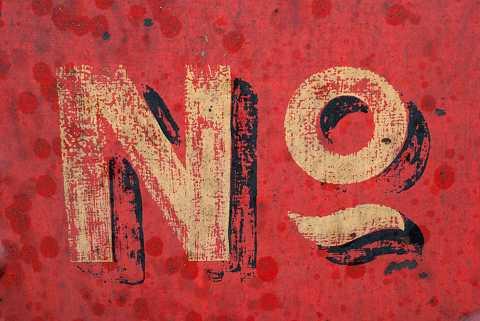
Red is a very powerful color to use in design. It can easily overwhelm if not used correctly and in the right amount, especially in its purest form.
Use it to portray power or passion. However, a red abstract background can be much more versatile than you think. Brighter reds are highly energetic, while darker shades of red are more elegant and powerful.
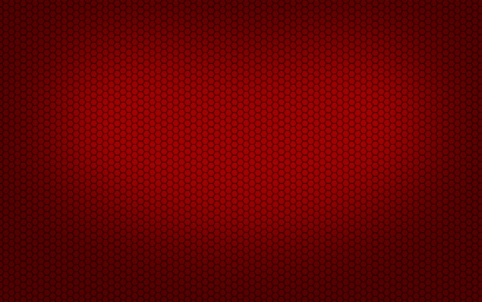
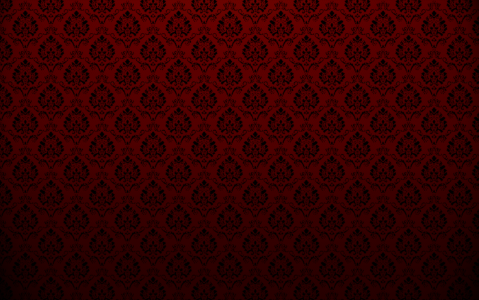
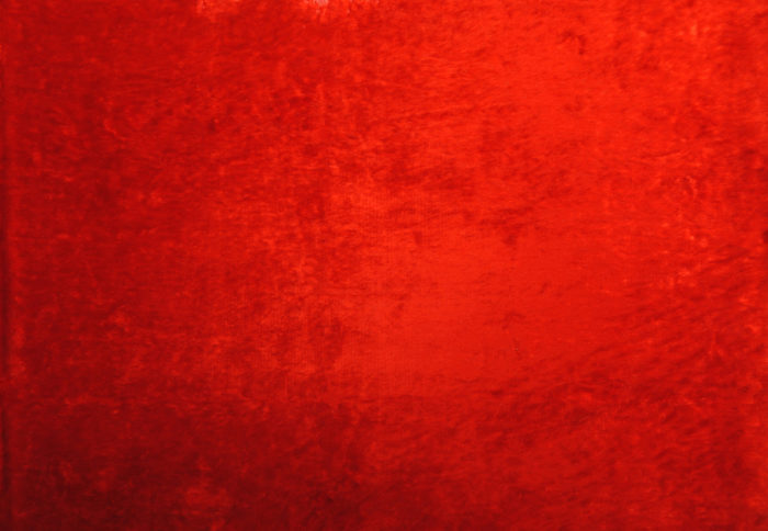
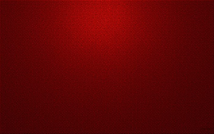
Red background textures




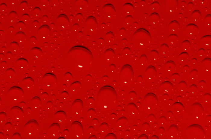
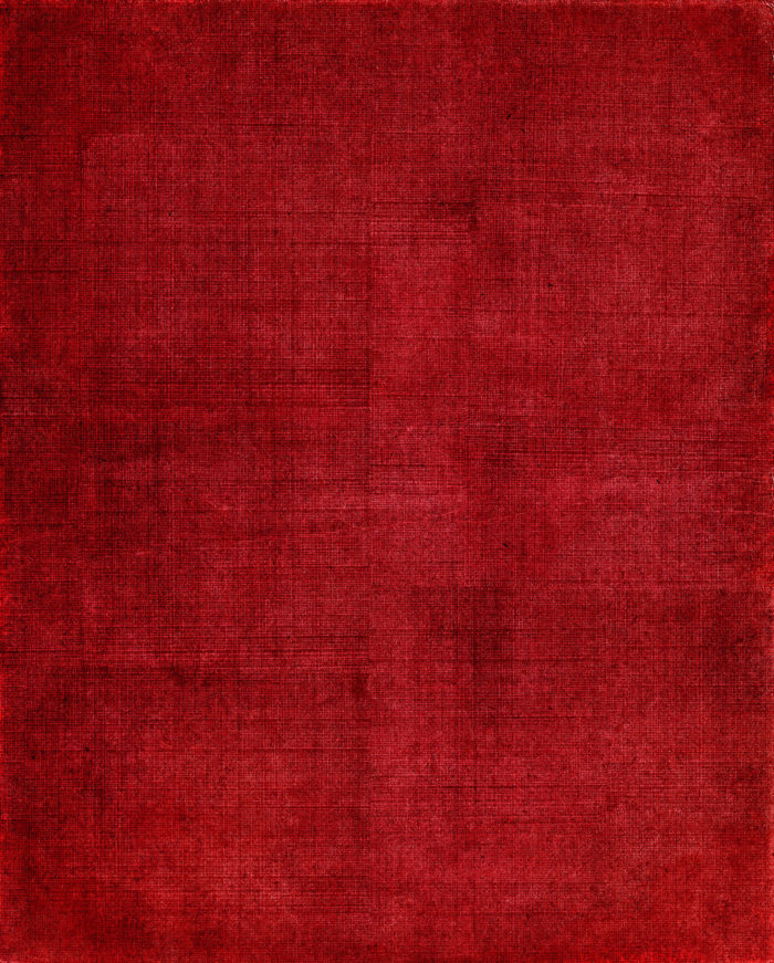
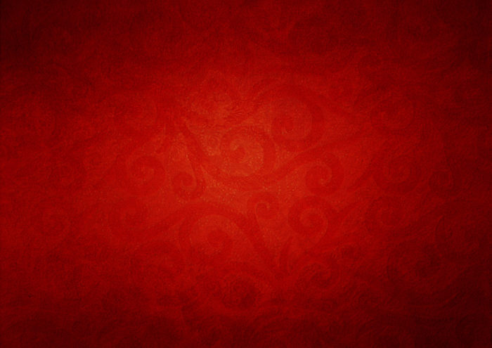
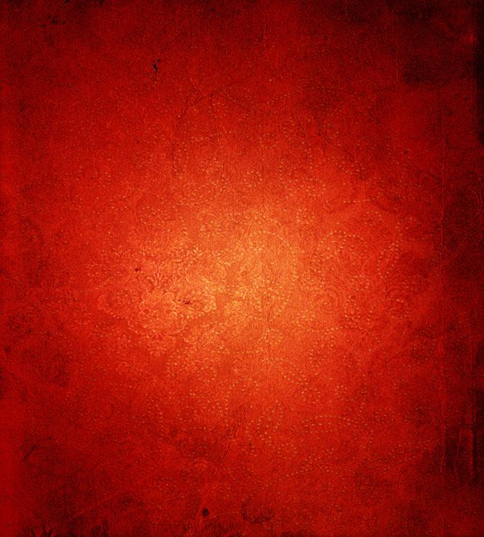

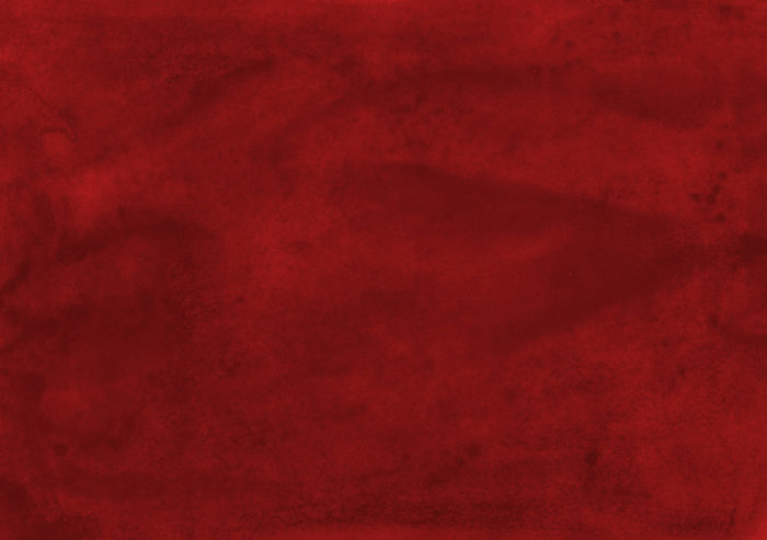

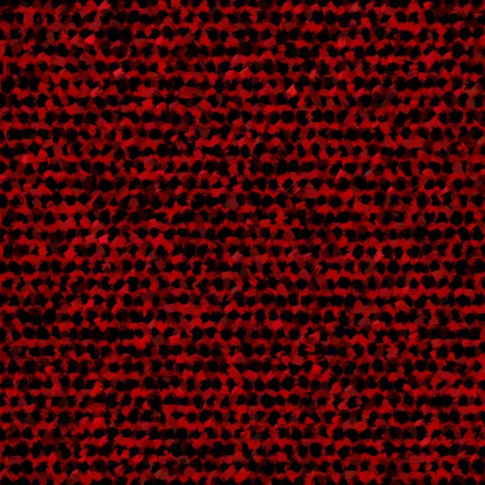

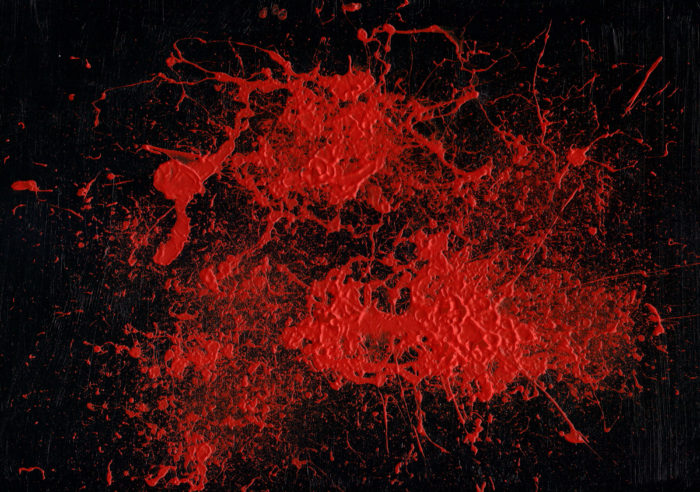

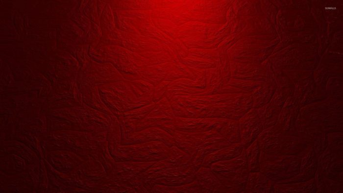

Red Hot
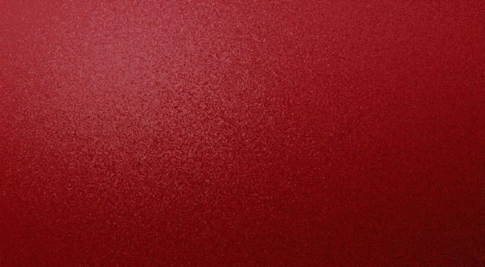
Red is not just a warm color. It is a hot color. It is very strong and hard not to notice wherever and however it is used in a design. It instantly grabs viewers’ attention to whatever it is used to highlight. It instantly brings heat and energy to a web page.
Red is a highly emotional color. It can be used to convey a wide array of feelings, including love, hate, anger, and just about everything in between.
Because of this wide array of emotional connotations, the color red used by many activist groups and charities as a part of their color scheme.
Red can also be used to display pride and strength, which is why it is commonly found on flags, team uniforms, and sports cars. It is a bit stronger than orange, another warm color, and is a better option if you need something with a bit more kick to it.
Be careful not to use too much red and be cautious about which shade of red you use for your red background. Red has been sued in the media and around the world in many cultures as a sign of danger to signal to stop.
This can turn away many viewers. Too much red acts like a wall that viewers run into right as they enter your site. It can be too harsh and not worth dealing with.
If you choose to use a completely red background and fill up their site with red, you need to do so carefully. Use light contrast and clearly legible text. A bright orange-red background with white text can be a bit too much for the eyes. A darker red can be easier to look at.
Red is a highly motivated, energetic, and nervous color. It makes people hungry and even raises their blood pressure. It begs for attention with hardly any effort at all. Deep reds, like maroon, indicate royalty or rage.
It is very sued for sending a strong message or conveying a strong personality. Red can also be used to communicate war or danger. Red is not a color you use to communicate gentle, wishy-washy emotions. It is a very, very strong color.
Where and How to Use Red
You can use red in every last element of your web design as long as you do so wisely. Use red in a way that triggers a visitor’s curiosity and pulls their attention to where it best serves the site’s purpose.
Red can be used to highlights the site’s logo, or pull attention to a particular image, or make your call to action stand out. A red background in just the right shade can set the right emotional tone for the whole site.
Red’s versatility and the way it combines with other colors mean you can use it in many different ways, but you should always think it out first. Avoid using red for energy, finance, and airlines, since it tends to send the wrong signals in those fields.
Using Red in Web Design
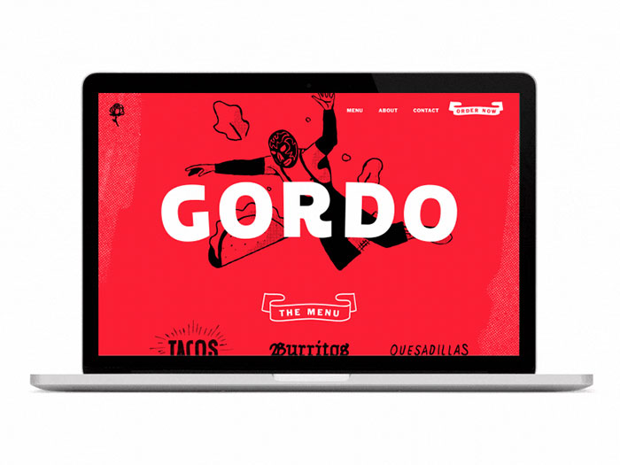
Red, as you can see, can be used to communicate a number of different tones, meanings, and moods. It is most likely to communicate the emotions associated with a particular shade that you use in a specific interface.
Bright red grabs viewers’ attention right away and is often used for CTA buttons. When you use it in a clean and minimalist interface, red conveys a very modern and professional feel.
A customer experience agency called RED uses the color for the logo, as you might guess, as well as their navigation elements, icons, brand names, and headlines, which are placed on neutral, fair-hued background with a lot of whitespace around them.
Using Red With Other Colors in Web Design
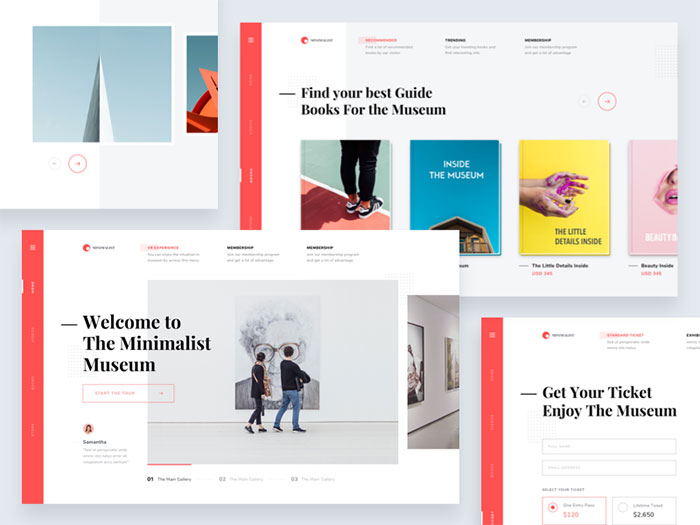
The meaning of a red background will change a bit when used with other colors. Mix red with green and yellow for food-related projects, similar to the McDonald’s logo and branding campaign.
Red and green are often used for a holiday feeling, while red and white are more clinical. Red and black can be ominous, while red and gray is quite professional.
Using Red in Infographics
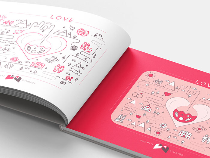
Red is very useful for drawing attention to a specific area on an infographic that you want viewers to pay attention to.
Bright reds will draw the eye of impulse buyers, while softer reds work better on more traditional shoppers with a budget. Remember, red works to grab attention, so use it to make sure people see what you want on an infographic.
FAQ On Red Background Textures
What are red background textures used for?
Red background textures are versatile and can enhance a wide range of projects. From digital marketing materials to social media graphics, they add depth and vibrancy.
They’re perfect for creating eye-catching website backgrounds, striking posters, and elegant invitations, giving each design a bold, impactful look.
Where can I find high-quality red background textures?
High-quality red background textures can be found on various design resource websites.
Platforms like Shutterstock, Adobe Stock, and Freepik offer a vast selection of textures, including fabric textures, grunge backgrounds, and geometric patterns, ensuring you find the perfect fit for your project.
How do I use red background textures in design software?
Using red background textures in design software like Photoshop or Illustrator is straightforward.
Import the texture, place it as a background layer, and adjust its size and opacity. Combine it with text elements or graphic overlays to create dynamic and visually appealing designs.
What types of red background textures are most popular?
Popular types include abstract textures, floral patterns, metallic textures, and grunge backgrounds.
Each type offers a unique aesthetic, from the elegance of red watercolor textures to the rugged feel of red brick backgrounds, allowing designers to match the mood and theme of their projects.
Can red background textures affect the mood of a design?
Absolutely. Red is a powerful color that evokes emotions such as passion, excitement, and urgency.
Using red background textures like crimson backdrops or scarlet texture patterns can intensify these feelings, making your designs more engaging and emotionally impactful.
Are there free resources for red background textures?
Yes, there are plenty of free resources available. Websites like Pexels, Unsplash, and Pixabay offer high-quality red textures without charge.
These platforms provide a variety of styles, from red paper backgrounds to red fabric textures, suitable for different design needs.
How can red background textures enhance branding?
Incorporating red background textures into branding can create a strong, memorable visual identity.
Red is associated with energy and confidence, making it ideal for logos, social media graphics, and marketing materials. Textures like red leather or red wood grain can add sophistication and depth.
What are some creative ways to use red background textures?
Get creative with red background textures by using them in collages, digital art, and product packaging.
Combine red gradient backgrounds with geometric patterns or overlay red vintage textures on photos to create unique and compelling visuals that stand out.
How do I choose the right red background texture for my project?
Choosing the right red background texture depends on the project’s theme and message. For a luxurious feel, use red velvet textures.
For a modern look, opt for red abstract designs. Consider the overall aesthetic and the emotions you want to evoke in your audience.
Can I customize red background textures?
Yes, you can customize red background textures to fit your specific needs. Use design software to alter colors, adjust brightness, and add effects.
For example, modify a red marble texture to match your brand’s color scheme or enhance a red canvas texture with overlays and filters.
Conclusion
Red background textures are not just visual elements; they are the heartbeat of dynamic and engaging design. Whether you’re crafting a bold poster, an elegant invitation, or a stunning website backdrop, the right red texture can transform your project.
From crimson backdrops and scarlet patterns to maroon texture files and ruby red wallpapers, the variety is endless. Each texture, be it red watercolor or metallic, brings its unique flair, adding depth and richness to your work.
Utilize resources from platforms like Shutterstock or Freepik to find high-quality textures. Customize them to fit your branding, ensuring a cohesive and compelling visual identity. Experiment with red abstract designs and geometric backgrounds to keep your designs fresh and innovative.
In essence, mastering the use of red background textures opens up a world of creativity. Embrace their power and watch your designs captivate and inspire.
If you enjoyed reading this article about red background, you should read these as well:
- Clouds background images to use in your designs
- Brick wall background textures that you can use in your designs
- Pastel background textures and images to download and design with
- Pink background images to use in your design projects
- Wood background textures that you can add in your designs
- Wood texture images to download and use in your projects

Renowned for his expertise in logo design and visual branding, Bogdan has developed a multitude of logos for various clients.
His skills extend to creating posters, vector illustrations, business cards, and brochures. Additionally, Bogdan's UI kits were featured on marketplaces like Visual Hierarchy and UI8.
He also wrote in the past years on sites like Design Your Way, WebDesignerDepot, WPDean, Designmodo, Speckyboy, Slider Revolution, and more.
- The Cursor Logo History, Colors, Font, And Meaning - 24 September 2026
- Top 7 Web Design Subscription Services That Replace Full-Time Hires - 24 September 2026
- Canva vs PowerPoint: Which Is Better for Presentations? - 22 September 2026

Bogdan Sandu is a seasoned designer who has been designing websites since 2008. Renowned for his expertise in logo design and visual branding, Bogdan has developed a multitude of logos for various clients. His skills extend to creating posters, vector illustrations, business cards, and brochures. Additionally, Bogdan's UI kits were featured on marketplaces like Visual Hierarchy and UI8. He also wrote in the past years on sites like Design Your Way, WebDesignerDepot, WPDean, Designmodo, Speckyboy, Slider Revolution, and more.
You Might Also Like