The McGill University logo is one of those academic marks that hasn’t needed a total overhaul to stay relevant. It’s been around, in some form, since 1906. And honestly, that says a lot about its design.
Built around a heraldic shield paired with a custom wordmark, this logo draws directly from the coat of arms of James McGill, the Scottish merchant who founded the university in 1821. The shield carries three red martlets, an open book, two crowns, and the Latin motto “In Domino Confido.” The current version was formally adopted by the Board of Governors in 1975, though the bones of the design go back to Percy Nobbs’ original 1906 work.
McGill sits at the top of Canadian higher education. It’s also one of only two non-American members of the Association of American Universities. So the logo doesn’t just represent a school. It represents a global research institution with over 200 years of history behind it. That kind of weight matters when you’re looking at how a visual identity functions.
The current logo has been in active use since the early 2000s, when McGill tightened up its formal brand policy. Before that, there were all kinds of inconsistent treatments floating around on merchandise and across faculties. Percy Nobbs designed the first coat of arms iteration, and the university has gone through at least four or five notable versions before landing on what we see today.
What Is the McGill University Logo?
The McGill University logo is a combination mark featuring a heraldic shield icon alongside a custom-designed wordmark reading “McGill.” The shield contains three red martlets, an open book bearing the inscription “In Domino Confido,” and two fleur-de-lis crowns. Percy Nobbs first designed it in 1906, and it was formally adopted in 1975.
Here’s the breakdown of its core attributes:
- Design Type: Combination mark (heraldic shield icon + custom wordmark)
- Primary Elements: Shield with three red martlets, open book, two crowns composed of fleur-de-lis, red banner representing Montreal’s mountains, and the Latin motto “In Domino Confido”
- Official Adoption Date: November 1975 (Board of Governors), with the brand policy formalized in 2000
- Original Designer: Percy Nobbs, then director of the McGill School of Architecture (1906 initial design)
- Trademark Status: Registered trademark governed by the McGill University Secretariat and the Office of Communications and External Relations. Registered with the Chief Herald of Canada in 1992
- Color Palette: McGill Red (#ED1B2F) as the primary color, paired with white (#FFFFFF) and black (#000000)
- Usage Context: University communications, digital platforms, print materials, merchandise, signage, vehicles, faculty branding, and social media avatars
How Has the McGill University Logo Evolved Over Time?

The McGill logo has gone through multiple shifts since 1906, but the core heraldic elements have remained consistent.
Percy Nobbs created the first formal coat of arms. It was patented in 1922 by the Garter King-at-Arms in London.
But the university didn’t officially adopt the design until 1975. Between those years, variations popped up constantly. The current version is a cleaned-up take on Nobbs’ original work, paired with a modern brand policy from 2000.
Original McGill Coat of Arms (1906-1922)
- Years Active: 1906 to approximately 1922
- Design Description: First formal heraldic device for the university, featuring the martlets, open book, crowns, and motto. The shield drew from James McGill’s personal armorial bearings. Percy Nobbs, who was directing the McGill School of Architecture at the time, created the design
- Color Scheme: Red martlets on silver/white background, gold book, silver crowns
- Designer: Percy Nobbs
- Context: Before this, McGill had no formalized coat of arms. Nobbs looked at the McGill family’s existing heraldic elements and turned them into something the university could actually use. The design was patented in 1922 through the Garter King-at-Arms in London, establishing the university’s legal right to the arms
- Cultural Significance: This was the first time McGill had a codified visual identity. It rooted the university in both Scottish heritage (via James McGill’s family arms) and Montreal’s French-Canadian identity (via the fleur-de-lis crowns)
Variation Period (1922-1975)
- Years Active: 1922 to 1975
- Design Description: During this stretch, the coat of arms appeared in multiple inconsistent forms. Some versions used reversed colors. Others showed a single crown instead of two. The martlet designs varied. Multiple mottos showed up in different treatments. Some versions included a surrounding banner with the Latin “Universitas Collegii McGill Monte Regio”
- Color Scheme: Varied, sometimes with reversed color fields
- Context: There was no formal usage policy. Faculties, departments, and merchandise producers all did their own thing. In 1956, Lord Lyon King-at-Arms of Edinburgh granted a posthumous coat of arms to James McGill himself, and the arms were registered in Scotland’s Public Register
- Key Changes from Previous: No single standardized version existed. The variations were largely uncontrolled
- Cultural Significance: This period shows what happens when a university grows faster than its brand standards. The inconsistency actually pushed McGill toward the formalization that came in 1975
Officially Adopted Coat of Arms (1975-1988)
- Years Active: 1975 to approximately 1988
- Design Description: The Board of Governors formally adopted the coat of arms in November 1975. This version closely resembled Nobbs’ original 1906 design, with the shield divided into two sections, three red martlets on silver in the lower half, red banner with two silver fleur-de-lis crowns and an open book on top
- Color Scheme: Red (PMS 485), gold (PMS 871U for the book), silver (PMS 877U for the crowns), white
- Context: The arms were later registered with the Chief Herald of Canada in 1992, giving them official recognition within Canadian heraldry
- Key Changes from Previous: Standardization. One official version, no more mix-and-match treatments
- Cultural Significance: This marked the moment McGill took its visual identity seriously at an institutional level
Brand Consistency Era (1988-2000)
- Years Active: 1988 to 2000
- Design Description: McGill began adopting more consistency in 1988, pairing the coat of arms with the custom wordmark “McGill” based on Garamond. The shield and wordmark started being used together as a unified logo mark
- Color Scheme: McGill Red, white, black
- Key Changes from Previous: Introduction of the custom wordmark alongside the shield, moving toward a combination mark format
- Cultural Significance: This period bridged the gap between a purely heraldic identity and a modern brand system. Universities everywhere were starting to think about branding the way corporations did, and McGill was catching up
Modern McGill Logo (2000-Present)
- Years Active: 2000 to present
- Design Description: The first formal brand policy was established in 2000, locking down the shield-plus-wordmark combination as the official university logo. The wordmark “McGill” uses a custom font derived from Garamond, where the six letters are designed as a single image and cannot be typed using any standard printing typeface
- Color Scheme: McGill Red (#ED1B2F), white (#FFFFFF), black (#000000)
- Context: The Office of Communications and External Relations developed a full Visual Identity Guide, with the 2022 revised version being the most current. The guide covers everything from clear space rules to vehicle decals to social media avatars
- Key Changes from Previous: Strict usage standards, digital format availability (SVG, PNG, EPS), defined secondary color suggestions, and clear rules about what you cannot do with the logo
- Cultural Significance: This is the version that positions McGill as a globally recognized brand, not just a Canadian university with a nice crest
What Do the Design Elements of the McGill University Logo Mean?
Every piece of the McGill shield ties back to the university’s founding story.
The three red martlets come from the McGill family coat of arms. The open book represents learning. The crowns nod to Montreal’s royal French-Canadian roots.
Together, these elements make the shield a compressed history lesson, connecting a Scottish merchant’s 1813 bequest to a modern research university that now draws students from over 150 countries.
What Does the Shield Represent?
The shield is the focal point of the entire logo. It’s divided into two distinct sections.
The lower half shows three red martlets on a silver (white) background. These come directly from James McGill’s family arms. The heraldic martlet is a mythical bird without legs, always depicted in flight. It signals constant movement, ambition, and the idea that the pursuit of knowledge never stops.
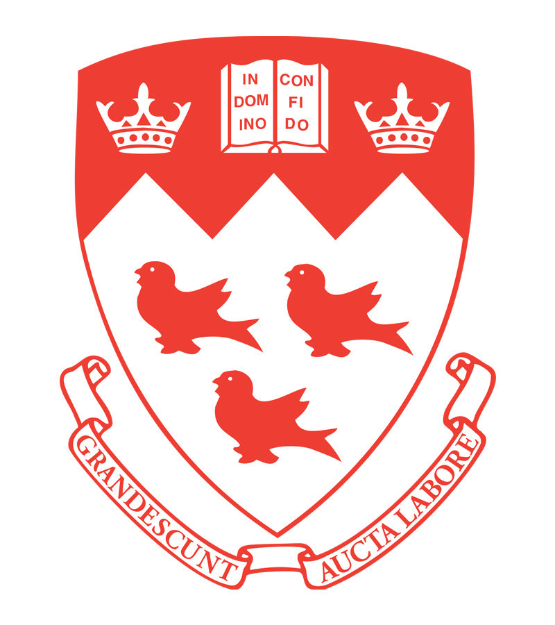
Above the martlets sits a red banner representing Montreal’s surrounding mountains. Two silver crowns made of fleur-de-lis sit on either side of an open book. The crowns point to Montreal’s royal charter and French origins. The book carries the inscription “In Domino Confido” (I trust in the Lord), which was James McGill’s personal motto.
Below the shield, an optional scroll reads “Grandescunt Aucta Labore” (By work all things increase and grow). The university’s guidelines say this scroll should only appear when the coat of arms stands alone and is large enough to keep the Latin text readable.
Why Did McGill University Choose These Specific Colors?
McGill Red is the anchor of the entire visual system. The brand guidelines are blunt about it: “McGill Red is our colour to own.”
As long as that red shows up alongside the logo, the rest of the color palette can flex. Here are the official values:
- McGill Red: Hex #ED1B2F, RGB (237, 27, 47), CMYK (0, 100, 90, 0), Pantone Solid 185 (for one or two-color printing). Strong, warm red that signals energy and academic tradition. Red is one of the most common choices in university logos and particularly among institutions from the Ivy League and similar groupings
- White: Hex #FFFFFF. Provides the clean background for the shield’s silver elements and creates readability across all formats
- Black: Hex #000000. Used in the wordmark and structural elements
- Pale Gray (suggested): #F4F4F4 for light web backgrounds
- Medium Gray (suggested): #D4D4D4 for structural accents like horizontal rules on web properties
For the full coat of arms in color printing, PMS 485 is used for the martlets, PMS 871U for the gold book, and PMS 877U for the silver crowns.
The psychology behind the color choices is straightforward. Red carries associations of passion, strength, and determination. White reads as clarity and purity. Together they create a high-contrast pair that works at practically any size.
What Typography Style Is Used in the McGill University Logo?

The wordmark “McGill” is built on a custom serif font derived from Garamond. But you can’t just type it out.
The six letters have been designed as a single image. No standard printing typeface can reproduce it. This is a key detail that a lot of people miss.
Garamond is a classic old-style serif with roots going back to the 16th century. It reads as traditional, scholarly, and refined. The custom modifications give the McGill wordmark a unique identity that can’t be faked with off-the-shelf fonts. This is smart typographic thinking, because it means the wordmark itself becomes part of the trademark. Good leading and careful kerning within the letterforms keep it readable at smaller sizes.
The font psychology at play here lines up perfectly with what you’d expect from a 200-year-old institution. Serif faces carry authority and trustworthiness.
What Are the Hidden Meanings in the McGill University Logo?
The legless martlets are the detail that catches most people off guard. In heraldry, the martlet is a bird that can never land. It’s always in flight. For a university, that’s a strong message about continuous learning and intellectual ambition.
The three martlets also tie to the McGill family specifically, not just to generic academic symbolism. So the logo is both personal and institutional at once.
The fleur-de-lis crowns do double duty. They reference Montreal’s French heritage and its royal charter. Percy Nobbs included them in 1906 to ground the university in its local context, not just in its Scottish founder’s background. It’s a design choice that says “we belong to this city.”
How Does the McGill University Logo Compare to Competitor Logos?
Most top-tier universities lean on heraldic shields. McGill is no exception. But there are real differences in how each school handles it.
The Harvard logo uses a simple three-book shield with “Veritas” and relies almost entirely on crimson for recognition. Much more minimal.
The University of Toronto logo, McGill’s closest Canadian rival, features a more detailed coat of arms with a tree, two beavers, and a crown. It’s busier. McGill’s shield is cleaner by comparison.
Oxford University’s logo uses a belt-surrounded shield with an open book and three crowns, reading “Dominus Illuminatio Mea.” Similar heraldic DNA, but Oxford’s design feels more ornamental.
Cambridge University’s emblem is also shield-based, with its cross and four lions. European schools tend to layer more symbolic elements into their crests.
The Stanford University logo breaks from the pattern entirely with its “S” tree mark, showing how American west-coast schools often reject the heraldic tradition.
Where McGill stands out is in the tightness of its combination mark. The shield-plus-wordmark format is strict, well-documented, and consistently applied. A lot of older universities still struggle with that kind of consistency.
What Are the Technical Specifications of the McGill University Logo?
Official Color Codes
- Primary Color – McGill Red: Hex #ED1B2F | RGB (237, 27, 47) | CMYK (0, 100, 90, 0) | Pantone Solid 185
- Secondary Color – White: Hex #FFFFFF | RGB (255, 255, 255) | CMYK (0, 0, 0, 0)
- Tertiary Color – Black: Hex #000000 | RGB (0, 0, 0) | CMYK (0, 0, 0, 100)
- Coat of Arms Gold (Book): Pantone 871U
- Coat of Arms Silver (Crowns): Pantone 877U
- Full Coat of Arms Red (Martlets): PMS 485
Dimensions and Proportions
The McGill Visual Identity Guide (2022 revised version) specifies that the logo is a trademark composed of two basic elements: the shield icon and the wordmark. These two pieces have a fixed spatial relationship that cannot be altered.
The guide covers clear space requirements, minimum size specifications, and proper versus improper usage examples. The shield can sometimes appear alone, but in most cases, the full logo (shield plus wordmark) is required. The wordmark should never appear without the shield except in rare, pre-approved circumstances.
Official logo files are available in vector graphics formats (SVG, EPS) and raster formats (PNG) for different use cases. The vector versions maintain quality at any scale, which matters when the logo appears on everything from business cards to building signage to vehicle decals.
What Cultural Impact Has the McGill University Logo Had?

The McGill crest is one of the most recognized academic symbols in Canada. It shows up on everything from alumni rings to downtown Montreal signage.
For a lot of international students (McGill draws from over 150 countries), the red shield is their first visual association with Canadian higher education. The Roddick Gates on the main campus, featuring the university’s arms, have become an unofficial landmark in Montreal.
The logo also plays a big role in athletics. The McGill Redbirds and Martlets sports teams pull their names directly from the heraldic martlets in the crest. That’s a pretty direct line from a 1906 coat of arms design to a student athlete’s jersey in 2025.
What’s interesting is how the logo has handled the shift to digital. Plenty of older heraldic logos look terrible at small sizes or on mobile screens. McGill’s combination mark format, with its clean shield and bold wordmark, actually scales down reasonably well. Not every university emblem can say that.
How Does the McGill University Logo Fit Into the Overall Brand Identity?
The logo sits at the center of a bigger brand system that includes official style guide documents, approved color palettes, custom fonts, and templates for everything from email signatures to web properties.
McGill’s Office of Communications and External Relations manages the whole thing. Individual faculties like the Desautels Faculty of Management and the Schulich School of Music have their own logo extensions, but they all tie back to the main mark.
The visual hierarchy is clear: McGill Red comes first, then the shield, then the wordmark. Secondary colors are suggested but not mandated, giving individual departments some flexibility without breaking the overall system. The Macdonald Campus even has its own separate coat of arms, designed in 1939 and redesigned in 1978, but it still connects back to the main McGill identity through shared visual cues.
This kind of structure is what separates a functioning brand from a collection of loosely related graphics. McGill figured that out around 2000, and the logo design principles they follow have kept things cohesive ever since.
How Should the McGill University Logo Be Used?
McGill takes logo usage seriously. The university’s trademark policy is managed by the McGill University Secretariat and enforced through the Office of Communications and External Relations.
Here’s what you need to know:
- Faculty and staff can download official logo files, fonts, and templates from the Visual Identity website. Custom social media avatars are available by request
- Third parties (including students and student organizations) need written authorization to use the logo. You submit a permissions form through the Visual Identity office
- Do’s: Always reproduce the logo from official artwork. Keep the shield and wordmark together. Maintain proper clear space. Use approved color versions only
- Don’ts: Never recreate the wordmark using standard fonts. Never separate the shield from the wordmark without approval. Never alter the proportions, colors, or spatial relationships between elements. Never use the logo in ways that could bring reputational harm to the university
- AI Policy: McGill specifically states that generative AI tools should not be used to create depictions of individuals from the university. AI-generated images using the brand must be labeled as such
- Contact: The Visual Identity office is located at the James Administration Building Annex, 845 Sherbrooke Street West, Montreal, Quebec H3A 0G4. Email: logo.communications@mcgill.ca
The trademark protection is real. The coat of arms has been registered with the Garter King-at-Arms (1922), Lord Lyon King-at-Arms (1956), and the Chief Herald of Canada (1992). That’s three separate heraldic registrations across two countries, which is unusual for a North American university.
FAQ on The McGill University Logo
What Does the McGill University Logo Look Like?
The McGill University logo is a combination mark. It pairs a heraldic shield with a custom wordmark reading “McGill.”
The shield shows three red martlets, an open book inscribed with “In Domino Confido,” and two fleur-de-lis crowns on a red and white background.
Who Designed the Original McGill Coat of Arms?
Percy Nobbs designed the first McGill coat of arms in 1906. He was director of the McGill School of Architecture at the time.
The design was patented in 1922 by the Garter King-at-Arms in London. The Board of Governors formally adopted the current version in 1975.
What Do the Martlets in the McGill Logo Represent?
The three red martlets come from the McGill family arms. In heraldry, martlets are mythical birds without legs, always shown in flight.
They represent continuous pursuit and ambition. For a university, that connection to ongoing scholarly effort is hard to beat.
What Are the Official McGill University Logo Colors?
McGill Red is the primary color. Its hex code is #ED1B2F, with RGB values of (237, 27, 47).
White and black round out the official palette. For print, Pantone Solid 185 is the standard.
What Font Is Used in the McGill Wordmark?
The wordmark uses a custom serif typeface derived from Garamond. The six letters were designed as a single image.
You can’t reproduce it with any standard printing font. That’s by design. It makes the wordmark itself part of the university’s trademark protection.
Can I Download the McGill University Logo?
Faculty and staff can download official logo files directly from McGill’s Visual Identity website. Formats include SVG, PNG, and EPS.
Everyone else needs to submit a permissions form. Students and student organizations are considered third parties and need written approval too.
What Does “In Domino Confido” Mean on the McGill Shield?
It translates to “I trust in the Lord.” This was James McGill’s personal motto, not something the university created later.
The phrase appears on the open book within the shield. A separate scroll below the shield carries the university’s official motto, “Grandescunt Aucta Labore.”
How Has the McGill Logo Changed Over the Years?
The McGill visual identity went through decades of inconsistent usage before the 1975 adoption. Reversed colors, single crowns, and varying martlet designs all showed up.
McGill started standardizing in 1988. The first formal brand policy came in 2000, locking down the shield-plus-wordmark format we see today.
Is the McGill University Logo Trademarked?
Yes. The coat of arms is registered with the Garter King-at-Arms (1922), Lord Lyon King-at-Arms (1956), and the Chief Herald of Canada (1992).
The McGill University Secretariat governs all trademark usage. Unauthorized use is prohibited without written permission from the Office of Communications and External Relations.
What Makes the McGill Logo Different From Other University Crests?
McGill’s combination mark is tighter than most. The shield-wordmark pairing has strict spatial rules that many older institutions still lack.
Compared to schools like Harvard or Oxford, McGill’s crest balances heraldic tradition with modern brand consistency. The custom Garamond-based wordmark adds a layer most competitors don’t have.
Conclusion
The McGill University logo works because it never abandoned what made it meaningful in the first place. Three martlets, an open book, and a shield rooted in James McGill’s own family arms. That’s been the foundation since Percy Nobbs put pen to paper in 1906.
What changed was the discipline around it. The 2000 brand policy and the 2022 Visual Identity Guide turned a historic coat of arms into a functioning modern brand system.
The custom Garamond-based wordmark, the strict McGill Red specifications, and the clear trademark protections all keep the identity consistent across print, digital, and merchandise.
Few Canadian university emblems carry this kind of heraldic depth while still working cleanly on a mobile screen. That balance between Montreal heritage and global recognition is exactly what keeps the McGill crest relevant after more than a century.

Renowned for his expertise in logo design and visual branding, Bogdan has developed a multitude of logos for various clients.
His skills extend to creating posters, vector illustrations, business cards, and brochures. Additionally, Bogdan's UI kits were featured on marketplaces like Visual Hierarchy and UI8.
He also wrote in the past years on sites like Design Your Way, WebDesignerDepot, WPDean, Designmodo, Speckyboy, Slider Revolution, and more.
- The Windsurf Logo History, Colors, Font, And Meaning - 10 October 2026
- How to Remove Background From Product Photos (No Photoshop) - 10 October 2026
- How Designers can Build a Stronger Online Creative Identity - 9 October 2026

Bogdan Sandu is a seasoned designer who has been designing websites since 2008. Renowned for his expertise in logo design and visual branding, Bogdan has developed a multitude of logos for various clients. His skills extend to creating posters, vector illustrations, business cards, and brochures. Additionally, Bogdan's UI kits were featured on marketplaces like Visual Hierarchy and UI8. He also wrote in the past years on sites like Design Your Way, WebDesignerDepot, WPDean, Designmodo, Speckyboy, Slider Revolution, and more.
You Might Also Like