The Burger King logo stands as one of the most recognizable symbols in the quick-service restaurant industry. It’s been through quite a few changes since the company started back in 1954.
What we see today is actually a return to retro styling. The current version dropped in 2021, designed by Jones Knowles Ritchie. They went back to basics with a minimalist approach that echoes the 1969 and 1994 designs.
Understanding what makes a logo work helps explain why this rebrand resonated so well. The burger bun concept has appeared in seven major iterations. Each version reflected changing design trends while keeping that core hamburger identity intact.
Among fast food brand marks, Burger King’s design consistently ranks among the most memorable. The company operates in over 100 countries, making logo recognition a business-critical asset.
What Is the Burger King Logo?
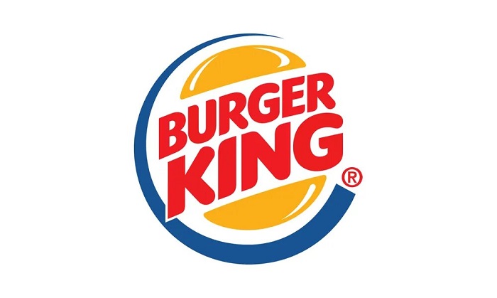
The Burger King logo is a wordmark sandwiched between two stylized burger bun halves, officially introduced in its current form on January 7, 2021. Jones Knowles Ritchie designed this version, emphasizing simplicity and appetite appeal through warm colors and rounded letterforms.
Design Type: Combination mark (wordmark with graphic element)
Primary Elements:
- Two curved shapes representing burger bun halves
- Custom wordmark spelling “BURGER KING”
- Rounded, friendly letterforms
Official Introduction Date: January 7, 2021
Designer/Agency: Jones Knowles Ritchie (JKR)
Trademark Status: Registered trademark owned by Restaurant Brands International
Color Palette:
- Flame Red: #D62300
- Fiery Orange: #FF8732
- BBQ Brown: #502314
- Sesame: #F5EBDC
Usage Context: Restaurant signage, packaging, mobile apps, merchandise, advertising campaigns, digital platforms, employee uniforms, and franchise materials
How Has the Burger King Logo Evolved Over Time?

Burger King’s visual identity has gone through seven major redesigns since 1954. Each shift reflected broader design trends and changing brand positioning.
The early versions were text-heavy. Then came the iconic bun concept in 1969.
The 1999 redesign added dimensionality and a blue swoosh. But by 2021, the brand stripped everything back to basics.
Original Burger King Logo (1954-1957)
Years Active: 1954-1957
Design Description: Simple text-based mark reading “Burger King” in a basic font. No graphic elements. No bun imagery. Just straightforward lettering.
Color Scheme: Single color applications, typically red or black
Designer: Unknown (internal design)
Context: Created when founders James McLamore and David Edgerton launched the Miami-based chain. Resources were limited. Branding wasn’t the priority it is today.
Key Changes from Previous: First logo, no predecessor
Cultural Significance: Represented the humble beginnings of what would become a global brand
Sitting King Logo (1957-1969)
Years Active: 1957-1969
Design Description: Featured a cartoon king character sitting on a burger. The mascot held a drink in one hand. Text wrapped around the circular emblem.
Color Scheme: Red, yellow, and brown tones
Designer: Unknown
Context: The company wanted personality. Mascot-based branding was huge in the 1950s and 60s. Think of all those cartoon characters selling cereal.
Key Changes from Previous: First introduction of the king character and mascot-based branding
Cultural Significance: Established the “king” identity that would persist in various forms for decades
First Bun Logo (1969-1994)
Years Active: 1969-1994
Design Description: Revolutionary introduction of the burger bun concept. Two orange-yellow bun halves sandwiching red “BURGER KING” text. Clean, simple, instantly recognizable.
Color Scheme: Orange-yellow buns, red text
Designer: Unknown
Context: The late 1960s saw a shift toward cleaner corporate identities. This design aligned with that movement while staying playful.
Key Changes from Previous: Eliminated the mascot entirely. Introduced the bun motif that would define the brand.
Cultural Significance: Created the template that all future logos would reference. This is the version people feel nostalgic about.
Updated Bun Logo (1994-1999)
Years Active: 1994-1999
Design Description: Refined version of the 1969 design. Slightly adjusted proportions. Updated color values. Maintained the core bun-and-text concept.
Color Scheme: Warmer orange tones, adjusted red
Designer: Sterling Brands
Context: Minor refresh to modernize without alienating existing brand equity
Key Changes from Previous: Subtle refinements rather than dramatic changes
Cultural Significance: Showed the company valued evolution over revolution
Blue Crescent Logo (1999-2021)
Years Active: 1999-2021
Design Description: Added a blue curved swoosh wrapping around the bun design. Introduced 3D effects and gradients. The text gained a slight tilt.
Color Scheme: Yellow, red, and blue
Designer: Sterling Brands
Context: The late 90s loved dimension and movement. Every brand wanted that dynamic, forward-leaning look. Blue was added to differentiate from McDonald’s red and yellow.
Key Changes from Previous: Blue color addition, 3D styling, angled composition
Cultural Significance: Represented the brand during its period of global expansion. This is the logo most millennials grew up with.
Modern Retro Logo (2021-Present)
Years Active: 2021-Present
Design Description: Complete return to flat design. Removed the blue swoosh. Custom typography with rounded, organic letterforms. Colors inspired by flame-grilled cooking.
Color Scheme: Flame Red, Fiery Orange, BBQ Brown, Sesame
Designer: Jones Knowles Ritchie
Context: Flat design dominates digital interfaces. The previous 3D logo looked dated on apps and social media. The rebrand also emphasized the flame-grilled cooking method.
Key Changes from Previous: Removed blue entirely. Eliminated 3D effects. New custom font. Warmer, more food-focused color palette.
Cultural Significance: Part of a broader trend of brands returning to simpler, heritage-inspired designs. Shows confidence in the original concept.
What Do the Design Elements of the Burger King Logo Mean?
Every element in the current logo connects to food and appetite appeal. The bun halves obviously reference hamburgers.
But the colors tie directly to the cooking process. Reds and oranges suggest flame-grilled preparation.
The rounded letterforms feel approachable and friendly. Nothing sharp or aggressive here.
Why Did Burger King Choose These Specific Colors?
The psychology behind color choices in branding runs deep, and Burger King’s color palette was carefully selected.
Flame Red (#D62300)
- Represents fire and flame-grilling
- Stimulates appetite (there’s research on this)
- Creates urgency and excitement
- Connects to the cooking method that differentiates BK from competitors
Burger King joins other brands using red in their visual identity to trigger hunger responses.
Fiery Orange (#FF8732)
- Warmth and energy
- Suggests freshness and friendliness
- Works alongside red to reinforce the flame theme
- More playful than pure red alone
The orange tones place Burger King among brands using warm yellow-orange hues to appear inviting.
BBQ Brown (#502314)
- Grounded, earthy quality
- References grilled meat
- Adds sophistication to the palette
- Balances the brighter colors
Sesame (#F5EBDC)
- Named after sesame seed buns
- Provides neutral background option
- Soft and appetizing
- Works across packaging and digital
What Typography Style Is Used in the Burger King Logo?
The current wordmark uses a custom typeface called “Flame.”
Jones Knowles Ritchie designed it specifically for this rebrand. It’s technically a sans-serif style, but with unusual rounded terminals.
The letters look almost edible. Soft, plump, friendly. Understanding the elements of type design helps explain why these specific characteristics work.
Readability at small sizes was a key consideration. The logo appears on everything from building signs to app icons.
What Are the Hidden Meanings in the Burger King Logo?
The psychology of shapes plays a role here. Rounded forms feel safe and approachable.
No accident that fast food logos avoid sharp angles. They want you relaxed and hungry, not alert.
The bun-sandwich concept works on multiple levels. It’s literal (showing the product) and metaphorical (suggesting wholeness and completeness).
Designers have noted the proportions create a subtle smile shape. Look at the overall silhouette and you might see it.
How Does the Burger King Logo Compare to Competitor Logos?
In the fast food space, Burger King’s current logo stands out for its warmth. McDonald’s uses red and yellow but in a much flatter, more corporate way.
Wendy’s leans into their mascot. KFC does the same with Colonel Sanders.
Burger King found middle ground. They have visual interest without a character to maintain.
The retro revival puts them in conversation with brands like Pepsi and various tech companies rediscovering their heritage. It’s a confident move. Says they don’t need flashy effects to compete.
Following solid logo design principles means the mark works across all applications without losing impact.
What Are the Technical Specifications of the Burger King Logo?
Official Color Codes:
Flame Red (Primary)
Fiery Orange (Secondary)
- Hex: #FF8732
- RGB: (255, 135, 50)
- CMYK: (0, 47, 80, 0)
- Pantone: 1505 C
BBQ Brown (Accent)
- Hex: #502314
- RGB: (80, 35, 20)
- CMYK: (0, 56, 75, 69)
- Pantone: 4695 C
Sesame (Background)
- Hex: #F5EBDC
- RGB: (245, 235, 220)
- CMYK: (0, 4, 10, 4)
- Pantone: 7527 C
Dimensions and Proportions:
- Aspect ratio: Approximately 2.5:1 (horizontal)
- Minimum size: 0.75 inches (print), 72 pixels (digital)
- Clear space: Equal to the height of the “B” on all sides
- Vertical stacking permitted with adjusted proportions
What Cultural Impact Has the Burger King Logo Had?
The 2021 rebrand sparked genuine conversation online. People noticed. They had opinions.
Nostalgia played a huge role. Adults who grew up with the 1969-1999 designs felt a connection to the new version.
It showed other brands that going backward could mean moving forward. Heritage has value.
The logo appears in countless memes, parodies, and pop culture references. That kind of recognition takes decades to build.
How Does the Burger King Logo Fit Into the Overall Brand Identity?
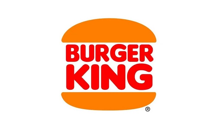
The logo anchors an entire visual system. It connects to packaging, restaurant interiors, employee uniforms, and digital experiences.
The “Flame” typeface extends beyond the wordmark. Menu boards, advertising, and apps use it consistently.
The brand guidelines document runs hundreds of pages. Every application is specified.
Photography style, illustration approach, tone of voice… it all connects back to what the logo establishes.
How Should the Burger King Logo Be Used?
Official Usage Guidelines:
Do:
- Use official files from Burger King’s brand portal
- Maintain minimum clear space
- Use approved color combinations only
- Scale proportionally
Don’t:
- Alter colors outside the approved palette
- Stretch or distort the logo
- Add effects, shadows, or outlines
- Place on busy backgrounds without proper contrast
- Recreate the logo with substitute fonts
Access: Franchisees and approved partners access official assets through Restaurant Brands International’s brand management system.
Licensing: The Burger King logo is a registered trademark. Any commercial use requires explicit written permission from RBI.
Protection: The company actively monitors and enforces trademark rights globally. Unauthorized use can result in legal action.
FAQ on The Burger King Logo
Who Designed the Current Burger King Logo?
Jones Knowles Ritchie (JKR) designed the 2021 rebrand. They’re a global creative agency known for brand identity work.
The design team stripped away the blue swoosh and 3D effects. They returned to the classic burger bun concept from 1969.
When Was the Burger King Logo First Created?
The first logo appeared in 1954 when James McLamore and David Edgerton founded the company in Miami, Florida.
It was basic text. Nothing fancy. The iconic bun design wouldn’t arrive until 1969.
Why Did Burger King Change Their Logo in 2021?
The previous logo looked dated on digital platforms. Restaurant Brands International wanted something that worked better on apps and social media.
The brand style guide needed a complete overhaul. Flat design dominates modern interfaces.
What Do the Colors in the Burger King Logo Mean?
The warm hues reference flame-grilled cooking. Reds and oranges stimulate appetite.
BBQ Brown adds earthiness. The Sesame shade mimics actual burger buns. Every color connects to food.
What Font Does Burger King Use?
Burger King uses a custom typeface called “Flame.” JKR created it specifically for the 2021 rebrand.
The letters are rounded and soft. Almost edible-looking. It’s a proprietary font not available publicly.
How Many Times Has the Burger King Logo Changed?
Seven major versions exist. The brand launched in 1954 with simple text.
A mascot appeared in 1957. The bun concept arrived in 1969. Updates followed in 1994, 1999, and 2021.
Is the Burger King Logo Trademarked?
Yes. Restaurant Brands International holds the trademark globally. The USPTO registration protects all visual elements.
Unauthorized commercial use triggers legal action. Franchisees access official assets through approved brand portals only.
What Is the Burger Bun Shape in the Logo Called?
It’s officially a “combination mark” in design terminology. The bun halves function as a framing device around the wordmark.
Some call it a sandwich logo. The shape creates instant product recognition for the fast food chain.
Why Did Burger King Remove the Blue Swoosh?
The blue was added in 1999 to differentiate from McDonald’s and Wendy’s. But it felt dated by 2020.
The retro revival trend made heritage designs valuable again. Blue wasn’t part of that original identity.
Where Can I Download the Official Burger King Logo?
Official vector files aren’t publicly available. The company protects its brand assets carefully.
Press kits sometimes include approved versions. Franchisees and partners access files through RBI’s internal systems with proper licensing.
Conclusion
The Burger King logo tells a story of brand evolution done right. Seven decades of refinement led to something that feels both fresh and familiar.
The 2021 rebrand proved that heritage matters. Sometimes the best path forward is looking back.
Strong visual hierarchy and clear emphasis on the core product keep this design working across every platform.
From restaurant signage to mobile apps, the burger bun symbol maintains instant recognition. That’s the mark of effective brand storytelling through design.
The flame-grilled identity isn’t going anywhere soon.

Renowned for his expertise in logo design and visual branding, Bogdan has developed a multitude of logos for various clients.
His skills extend to creating posters, vector illustrations, business cards, and brochures. Additionally, Bogdan's UI kits were featured on marketplaces like Visual Hierarchy and UI8.
He also wrote in the past years on sites like Design Your Way, WebDesignerDepot, WPDean, Designmodo, Speckyboy, Slider Revolution, and more.
- Canva vs Photoshop: When Does Each Make Sense? - 12 September 2026
- Briefing 3D Game Animation: Rigs, Clip Lists and Engine Handoffs - 11 September 2026
- The Webflow Logo History, Colors, Font, And Meaning - 10 September 2026

Bogdan Sandu is a seasoned designer who has been designing websites since 2008. Renowned for his expertise in logo design and visual branding, Bogdan has developed a multitude of logos for various clients. His skills extend to creating posters, vector illustrations, business cards, and brochures. Additionally, Bogdan's UI kits were featured on marketplaces like Visual Hierarchy and UI8. He also wrote in the past years on sites like Design Your Way, WebDesignerDepot, WPDean, Designmodo, Speckyboy, Slider Revolution, and more.
You Might Also Like