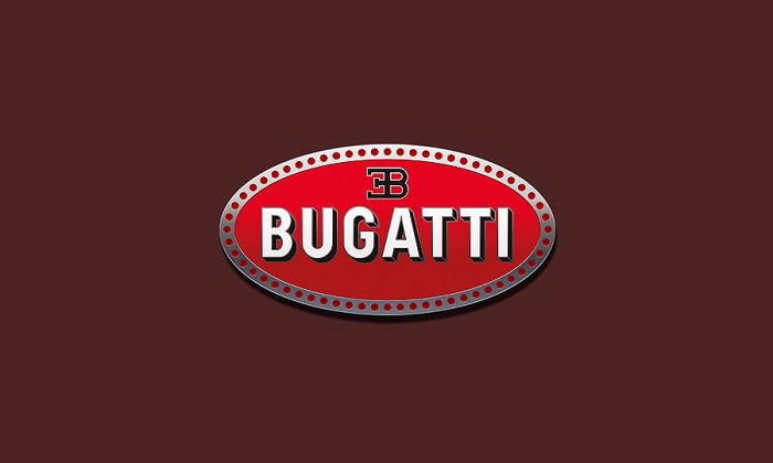
The Bugatti logo stands as one of the most recognizable emblems in automotive history. This oval-shaped badge carries the initials “EB” for founder Ettore Bugatti, set against a distinctive red and white background.
Within the world of car logos, few symbols communicate exclusivity quite like the Bugatti macaron. The current version dates back to the brand’s early days in Molsheim, France, with refinements made over more than a century.
Ettore Bugatti himself oversaw the original design. The badge has seen approximately three major iterations since 1909, though the core elements remain remarkably consistent.
What is the Bugatti Logo?
The Bugatti logo is an oval emblem featuring reversed “EB” initials honoring founder Ettore Bugatti, surrounded by 60 pearls on a red background with white lettering. Introduced around 1909, the design reflects Art Deco influences and represents automotive excellence.
Design Type: Emblem (combination mark with monogram and decorative border)
Primary Elements:
- Reversed “EB” initials in custom typography
- Oval shape with decorative pearl border
- Red background field
- White lettering and ornamental details
- “BUGATTI” wordmark integrated into the design
Official Introduction Date: Circa 1909
Designer: Ettore Bugatti (founder)
Trademark Status: Registered trademark owned by Bugatti Automobiles S.A.S., now under Bugatti Rimac
Color Palette:
- Bugatti Red: #CC0000
- White: #FFFFFF
- Black (outline details): #000000
Usage Context: Vehicle grilles, steering wheels, key fobs, marketing materials, dealership signage, merchandise, digital platforms
How Has the Bugatti Logo Evolved Over Time?
The Bugatti emblem has remained surprisingly stable since its creation.
Most changes involved subtle refinements rather than dramatic redesigns.
Three distinct phases mark its evolution: the original 1909 design, mid-century adjustments, and the modern revival starting in the 1990s.
Original Bugatti Logo (1909-1947)
Years Active: 1909-1947
Design Description: The first badge featured the reversed EB monogram within an oval frame. Sixty pearls surrounded the central design, reportedly representing the 60 pearls Ettore Bugatti’s father used in jewelry designs.
Color Scheme: Deep red background with white and black detailing
Designer: Ettore Bugatti
Context: Created when Bugatti established his automobile company in Molsheim, Alsace. The region was then part of Germany, later becoming French territory.
Cultural Significance: The badge appeared on legendary models like the Type 35 and the Royale, establishing Bugatti as a symbol of racing excellence and automotive artistry.
Dormant Period Logo (1947-1987)
Years Active: 1947-1987
Design Description: The company ceased automobile production after Ettore’s death. The logo existed primarily on archived materials and collector vehicles.
Key Changes: No active updates during this period
Context: Bugatti’s intellectual property changed hands several times. The brand lived on through racing heritage and vintage car collecting.
Revival Era Logo (1987-1998)
Years Active: 1987-1998
Design Description: Romano Artioli revived Bugatti and updated the badge for the EB110. The core design remained faithful to the original while receiving cleaner lines suitable for modern production.
Color Scheme: Same red, white, and black palette
Key Changes from Previous: Sharper definition, slightly modernized proportions
Cultural Significance: Marked Bugatti’s return as a supercar manufacturer
Modern Bugatti Logo (1998-Present)
Years Active: 1998-present
Design Description: Volkswagen Group acquired the brand and refined the emblem further. The current version maintains all traditional elements with improved production quality.
Color Scheme: Classic red and white with enhanced depth
Designer: Refined under Volkswagen Group direction
Key Changes from Previous: Higher production values, three-dimensional rendering for physical badges, flat versions for digital use
Cultural Significance: Adorns the Veyron, Chiron, and limited editions like La Voiture Noire
What Do the Design Elements of the Bugatti Logo Mean?
Every component of the Bugatti badge carries specific meaning.
The reversed EB initials honor the founder directly.
The 60 pearls reference the Bugatti family’s artistic background, particularly Carlo Bugatti’s jewelry work.
Red signals passion and racing heritage.
Why Did Bugatti Choose These Specific Colors?
Bugatti Red (#CC0000): This deep red carries strong associations with passion, power, and Italian racing tradition. Ettore Bugatti was born in Milan, and red reflects that heritage.
The psychology behind color choices matters here. Red triggers excitement and urgency.
It works well on red logos across luxury and performance brands.
White (#FFFFFF): Provides contrast and represents purity of engineering. The white lettering stands out sharply against the red field.
Black (#000000): Used for outlines and depth. Adds definition and seriousness to the overall composition.
What Typography Style Is Used in the Bugatti Logo?
![]()
Bugatti uses a custom serif font for the wordmark.
The letterforms feel classical, almost architectural.
High x-height and elegant serifs give the typography a timeless quality.
The reversed EB monogram uses stylized capitals that read clearly even at small sizes.
What Are the Hidden Meanings in the Bugatti Logo?
Those 60 pearls aren’t random decoration.
They reference Carlo Bugatti, Ettore’s father, who was a renowned furniture designer and jeweler.
The oval shape itself suggests speed and aerodynamics, fitting for a racing manufacturer.
Some interpret the reversed initials as a mirror reflection, symbolizing perfection through opposite perspectives.
How Does the Bugatti Logo Compare to Competitor Logos?
Bugatti’s emblem sits in a category of its own among hypercar manufacturers.
Where competitors like Ferrari use a prancing horse mascot, Bugatti relies on heraldic simplicity.
The Rivian logo takes a completely different approach with modern minimalism.
Compared to brands like Lamborghini with its charging bull, Bugatti’s monogram approach feels more refined and aristocratic. Less aggressive, more assured.
The oval shape distinguishes it from the shields used by Porsche and Lamborghini. It’s softer, yet the red background adds presence.
Among tech company logos, you see similar restraint in premium brands. Apple comes to mind. Sometimes less really does communicate more.
What Are the Technical Specifications of the Bugatti Logo?
Official Color Codes:
Primary Color – Bugatti Red:
Secondary Color – White:
- Hex: #FFFFFF
- RGB: (255, 255, 255)
- CMYK: (0, 0, 0, 0)
Accent Color – Black:
- Hex: #000000
- RGB: (0, 0, 0)
- CMYK: (0, 0, 0, 100)
Dimensions and Proportions:
- Aspect Ratio: Approximately 1.4:1 (width to height)
- Minimum Size: 15mm width for print applications
- Clear Space: Equal to the height of one pearl on all sides
- The logo should never be stretched, rotated, or recolored outside official variations
What Cultural Impact Has the Bugatti Logo Had?
The Bugatti badge transcends automotive branding.
It represents a specific type of European excellence, the kind you see in haute couture and fine watchmaking.
The logo appears in museums worldwide, from the Cite de l’Automobile in Mulhouse to the Petersen in Los Angeles.
Pop culture references abound. Rappers name-drop Bugatti constantly. The badge became shorthand for ultimate success.
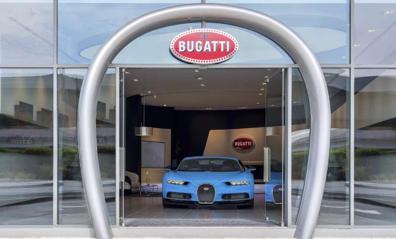
How Does the Bugatti Logo Fit Into the Overall Brand Identity?
Bugatti maintains strict brand guidelines governing every touchpoint.
The logo connects to a broader visual system including specific photography styles, typeface families, and color applications.
Interior details on vehicles echo the badge’s pearl motif.
Marketing materials emphasize the same red-white-black palette.
Even the architecture of Bugatti showrooms reflects the emblem’s elegant geometry.
How Should the Bugatti Logo Be Used?
Official Usage Guidelines:
- Never alter the proportions or colors
- Maintain required clear space around the emblem
- Use only approved file formats from official sources
- The logo should appear on neutral or complementary backgrounds
Where to Access Official Logos: Authorized dealers and Bugatti Automobiles S.A.S. provide approved assets for legitimate business use
Licensing Information: Third-party use requires written permission from Bugatti Rimac
Trademark Protection: The Bugatti name, EB monogram, and macaron design are registered trademarks protected internationally. Unauthorized reproduction can result in legal action.
FAQ on The Bugatti Logo
What Does the Bugatti Logo Represent?
The Bugatti emblem represents automotive excellence and craftsmanship rooted in French engineering traditions.
The reversed EB initials honor founder Ettore Bugatti directly.
Every element communicates luxury, from the oval shape to the distinctive red background. It’s heritage made visible.
Who Designed the Bugatti Logo?
Ettore Bugatti created the original badge around 1909 when he founded the company in Molsheim, France.
The design drew from his Italian roots and family artistic background.
His father Carlo Bugatti was a renowned furniture designer and jeweler, influencing the decorative pearl elements.
What Do the 60 Pearls on the Bugatti Logo Mean?
The 60 pearls surrounding the oval badge reference Carlo Bugatti’s jewelry work.
They add a decorative touch that separates Bugatti from typical automotive brand symbols.
Some historians suggest the pearls represent perfection and attention to detail. The exact count was intentional, not random.
Why Is the Bugatti Logo Red and White?
Red reflects Ettore Bugatti’s Italian heritage. He was born in Milan before establishing his company in Alsace.
The color palette creates strong visual hierarchy and immediate recognition.
White provides clarity. Black adds definition around edges.
What Does EB Stand for in the Bugatti Logo?
EB stands for Ettore Bugatti, the company founder.
The initials appear reversed in a mirror-image arrangement within the oval macaron badge.
This monogram style was common among European luxury brands of the early 1900s. It adds a personal signature to every vehicle.
When Was the Bugatti Logo Created?
The original Bugatti badge appeared around 1909 when Ettore established Bugatti Automobiles in Molsheim.
The core design has remained consistent for over a century.
Minor refinements occurred during the 1990s revival and after Volkswagen Group acquired the brand in 1998.
Has the Bugatti Logo Changed Over Time?
The Bugatti marque has stayed remarkably stable. Three main phases exist: original 1909 design, the EB110 revival version, and the modern Volkswagen-era refinement.
Changes involved production quality improvements rather than redesigns.
The principles behind effective logos favor this consistency.
Where Is the Bugatti Logo Placed on Vehicles?
The badge appears on the front grille as the primary focal point.
You’ll also find it on steering wheels, key fobs, and wheel centers.
The Bugatti Chiron, Veyron, and Bolide all feature the macaron prominently. Hood placement varies by model.
Is the Bugatti Logo Trademarked?
Yes. Bugatti Rimac holds international trademark protection for the emblem, EB monogram, and Bugatti name.
Unauthorized use faces legal consequences.
The brand maintains strict brand style guide requirements for any approved third-party applications.
What Shape Is the Bugatti Logo?
The Bugatti badge uses an oval shape, distinguishing it from shield-based competitors like Porsche and Lamborghini.
Ovals suggest speed and aerodynamics.
The psychology of shapes plays a role here. Curved forms feel more approachable than angular alternatives while maintaining elegance.
Conclusion
The Bugatti logo stands as a masterclass in automotive brand identity. Few emblems carry this much history while remaining visually relevant after a century.
From Ettore Bugatti’s original 1909 design in Molsheim to the modern Bugatti Chiron and Veyron badges, the core elements persist.
The reversed EB initials, 60 pearls, and red oval shape communicate luxury without saying a word.
This is what separates lasting logo design from forgettable marks. The Bugatti macaron doesn’t follow trends. It sets them.
French engineering excellence, Italian artistic heritage, and racing legacy all compressed into one badge.
Renowned for his expertise in logo design and visual branding, Bogdan has developed a multitude of logos for various clients.
His skills extend to creating posters, vector illustrations, business cards, and brochures. Additionally, Bogdan's UI kits were featured on marketplaces like Visual Hierarchy and UI8.
He also wrote in the past years on sites like Design Your Way, WebDesignerDepot, WPDean, Designmodo, Speckyboy, Slider Revolution, and more.
- The Retool Logo History, Colors, Font, And Meaning - 20 July 2026
- CMYK to Pantone Converter - 19 July 2026
- Fresh Inter Font Pairing Ideas for Modern Designs - 18 July 2026
Bogdan Sandu is a seasoned designer who has been designing websites since 2008. Renowned for his expertise in logo design and visual branding, Bogdan has developed a multitude of logos for various clients. His skills extend to creating posters, vector illustrations, business cards, and brochures. Additionally, Bogdan's UI kits were featured on marketplaces like Visual Hierarchy and UI8. He also wrote in the past years on sites like Design Your Way, WebDesignerDepot, WPDean, Designmodo, Speckyboy, Slider Revolution, and more.
You Might Also Like