


The Carta logo is one of the most recognized marks in fintech. It sits at the center of how startups, investors, and law firms identify the equity management platform that handles trillions in private market value.
But here’s the thing. Most people see it every day on cap table reports and 409A valuation documents without ever thinking about why it looks the way it does.
The current Carta logo is a clean, lowercase wordmark rendered in a custom sans-serif typeface. Black text. No icon. No decorative flair. It replaced the earlier blue-palette identity when the company rebranded from eShares in November 2017.
Founded in 2012 by Henry Ward, Manu Kumar, and Joshua Reeves, the company has gone through at least two major logo iterations. The shift from eShares to Carta wasn’t just a name swap. It was a full visual overhaul, driven by the company’s expansion beyond basic cap table management into fund administration, 409A valuations, and secondary market transactions.
What Is the Carta Logo?
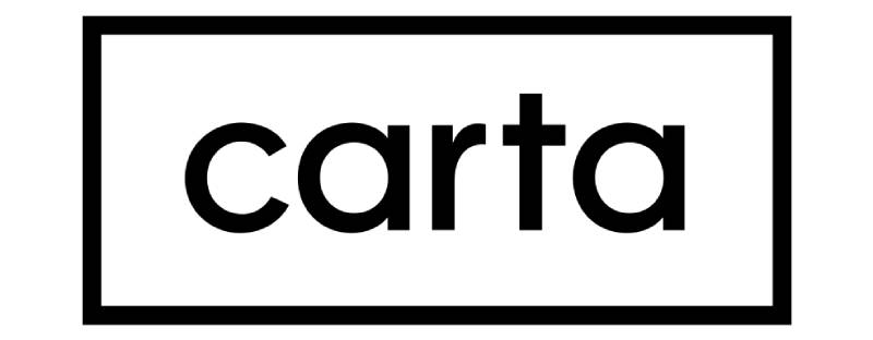
The Carta logo is a lowercase wordmark built on a custom sans-serif font with clean, rounded letterforms. It was officially introduced in November 2017 during the company’s rebrand from eShares, with creative direction by Studio Mococo. The design communicates trust, accessibility, and professionalism in private market technology.
Here’s a breakdown of its key attributes:
- Design Type: Wordmark (text-only, no icon or symbol accompanies the primary mark)
- Primary Elements: Lowercase custom typography spelling “carta” with balanced letter spacing and rounded terminals
- Official Introduction Date: November 6, 2017
- Designer/Agency: Studio Mococo provided initial creative direction, with Carta’s in-house design team (led by Xuefei Zhang) handling ongoing brand system development
- Trademark Status: Registered trademark used for branding and identification of the Carta software platform
- Color Palette: Primary black (#000000), with brand colors including Hippie Blue (#5489AD) and Catskill White (#E3EEF3) used across the broader visual system
- Usage Context: Cap table reports, 409A valuation documents, investor relations materials, web platform, mobile applications, partnership communications with firms like Goldman Sachs, and IPO documentation
How Has the Carta Logo Evolved Over Time?

Carta’s visual identity has gone through two distinct phases. The first was the eShares era, running from 2012 to 2017. The second is the Carta brand we know today, which launched in late 2017 and received a more recent refresh with help from Studio Mococo’s creative team.
The transition wasn’t gradual. It happened all at once. New name, new domain, new logo, new mission statement.
The eShares Logo (2012-2017)
Years Active: 2012 to November 2017
The original eShares mark reflected the company’s early focus: digitizing stock certificates for startups. It was a more literal, descriptive brand. The name itself told you exactly what the product did.
Visually, the eShares identity used a blue color palette. It felt functional, startup-y, and very much of its era. At that point, the company was primarily serving early-stage startups managing equity compensation.
The identity worked fine when the product was narrow. But as Carta expanded into 409A valuations, fund administration, and board management tools, “eShares” started feeling too small. The team also couldn’t secure the eshares.com domain, which created security and branding concerns.
The First Carta Wordmark (2017-circa 2022)
Years Active: November 2017 to approximately 2022
On November 6, 2017, eShares became Carta. The name itself carries meaning. “Carta” translates to charter or formal document of incorporation. For a company building infrastructure around ownership records, that’s a pretty good fit.
The new wordmark dropped the old blue branding in favor of a cleaner approach. The typeface was custom-designed with rounded, approachable letterforms. It still carried some of the blue-leaning brand palette at this stage.
The rebrand was comprehensive. Website layout, domain, logo, and mission statement all changed simultaneously. A logo morph animation was created to transition users from the old mark to the new one.
The Current Carta Logo (2022-Present)
Years Active: Approximately 2022 to present
The most recent version moved to a black and white color palette, dropping the previous blue tones from the primary mark. This is the version you see today across the platform, marketing materials, and partnership documents.
Studio Mococo worked closely with Carta’s product, editorial, and people teams on this refresh. The brand positioning shifted to “Infrastructure for innovators,” and the visual system introduced building block motifs alongside the wordmark.
The in-house team, led by Senior Visual Designer Xuefei Zhang, built out a design system in Figma with over 300 illustrations and components. That kind of systematized approach means the logo now appears consistently whether it’s on a Series A term sheet or a mobile notification.
The shift to black and white was intentional. It gives the mark more flexibility across different backgrounds and media formats while projecting the kind of authority that institutional investors and law firms expect.
What Do the Design Elements of the Carta Logo Mean?

Every part of the Carta wordmark was chosen to signal trust and clarity in financial transactions. The lowercase letters suggest approachability. The clean geometry communicates precision.
And the lack of a standalone icon? That’s a deliberate choice too. It keeps the focus entirely on the company name, which matters when your brand appears on legal documents and SEC filings.
Why Did Carta Choose These Specific Colors?
The current primary logo uses black (#000000). Straightforward, high-contrast, and impossible to misread on any background. In color psychology, black signals authority, sophistication, and formality. For a platform handling trillions in equity, that tracks.
The broader brand system still uses Hippie Blue (#5489AD) and Catskill White (#E3EEF3). Blue shows up a lot in fintech for good reason. It builds trust. It feels stable. Catskill White provides breathing room and keeps layouts from feeling heavy.
Carta’s internal brand guidelines are strict about color usage. They specify that brand colors should not be modified on the logo or associated text. The design system uses color tokens rather than raw hex values, which makes maintenance easier and keeps everything consistent across product and marketing.
What Typography Style Is Used in the Carta Logo?
The Carta wordmark uses a custom sans-serif typeface. It’s not an off-the-shelf font. The letterforms have rounded terminals and even stroke widths, which gives the mark a modern but approachable feel.
Readability was a clear priority. The logo appears on everything from large website headers to tiny favicons, and it needs to work at every size. The generous letter spacing helps with legibility on financial documents where precision matters.
It’s worth noting that several fonts named “Carta” exist online, but none of them match the actual logo font. The custom approach makes sense. When your brand sits on legal paperwork, you want something nobody else is using.
What Are the Hidden Meanings in the Carta Logo?
The name “Carta” means charter or paper in several Romance languages. For a company that replaced paper stock certificates with digital records, there’s an intentional irony there. You’re using the word for paper to name the thing that killed paper.
The lowercase treatment is another deliberate call. It softens the brand. Fintech companies that deal with large sums of money often lean toward uppercase or title case to project authority. Carta went the opposite direction, signaling that equity management should feel accessible, not intimidating.
The absence of a standalone icon also says something. It suggests the company doesn’t need a symbol to be recognized. The word itself is the brand. That’s a confidence move.
How Does the Carta Logo Compare to Competitor Logos?
Look at the equity management and fintech space, and you’ll notice a pattern. Most competitors lean into blue-heavy palettes and geometric icons. Carta’s black-and-white wordmark stands apart precisely because it doesn’t follow that formula.
AngelList uses a bold, dark wordmark with a halo-like icon. It’s more playful, reflecting its roots in the startup community. Forge Global goes with a more corporate blue-and-white combination mark. EquityZen uses teal tones with a circular icon element.
Broader tech company branding trends show a strong move toward simplified wordmarks. Companies like Stripe use a clean wordmark with a signature color (purple, in their case). Plaid pairs its wordmark with a distinctive square pattern. Robinhood keeps a simple feather icon next to text.
What separates Carta is the total commitment to the wordmark-only approach. No icon backup. No gradient. No secondary mark for small spaces. Just the name, rendered cleanly. In financial services, where clients include everyone from first-time founders to Goldman Sachs, that restraint actually communicates a lot. You’re dealing with a company that doesn’t need visual gimmicks to earn trust.
Other fintech brands in the ecosystem take different approaches. SoFi uses a rounded, friendly wordmark. Coinbase pairs its name with a distinctive “C” icon. Square (now Block) built their entire identity around a geometric shape.
What Are the Technical Specifications of the Carta Logo?
Official Color Codes
- Primary Color: Black
- Hex: #000000
- RGB: (0, 0, 0)
- CMYK: (0, 0, 0, 100)
- Secondary Color: Hippie Blue
- Hex: #5489AD
- RGB: (84, 137, 173)
- CMYK: (51, 21, 0, 32)
- Tertiary Color: Catskill White
- Hex: #E3EEF3
- RGB: (227, 238, 243)
- CMYK: (7, 2, 0, 5)
Dimensions and Proportions
The Carta logo SVG file has a nominal size of 512 x 223 pixels, giving it an approximate aspect ratio of 2.3:1. The logo is distributed in vector format (SVG) to keep it sharp at any size.
Carta’s brand guidelines emphasize exact proportions and spacing rules. Clear space around the logo must be maintained to prevent visual crowding on materials like investor presentations and due diligence documents. The guidelines also specify that the logo should not be distorted, recolored, or modified in any way that contradicts the official brand style guide.
For digital use, the design system references color tokens instead of hardcoded hex values. This is a thoughtful infrastructure choice. It means updating a brand color across the entire product and marketing ecosystem takes one change, not hundreds.
What Cultural Impact Has the Carta Logo Had?
Carta’s logo has become shorthand for private market infrastructure. If you’ve worked at a venture-backed startup in the last few years, you’ve almost certainly seen it on your equity grant documents, your 409A valuation reports, or your cap table dashboard.
That kind of repeated exposure in high-stakes financial contexts builds a specific type of brand recognition. It’s not flashy. It’s not consumer-facing in the way a Cash App or Venmo logo might be. But within the startup and venture capital ecosystem, the Carta wordmark carries serious weight.
The rebrand from eShares to Carta also became something of a case study in startup branding. Multiple investors and industry commentators wrote about the name change. Andrew Parker, a board member, published a piece explaining how the name reflected the company’s expanding mission around ownership. The rebrand story even circulated on Hacker News and domain investing forums because the company couldn’t secure the eshares.com domain.
For a company now managing equity for over 40,000 companies and more than one million stakeholders, the logo functions less as marketing and more as institutional signage. It’s the thing you see before you accept your stock grant.
How Does the Carta Logo Fit Into the Overall Brand Identity?

The logo is just one piece of a much larger system. Carta’s brand identity includes isometric illustrations, a defined web palette, product UI design standards, and detailed guidelines around how brand colors interact with interface elements.
Studio Mococo’s brand positioning work centered on the idea of “Infrastructure for innovators.” The logo sits at the top of this system as the primary identifier, but the real depth comes from how it connects to everything else.
The in-house design team built the system in Figma, creating a library of over 300 illustrations using lined styles and components. Those isometric illustrations show up on the website, in product onboarding, and across marketing materials. They visually represent building blocks, which ties back to the infrastructure concept.
Product UI follows the same rules. Feature-specific details get isolated focus through color, photography, or line treatments. The brand and extended web palette carry through into the product interface, with strokes used sparingly to keep things visually lightweight. Everything flows from core design principles that prioritize clarity and consistency over decoration.
Carta’s front-end teams, sales teams, and marketing teams all pull from the same centralized components. That means when you see the Carta brand on a conference booth, it matches what you see in the app, which matches what shows up on an investor report. That kind of brand unity doesn’t happen by accident. It takes real systems thinking.
How Should the Carta Logo Be Used?
Carta maintains clear rules around logo usage. Their internal guidelines (accessible through Carta’s brand design system, known as “Ink”) cover everything from color restrictions to accessibility standards.
Key usage rules:
- Don’t change the colors of the logo or associated text. The brand guidelines are explicit about this.
- Don’t modify proportions. The logo must maintain its original aspect ratio and clear space at all times.
- Use color tokens, not raw hex values, when referencing brand colors in digital implementations. This ensures consistency across the product.
- Accessibility matters. Carta references Section 508 of the U.S. Rehabilitation Act and WCAG guidelines when making color decisions. Contrast between adjacent colors must be high enough to maintain legibility.
- State changes for interactive elements use specific color combinations for normal, hover, and inactive states. These are standardized across the design system.
The logo is available in SVG vector format for scalable use. You can also find PNG versions at various resolutions (320×139, 640×279, 1024×446, 1280×558, and 2560×1115 pixels).
For third-party use, Carta’s trademark protections apply. The logo is a registered mark used specifically for branding and identification of the Carta software platform. If you’re a partner or portfolio company looking to reference the Carta brand, you’ll want to follow whatever media kit or press resource guidelines they provide directly.
One detail worth knowing: Carta’s design system doesn’t just cover the logo itself. It includes standard color combinations for common UI situations, matching hover and inactive state colors, and guidance around how color communicates meaning in the product. The system is built so that color is never the only way information gets communicated, which is good accessibility practice that most companies still skip.
FAQ on The Carta Logo
What does the Carta logo look like?
The Carta logo is a lowercase wordmark set in a custom sans-serif typeface. Black text on a white background. No icon, no symbol, no extra graphics.
It’s stripped-down on purpose. The design puts full focus on the company name itself.
When did Carta change its logo from eShares?
The rebrand happened on November 6, 2017. Carta replaced the old eShares identity entirely. New name, new domain, new logo, new mission statement.
The shift came after Series C funding as the company expanded beyond basic cap table management.
Who designed the Carta logo?
Studio Mococo provided initial creative direction for the rebrand. Carta’s in-house design team then took ownership of the full brand system.
Xuefei Zhang, a Senior Visual Designer at Carta, led the ongoing visual identity work using Figma.
What font is used in the Carta logo?
The logo uses a custom-designed font with rounded terminals and even stroke widths. It’s not available for download anywhere. Several fonts named “Carta” exist online, but none match the actual wordmark.
What are the official Carta brand colors?
The primary logo color is black (#000000). The broader brand system includes Hippie Blue (#5489AD) and Catskill White (#E3EEF3).
Earlier versions leaned into a blue palette. The current mark moved to black and white for more flexibility.
What does the name “Carta” mean?
“Carta” means charter or formal document in several Romance languages. For an equity management platform that digitized paper stock certificates, the name carries intentional irony.
It also suggests mapping, as in mapping asset ownership across private markets.
Can I download the Carta logo in vector format?
Yes. The Carta logo is available as an SVG file with nominal dimensions of 512 x 223 pixels. PNG versions exist at multiple resolutions too.
Always use official sources. Trademark protections apply to any third-party usage.
Why did Carta switch from a blue logo to black and white?
The black and white approach gives the mark better versatility across different backgrounds and media formats. It projects authority that institutional investors and law firms expect from financial technology platforms.
Blue still lives in the extended brand palette. Just not in the primary mark.
How does the Carta logo compare to other fintech logos?
Most competitors use blue-toned logos with geometric icon elements. Carta stands apart with its wordmark-only, black-and-white approach.
Companies like AngelList and Forge Global pair their names with icons. Carta skips that entirely. It’s a confidence play.
Are there rules for using the Carta logo?
Carta’s brand style guide is strict. Don’t change the colors. Don’t distort proportions. Don’t place the mark on cluttered backgrounds.
Their design system uses color tokens instead of raw hex values, and references WCAG accessibility standards for all color decisions.
Conclusion
The Carta logo works because it doesn’t try too hard. A clean wordmark, a minimalist design approach, and a black-and-white palette that scales from mobile screens to SEC filings.
That kind of restraint is rare in fintech branding. Most companies in the equity management space overload their marks with icons and color gradients. Carta went the other way.
The 2017 rebrand from eShares gave the company a visual identity that matched its growing role in private market infrastructure. Studio Mococo’s creative direction, paired with a strong in-house design system, keeps the brand consistent across cap table reports, web platforms, and investor materials.
Sometimes the best logo is the one that gets out of your way. Carta figured that out.

Renowned for his expertise in logo design and visual branding, Bogdan has developed a multitude of logos for various clients.
His skills extend to creating posters, vector illustrations, business cards, and brochures. Additionally, Bogdan's UI kits were featured on marketplaces like Visual Hierarchy and UI8.
He also wrote in the past years on sites like Design Your Way, WebDesignerDepot, WPDean, Designmodo, Speckyboy, Slider Revolution, and more.
- The Windsurf Logo History, Colors, Font, And Meaning - 10 October 2026
- How to Remove Background From Product Photos (No Photoshop) - 10 October 2026
- How Designers can Build a Stronger Online Creative Identity - 9 October 2026

Bogdan Sandu is a seasoned designer who has been designing websites since 2008. Renowned for his expertise in logo design and visual branding, Bogdan has developed a multitude of logos for various clients. His skills extend to creating posters, vector illustrations, business cards, and brochures. Additionally, Bogdan's UI kits were featured on marketplaces like Visual Hierarchy and UI8. He also wrote in the past years on sites like Design Your Way, WebDesignerDepot, WPDean, Designmodo, Speckyboy, Slider Revolution, and more.
You Might Also Like


