Forty-four points. That’s the smallest tap target Apple’s Human Interface Guidelines will allow for a single row in a list, and almost nobody using an iPhone has ever thought about it.
It’s just there, holding up every chat thread, every product feed, every settings screen you’ve scrolled through half paying attention.
Android runs a slightly different number. Google’s Material Design puts the floor at 48dp, a few pixels roomier than iOS. Neither number sounds like much on its own, but it’s the kind of decision that gets made before anyone opens a color picker or thinks about brand fonts.
A list is basically one row, repeated. Nail that single row and the rest of the screen tends to sort itself out. Miss it, and you’ll feel the wrongness even if you can’t quite say why, a scroll that’s just slightly off.
What Is List UI Design in Mobile Apps
Open the iOS Settings app, or Gmail, or almost any app with more than a couple of screens, and you’re looking at a list. Repeating rows, one scrollable column, each row built off the same template as the one above it.
That repetition isn’t laziness or a shortcut. It leans on the same repetition principle that makes any recurring design element read as consistent instead of random.
A list isn’t a grid, which spreads items across multiple columns, and it isn’t a card layout either, where each item gets its own bordered, elevated block. A list stays single-column, scrolling continuously downward. That’s really the whole distinction, and it’s why lists end up as the default for messages, settings, and search results, while grids handle things like photo browsing.
Inside an app’s structure, lists tend to do one of a few jobs. Some push a user to another screen, the way tapping a row in iOS Settings drops you into a sub-menu. Others just display data, records like transactions or contacts sitting there for reference. And then there are feed lists, the kind that stream content the way an Instagram feed never really stops.
Core Parts of a List Row
Break a row down and you keep finding the same handful of pieces, though not every row uses all of them.
- A leading element, an avatar, icon, or thumbnail sitting at the start of the row
- Primary text, the main label most people scan first
- Secondary text, usually a size smaller, holding whatever supporting detail matters
- A trailing element (a value, a switch, a chevron) hinting at what tapping the row will do
- Some kind of divider or spacing gap, separating this row from the next one
The leading icon and the primary text line up on the same vertical axis. It’s a small alignment choice, but it’s the reason a long list reads as orderly instead of jagged.
What Are the Main Types of List Layouts
Not every list looks the same once you start paying attention. Some rows hold a single line of text and nothing else. Others stack a preview underneath, group themselves under section headers, let you swipe sideways to reveal a hidden action, or collapse into an accordion until someone taps to expand it.
Each format is really solving a different scanning problem, whether that’s a flat settings menu or a nested set of options.
| List Type | Example App | Best Use Case |
|---|---|---|
| Single-line | iOS Settings app | Simple option menus |
| Two-line / three-line | Gmail inbox | Messages with metadata |
| Grouped / sectioned | iOS Contacts | Alphabetized or categorized data |
| Swipeable | Apple Mail | Quick row actions |
| Expandable / accordion | Nested settings menus | Layered content |
Single-Line vs Multi-Line Rows
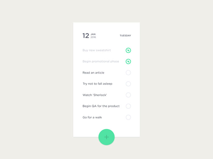
iOS Settings keeps things about as simple as a row can get: one string of text, nothing else, whether that’s “Wi-Fi,” “Bluetooth,” or whatever menu item you’re scanning for.
Add a second line underneath and you’ve got what Gmail does with every message in an inbox, a sender name sitting above the subject line. Chat apps push it one step further, adding a third line for a short message preview or a bit of metadata under the contact’s name, which is basically why an inbox is readable at a glance and a plain settings menu isn’t even trying to be.
Material Design tracks this progression with actual numbers: a single-line row runs 48 to 56dp tall, two-line climbs to 72dp, and three-line tops out at 88dp (Google Material Design documentation).
Grouped vs Flat Lists
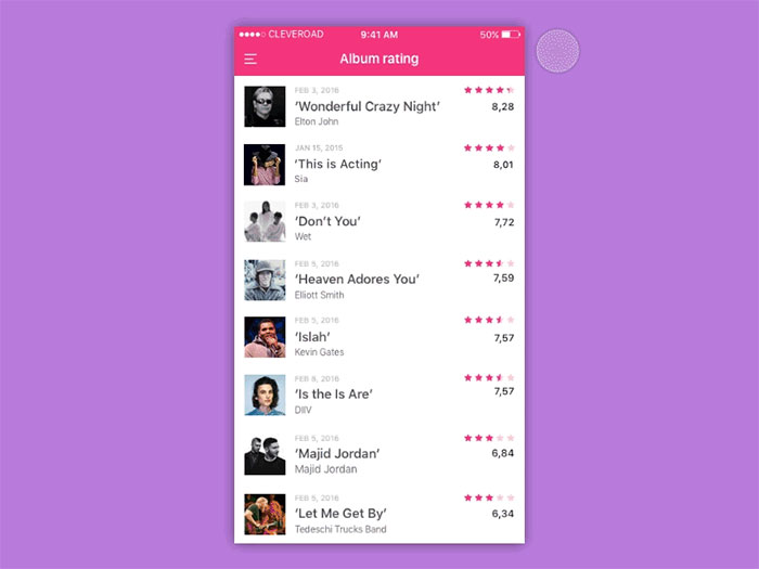
Flat lists don’t bother with visual breaks. Every row runs into the next one, in whatever order the data arrived.
Grouped lists take a different approach, clustering related rows under a header, which is exactly what iOS Contacts does with its alphabetical letters running down the side. That header-and-cluster pattern is really the proximity principle at work, the same idea that makes anything visually close together get read as one unit instead of scattered pieces.
- Grouped lists tend to work best for settings, contacts, and category menus
- Flat lists work better for chronological feeds, where order matters more than category
Todoist is a decent example of grouping done well. Tasks split into sections like “Today” and “Upcoming” instead of getting dumped into one continuous list.
How Do iOS and Android List Guidelines Differ
Apple and Google don’t agree on much when it comes to list design, and the rulebooks each one has published make that pretty clear: Apple’s Human Interface Guidelines on one side, Google’s Material Design system on the other.
Touch target size, divider style, trailing indicators, how a row reacts to a tap. All of it diverges.
| Feature | iOS | Android |
|---|---|---|
| Minimum touch target | 44 by 44 points | 48 by 48 dp |
| Divider style | Inset, aligned to text | Full-bleed, edge to edge |
| Trailing indicator | Chevron for disclosure | Overflow menu or none |
| Press feedback | Row highlight or dim | Ripple effect |
iOS List Conventions
iOS renders lists through UITableView, or through SwiftUI’s List view in a newer codebase. Both inherit the platform’s row styling automatically, which is honestly one of the nicer things about building for iOS. You’re not fighting the defaults.
Apple’s Human Interface Guidelines set the tap target floor at 44 by 44 points for any interactive row, settings screen or chat thread, doesn’t matter which. Dividers sit inset from the leading icon rather than stretching full width, and a chevron on the trailing edge tells you the row pushes to another screen before you’ve even tapped it.
Android List Conventions
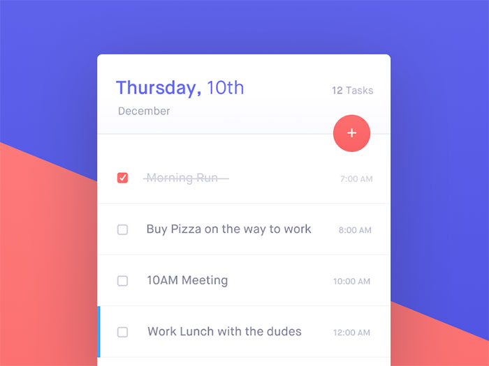
Android’s version runs through RecyclerView in traditional Views, or LazyColumn in Jetpack Compose. Both exist to recycle row views as the user scrolls, so the system isn’t building a fresh one every time.
The touch target minimum sits at 48 by 48 dp here, per Google’s Material Design specification, a bit more generous than Apple’s number. Dividers run edge to edge instead of inset, and tapping a row triggers a ripple instead of the static highlight iOS uses. Material Design 3 still keeps the same 8dp spacing grid Android has used for years.
What Spacing and Sizing Standards Apply to List Rows
None of this is guesswork. Row height, touch target size, and margin width follow fixed numbers on both major platforms. iOS asks for a 44pt minimum, Android asks for 48dp, and both platforms commonly use 16 units of horizontal margin from the screen edge.
- Touch target sits at a minimum of 44 by 44 points on iOS, 48 by 48 dp on Android
- Row height runs 44pt for a plain iOS row, 56dp for a one-line Material row, and 72dp for a two-line row
- Horizontal margin lands around 16 points or dp from the screen edge on both platforms
- Icon size is commonly sized to a 24dp grid inside the row
That 24dp icon grid isn’t arbitrary. It’s a direct application of the same grid systems that keep everything else on screen snapping to consistent multiples instead of floating at random sizes.
Primary and secondary text also sit on separate steps of the type scale, body size up top, a smaller caption size underneath. That’s visual hierarchy doing its job, letting someone scan a row in under a second without trying to.
Here’s where it gets more interesting, though. WCAG 2.2’s Success Criterion 2.5.8, published as a W3C Recommendation on October 5, 2023, sets a separate floor of 24 by 24 CSS pixels for pointer targets, a minimum that sits below both platform defaults and applies whenever spacing between small controls gets tight (W3C).
Dense finance and transaction rows are where this actually bites. Cram more data into a row and the tappable area quietly shrinks under that 44pt or 48dp floor before anyone notices.
What Interaction Patterns Do Mobile Lists Use
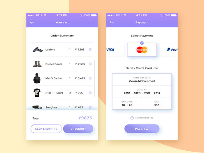
Tap, swipe, long-press, drag, pull. That’s roughly the full gesture vocabulary for a list, and mixing them without some kind of visual cue is where most list interfaces start confusing people.
A tap usually selects a row or pushes forward to the next screen, though in gallery and file-manager apps it often switches into multi-select mode instead, letting someone batch-select for a bulk action. Swipe reveals row actions on the leading or trailing edge, the pattern behind Gmail’s archive swipe and Mail’s delete swipe, both of which most iPhone owners have triggered by accident at least once.
Long-press opens a context menu without leaving the row. iOS handles this through its context menu API, Android through a popup menu. Dragging reorders rows in place, exactly how Trello and Apple Reminders handle manual sorting. And pulling down from the top refreshes the list, the gesture X and Instagram both lean on to fetch new posts.
Nielsen Norman Group’s mobile usability research found that swiping stays less discoverable than tapping or other direct manipulation, and recommends a visible cue whenever a row hides a swipe action behind it (Nielsen Norman Group). They also warn against swipe ambiguity, using the same gesture for two different actions on the same screen, since that kind of inconsistency erodes trust in a list faster than a missing icon.
How Should Lists Handle Loading and Pagination
There’s more than one way to load a long list, and the right choice depends less on preference than on what someone’s actually trying to do: browse casually, or hunt down something specific.
| Pattern | Best For | Main Risk |
|---|---|---|
| Infinite scroll | Feeds, discovery browsing | Hard to backtrack or compare items |
| Load more button | Mixed browsing and searching | Extra tap between batches |
| Pagination | Goal-driven search results | Breaks continuous scrolling |
Infinite scroll tends to raise engagement, but Nielsen Norman Group’s research found it creates real friction for anyone trying to find, compare, or return to a specific item later (Nielsen Norman Group). In their own usability write-up, Nike’s listing pages run on infinite scroll while Adidas sticks with pagination for the same kind of product grid, offered as evidence that the right pattern depends on the shopping task, not the platform.
Skeleton screens beat spinners on perceived speed, and that’s not just a hunch. A study presented at the 2018 European Conference on Cognitive Ergonomics found users rated pages with skeleton screens higher on both perceived loading speed and ease of navigation than the same pages with spinners (Mejtoft, Långström, and Söderström, 2018).
Most infinite-scroll setups fetch the next batch before the user actually hits the bottom of the current one. The prefetch threshold is usually set a screen height or two ahead of the visible edge, so loading rarely feels like it’s catching up.
How Should Empty and Error States Be Designed
A blank list and a broken list are not the same problem, even though plenty of apps handle them with the exact same generic placeholder.
An empty state just needs to say, plainly, that there’s genuinely nothing here yet, paired with one clear action. Todoist’s “no tasks” screen does this well: a short illustration, one line of text, one button. An error state is a different job. It needs a retry control, a plain-language explanation of what went wrong, and an offline indicator if that’s the actual cause.
There’s a third case worth calling out too, a filtered search that comes back empty inside an otherwise full list. That’s not the same as a genuinely empty inbox, and the fix isn’t the same message either. It should point back to clearing the filter, not repeat “nothing here” as if the whole list were actually blank.
Baymard Institute’s usability benchmarking finds that nearly 50 percent of ecommerce sites implement a “No Results” page in a way that leaves users with few or no options to recover from a search that returns nothing, beyond generic search tips (Baymard Institute).
Slack, for what it’s worth, handles a failed load by falling back to cached messages instead of a blank screen. Small decision, but it keeps the list useful even when the network request behind it doesn’t come through.
How Does List Virtualization Affect Performance
Skip virtualization and you’ll find out the hard way, janky scrolling on any list long enough to actually need scrolling. Virtualization itself is a fairly simple idea once you see it working. It renders only the rows currently visible on screen, plus a small buffer, and reuses those views as the user scrolls instead of building new ones constantly.
| Platform | Component | Reuse Mechanism |
|---|---|---|
| iOS | UITableView / UICollectionView | dequeueReusableCell queue |
| Android (Views) | RecyclerView | ViewHolder pattern |
| Android (Compose) | LazyColumn | Composable recycling |
Native List Virtualization
iOS pulls rows from an internal reuse queue through dequeueReusableCell rather than building a fresh cell for every row (Apple Developer Documentation). Android does something conceptually similar but implements it differently, caching view references through RecyclerView’s ViewHolder pattern so the system never has to run a fresh findViewById lookup on a row scrolling back into view.
Jetpack Compose’s LazyColumn applies the same underlying idea to declarative UI, composing only the items currently on screen instead of building the whole list up front.
This is the whole reason a 20-row list and a 2,000-row list feel identical to scroll through. The system never allocates more views than the screen can actually show, no matter how much data is sitting behind it.
Cross-Platform List Virtualization
React Native’s built-in FlatList handles small datasets fine, then starts dropping frames as a list grows, which is the exact problem Shopify’s engineering team set out to fix.
FlashList, built by that same Shopify team, swaps FlatList’s render approach for a recycler pattern closer to RecyclerView, and targets 60 frames per second or better even on low-end Android devices (Shopify Engineering, 2022). It reuses component instances instead of tearing them down and rebuilding on every scroll, and Flutter’s ListView does something comparable through its builder constructor, building items lazily rather than all at once.
Cross-platform frameworks aren’t inventing anything new here. They’re borrowing a recycling concept native toolkits already proved out, just implementing it in JavaScript or Dart instead of native code.
What Accessibility Requirements Apply to List UI
A screen reader user moves through a list on a completely different path than someone tapping the screen with a finger. Getting the reading order, the grouping, and the contrast right decides whether that path actually works.
VoiceOver accounts for roughly 71 percent of mobile screen reader use versus about 35 percent for TalkBack, so iOS testing tends to carry more weight in most accessibility budgets, fairly or not (WebAIM Screen Reader User Survey, 2024).
Row grouping matters more than it sounds like it should. Combine a row’s icon, text, and metadata into one accessible element so VoiceOver and TalkBack announce it once, instead of stopping on every individual piece. Swipe actions need their own handling too, exposed through accessibilityCustomActions on iOS or an accessibility action on Android, since a horizontal swipe already means something else to VoiceOver.
Contrast follows the same baseline as the rest of the interface. WCAG’s Success Criterion 1.4.3 sets a 4.5 to 1 minimum ratio for body text inside a row, governing contrast the same way it does everywhere else on screen.
Apple’s own accessibility documentation recommends grouping and decluttering row elements specifically to cut down the number of swipes a VoiceOver user needs to reach the next row.
How Do List Patterns Differ by App Category
The same row anatomy gets stretched or compressed depending on what the list actually needs to show. Messaging, e-commerce, utility, social feed, finance, each one bends the format toward its own priorities.
| Category | Row Pattern | Example |
|---|---|---|
| Messaging | Avatar, unread badge, timestamp | |
| E-commerce | Thumbnail, price, rating inline | Amazon search results |
| Utility | Grouped rows, inline switches | Android Settings |
| Social feed | Card-list hybrid, embedded media | LinkedIn feed |
| Finance | Dense rows, right-aligned values | Banking transaction lists |
Messaging apps lean on the two-line format mentioned earlier. WhatsApp’s unread badge is a good example of small but deliberate emphasis, the kind of detail that pulls the eye before anything else in the row even registers.
E-commerce blends list and grid conventions in a way that’s honestly a little unusual. Amazon keeps things single-column on narrow screens, technically a list, but still manages to pack a thumbnail, a price, and a star rating into each row.
Utility apps go the plain route. Android’s Settings favors grouped rows with an inline switch, skipping the trailing chevron iOS reserves for that same job.
Social feeds push furthest from anything resembling a plain list. LinkedIn wraps each post inside a card, and the whole thing still scrolls as one continuous column underneath it all.
Finance apps sit at the opposite end from messaging. Where messaging apps give rows generous white space to breathe, finance apps compress that same space down, fitting more rows onto the screen at the cost of some visual room.
What Are Common List UI Mistakes to Avoid
Most list problems aren’t one catastrophic design failure. They’re the same handful of small mistakes, repeating across different apps and different teams, mistakes that are avoidable once someone knows to check for them before shipping.
- Undersized touch targets cause repeated mistaps, and it shows up worst in dense finance or transaction lists where rows get built below the platform’s minimum floor
- Inconsistent row heights break the scroll rhythm, mixing sizes in the same list makes the whole thing feel unfinished even when nothing’s technically broken
- Missing empty or error states leave a blank screen with no message, and a user left guessing whether the app crashed or just has nothing to show
- Overloaded rows stack more than one primary action into a single row, forcing someone to guess which part actually does what
- Skipped virtualization is probably the most common one. Lists that render every row up front are the ones most likely to drop frames once the dataset grows
Notice the pattern, though. None of these show up in a five-row test list. They only surface once a list gets long enough, or busy enough, to expose the problem, which is exactly why so many slip past a review that never tested beyond a handful of sample rows.
How Do You Test List UI Usability
Testing a list well means covering two different things at once: how it performs technically, and how people actually use it. Skip either track and you’ll miss roughly half the problems a shipped list can have.
| Tool | Platform | What It Catches |
|---|---|---|
| Xcode Instruments | iOS | Dropped frames, memory spikes |
| Android Studio Profiler | Android | Jank, memory, CPU usage |
| Accessibility Scanner | Android | Missing labels, contrast issues |
Usability testing with real users still catches what profilers and scanners can’t. Nielsen Norman Group’s original research found that five test participants surface about 85 percent of a product’s usability problems, a threshold that applies as well to a single list screen as to a full app (Nielsen Norman Group, 2000).
Testing against the actual dataset size matters more than people expect. A 3-item list and a 300-item list expose different problems, so a team that only tests with sample data misses the scroll and virtualization issues that only show up at scale.
Mobile App List Design Examples
Shopping List App
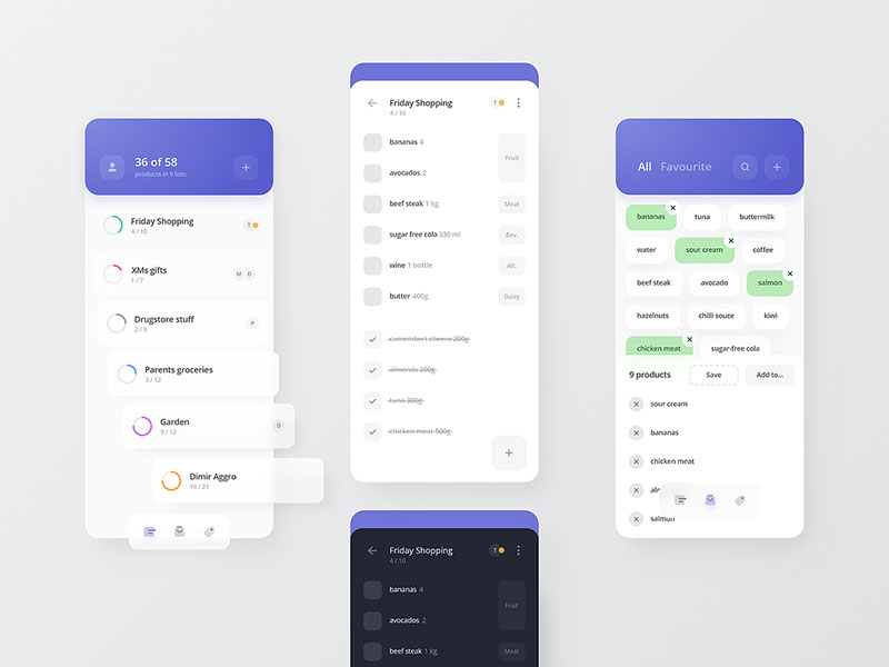
Wishlist page
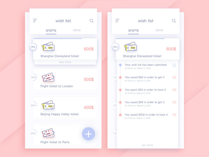
Timer Picking
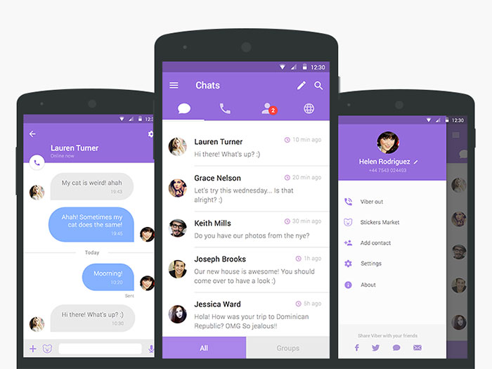
Viber redesign
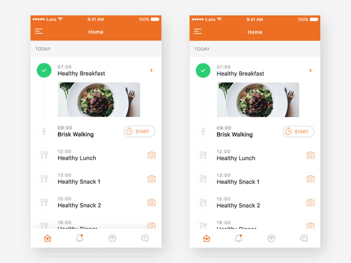
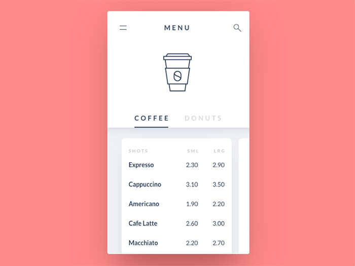
Coffee menu
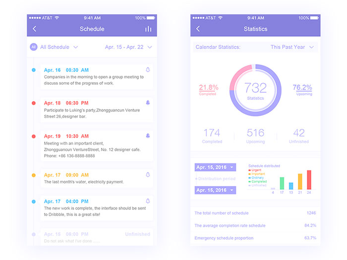
Schedule list design
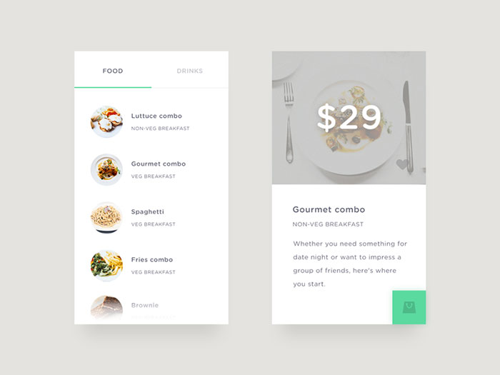
Food/Drink Menu
Itinerary listing design

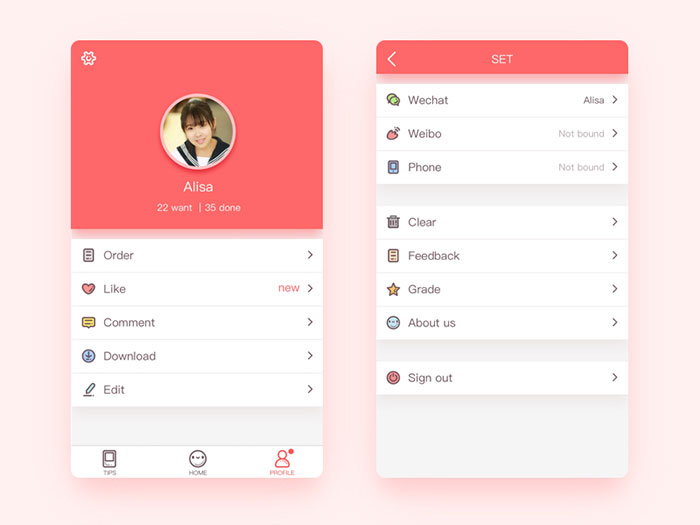
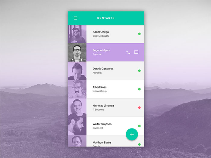
Profile list UI
Dinner Calendar App
Inbox App
All Tasks list design
Shipp Calendar
Sup! – App for friends
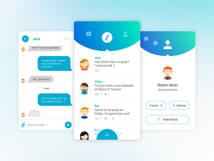
Simple chat app
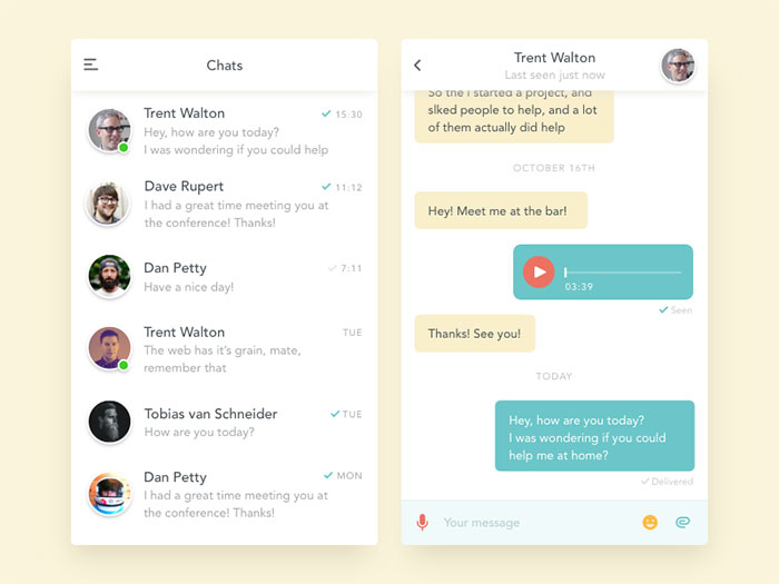
Music Player App
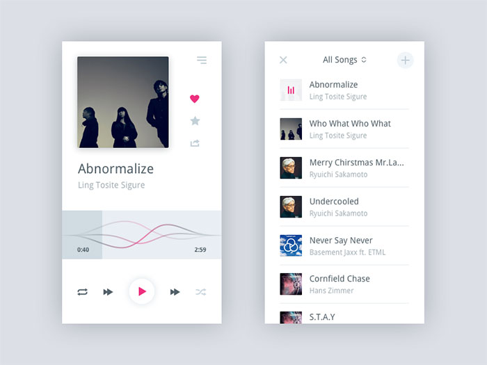
Pantryfeed Profile Splash
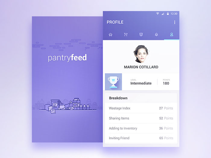
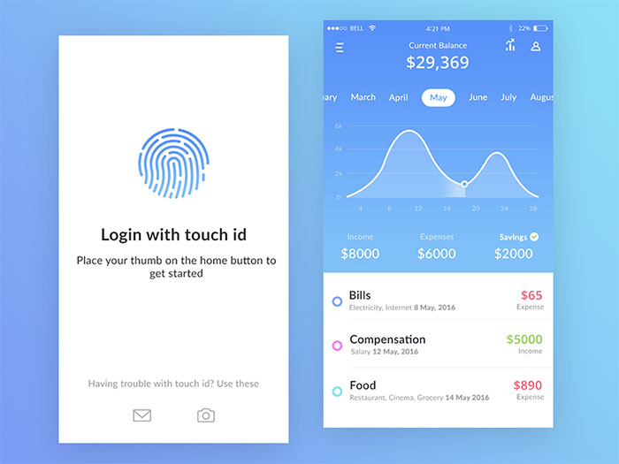
Bank app mock ups
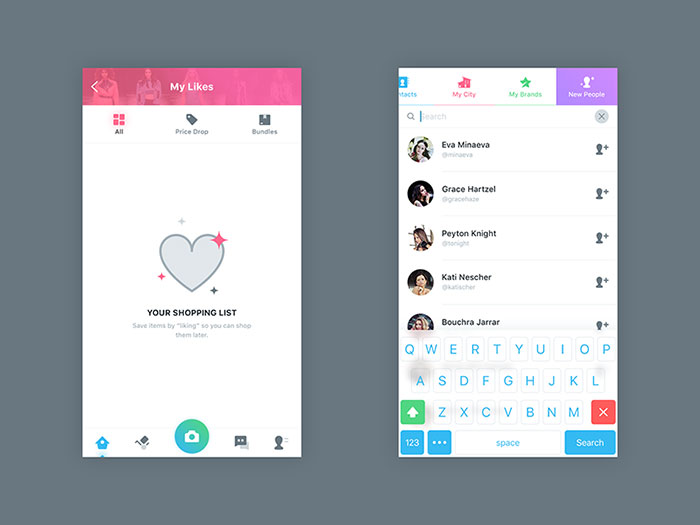
My Likes And Find People
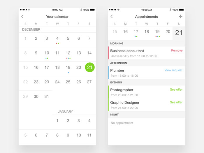
Appointments on calendar
Job listing
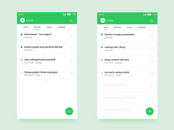
Daily UI #12
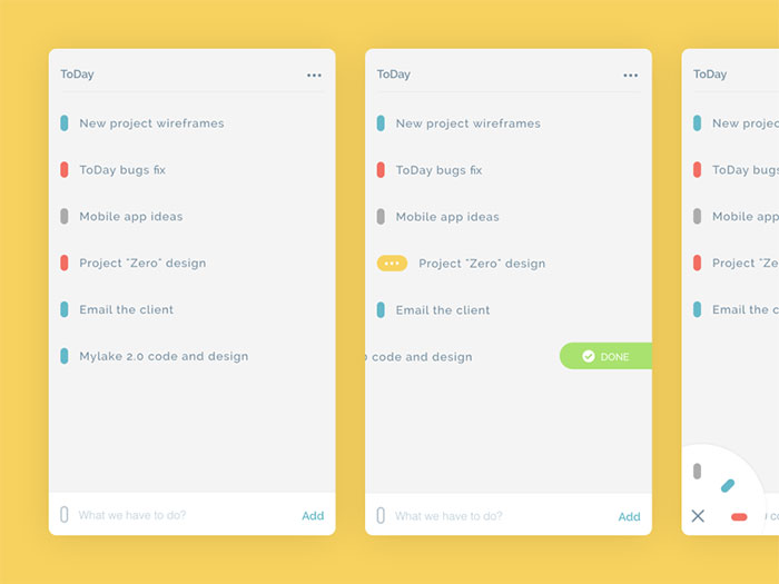
Updated ToDay app
FAQ on List UI Design For Mobile Apps
What is a sticky header in a mobile list?
A sticky header stays pinned to the top of the screen while everything beneath it keeps scrolling past. Grouped lists rely on this most, keeping a section label like “A” or “Today” visible right up until the next group takes over.
How does a section index work in a grouped list?
Run a finger down the right edge of a grouped list and, if there’s a section index (sometimes called an alphabet scrubber), you can jump straight to a letter instead of scrolling the whole way. iOS Contacts is what made the pattern popular for long alphabetical lists.
Should destructive swipe actions use a different color?
Generally, yes. Delete and other destructive actions typically render in red, while safer actions like archive or pin stick to a neutral or brand color. That difference lets someone register the risk before the swipe even finishes, without reading the label first.
How do you handle long text inside a list row?
Primary text usually truncates to one line with an ellipsis, while secondary text gets a bit more room, wrapping to two lines before it cuts off. Nothing’s actually lost, though. The full content stays available on tap, just deferred to a detail screen.
What is a floating action button, and how does it relate to a list?
A floating action button (FAB) hovers above a list, usually tucked into a bottom corner, reserved for the single most common action, composing a message, adding an item, whatever that main task is. It stays fixed in place while the list scrolls underneath it.
How do you add search or filter controls to a long list?
A search field usually docks at the top and filters rows in place as someone types, rather than opening a separate screen. Filter chips underneath the search bar can narrow things further without triggering a full reload.
What happens if a user swipes the wrong row action by accident?
A brief undo option, usually a snackbar or toast at the bottom of the screen, reverses the action within a few seconds. It’s a decent way to protect against destructive swipes like delete, without forcing a confirmation dialog onto every action someone takes.
How should list rows adapt for dark mode?
Row backgrounds shift from white to a dark gray rather than pure black, which keeps dividers and icons visible instead of washing out under harsh contrast. Text and icon colors invert through the same semantic color tokens used everywhere else in the interface.
What’s the difference between a list and a carousel?
A list scrolls vertically, showing every row in one continuous sequence. A carousel works sideways instead, horizontal, showing only a subset of items at a time, and it tends to suit browsing options side by side more than scanning a full set of results.
How do you localize a list for right-to-left languages?
The entire row flips. Leading elements move to the right, trailing elements move to the left, and swipe directions reverse to match. Arabic and Hebrew interfaces expect that full mirroring, not just translated text sitting inside the same layout.
Conclusion
Sequencing matters more than polish here. Row height and touch target sizing need to get settled before anything else gets attention, dividers, swipe actions, dark mode, all of that sits on top of that foundation, not next to it.
Get the row wrong, and no amount of animation work fixes a screen nobody can tap accurately.
Empty states and error states deserve budget from day one too, not a patch bolted on after launch. A list with zero rows isn’t some edge case tucked away somewhere. For a good chunk of users, it’s the first screen they’ll actually see.
Test against the real dataset early, not a five-row mockup. Mockups hide exactly the virtualization and scroll problems that only show their face once a list is carrying a few hundred rows in production.

Renowned for his expertise in logo design and visual branding, Bogdan has developed a multitude of logos for various clients.
His skills extend to creating posters, vector illustrations, business cards, and brochures. Additionally, Bogdan's UI kits were featured on marketplaces like Visual Hierarchy and UI8.
He also wrote in the past years on sites like Design Your Way, WebDesignerDepot, WPDean, Designmodo, Speckyboy, Slider Revolution, and more.
- Serif Italic Font Generator - 2 September 2026
- How To Use AI In Graphic Design Without Losing Creativity - 31 August 2026
- Bold Space Grotesk Font Pairing for Contemporary Brands - 29 August 2026

Bogdan Sandu is a seasoned designer who has been designing websites since 2008. Renowned for his expertise in logo design and visual branding, Bogdan has developed a multitude of logos for various clients. His skills extend to creating posters, vector illustrations, business cards, and brochures. Additionally, Bogdan's UI kits were featured on marketplaces like Visual Hierarchy and UI8. He also wrote in the past years on sites like Design Your Way, WebDesignerDepot, WPDean, Designmodo, Speckyboy, Slider Revolution, and more.
You Might Also Like