Century Gothic stopped being just another geometric sans-serif the moment you realized its licensing costs were eating your budget.
Or maybe the font just feels overused. Either way, you’re hunting for fonts similar to Century Gothic that deliver the same clean, modern aesthetic without the drawbacks.
This guide covers 20 professional alternatives spanning free Google Fonts and premium options. You’ll find geometric sans-serif fonts that match Century Gothic’s circular letterforms, plus humanist alternatives that improve readability while keeping that contemporary feel.
Each option includes:
- Actual weight ranges and format availability
- Real licensing costs (not vague “contact for pricing”)
- Specific use cases where it outperforms Century Gothic
- Visual differences that matter in practice
Whether you need a free substitute for web design or a premium typeface for branding projects, you’ll find it here.
Fonts Similar To Century Gothic
| Font Name | Classification | Key Attributes | Best Use Context |
|---|---|---|---|
| Futura | Geometric Sans-serif | Perfect circles, strict geometry, Art Deco influence | High-end branding, luxury products |
| Avenir | Humanist Geometric | Softer geometry, organic curves, highly legible | Body text, corporate communications |
| Avant Garde | Geometric Sans-serif | 1970s design, circular forms, tight spacing | Headlines, display typography |
| Gotham | Geometric Sans-serif | Inspired by NYC signage, wide range of weights | Editorial, political campaigns |
| Proxima Nova | Hybrid Geometric | Bridges geometric and humanist, versatile weight range | Web interfaces, mobile apps |
| Montserrat | Geometric Sans-serif | Google Font, inspired by Buenos Aires, free license | Web projects with budget constraints |
| Questrial | Geometric Sans-serif | Rounded terminals, clean lines, Google Font | Modern web design, minimalist layouts |
| Didact Gothic | Geometric Sans-serif | Educational focus, high readability, free | Educational materials, learning platforms |
| Muli | Geometric Sans-serif | Low contrast, multiple weights, rounded | Display and body text combination |
| Spartan | Geometric Sans-serif | Inspired by Futura, variable font technology | Modern responsive websites |
| Raleway | Elegant Geometric | Thin weight specialty, refined elegance, Google Font | Fashion, lifestyle brands |
| Brandon Grotesque | Geometric Sans-serif | Uppercase specialized, 1920s influence, condensed variants | Logo design, headline typography |
| Myriad Pro | Humanist Sans-serif | Adobe standard, highly legible, extensive family | Adobe ecosystem, corporate identity |
| Optima | Humanist Sans-serif | Classical proportions, flared strokes, serif-like feel | Formal documents, high-end publications |
| Gill Sans | Humanist Sans-serif | British heritage, warm and friendly, quirky details | UK-focused brands, railway signage |
| Neuzeit Grotesk | Geometric Sans-serif | Modernist German design, precise geometry, professional | Architecture, design studios |
| Arial | Neo-Grotesque | Universal availability, neutral design, system default | System fonts, basic business documents |
| Nunito Sans | Rounded Humanist | Friendly rounded terminals, Google Font, accessible | User-friendly interfaces, children’s content |
| Roboto | Neo-Grotesque | Android system font, dual nature, mechanical + friendly | Android apps, Material Design |
| Open Sans | Humanist Sans-serif | Neutral, optimized for screens, extensive language support | Web applications, multilingual sites |
Futura

Paul Renner’s 1927 geometric sans-serif shares Century Gothic’s clean, circular foundation but predates it by decades.
Design Characteristics
- Pure geometric construction with near-perfect circles for O, Q
- Tall ascenders create different vertical proportions than Century Gothic
- Alternative glyphs (single-story ‘a’, geometric ‘g’) available in many versions
Best Use Cases
- High-end fashion branding and editorial design
- Architectural signage requiring timeless appeal
- Print applications where geometric precision matters
Technical Specifications
- Available in 7-22 weights depending on version (Thin to Ultra)
- OTF and TTF formats across multiple foundries
- Futura Now (Monotype) offers 102 styles including variable font option
Licensing & Availability
- Commercial font requiring paid license
- Available through Linotype, Monotype, Adobe Fonts, MyFonts
- Prices vary by foundry; desktop licenses typically $35-75 per weight
Key Differences from Century Gothic
- More condensed letterforms with tighter spacing
- Sharper, more angular points on letters like A and M
- Choose Futura when project demands recognized prestige and historical gravitas
Avenir
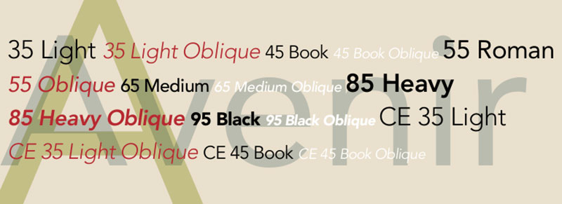
Adrian Frutiger’s 1988 masterwork balances geometric structure with humanist warmth, making it more versatile than Century Gothic’s rigid geometry.
Design Characteristics
- Optically corrected circles (not perfect geometry like Century Gothic)
- Two-story ‘a’ and ‘t’ with subtle curve add traditional readability
- More even color in text blocks than pure geometric sans
Best Use Cases
- Extended body text where readability trumps pure modernism
- Corporate branding requiring sophisticated professionalism
- Airport signage and wayfinding systems (Dallas Fort Worth, Hong Kong)
Technical Specifications
- Avenir: 12 styles (6 weights with italics)
- Avenir Next: 24-32 styles including condensed widths
- Full Latin, Greek, Cyrillic, Vietnamese support in Next versions
Licensing & Availability
- Commercial font through Linotype/Monotype
- Bundled with macOS/iOS since Mountain Lion (2012)
- Desktop licenses $35-65 per weight; web licenses based on pageviews
Key Differences from Century Gothic
- Warmer, more approachable feel versus Century Gothic’s cooler precision
- Superior for long-form reading; Century Gothic better for headlines
- Wider weight range offers more typographic flexibility
Avant Garde
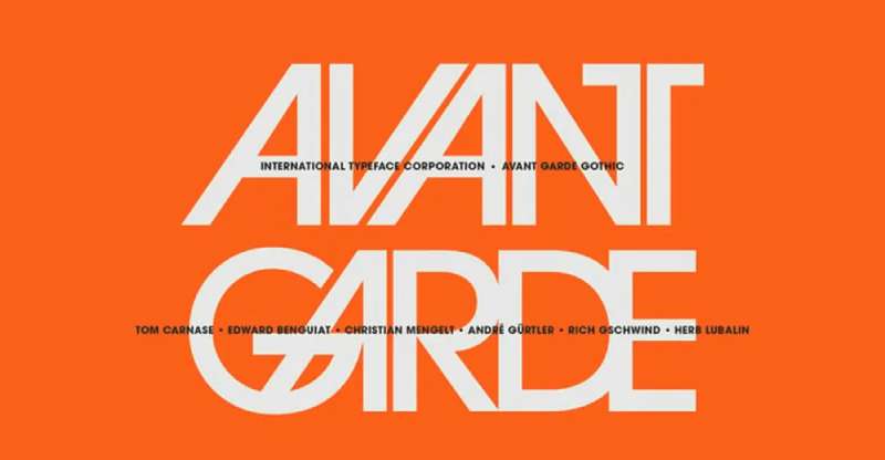
Herb Lubalin’s 1970 design emphasizes tight letterspacing and geometric perfection, pushing Century Gothic’s aesthetic to radical extremes.
Design Characteristics
- Extremely geometric with perfect circular forms
- Designed for tight spacing with extensive ligatures
- Distinctive single-story ‘a’, circular dots, perfect circles throughout
Best Use Cases
- Logo design and brand identity work
- Magazine headlines and display typography
- Projects requiring 1970s retro aesthetic
Technical Specifications
- ITC Avant Garde Gothic: 5 weights (Book, Medium, Demi, Bold, Extra Light) with obliques
- Over 100 alternates and ligatures in Pro versions
- OTF format with extensive glyph coverage
Licensing & Availability
- Commercial font through ITC/Monotype
- Available via Adobe Fonts subscription
- Individual weight licenses $35-50
Key Differences from Century Gothic
- More distinctive and less neutral than Century Gothic
- Ligatures create unique typographic opportunities
- Choose Avant Garde for attention-grabbing display work, not body text
Gotham
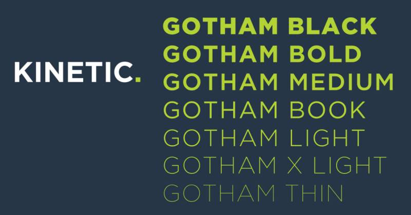
Designed by Tobias Frere-Jones in 2000, Gotham draws from New York architectural signage for an engineered, utilitarian aesthetic distinct from Century Gothic’s European modernism.
Design Characteristics
- Wide, sturdy letterforms with architectural presence
- Slightly squared circular forms create engineered appearance
- Consistent stroke width across weights maintains structural integrity
Best Use Cases
- Political campaigns and civic branding (Obama 2008, 2012)
- Corporate identity requiring authority without coldness
- Editorial design for magazines and news platforms
Technical Specifications
- Massive family: 4 widths, 8 weights (Thin to Ultra), separate rounded version
- Total of 132 styles including Screen-optimized variants
- Full OpenType features including Greek and Cyrillic (added 2015)
Licensing & Availability
- Premium commercial font exclusively from Hoefler & Co.
- No third-party distribution
- Complete bundle: $996 for single computer; individual weights available
Key Differences from Century Gothic
- Much wider proportions create stronger horizontal presence
- American vernacular roots versus Century Gothic’s Bauhaus heritage
- Superior weight range but significantly higher cost
Proxima Nova
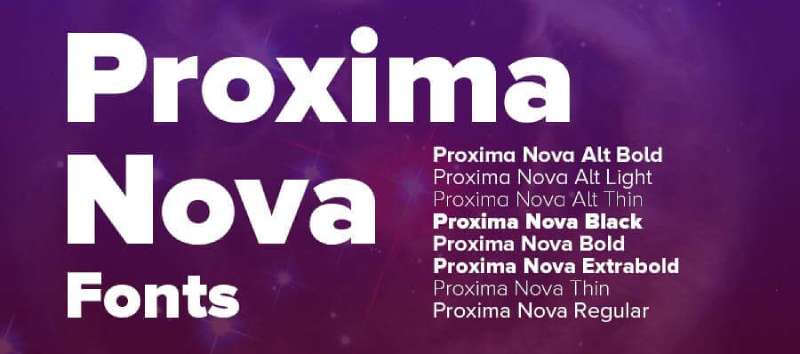
Mark Simonson’s 2005 hybrid bridges Futura’s geometry and Akzidenz Grotesk’s grotesque sensibility, offering more versatility than Century Gothic.
Design Characteristics
- Humanistic proportions with somewhat geometric appearance
- More open apertures improve screen legibility
- Carefully optically adjusted rather than mathematically pure
Best Use Cases
- Most popular commercial web font since 2010 (BuzzFeed, Flickr, NBC News)
- UI/UX design requiring excellent screen performance
- Marketing materials balancing modern and approachable
Technical Specifications
- 80 fonts total: 8 weights × 5 widths (Normal, Condensed, Extra Condensed, Wide, Extra Wide)
- Extensive language support including Greek, Cyrillic, Arabic, Thai, Devanagari
- Variable font version (Proxima Vara) available
Licensing & Availability
- Commercial font through Mark Simonson Studio
- Available via Adobe Fonts subscription
- Desktop licenses $40-60 per weight; web licenses tiered by pageviews
Key Differences from Century Gothic
- Better optimized for digital environments
- Wider range of widths provides more design flexibility
- Slightly warmer personality makes it more versatile across applications
Montserrat

Julieta Ulanovsky’s 2011 homage to Buenos Aires signage offers a free alternative with geometric structure similar to Century Gothic.
Design Characteristics
- Geometric sans inspired by urban typography
- Slightly wider proportions than Century Gothic
- Clean, open letterforms optimized for screen display
Best Use Cases
- Web projects requiring modern geometric aesthetic without licensing costs
- Startup branding and digital product design
- Projects with limited budget needing professional appearance
Technical Specifications
- 18 weights: 9 uprights with matching italics (Thin to Black)
- Variable font support included
- TTF, OTF, WOFF/WOFF2 formats available
Licensing & Availability
- Free under SIL Open Font License
- Available through Google Fonts, Adobe Fonts
- Commercial use permitted without restrictions
Key Differences from Century Gothic
- Completely free versus Century Gothic’s licensing requirements
- Slightly less refined letterforms, particularly at smaller sizes
- Most accessible Century Gothic alternative for budget-conscious projects
Questrial
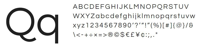
Created by Joe Prince in 2011, Questrial strips geometric sans design to essential forms, creating an even simpler aesthetic than Century Gothic.
Design Characteristics
- Minimal, unadorned geometric structure
- Single weight design maintains consistency
- Very tall x-height improves legibility at small sizes
Best Use Cases
- Body text for blogs and content-heavy websites
- Mobile interfaces requiring clarity at various sizes
- Minimalist design projects
Technical Specifications
- Single weight (Regular) only
- Basic Latin character set
- Web-optimized through Google Fonts
Licensing & Availability
- Free through SIL Open Font License
- Hosted on Google Fonts
- No licensing fees for any use
Key Differences from Century Gothic
- Only one weight limits typographic hierarchy options
- Taller x-height than Century Gothic improves small-size performance
- Choose Questrial for simple projects not requiring weight variation
Didact Gothic
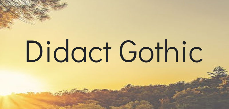
Designed by Daniel Johnson, Didact Gothic prioritizes legibility for educational content with geometric underpinnings similar to Century Gothic.
Design Characteristics
- Clean geometric structure with slightly condensed proportions
- Designed specifically for extended screen reading
- Simple, unambiguous letterforms aid readability
Best Use Cases
- Educational platforms and e-learning interfaces
- Technical documentation and instructional content
- Situations where clarity outweighs personality
Technical Specifications
- Single weight available
- Basic to extended Latin character sets
- OTF and web font formats
Licensing & Availability
- Free under SIL Open Font License
- Available through Google Fonts
- Unrestricted commercial use
Key Differences from Century Gothic
- More condensed, fitting more text per line
- Designed explicitly for screen reading versus Century Gothic’s print origins
- Limited to single weight versus Century Gothic’s family
Muli
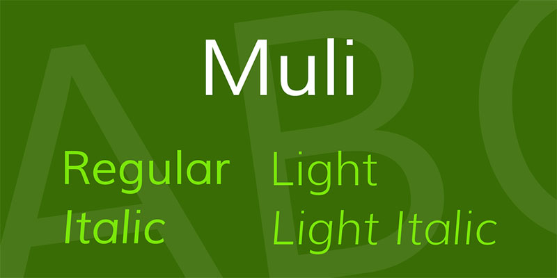
Vernon Adams’ 2011 design (now rebranded as Mulish) offers a minimalist geometric sans with improved web performance compared to Century Gothic.
Design Characteristics
- Low-contrast, uniform stroke weights
- Generous apertures and open counters
- Slightly wider than Century Gothic with more relaxed spacing
Best Use Cases
- Content-focused websites and applications
- Digital interfaces prioritizing legibility over distinctiveness
- Responsive design requiring performance optimization
Technical Specifications
- 14 weights (ExtraLight to Black) with matching italics in Mulish version
- Variable font available for dynamic weight adjustment
- Extensive Latin and Vietnamese character support
Licensing & Availability
- Free under SIL Open Font License
- Available on Google Fonts (as Mulish)
- No restrictions on commercial use
Key Differences from Century Gothic
- More weights available provides better typographic range
- Variable font technology absent in Century Gothic
- Optimized for web performance with smaller file sizes
Spartan
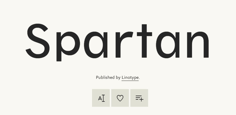
A free interpretation of geometric sans principles, Spartan closely mimics Century Gothic’s structure while being completely open-source.
Design Characteristics
- Near-identical geometric construction to Century Gothic
- Perfect circles, uniform stroke weights
- Clean, neutral aesthetic suitable for broad applications
Best Use Cases
- Projects requiring Century Gothic aesthetic without licensing
- Web applications prioritizing free fonts
- Designs emphasizing pure geometric modernism
Technical Specifications
- 9 weights (Thin to Black) available
- Variable font option
- Basic and extended Latin support
Licensing & Availability
- Free under SIL Open Font License
- Available through Google Fonts
- Unrestricted usage including commercial projects
Key Differences from Century Gothic
- Virtually interchangeable visually
- Completely free alternative eliminates licensing concerns
- Best direct substitute when budget prohibits Century Gothic
Raleway
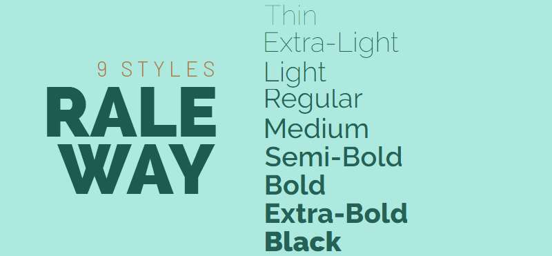
Designed by Matt McInerney in 2012, Raleway blends geometric sans structure with elegant thin weights unavailable in Century Gothic.
Design Characteristics
- Distinctive elegant thin weights with refined details
- Geometric foundation with subtle humanist adjustments
- Slightly narrower than Century Gothic in lighter weights
Best Use Cases
- Luxury branding and high-end editorial design
- Display typography where thin weights create sophistication
- Web headers and hero sections
Technical Specifications
- 18 weights (Thin to Black) with italics
- Variable font support
- Extended Latin and Vietnamese character sets
Licensing & Availability
- Free under SIL Open Font License
- Hosted on Google Fonts
- Adobe Fonts also offers access
Key Differences from Century Gothic
- Exceptional thin weights for elegant display applications
- More condensed proportions in lighter weights
- Choose Raleway when project needs more refined, upscale appearance
Brandon Grotesque
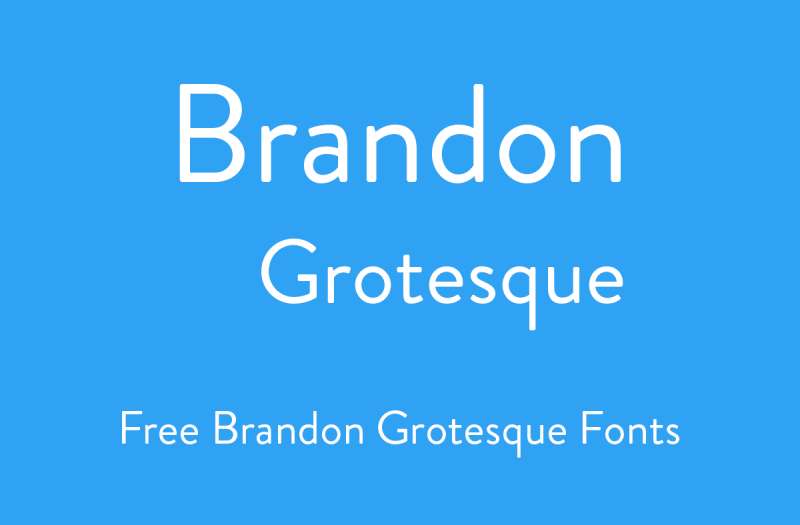
Hannes von Döhren’s 2010 design combines geometric sans structure with unusually low x-height, creating distinctive elegance absent from Century Gothic.
Design Characteristics
- Low x-height creates elongated, sophisticated proportions
- Geometric structure with subtle humanist warmth
- Slightly condensed letterforms with refined details
Best Use Cases
- High-end branding and fashion-forward design
- Editorial headlines requiring distinction
- Display typography where uniqueness matters
Technical Specifications
- 12 weights (Thin to Black) with italics
- Brandon Text companion family for body copy
- Full OpenType features including alternates
Licensing & Availability
- Commercial font through HVD Fonts
- Available via Adobe Fonts, MyFonts, Fontspring
- Desktop licenses $40-70 per weight
Key Differences from Century Gothic
- Low x-height creates more dramatic appearance
- Not suitable for body text like Century Gothic can be
- Choose Brandon Grotesque when headline impact is priority
Myriad Pro
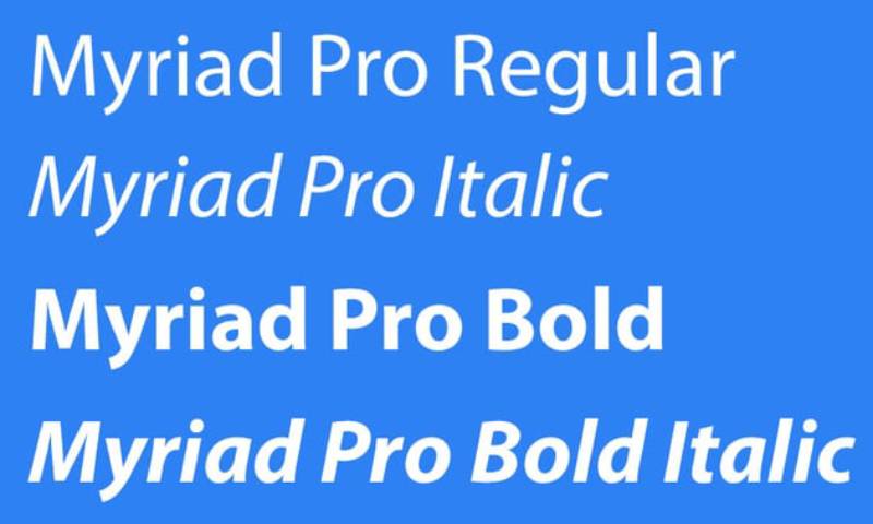
Designed by Robert Slimbach and Carol Twombly for Adobe in 1992, Myriad Pro offers humanist warmth within geometric structure, making it more versatile than Century Gothic.
Design Characteristics
- Humanist proportions with subtle geometric influences
- Open apertures and generous spacing
- Professional workhorse with extensive character set
Best Use Cases
- Corporate communications requiring approachability
- Lengthy documents needing comfortable readability
- Multi-platform design (former Apple corporate typeface)
Technical Specifications
- 4 widths, 20 weights total
- Extensive OpenType features including true small caps
- Full Adobe Western 2 character set
Licensing & Availability
- Commercial font through Adobe
- Bundled with Adobe Creative Cloud
- Individual licenses through Adobe Fonts store
Key Differences from Century Gothic
- More humanist, less purely geometric
- Better suited for extended text than Century Gothic
- Choose Myriad Pro when readability outweighs geometric purity
Optima
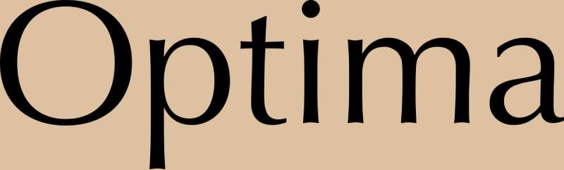
Hermann Zapf’s 1958 flared sans-serif occupies unique space between serif and sans, offering more warmth than Century Gothic’s pure geometry.
Design Characteristics
- Distinctive stroke modulation creates subtle flaring at terminals
- Classical proportions inspired by Renaissance inscriptions
- More organic than geometric despite lacking serifs
Best Use Cases
- Luxury branding requiring classical elegance
- Print materials where distinctive personality adds value
- Editorial design balancing modernity and tradition
Technical Specifications
- 6 weights (Regular to ExtraBold) with italics
- Optima Nova expanded family offers more weights
- Traditional letterpress and digital versions available
Licensing & Availability
- Commercial font through Linotype/Monotype
- Available via Adobe Fonts subscription
- Desktop licenses $35-50 per weight
Key Differences from Century Gothic
- Flared strokes create completely different aesthetic
- More suitable for text than display versus Century Gothic
- Choose Optima when warmth and sophistication trump geometric modernism
Gill Sans
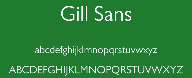
Eric Gill’s 1928-1930 British classic mixes humanist warmth with geometric simplicity, predating but philosophically differing from Century Gothic.
Design Characteristics
- Humanist proportions based on Roman letterforms
- Quirky details (eyeglass ‘g’, distinctive ‘a’) add character
- Less mechanically geometric than Century Gothic
Best Use Cases
- British brand identity and corporate work
- Book typography requiring friendly professionalism
- Transport signage (British railways, London Underground historically)
Technical Specifications
- Multiple widths and weights (Light to Ultra Bold)
- Extensive character set in Pro versions
- Various digital interpretations exist
Licensing & Availability
- Commercial font through Monotype
- Bundled with macOS
- Desktop licenses $35-60 per weight
Key Differences from Century Gothic
- Quirky British personality versus Century Gothic’s German neutrality
- Better text performance due to humanist structure
- Choose Gill Sans when warmth and character outweigh pure modernism
Neuzeit Grotesk

Wilhelm Pischner’s 1928 design offers pure geometric structure similar to Century Gothic but with distinctive German Bauhaus character.
Design Characteristics
- Strict geometric construction with perfect circles
- Angular terminals and clean, mechanical forms
- More condensed than Century Gothic
Best Use Cases
- Projects requiring authentic 1920s geometric aesthetic
- German design heritage or Bauhaus-influenced branding
- Display typography needing historical authenticity
Technical Specifications
- Multiple weights from Light to Bold
- Character set varies by digital version
- Condensed variants available
Licensing & Availability
- Available through Linotype and URW++
- Various digital interpretations exist
- Desktop licenses $35-60 per weight
Key Differences from Century Gothic
- More condensed proportions fit more text
- Authentic 1920s aesthetic versus Century Gothic’s 1990s optimization
- Choose Neuzeit Grotesk for projects emphasizing design history
Arial
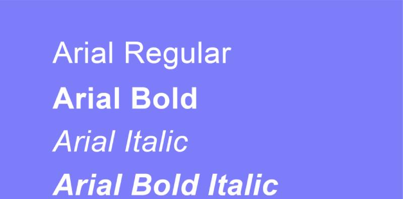
Monotype’s 1982 Helvetica alternative offers familiar neutrality but lacks Century Gothic’s geometric purity and elegance.
Design Characteristics
- Neo-grotesque structure with subtle geometric influences
- Extremely neutral, utilitarian appearance
- Wider than Century Gothic with looser spacing
Best Use Cases
- Corporate documents requiring universal compatibility
- Quick-turnaround projects using system fonts
- Situations prioritizing ubiquity over distinction
Technical Specifications
- Basic family: Regular, Bold, Italic, Bold Italic
- Extended versions add Light, Black weights
- Bundled with Windows and Microsoft Office
Licensing & Availability
- Included with Windows and MS Office
- Commercial licenses available through Monotype for extended use
- Free for basic document creation on licensed systems
Key Differences from Century Gothic
- Grotesque rather than geometric structure
- Less visually interesting but more universally available
- Choose Arial only when licensing/compatibility leave no alternative
Nunito Sans
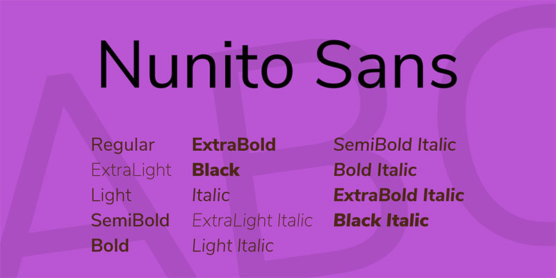
Vernon Adams’ 2014 rounded geometric sans balances Century Gothic’s geometry with friendlier, more approachable terminals.
Design Characteristics
- Gently rounded terminals soften geometric structure
- Balanced proportions between condensed and wide
- Clean, contemporary aesthetic with warmth
Best Use Cases
- User interfaces requiring approachability
- Brand design balancing modern and friendly
- Web applications targeting broad audiences
Technical Specifications
- 14 weights (ExtraLight to Black) with italics
- Variable font available
- Extended Latin character support
Licensing & Availability
- Free under SIL Open Font License
- Available through Google Fonts
- No commercial use restrictions
Key Differences from Century Gothic
- Rounded terminals create friendlier appearance
- More weights provide better typographic flexibility
- Choose Nunito Sans when approachability matters more than pure geometry
Roboto
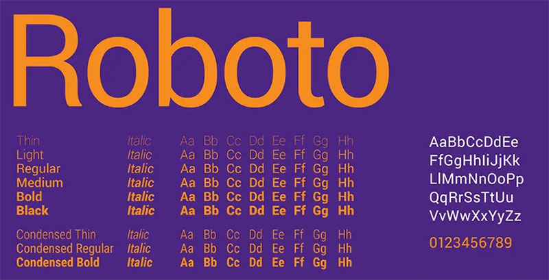
Christian Robertson’s 2011 Android system font blends geometric and grotesque features, optimizing for screens in ways Century Gothic wasn’t designed for.
Design Characteristics
- Hybrid geometric-grotesque structure
- Mechanical skeleton with friendly curves
- Optimized for high-density displays
Best Use Cases
- Android app interfaces and Material Design implementations
- Responsive web design across device sizes
- Projects requiring Google ecosystem consistency
Technical Specifications
- 12 weights (Thin to Black) with italics
- Condensed family adds 6 additional weights
- Variable font versions available
Licensing & Availability
- Free under Apache License 2.0
- Hosted on Google Fonts
- Default Android system font
Key Differences from Century Gothic
- Better screen optimization with extensive hinting
- Less purely geometric, more pragmatic
- Choose Roboto for cross-platform digital products
Open Sans

Steve Matteson’s 2011 humanist sans prioritizes legibility over geometric purity, making it more readable than Century Gothic in extended text.
Design Characteristics
- Humanist letterforms with low stroke contrast
- Wide apertures and open counters optimize readability
- Neutral but friendly appearance
Best Use Cases
- Content-heavy websites and blogs
- Mobile interfaces requiring excellent legibility
- Documents requiring extended comfortable reading
Technical Specifications
- 10 weights (Light to ExtraBold) with italics
- Condensed family available
- Extensive Latin, Greek, Cyrillic support
Licensing & Availability
- Free under Apache License 2.0 and SIL OFL
- Most popular font on Google Fonts by usage
- Unrestricted commercial use
Key Differences from Century Gothic
- Humanist rather than geometric structure
- Superior for body text; Century Gothic better for headlines
- Choose Open Sans when readability trumps geometric aesthetic
FAQ on Fonts Similar To Century Gothic
What is the closest free alternative to Century Gothic?
Spartan from Google Fonts replicates Century Gothic’s geometric structure almost identically. Montserrat offers another excellent free option with slightly wider proportions and more weight variations, making it the most popular free substitute for professional projects.
Can I use Futura instead of Century Gothic?
Yes, but expect visual differences. Futura features taller ascenders and more condensed proportions than Century Gothic. Both share geometric foundations, but Futura’s design predates Century Gothic by decades and carries different typographic hierarchy implications.
Is Gotham similar to Century Gothic?
Not particularly. Gotham has wider, architectural proportions inspired by American signage while Century Gothic follows European geometric sans-serif traditions. Gotham works better for bold corporate branding; Century Gothic suits lighter, more minimal applications.
Which Google Font looks most like Century Gothic?
Spartan matches Century Gothic’s geometry most closely. Questrial and Didact Gothic offer similar clean aesthetics but with single weights only. For projects needing multiple weights, Montserrat provides the best balance of similarity and versatility.
What fonts pair well with Century Gothic alternatives?
Serif fonts like Merriweather, Garamond, or Georgia create strong contrast with geometric sans-serifs. For pairing fonts within sans-serif families, combine different weights of the same typeface rather than mixing similar geometric fonts.
Is Proxima Nova better than Century Gothic?
Proxima Nova offers superior screen optimization, more weights (80 versus Century Gothic’s basic family), and better language support. It’s become the web’s most popular commercial font since 2010, making it more versatile for digital projects.
Why is Century Gothic so expensive compared to alternatives?
Century Gothic requires commercial licensing through Monotype. Free alternatives like Montserrat and Spartan emerged because designers needed cost-effective geometric sans-serif options. Premium fonts like Gotham cost even more due to extensive development and brand recognition.
What’s the difference between geometric and humanist sans-serif fonts?
Geometric sans-serifs (Century Gothic, Futura) use circular forms and uniform strokes. Humanist sans-serifs (Open Sans, Myriad Pro) feature stroke variation and proportions based on calligraphy, improving readability for body text but sacrificing pure geometric modernism.
Can I use Avenir for web design?
Absolutely. Avenir performs excellently on screens and comes bundled with macOS/iOS since 2012. Avenir Next offers even better screen optimization with extended character sets. Both work well for web design requiring sophisticated, readable typography.
Are there any vintage alternatives to Century Gothic?
Neuzeit Grotesk (1928) offers authentic Bauhaus-era geometric design. Avant Garde provides 1970s retro aesthetic. Both predate Century Gothic’s 1991 release and bring historical authenticity to projects referencing specific graphic design movements and eras.
Conclusion
Finding fonts similar to Century Gothic doesn’t mean settling for second-best alternatives. Many options actually outperform the original in specific contexts.
Free options like Montserrat and Spartan eliminate licensing headaches while delivering clean geometric aesthetics. Premium choices like Proxima Nova and Gotham bring superior technical specifications and expanded weight ranges that Century Gothic can’t match.
Your choice depends on project requirements. Need extensive language support? Avenir Next covers multiple scripts. Working on a tight budget? Google Fonts offers several professional geometric sans-serif fonts at zero cost.
The best typeface balances aesthetic goals with practical constraints like font licensing, character set needs, and performance requirements. Test candidates in your actual layouts rather than relying on specimen sheets alone.
Modern typography offers better options than defaulting to familiar choices.
If you enjoyed reading this article on fonts similar to Century Gothic, you should check out these articles with fonts similar to Proxima Nova, Avenir, Lato, Papyrus, Old English, Comic Sans, Minion Pro, Gill Sans, and Eurostile.

Renowned for his expertise in logo design and visual branding, Bogdan has developed a multitude of logos for various clients.
His skills extend to creating posters, vector illustrations, business cards, and brochures. Additionally, Bogdan's UI kits were featured on marketplaces like Visual Hierarchy and UI8.
He also wrote in the past years on sites like Design Your Way, WebDesignerDepot, WPDean, Designmodo, Speckyboy, Slider Revolution, and more.
- How to Install Fonts on Mac (Step-by-Step Guide) - 20 September 2026
- From Mockup to Code: How AI-Augmented Development Speeds Up the Design Handoff - 19 September 2026
- The Beehiiv Logo History, Colors, Font, And Meaning - 18 September 2026

Bogdan Sandu is a seasoned designer who has been designing websites since 2008. Renowned for his expertise in logo design and visual branding, Bogdan has developed a multitude of logos for various clients. His skills extend to creating posters, vector illustrations, business cards, and brochures. Additionally, Bogdan's UI kits were featured on marketplaces like Visual Hierarchy and UI8. He also wrote in the past years on sites like Design Your Way, WebDesignerDepot, WPDean, Designmodo, Speckyboy, Slider Revolution, and more.
You Might Also Like