Sometimes clean typography just doesn’t cut it. You need something raw, something with edge.
That’s where the best cracked fonts come in. These distressed typefaces bring texture, drama, and visual tension to headlines, posters, and branding projects.
Finding the right one takes time though. Some look cheap. Others sacrifice readability for style.
This collection features 36 cracked and broken fonts that actually work. Each entry covers:
- Style characteristics and visual weight
- Best use cases for graphic design projects
- Font pairing suggestions
- Technical specs and licensing details
Whether you’re designing horror movie titles, gaming graphics, or urban streetwear branding, you’ll find options here that deliver real impact.
The Best Cracked Fonts
| Font Name | Visual Style & Character | Best Use Cases | Design Context |
|---|---|---|---|
| Broken | Fragmented letterforms with sharp, angular breaks creating discontinuous character structures | Punk rock graphics, rebellion messaging, shattered glass effects, disruption branding | Emphasizes fracture, discontinuity, and anti-establishment messaging |
| Bigger Cracks | Wide, prominent fissures throughout letterforms with exaggerated crack patterns for maximum visibility | Large-format prints, billboard designs, earthquake awareness campaigns, structural damage themes | Requires distance viewing where substantial crack width maintains readability |
| Asphalt Crack | Irregular, organic crack patterns mimicking weathered pavement with rough, textured edges | Urban photography watermarks, road construction signage, city decay documentation, street art projects | Authentic urban environment simulation requiring pavement texture realism |
| Broken Space | Disconnected character segments with intentional gaps creating spatial separation within letters | Sci-fi interfaces, glitch art, digital malfunction themes, futuristic error messages | Technology failure context emphasizing digital fragmentation and system breakdown |
| Shatterbox | Contained, boxed letterforms with internal shattering confined within geometric boundaries | Product packaging damage warnings, fragile shipping labels, broken screen simulations, impact testing graphics | Controlled destruction within defined parameters, suggesting contained breakage |
| Broken Glass | Sharp, crystalline fracture patterns with reflective qualities mimicking shattered transparent material | Window replacement services, security system advertising, crime scene documentation, accident reconstruction | Transparent material breakage requiring glass-specific crack characteristics |
| Glaz Krak | Glazed ceramic crackle finish with fine, web-like crazing patterns suggesting pottery damage | Pottery studio branding, ceramic repair services, artisan craft labels, vintage pottery catalogs | Ceramic and porcelain contexts requiring authentic glaze cracking representation |
| Breakaway | Dynamic separation with pieces appearing to pull apart or escape from main letterform structure | Freedom movements, liberation campaigns, breakout events, escape room branding, separation services | Motion and departure themes emphasizing active breaking rather than static damage |
| Opium | Hazy, deteriorated letterforms with dreamlike distortion suggesting substance-induced perception alteration | Psychedelic art, substance abuse awareness, historical opium den references, altered state themes | Consciousness alteration context requiring surreal, degraded visual quality |
| Gipsiero | Crumbling plaster texture with chalky, deteriorated edges mimicking aged wall surfaces | Architectural restoration, ancient ruin documentation, wall repair services, Mediterranean aesthetic projects | Building material decay requiring plaster-specific weathering characteristics |
| Sniper | Bullet hole perforation effects with impact radiating cracks and precise penetration damage | Military gaming, shooting range signage, ballistic testing reports, action movie titles, tactical training materials | Ballistic impact context requiring accurate bullet damage representation |
| Crack and Bold | Heavy weight letterforms with prominent crack patterns, balancing readability with distressed appearance | Bold headlines, impactful statements, construction site warnings, industrial safety signage | Maintains legibility while conveying damage, suitable for primary messaging |
| Rock | Stone-like texture with natural fracture lines resembling sedimentary or metamorphic rock splitting | Geology presentations, mining company logos, natural stone suppliers, mountain climbing events, quarry operations | Natural geological materials requiring authentic stone fracture patterns |
| Vtks Untitled | Anonymous, raw destruction with undefined crack patterns creating mysterious, unfinished appearance | Underground art, anonymous messaging, unbranded projects, prototype designs, work-in-progress labels | Deliberately unrefined aesthetic suggesting unfinished or anonymous creation |
| Twylite Zone | Supernatural distortion with reality-bending cracks suggesting otherworldly dimensional breakage | Paranormal content, sci-fi horror, dimension-crossing themes, mystery podcasts, supernatural investigation shows | Reality distortion context requiring surreal, non-physical damage representation |
| MosaicCaps | Tessellated, tile-like fragmentation with geometric breaks creating mosaic pattern effects | Byzantine art references, tile installation services, mosaic workshops, decorative capital letters, museum exhibits | Artistic fragmentation rather than damage, suggesting intentional decorative breaking |
| Gastada | Worn, eroded appearance with gradual deterioration suggesting prolonged use or weathering | Vintage branding, antique shop signage, historical restoration, aged document simulation, retro product labels | Time-based decay rather than sudden breakage, emphasizing gradual erosion |
| HackingTrashed | Digital corruption with data destruction effects suggesting cyber attack or system compromise | Cybersecurity warnings, hacking conferences, data breach notifications, tech thriller titles, ransomware education | Digital security breach context requiring technological destruction representation |
| Destroy | Complete devastation with extreme fragmentation suggesting total structural failure and obliteration | Demolition services, destruction derbies, catastrophe themes, apocalyptic gaming, extreme impact messaging | Maximum destruction context emphasizing complete annihilation over partial damage |
| Electrickle | Electric shock fracture patterns with lightning-like branching cracks suggesting electrical damage | Electrical safety warnings, power company branding, lightning documentation, energy drink packaging, electrical repair services | Electrical current damage requiring characteristic dendritic crack patterns |
| Rock it | Energetic, music-inspired breaks with rhythmic crack patterns suggesting sound wave impact | Rock concert posters, music festival branding, band logos, audio equipment advertising, sound studio signage | Musical energy context combining rock aesthetic with dynamic breaking effect |
| Broken Type | Typewriter-inspired damage with mechanical failure characteristics and interrupted keystroke effects | Vintage typing aesthetics, journalism themes, writer’s block concepts, typewriter repair services, detective fiction | Mechanical printing damage requiring typewriter-specific malfunction representation |
| TNT X Plosion | Explosive blast fragmentation with outward radiating breaks suggesting detonation force impact | Action game titles, demolition advertising, fireworks displays, explosive handling warnings, stunt show promotions | Explosive force context requiring characteristic blast-pattern fragmentation |
| Mishmash | Chaotic, inconsistent breaks with random crack patterns creating disordered, unpredictable appearance | Chaos theory presentations, disorder concepts, eclectic branding, experimental art, confusion themes | Intentional disorder emphasizing randomness and lack of systematic pattern |
| Before Collapse | Pre-failure stress cracks suggesting imminent structural failure with tension-based fracturing | Structural engineering warnings, building inspection reports, tension documentation, disaster prevention campaigns | Warning state context emphasizing preventable failure through early detection |
| Fracture Dreams | Surreal, dreamlike breaks with soft, flowing crack patterns suggesting subconscious fragmentation | Psychology themes, dream analysis content, surrealist art, mental health awareness, sleep disorder documentation | Psychological breaking rather than physical, requiring ethereal crack characteristics |
| Broken Wood Font | Splintered wood grain with fibrous breaks following natural wood structure and grain direction | Carpentry services, lumber yards, wood restoration, forestry programs, rustic cabin branding, woodworking tutorials | Organic wood material requiring authentic grain-following splinter patterns |
| Grounded Cracked | Earth-based fractures with soil and ground characteristics suggesting terrain disruption | Earthquake documentation, drought awareness, soil science, foundation repair, seismic activity warnings | Ground-level damage requiring earth-specific crack patterns and soil texture |
| Fractura | Medical bone fracture aesthetic with clean break lines suggesting skeletal damage | Orthopedic services, medical education, bone health campaigns, injury prevention, sports medicine, radiology presentations | Anatomical fracture context requiring medically accurate break representation |
| Urban Plaza | City concrete damage with urban wear patterns reflecting public space deterioration | Urban planning documents, city maintenance reports, public works signage, metropolitan photography, concrete repair services | Urban infrastructure decay requiring city-specific weathering characteristics |
| Thelor Cevlok | Alien language aesthetic with otherworldly crack patterns suggesting extraterrestrial writing system damage | Science fiction novels, alien contact themes, fantasy gaming, constructed language projects, space exploration fiction | Non-human origin context requiring unfamiliar, exotic damage patterns |
| Groovy Volcano | Lava-flow inspired breaks with molten, flowing characteristics and heat-based distortion | Volcanic tourism, geology education, lava lamp branding, hot sauce packaging, geothermal energy promotions | Volcanic activity context requiring molten material flow characteristics |
| Cracking Sans | Clean, modern sans-serif with minimalist crack integration balancing contemporary design with distressed effect | Modern grunge branding, contemporary distressed aesthetics, minimalist urban design, tech startup logos with edge | Contemporary design context requiring subtle distressing without sacrificing modern appeal |
| The Quakeer | Seismic shift patterns with earthquake-induced displacement and ground movement effects | Earthquake preparedness, seismology studies, disaster relief organizations, tectonic activity documentation, safety drills | Seismic event context requiring characteristic ground displacement and shaking effects |
Broken
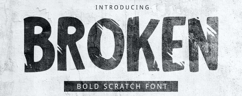
A handwritten-style display font with scratches and cracks worked into every letterform. All-caps only, which actually suits its rough aesthetic.
The scratched texture gives each character a hand-damaged appearance. Looks like someone took sandpaper to the letters.
Font Characteristics
- All uppercase letters only
- Handwritten base style
- Scratch and crack detailing
- Bold stroke weight
- Rough, distressed edges
Best Use Cases
Great for:
- YouTube thumbnail text
- Social media quote graphics
- T-shirt designs
- Punk and rock band materials
- Protest and activism posters
The handmade feel works when you want raw authenticity.
Pairing Recommendations
Clean geometric fonts balance the chaos. Try simple sans serifs for any supporting copy.
Avoid other distressed or grunge typefaces. One damaged font per layout is enough.
Technical Details
- Format: TTF, OTF
- Style: Uppercase only
- License: Check source (varies by version)
- Available on: Envato Elements, Creative Market
Design Considerations
Not for body text. Ever. This is strictly headline territory.
The scratch details get lost at smaller sizes. Stay above 48pt for best results.
Bigger Cracks

A decorative sans serif with flared edges and visible crack patterns running through each character. Maulana Creative designed this one with bold strokes and playful energy.
Supports over 100 languages, which is impressive for a display font this stylized.
Font Characteristics
- Flared sans serif structure
- Visible crack patterns
- Bold character weight
- Ligatures and alternates included
- Multilingual support (100+ languages)
Best Use Cases
Works well for:
- Logo design projects
- Social media branding
- Movie and book titles
- Short promotional text
- Product packaging
The fun, almost cartoon-like cracks suit lighter projects better than horror themes.
Pairing Recommendations
Pairs nicely with serif or script fonts for secondary text. The bold sans structure creates good contrast.
Skip other decorative fonts. Let Bigger Cracks be the star.
Technical Details
- Format: TTF, OTF, WOFF
- Designer: Maulana Creative
- License: Free for personal use (commercial requires purchase)
- Available on: Envato Elements, GraphicRiver
Design Considerations
The flared edges need extra kerning attention. Some letter pairs sit awkwardly by default.
Works on both light and dark backgrounds. The crack patterns show clearly either way.
Asphalt Crack
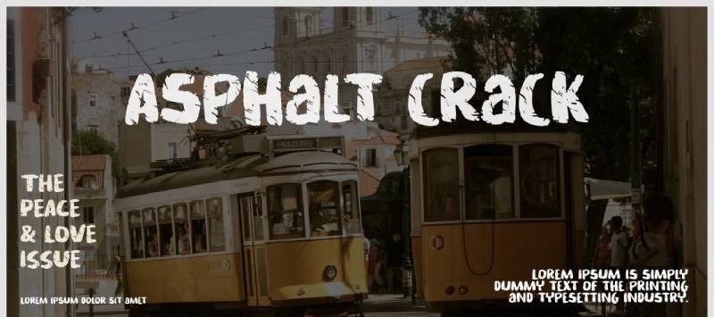
Gassstype Studio created this distressed cartoon-style display font. It blends strong, bold characters with a cracked texture that suggests weathered pavement.
Despite the playful cartoon influence, it carries weight and presence.
Font Characteristics
- Cartoon-inspired display style
- Heavy distressing throughout
- Bold stroke weight
- Strong, challenging character
- PUA encoded for easy access to glyphs
Best Use Cases
Solid choice for:
- Children’s book titles
- Packaging design
- Brand logotypes
- Poster headlines
- Magazine typography
The cartoon undertone works for products aimed at younger audiences too.
Pairing Recommendations
Simple sans serifs work best alongside. The decorative weight of Asphalt Crack needs minimal competition.
Avoid other cartoon or display fonts in the same layout.
Technical Details
- Format: TTF, OTF
- Designer: Gassstype Studio
- License: Free for personal use only (commercial requires license)
- Available on: DaFont, Creative Fabrica
Design Considerations
Personal use is free. Commercial projects require purchasing a license. Check the terms before using in client work.
The cartoon edge might not suit serious corporate projects. Know your audience.
Broken Space
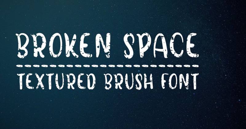
A handmade all-caps brush font with added texture. The rounded sans serif structure gives it a vintage feel that’s uncommon in this category.
Font Bundles released this one with their Premium License, covering commercial use.
Font Characteristics
- All uppercase brush font
- Rounded sans serif base
- Vintage textured finish
- Handmade aesthetic
- Fun, approachable vibe
Best Use Cases
Fits well with:
- Poster and flyer layouts
- Logo and wordmark design
- Packaging projects
- Craft and DIY branding
- Retro-themed graphics
The rounded edges soften the broken texture, making it friendlier than typical cracked fonts.
Pairing Recommendations
Pairing with elegant scripts creates interesting tension. The rough meets refined contrast works here.
Clean body fonts keep things readable. Don’t stack brush on brush.
Technical Details
- Format: TTF, OTF
- License: Free with Premium License (commercial use allowed)
- Available on: Font Bundles
Design Considerations
The brush texture shows best at larger sizes. Below 36pt, details start blending together.
Works great on craft paper mockups or textured backgrounds. The vintage vibe amplifies.
Shatterbox
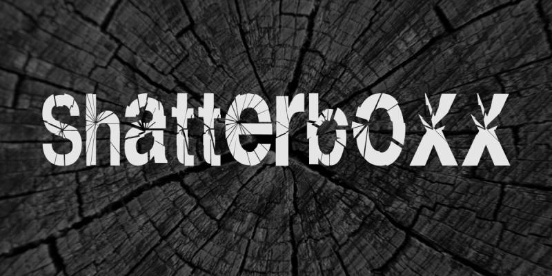
Also spelled Shatterboxx. Created by liquid_graphix, this bold display font mimics shattered glass cutting through each letter.
Free for commercial use. One of the better free options in this category.
Font Characteristics
- Shattered glass aesthetic
- Bold display weight
- Mixed case works best (all caps or all lowercase)
- 99 characters included
- Sharp, angular breaks
Best Use Cases
Strong choice for:
- Movie poster titles
- Banner graphics
- Thriller and action themes
- Event promotion materials
- Video game branding
The glass-break effect suits dramatic, high-energy projects.
Pairing Recommendations
Neutral sans serifs balance the visual noise. Keep supporting text simple.
Avoid other broken or shattered styles. One explosion per design.
Technical Details
- Format: TTF
- Designer: liquid_graphix
- Characters: 99
- License: Free for personal and commercial use
- Available on: 1001 Fonts, DaFont
Design Considerations
Works best at extra large sizes. The designer specifically notes this.
Use either all caps or all lowercase. Mixing case creates inconsistent break patterns.
Broken Glass
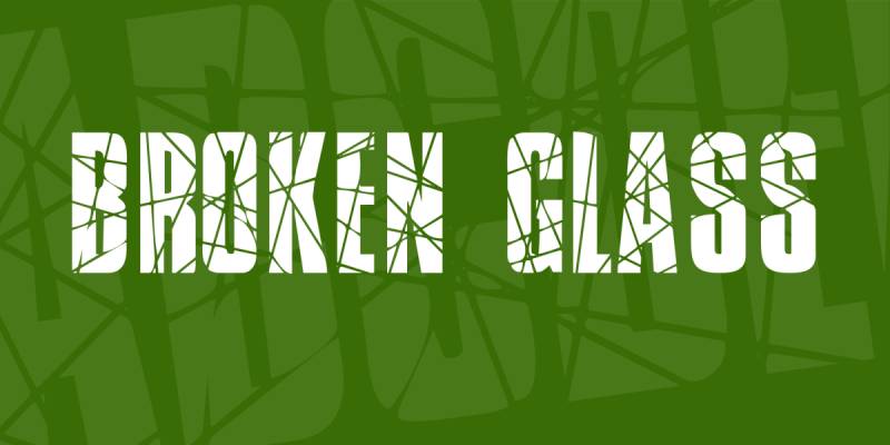
JLH Fonts designed this free display typeface specifically to mimic shattered glass. The fragmented letterforms read like someone threw a rock through a window.
Public domain license means complete freedom for any project.
Font Characteristics
- Sans serif structure
- Shattered fragment texture
- Uppercase letters, numbers, symbols
- No lowercase characters
- Clean break patterns
Best Use Cases
Ideal for:
- Horror and thriller projects
- Gaming graphics
- Clothing and merchandise
- Social media visuals
- Flyer designs
The missing lowercase keeps it strictly display-focused.
Pairing Recommendations
Standard body fonts work alongside. The fragmented style needs clean contrast.
Other decorative fonts compete too much. Keep Broken Glass isolated.
Technical Details
- Format: TTF
- Designer: JLH Fonts
- License: Public domain (free for all uses)
- Available on: FontSpace, 1001 Fonts, DaFont
Design Considerations
Capital letters only. Plan your layouts knowing you have no lowercase option.
Readability challenges at small sizes. The fragments blur together below 40pt or so.
Best against solid backgrounds. Busy imagery behind the text makes the breaks hard to read.
Glaz Krak
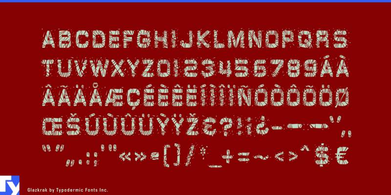
Raymond Larabie created this in 1996 and later released it into the public domain. A brittle, pulverized display sans that adds urgency to any headline.
The shattered letterforms have a distinctive broken appearance without looking overdone.
Font Characteristics
- Pulverized sans serif design
- Sharp, fractured letterforms
- Bold weight
- Available in solid and outline versions
- Supports Latin-based European languages
Best Use Cases
Works for:
- Urgent messaging and announcements
- Action and thriller themes
- Gaming graphics
- Band merchandise
- Promotional materials
The fractured look suggests impact and immediacy.
Pairing Recommendations
Clean geometric fonts work best alongside. The broken texture needs visual rest.
Avoid other distressed styles. One damaged font per layout.
Technical Details
- Format: TTF, OTF
- Designer: Raymond Larabie (Typodermic)
- License: Public domain (CC0, free for all uses)
- Available on: DaFont, 1001 Fonts
Design Considerations
The aggressive fragmentation limits readability at small sizes. Stay above 36pt.
Public domain status means complete freedom for any project.
Breakaway
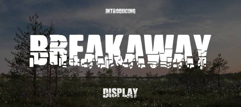
Vic Fieger designed this explosion-style display font. The letters look like they’re breaking apart or deforming under pressure.
Over 290,000 downloads on DaFont alone. A proven crowd favorite.
Font Characteristics
- Explosion/crumbling aesthetic
- Bold, fat letterforms
- Uppercase only (no lowercase)
- 70 characters included
- Damaged, deformed appearance
Best Use Cases
Solid for:
- Gaming and entertainment graphics
- Action movie titles
- Clothing and merchandise
- YouTube thumbnails
- Event advertisements
The futuristic broken design suggests cyberpunk themes.
Pairing Recommendations
Minimal sans serifs balance the chaos. Let Breakaway handle the drama alone.
Technical Details
- Format: TTF
- Designer: Vic Fieger
- Characters: 70
- License: 100% free (personal and commercial)
- Available on: DaFont, 1001 Fonts
Design Considerations
No lowercase means planning around all-caps layouts.
The explosion effect works best at large sizes where the breaking details show.
Opium
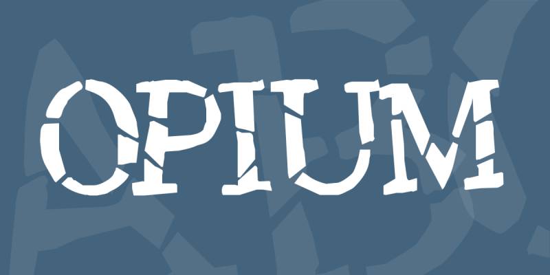
A decorative display font with a distinctive distressed quality. The weathered texture gives it a vintage, aged appearance.
Font Characteristics
- Distressed display style
- Vintage weathered texture
- Decorative letterforms
- Display weight
Best Use Cases
Good for:
- Vintage-themed projects
- Book cover designs
- Music and band graphics
- Alternative branding
- Retro aesthetics
Pairing Recommendations
Clean body fonts provide necessary contrast. The distressed texture needs breathing room.
Technical Details
- Format: TTF, OTF
- License: Check source for terms
- Available on: Various font sites
Design Considerations
The vintage distressing suits period-specific designs better than modern projects.
Gipsiero
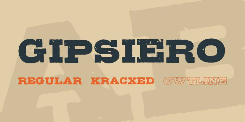
Bumbayo Font Fabrik created this grunge slab serif font inspired by old Universal horror movies and vintage B-movie signs.
Comes in three styles: Regular, Kracxed (cracked), and OwtLine (outline).
Font Characteristics
- Grunge slab serif base
- Horror movie inspiration
- Three style variations
- 96-103 characters per style
- Uppercase, lowercase, and numbers included
Best Use Cases
Ideal for:
- Horror and Halloween themes
- Extreme sports branding
- Music band materials
- Comic book covers
- Magazine headlines
- Game console graphics
The B-movie aesthetic suits entertainment projects.
Pairing Recommendations
Simple sans serifs for body text. The grunge texture carries enough visual weight.
Technical Details
- Format: OTF
- Designer: Bumbayo Font Fabrik
- License: 100% free (personal and commercial)
- Available on: DaFont, 1001 Fonts
Design Considerations
The Kracxed version adds crack texture to the base design. Choose based on how much distressing you need.
First released 2007, updated 2011. A proven, stable font.
Sniper
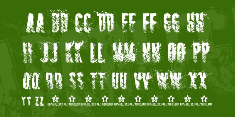
A military-style distressed font with tactical aesthetics. Sharp edges combined with weathered texturing.
Font Characteristics
- Military/tactical style
- Distressed texture
- Sharp, angular letterforms
- Stencil influences
Best Use Cases
Works for:
- Military and tactical themes
- Action gaming graphics
- Survival brand materials
- Aggressive marketing
Technical Details
- Format: TTF, OTF
- License: Varies by source
Crack and Bold
A decorative display font combining bold weight with visible crack patterns throughout the letterforms.
Font Characteristics
- Bold display weight
- Visible crack patterns
- Decorative style
- Strong visual presence
Best Use Cases
Suitable for:
- Headlines and titles
- Poster designs
- Brand materials
- Social media graphics
Rock
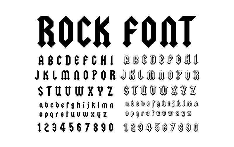
A chunky display font with rocky, textured letterforms. The rough edges suggest stone or mineral surfaces.
Font Characteristics
- Chunky, heavy weight
- Rocky/stone texture
- Display style
- Bold presence
Best Use Cases
Good for:
- Music and band branding
- Sports graphics
- Event promotions
- Heavy metal aesthetics
Vtks Untitled
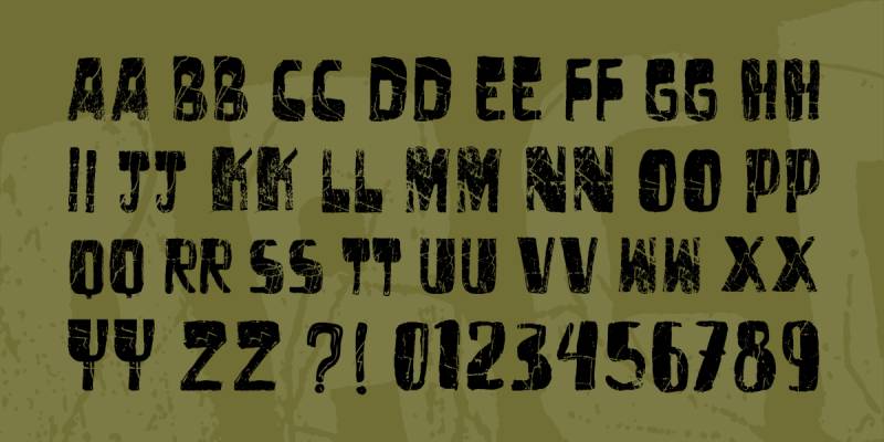
Douglas Vitkauskas created this eroded display font. Part of his extensive VTKS collection on DaFont.
Over 412,000 downloads. One of the more popular distressed options.
Font Characteristics
- Eroded/distressed style
- 679 glyphs included
- Extensive character coverage
- Regular weight
Best Use Cases
Works for:
- Alternative and grunge projects
- Music graphics
- Urban designs
- Creative headlines
Technical Details
- Format: TTF
- Designer: Douglas Vitkauskas
- License: Free for personal use (commercial at vtksdesign.com)
- Available on: DaFont
Design Considerations
The extensive glyph set makes this more versatile than many distressed fonts.
Personal use free. Commercial requires license purchase.
Twylite Zone
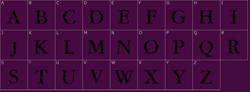
A decorative display font with an eerie, otherworldly quality. The name suggests sci-fi or supernatural themes.
Font Characteristics
- Eerie display style
- Sci-fi/supernatural aesthetic
- Decorative letterforms
Best Use Cases
Suitable for:
- Sci-fi projects
- Horror and supernatural themes
- Mystery designs
- Alternative entertainment
MosaicCaps
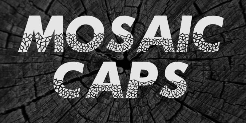
A fragmented display font where letters appear constructed from broken pieces or tiles.
Font Characteristics
- Mosaic/fragmented design
- Uppercase focused
- Decorative display style
- Unique broken appearance
Best Use Cases
Good for:
- Artistic projects
- Creative headlines
- Unique branding
- Decorative applications
Gastada
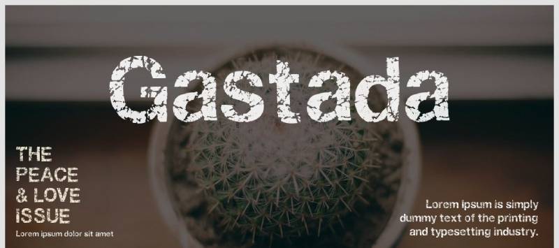
A worn, distressed display font with a weathered appearance suggesting age and use.
Font Characteristics
- Worn/weathered texture
- Distressed styling
- Vintage appearance
- Display weight
Best Use Cases
Works for:
- Vintage designs
- Rustic themes
- Aged aesthetics
- Retro projects
HackingTrashed
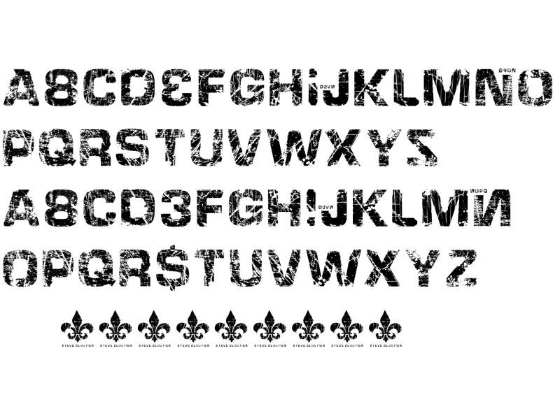
A digital glitch-style font combining technological themes with distressed texturing.
Font Characteristics
- Glitch/digital aesthetic
- Trashed/distressed texture
- Tech-inspired design
- Display style
Best Use Cases
Ideal for:
- Cyberpunk projects
- Tech and hacking themes
- Digital art
- Gaming graphics
Destroy
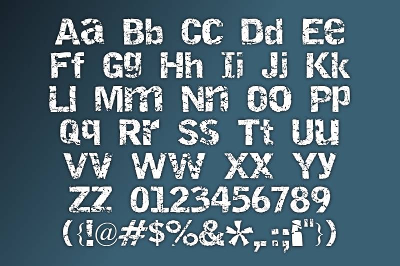
Typografski released this aggressive display font through Font Squirrel. The name says it all.
Font Characteristics
- Aggressive destroyed aesthetic
- Bold display weight
- Damaged letterforms
- High impact design
Best Use Cases
Good for:
- Aggressive branding
- Action themes
- Punk and metal aesthetics
- High-energy projects
Technical Details
- Format: TTF, OTF
- Designer: Typografski
- License: Free
- Available on: Font Squirrel
Electrickle
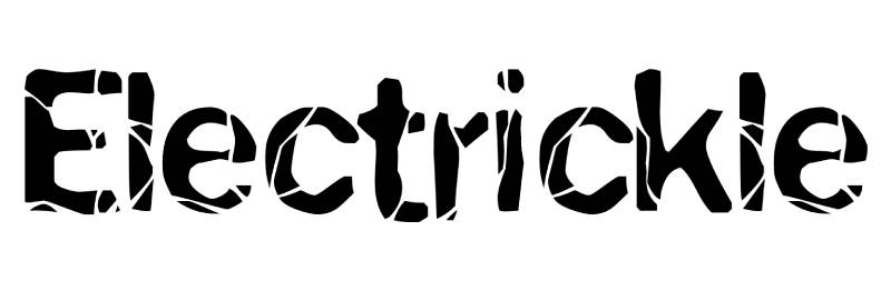
A font combining electrical or spark-like elements with cracked texturing.
Font Characteristics
- Electric/spark aesthetic
- Cracked elements
- Display style
- High energy appearance
Best Use Cases
Works for:
- Energy and power themes
- Electric/tech projects
- Dynamic designs
- Youth-oriented graphics
Rock it
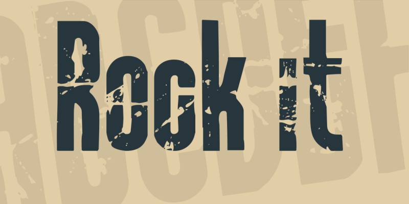
A bold display font with rocky, textured letterforms designed for high-impact headlines.
Font Characteristics
- Bold rocky texture
- Display weight
- Strong visual impact
- Chunky letterforms
Best Use Cases
Suitable for:
- Music projects
- Event promotions
- Sports graphics
- Entertainment materials
Broken Type
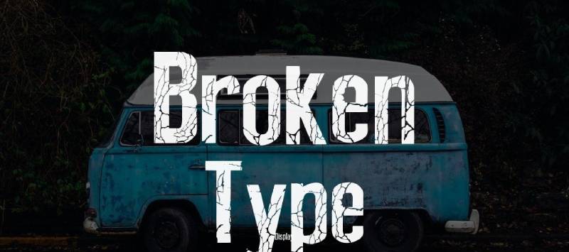
Another Galdino Otten creation. This eroded display font features a bold, distressed appearance with cracked and chipped texturing.
Over 85,000 downloads on DaFont.
Font Characteristics
- Bold, uppercase focused
- Cracked and chipped texture
- 176-235 characters
- Distressed eroded style
Best Use Cases
Ideal for:
- Album covers
- Rock and alternative branding
- Posters and headlines
- Urban designs
Technical Details
- Format: TTF
- Designer: Galdino Otten
- License: Free for personal use (donation for commercial)
- Available on: DaFont
Design Considerations
Same licensing as Before Collapse. Contact designer for commercial projects.
TNT X Plosion
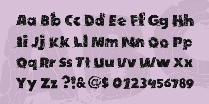
An explosive-style display font where letters appear to be detonating or fragmenting.
Font Characteristics
- Explosion aesthetic
- Fragmenting letterforms
- Bold display weight
- High impact design
Best Use Cases
Good for:
- Action themes
- Explosive marketing
- Gaming graphics
- High-energy promotions
Mishmash
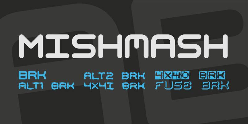
Ænigma Fonts (Brian Kent) created this techno-style font family with broken, fragmented elements.
Comes in 6 different styles including fused, alternate, and 4×4 variations.
Font Characteristics
- Techno/display style
- Fragmented, angular letters
- 6 style variations
- 97 characters per style
- Grunge and 3D elements
Best Use Cases
Works for:
- Tech and gaming projects
- Urban designs
- Edgy branding
- Display headlines
Technical Details
- Format: TTF
- Designer: Ænigma Fonts (Brian Kent)
- License: Free for personal and commercial use
- Available on: DaFont, 1001 Fonts
Design Considerations
The 6 variations offer flexibility. Test each to find the right level of fragmentation.
Before Collapse
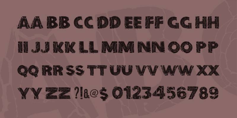
Galdino Otten designed this fat, poster-style font with a crumbling, collapsing aesthetic. Letters look like they’re about to fall apart.
Includes both Regular and Italic versions.
Font Characteristics
- Fat, bold weight
- Crumbling/collapsing texture
- Explosion-like fragmentation
- 96 characters
- Regular and Italic styles
Best Use Cases
Ideal for:
- Dramatic headlines
- Disaster and action themes
- Poster designs
- High-impact messaging
Technical Details
- Format: TTF
- Designer: Galdino Otten
- Characters: 235
- License: Free for personal use (commercial requires license)
- Available on: DaFont
Design Considerations
The collapsing effect suggests urgency or destruction. Match content to the aesthetic.
Fracture Dreams
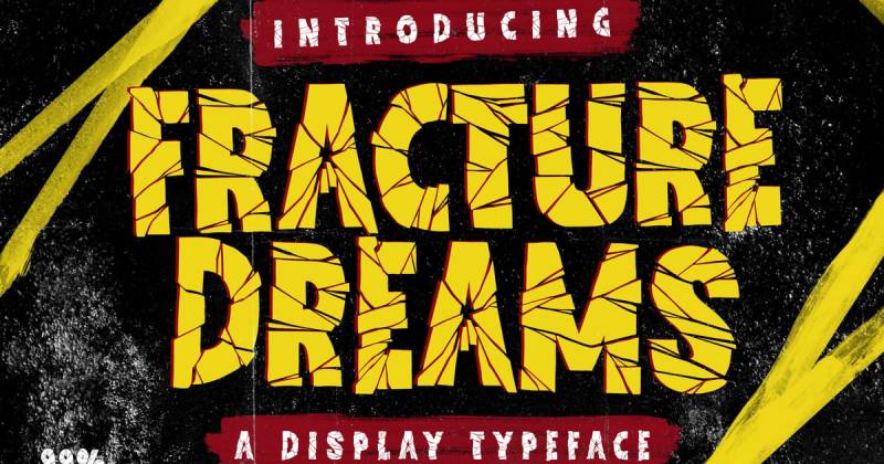
Dansdesign Studio created this graffiti-style horror display font. Combines cracked textures with bold, Impact-like weight.
Supports over 213 languages. Impressive multilingual coverage.
Font Characteristics
- Graffiti/horror hybrid style
- Cracked texture throughout
- Bold, heavy weight
- Blackletter influences
- PUA encoded
Best Use Cases
Works for:
- Horror and Halloween projects
- Urban and street art themes
- Movie posters and book covers
- Apparel designs
- Retro-urban branding
Technical Details
- Format: OTF, TTF, Web fonts
- Designer: Dansdesign Studio
- License: Free for personal use (commercial requires license)
- Available on: Creative Market, Envato Elements
Design Considerations
The horror-graffiti combination suits specific aesthetics. Not for corporate work.
Broken Wood Font

A decorative font mimicking splintered, cracked wood. The organic texture suggests natural wear and weathering.
Font Characteristics
- Wood grain texture
- Splintered/cracked appearance
- Organic, natural feel
- Decorative display style
Best Use Cases
Ideal for:
- Rustic and nature themes
- Cabin and outdoor branding
- Western aesthetics
- Vintage woodworking projects
Grounded Cracked
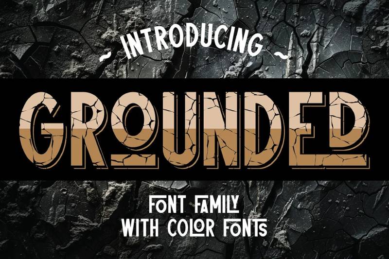
Pete Cruzine designed this condensed sans serif with clean lines and crack texturing. Comes with 6 font versions.
Features 55 ligatures and multilingual support for 212+ languages.
Font Characteristics
- Condensed sans serif base
- Sharp, clean structure
- Crack texture overlay
- 6 versions (clean, extrude, shadow, color fonts)
- 55 ligatures included
Best Use Cases
Works for:
- Logo and monogram design
- Branding projects
- Headlines and headers
- Urban and street style
Technical Details
- Format: TTF, OTF, Web fonts
- Designer: Pete Cruzine
- License: Premium (check source)
- Available on: Envato Elements, Deeezy
Design Considerations
The multiple versions let you choose how much crack texture to apply. Clean version works for subtle distressing.
Fractura
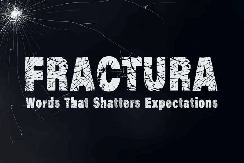
A decorative font with bold, cracked letterforms. Dramatic appearance designed for attention-grabbing headlines.
Font Characteristics
- Bold, cracked design
- Dramatic appearance
- Decorative display style
- Strong visual impact
Best Use Cases
Good for:
- Headlines and posters
- Logos requiring strength
- Impact-focused designs
- Breaking-through themes
Urban Plaza
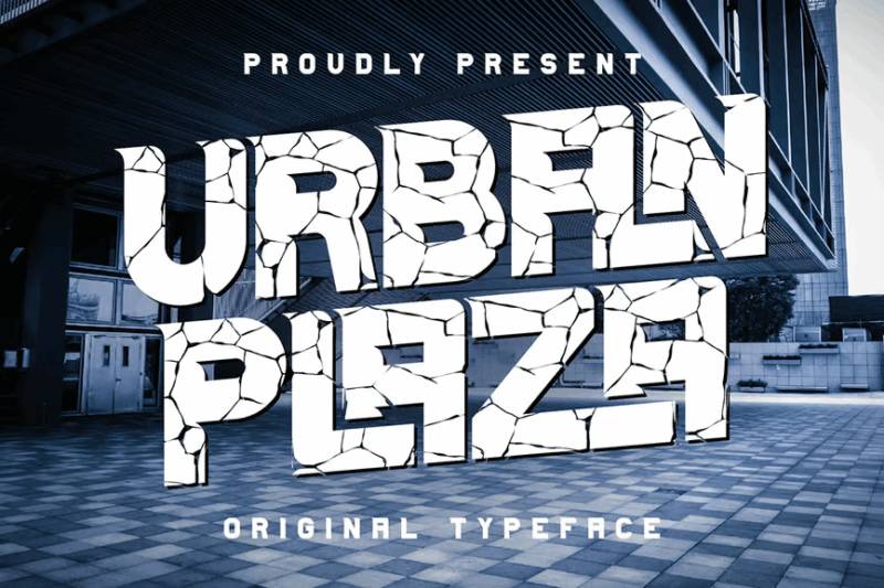
Cruzine Design (also known as Vozzy) created this urban-style sans serif with rough texturing. Comes in regular and cracked versions.
Features ligatures and supports 212+ languages.
Font Characteristics
- Urban sans serif base
- Rough, textured appearance
- Bold, sharp letterforms
- Regular and cracked versions
- Ligatures included
Best Use Cases
Ideal for:
- Urban and street branding
- Bold headlines
- Logo design
- Gritty, authentic aesthetics
Technical Details
- Format: TTF, OTF, Web fonts
- Designer: Cruzine Design / Oleg Voznyy
- License: Premium ($7-15 for individual styles)
- Available on: MyFonts, Envato Elements
Design Considerations
The cracked version adds texture to the already rough base. Two-level distressing available.
Thelor Cevlok
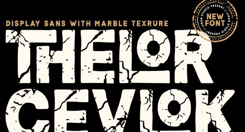
A sans serif display font with unique textured appearance. Distinctive character that balances modernity with visual interest.
Font Characteristics
- Textured sans serif
- Modern display style
- Unique character design
- Visual interest through texture
Best Use Cases
Works for:
- Eye-catching headlines
- Logo and branding
- Modern designs with edge
- Distinctive typography needs
Groovy Volcano
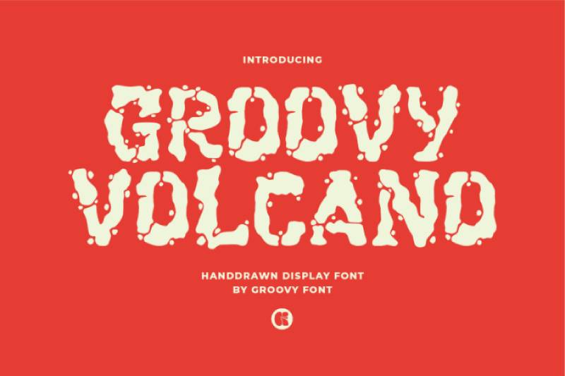
A decorative display font with retro-inspired edgy design. Combines funky vintage vibes with modern twist.
Font Characteristics
- Retro-inspired design
- Edgy, decorative style
- Funky vintage vibe
- Display weight
Best Use Cases
Good for:
- Retro-themed projects
- Funky branding
- Entertainment graphics
- Vintage with edge
Cracking Sans
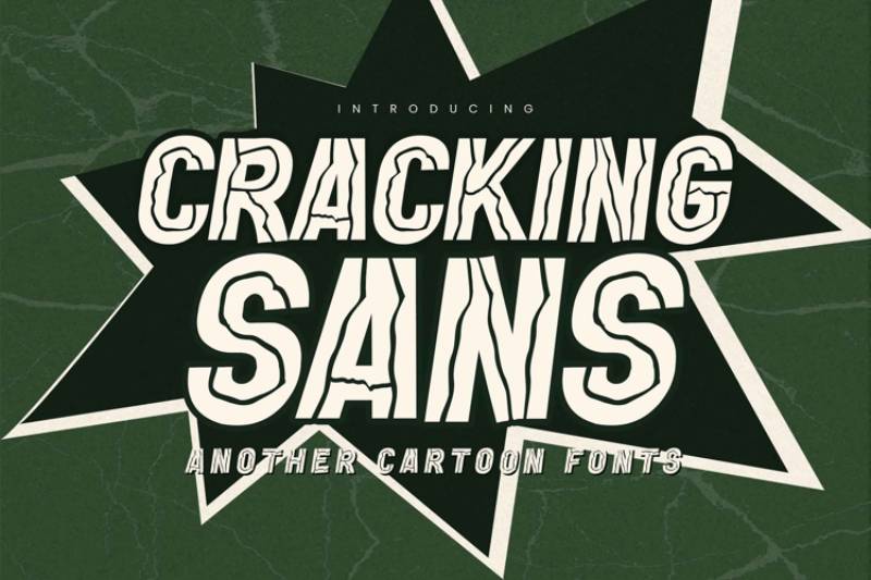
Gassstype Studio designed this cartoon-style font with visible crack patterns. Playful yet damaged aesthetic.
Font Characteristics
- Cartoon sans serif base
- Visible crack patterns
- Playful, fun vibe
- Display style
Best Use Cases
Ideal for:
- Children’s designs
- Cartoon and animation projects
- Fun branding
- Playful marketing materials
Technical Details
- Format: TTF, OTF
- Designer: Gassstype Studio
- License: Free for personal use (commercial requires license)
- Available on: Envato Elements, CufonFonts
Design Considerations
The cartoon base makes this friendlier than typical cracked fonts. Good for younger audiences.
The Quakeer
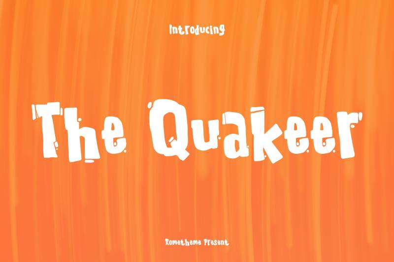
Rometheme designed this bold display font with a playful, cartoon quality. Despite some sources calling it horror-inspired, it reads as more fun than scary.
Font Characteristics
- Bold display weight
- Cartoon-like playfulness
- Cute, kids-friendly aesthetic
- PUA encoded
- OTF format
Best Use Cases
Works for:
- Logo and poster design
- T-shirt graphics
- CD and album covers
- Branding for playful products
- Social media content
Technical Details
- Format: OTF
- Designer: Rometheme
- License: Standard license included
- Available on: Creative Market, Deeezy
Design Considerations
More playful than scary. Works for kids’ content despite the shaky letterforms.
Reads as fun and energetic rather than horror-focused.
FAQ on The Best Cracked Fonts
What are cracked fonts?
Cracked fonts are decorative typefaces with broken, shattered, or distressed letterforms. The fractures create a worn, damaged aesthetic.
Designers use them for headlines, posters, and branding when they need raw visual impact over clean typography.
Where can I download free cracked fonts?
DaFont, FontSpace, and 1001 Fonts offer extensive free collections. Google Fonts has limited options in this style.
Always check licensing terms. “Free for personal use” doesn’t always cover commercial projects.
Are cracked fonts good for logos?
They work for specific brands. Think gaming companies, rock bands, horror franchises, or streetwear labels.
Skip them for corporate identities or anything needing a clean, professional logo. Readability matters there.
What file formats do cracked fonts come in?
Most ship as TTF (TrueType) or OTF (OpenType). Some premium options include WOFF files for web design.
PNG-based alphabets exist too. These offer more customization but require manual placement.
Can I use cracked fonts for commercial projects?
Depends entirely on the license. Many free fonts restrict commercial use.
Premium fonts from Creative Market or Envato Elements typically include commercial licenses. Read the terms before launching any paid project.
What fonts pair well with cracked typography?
Clean sans serifs create balance. The distressed texture needs calm companions for supporting text.
Avoid pairing with other decorative or grunge design fonts. One damaged typeface per layout is plenty.
Are cracked fonts readable at small sizes?
Generally, no. The broken details blur together below 36-48pt.
Keep cracked fonts for headlines, titles, and display purposes only. Use standard body fonts for longer text blocks.
How do I install cracked fonts on my computer?
Download the font file. Unzip if needed. Double-click the TTF or OTF file.
Click “Install” on the preview window. The font appears in Photoshop, Illustrator, Canva, and other apps immediately.
What’s the difference between cracked and distressed fonts?
Cracked fonts show visible fracture lines through letters. Distressed fonts have worn, faded, or weathered textures.
Both fall under the damaged aesthetic category. Cracked styles tend toward sharper, more dramatic breaks.
Which software works best with cracked fonts?
Adobe Photoshop and Illustrator handle them well. Canva and Figma support standard font files too.
For print design work, InDesign manages typography placement better. Any program accepting TTF or OTF files will work.
Conclusion
Choosing the best cracked fonts comes down to matching the typeface to your project’s tone. Not every shattered style fits every design.
Horror themes need sharp, dramatic breaks. Playful projects work better with cartoon-style fractures. Vintage aesthetics call for weathered, worn textures.
Before downloading, check the license. Free fonts often restrict commercial use. Premium options from Envato Elements or Creative Market give you more flexibility.
Keep these display fonts reserved for headlines and titles. They create strong visual hierarchy but fail as body text.
Pair them with clean typefaces. Build your mood board first. Test at multiple sizes.
The right cracked font adds instant character to posters, gaming graphics, and bold branding projects. Choose intentionally.

Renowned for his expertise in logo design and visual branding, Bogdan has developed a multitude of logos for various clients.
His skills extend to creating posters, vector illustrations, business cards, and brochures. Additionally, Bogdan's UI kits were featured on marketplaces like Visual Hierarchy and UI8.
He also wrote in the past years on sites like Design Your Way, WebDesignerDepot, WPDean, Designmodo, Speckyboy, Slider Revolution, and more.
- Canva vs Photoshop: When Does Each Make Sense? - 12 September 2026
- Briefing 3D Game Animation: Rigs, Clip Lists and Engine Handoffs - 11 September 2026
- The Webflow Logo History, Colors, Font, And Meaning - 10 September 2026

Bogdan Sandu is a seasoned designer who has been designing websites since 2008. Renowned for his expertise in logo design and visual branding, Bogdan has developed a multitude of logos for various clients. His skills extend to creating posters, vector illustrations, business cards, and brochures. Additionally, Bogdan's UI kits were featured on marketplaces like Visual Hierarchy and UI8. He also wrote in the past years on sites like Design Your Way, WebDesignerDepot, WPDean, Designmodo, Speckyboy, Slider Revolution, and more.
You Might Also Like