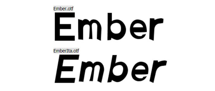
Amazon uses Amazon Ember, a humanist sans-serif font commissioned exclusively for the brand and designed by London-based type foundry Dalton Maag.
Amazon Ember was designed in 2015 and first deployed in 2016 on the Kindle Oasis. It now serves as the master brand font across Amazon.com, the mobile app, Fire TV, Echo devices, and all Amazon marketing materials.
For its logo, Amazon uses a wordmark based on ITC Officina Sans Bold, a separate typeface designed by Erik Spiekermann and Ole Schäfer.
For Kindle reading, Amazon developed a second custom font called Bookerly in 2015, a serif typeface also created by Dalton Maag and optimized for long-form digital reading.
What Type of Font Is Amazon Ember?
Amazon Ember is classified as a humanist sans-serif. It sits between the warmth of traditional humanist typefaces and the structure of geometric sans-serifs.
Key visual characteristics include:
- Slightly rounded terminals on characters like “a,” “c,” and “s”
- A double-story lowercase “a” and “g” for better legibility at small sizes
- Moderate x-height, contributing to strong readability on screens
- Six weights in the standard subfamily, plus italics
- A condensed variant and a Display variant with distinctive rounded corners
The font’s humanist construction gives it approachability without sacrificing clarity. That balance matters a lot when you’re rendering text across thousands of product listings at varying sizes.
Amazon’s brand guidelines define two primary weights for product use: Amazon Ember Light (body copy) and Amazon Ember Bold (subheadings and calls to action). The Display weights are reserved for brand names and headlines above 72pt.
As of 2020, the Ember family includes 3 subfamilies: Ember (6 weights plus italics), Ember Condensed (4 weights plus italics), and Ember Display (5 upright weights). That’s a comprehensive font system by any standard, built for real flexibility across devices.
Who Designed Amazon Ember?
Dalton Maag, a London-based type design studio, created Amazon Ember in 2015 under an exclusive commission from Amazon.
The font is proprietary. Dalton Maag designed it solely for Amazon’s use and holds the copyright from 2015 onward. It is not part of Dalton Maag’s public library.
Dalton Maag is known for custom typography work for major global brands. Amazon Ember sits alongside their other high-profile bespoke projects as a strong example of what purpose-built typography elements can do for brand identity at scale.
The Amazon logo wordmark is a separate case. ITC Officina Sans Bold was designed by Erik Spiekermann and Ole Schäfer for ITC and released via OpenType in 1990. Amazon adopted it for the logo wordmark during the brand’s early years, and the current wordmark has since been refined into a custom logotype.
Is Amazon Ember Free to Use?
No. Amazon Ember is proprietary and not available for public or commercial licensing.
Amazon does distribute a version of the font through its developer portal (Amazon Alexa branding resources), which includes TTF and web font formats. However, that download comes with strict usage restrictions. It is intended for developers building Alexa skills and Echo-adjacent products, not for general design work.
The download package from Amazon’s developer site includes:
- Amazon Ember and Amazon Ember Display
- Bookerly (serif, for reading interfaces)
- Desktop formats (TTF) and web formats (EOT, WOFF, WOFF2)
Using it outside Amazon’s ecosystem or without following their brand guidelines would violate font licensing terms. If you want the look without the legal risk, alternatives are a better path. More on those below.
ITC Officina Sans Bold (the logo font) is commercially available. Individual styles start at around $40.99 USD, with the full family of 10 fonts available at higher cost through platforms like MyFonts.
What Font Did Amazon Use Before Ember?
Before Amazon Ember became the brand’s standard in 2016, Amazon’s website and apps relied on system fonts including Verdana and Arial. These were common web-safe fallbacks used throughout the early-to-mid 2000s across much of the web.
The logo wordmark has a longer history. Amazon’s first logo appeared in 1994 and went through several visual changes over the following six years. By 2000, the brand settled on the current wordmark style, using ITC Officina Sans Bold above the now-iconic arrow smile.
On the Kindle side, the reading fonts Caecilia and Tiro were used before Bookerly replaced them in 2015. Both were functional choices, but Amazon wanted something designed specifically for digital reading at the e-reader screen scale.
The shift to Amazon Ember in 2016 represented a deliberate move away from generic system fonts toward a cohesive, owned brand identity across all touchpoints. That’s a meaningful distinction from a logo and branding perspective.
What Are the Best Free Alternatives to Amazon Ember?
Since Amazon Ember is off-limits for most use cases, here are 5 solid free alternatives with similar humanist sans-serif character:
| Font | Similarity to Ember | License | Source |
| Inter | High screen legibility, neutral proportions, similar weight range | Free (OFL) | Google Fonts |
| Lato | Humanist structure, warm tone, comparable x-height | Free (OFL) | Google Fonts |
| IBM Plex Sans | Clean humanist sans, strong legibility at small sizes | Free (OFL) | Google Fonts |
| Nunito | Rounded terminals, approachable feel similar to Ember Display | Free (OFL) | Google Fonts |
| DM Sans | Geometric-humanist hybrid, good for UI use | Free (OFL) | Google Fonts |
Inter and IBM Plex Sans are the closest in actual behavior. Both hold up well at small sizes, which is the main thing Ember was engineered to do. If you need rounded corners closer to Ember Display, Nunito is the pick.
Worth noting: none of these will perfectly replicate Ember. That’s kind of the point of a custom typeface. But for web design, UI work, or branding, any of the 5 above will get you into the right territory without touching a proprietary file.
How to Use Amazon Ember Alternatives in Your Projects
Web Development
Inter is the easiest drop-in. Add it via Google Fonts and set your CSS font stack to fall back gracefully:
“ font-family: 'Inter', -apple-system, BlinkMacSystemFont, 'Segoe UI', Arial, sans-serif; `
This mirrors the kind of font stack Amazon itself uses in fallback scenarios on lower-bandwidth connections. On Android, Roboto kicks in. On iOS and macOS, San Francisco takes over. A layered stack like this keeps your web-safe font coverage solid.
Figma and Design Tools
Inter is already built into Figma as a system font. No import needed.
For Lato or DM Sans, go to Google Fonts, download the full family, install it on your system, and it will appear in Figma, Illustrator, and Photoshop automatically. If you’re using Adobe Illustrator, installed system fonts show up immediately after restarting the app.
Canva
Canva includes Inter and Lato natively. Search by name in the font selector. If you need to upload fonts to Canva, that option is available on Canva Pro using the Brand Kit feature.
Why Did Amazon Choose This Font?
The short answer: scale and consistency. Amazon operates across phones, tablets, desktops, smart TVs, and smart speakers. A generic system font would look different on every device. A custom typeface solves that.
Amazon’s official brand guidelines describe Ember as communicating “a consistent, unified identity.” That’s not marketing language. When a brand renders text on 500 million product pages across dozens of countries, visual hierarchy and font consistency directly affect how readable and trustworthy the interface feels.
The humanist classification was intentional. Geometric sans-serifs can feel cold. Amazon sells to everyone, and a font that reads as approachable while staying clean and functional fits that positioning far better than something sterile.
The decision to separate the reading experience (Bookerly, a serif font) from the shopping interface (Ember, a sans-serif font) also shows deliberate thinking about context. Long-form reading on a Kindle calls for different typographic priorities than scanning product listings on a phone. Amazon commissioned 2 separate custom typefaces rather than forcing one to do both jobs. That’s a sound design decision, not just a branding exercise.
The result is a brand where typographic hierarchy, weight variation, and font consistency work together without the user ever consciously noticing. Which is, honestly, exactly how good typography is supposed to work.
Other major brands with similar scale, like Walmart, Netflix, and Uber, have taken the same route and commissioned proprietary typefaces for exactly this reason.
FAQ on The What Font Does Amazon Use
What is the main font Amazon uses?
Amazon’s primary font is Amazon Ember, a custom humanist sans-serif typeface.
It appears across Amazon.com, the mobile app, Fire TV, Echo devices, and all marketing materials. Dalton Maag designed it exclusively for Amazon in 2015.
What font does the Amazon logo use?
The Amazon logo wordmark is based on ITC Officina Sans Bold, designed by Erik Spiekermann and Ole Schäfer.
The current logo has been refined into a custom logotype over time and is no longer a straight use of that typeface.
Is Amazon Ember free to download?
Technically, Amazon distributes Ember through its developer portal for Alexa and Echo branding purposes.
But font licensing restrictions apply. It is not cleared for general commercial use. For most projects, free alternatives like Inter or Lato are the safer choice.
What font does Amazon Kindle use?
Kindle uses Bookerly, a custom serif font also created by Dalton Maag and introduced in 2015.
It replaced earlier Kindle fonts Caecilia and Tiro. Bookerly is optimized for long-form reading on e-ink screens.
What type of font is Amazon Ember?
Amazon Ember is a humanist sans-serif. It combines the warmth of humanist typefaces with the clarity of geometric designs.
It features a double-story lowercase “a,” rounded terminals, and a moderate x-height built for screen readability.
Who designed Amazon Ember?
Dalton Maag, a London-based type foundry, designed Amazon Ember in 2015 under an exclusive commission from Amazon.
The copyright belongs to Dalton Maag Ltd. The font is proprietary and not part of any public font library.
What fonts are similar to Amazon Ember?
The closest free alternatives are Inter, Lato, and IBM Plex Sans. All three are humanist sans-serif fonts with strong screen legibility.
For rounded details closer to Ember Display, Nunito is a good pick. All are available free via Google Fonts.
Does Amazon use the same font across all its products?
Mostly yes. Amazon Ember is the master brand font across products and services.
Some subsidiaries like Twitch and Whole Foods kept their own typefaces after acquisition. AWS and Alexa interfaces also use Ember, with Display weights for large-scale applications.
What font did Amazon use before Amazon Ember?
Before Ember launched in 2016, Amazon’s website relied on system fonts including Verdana and Arial.
These were standard web safe fonts common across most sites at the time. The Kindle used Caecilia and Tiro before Bookerly replaced them in 2015.
What font does the Amazon app use?
The Amazon mobile app uses Amazon Ember as its primary UI font across both iOS and Android.
On lower-bandwidth connections or unsupported devices, the app falls back to system fonts: San Francisco on iOS and Roboto on Android.
Conclusion
If you’ve ever wondered what font does Amazon use, the answer is Amazon Ember, a proprietary humanist sans-serif typeface built from the ground up by Dalton Maag in 2015.
The logo wordmark draws from ITC Officina Sans Bold, while Kindle reading relies on Bookerly, a custom serif designed for e-ink screens.
Amazon’s font system is deliberate. Every weight, every variant, every fallback serves the brand’s core need: consistent readability across millions of screens and devices.
For designers looking to match that clean, approachable style, free alternatives like Inter or IBM Plex Sans come closest without any licensing complications.
Renowned for his expertise in logo design and visual branding, Bogdan has developed a multitude of logos for various clients.
His skills extend to creating posters, vector illustrations, business cards, and brochures. Additionally, Bogdan's UI kits were featured on marketplaces like Visual Hierarchy and UI8.
He also wrote in the past years on sites like Design Your Way, WebDesignerDepot, WPDean, Designmodo, Speckyboy, Slider Revolution, and more.
- The Figma Logo History, Colors, Font, And Meaning - 25 July 2026
- Canva for Teams Review: Is It Worth the Business Plan? - 24 July 2026
- 5 Brand Compliance Checkpoints Every Enterprise Should Automate - 23 July 2026
Bogdan Sandu is a seasoned designer who has been designing websites since 2008. Renowned for his expertise in logo design and visual branding, Bogdan has developed a multitude of logos for various clients. His skills extend to creating posters, vector illustrations, business cards, and brochures. Additionally, Bogdan's UI kits were featured on marketplaces like Visual Hierarchy and UI8. He also wrote in the past years on sites like Design Your Way, WebDesignerDepot, WPDean, Designmodo, Speckyboy, Slider Revolution, and more.
You Might Also Like