


The Tegus logo is the visual mark of one of the most talked-about market intelligence platforms in the financial research space. Founded in 2016 by twin brothers Michael Elnick and Thomas Elnick in Chicago, Illinois, Tegus built its reputation by giving institutional investors fast access to expert call transcripts and private company data.
Before being acquired by AlphaSense for $930 million in July 2024, Tegus had carved out a strong identity in the fintech world. The Tegus logo carried that identity across digital platforms, pitch decks, and investor communications. It became associated with a company trusted by over 30,000 users researching more than 35,000 public and private companies.
The brand went through a few visual shifts since its founding, but the core idea stayed the same: clean, modern, and built for a professional audience. The logo sits within a broader tradition of fintech and SaaS branding that leans on simplicity, readability, and trust.
What Is the Tegus Logo?
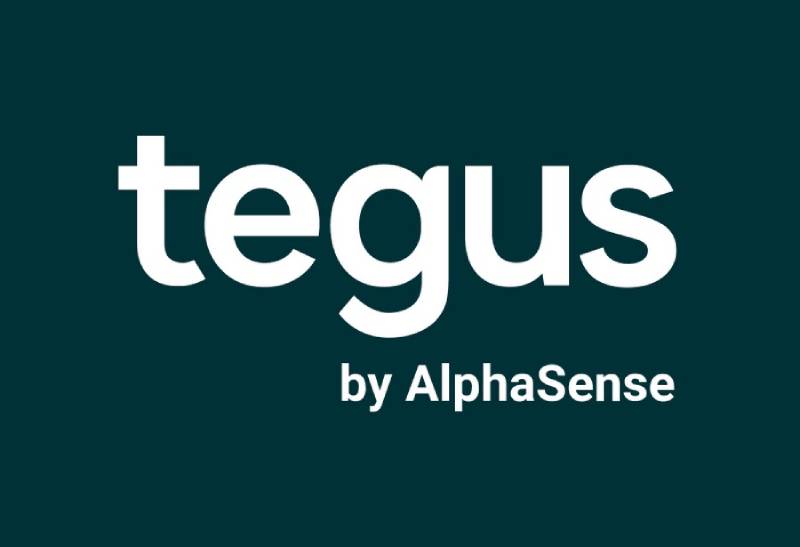
The Tegus logo is a wordmark-style design featuring the company name “Tegus” rendered in a clean, modern sans-serif typeface. Introduced around the company’s founding in 2016, the mark uses a dark navy blue as its primary color, reflecting trust and authority in the financial services sector.
Here’s a breakdown of the key attributes:
- Design Type: Wordmark (logotype). No icon, no emblem. Just the company name set in type. It’s the kind of choice you see a lot in B2B SaaS, and it works because the name itself is short and distinctive.
- Primary Elements: The typography does all the heavy lifting here. The letterforms are geometric, slightly rounded, with consistent stroke widths. There’s no symbol or pictorial mark accompanying the text in the primary version.
- Official Introduction Date: Around 2016, coinciding with the company’s launch. The logo was later refined as the company grew and raised funding.
- Designer/Agency: The original designer or agency behind the Tegus wordmark has not been publicly credited. An internal concept by Sean Brice appeared on Dribbble, exploring a tegu lizard mark with a hidden dollar sign, though this was a personal project rather than an official redesign.
- Trademark Status: Tegus, Inc. operated as a registered company. Following the AlphaSense acquisition in July 2024, brand assets transitioned under AlphaSense’s umbrella.
- Color Palette: The primary logo uses a deep navy blue, close to #1A2B4A (approximate), set against white backgrounds. The palette signals professionalism and reliability. White is used as the secondary color for reversed applications.
- Usage Context: The logo appeared on the Tegus platform interface, marketing materials, investor pitch decks, conference signage, company merchandise, and partner communications. Post-acquisition, it appears alongside AlphaSense branding on tegus.com.
How Has the Tegus Logo Evolved Over Time?

Tegus didn’t go through dramatic logo overhauls like some consumer brands do. The visual identity stayed relatively consistent from launch to acquisition.
But there were refinements. Small typographic adjustments, color fine-tuning, and layout changes that tracked with the company’s growth from scrappy startup to $930 million acquisition target.
Original Tegus Logo (2016-2019)
- Years Active: 2016-2019
- Design Description: A simple wordmark in a geometric sans-serif font. Clean, no-nonsense. The kind of logo you’d expect from two brothers who came from finance and wanted to look credible from day one.
- Color Scheme: Dark blue on white. The blue leaned slightly toward navy.
- Designer: Not publicly disclosed.
- Context: Tegus was a small team at this point, operating out of Chicago with a focus on buy-side investors. The logo needed to work on a website, in emails, and maybe on a few slide decks. That was pretty much it.
- Cultural Significance: It established Tegus as a serious player, not a flashy startup. The restraint in the design was deliberate.
Refined Tegus Logo (2019-2024)
- Years Active: 2019-2024
- Design Description: The wordmark was polished. Letter spacing got tighter. The typeface may have been swapped or customized, with slightly more rounded terminals and better optical balance.
- Color Scheme: Still dark navy blue, but the exact shade appears to have been tweaked slightly brighter. White backgrounds remained standard.
- Key Changes from Previous: Tighter kerning, slightly adjusted letterforms, and better optimization for digital screens. The logo needed to work at smaller sizes now, across mobile apps and partner integrations.
- Context: Tegus raised $90 million in Series B funding in late 2021, acquired BamSEC and Canalyst, and grew to over 500 employees. The brand had to scale with the company.
- Cultural Significance: By this point, the Tegus logo was recognizable in “fintwit” (financial Twitter) circles and at investor conferences. It became shorthand for a new kind of research platform.
Post-Acquisition Branding (2024-Present)
- Years Active: July 2024 onward
- Design Description: After AlphaSense completed the acquisition, the Tegus wordmark began appearing alongside AlphaSense branding. The standalone Tegus logo is still visible on legacy materials and the tegus.com domain, but it now carries the “by AlphaSense” tag.
- Key Changes from Previous: The logo itself didn’t change, but its context did. It moved from being a standalone brand identity to a sub-brand within the AlphaSense ecosystem.
- Context: AlphaSense acquired Tegus for $930 million and raised $650 million in a new funding round, reaching a $4 billion valuation. The combined platform serves thousands of institutional clients globally.
What Do the Design Elements of the Tegus Logo Mean?
The Tegus logo keeps things deliberately stripped back. There’s no hidden icon, no abstract swoosh, no clever negative space trick. It’s a wordmark, and its strength comes from the typography and color choices.
That simplicity is the point. In financial services, trust comes from looking like you don’t need to try too hard.
Why Did Tegus Choose These Specific Colors?
Dark navy blue. That’s the anchor of the whole visual identity.
In color psychology, blue signals dependability, intelligence, and calm. There’s a reason so many financial companies lean on it. Look at the Coinbase logo or the Palantir logo, and you’ll see similar thinking.
Tegus went with a deeper, more saturated navy rather than a bright or royal blue. That choice pushes the feel toward sophistication and seriousness. Bright blues read as friendly and accessible (think Zoom). Tegus’s dark blue reads as “we handle serious money.”
White serves as the secondary color for reversed logo applications and backgrounds. It’s clean, creates strong contrast, and keeps the focus entirely on the typography.
Approximate color values for the primary brand blue are around:
- Hex: #1A2B4A (approximate dark navy)
- RGB: (26, 43, 74)
- CMYK: (65, 42, 0, 71)
What Typography Style Is Used in the Tegus Logo?
The Tegus wordmark uses a geometric sans-serif style. The letters have consistent stroke widths, minimal contrast between thick and thin strokes, and slightly rounded terminals.
It feels modern without being trendy. The lowercase presentation creates a friendlier, more approachable tone than all-caps would. That’s an interesting choice for a finance platform, and it works.
The x-height appears generous, which helps with legibility at small sizes. Think about where this logo lives most of the time: browser tabs, mobile headers, email signatures. It needs to read clearly at 16 pixels.
Crunchbase notes that Tegus used Adobe Fonts as part of its tech stack, so the logotype may draw from or be inspired by a commercially available geometric sans like Proxima Nova, Inter, or a similar family, though the specific typeface hasn’t been publicly confirmed.
What Are the Hidden Meanings in the Tegus Logo?
Well, the name “Tegus” itself has an interesting backstory. A tegu is a large lizard, and the company’s name is also reminiscent of Tegucigalpa, the capital of Honduras. But the logo itself? It doesn’t try to sneak in animal imagery or geographical references.
One Tegus designer did post a concept on Dribbble that hid a dollar sign inside a stylized tegu lizard. That was a personal exploration, not something the company adopted officially. But it shows people inside the company thought about those connections.
The real “hidden meaning” is the minimalist approach itself. By not including a symbol, the logo says: “Our product speaks for itself. We don’t need a mascot.”
How Does the Tegus Logo Compare to Competitor Logos?

In the market intelligence and expert network space, most brands play it safe with their logos. And Tegus fits right in that pattern.
AlphaSense, the company that acquired Tegus, uses a wordmark with a small abstract icon. FactSet goes with a bold, confident wordmark in green. Bloomberg uses a thick, all-caps slab treatment.
Where Tegus differs is in its softer, lowercase approach. Most competitors in financial data go for all-caps or mixed-case with bold weights. Tegus’s choice to stay lowercase and relatively lightweight gives it a slightly more modern, tech-forward feel.
Compare it to other SaaS platforms in the broader tech company logos space. Datadog has its mascot. HubSpot has its sprocket icon. Stripe keeps it to a clean wordmark in purple. Tegus is closer to Stripe’s philosophy: let the name be the brand.
What Are the Technical Specifications of the Tegus Logo?
Official Color Codes
- Primary Color: Dark Navy Blue
- Hex: #1A2B4A (approximate)
- RGB: (26, 43, 74)
- CMYK: (65, 42, 0, 71) approximate
- Secondary Color: White
- Hex: #FFFFFF
- RGB: (255, 255, 255)
- CMYK: (0, 0, 0, 0)
Note: Tegus never publicly released an official brand guide with exact Pantone or hex values. The values above are approximations based on available brand assets.
Dimensions and Proportions
The logo is available in vector formats (SVG, AI, EPS) and raster formats (PNG at 2000x1001px). The aspect ratio is roughly 2:1, landscape orientation.
For minimum size, the wordmark should remain legible at roughly 80px wide on screen. Below that, the letterforms start losing clarity, especially the “e” and “s” which have smaller counters.
Clear space should be maintained around the logo, typically equal to the height of the lowercase “t” on all sides. This prevents the mark from feeling cramped next to other elements.
What Cultural Impact Has the Tegus Logo Had?
Look, Tegus isn’t Nike. The logo didn’t become a cultural icon in the mainstream sense.
But within its world, it meant something. On financial Twitter, where independent investors and hedge fund analysts swapped research tips, the Tegus brand became a signal. If someone mentioned Tegus, you knew they were serious about primary research.
The logo showed up on conference lanyards, podcast sponsorships (including Patrick O’Shaughnessy’s well-known “Invest Like the Best” podcast), and in the corner of thousands of expert call transcripts. For a certain slice of the investment community, it was as recognizable as Bloomberg’s terminal green.
The $930 million acquisition by AlphaSense further cemented the Tegus brand’s significance. It proved that the identity the Elnick brothers built, logo included, represented real value.
How Does the Tegus Logo Fit Into the Overall Brand Identity?

The logo was always one piece of a bigger system. Tegus built a visual identity that stretched across its platform UI, marketing site, investor materials, and company merchandise. The dark blue of the logo set the tone for everything else.
The platform interface used the same blue tones as the logo, creating a unified feel between brand and product. White space played a big role in the overall design language, keeping things uncluttered and easy to scan, which matters a lot when users are reading through dense financial transcripts.
Typography across the brand extended the same geometric sans-serif sensibility found in the logo. Headers, body text, and UI elements all shared that clean, modern DNA.
Post-acquisition, the Tegus visual identity now exists within AlphaSense’s broader brand guidelines. The tegus.com site redirects visitors toward AlphaSense while still acknowledging the Tegus name and legacy.
How Should the Tegus Logo Be Used?
Usage Do’s
- Use the logo on white or very light backgrounds for maximum readability
- Maintain the required clear space around the mark
- Use official vector files (SVG, AI) for print applications to avoid quality loss
- Use the PNG version with transparent background for digital applications
- Keep the logo proportions locked when resizing
Usage Don’ts
- Don’t stretch, skew, or rotate the logo
- Don’t change the logo colors outside the approved palette
- Don’t place the logo on busy backgrounds or photographs without a container
- Don’t add effects like drop shadows, gradients, or outlines
- Don’t recreate the logo using a different typeface
Where to Access Official Logos
Brand asset platforms like Brandfetch and Logowik host downloadable versions of the Tegus logo in multiple formats, including SVG, PNG, AI, EPS, and PDF. Seek Logo also provides vector versions.
Since AlphaSense completed the acquisition, any official new uses of the Tegus brand would fall under AlphaSense’s brand management. For licensing or partnership inquiries, contacting AlphaSense directly would be the right move.
Trademark Protection
The Tegus name and associated brand assets are the property of Tegus, Inc., now operating under AlphaSense. Unauthorized use of the Tegus logo for commercial purposes, or in ways that imply endorsement or partnership, would likely run into trademark issues. If you’re looking to reference the logo in editorial or research content, standard fair use guidelines apply.
FAQ on The Tegus Logo
What does the Tegus logo look like?
The Tegus logo is a wordmark set in a geometric sans-serif typeface. It spells out “Tegus” in lowercase letters using a deep navy blue color. There’s no icon or symbol. Just clean, confident typography against a white background.
What type of logo design does Tegus use?
Tegus uses a logotype, meaning the company name itself is the logo. No mascot, no abstract mark. This approach is common among SaaS platforms and fintech brands that want to keep their visual identity simple and professional.
What colors are in the Tegus logo?
Dark navy blue is the primary color, approximately #1A2B4A. White serves as the secondary color for reversed applications.
The blue signals trust and authority, which matters when your users are institutional investors making high-stakes decisions.
Who designed the Tegus logo?
The original designer hasn’t been publicly credited. Tegus was founded in 2016 by Michael Elnick and Thomas Elnick in Chicago. A concept redesign by Sean Brice appeared on Dribbble, but that was a personal project, not an official brand refresh.
Has the Tegus logo changed over the years?
Not dramatically. The wordmark stayed consistent from 2016 through the 2024 AlphaSense acquisition. Minor refinements happened along the way, like tighter letter spacing and small typographic adjustments as the company scaled from startup to a $930 million exit.
What font does the Tegus logo use?
The exact typeface hasn’t been confirmed publicly. It appears to be a geometric sans-serif with even stroke widths and rounded terminals. Crunchbase lists Adobe Fonts in the company’s tech stack, so the logotype likely draws from that library.
Where can I download the Tegus logo?
Brand asset sites like Brandfetch, Logowik, and Seek Logo offer the Tegus logo in vector formats like SVG and AI, plus PNG files.
The PNG version is available at 2000×1001 pixels with a transparent background.
What happened to the Tegus logo after the AlphaSense acquisition?
AlphaSense completed the acquisition in July 2024 for $930 million. The Tegus wordmark still appears on legacy materials and the tegus.com domain, but now carries “by AlphaSense” branding. The logo itself didn’t change, just its context.
Why doesn’t the Tegus logo have an icon or symbol?
Wordmark-only logos work well for B2B companies with short, distinctive names. Tegus didn’t need a symbol to stand out. The name is unusual enough on its own. Companies like Stripe follow the same logo design philosophy.
Is the Tegus logo trademarked?
Tegus, Inc. operated as a registered company, and its brand assets carry standard trademark protections. Since the AlphaSense acquisition, those protections now fall under AlphaSense’s intellectual property portfolio. Unauthorized commercial use would be a problem.
Conclusion
The Tegus logo tells the story of a company that prioritized substance over flash. A dark navy wordmark, lowercase lettering, and zero visual gimmicks. It worked because the brand identity matched what the platform actually delivered to investment professionals.
Now operating under AlphaSense, the Tegus brand mark lives on as a sub-brand within a $4 billion enterprise. The logo’s clean design and corporate identity still hold up.
For anyone building a fintech or B2B platform, the Tegus approach to logo design is worth studying. Keep it simple. Let the product do the talking. That strategy carried a startup from a Chicago office to a $930 million acquisition, and the visual branding never got in the way.

Renowned for his expertise in logo design and visual branding, Bogdan has developed a multitude of logos for various clients.
His skills extend to creating posters, vector illustrations, business cards, and brochures. Additionally, Bogdan's UI kits were featured on marketplaces like Visual Hierarchy and UI8.
He also wrote in the past years on sites like Design Your Way, WebDesignerDepot, WPDean, Designmodo, Speckyboy, Slider Revolution, and more.
- The Windsurf Logo History, Colors, Font, And Meaning - 10 October 2026
- How to Remove Background From Product Photos (No Photoshop) - 10 October 2026
- How Designers can Build a Stronger Online Creative Identity - 9 October 2026

Bogdan Sandu is a seasoned designer who has been designing websites since 2008. Renowned for his expertise in logo design and visual branding, Bogdan has developed a multitude of logos for various clients. His skills extend to creating posters, vector illustrations, business cards, and brochures. Additionally, Bogdan's UI kits were featured on marketplaces like Visual Hierarchy and UI8. He also wrote in the past years on sites like Design Your Way, WebDesignerDepot, WPDean, Designmodo, Speckyboy, Slider Revolution, and more.
You Might Also Like


