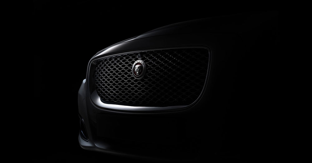
The Jaguar Logo stands as one of the most recognized symbols in automotive history. A leaping cat frozen mid-stride. Pure British luxury captured in chrome and steel.
This emblem belongs to Jaguar Cars Limited, the luxury vehicle manufacturer headquartered in Coventry, England. Within the broader landscape of car logos, Jaguar’s mark occupies a unique space where animal mascots meet refined elegance.
The current Jaguar identity features two main elements: the “Leaper” hood ornament introduced in 1945 and the “Growler” face emblem. The brand has undergone approximately nine logo iterations since its founding as the Swallow Sidecar Company in 1922.
What is the Jaguar Logo?
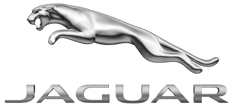
The Jaguar Logo consists of a stylized leaping jaguar cat, officially introduced in 1945 when the company rebranded from SS Cars. The design represents speed, power, and grace. It was created under the direction of founder Sir William Lyons.
Design Type: Combination mark featuring both mascot emblem and wordmark
Primary Elements:
- The Leaper: A chrome three-dimensional jaguar in mid-leap
- The Growler: A frontal jaguar face showing teeth
- Wordmark: “JAGUAR” text in custom lettering
Official Introduction Date: 1945 (post-WWII rebrand)
Designer: F. Gordon Crosby created the original Leaper sculpture
Trademark Status: Registered globally under Jaguar Land Rover Limited, a subsidiary of Tata Motors
Color Palette:
- British Racing Green: #005A2B
- Silver Chrome: #C0C0C0
- Black: #000000
- Gold accents: #D4AF37
Usage Context: Vehicle grilles, hood ornaments, wheel centers, dealership signage, marketing materials, merchandise, and digital platforms
How Has the Jaguar Logo Evolved Over Time?
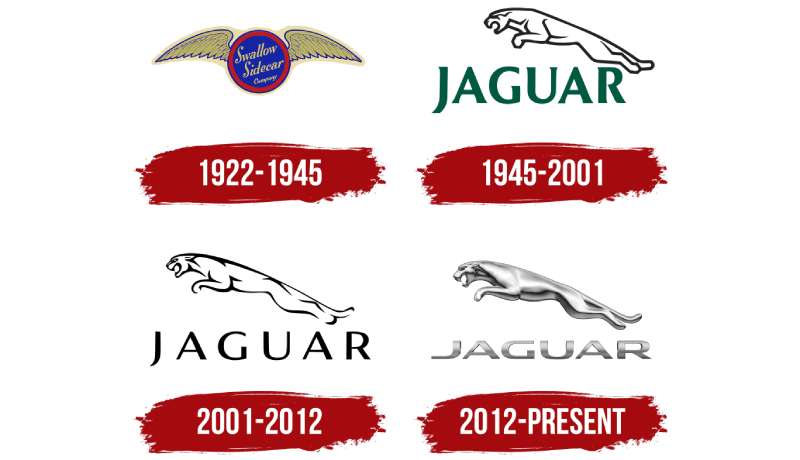
The Jaguar brand identity has transformed dramatically since 1922. What began as SS Cars with a winged emblem became the leaping cat we recognize today.
Each redesign reflected shifts in ownership, market positioning, and design trends. The brand has moved through Art Deco influences, chrome-heavy mid-century styling, and now toward digital-first minimalism.
Swallow Sidecar Company Era (1922-1935)
Years Active: 1922-1935
Design Description: The original company used “SS” initials with wings. No jaguar imagery existed yet. The aesthetic drew from Art Deco styling popular at the time.
Color Scheme: Black and silver dominated early branding
Context: William Lyons and William Walmsley founded the company to make motorcycle sidecars. The wing motif suggested speed and freedom.
Cultural Significance: Represented British craftsmanship during the interwar period
SS Jaguar Period (1935-1945)
Years Active: 1935-1945
Design Description: The word “Jaguar” first appeared as a model name in 1935 for the SS Jaguar saloon. A hexagonal badge with wings framed the SS letters.
Color Scheme: Red, silver, and black
Key Changes from Previous: Introduction of the Jaguar name, though still secondary to SS branding
Context: The jaguar name was chosen for its connotations of grace, power, and speed. Lyons paid the Blackpool Zoo to observe the animals.
Post-War Rebrand (1945-1957)
Years Active: 1945-1957
Design Description: Complete elimination of SS initials due to Nazi associations. The Leaper mascot debuted. F. Gordon Crosby sculpted the iconic jumping cat.
Color Scheme: Chrome silver with green accents
Designer: F. Gordon Crosby, automotive artist
Key Changes from Previous: Total brand identity overhaul. SS became simply “Jaguar.”
Cultural Significance: Marked the birth of modern Jaguar identity. The Leaper became a status symbol on British roads.
Growler Introduction (1957-2001)
Years Active: 1957-2001
Design Description: The snarling jaguar face (Growler) joined the Leaper. This frontal view showed the cat’s fierce expression with visible fangs.
Color Scheme: Green, gold, and chrome
Key Changes from Previous: Added a flat emblem option for grille mounting. The Growler worked better at smaller sizes than the three-dimensional Leaper.
Context: Safety regulations began limiting hood ornaments. The Growler provided a flush alternative.
Ford Era Refinements (2001-2008)
Years Active: 2001-2008
Design Description: Under Ford ownership, the logo received subtle modernization. Cleaner lines. Slightly more aggressive Growler expression.
Color Scheme: Deeper British Racing Green with chrome
Key Changes from Previous: Refined proportions for digital use. Maintained heritage elements.
Tata Motors Period (2008-2021)
Years Active: 2008-2021
Design Description: Tata Motors acquired Jaguar and Land Rover. Logo received minor updates while preserving brand DNA.
Color Scheme: Black, chrome, and British Racing Green remained standard
Context: Indian ownership brought investment while respecting British heritage
2021 Digital Update
Years Active: 2021-2024
Design Description: Refined Leaper with smoother curves. Optimized for digital screens and social media avatars.
Key Changes from Previous: Reduced detail for better scaling. Works well as app icons and favicons.
2024 Rebrand
Years Active: 2024-present
Design Description: Radical departure. New wordmark with striped “JaGUar” treatment in mixed case. The Leaper removed from primary branding.
Color Scheme: Pink, blue, yellow, and red
Context: Signals pivot to all-electric luxury vehicles. Controversial among brand loyalists.
Key Changes from Previous: Most dramatic shift in company history. Intentionally polarizing.
What Do the Design Elements of the Jaguar Logo Mean?
The leaping jaguar represents raw power controlled by elegance. This animal was chosen specifically for its combination of speed, agility, and beauty.
William Lyons wanted a symbol that would convey luxury without being pretentious. The jaguar cat fit perfectly.
Why Did Jaguar Choose These Specific Colors?
British Racing Green
- Hex: #005A2B
- Symbolic meaning: British motorsport heritage and national identity
- Psychological impact: Conveys sophistication, tradition, and exclusivity
- Brand connection: Links to Jaguar’s racing pedigree at Le Mans
Understanding color psychology explains why this shade resonates with luxury buyers. Green suggests stability and prestige.
Chrome Silver
- Hex: #C0C0C0
- Symbolic meaning: Precision engineering and metalwork quality
- Psychological impact: Suggests high technology and premium materials
Black
- Hex: #000000
- Symbolic meaning: Power, mystery, and sophistication
- Brand connection: Classic choice for luxury marques
The official color palette remains consistent across all brand touchpoints.
What Typography Style Is Used in the Jaguar Logo?
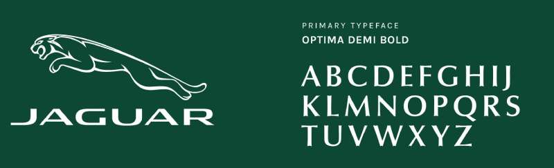
Jaguar historically used custom lettering with serif characteristics. The letters featured elongated serifs suggesting speed and forward motion.
In contrast to modern sans-serif fonts favored by tech brands, Jaguar’s classic typeface emphasized heritage.
The 2024 rebrand shifted dramatically. The new wordmark uses a geometric sans-serif with unusual capitalization. “JaGUar” mixes upper and lowercase in unconventional ways.
Readability took a backseat to making a statement. Some critics say the new typography sacrifices legibility for distinctiveness.
What Are the Hidden Meanings in the Jaguar Logo?
The Leaper’s posture tells a story. It’s caught mid-leap, suggesting motion even when still. This captures what Jaguar cars aim to deliver.
The Growler shows teeth without appearing aggressive. It’s confident, not hostile. This balance took several iterations to achieve.
Some observers note the Leaper’s proportions follow natural feline anatomy closely. F. Gordon Crosby studied actual jaguars extensively.
The newer 2024 identity contains deliberate ambiguity. Those stripes in the wordmark? They could reference speed lines, a jaguar’s spots, or nothing at all.
How Does the Jaguar Logo Compare to Competitor Logos?
Among luxury automakers, Jaguar’s animal mascot approach puts it in select company. Most competitors use abstract symbols, initials, or coats of arms.
The Ferrari Logo features its prancing horse, creating a natural comparison. Both use animal imagery to suggest speed and power. But Ferrari’s horse stands upright while Jaguar’s cat leaps forward.
The Bentley Logo takes a different path with its winged B. More restrained. More traditional British. Jaguar feels wilder by comparison.
Looking at the Lamborghini Logo with its fighting bull, you see another animal mascot. Lamborghini’s bull suggests aggression while Jaguar’s cat implies grace.
The Porsche Logo uses the Stuttgart horse within a coat of arms. Heraldic and historical. Jaguar’s approach feels more dynamic and modern despite its heritage.
German competitors like BMW and Audi rely on geometric precision. Their roundels and rings feel calculated. Jaguar’s cat adds organic warmth to the luxury segment.
What Are the Technical Specifications of the Jaguar Logo?
Official Color Codes:
Primary Color: British Racing Green
- Hex: #005A2B
- RGB: (0, 90, 43)
- CMYK: (100, 0, 52, 65)
- Pantone: 349 C
Secondary Color: Black
- Hex: #000000
- RGB: (0, 0, 0)
- CMYK: (0, 0, 0, 100)
Accent Color: Silver
- Hex: #C0C0C0
- RGB: (192, 192, 192)
- CMYK: (0, 0, 0, 25)
The brand specifies Pantone values for print consistency. Digital applications use RGB values, while commercial printing requires CMYK specifications.
Dimensions and Proportions:
- Leaper aspect ratio: Approximately 3:1 (width to height)
- Minimum size: 25mm width for print, 100px for digital
- Clear space: Equal to the height of the “J” in the wordmark on all sides
The logo works as vector graphics for infinite scaling. High-resolution versions maintain detail at any size.
What Cultural Impact Has the Jaguar Logo Had?
The Leaper became a symbol of British cool during the 1960s. It appeared in spy films. It represented post-war British achievement.
E-Type Jaguars with their hood mascots became cultural icons. Enzo Ferrari called the E-Type the most beautiful car ever made. That Leaper on the hood was part of the appeal.
The logo influenced how luxury brands approach mascot design. It proved animal imagery could work in premium markets without feeling childish.
The 2024 rebrand sparked massive online debate. Social media exploded with reactions. Whether loved or hated, the new direction got people talking about Jaguar again.
How Does the Jaguar Logo Fit Into the Overall Brand Identity?
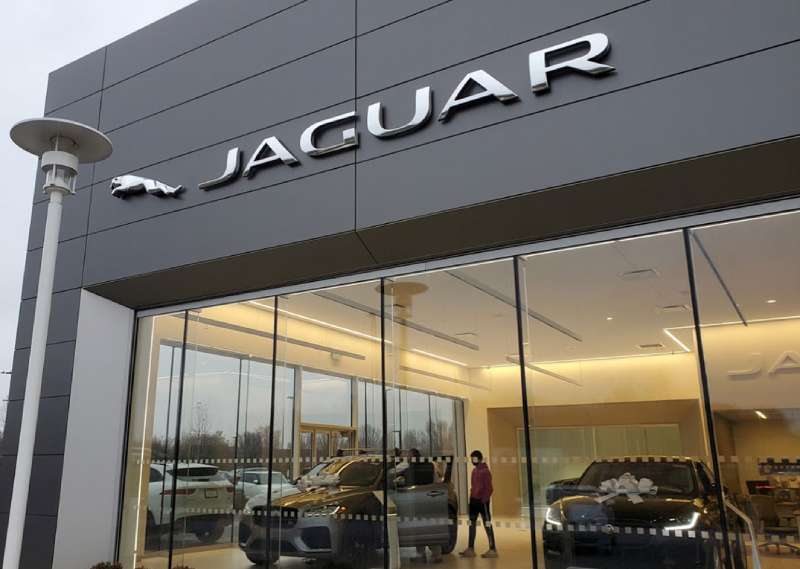
The Leaper and Growler anchor a comprehensive identity system. They appear on vehicles, dealerships, merchandise, and all marketing materials.
Jaguar’s brand guidelines specify exactly how these elements interact. Spacing, color combinations, and placement follow strict rules.
The logo connects to broader themes in the company’s messaging. British heritage. Racing pedigree. Graceful power. Every touchpoint reinforces these ideas.
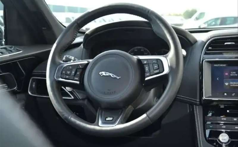
Interior design cues reference the Leaper. Seat stitching patterns. Dashboard emblems. Even the startup animation on infotainment screens.
The 2024 identity shift signals a complete rethink. As Jaguar moves to electric-only production, the brand wants to attract new customers who might not care about heritage.
How Should the Jaguar Logo Be Used?
Official Usage Guidelines:
Do:
- Use official logo files from Jaguar media resources
- Maintain minimum clear space around the logo
- Use approved color combinations only
- Scale proportionally without distortion
Don’t:
- Alter logo colors outside brand specifications
- Stretch or compress the logo
- Add effects like shadows or gradients not in original files
- Place the logo on busy backgrounds that reduce visibility
Where to Access Official Logos:
- Jaguar Media Center (media.jaguar.com)
- Authorized dealer resources
- Official press kit downloads
Licensing Information:
The Jaguar logo is a registered trademark of Jaguar Land Rover Limited. Commercial use requires written permission. Unauthorized reproduction violates trademark law.
Trademark Protection:
Both the Leaper and Growler are protected globally. The company actively pursues unauthorized uses. Counterfeit merchandise bearing these marks faces legal action.
Fan art and editorial use typically fall under fair use, but commercial applications always need approval.
FAQ on The Jaguar Logo
What Does the Jaguar Logo Represent?
The leaping jaguar emblem represents speed, power, and grace. Sir William Lyons chose this feline mascot because it embodied everything the British luxury car manufacturer wanted to communicate.
The animal symbolizes agility and elegance. It’s a perfect match for sports car branding.
Who Designed the Original Jaguar Leaper?
F. Gordon Crosby, a renowned automotive artist, sculpted the original Leaper hood ornament in 1945. He studied actual jaguars to capture authentic feline anatomy.
Crosby worked closely with founder William Lyons on the design. His work shaped logo design principles for the entire automotive industry.
When Was the Jaguar Logo First Introduced?
The iconic chrome jaguar badge debuted in 1945 when the company rebranded from SS Cars. The name change happened after World War II.
SS had unfortunate Nazi associations. Jaguar became the sole identity going forward.
Why Did Jaguar Change Their Logo in 2024?
Jaguar’s 2024 rebrand signals their shift to all-electric vehicles. The new wordmark targets younger luxury buyers who prioritize sustainability over heritage.
It’s controversial. The striped “JaGUar” treatment abandons the Leaper entirely from primary branding. Bold move for a company built on tradition.
What Is the Difference Between the Leaper and Growler?
The Leaper is a three-dimensional jumping cat sculpture used as a hood ornament. The Growler shows the jaguar’s face head-on with visible fangs.
Safety regulations limited hood mascots. The flat Growler works better on modern grilles and at smaller scales.
What Are the Official Jaguar Logo Colors?
British Racing Green, chrome silver, and black form the traditional palette. These colors connect to UK motorsport heritage and premium positioning.
Understanding color theory explains why this combination works. Green suggests prestige while silver implies precision engineering.
Is the Jaguar Hood Ornament Still Used Today?
Yes, but less frequently. Pedestrian safety regulations restrict protruding hood ornaments in many markets. Some models offer retractable versions.
The Leaper appears on select vehicles as a heritage option. Most production models now use the flat Growler emblem instead.
What Font Does Jaguar Use in Their Logo?
Historically, Jaguar used custom lettering with elegant serif characteristics. The letterforms featured extended strokes suggesting forward motion.
The 2024 rebrand introduced geometric sans-serif typeface styling. Completely different approach. Very polarizing among brand enthusiasts.
How Valuable Is Jaguar’s Brand Identity?
The Jaguar brand is valued in the billions as part of Jaguar Land Rover under Tata Motors ownership. The Leaper alone carries significant trademark value.
Brand recognition built over decades contributes heavily. That leaping cat means something to luxury car buyers worldwide.
Can I Use the Jaguar Logo for My Business?
No. The Jaguar trademark is protected globally. Commercial use requires written permission from Jaguar Land Rover Limited.
Unauthorized reproduction violates trademark law. The company actively pursues counterfeit merchandise. Editorial and fan art may qualify as fair use, but commercial applications always need approval.
Conclusion
The Jaguar Logo remains one of the most recognized symbols in British automotive heritage. From F. Gordon Crosby’s original Leaper sculpture to the controversial 2024 rebrand, this emblem has constantly evolved.
Few car badges carry such weight. The leaping cat symbol connects decades of motorsport success with luxury vehicle craftsmanship.
Whether you prefer the classic chrome jaguar badge or the new direction under Tata Motors, one thing stays true. This brand identity shaped how we think about automotive branding.
The Growler and Leaper earned their place in design history.

Renowned for his expertise in logo design and visual branding, Bogdan has developed a multitude of logos for various clients.
His skills extend to creating posters, vector illustrations, business cards, and brochures. Additionally, Bogdan's UI kits were featured on marketplaces like Visual Hierarchy and UI8.
He also wrote in the past years on sites like Design Your Way, WebDesignerDepot, WPDean, Designmodo, Speckyboy, Slider Revolution, and more.
- Canva vs PowerPoint: Which Is Better for Presentations? - 22 September 2026
- How to Install Fonts on Mac (Step-by-Step Guide) - 20 September 2026
- From Mockup to Code: How AI-Augmented Development Speeds Up the Design Handoff - 19 September 2026

Bogdan Sandu is a seasoned designer who has been designing websites since 2008. Renowned for his expertise in logo design and visual branding, Bogdan has developed a multitude of logos for various clients. His skills extend to creating posters, vector illustrations, business cards, and brochures. Additionally, Bogdan's UI kits were featured on marketplaces like Visual Hierarchy and UI8. He also wrote in the past years on sites like Design Your Way, WebDesignerDepot, WPDean, Designmodo, Speckyboy, Slider Revolution, and more.
You Might Also Like