

The Real Madrid logo evolution and why the emblem is so popular
A logo means a lot to any company even in the football world they play such a big role for the club identity and their fans. It is designed to show the uniqueness of a particular team and make its fans connect with it. Each club has its own history and different subjects of interest for their supporters. The Real Madrid logo, for example, is one that has a rich history.
It been launched for quite some time and we can say that they really have one of the best logos done because the design is modern and it follows all the graphic design rules that are generally applied to these types of designs.
But in order to understand the Real Madrid logo better we need to explore more about its history and how did it end up today looking like this. So, let’s check out more details and see how this club evolved in time.
The Real Madrid Club History
Real Madrid took birth from a team that was created in Madrid in 1897. After that in 1902, the Madrid Football Club was made with the help of some fans that later became known as Real Madrid. This club is one of the most successful European soccer teams and we really think it is great what they managed to accomplish.
Having a blue and white logo that was inspired by an English team actually, Real Madrid became to build up their name right away.
Between 1905 and 1907 together with their first coach, Arthur Johnson the team ended up winning three titles in a row in the Spanish League. These were the first of the 29 La Liga championships that were won by the club together with five consecutive ones.
The Real Madrid logo
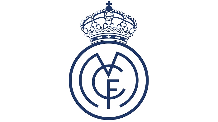
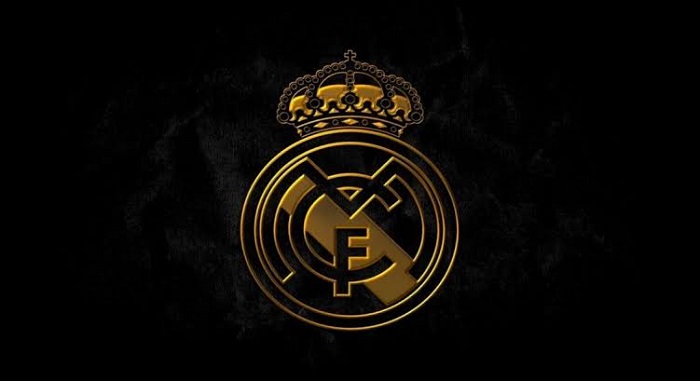
The Real Madrid Logo has a lot of styles but one thing that remained the same was that they always showed a crown at the top of the logo. The shape of the crown that we can see at the top of the Real Madrid symbol is in the same shape but sometimes the stones that are stuck to the crown are in different numbers or shapes.
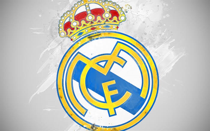
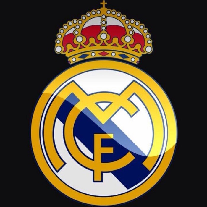
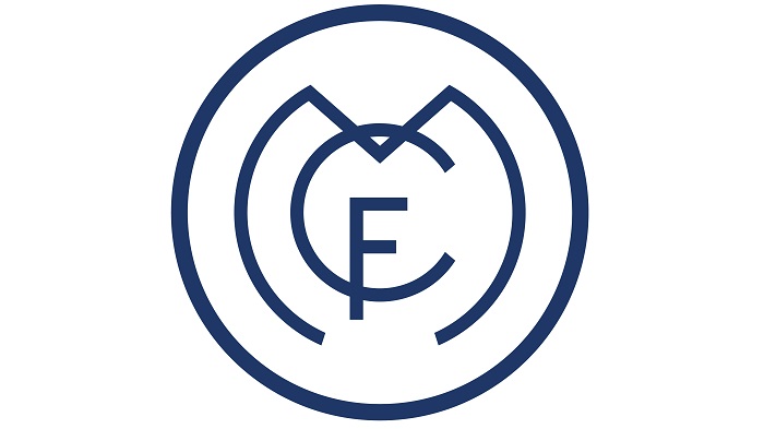
The Real Madrid logo is one of the most popular and easy to recognize logos in a sports team. It was first launched in 1920 and during the years since then, it has different modifications. The logo has a royal crown, the brand initials in the middle of the crest and a band of Castile.
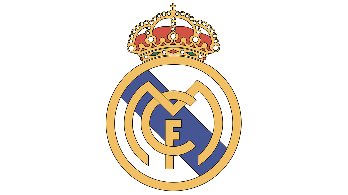
Their current one really looks like the logo that was introduced in 1941 with the exception of a couple of modifications. The color of the brand was replaced by dark blue and the way the letters are positioned also changed.
The Font
The three letters that are being used in the logo do not really belong to any of the typefaces that already exist. Each character has been made from zero and the most interesting looking one is the M.
The Color symbolism
Each color that we see in the Real Madrid logo stands for something. Yellow stands for gold and the connection with the royal house, the red stands for passion and energy and the blue stands for loyalty.
The colors have been kept no matter where the Real Madrid logo is being used and this was probably a smart move coming from the club if we think of the branding aspect.
The Real Madrid logo History
The Real Madrid logo history is not that complicated because they only did a few small changes through time. The crest didn’t have any major changes since 1941 and the other elements are also quite similar to the original version.
The Real Madrid logo Evolution
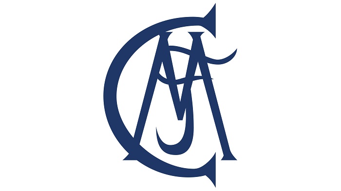
The first Real Madrid badge that was made in 1902 had three interlacing letters MCF. They stood for Madrid Club de Futbol and the color of it was blue. The shirts that they used as a team were white together with the blue badge on them.
1908
Six years later, after the first Real Madrid logo was created, the club decided to make some changes. The interlacing letters were changed in 1908 but the crest colors remained the same.
1920
On June 29, 1920, the Spanish King Alfonso XIII awarded the Madrid royal title to the club logo and this event was captured together with the appearance of a crown. In their official matches, we can still see their stylized city logo.
1931
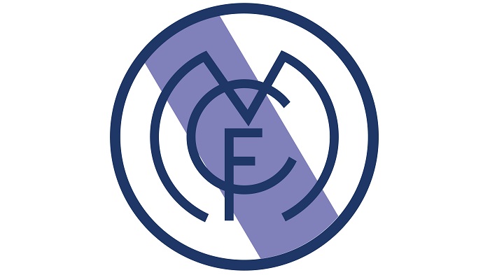
In this period the team had the name of football club Madrid and the logo lost its crown due to the prohibition to use any kind of monarchical symbols. In the same time, the Real Madrid logo had a strip of purple hue that showed the region of Castile, the territory where Madrid is located today.
1941
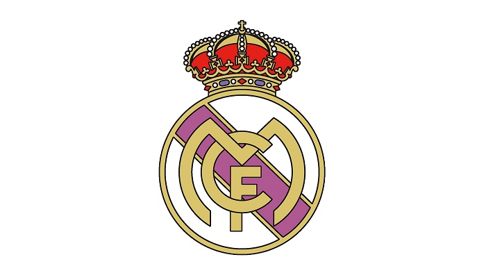
After a few years in 1941, Real Madrid brought back the Royal Crown to the logo and also kept a mulberry stripe of Castile in. The crest was done in a full gold color and their name got changed back to Real Madrid Club de Futbol. Since then this was the club’s logo that only had a minor change in 2011 by switching the mulberry stripe with a bluish shade.
2001
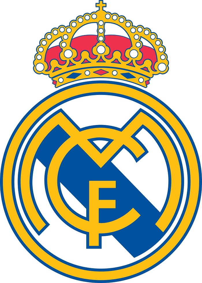
As we just saw, the change that was done in 2001 was really not a big one and the logo really looks great in the 21st century. Using this form the Real Madrid logo kept the same format for five decades.
Real Madrid C.F. wears white
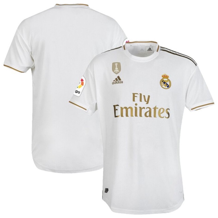
There are many myths about the fact that Real Madrid C.F. has white uniforms but the most known one goes back to the origins of football in Spain because a lot of boys used to practice in their white undershirts.
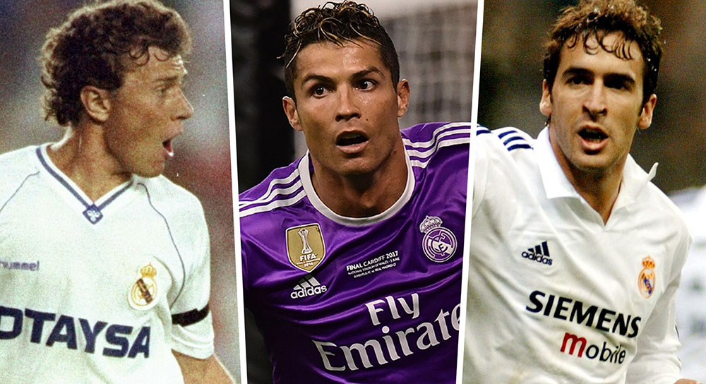
The Popularity of Real Madrid
They can also be considered some of the richest and popular teams so Real Madrid C.F. is the second richest in the world in terms of revenue and the second most valuable club in the world to date. They made more than 600 million euros per year and have almost 228 million supporters.
So, the Real Madrid logo is quite a famous one and we really have to appreciate what this brand has managed to accomplish.
If you enjoyed reading this article about the Real Madrid logo, you should read these as well:
- Logomark Vs Logotype: Understanding the Difference
- Superhero logos: The symbols of the comic book universe
- Learn About The Apple Logo: The Tech Giant’s Branding
- How to create a logo & branding questionnaire (Templates included)
Bogdan Sandu, a seasoned designer with 15 years of diverse experience, has been designing websites since 2008.
Renowned for his expertise in logo design and visual branding, Bogdan has developed a multitude of logos for various clients.
His skills extend to creating posters, vector illustrations, business cards, and brochures. Additionally, Bogdan's UI kits were featured on marketplaces like Visual Hierarchy and UI8.
Latest posts by Bogdan Sandu (see all)
- Light Up Your Designs with These Light Color Palettes - 19 April 2024
- How to Measure Brand Loyalty Effectively - 19 April 2024
- The Square Enix Logo History, Colors, Font, And Meaning - 18 April 2024