


Some album covers make you want to buy the record. Others make you wonder if anyone at the label was paying attention.
The worst album covers in music history range from bizarre Photoshop disasters to genuinely offensive artwork that got pulled from store shelves. Big names like The Beatles, Black Sabbath, and Kanye West have all released terrible album art that became more famous than the music inside.
Bad cover design isn’t just funny. It tells a real story about creative misjudgment, label politics, and what happens when no one in the room says “maybe not.”
This list breaks down 10 of the ugliest, most embarrassing, and most controversial record covers ever printed. You’ll get the full backstory on each one, the design mistakes that stand out, and whether the music was actually any good despite the awful packaging.
The Worst Album Covers of All Time
The Beatles – Yesterday and Today (1966)
Why It’s So Bad
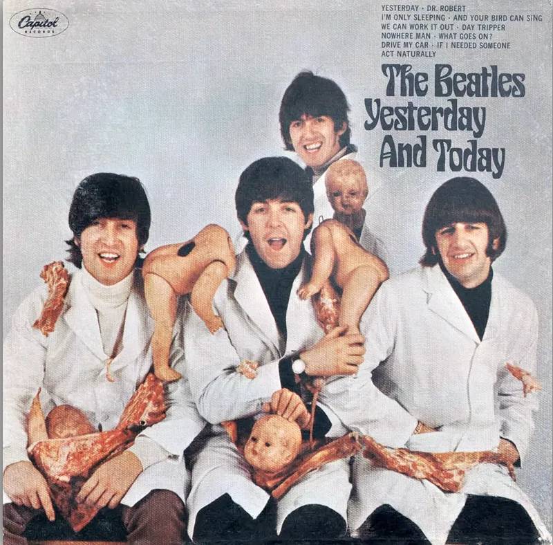
The so-called “butcher cover” shows John, Paul, George, and Ringo wearing white smocks, covered in raw meat and dismembered baby doll parts.
It’s grotesque. And it came from a band that was, at the time, the biggest pop act on the planet. The disconnect between their clean-cut image and this bloody mess made it even more jarring.
This wasn’t some underground shock art. It was a major label release from Capitol Records, printed on roughly 750,000 copies before anyone hit the brakes.
The Story Behind the Cover
Photographer Robert Whitaker shot the image as part of a conceptual art piece he called “A Somnambulant Adventure.” He wanted to comment on the absurd level of fan worship the band received.
The band members went along with it. Lennon pushed hard for it, calling the photo “as relevant as Vietnam.” McCartney also backed the concept and told Capitol’s president it was their statement against the war.
But George Harrison later called it “gross and stupid,” adding that sometimes they did things thinking it was cool when it was actually just dumb.
Design Mistakes That Stand Out
The problem here wasn’t really about graphic design principles. It was about judgment.
Capitol’s art director tried to make the photo look like a painting by adding a canvas texture. That didn’t help. You can’t dress up raw meat and doll heads with a filter and expect it to feel artistic. The color theory was fine, technically. But everything else was a disaster in terms of audience awareness.
The Music vs. the Artwork
The album itself is solid. It includes tracks from Help!, Rubber Soul, and early Revolver sessions. Songs like “Yesterday,” “Nowhere Man,” and “Drive My Car” are among the Beatles’ best work.
The music had nothing to do with the cover’s tone. It was a compilation, not a concept record.
What the Artist or Label Said
Capitol recalled the album almost immediately after retailers protested. They pasted a new, tamer photo of the band sitting around a steamer trunk over the original cover.
Lennon was annoyed by the replacement. He called it “an awful looking photo of us looking just as deadbeat but supposed to be a happy-go-lucky foursome.”
Where to Listen
Available on Spotify, Apple Music, and YouTube Music. Original butcher cover copies are among the most valuable vinyl records in history, with sealed versions selling for over $40,000 at auction.
Black Sabbath – Born Again (1983)
Why It’s So Bad
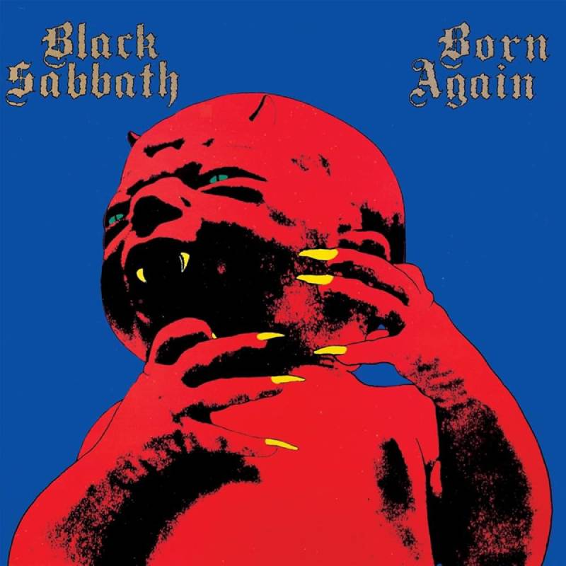
A bright red, fanged demon baby with yellow claws stares at you from a neon background. That’s the whole cover.
It looks like someone dared a designer to make the ugliest thing possible. And then the label said yes.
The Story Behind the Cover
The designer was Steve “Krusher” Joule, who also worked on Ozzy Osbourne’s solo album art. When Ozzy and Sharon split from Don Arden’s management, Arden tried to poach Ozzy’s entire creative team for Sabbath.
Joule didn’t want to betray Ozzy. So he submitted intentionally bad cover concepts, expecting the band to reject them. The demon baby was based on a black-and-white photo from a 1968 magazine called Mind Alive. He overexposed some photocopies, added horns and fangs, slapped on clashing colors, and figured nobody would approve it.
But guitarist Tony Iommi actually liked it. Manager Don Arden loved it. And suddenly Joule had to finish the thing for real, which he reportedly did in one night with Jack Daniel’s and speed.
Design Mistakes That Stand Out
Where to start. The contrast is aggressive in all the wrong ways. Hot red background, acid yellow claws, black outlines that look traced. There’s zero visual hierarchy. Your eye doesn’t know where to go because everything screams at the same volume.
The font choice is a mangled Old English typeface that barely reads as “Black Sabbath.” It fights the image instead of working with it.
The Music vs. the Artwork
Born Again was the only Sabbath album featuring Deep Purple vocalist Ian Gillan. It’s a flawed record, but tracks like “Zero the Hero” and “Trashed” have genuine power. Cannibal Corpse even covered “Zero the Hero” later on.
The album reached No. 4 in the UK. The cover almost certainly hurt its reception more than the music did.
What the Artist or Label Said
Ian Gillan’s reaction became legendary. He reportedly said he “looked at the cover and puked.” He also allegedly threw a box of 25 copies out of his window.
Kerrang! magazine ranked it second on their list of the 10 worst metal album sleeves ever. But not everyone hated it. Max Cavalera from Sepultura and Glen Benton from Deicide both called it their favorite album sleeve of all time.
Where to Listen
Available on all major streaming platforms. The 2011 deluxe reissue includes bonus tracks and extended versions.
Scorpions – Love at First Sting (1984)
Why It’s So Bad
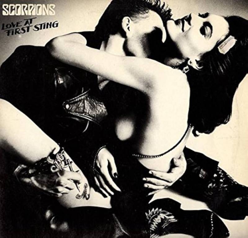
The original cover features a man tattooing the thigh of a partially nude woman in a suggestive pose. It was shot by legendary German fashion photographer Helmut Newton, which gave it a polished, editorial look. That didn’t save it from controversy.
Several U.S. retailers refused to stock it. Walmart filed a complaint about the partial nudity, and PolyGram Records eventually issued an alternate cover showing just the band members.
The Story Behind the Cover
The Scorpions originally approached Andy Warhol for the cover art. Warhol agreed but insisted on retaining image rights, which would have forced the band to license it for merchandise. They passed and went with Newton instead.
This wasn’t the band’s first rodeo with provocative artwork. Earlier albums like Lovedrive and especially Virgin Killer (1976) had caused far bigger scandals. By Love at First Sting, the Scorpions had a reputation for pushing boundaries with their record sleeve art.
Design Mistakes That Stand Out
Newton’s photography was technically excellent. The real issue was context. A fashion magazine editorial and an album cover sitting in a record store next to kids’ music are two very different things. The band’s logo placement feels like an afterthought, competing with the provocative imagery instead of complementing it.
The Music vs. the Artwork
This is arguably the best Scorpions album. “Rock You Like a Hurricane,” “Still Loving You,” and “Big City Nights” are all on here. It peaked at No. 6 on the Billboard 200 and eventually went triple platinum in the U.S.
The music was strong enough to succeed despite the cover controversy. Most fans from that era remember it fondly regardless of which version they owned.
What the Artist or Label Said
The band didn’t fight the alternate cover too hard. They’d learned from the Virgin Killer backlash years earlier. The Scorpions simply provided a group photo for retailers who needed it and moved on.
Where to Listen
Available everywhere. The 40th anniversary reissue and deluxe editions include bonus material from the original recording sessions.
Bee Gees – Cucumber Castle (1970)
Why It’s So Bad
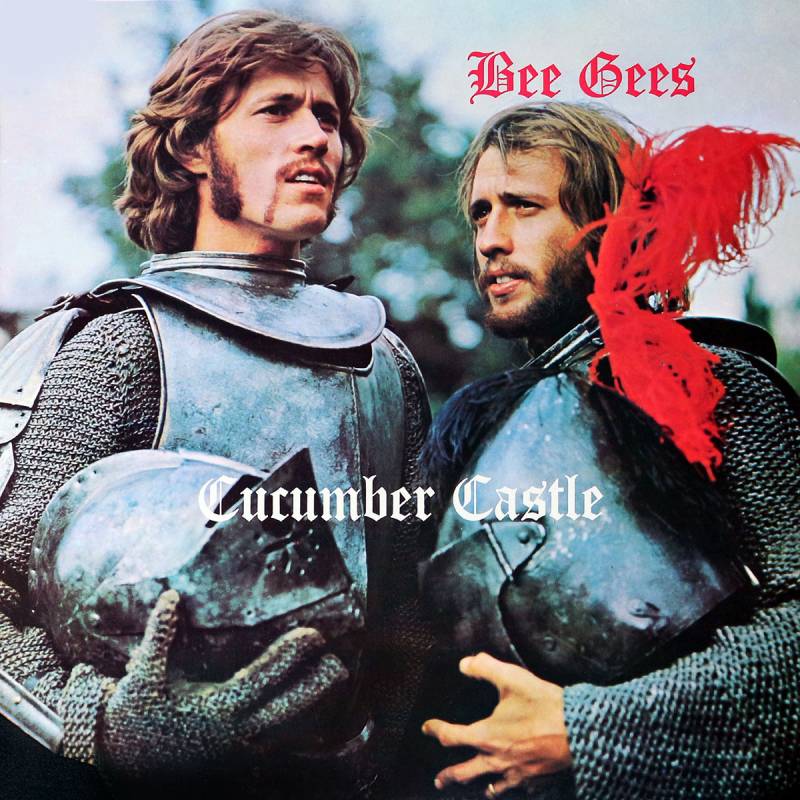
Barry and Maurice Gibb stand in full medieval knight armor with red plumes on their helmets. They look like extras from a school play about King Arthur. It’s goofy, dated, and completely out of step with anything happening in music at the time.
The Story Behind the Cover
The armor came from a BBC television comedy special, also called Cucumber Castle. The brothers played two sparring sons of a king in the show, and someone thought a still from that production would work as an album cover.
Robin Gibb had left the group at this point, making this the only Bee Gees album without him. The whole project had a thrown-together quality, and the cover reflected that.
Design Mistakes That Stand Out
The framing is flat. Two guys in armor, center frame, no background interest. There’s no visual emphasis drawing you in. No mood. No story beyond “we wore costumes once.”
Using a TV still as album artwork was a budget move that showed. The image quality, the lighting, the awkward poses. None of it translated to a compelling record sleeve.
The Music vs. the Artwork
The album has some decent moments. “Don’t Forget to Remember” was a No. 2 UK hit. There are country, soul, and folk influences woven through the tracklist. But the medieval cover gives zero indication of any of that.
If you grabbed this off a shelf based on the cover alone, you’d expect Renaissance fair music.
What the Artist or Label Said
The Bee Gees never really addressed the cover publicly. The album was released during their messy breakup period, and everyone was focused on solo careers. It’s one of those covers that just… happened, without anyone caring enough to stop it.
Where to Listen
Available on Spotify and Apple Music. It’s mostly for completists, but the country-influenced tracks hold up surprisingly well.
Kanye West – My Beautiful Dark Twisted Fantasy (2010)
Why It’s So Bad
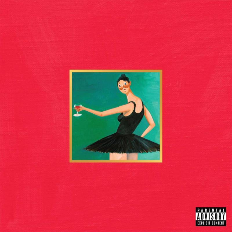
The main cover is a George Condo painting showing Kanye on a couch with a nude, armless, winged creature straddling him. It’s crude, intentionally provocative, and it got exactly the reaction Kanye wanted.
Multiple retailers refused to carry it. Apple pixelated the image on iTunes. Some streaming services still display a blurred version.
The Story Behind the Cover
Kanye commissioned American painter George Condo to create the artwork. Condo later revealed that Kanye specifically wanted something provocative enough to get banned by retailers.
When the cover leaked, Kanye tweeted that it had been “banned in the USA” and compared his situation to Nirvana, whose Nevermind cover featured a naked baby without controversy. Walmart denied banning the cover, saying they hadn’t even seen it. The label told Kanye they’d stand behind him if he insisted, but strongly urged an alternative.
Condo actually created five different covers for the album. All five were included with physical purchases. The ballerina painting became the default “safe” version for most retail and digital platforms.
Design Mistakes That Stand Out
The painting itself isn’t poorly executed. Condo is a respected artist. But as cover design, it fails at the basic job of representing the music inside. The wide red border, the cartoonish figures, the beer bottle. It reads more like a provocative gallery piece than album packaging.
The color palette is muddled. Reds, browns, flesh tones. Nothing pops on a shelf or in a thumbnail.
The Music vs. the Artwork
This might be the biggest gap between cover quality and music quality on this entire list. Pitchfork gave the album a perfect 10. Rolling Stone ranked it among the best albums of the 2010s. It debuted at No. 1 on the Billboard 200 with nearly 500,000 first-week sales.
Tracks like “Power,” “Runaway,” and “All of the Lights” feature collaborations with Jay-Z, Nicki Minaj, Rihanna, Bon Iver, and Elton John. The production is maximalist and layered with soul, electronic, and symphonic elements.
The cover is the weakest part of a near-perfect record.
What the Artist or Label Said
When asked about the censorship, Condo said the real problem was what people projected onto the image, not the image itself. Kanye seemed to enjoy the controversy as free publicity, which, honestly, it was.
Where to Listen
Available on all platforms, though the cover image varies by service. Physical copies with all five Condo paintings are collector’s items now.
Chumbawamba – Tubthumper (1997)
Why It’s So Bad
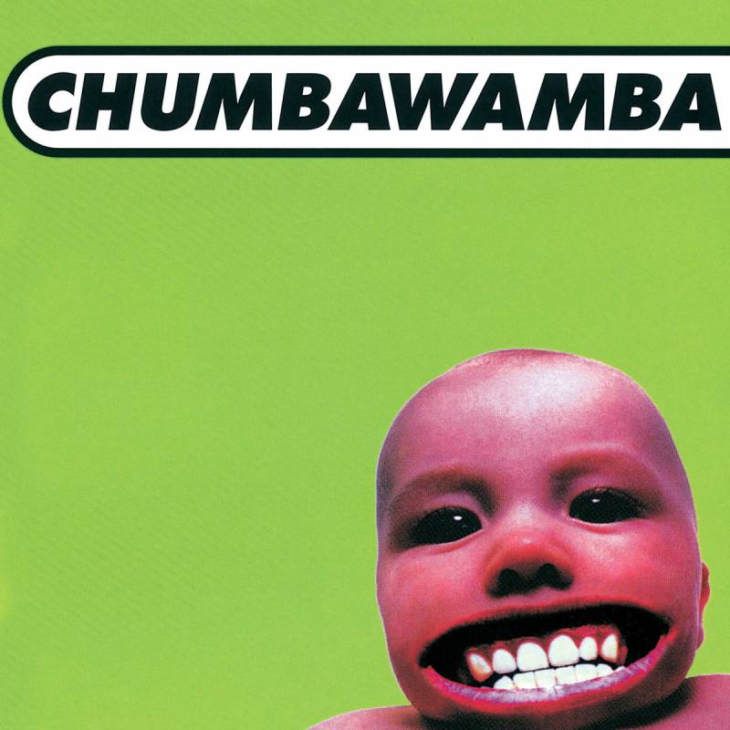
A photo of a baby, filtered in sickly pink, with an oversized adult mouth digitally pasted on. It sits on a flat color background. The whole thing looks like someone’s first experiment with Photoshop. Which, given the era, it basically was.
Rolling Stone questioned whether the baby on the cover should have grounds for legal action against the band, comparing it to the Nirvana Nevermind controversy.
The Story Behind the Cover
The band had used a baby motif on their previous album Anarchy as well, where the “anarchy baby” was being born. For Tubthumper, they aged the baby up to about eight months old and gave it “a bit of attitude,” according to band interviews.
Late 1990s CD cover design was full of this kind of thing. Cheap digital effects, garish colors, zero restraint. Tubthumper is one of the most visible examples of that trend going wrong.
Design Mistakes That Stand Out
Everything feels quick and careless. The color grading on the baby photo clashes with the background. The mouth swap is obvious and unsettling in a way that’s not funny or clever. There’s no balance, no alignment logic, no sense of design elements working together.
It screams “we had a deadline and a copy of Photoshop 4.0.”
The Music vs. the Artwork
“Tubthumping” became one of the biggest singles of the late ’90s, a global anthem that hit the top 10 in multiple countries. The album sold over 3.2 million copies in the U.S. alone and peaked at No. 3 on the Billboard 200.
The music blended pop rock, dance-pop, and political commentary in a surprisingly effective way. The cover gave none of that away.
What the Artist or Label Said
The band never seemed too concerned about the cover. They were more focused on the controversies around vocalist Alice Nutter telling fans on TV to steal the album from chain stores, which got it pulled from Virgin Megastores shelves while it was still in the top 10.
Where to Listen
Available on Spotify, Apple Music, and YouTube Music.
Van Halen – Balance (1995)
Why It’s So Bad
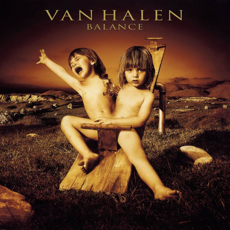
Two conjoined twins, played by the same child, pulling each other’s hair. The twins are positioned to roughly mimic the shape of the Van Halen logo. It’s a deeply uncomfortable image that somehow manages to be both conceptual and tasteless.
The Story Behind the Cover
This was the last of four albums with Sammy Hagar on vocals, during a period when tensions between Hagar and Eddie Van Halen were reaching a breaking point. The fighting twins were meant to represent that internal conflict.
The kid in the photo was not, despite persistent rumors, Wolfgang Van Halen.
Design Mistakes That Stand Out
The concept is too literal. Two people fighting, get it? The execution makes it worse. The child’s expression, the hair-pulling, the mirrored composition. It’s the kind of idea that sounds interesting in a meeting and falls apart in execution. The symmetry feels forced rather than intentional.
The Music vs. the Artwork
The album actually performed well commercially. “Can’t Stop Lovin’ You” was a hit single. But the Van Hagar era was winding down, and the cover’s uncomfortable vibe matched the band’s internal chaos more than anyone probably intended.
What the Artist or Label Said
Neither the band nor the label made significant public comments about the cover at the time. The focus was squarely on the Hagar/Van Halen drama that would lead to Hagar’s departure shortly after.
Where to Listen
Available on all major streaming platforms.
Stevie Wonder – In Square Circle (1985)
Why It’s So Bad
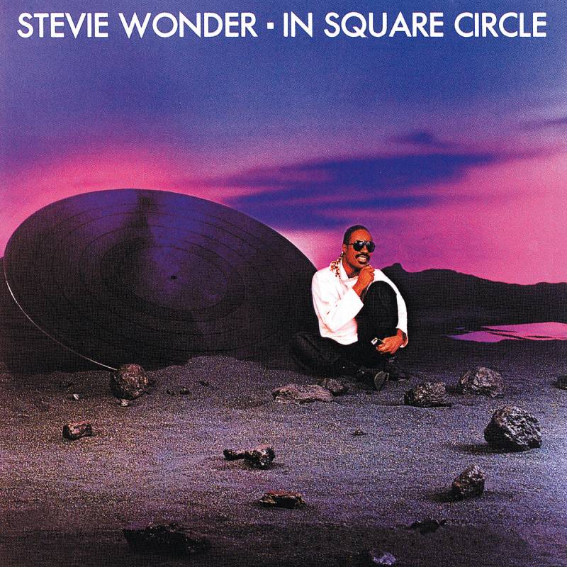
Stevie Wonder smiles in the foreground while behind him sits a bizarre post-apocalyptic landscape. Rocks, a spaceship-sized vinyl record, and a vaguely desolate backdrop that looks like a low-budget sci-fi movie set.
Nothing about it connects to the music. Nothing about it says “Stevie Wonder.”
The Story Behind the Cover
The 1980s were rough for album art across the board. Overproduced digital effects, awkward photo composites, and concepts that tried too hard. In Square Circle landed right in the middle of that trend.
Wonder was coming off the massive success of Hotter Than July and the soundtrack to The Woman in Red. He had the budget and the clout to do something memorable. This wasn’t it.
Design Mistakes That Stand Out
The background and foreground don’t belong in the same image. The lighting is inconsistent. Wonder looks like he was photographed separately and composited in. The whole thing lacks unity as a composition.
The Music vs. the Artwork
The album contains “Overjoyed,” one of the most beautiful ballads Wonder ever wrote. “Part-Time Lover” hit No. 1 on the Billboard Hot 100. The music is genuinely excellent.
The cover does it zero favors.
What the Artist or Label Said
Wonder hasn’t publicly commented on the cover. Given that he’s blind, it’s possible the visual disconnect wasn’t something he could fully evaluate during production.
Where to Listen
Available everywhere. “Overjoyed” alone makes it worth revisiting.
Rolling Stones – Dirty Work (1986)
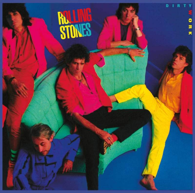
Why It’s So Bad
Neon colors splashed everywhere. The band’s faces painted in clashing, garish tones. It looks like someone attacked a photo with every highlighter in the office supply cabinet.
For a band that had one of the most recognizable logos in music, this cover abandoned everything that made the Stones’ visual identity work.
The Story Behind the Cover
The mid-’80s were a low point for the Jagger/Richards relationship. Both were pursuing solo projects. The sessions for Dirty Work were tense and often hostile. The album felt like an obligation, and the cover looked like one too.
Design Mistakes That Stand Out
The neon color psychology here sends all the wrong signals. Bright, aggressive, chaotic. It doesn’t communicate rock and roll. It communicates a bad night at a paint factory. The typography is plain and gets lost against the visual noise.
The Music vs. the Artwork
Critics and fans generally consider Dirty Work a solid post-’70s Stones record. It’s not their best, but it’s not a throwaway either. The cover makes it look far worse than it sounds.
What the Artist or Label Said
The band hasn’t said much about it publicly. By this point, the Stones were barely speaking to each other, let alone coordinating on cover art decisions.
Where to Listen
Available on all streaming platforms.
Phil Collins – No Jacket Required (1985)
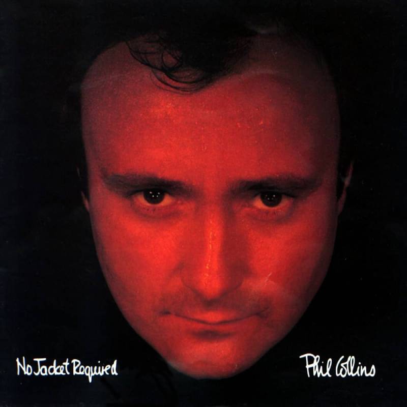
Why It’s So Bad
Phil Collins’ face. That’s it. Phil Collins looking slightly sweaty, with a patchy bit of hair catching the light. No concept. No design. No effort beyond “point camera at Phil.”
It’s the album cover equivalent of a passport photo.
The Story Behind the Cover
Collins had a habit of putting his face on every album cover. They’re all basically the same. But No Jacket Required stands out because the album was so massive, selling over 25 million copies worldwide, that this particular unflattering shot became one of the most-seen album covers of the entire decade.
Design Mistakes That Stand Out
There’s no design to critique because there’s barely any design present. No interesting movement, no composition, no concept. Just a headshot with text. Even the kerning on the title feels like it was set to default and left alone.
Compare this to anything Peter Gabriel did with his album packaging and the gap is embarrassing.
The Music vs. the Artwork
“Sussudio,” “One More Night,” “Take Me Home,” “Don’t Lose My Number.” This album was everywhere in 1985. It won the Grammy for Album of the Year. The music was inescapable pop-rock at its peak commercial power.
The cover suggested none of that energy.
What the Artist or Label Said
Collins never seemed bothered by his plain cover approach. He once acknowledged that his album covers were basically interchangeable. For a musician who sold tens of millions of records, the packaging design clearly wasn’t a priority.
Where to Listen
Available on all platforms. The 2016 remaster sounds great, even if the cover still looks the same.
FAQ on Worst Album Covers
What is the worst album cover of all time?
Most lists put The Beatles’ Yesterday and Today “butcher cover” at the top. The image of the band covered in raw meat and dismembered doll parts forced Capitol Records to recall 750,000 copies in 1966.
Why do some albums have terrible cover art?
Bad album artwork usually comes down to tight deadlines, label politics, or poor creative direction. Sometimes the artist has full control and makes a questionable call. Other times, the graphic designer is working with zero budget or bad instructions.
What album cover was banned for being too controversial?
Kanye West’s My Beautiful Dark Twisted Fantasy cover by painter George Condo was pixelated on iTunes and rejected by several retailers in 2010. The Scorpions and John Lennon also had covers pulled from stores.
Do bad album covers affect music sales?
They can. Retailers refusing to stock an album directly cuts distribution. But controversy sometimes boosts sales through publicity. The Beatles’ butcher cover became one of the most valuable vinyl records in collector history.
Which band has the most bad album covers?
The Scorpions hold this record with at least three banned covers across their career. Albums like Virgin Killer, Lovedrive, and Love at First Sting all faced censorship or alternate artwork for different markets.
Are weird album covers the same as bad album covers?
Not always. Weird can be intentional and effective. Pink Floyd’s artwork is strange but iconic. Bad covers fail at basic design or audience awareness. There’s a line between creative risk and poor judgment.
What makes a good album cover vs. a bad one?
Good covers use strong composition, clear typography, and a visual concept that matches the music. Bad ones ignore these basics. Clashing colors, amateur photo editing, and zero connection to the songs inside are common problems.
Can a great album have a terrible cover?
Absolutely. Stevie Wonder’s In Square Circle contains “Overjoyed” but has a bizarre sci-fi cover. Phil Collins’ No Jacket Required won Grammy Album of the Year behind what’s basically a sweaty headshot.
Who designs album covers?
Album art is typically created by graphic designers, photographers, or fine artists hired by the record label. Some artists like Kanye West commission painters directly. Firms like Hipgnosis designed covers for Led Zeppelin, Pink Floyd, and others.
Are old album covers worse than modern ones?
Older vinyl covers had more surface area to get wrong, and fewer people checking the work. But modern digital releases still produce bad art. The difference is that today’s ugly covers live forever as tiny thumbnails on Spotify and Apple Music.
Conclusion
The worst album covers in music history prove that even the biggest artists and record labels can get it completely wrong. From recalled vinyl sleeves to pixelated digital artwork, bad cover design has followed the music industry for decades.
What’s interesting is how many of these albums contain great music. Terrible album artwork doesn’t always mean terrible songs. Sometimes it’s the opposite.
The real takeaway is that album cover design matters more than most people think. It shapes first impressions, affects retail distribution, and sticks in memory long after the tracklist fades. A poorly designed record sleeve can overshadow even the best songwriting.
Whether it’s an embarrassing band photo, a cheap Photoshop job, or a deliberately provocative painting, these covers remind us that music packaging is its own art form. And getting it wrong is surprisingly easy.

Renowned for his expertise in logo design and visual branding, Bogdan has developed a multitude of logos for various clients.
His skills extend to creating posters, vector illustrations, business cards, and brochures. Additionally, Bogdan's UI kits were featured on marketplaces like Visual Hierarchy and UI8.
He also wrote in the past years on sites like Design Your Way, WebDesignerDepot, WPDean, Designmodo, Speckyboy, Slider Revolution, and more.
- Jujutsu Kaisen Font Generator - 12 October 2026
- The Windsurf Logo History, Colors, Font, And Meaning - 10 October 2026
- How to Remove Background From Product Photos (No Photoshop) - 10 October 2026

Bogdan Sandu is a seasoned designer who has been designing websites since 2008. Renowned for his expertise in logo design and visual branding, Bogdan has developed a multitude of logos for various clients. His skills extend to creating posters, vector illustrations, business cards, and brochures. Additionally, Bogdan's UI kits were featured on marketplaces like Visual Hierarchy and UI8. He also wrote in the past years on sites like Design Your Way, WebDesignerDepot, WPDean, Designmodo, Speckyboy, Slider Revolution, and more.
You Might Also Like


