Instagram uses Instagram Sans, a custom geometric sans-serif font developed in collaboration with Colophon Foundry, a UK-based type studio.
Instagram introduced this typeface in May 2022 as part of a full brand refresh, replacing its long-standing reliance on third-party fonts like Proxima Nova.
Inside the app, the interface text relies on system fonts: SF Pro (San Francisco) on iOS devices and Roboto on Android. Instagram Sans appears in marketing materials, ads, and key brand touchpoints.
What Type of Font Is Instagram Sans?
Instagram Sans sits in a specific typographic category that blends two distinct styles.
Classification: Geometric sans-serif with humanist curve influences.
Core visual traits:
- Soft, rounded terminals that reference the app’s “squircle” logo shape
- A teardrop-shaped counter inside the lowercase “a”
- Sheared terminals that hint at handwritten letterforms
- An intentionally unexpected quirk in the uppercase “Q”
These details make it feel clean and structured at a glance, but slightly human up close. That balance is the whole point.
The x-height is generous, which helps readability at small sizes on mobile screens. The tracking is open enough to work in condensed UI environments without feeling cramped.
Instagram Sans comes in several styles: Regular, Headline, Condensed, and Script. Each handles a different role across the brand system, from tight UI labels to expressive editorial headers.
Who Designed Instagram Sans?
The typeface was created by Colophon Foundry, based in London, in partnership with Instagram’s in-house brand team and a group of global type foundries and language specialists.
Instagram commissioned the font specifically for the 2022 rebrand. It was not adapted from an existing commercial typeface. That means it was built entirely from scratch to match Instagram’s visual identity.
A team of 40 typographers and language experts reviewed the font to confirm it worked across scripts including Arabic, Thai, Japanese, Korean, and Kannada. That level of multilingual coverage is unusual for a brand typeface, and it reflects how globally distributed Instagram’s user base actually is.
Edd Harrington of Colophon Foundry described the project as a challenge in creating something that could represent billions of different people across different languages, without losing a coherent visual personality.
Is Instagram Sans Free to Use?
No. Instagram Sans is proprietary and is not available for public download or commercial use.
Instagram’s brand guidelines make this clear. The font is an internal brand asset owned by Meta, and using it outside the platform would violate their font licensing terms.
You can view it on Instagram’s official brand page at about.instagram.com/brand, but that page is for reference only.
If you need something that approximates the look for your own projects, the alternatives section below covers the closest free options.
What Font Did Instagram Use Before?
Instagram’s typography history breaks down into three distinct phases.
| Period | Font Used | Context |
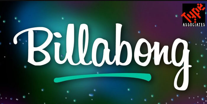
| 2010–2016 | Billabong | Original logo wordmark |
| 2013–2016 | Freight Sans | In-app interface text |
| 2016–2022 | Proxima Nova | Web, app UI, branding |
| 2022–present | Instagram Sans | Full brand system |
The original logo used Billabong, a free-flowing script font created by Australian designer John Costello.
That choice made sense in 2010. Instagram was positioning itself as a casual, personal photo-sharing app with a nostalgic, analog feel. A handwritten script matched that identity exactly.
The 2016 redesign dropped Billabong entirely, along with the retro camera icon. Proxima Nova (designed by Mark Simonson) became the primary typeface across web and app interfaces. It was clean, neutral, and widely used across the tech industry at the time. The problem? Dozens of other platforms used the exact same font. There was nothing proprietary about it.
The 2022 switch to Instagram Sans solved that. For the first time, Instagram owned its typography outright.
What Are the Best Free Alternatives to Instagram Sans?
Since Instagram Sans is proprietary, designers often need a similar-feeling geometric font for projects inspired by Instagram’s visual style.
| Font | Similarity | License | Source |
| Poppins | Rounded geometry, clean weight range | Free | Google Fonts |
| Nunito | Soft terminals, friendly feel | Free | Google Fonts |
| DM Sans | Minimal, modern, high legibility | Free | Google Fonts |
| Inter | Neutral, UI-optimized, open spacing | Free | Google Fonts |
| Proxima Nova | Instagram’s own pre-2022 font | Paid | Adobe Fonts |
Poppins is probably the closest free option for general design work. Its circular letterforms and even weight distribution sit in similar territory to Instagram Sans Regular.
For headline-style usage, Nunito handles the soft, rounded aesthetic well. And if you’re working on UI or Instagram post designs, DM Sans keeps things legible at small sizes without looking generic.
Worth noting: if you want to explore your options systematically, a font pairing generator can help you match one of these alternatives with a complementary typeface for headings or body copy.
How to Use Instagram Sans Alternatives in Design Tools
In Canva
Canva includes Poppins and DM Sans in its free font library.
Select either from the font dropdown in the text editor. If you want to upload fonts to Canva (like a purchased Proxima Nova license), that feature is available on Canva Pro.
In Figma
Figma pulls directly from Google Fonts, so Poppins, Inter, and Nunito are all available without installation.
If you need Proxima Nova or another paid option, you can install it on your system and Figma will pick it up automatically. Full details on how to add fonts to Figma cover the exact steps.
In Photoshop
Download your chosen font from Google Fonts and install it system-wide. Once installed, it appears in Photoshop’s character panel automatically.
If you run into issues, this guide on how to add fonts to Photoshop walks through the process for both Mac and Windows.
CSS for Web Projects
For any web project that targets an Instagram-style aesthetic, here’s a straightforward Google Fonts embed for Poppins:
“ @import url('https://fonts.googleapis.com/css2?family=Poppins:wght@400;500;600;700&display=swap');
body { font-family: ‘Poppins’, sans-serif; } `
Why Did Instagram Choose This Font?
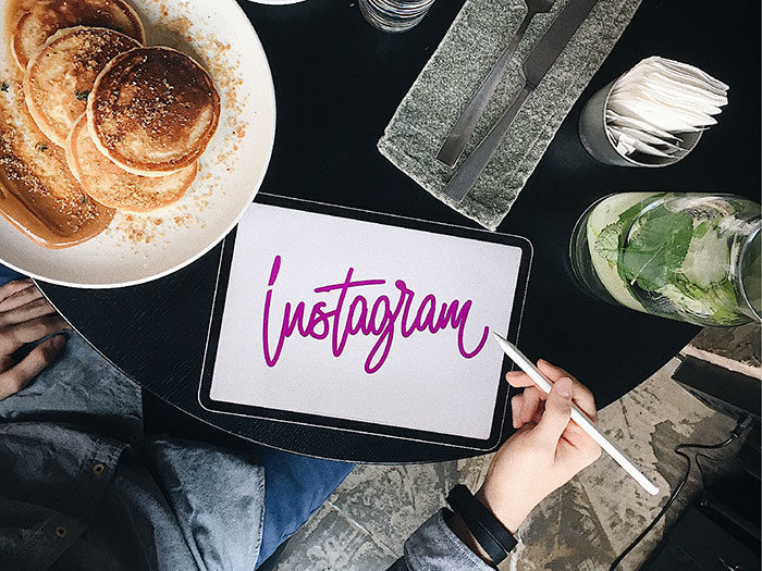
By 2022, Proxima Nova was showing up in the branding of dozens of tech companies. Instagram had no typographic identity it could call its own.
The brief for Instagram Sans was specific: create a typeface that works in every language Instagram operates in, reflects the “squircle” shape that defines the app’s logo, and feels both modern and human at the same time.
Instagram’s Creative Director Cynthia P. described the project as assembling a group of global typographers and creative technologists specifically to push the brand’s boundaries while keeping the best of what already existed.
There’s also a practical side to this. Custom brand typography eliminates licensing issues at scale. When a platform serves over 2 billion users and runs ads in dozens of countries, relying on a third-party font introduces legal and consistency risks. Owning the typeface outright removes that entirely.
The Headline style in particular was designed to carry personality. According to Instagram’s design team, the “squircle” forms in letters like “a” and “o” were intentional departures from conventional geometric sans-serif conventions. They wanted something that felt like it had been drawn by a person, not generated by a grid.
That combination of visual hierarchy control, global script support, and brand ownership is why Instagram built this font instead of licensing one. It’s also why you can’t download it. The typeface itself is part of what makes Instagram’s brand recognizable, and that recognition only works if no one else can use it.
If you’re curious how other platforms handle their brand typography, it’s worth checking out what the TikTok font, Pinterest font, and Snapchat font choices say about each platform’s identity. Each one tells a slightly different story.
FAQ on What Font Does Instagram Use
What is the main font Instagram uses?
Instagram’s primary brand font is Instagram Sans, a custom typeface launched in May 2022.
It appears in marketing, ads, and key interface elements. Inside the app, system fonts handle body text: SF Pro on iOS, Roboto on Android.
Who created Instagram Sans?
Colophon Foundry, a UK-based type studio, developed Instagram Sans in collaboration with Instagram’s in-house brand team and global type foundries.
A team of 40 typographers reviewed the font across multiple scripts and languages before release.
Is Instagram Sans free to download?
No. Instagram Sans is proprietary and not available for public download.
It’s owned by Meta. Using it outside the platform violates their brand guidelines. Free alternatives like Poppins or DM Sans closely match its geometric style.
What font did Instagram use before Instagram Sans?
From 2016 to 2022, Instagram relied on Proxima Nova across its web and app interfaces.
Before that, the original logo wordmark used Billabong, a handwritten script font created by Australian designer John Costello.
What font does Instagram use on iOS?
On Apple devices, Instagram uses SF Pro (San Francisco) for UI text, menus, and captions.
It’s Apple’s system font, optimized for small screens. Instagram adopts it to keep the interface consistent with the broader iOS experience.
What font does Instagram use on Android?
Android users see Roboto, Google’s default system font, throughout the Instagram interface.
Roboto was designed by Christian Robertson. Its geometric structure and open curves make it readable across different Android screen sizes and device manufacturers.
What fonts are available in Instagram Stories?
Instagram Stories currently offers several built-in text styles: Classic, Modern, Neon, Typewriter, Strong, and newer additions like Signature, Editor, Bubble, Deco, and Poster.
Instagram added 6 new font styles in late 2024, giving creators more expressive options for posts and Reels.
What type of font is Instagram Sans?
Instagram Sans is a geometric sans-serif typeface with humanist curve influences.
It features soft, rounded terminals inspired by the app’s “squircle” logo shape. The kerning and letterform details give it a human quality despite its clean structure.
What font does Instagram use for its logo?
Since 2022, the Instagram wordmark uses Instagram Sans.
Before that, the 2016 rebrand introduced a custom sans-serif wordmark, replacing the original Billabong script that defined Instagram’s early logo from 2010 to 2016.
What are the best free alternatives to Instagram Sans?
Poppins, DM Sans, Inter, and Nunito are the closest free options available on Google Fonts.
Each shares Instagram Sans’s clean geometry and strong screen legibility. Proxima Nova is the most accurate match but requires a paid font license through Adobe Fonts.
Conclusion
If you’ve been wondering what font does Instagram use, the answer covers three layers: Instagram Sans for brand identity, SF Pro for iOS UI, and Roboto for Android.
Each serves a specific purpose within the platform’s design system.
Instagram Sans, built with Colophon Foundry, replaced Proxima Nova in 2022 and gave Meta full typographic ownership for the first time. It’s proprietary, so for your own projects, fonts similar to Proxima Nova or options like Poppins and Inter are your best starting points.
Understanding Instagram’s typographic hierarchy is useful whether you’re building a brand, designing content, or just curious about the decisions behind one of the world’s most recognized social media platforms.

Renowned for his expertise in logo design and visual branding, Bogdan has developed a multitude of logos for various clients.
His skills extend to creating posters, vector illustrations, business cards, and brochures. Additionally, Bogdan's UI kits were featured on marketplaces like Visual Hierarchy and UI8.
He also wrote in the past years on sites like Design Your Way, WebDesignerDepot, WPDean, Designmodo, Speckyboy, Slider Revolution, and more.
- Pantone to HEX converter - 21 July 2026
- The Retool Logo History, Colors, Font, And Meaning - 20 July 2026
- CMYK to Pantone Converter - 19 July 2026

Bogdan Sandu is a seasoned designer who has been designing websites since 2008. Renowned for his expertise in logo design and visual branding, Bogdan has developed a multitude of logos for various clients. His skills extend to creating posters, vector illustrations, business cards, and brochures. Additionally, Bogdan's UI kits were featured on marketplaces like Visual Hierarchy and UI8. He also wrote in the past years on sites like Design Your Way, WebDesignerDepot, WPDean, Designmodo, Speckyboy, Slider Revolution, and more.
You Might Also Like