


From 1872 to 2020, Popular Science magazine covers told the story of how we imagined the future. Each issue captured the obsessions of its era, whether that was wartime aviation, Moon landings, or nanotechnology.
These covers did more than sell copies on the newsstand. They shaped how millions of people thought about science, technology, and progress.
Some won National Magazine Awards. Others became collectible prints that hang in offices and studios today. A few predicted entire industries decades before they existed.
This article breaks down the most notable PopSci covers across the magazine’s over 150-year print run. You’ll see how the cover art evolved from plain text pages to award-winning editorial design, and why certain issues still matter to collectors, designers, and science enthusiasts.
Best Popular Science Magazine Covers
Popular Science Monthly, May 1872 – The Inaugural Issue

Cover Image and Design
The very first issue of Popular Science Monthly looked nothing like what you’d expect from a magazine today. No flashy cover art. No bold typography screaming for attention.
It was a plain, text-heavy front page. About 100 pages of scholarly articles with barely any illustrations. The masthead sat at the top in a straightforward serif arrangement, and the whole thing read more like an academic journal than a newsstand publication.
Issue Date and Theme
Published in May 1872 by founder Edward L. Youmans. The premiere issue covered topics like Herbert Spencer’s “The Study of Sociology,” an essay on science and immortality, and a piece about the solar eclipse of December 1871.
Youmans himself called it “experimental.” He wanted to bring science to the educated public, not just researchers.
Why This Cover Stands Out
It’s where everything started. Over 150 years of science communication trace back to this single issue.
The cover represents a time when print design for science publications had zero visual flair. There was no need for newsstand appeal because the audience was already invested. That simplicity, honestly, is what makes it so collectible now.
Cover Art Style and Visual Approach
No illustrations on the cover itself. Just typeset text listing contents and publisher information. The interior had a few engravings (like a sketch of the sun’s corona), but the cover relied entirely on the weight of the publication’s name.
A very different approach from the bold emphasis and graphic treatments that would come decades later.
Key Topics Featured
- Herbert Spencer’s study of sociology
- The recent eclipse of the sun
- Science and immortality
- Disinfection and disinfectants
- The source of muscular power
Historical and Cultural Context
1872 was a period of rapid scientific growth. Darwin’s work was still fresh. Spencer had just coined “survival of the fittest.” Youmans saw a gap between academic research and public understanding, and this magazine was his answer.
Where to Find This Issue
The Internet Archive hosts Volume 1 (May to October 1872). Google Books also carries the full scan through a 2010 partnership with Popular Science. Free to read online.
Popular Science, September 1917 – World War I Era
Cover Image and Design
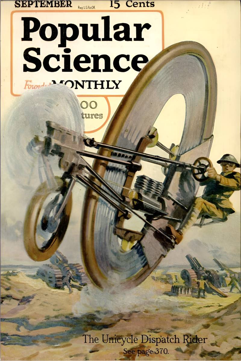
This is where Popular Science started looking like a real magazine. The September 1917 cover featured bold, painted illustrations with military and technology themes. Bright colors. Action scenes. The kind of cover art that grabbed you at the newsstand.
The cover lines promoted stories about wartime innovation and mechanical ingenuity.
Issue Date and Theme
September 1917. The United States had entered World War I just five months earlier. The magazine leaned heavily into patriotic content, covering military technology, aviation advances, and practical engineering for the war effort.
Why This Cover Stands Out
It marks the shift from scholarly journal to popular periodical. Editor Waldemar Kaempffert (formerly of Scientific American) had completely overhauled the magazine starting in late 1915. By 1917, the transformation was complete.
The circulation had already doubled. The new version had hundreds of short articles with hundreds of illustrations, all written for “the home craftsman and hobbyist.”
Cover Art Style and Visual Approach
Hand-painted illustration in a realistic style. Strong use of contrast between subject and background. The focal point was always a piece of technology or a person interacting with machinery.
These early painted covers feel like they belong in a museum now. They have that warm, analog quality you just can’t fake digitally.
Key Topics Featured
- Military aviation technology
- Wartime engineering innovations
- DIY mechanical projects
- Practical home science
Historical and Cultural Context
World War I pushed science magazines into the mainstream. People wanted to understand the technology behind the war. Popular Science filled that gap better than most, mixing accessible writing with detailed illustrations that showed how things actually worked.
Where to Find This Issue
Available on Google Books and the Internet Archive. Vintage print copies appear on eBay regularly, typically priced between $15 and $40 depending on condition.
Popular Science, May 1952 – “The S.S. United States”
Cover Image and Design
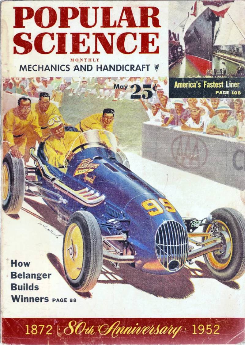
A stunning cover featuring the S.S. United States, America’s new superliner. The illustration showed the massive ocean liner in full glory, emphasizing its scale and engineering. The color palette was dominated by deep ocean blues and the ship’s sleek white hull.
Issue Date and Theme
May 1952. The cover story detailed everything about the S.S. United States before its maiden voyage. This was peak mid-century American optimism about engineering and transportation.
Why This Cover Stands Out
It’s a snapshot of a moment when ocean liners still mattered. Within 15 years, jet travel would make these ships obsolete for transatlantic crossings. But in 1952, building the fastest liner afloat was a matter of national pride.
The cover illustration perfectly captures that confidence. It’s the kind of image that makes you feel something, which is what the best magazine cover art should do.
Cover Art Style and Visual Approach
Mid-century illustration style with clean lines and bold color blocking. The composition used scale and proportion to make the ship look massive against the surrounding water. Very typical of 1950s science magazine cover art, where technology was always shown as grand and impressive.
Key Topics Featured
- S.S. United States technical specifications
- Marine engineering breakthroughs
- Cold War-era transportation technology
- Home improvement and DIY projects
Historical and Cultural Context
The early 1950s were the golden age of Popular Science magazine covers. The artwork was at its peak. Science fiction was booming. And the magazine sat right at the intersection of real technology and futuristic dreaming.
Where to Find This Issue
Searchable on Google Books. Framed prints of this cover are available from PopularSciencePrints.com. Original copies are popular with collectors.
Popular Science, February 2014 – The Major Redesign
Cover Image and Design
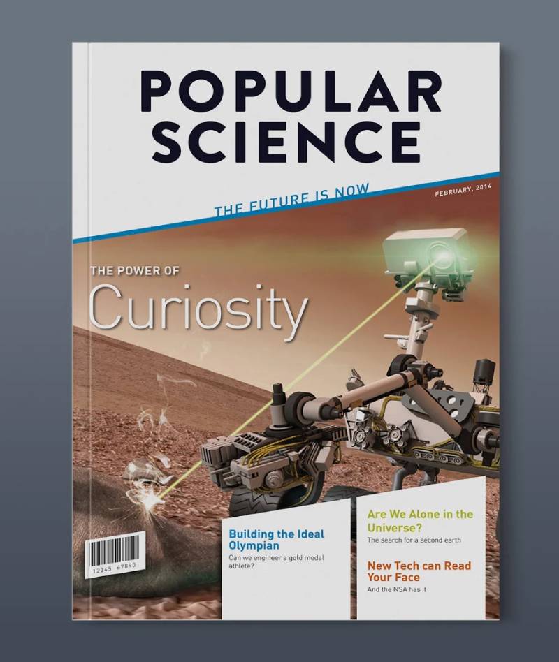
This was a complete visual overhaul. New logo, new layout, new everything. The February 2014 issue introduced a redesigned masthead and a format that leaned heavily on graphics, imagery, and modern editorial design.
The cover used bold color choices and contemporary typographic hierarchy to signal that this wasn’t your dad’s Popular Science anymore.
Issue Date and Theme
February 2014. The editors acknowledged the magazine’s 141-year history while pushing toward a broader, more visually driven audience. The cover story itself reflected this forward-looking approach.
Why This Cover Stands Out
It’s the first issue of the “new” Popular Science. The logo changed for the first time in 8 years. The entire magazine structure was rebuilt.
For anyone tracking the evolution of science magazine cover design, this is a major milestone. It shows how a 142-year-old publication tried to stay relevant in the age of tablets and smartphones. The redesign was completed by November 2014 with a matching website overhaul.
Cover Art Style and Visual Approach
Modern editorial design with heavy use of gradient effects, large-scale photography, and bold sans-serif type. The new visual identity drew from contemporary graphic design principles that prioritized clean layouts and high-impact imagery.
Key Topics Featured
- Technology innovation stories
- Environmental science coverage
- Consumer electronics
- The redesign itself as a statement about the future of print
Design Techniques Used
The 2014 redesign brought in a grid system for more structured page layouts. Heavier use of infographics. Larger photos with less text overlay. The goal was to make each page scannable and visually rich.
Where to Find This Issue
Available digitally through Zinio and Magzter. Some print copies still available from resellers.
Popular Science, March 2018 – Late Print Era Excellence
Cover Image and Design
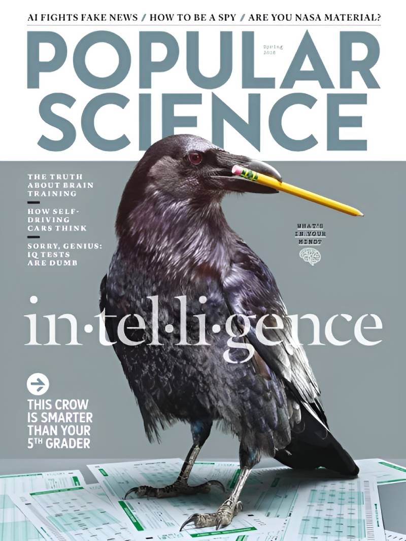
By March 2018, Popular Science had shifted to quarterly publication. The covers became more like poster designs, since each issue now had to carry weight for three months instead of one. Bigger visual statements. More deliberate art direction.
Issue Date and Theme
March 2018. This was one of the last print-era covers produced before the magazine began its transition to digital-only. It represented the final years of a publication tradition that stretched back to 1872.
Why This Cover Stands Out
It’s a beautiful example of what print science magazines could do when given the time and budget for strong art direction. The quarterly format meant more resources per cover, and it showed.
I think there’s something bittersweet about these late-era covers. They were better designed than ever, but the format was already dying.
Cover Art Style and Visual Approach
Photography and digital illustration combined. Strong use of color theory to create mood and direct the viewer’s eye. The layouts had evolved into something closer to fine art than traditional magazine design.
Key Topics Featured
- Science and technology deep dives
- Environmental reporting
- Space exploration updates
- Consumer tech reviews
Historical and Cultural Context
By 2018, print magazines were fighting for survival. Popular Science adapted by going quarterly, allowing each issue to function more like a special edition. This strategy bought time but didn’t prevent the eventual shift to digital in 2021.
Where to Find This Issue
Digital copies on Magzter. Print copies through magazine resellers and eBay.
Popular Science, Fall 2018 – “The Tiny Issue”
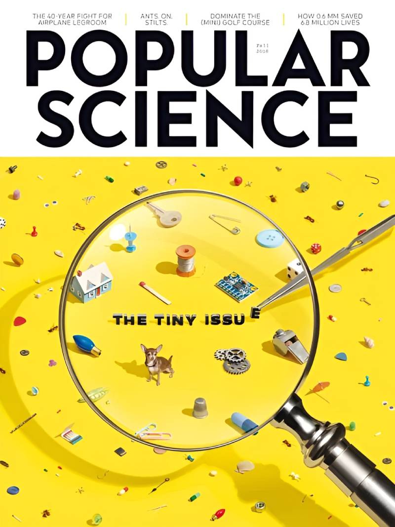
Cover Image and Design
The Tiny Issue took a bold design risk. Everything about this cover was built around the concept of miniaturization. The visual approach played with scale, using macro photography and clever framing techniques to make small things look enormous.
Issue Date and Theme
Fall 2018. A single-topic issue devoted entirely to the science of small things. Nanotechnology, microchips, tiny organisms, miniaturized engineering. Everything in the issue connected to a unified theme.
Why This Cover Stands Out
It won the National Magazine Award in 2019 for Single-Topic Issue. The American Society of Magazine Editors recognized it as one of the best magazine issues of the year.
What made it special wasn’t just the content. It was how the storytelling carried through every page. The cover set the tone, and the interior followed through. That kind of editorial consistency is harder to pull off than it looks.
Cover Art Style and Visual Approach
Macro photography paired with clean editorial typography. The design played with perception, using tight crops and unusual angles to create visual surprise. Smart application of rhythm across the cover’s composition.
Key Topics Featured
- Nanotechnology breakthroughs
- Microchip engineering
- Miniaturized medical devices
- Tiny organisms with outsized scientific importance
Design Techniques Used
The entire issue used a unified color palette and consistent typographic treatment to tie the single-topic concept together visually. A mood board approach likely guided the overall aesthetic direction.
Where to Find This Issue
Available on Amazon (print). Digital copies through Magzter and Zinio. Worth tracking down if you’re interested in award-winning magazine design.
Popular Science, 2021 – “The Heat Issue”

Cover Image and Design
This was the first cover to win a National Magazine Award in the digital-only format. No print version existed. The cover design had to work entirely on screens, which meant rethinking proportions, RGB color output, and how the image would render at different pixel densities.
Issue Date and Theme
2021. The Heat Issue was a comprehensive look at climate change, focusing on both the harsh realities and the engineering innovations being developed to address global warming. It won the 2022 ASME award.
Why This Cover Stands Out
It proved that digital-only science publications could still produce award-winning editorial work. A lot of people assumed the move away from print would mean a decline in quality. This issue proved them wrong.
Editor-in-chief Corinne Iozzio led the team that produced it. The issue also celebrated Popular Science’s 150-year anniversary, adding extra weight to an already significant publication.
Cover Art Style and Visual Approach
Digital-native design. The cover used high-saturation color to communicate urgency about climate topics. The composition didn’t need to work on a newsstand rack, so it could take bigger visual risks. No DPI constraints from print, just pure screen-optimized imagery.
Key Topics Featured
- Climate change science and data
- Heat-related engineering solutions
- Environmental technology innovation
- Global warming’s impact on communities
Historical and Cultural Context
Popular Science switched to all-digital in April 2021. The Heat Issue showed that the brand could survive (and thrive) without paper. It was a proof of concept for digital science journalism, and the ASME award validated the approach.
The magazine had been owned by Recurrent Ventures since 2020, after North Equity LLC purchased it from Bonnier Group. This new ownership structure pushed the digital-first strategy.
Where to Find This Issue
Available through PopSci+ digital subscription. You can also access it via the Popular Science website at popsci.com.
FAQ on Popular Science Magazine Covers
When was the first Popular Science magazine cover published?
The first issue launched in May 1872, founded by Edward L. Youmans. It was a plain, text-heavy scholarly journal with no cover illustrations. The visual magazine format didn’t arrive until the 1915 redesign under editor Waldemar Kaempffert.
What size were Popular Science magazine covers?
Most issues followed the standard American magazine trim size of roughly 8 x 10.75 inches. This stayed consistent across decades of print publication, from the early 1900s through the final print issues in 2020.
Are vintage Popular Science covers worth anything?
Yes. Collectible covers from the 1920s through 1960s sell for $15 to $100+ depending on condition and subject matter. Wartime issues and space-era covers tend to fetch the highest prices among collectors.
When did Popular Science stop printing physical magazines?
The last print issue came out in early 2020. Popular Science switched to an all-digital format in April 2021 under parent company Recurrent Ventures. The magazine format was fully abandoned by 2023.
Who designed the most iconic Popular Science covers?
The magazine used various illustrators and art directors over its 148-year print run. The mid-century era (1930s-1960s) produced the most recognized cover art, featuring hand-painted illustrations of futuristic technology and engineering.
Did Popular Science win any awards for its cover design?
Popular Science won over 58 awards total, including ASME awards in 2003, 2004, 2019, and 2022. The Tiny Issue (2018) and The Heat Issue (2021) both won for Single-Topic Issue excellence.
Where can I browse old Popular Science magazine covers?
Google Books hosts scans from 1872 through March 2009 for free. The Internet Archive carries early volumes. Sites like CoverBrowser.com display a full gallery of cover thumbnails organized by decade.
How did Popular Science cover design change over the years?
It evolved from plain text (1872) to painted illustrations (1917-1960s) to photography-based layouts (1970s-2000s) to modern digital design. The 2014 redesign introduced a new logo and graphics-heavy format.
Can I buy prints of Popular Science magazine covers?
Yes. PopularSciencePrints.com sells framed and unframed art prints of vintage covers. Prices start around $19 for art prints and go up to $111+ for framed versions. Original copies also circulate on eBay.
What topics appeared most often on Popular Science covers?
Aviation, automobiles, space technology, and DIY projects dominated across decades. The magazine consistently featured consumer technology previews, military engineering during wartime, and futuristic concepts like flying cars and personal robots.
Conclusion
Popular Science magazine covers documented over a century of scientific progress through editorial illustration, photography, and digital design. From the text-only premiere in 1872 to the award-winning Heat Issue in 2021, each cover reflected the visual communication standards of its time.
The mid-century painted covers remain the most collectible. But the later digital-era issues proved that strong art direction survives any format change.
Whether you’re a vintage magazine collector, a science journalism fan, or someone studying the history of publication design, these covers offer a unique record. They show what excited people about science at every point in modern history.
The print run ended. The archive didn’t. Every issue from 1872 to 2009 is still free to browse on Google Books.

Renowned for his expertise in logo design and visual branding, Bogdan has developed a multitude of logos for various clients.
His skills extend to creating posters, vector illustrations, business cards, and brochures. Additionally, Bogdan's UI kits were featured on marketplaces like Visual Hierarchy and UI8.
He also wrote in the past years on sites like Design Your Way, WebDesignerDepot, WPDean, Designmodo, Speckyboy, Slider Revolution, and more.
- Jujutsu Kaisen Font Generator - 12 October 2026
- The Windsurf Logo History, Colors, Font, And Meaning - 10 October 2026
- How to Remove Background From Product Photos (No Photoshop) - 10 October 2026

Bogdan Sandu is a seasoned designer who has been designing websites since 2008. Renowned for his expertise in logo design and visual branding, Bogdan has developed a multitude of logos for various clients. His skills extend to creating posters, vector illustrations, business cards, and brochures. Additionally, Bogdan's UI kits were featured on marketplaces like Visual Hierarchy and UI8. He also wrote in the past years on sites like Design Your Way, WebDesignerDepot, WPDean, Designmodo, Speckyboy, Slider Revolution, and more.
You Might Also Like


