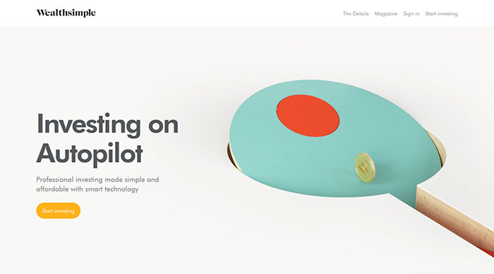
Startup website design examples sort into four patterns, each built for a different job: showing the product, explaining the offer, selling the brand, or collecting a waitlist.
Selection follows stage fit, because Stripe, Slack and Dropbox, the usual anchors of these lists, left the early stage years ago. A seed-stage team has neither their budget nor their traffic.
Every pattern still answers to the same measured limits. Since March 12, 2024, Interaction to Next Paint has replaced First Input Delay as a Core Web Vital, which adds a 200-millisecond responsiveness line next to the 2.5-second loading line (web.dev, 2024).
Startup website design examples worth studying
Group the examples by what the homepage is built to do: show the product, explain the offer, sell the brand, or collect a waitlist. That grouping tells you which pattern to copy at your stage.
| Example | Pattern | Strongest element | Limit |
|---|---|---|---|
| Linear | Product-led | Restrained layout, interface as the main visual | Needs a finished product to show |
| Dropbox | Explainer-led | Plain statement of what the product does | Weak when the offer takes a paragraph to explain |
| Mailchimp | Brand-led | Color and illustration carry the personality | Can hide the product from technical buyers |
| Superhuman | Waitlist-led | One action: request access | Only works with real demand |
| Basecamp | Long-form sales page | An argument built from top to bottom | Needs strong copy and patient visitors |
Product-led homepages
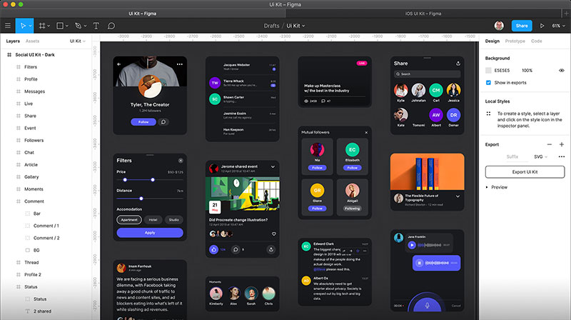
Who does it: Linear, Notion, Figma, Vercel.
- The interface is the main visual
- Copy stays short because the screens carry the explanation
- Works best for tools used daily by a technical or professional audience
Webstacks points out that Notion shows its real product interface across the page, not only mockups, and calls Linear’s homepage calm and deliberate. Vercel (a developer platform) and Figma (a design tool) follow the same logic for audiences who judge a tool by looking at it.
Limit: a pre-product team has no interface to show. Prototype screenshots look thin next to Linear’s.
Explainer-led homepages

Explainer-led pages answer one question: what does this do?
Unicorn Platform describes Dropbox’s page as clean and uncluttered, and Webstacks says Stripe’s homepage reads as direct and calm even though the product is complex. Slack takes a friendlier route, showing real use cases from team chat to AI tools.
This pattern suits a startup with a live MVP and one clear job to explain. It breaks down when the product has five equal use cases.
Brand-led homepages
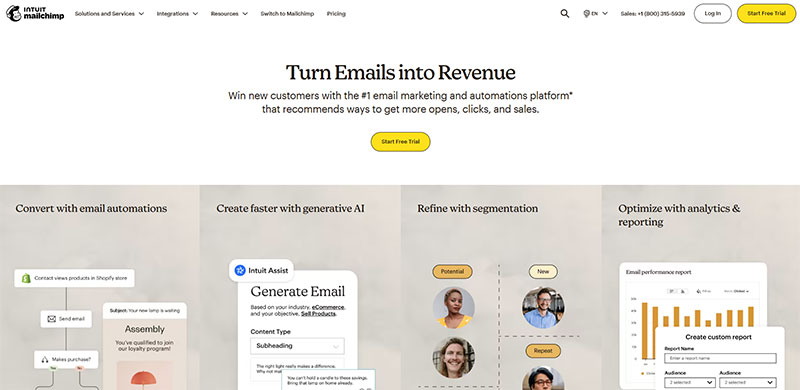
Mailchimp built its identity on illustration and color. Airbnb built its homepage around photography of places.
Works when: the product is simple and the customer chooses on feeling.
Fails when: the buyer is technical and wants to see the product before reading a word.
Waitlist-led homepages
Superhuman ran a waitlist, and founder Rahul Vohra personally onboarded every new user for years, according to an a16z speedrun summary of a fireside chat.
A waitlist page has one job: capture the request. A pricing grid or feature tour adds choices the visitor cannot act on yet.
Which pattern fits which stage
- Waitlist stage: waitlist-led, one headline, one form
- MVP live: explainer-led, one product visual
- Funded and scaling: product-led, with proof and pricing
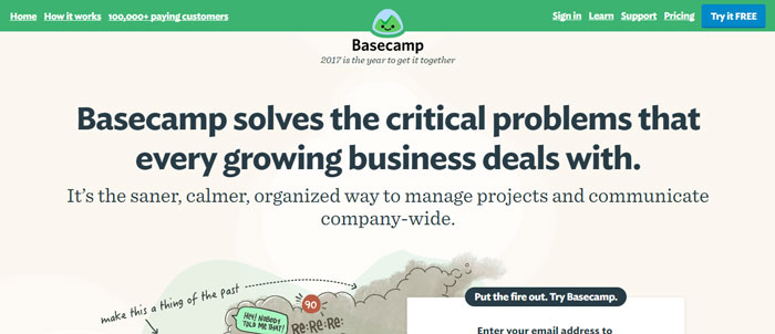
Basecamp is the counterexample to short homepages. Its long page argues the case from the top down, which only works when the copy earns every scroll.
Stripe, Slack, Dropbox, Airbnb and Notion stopped being early-stage years ago, so as of October 2026 their sites reflect mature-company budgets. Copy the pattern, not the polish.
For launch-stage sites, a longer gallery of standout startup sites is a better benchmark. Zebracat, Rabbit and Deed, all from current Webflow and HTMLBurger roundups, sit closer to a real early-stage budget.
How the best startup hero sections work

A strong hero section has three parts: an outcome headline, a one-sentence subheadline, and a visual of the real product. Nielsen Norman Group puts the window for landing the value proposition at about 10 seconds.
Headline types
- Outcome claim: Zebracat opens with “Create viral videos in seconds” and spends the rest of the page backing it up, per Webflow
- Category label: names what the product is, useful when the category is unfamiliar
- Product name: only works when the name already means something to the visitor
Subheadline job
The subheadline says who the product is for and how it works. One sentence.
If it repeats the headline in softer words, delete it.
Product visual types
- Live product interface (Linear, Notion)
- Animated interface (Vareto)
- Feature visuals (Asana)
- Photo or illustration, for consumer products
Webflow notes that Vareto’s page opens with a headline and an animated image of the tool, and SeedProd describes Asana explaining features through visual examples.
Whatever the visual, the headline, subheadline and button need a clear order for the eye to follow. The visual should support that order instead of competing with it.
Where hero sections fail
Nielsen Norman Group’s 1997 study found that 79 percent of test users scanned new pages and only 16 percent read word by word. The study is old, but the habit has not reversed.
A hero that makes a big claim with no product visual leaves the visitor to take it on faith.
Headlines like “The future of work” fail the scan test for the same reason. They say nothing a competitor could not say.
Which visual style fits a startup site?
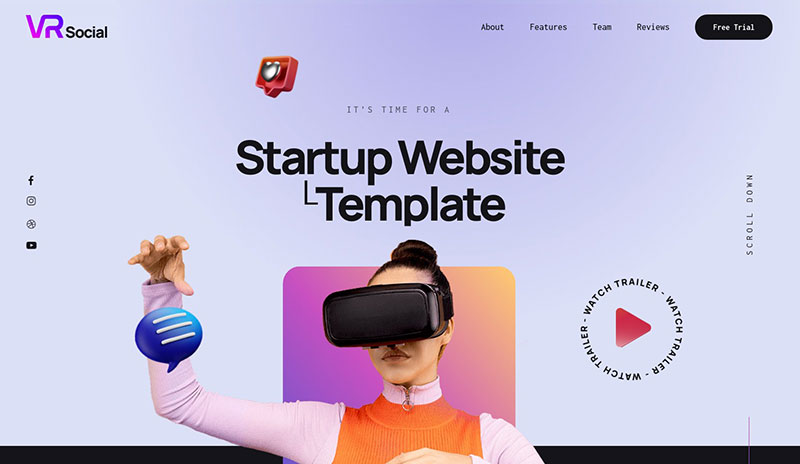
Match the style to the buyer and the product’s complexity: minimal for simple offers, illustration for consumer brands, screenshot-led for software, dark mode for developer tools.
Minimalist-first roundups, such as Crazy Egg’s, tell founders to avoid crowded layouts. Webstacks’ SaaS picks include monday.com, a homepage it describes as full of energy.
Both advice sets hold. The less a visitor needs to understand, the less the page needs to carry.
Minimal
Pros:
- Fast to scan
- Few assets to load and maintain
- Easy to extend as the product grows
Cons:
- Looks like every other minimal site
- Hides detail a complex product needs
Minimal does not mean empty. Minimalist layout principles still demand deliberate type, spacing and one accent color, and a careful font pairing does most of the work.
Illustration-led
Mailchimp is the reference point.
Pros: distinct brand voice, no dependence on photography, easy to rework for campaigns.
Cons: custom illustration takes time, and enterprise buyers can read it as unserious.
Screenshot-led
- Pro: visitors see the product before reading anything
- Con: screens go stale with every interface update
- Pro: Notion and Linear show the product doing real work
- Con: dense screens shrink into noise on a phone
Dark mode
WCAG 2.2 success criterion 1.4.3 sets a minimum contrast of 4.5:1 for body text and 3:1 for large text. W3C adds that the computed ratio is not rounded, so 4.499:1 fails.
Passing in a light layout does not guarantee passing in a dark one. Gray body text on near-black is the usual culprit, and hero headlines placed over photos without an overlay have the same problem.
Run every text and background pairing, hover states included, through a contrast checking tool before launch.
Pro: product screens stand out, and developer audiences expect it from tools like Linear and Vercel. Con: low-contrast text is easy to ship by accident.
Navigation and call to action placement
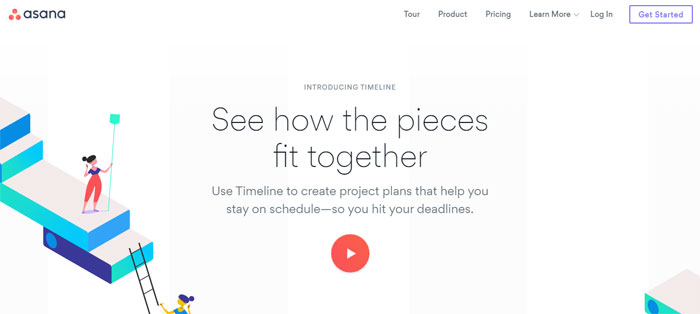
Keep the top bar to the few links a visitor needs before signing up, then put one primary button at its right edge and repeat it in the hero.
Navigation
- Visible text links on desktop, a hamburger icon only on mobile
- A workable set: product, pricing, customers, login, plus the button
- A sticky bar keeps the button in reach while visitors scroll (Webflow credits KeyReply’s site for this)
- Mega menus belong to sites with dozens of pages
Nielsen Norman Group research found that hiding navigation behind a menu icon raises task time and lowers menu use compared with visible links. That cost is acceptable on a phone and avoidable on a desktop.
Call to action wording and placement
Request a demo: sales-led B2B products where a person closes the deal.
Start free trial: tools a visitor can test alone, with low commitment.
Join waitlist: pre-launch pages like Superhuman’s.
Placement: header right, hero, and again at the bottom after the proof.
Single versus dual call to action
Unbounce analyzed 18,639 landing pages and found a single call to action converted at 13.5 percent, against 11.9 percent for two and 10.5 percent for three (reported by MarketingProfs, 2019).
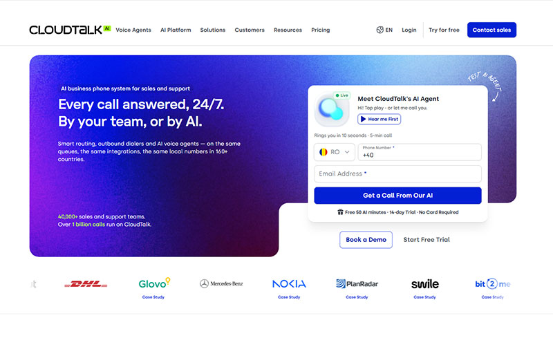
Browsee’s review of CloudTalk’s page shows the other side: two buttons, one for a demo form and one for a free trial. The Unbounce data covers landing pages, not product homepages, and the two kinds of page do different jobs.
Use two buttons only when they serve visitors at different stages of readiness. Make one filled and primary, the other a plain text or outline style.
Hotjar heatmaps show where clicks and scroll depth actually land. Test the hero button wording against a variant before redesigning anything.
Which social proof formats work when you have few customers?
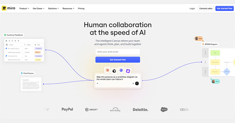
Four formats cover most startup sites: a logo bar, named testimonials, usage metrics and review badges. With few customers, lean on the ones that need the fewest of them.
Logo bar: sits under the hero. Webstacks notes that Slack’s page pairs stats with customer logos without slowing the page.
Named testimonials: name, role and company, ideally with a face.
Usage metrics: HTMLBurger describes Deed’s site as pairing 3D models with metrics that show its value.
Review badges: only from platforms the visitor recognizes and can click through to.
What to show before you have customers
- Investor or accelerator logos
- Press mentions
- Waitlist size
Where proof breaks
Unverifiable proof costs trust. Logos from companies that never agreed to appear, quotes with no name, and numbers with no date all read as decoration.
Place proof next to the decision it supports: a testimonial beside the sign-up button, a metric beside the claim it backs.
Pricing page layouts startups use
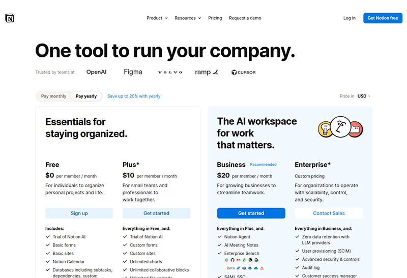
Published pricing guides converge on one layout: three tier cards, the middle plan highlighted, and a monthly and annual toggle above the cards. A comparison table goes below when the plans differ on many features.
| Layout | Best for | Watch out |
|---|---|---|
| Cards only | One product, two or three simple plans | Feature differences get buried |
| Cards plus comparison table | Plans that differ on many features | Long scroll on mobile |
| Contact sales | Enterprise or custom usage | Visitors cannot size the cost |
Tier count and the highlighted plan
- Two tiers fit simple products, such as free and paid
- Three tiers give visitors a middle reference point, according to HTMLBurger’s pricing pattern guide
- A “Most popular” cue on the middle plan makes it the baseline the other plans get compared against
- Past three, every extra tier adds one more comparison the visitor has to make
Billing toggle
Guides disagree on the default.
Annual first: several pricing guides argue that showing monthly pricing first makes visitors anchor to the higher number.
Monthly first: HTMLBurger notes that visitors check the monthly rate first, and recommends a discount for annual billing.
Both camps agree on the details that matter: label Monthly and Annual clearly, and show the saving as a plain number.
When contact sales replaces public pricing
Use it for enterprise tiers with custom usage. Keep public prices for the plans a visitor can buy alone, because a page with no numbers gives self-serve buyers nothing to compare.
Webflow, Framer or custom code: which build fits a startup?
Pick Webflow when content will keep growing, Framer when speed to launch matters most, custom code when engineers own the site, and a template builder when the site stays simple.
| Platform | Fits | Design control | Main limit |
|---|---|---|---|
| Webflow | Teams with a designer and growing content | High, visual editor plus custom code | Steeper learning curve |
| Framer | Small teams launching fast | High for layout and animation | No code export |
| Custom code | Teams with engineers | Full | Developer time for every change |
| Wix or Squarespace | Simple sites run by one person | Template-bound | Little custom interaction |
Webflow and Framer

Ownership: Webflow exports clean HTML and CSS, while Framer offers no code export, according to comparison reviews from Subframe and Rapidevelopers.
Content depth: Rapidevelopers rates Webflow ahead on CMS depth. Both platforms include managed hosting.
No export means a rebuild if the team outgrows the tool. That cost is easy to ignore on launch week.
Plan prices disagree across published comparisons, by plan tier and by date. Read each vendor’s pricing page the week you buy.
One 2026 review rates Framer faster out of the box than Webflow, but publishes no test method. Measure your own build before believing either claim.
Custom code with Next.js and Tailwind CSS
- Full control over markup and speed
- Every copy change needs a developer or a headless CMS
- The right call when the team needs code ownership or custom logic
Wix and Squarespace

Template builders suit a simple site that one non-designer maintains. Browsing real sites built on Squarespace shows how far the templates stretch before custom interaction hits a wall.
Failure mode: heavy animation scripts on any no-code build slow interaction response, and the builder’s visual editor will not warn you.
Page speed and accessibility standards for startup sites
Google’s Core Web Vitals give a startup site three pass lines: loading, responsiveness and layout stability. Two of them have hard numbers that a team can check this week.
- LCP good: 2.5 seconds or less
- LCP poor: above 4.0 seconds
- INP good: 200 milliseconds or less
- Measured at: the 75th percentile of page loads, split by mobile and desktop
- Field data window: 28 days in the Chrome User Experience Report
All five values come from web.dev documentation.
Dated change: INP replaced FID
On March 12, 2024, Interaction to Next Paint replaced First Input Delay as a Core Web Vital, and Search Console dropped FID, per the web.dev announcement.
Any speed checklist that still lists FID is out of date.
Lab data versus field data
Lighthouse: one controlled test load. Good for diagnosing why a page is slow.
Field data: real Chrome users over 28 days. Good for deciding whether a problem exists at all.
web.dev warns that the two can disagree, even for the same page. A strong Lighthouse score does not clear a poor field result.
The Lighthouse accessibility category has a similar limit. Automated checks cover only part of WCAG, so a high score is not a conformance statement.
Image format and font loading
- AVIF or WebP instead of JPEG
- Explicit width and height on the hero image and the logo
- Preload the hero image and give it high fetch priority
- Never lazy-load the hero image
- font-display: swap on custom fonts, loading only the weights the page uses
Whatever the hero visual is (live interface, animation, photo), that element usually becomes the LCP element. Its file size and loading priority set the score.
When copying a well-known startup site backfires
Copying fails when the example’s context does not match yours: its audience, its traffic, its build or its promise.
Audience mismatch: a dark, code-flavored page built for developers reads cold to a consumer buyer.
Borrowed promise: copying a competitor’s headline copies its claim, and your product may not keep it.
Animation weight: scroll effects cost scripts, and scripts cost interaction response on mid-range phones.
Galleries of animated websites reward spectacle. HTMLBurger praises Deleito for smooth 3D scrolling that makes browsing feel interactive, but a founder should test that kind of effect against the INP line before adopting it.
Copy the structure that solved a problem you share. Skip the parts that only make the example look expensive.
How to adapt an example to your own startup site
- Pick the example whose pattern matches your stage and your buyer, not your taste
- Write the headline and subheadline in plain words before touching a layout
- Choose the platform, then set a loading budget of 2.5 seconds for LCP
- Launch with one primary button and the real proof you have today
- Read heatmaps and recordings before changing anything, then test one variable at a time
If you only have a week
Copy the explainer-led pattern. One headline, one subheadline, one real product visual and one button.
Build it on a Webflow or Framer template, export images as AVIF or WebP, and check LCP in field data once traffic arrives.
Startup Website Design FAQ
Is a startup homepage the same as a landing page?
No. A homepage serves several audiences and links outward, while a landing page serves one campaign and one action. Early on, a waitlist page can play both roles until traffic comes from more than one source.
How many pages does a startup website need at launch?
Four cover most launches: homepage, pricing (if the product is self-serve), about, and a contact or demo page. Add a blog or docs only when someone will maintain them.
How long should a startup homepage be?
As long as its pattern requires. A waitlist page fits one screen, an explainer-led homepage runs a few sections, and a long sales page in the Basecamp style needs room for a full argument.
Does a startup homepage need a video?
Only when the product is hard to show in a still image. Video adds loading weight, so serve a poster image first and load the file afterward to protect the LCP score.
Should a startup use a website template?
Yes, for a first version. Templates on Webflow, Framer, Wix or Squarespace get a site live fast. Rewrite the headline, product visual and proof first, because those carry what makes you different.
How much does a startup website cost?
It depends on the build path. A template costs a platform plan plus a domain, while hiring this design agency or another professional team adds design fees, and custom code adds engineering time.
Where can you find more startup website examples?
Awwwards recognizes top web, UI and UX projects, and The Best Designs showcases work from around the world. For launch-stage sites specifically, current roundups from Webflow and HTMLBurger are the better starting point.
What should a startup about page show?
The founders, the problem the product solves, and real backers if there are any. Link to open roles only when roles are actually open.
What to Build First on a Startup Site
Startup website design examples pay off in a fixed order: the message first, the proof second, the speed budget third, and visual polish last.
- Message: headline and subheadline
- Proof: only what is real today
- Speed budget, then polish
Words cost the least to change and polish is the easiest to postpone, so this sequence protects a small budget.
The trade-off is a plainer first version next to a funded competitor. Teams that accept that go live sooner and learn from real traffic.
This order was verified in October 2026, and a change to Google’s Core Web Vitals set would reorder the speed step.
Once the first version holds, record the winning type, colors and button styles in a short brand style guide so later pages match.

Renowned for his expertise in logo design and visual branding, Bogdan has developed a multitude of logos for various clients.
His skills extend to creating posters, vector illustrations, business cards, and brochures. Additionally, Bogdan's UI kits were featured on marketplaces like Visual Hierarchy and UI8.
He also wrote in the past years on sites like Design Your Way, WebDesignerDepot, WPDean, Designmodo, Speckyboy, Slider Revolution, and more.
- Best Email Design System Examples From Leading Brands - 5 October 2026
- Canva AI Features Reviewed: Are They Actually Useful? - 4 October 2026
- The Substack Logo History, Colors, Font, And Meaning - 2 October 2026

Bogdan Sandu is a seasoned designer who has been designing websites since 2008. Renowned for his expertise in logo design and visual branding, Bogdan has developed a multitude of logos for various clients. His skills extend to creating posters, vector illustrations, business cards, and brochures. Additionally, Bogdan's UI kits were featured on marketplaces like Visual Hierarchy and UI8. He also wrote in the past years on sites like Design Your Way, WebDesignerDepot, WPDean, Designmodo, Speckyboy, Slider Revolution, and more.
You Might Also Like