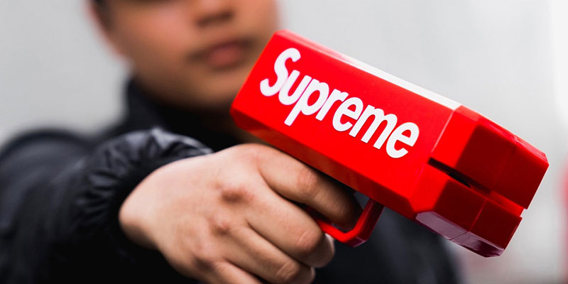
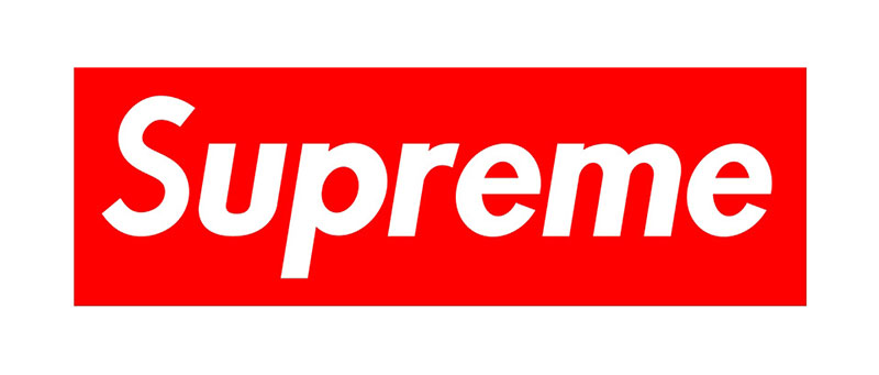
Supreme uses Futura Heavy Oblique, a geometric sans-serif font designed by Paul Renner in 1927.
The brand adopted this typeface when James Jebbia founded Supreme on Lafayette Street in New York City in April 1994. It appears as white lettering set inside the brand’s iconic red box, forming one of the most recognized wordmarks in streetwear.
Supreme’s version is a slightly modified take on the original Futura Heavy Oblique, with tighter letter spacing and subtle adjustments to specific characters like the “E” and “R” that give it a distinct look while staying close to the source material.
—
What Type of Font Is Futura Heavy Oblique?
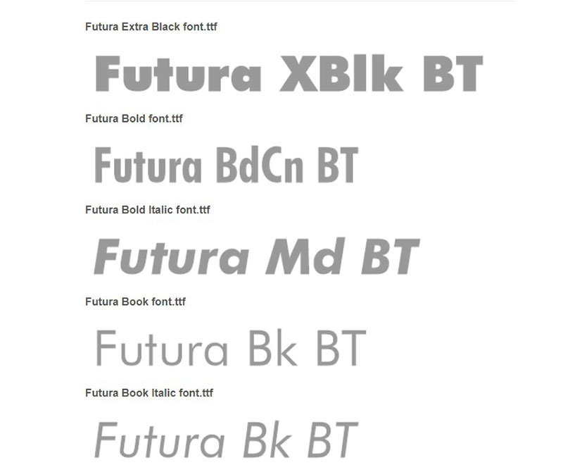
Futura Heavy Oblique is a geometric sans-serif typeface. It belongs to the geometric grotesque classification, built on circular and square forms rather than humanist or calligraphic proportions.
The “Heavy” weight sits above Bold in Futura’s weight scale, giving the letterforms a dense, high-impact presence. The “Oblique” style is a slanted version of the upright, not a true italic. True italics redraw the letterforms entirely; oblique fonts simply tilt the roman design forward.
Key visual characteristics:
- Stroke contrast: Near-uniform stroke weight throughout
- Terminals: Geometric, cut at right angles rather than rounded
- x-height: Moderate, contributing to strong visual hierarchy at display sizes
- Forward slant: Creates energy and a sense of movement at rest
This combination makes it effective for short, high-impact display use. It falls apart at small body text sizes, which is fine since Supreme never needed it there.
Who Designed Futura Heavy Oblique?
Paul Renner designed Futura, and the Bauer Type Foundry in Frankfurt, Germany, published it in 1927.
Renner developed the typeface independently, though its aesthetic aligns closely with the Bauhaus design movement of the same period. He was not a Bauhaus member, but shared the school’s interest in reducing letterforms to their geometric essentials.
The Bold Oblique and Heavy Oblique styles were released in 1930 as extensions of the original family.
Futura was not commissioned specifically for Supreme. James Jebbia licensed an existing commercial typeface, not a bespoke one. The logo’s designer, Brendon Babenzien, applied the typeface to the red box concept inspired by artist Barbara Kruger’s work.
Since 2001, Futura has been a registered trademark of Bauer Types S.L. In June 2025, Bauer Types and TypeTogether announced a partnership to release “Futura 100,” described as a more accurate and globally inclusive update of the original.
Is Futura Heavy Oblique Free to Use?
No. Futura is a commercial typeface. It requires a paid font license for commercial use.
Here are the main licensed sources:
| Version | Distributor | License Type |
| Futura Now | Monotype / MyFonts | Paid (desktop, web, app) |
| Futura PT | Adobe Fonts (Paratype) | Included with Creative Cloud |
| Futura (Linotype) | Fonts.com / Linotype | Paid per license type |
Futura PT via Adobe Fonts is cleared for both personal and commercial use as long as you maintain an active Creative Cloud subscription. Desktop, web, and app uses each require separate license coverage under Monotype’s model.
Worth noting: Futura entered the public domain in Germany in 2026 (70 years after Paul Renner’s death), though specific digitized versions may still carry separate copyright protection depending on jurisdiction.
What Font Did Supreme Use Before Futura?
Supreme launched with Futura Heavy Oblique from day one in 1994. There was no earlier primary typeface for the brand.
That said, Supreme did briefly experiment with an “Old English” style in the late 1990s for specific product lines and limited runs. This was short-lived and never replaced the main box logo.
In 2017, Supreme updated the logo with a heavier weight and slightly more pronounced slant. The core typeface remained Futura. The change was more of a refinement than a rebrand.
Supreme has also used various secondary typefaces across different product lines, campaigns, and collaborations over the years, but the red box wordmark has stayed locked to Futura throughout.
Best Free Alternatives to Futura Heavy Oblique
You can’t use Supreme’s exact font without a commercial license. These 5 free options come closest to replicating its geometric weight and forward-leaning energy.
| Font | Similarity | License | Source |
| Jost | Closest overall match, single-story “a,” geometric proportions | OFL (free commercial use) | Google Fonts |
| Josefin Sans | Tall x-height, geometric Art Deco structure | OFL (free commercial use) | Google Fonts |
| Nunito | Geometric base with softened terminals | OFL (free commercial use) | Google Fonts |
| Kumbh Sans | Clean geometry, strong in heavier weights | OFL (free commercial use) | Google Fonts |
| Montserrat | Geometric sans-serif, widely available, multiple weights | OFL (free commercial use) | Google Fonts |
Jost was specifically built as an open-source Futura alternative and scores a 90% similarity rating on FontAlternatives. It supports the single-story “a” that defines Futura’s lowercase through a stylistic set (CSS: font-feature-settings: "ss01" 1).
For an oblique style, most of these offer italic variants that approximate the forward-leaning angle. None replicate the exact heaviness of Futura Heavy Oblique out of the box, so combining Black weight with a CSS skew can help close the gap.
If you want to explore more options, check out this full list of fonts similar to Futura.
How to Use Futura-Style Fonts in Design Tools
In Figma
Using Google Fonts: Figma pulls Google Fonts automatically. Search “Jost” or “Josefin Sans” directly in the font picker and set the weight to Black or ExtraBold for a heavy display look.
For the licensed Futura PT, install it via Adobe Fonts and the Figma desktop app will detect it locally.
In Canva
Canva has a built-in “Futura” option in its font library for Pro users. Free accounts can upload fonts to Canva manually by going to Brand Kit and uploading the .ttf or .otf file.
Josefin Sans is available natively in Canva’s free font library as a solid fallback.
In Photoshop
If you have a Creative Cloud subscription, Futura PT is available directly through Adobe Fonts. Activate it in the Adobe Fonts panel and it will appear in Photoshop’s font list automatically.
Alternatively, you can add fonts to Photoshop by installing any .ttf or .otf file at the system level. Photoshop picks up system fonts on restart.
For Web Use
Embed Jost via Google Fonts for zero-cost web use:
“ <link href="https://fonts.googleapis.com/css2?family=Jost:wght@900&display=swap" rel="stylesheet"> `
Then in CSS:
` font-family: 'Jost', sans-serif; font-weight: 900; font-style: italic; `
This gives you a heavy oblique geometric font that reads close to Futura without any licensing cost.
Why Did Supreme Choose This Font?
The short answer: James Jebbia handed a book on Barbara Kruger’s artwork to his designer, and the logo came directly from that.
Kruger, a conceptual artist active since the 1970s, built her signature style around white Futura Bold Italic text placed on red rectangles, layered over found photography. Her work critiques consumerism and gender politics through the visual language of advertising. Jebbia, who openly acknowledged the logo was “based directly” on Kruger’s work in connection with a later lawsuit, saw the graphic system and translated it into a brand identity.
The choice made practical sense beyond the art reference. Futura Heavy Oblique carries specific psychological weight. The forward slant communicates momentum. The heavy stroke weight projects confidence without requiring any decoration. The geometric construction fits cleanly inside a rectangular frame at any size, from a sticker to a billboard.
Futura’s industrial roots in the Bauhaus movement also resonated with streetwear’s utilitarian aesthetic. The font psychology here isn’t subtle. Bold geometric sans-serifs signal authority, modernity, and a refusal to apologize for taking up space. That’s exactly the attitude Supreme built its brand around.
The red-and-white color system amplifies this. Red carries urgency and dominance. White lettering on red creates maximum contrast, making the wordmark readable at any size and from any distance. The typography and color work as a single system, not two separate decisions.
It’s also worth noting that Futura never goes away. Unlike trendy display faces that date quickly, Futura’s geometry keeps it looking current decade after decade. For a brand built on limited drops and controlled scarcity, anchoring the visual identity to something that doesn’t age was a smart long-term move.
Other brands using Futura or its close variants include Nike (Futura Extra Bold Condensed Oblique), Louis Vuitton, Volkswagen, and Dolce & Gabbana. Supreme sits in good company typographically, even if its use of the face is arguably the most culturally loaded of the group.
If you’re drawn to the aesthetic these best fonts for clothing brands use, Futura’s combination of weight and geometry is worth studying as a model. Few typefaces have punched as far above their weight class in terms of cultural impact relative to their visual simplicity.
FAQ on What Font Does Supreme Use
What font does Supreme use in its logo?
Supreme uses Futura Heavy Oblique, a geometric sans-serif typeface designed by Paul Renner in 1927.
The white wordmark sits inside a red box, a format directly inspired by artist Barbara Kruger’s visual style.
Is the Supreme font the same as Futura Bold?
Not exactly. The Supreme logo uses the Heavy Oblique variant, which is heavier than standard Futura Bold.
Supreme’s version also features tighter letter spacing and minor character tweaks, making it a modified take on the original typeface.
Did Supreme design its own custom font?
No. Supreme licensed an existing commercial typeface rather than commissioning a bespoke one.
The logo’s distinct look comes from character modifications and tight spacing applied to Futura Heavy Oblique, not from a fully original design.
Who designed the Supreme logo?
Designer Brendon Babenzien created the logo in 1994 using Futura Heavy Oblique as the typeface base.
James Jebbia provided a book on Barbara Kruger’s artwork as the visual reference, which directly shaped the red box and white lettering format.
Is the Supreme font free to download?
Futura Heavy Oblique is a commercial font and requires a paid license for any use.
Futura PT is accessible through Adobe Fonts with an active Creative Cloud subscription, cleared for both personal and commercial projects.
What are the best free alternatives to the Supreme font?
Jost is the closest free alternative, built specifically as an open-source Futura substitute with matching geometric proportions.
Josefin Sans, Montserrat, and Kumbh Sans are solid options too, all available free on Google Fonts for commercial use.
Why did Supreme choose Futura for its branding?
The forward slant signals momentum, and the heavy stroke weight projects confidence without any decoration.
Futura’s geometric sans-serif structure also fits cleanly inside a rectangular box at any size, from a small sticker to a large storefront sign.
What color is the Supreme logo font?
The wordmark is set in white, placed against a red background inside the brand’s signature box.
This high-contrast combination maximizes legibility at any scale and is central to the Supreme brand’s visual identity system.
Has Supreme ever changed its font?
Supreme refined the logo in 2017 with a heavier weight and a slightly more pronounced slant, but the core typeface stayed the same.
The brand briefly used an Old English style on select product lines in the late 1990s, though it never replaced the main box logo.
What other brands use Futura?
Nike uses Futura Extra Bold Condensed Oblique. Volkswagen has used Futura in advertising since the 1960s.
Louis Vuitton, Dolce & Gabbana, and Absolut Vodka all rely on Futura or close variants as part of their brand typography systems.
Conclusion
So, what font does Supreme use? Futura Heavy Oblique, a geometric sans-serif typeface from 1927 that became one of streetwear’s most recognized wordmarks.
The choice was never accidental. Barbara Kruger’s visual language, James Jebbia’s instincts, and Futura’s bold oblique letterforms all converged into a brand identity that has stayed consistent for over three decades.
If you need something close without the licensing cost, Jost or Josefin Sans are your best starting points for replicating that geometric sans-serif weight and forward-leaning energy.

Renowned for his expertise in logo design and visual branding, Bogdan has developed a multitude of logos for various clients.
His skills extend to creating posters, vector illustrations, business cards, and brochures. Additionally, Bogdan's UI kits were featured on marketplaces like Visual Hierarchy and UI8.
He also wrote in the past years on sites like Design Your Way, WebDesignerDepot, WPDean, Designmodo, Speckyboy, Slider Revolution, and more.
- Canva vs PowerPoint: Which Is Better for Presentations? - 22 September 2026
- How to Install Fonts on Mac (Step-by-Step Guide) - 20 September 2026
- From Mockup to Code: How AI-Augmented Development Speeds Up the Design Handoff - 19 September 2026

Bogdan Sandu is a seasoned designer who has been designing websites since 2008. Renowned for his expertise in logo design and visual branding, Bogdan has developed a multitude of logos for various clients. His skills extend to creating posters, vector illustrations, business cards, and brochures. Additionally, Bogdan's UI kits were featured on marketplaces like Visual Hierarchy and UI8. He also wrote in the past years on sites like Design Your Way, WebDesignerDepot, WPDean, Designmodo, Speckyboy, Slider Revolution, and more.
You Might Also Like