Lawyers most commonly use Times New Roman, Century Schoolbook, and Garamond for legal documents. The choice depends on the jurisdiction, the document type, and whether the filing goes to a court with specific font rules.
The U.S. Supreme Court, for example, requires all booklet-format briefs to be set in a Century family font, such as Century Expanded, New Century Schoolbook, or Century Schoolbook, at 12-point size with at least 2 points of leading.
Most other courts accept any legible serif font at 12 to 14 points, but a handful have banned specific options outright.
—
What Type of Font Do Lawyers Typically Use?
The legal field defaults to serif typefaces for body text. That’s not arbitrary. Research referenced in the Seventh Circuit’s practitioner handbook found that readers retained text in serif fonts nearly 10% better than equivalent text in sans-serif fonts.
Federal appellate rules actually require serif type for brief body text. Sans-serif fonts like Arial or Helvetica are permitted only for headings and captions in those filings.
Here’s how the most common legal fonts break down:
| Font | Classification | Primary Use | Court Status |
| Century Schoolbook | Serif (Century family) | Briefs, appellate filings | Required by U.S. Supreme Court (Rule 33) |
| Times New Roman | Serif (transitional) | General court filings | Accepted widely; discouraged by 7th Circuit |
| Garamond | Serif (old-style) | Contracts, firm documents | Generally accepted |
| Bookman Old Style | Serif (book face) | Electronic filings | Required by FL Supreme Court (14pt) |
| Arial | Sans-serif | Headings, web content | Recommended by 7th Circuit for screen reading |
The Federal Rules of Appellate Procedure also require proportionally spaced typefaces to be 14-point or larger for body text in federal appeals courts.
Why Do Lawyers Use These Specific Fonts?
Most of it comes down to readability and retention, not tradition. Judges at the appellate level read roughly 1,000 pages of briefs per argument session. A font that improves retention by even a few percentage points matters in that context.
The Century family was designed specifically for book reading, which makes it suited to legal briefs. Century Schoolbook features wider letter shapes and generous spacing, which improves readability at small sizes and in dense passages.
Times New Roman, by contrast, was designed in 1929 by typographer Stanley Morison for The Times of London. Its narrow, closely spaced letterforms were built to help newspaper readers skim quickly, not to encourage careful reading of a 40-page brief.
The Seventh Circuit put it plainly: lawyers don’t want their audience to read fast and discard the document. They want to maximize retention. That’s a different goal from what Times New Roman was built for.
Who Designed the Most Common Legal Fonts?
Century Schoolbook
Designed by: Morris Fuller Benton for American Type Founders (ATF) in 1923.
It belongs to the Century type family, which ATF originally developed in the late 1890s. The U.S. Supreme Court adopted it for its opinions and later formally required it for all booklet-format briefs under Rule 33(1)(b).
Century Schoolbook has been called the “crème de la crème of legal fonts” by legal typography commentators, and Matthew Butterick’s book Typography for Lawyers placed it on the short “A list” of recommended fonts for attorneys.
Times New Roman

Arial

Designed by: Stanley Morison and Victor Lardent for The Times of London in 1932, later digitized and distributed by Monotype.
It became the default font in early versions of Microsoft Word, which is largely why it became so embedded in legal practice. It wasn’t a deliberate choice by the legal profession. It was just there.
The U.S. Department of State used Times New Roman as its standard document font from 2004 to 2023, then switched to Calibri, before reverting to Times New Roman again in 2025.
Garamond
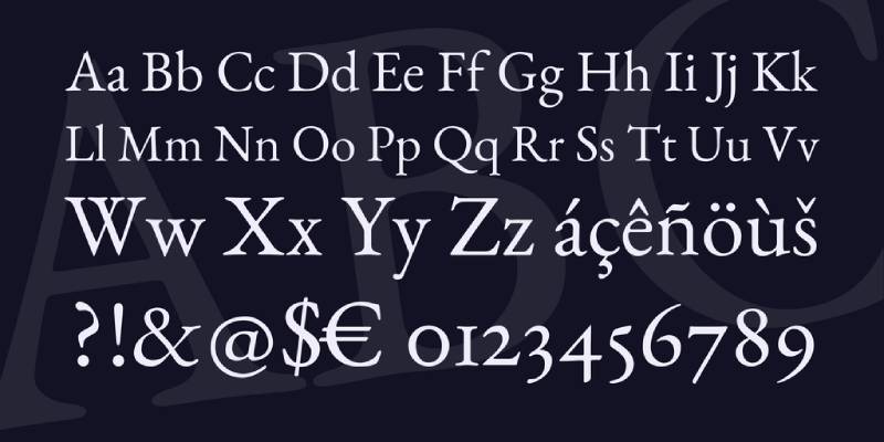
Designed by: Claude Garamond in the 16th century, with modern digital revivals by Adobe (Adobe Garamond) and Google (Cormorant Garamond, a free variant).
It’s less dense than Times New Roman and suits formal documents like estate planning files, firm brochures, and contracts that need a more refined appearance. At small sizes it can look thin on low-resolution screens, which is worth keeping in mind.
Are These Fonts Free to Use?
Depends on which one you’re using and how you’re using it.
Times New Roman is a Monotype typeface. It comes bundled with Microsoft Windows and Office products, but that license covers personal and internal business use. If you’re embedding it in a document you’re distributing commercially, check the license terms.
Century Schoolbook is also a commercial Monotype font. It ships with Microsoft Office, so most lawyers already have it. New Century Schoolbook, a slightly different version from URW, requires a paid license if sourced separately.
Garamond has multiple versions with different licensing. Adobe Garamond is a paid commercial font. Cormorant Garamond is free via Google Fonts under the SIL Open Font License and is a solid free alternative for firms that want that old-style serif look without licensing costs.
For font licensing in general: always verify before embedding fonts in PDFs or client-facing documents. Legal professionals, of all people, probably shouldn’t be violating font licenses.
What Font Did Lawyers Use Before Times New Roman?
Before desktop publishing became standard, legal documents were typed on typewriters. The default font was Courier, a monospaced typeface developed by IBM in the 1950s.
Courier’s design had nothing to do with readability. It was built to simplify typewriter mechanics: every letter takes up the same horizontal space, which allowed typewriter correction keys to be a uniform size.
When word processors replaced typewriters in the 1980s and 1990s, Times New Roman inherited the default slot. Microsoft Word shipped with it as the out-of-the-box font, and law firms carried the habit forward.
Courier New persisted in legal practice longer than most people expect. Some courts still accept it for transcripts and deposition summaries, where consistent line spacing and uniform character width matter for layout. That said, most courts have moved away from it for general filings, and the North Carolina Supreme Court stopped publishing opinions in Courier New in favor of Century Schoolbook.
Best Free Alternatives to Standard Legal Fonts
If you need court-compliant alternatives without paid licenses, these are worth looking at:
| Font | Resembles | License | Source |
| Libre Baskerville | Baskerville; a classic “British” legal serif. | OFL (Free) | Google Fonts |
| Merriweather | Century Schoolbook; wide stance, high legibility. | OFL (Free) | Google Fonts |
| Cormorant Garamond | Garamond; elegant, thin “old-style” serif. | OFL (Free) | Google Fonts |
| Georgia | Times New Roman; but optimized for screens. | System Font | Pre-installed |
| EB Garamond | Garamond; a meticulous open-source revival. | OFL (Free) | Google Fonts |
Merriweather is probably the most court-safe free option if you need something that reads like Century Schoolbook. It has wide letterforms and generous spacing, and it renders well in both print and PDF.
Georgia is a solid pick for anything screen-facing. It was designed specifically for low-resolution screens, unlike Times New Roman, and it’s already on every major operating system.
How to Use Legal Fonts in Your Documents
For Court Filings
Check your court’s local rules first. This is not optional.
- U.S. Supreme Court: Century family, 12pt body, 10pt footnotes, 2pt leading minimum
- Federal appellate courts (FRAP Rule 32): Serif, 14pt or larger for body text
- Florida Supreme Court: Arial or Bookman Old Style at 14pt
- Virginia Supreme Court: Cambria, Century, Century Schoolbook, Georgia, Palatino Linotype, Times New Roman (among others)
- Georgia Supreme Court: Serif only for body, 13pt minimum, Helvetica or Verdana permitted for headings
Using the wrong font in a federal court filing can get the document rejected. Some courts won’t warn you first.
For Contracts and Client Documents
You have more flexibility here. The standard advice is to use 12-point body text minimum, bump to 14 points for anything that will be read on a screen, and keep line spacing generous.
Good leading matters more than people realize. Tight line spacing on a dense legal document is genuinely difficult to read. Most attorneys who format contracts in Microsoft Word leave this at the default, which is often too tight.
For firm letterhead and branded documents, you have room to be more intentional. Understanding font psychology helps here: serif fonts signal authority and tradition, which is usually what law firms want to project. The typographic hierarchy of your documents, how headings, subheadings, and body text relate to each other visually, affects how clients perceive your firm’s professionalism before they read a single word.
For Law Firm Websites
Different rules apply online. Sans-serif fonts like Georgia (technically a screen-optimized serif), sans-serif options like Arial or Helvetica, or modern choices like Inter or Source Sans Pro tend to perform better on screens.
Times New Roman and Century Schoolbook were designed for print. They can look slightly dated and cramped on a website at small sizes.
Most law firm sites use a combination: a serif font for headings to signal authority, and a clean sans-serif for body text to maximize screen readability. If you want practical guidance on pairing, a font pairing generator can save time when testing combinations.
Why the Font Choice Actually Matters in Legal Practice
This isn’t just aesthetics. The Seventh Circuit’s practitioner handbook is unusually direct about it: judges read roughly 1,000 pages per argument session, and a font that improves retention is a competitive advantage.
Century Schoolbook’s wider letterforms mean each line contains fewer characters than Times New Roman. That sounds inefficient until you consider that it also means each line is easier to parse. The 7th Circuit noted that briefs should read like books, not newspapers, and the font should match that goal.
There’s also the question of document length. Century Schoolbook’s wider characters mean the same content runs slightly longer than it would in Times New Roman. For attorneys working against page limits, that’s a practical consideration worth knowing before switching.
Matthew Butterick, the Harvard-trained typographer and attorney behind Typography for Lawyers, placed Times New Roman on his “C list” of questionable fonts and Century Schoolbook on his “A list.” His core argument is simple: typography affects how carefully your document gets read, and for legal writing, that affects outcomes. The best fonts for professional documents are ones that serve the reader, not the writer’s habits.
Well, almost. Some things in legal practice move slowly. Times New Roman is still the default in most law schools and many state courts. It’ll be around for a while.
FAQ on What Font Do Lawyers Use
What is the most common font used in legal documents?
Times New Roman remains the most widely used font in legal documents. It ships as a default in Microsoft Word, which is mostly why it stuck. Century Schoolbook is increasingly preferred for court filings due to better readability and retention.
What font does the U.S. Supreme Court require?
The Supreme Court requires all booklet-format briefs to use a Century family font, specifically Century Expanded, New Century Schoolbook, or Century Schoolbook, at 12-point size with at least 2 points of leading between lines.
Can lawyers use sans-serif fonts in court filings?
Generally, no. Federal appellate rules require serif fonts for body text in briefs. Sans-serif options like Arial are permitted only for headings and captions. Some state courts make exceptions, so always check local rules.
What font size do lawyers use for legal documents?
Most courts require a minimum of 12-point for body text. Federal appellate courts set the bar at 14-point. The Florida Supreme Court specifically requires 14-point Arial or Bookman Old Style for electronic filings.
Is Times New Roman still acceptable for court filings?
It depends on the court. Times New Roman is accepted in most jurisdictions. The Seventh Circuit actively discourages it. The U.S. Supreme Court prohibits it entirely, requiring Century family fonts instead.
What font do lawyers use for contracts?
For contracts, attorneys most often use Times New Roman, Garamond, or Georgia. There are no strict rules outside of court filings, so the choice usually reflects the firm’s brand or the document’s formality level.
Why do lawyers prefer serif fonts over sans-serif fonts?
Research cited by the Seventh Circuit found that readers retained serif text nearly 10% better than sans-serif text. For long documents like briefs, that retention difference has real consequences for how well a judge absorbs the argument.
What is the best font for legal briefs?
Century Schoolbook is widely considered the top choice for legal briefs. It has wider letterforms than Times New Roman, better spacing, and stronger retention scores. Matthew Butterick’s Typography for Lawyers ranks it on his “A list” of fonts for attorneys.
What font did lawyers use before Times New Roman?
Before word processors, legal documents were typed in Courier, a monospaced font developed by IBM in the 1950s for typewriter mechanics. When Microsoft Word became standard, Times New Roman replaced it as the default.
Are there free font alternatives lawyers can use?
Yes. Merriweather and Libre Baskerville are free via Google Fonts and both suit formal legal documents. Georgia is pre-installed on most systems and works well for screen-facing documents. All three carry professional-grade readability for legal use.
Conclusion
Understanding what font do lawyers use comes down to one core principle: readability drives retention, and retention affects outcomes.
Century Schoolbook leads for formal court filings and appellate briefs. Times New Roman still works in most jurisdictions, though its days as the unquestioned default are fading.
For contracts and client-facing documents, Garamond, Georgia, and Bookman Old Style all hold up well. Font size, leading, and tracking matter just as much as the typeface itself.
Always check your jurisdiction’s court formatting rules before filing. Everything else is a judgment call.

Renowned for his expertise in logo design and visual branding, Bogdan has developed a multitude of logos for various clients.
His skills extend to creating posters, vector illustrations, business cards, and brochures. Additionally, Bogdan's UI kits were featured on marketplaces like Visual Hierarchy and UI8.
He also wrote in the past years on sites like Design Your Way, WebDesignerDepot, WPDean, Designmodo, Speckyboy, Slider Revolution, and more.
- The Windsurf Logo History, Colors, Font, And Meaning - 10 October 2026
- How to Remove Background From Product Photos (No Photoshop) - 10 October 2026
- How Designers can Build a Stronger Online Creative Identity - 9 October 2026

Bogdan Sandu is a seasoned designer who has been designing websites since 2008. Renowned for his expertise in logo design and visual branding, Bogdan has developed a multitude of logos for various clients. His skills extend to creating posters, vector illustrations, business cards, and brochures. Additionally, Bogdan's UI kits were featured on marketplaces like Visual Hierarchy and UI8. He also wrote in the past years on sites like Design Your Way, WebDesignerDepot, WPDean, Designmodo, Speckyboy, Slider Revolution, and more.
You Might Also Like