Comic Sans gets a bad rap, but sometimes you need that casual, approachable vibe without the stigma. Whether you’re designing educational materials, creating child-friendly content, or just want something more relaxed than traditional serif fonts, fonts similar to Comic Sans offer the perfect middle ground.
The challenge isn’t finding alternatives. It’s finding ones that actually work.
Many designers struggle with this exact problem. They need friendly, readable typography that feels approachable without looking unprofessional. The good news? There are dozens of quality options that capture Comic Sans’ playful spirit while offering better design flexibility.
This guide covers handpicked alternatives that range from subtle improvements to complete style departures. You’ll discover fonts that work for everything from classroom materials to creative projects.
Each recommendation includes practical use cases, pairing suggestions, and accessibility considerations to help you make informed typography choices.
Fonts Similar To Comic Sans
| Font Name | Platform Availability | Primary Use Case | Design Characteristics |
|---|---|---|---|
| Comic Neue | Cross-platform (Google Fonts) | Professional casual design | Refined letterforms, improved legibility |
| Chalkboard | macOS system font | Educational materials | Chalk-like texture, classroom aesthetic |
| Chalkboard SE | macOS system font | Enhanced educational content | Special edition with refined strokes |
| Kristen ITC | Windows system font | Decorative headlines | Condensed, tall letterforms |
| Cavolini | Commercial font license | Creative projects | Rounded, whimsical appearance |
| Segoe Print | Windows system font | Handwritten-style content | Brush-like strokes, informal feel |
| Trellis | Specialty font foundry | Artistic typography | Geometric structure, playful design |
| Kidprint | Educational software | Children’s learning materials | Child-like handwriting simulation |
| Schoolbell | Google Fonts library | Web-friendly casual text | Clean, readable handwriting style |
| Patrick Hand | Google Fonts library | Personal branding content | Natural handwriting appearance |
Comic Neue

Comic Neue represents a sophisticated reimagining of Comic Sans, designed by Craig Rozynski in 2014. This casual script font modernizes the original’s playful nature while addressing its technical shortcomings. The typeface maintains approachable handwriting characteristics without the controversial quirks that plagued its predecessor.
Typography Characteristics
- Weight variations: Light, Regular, Bold with corresponding angular versions
- Character set: Extended Latin script supporting most European languages, including Cyrillic and Greek
- Letter spacing: Improved kerning and refined character spacing
- Readability: Enhanced legibility through consistent letterforms and proper baseline alignment
Visual Design Properties
- Stroke style: Refined handwritten quality with polished terminals
- Letter shapes: Smoother curves and more balanced proportions than Comic Sans
- Baseline consistency: Stable character alignment maintaining readability
- Font personality: Professional yet approachable casual tone
Use Cases and Applications
- Target audience: General users, including typography professionals
- Project types: Educational materials, informal communications, digital content
- Industry applications: Publishing, education, casual branding
- Platform compatibility: Web fonts, desktop publishing, mobile applications
Technical Specifications
- Font format: OpenType, TrueType, WOFF, WOFF2
- File size: Optimized for web performance
- Browser support: Universal modern browser compatibility
- Licensing: SIL Open Font License (free for commercial use)
Comparison to Comic Sans
Comic Neue successfully refines Comic Sans’ informality while improving professional acceptability. The redesigned letterforms eliminate awkward quirks while preserving the original’s friendly character, making it suitable for broader applications.
Chalkboard
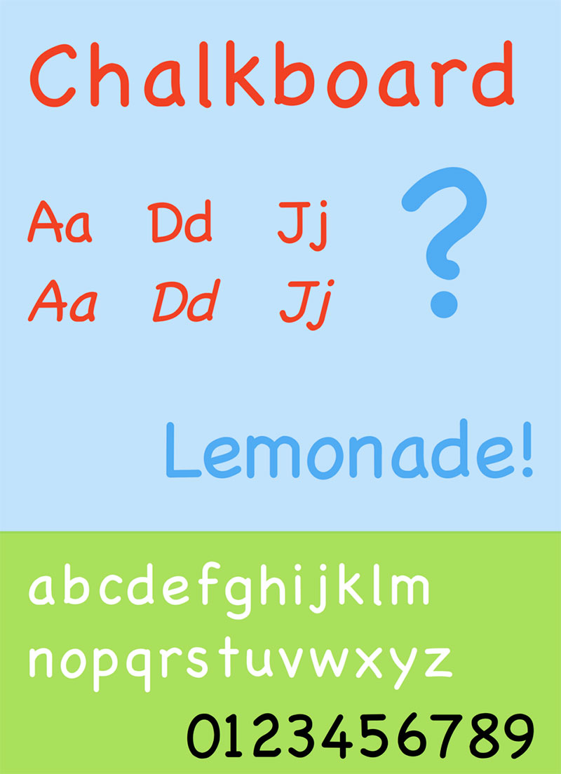
Chalkboard emerged from Apple in 2003 as part of Mac OS X v10.3. This distinctive typeface mimics chalk-drawn letters with natural texture and informal character. Apple designed it to compete with Comic Sans while offering superior aesthetic qualities for casual typography applications.
Typography Characteristics
- Weight variations: Regular weight with consistent stroke thickness
- Character set: Basic Latin character support
- Letter spacing: Natural spacing reflecting hand-drawn characteristics
- Readability: Clear distinction between characters despite textured appearance
Visual Design Properties
- Stroke style: Rough, chalk-like texture with organic edges
- Letter shapes: Slightly irregular forms suggesting hand-lettered chalkboard writing
- Baseline consistency: Moderate variation creating authentic handmade feel
- Font personality: Educational, nostalgic, and approachable
Use Cases and Applications
- Target audience: Students, educators, casual designers
- Project types: Educational presentations, classroom materials, informal documents
- Industry applications: Education, entertainment, child-focused content
- Platform compatibility: macOS system font, limited cross-platform availability
Technical Specifications
- Font format: TrueType format
- File size: Standard system font size
- Browser support: Limited to Apple ecosystem by default
- Licensing: Apple proprietary (included with macOS)
Comparison to Comic Sans
Chalkboard offers a more textured, educational aesthetic compared to Comic Sans’ smooth curves. While both target informal applications, Chalkboard’s chalk-inspired design provides stronger thematic context for educational content.
Chalkboard SE

Chalkboard SE (Special Edition) builds upon the original Chalkboard with expanded language support and improved character coverage. Released alongside macOS updates, it maintains the chalk-inspired aesthetic while supporting international typography needs through extended character sets.
Typography Characteristics
- Weight variations: Regular and Bold weights available
- Character set: Extended support including Cherokee, Greek, and Cyrillic scripts
- Letter spacing: Consistent with original Chalkboard spacing
- Readability: Enhanced through broader character differentiation
Visual Design Properties
- Stroke style: Preserved chalk texture with refined execution
- Letter shapes: Maintains irregular, hand-drawn character forms
- Baseline consistency: Authentic variation suggesting manual creation
- Font personality: Educational warmth with international accessibility
Use Cases and Applications
- Target audience: Global educators, multilingual content creators
- Project types: International educational materials, multicultural presentations
- Industry applications: Education, children’s media, informal multilingual content
- Platform compatibility: macOS system integration, broader language support
Technical Specifications
- Font format: TrueType with extended Unicode coverage
- File size: Larger due to expanded character set
- Browser support: macOS native, requires licensing for other platforms
- Licensing: Apple proprietary with extended language coverage
Comparison to Comic Sans
Chalkboard SE provides similar casual appeal with educational context that Comic Sans lacks. The textured appearance and international character support make it more specialized for educational applications.
Kristen ITC

George Ryan designed Kristen ITC for International Typeface Corporation, drawing inspiration from handwritten restaurant menus. This casual script captures childlike handwriting qualities while maintaining professional typography standards. The design deliberately embraces asymmetric characteristics suggesting authentic manual lettering.
Typography Characteristics
- Weight variations: Regular and Bold weights with distinct character
- Character set: Standard Latin character support with punctuation
- Letter spacing: Natural handwriting rhythm and flow
- Readability: Clear character recognition despite informal structure
Visual Design Properties
- Stroke style: Genuine handwriting feel with natural irregularities
- Letter shapes: Childlike proportions with authentic asymmetry
- Baseline consistency: Intentional variation mimicking child’s handwriting
- Font personality: Playful, innocent, and genuinely handcrafted
Use Cases and Applications
- Target audience: Children, parents, casual designers
- Project types: Children’s books, playful branding, informal invitations
- Industry applications: Children’s entertainment, education, family-oriented businesses
- Platform compatibility: Desktop publishing, limited web font availability
Technical Specifications
- Font format: TrueType, PostScript formats
- File size: Standard commercial font size
- Browser support: Requires licensing for web implementation
- Licensing: Commercial ITC license required
Comparison to Comic Sans
Kristen ITC offers more authentic handwriting characteristics than Comic Sans’ designed regularity. While both target casual applications, Kristen ITC provides genuine childlike charm rather than Comic Sans’ attempted informality.
Cavolini

Carl Crossgrove created Cavolini for Monotype, specifically targeting small screen legibility while maintaining handwritten charm. This versatile family combines casual appeal with technical optimization for digital environments. The design balances informality with professional clarity requirements.
Typography Characteristics
- Weight variations: Regular, Bold, Italic in standard and condensed widths
- Character set: Extensive Latin, Cyrillic, and Greek character support
- Letter spacing: Generous spacing optimized for small screen reading
- Readability: Large x-height and clear apertures enhance legibility
Visual Design Properties
- Stroke style: Handwritten character with refined execution
- Letter shapes: Open forms with clearly defined counters
- Baseline consistency: Stable alignment supporting extended reading
- Font personality: Professional casualness with approachable warmth
Use Cases and Applications
- Target audience: Digital designers, mobile app developers, general users
- Project types: Mobile interfaces, digital reading, casual branding
- Industry applications: Technology, education, informal communication
- Platform compatibility: Optimized for screens, web fonts, mobile devices
Technical Specifications
- Font format: OpenType with comprehensive feature set
- File size: Optimized for digital performance
- Browser support: Excellent cross-platform web compatibility
- Licensing: Monotype commercial licensing
Comparison to Comic Sans
Cavolini provides technical sophistication Comic Sans lacks while maintaining similar approachability. The extensive weight options and screen optimization make it more versatile for professional digital applications.
Segoe Print

Segoe Print represents Microsoft’s contribution to casual handwriting fonts, designed to complement the broader Segoe font family. This clean, readable script maintains professional standards while offering informal character suitable for various digital applications within the Windows ecosystem.
Typography Characteristics
- Weight variations: Regular and Bold weights
- Character set: Standard Latin character coverage
- Letter spacing: Balanced spacing for optimal readability
- Readability: Clear character distinction with friendly appeal
Visual Design Properties
- Stroke style: Clean handwriting simulation without texture
- Letter shapes: Consistent proportions with slight informal variation
- Baseline consistency: Stable character alignment
- Font personality: Friendly professionalism with casual undertones
Use Cases and Applications
- Target audience: Windows users, business communicators, casual designers
- Project types: Office documents, presentations, informal digital content
- Industry applications: Business communication, education, general computing
- Platform compatibility: Windows system integration, limited cross-platform use
Technical Specifications
- Font format: TrueType system font
- File size: Standard Windows system font size
- Browser support: Windows native, requires licensing elsewhere
- Licensing: Microsoft proprietary system font
Comparison to Comic Sans
Segoe Print offers cleaner, more professional handwriting aesthetics than Comic Sans. Both serve similar casual communication needs, but Segoe Print maintains better integration with business environments.
Trellis
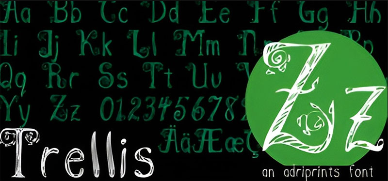
Trellis provides a hand-lettered script option focusing on clean, readable handwriting simulation. This font bridges the gap between formal typography and casual handwritten communication, offering designers a reliable option for projects requiring approachable yet professional text presentation.
Typography Characteristics
- Weight variations: Single weight focusing on optimal balance
- Character set: Standard character support for basic typography needs
- Letter spacing: Natural handwriting flow with consistent rhythm
- Readability: Clean letterforms ensuring clear communication
Visual Design Properties
- Stroke style: Simplified handwriting without complex flourishes
- Letter shapes: Balanced proportions maintaining readability
- Baseline consistency: Steady character alignment
- Font personality: Clean casualness with understated charm
Use Cases and Applications
- Target audience: Designers seeking clean handwriting alternatives
- Project types: Casual branding, informal communications, personal projects
- Industry applications: Design, education, casual business communication
- Platform compatibility: Desktop publishing, limited digital optimization
Technical Specifications
- Font format: Standard desktop font formats
- File size: Compact for basic character coverage
- Browser support: Limited web font availability
- Licensing: Standard commercial or free licensing varies by distributor
Comparison to Comic Sans
Trellis offers cleaner handwriting aesthetics without Comic Sans’ controversial associations. While both target casual applications, Trellis provides more refined execution suitable for professional casual contexts.
Kidprint
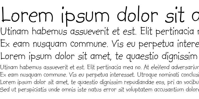
Steve Matteson designed Kidprint for Monotype to authentically replicate children’s printing style. This specialized display font captures the genuine characteristics of early learning handwriting, making it ideal for educational materials and child-focused design applications.
Typography Characteristics
- Weight variations: Regular and Bold weights mimicking child development stages
- Character set: Basic Latin characters with child-appropriate punctuation
- Letter spacing: Natural spacing reflecting learning handwriting patterns
- Readability: Clear despite intentional childlike irregularities
Visual Design Properties
- Stroke style: Authentic child printing with natural inconsistencies
- Letter shapes: Genuine learning-stage proportions and formations
- Baseline consistency: Slight variation suggesting developing motor skills
- Font personality: Innocent, educational, and authentically childlike
Use Cases and Applications
- Target audience: Educators, children’s content creators, parents
- Project types: Educational materials, children’s books, learning resources
- Industry applications: Education, children’s entertainment, family services
- Platform compatibility: Desktop publishing, educational software
Technical Specifications
- Font format: Professional font formats from Monotype
- File size: Standard commercial font size
- Browser support: Requires commercial licensing for web use
- Licensing: Monotype commercial licensing required
Comparison to Comic Sans
Kidprint provides authentic child handwriting characteristics that Comic Sans only approximates. While both target educational applications, Kidprint offers genuine developmental authenticity for specialized educational contexts.
Schoolbell
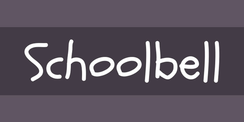
Brian J. Bonislawsky created Schoolbell for Font Diner, capturing the whimsical character of school chalkboard writing and children’s drawings. This playful typeface brings nostalgic classroom charm to digital projects while maintaining practical readability for contemporary applications.
Typography Characteristics
- Weight variations: Single weight optimized for display use
- Character set: Complete Latin character set with punctuation and numbers
- Letter spacing: Open spacing supporting clear character recognition
- Readability: Friendly letterforms with clear character differentiation
Visual Design Properties
- Stroke style: Smooth handwriting with slight wobble suggesting chalk drawing
- Letter shapes: Rounded, bouncy characters with playful irregularities
- Baseline consistency: Consistent baseline with character personality variation
- Font personality: Cheerful, educational, and warmly nostalgic
Use Cases and Applications
- Target audience: Educators, children’s designers, nostalgic brand creators
- Project types: Educational materials, children’s content, school-themed designs
- Industry applications: Education, children’s entertainment, nostalgic branding
- Platform compatibility: Google Fonts integration, broad web compatibility
Technical Specifications
- Font format: Web fonts, TrueType, OpenType formats
- File size: Optimized for web delivery through Google Fonts
- Browser support: Excellent cross-platform web compatibility
- Licensing: SIL Open Font License (free for all uses)
Comparison to Comic Sans
Schoolbell provides more authentic educational character than Comic Sans while offering better technical implementation. Both serve educational markets, but Schoolbell delivers genuine classroom nostalgia with superior design execution.
Patrick Hand

Patrick Wagesreiter designed Patrick Hand based on his personal handwriting, creating an authentic handwritten effect for digital typography. Available through Google Fonts, this popular choice provides genuine handwriting characteristics while maintaining excellent readability across digital platforms and devices.
Typography Characteristics
- Weight variations: Regular weight with consistent stroke characteristics
- Character set: Latin character support with international diacritics
- Letter spacing: Natural handwriting flow and rhythm
- Readability: Clear character recognition with personal handwriting charm
Visual Design Properties
- Stroke style: Authentic personal handwriting without artificial refinement
- Letter shapes: Natural proportions with slight irregularities
- Baseline consistency: Stable alignment maintaining legibility
- Font personality: Personal, friendly, and genuinely handcrafted
Use Cases and Applications
- Target audience: Bloggers, personal brand creators, casual designers
- Project types: Personal websites, informal communications, creative projects
- Industry applications: Personal branding, education, casual digital content
- Platform compatibility: Google Fonts integration, universal web compatibility
Technical Specifications
- Font format: Web fonts optimized for digital delivery
- File size: Efficient Google Fonts optimization
- Browser support: Universal modern browser compatibility
- Licensing: SIL Open Font License (completely free)
Comparison to Comic Sans
Patrick Hand offers authentic personal handwriting that Comic Sans artificially simulates. While both serve casual communication needs, Patrick Hand provides genuine personal character with superior technical implementation and broader accessibility.
FAQ on Fonts Similar To Comic Sans
Why do people seek alternatives to Comic Sans?
Comic Sans faces criticism for overuse in inappropriate contexts like professional documents. Many designers consider it unprofessional despite its intended casual purpose.
While functional for children’s materials, it lacks the sophistication needed for business communication or formal presentations.
What makes a font similar to Comic Sans?
Casual handwriting characteristics define Comic Sans alternatives. Look for rounded letterforms, friendly personality, and informal stroke style.
The best alternatives maintain approachable readability while offering better design execution and professional acceptability in various contexts.
Which free alternatives work best for educational materials?
Comic Neue and Schoolbell excel in educational settings. Both offer improved typography while maintaining child-friendly appeal.
Patrick Hand provides authentic handwriting feel through Google Fonts. These options support classroom materials without licensing costs.
Are Comic Sans alternatives better for dyslexia support?
Some alternatives like Comic Neue improve readability through refined letterforms and consistent spacing. However, specialized fonts for dyslexia often work better.
OpenDyslexic and similar dedicated typefaces provide specific features designed for reading difficulties rather than general casual appeal.
What’s the most professional Comic Sans alternative?
Cavolini offers the best balance of casual warmth and professional polish. Designed for screen readability, it works well in business contexts.
Comic Neue also provides sophisticated informality suitable for corporate communications requiring approachable yet credible typography.
Can I use Comic Sans alternatives for web design?
Many alternatives integrate seamlessly into web design projects. Google Fonts offers Patrick Hand, Schoolbell, and Comic Neue for free.
Consider font licensing requirements for commercial alternatives. Ensure proper web font optimization for fast loading times.
Which alternatives work best for children’s content?
Kidprint authentically replicates children’s handwriting development stages. Schoolbell captures playful classroom nostalgia effectively.
Both fonts maintain child-friendly characteristics while offering superior design execution compared to Comic Sans for educational and entertainment applications.
How do Comic Sans alternatives perform in print design?
Most alternatives translate well to print design applications. Kristen ITC and Chalkboard offer distinct textures suitable for physical materials.
Consider print resolution requirements and font licensing when selecting alternatives for commercial printing projects or published materials.
What about mobile app compatibility?
Modern alternatives like Cavolini optimize specifically for mobile screens with large x-height and clear apertures. Patrick Hand works well across devices.
Test mobile readability at various sizes before implementation. Some handwriting fonts may lose clarity on smaller screens despite casual appeal.
Are there Comic Sans alternatives for specific languages?
Chalkboard SE provides extended character support including Cyrillic and Greek scripts. Comic Neue offers broad European language coverage.
Check character set specifications for international projects. Many alternatives focus primarily on Latin scripts, limiting multilingual applications.
Conclusion
Finding quality fonts similar to Comic Sans transforms how you approach casual typography projects. These alternatives deliver the same approachable energy without the professional stigma.
Whether you need handwriting fonts for educational materials or playful typefaces for creative projects, options like Comic Neue and Patrick Hand provide superior design execution. Kidprint excels for authentic children’s content.
The right choice depends on your specific needs. Consider font spacing requirements and target audience when selecting alternatives.
Don’t overlook technical factors like licensing and platform compatibility. Free options through Google Fonts often work perfectly for websites and digital projects.
Remember that typography elements like leading and character spacing affect readability more than font choice alone. Test your selections across different devices and contexts.
The era of settling for Comic Sans has ended. Better alternatives exist for every application, from classroom materials to casual branding projects that require approachable yet professional typography solutions.

Renowned for his expertise in logo design and visual branding, Bogdan has developed a multitude of logos for various clients.
His skills extend to creating posters, vector illustrations, business cards, and brochures. Additionally, Bogdan's UI kits were featured on marketplaces like Visual Hierarchy and UI8.
He also wrote in the past years on sites like Design Your Way, WebDesignerDepot, WPDean, Designmodo, Speckyboy, Slider Revolution, and more.
- How to Install Fonts on Mac (Step-by-Step Guide) - 20 September 2026
- From Mockup to Code: How AI-Augmented Development Speeds Up the Design Handoff - 19 September 2026
- The Beehiiv Logo History, Colors, Font, And Meaning - 18 September 2026

Bogdan Sandu is a seasoned designer who has been designing websites since 2008. Renowned for his expertise in logo design and visual branding, Bogdan has developed a multitude of logos for various clients. His skills extend to creating posters, vector illustrations, business cards, and brochures. Additionally, Bogdan's UI kits were featured on marketplaces like Visual Hierarchy and UI8. He also wrote in the past years on sites like Design Your Way, WebDesignerDepot, WPDean, Designmodo, Speckyboy, Slider Revolution, and more.
You Might Also Like