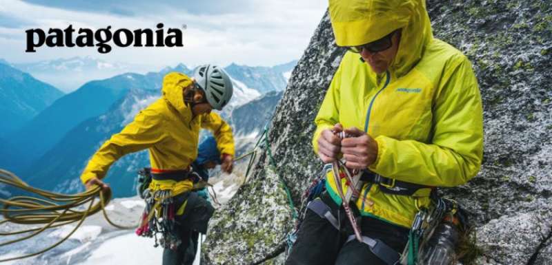
Patagonia’s logo uses a typeface closely matching Belwe Bold, a serif display font originally designed by Georg Belwe for the Schelter & Giesecke foundry in Dresden. The wordmark has been in use since the brand’s early years and sits beneath the iconic Mount Fitz Roy silhouette. In 2025, Patagonia also introduced Ridgeway Sans, a custom sans-serif font developed in-house for UI and marketing use.
What Type of Font Is Belwe Bold?
Belwe Bold is a display serif typeface. It sits in the Kuenstler classification, a category that blends Art Nouveau influences with early 20th-century German type design.
The font’s most recognizable features:
- Thick, weighted strokes with soft curves
- Serifs that vary in angle across the alphabet
- A distinctive lowercase “g” with a curved tail
- Compact x-height that gives it a sturdy, grounded look
The serif structure gives the wordmark a sense of weight and age, without feeling stiff. It reads as confident rather than corporate.
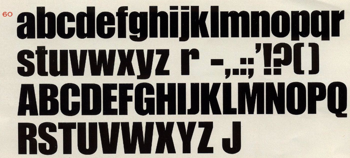
Patagonia’s logo uses the condensed variation, which makes the lettering feel taller and more compact. That proportion works well when the text is placed over the mountain illustration.
Who Designed Belwe Bold?
Georg Belwe designed the typeface for the Schelter & Giesecke foundry in Leipzig, Germany. The original release dates to around 1913, with the bold and condensed cuts following in subsequent years.
Belwe worked as a professor at the Royal Academy for Graphic Arts and Book Trade in Leipzig. He was a type designer, graphic artist, and teacher active from the late 1800s through the mid-20th century.
Bitstream later digitized the font family and published it commercially. The digital version was released in the 1990s and remains available through MyFonts under the Bitstream foundry.
Patagonia did not commission Belwe specifically. The brand adopted an existing commercial typeface, modified it for use in their wordmark, and the result became inseparable from their identity.
Is Belwe Bold Free to Use?
No. The commercial version published by Bitstream requires a paid license for any business use. Prices start around $39 per style on MyFonts.
| Version | License | Source | Cost |
| Belwe (Bitstream) | Commercial | MyFonts | ~$39/style |
| Belwe Gotisch (digitized) | Personal use only | Various font sites | Free |
| Ridgeway Sans | Proprietary (Patagonia) | Not available publicly | N/A |
Some sites offer free TTF downloads labeled as “Patagonia font.” Most of these are personal-use-only versions and are not cleared for logos, branding, or commercial work. Check the license carefully before using any version.
Font licensing matters more than most people realize, especially if you plan to use a typeface in a brand context. Getting it wrong can create legal problems later.
What Font Did Patagonia Use Before? (And What Changed in 2025)
The Belwe Bold wordmark has remained consistent since the brand’s early years following its 1973 founding. There was no major rebrand or logo font switch during that time.
What did change recently: in early 2025, Patagonia introduced Ridgeway Sans, a custom typeface developed internally. The font is named after a former colleague and is used across the brand’s digital platforms and marketing materials.
Ridgeway Sans is a proprietary typeface, not available for public download. It functions as a secondary system font alongside the legacy Belwe Bold logo lettering.
This makes Patagonia’s current type system a two-part setup: Belwe Bold for the logo and heritage branding, Ridgeway Sans for interface and editorial use.
What Are the Best Free Alternatives to Belwe Bold?
If you need something that carries a similar weight and character to the Patagonia wordmark, these are worth trying:
| Font | Similarity | License | Source |
| Playfair Display | Heavy serif with strong contrast | Free (OFL) | Google Fonts |
| Libre Baskerville | Sturdy serif, similar x-height feel | Free (OFL) | Google Fonts |
| Cormorant Garamond | High-contrast display serif | Free (OFL) | Google Fonts |
| Josefin Slab | Condensed, structured feel | Free (OFL) | Google Fonts |
Playfair Display is probably the closest match for general branding use. It has the kind of editorial confidence that pairs well with outdoor or heritage aesthetics.
Libre Baskerville is a better pick if you need something that holds up well at smaller sizes, like product labels or catalog body text.
How to Use a Belwe Alternative in Your Design Tools
In Canva: Search for Playfair Display directly in the font selector. It’s included in the free plan. You can also upload fonts to Canva if you’ve purchased a commercial Belwe license.
In Figma: All Google Fonts are available by default. Playfair Display and Libre Baskerville are both accessible without any installation. If you need to bring in a custom file, the process for adding fonts to Figma involves installing the font locally on your machine first.
In Photoshop: You’ll need to install the font file to your system before it shows up. Here’s how to handle adding fonts to Photoshop if you’re not familiar with the process.
CSS font stack for web use:
“ font-family: 'Playfair Display', 'Georgia', serif; `
Georgia is a solid web-safe font fallback for serif logo-style type. It won’t match Belwe, but it’s readable and widely supported across all browsers.
Why Did Patagonia Choose This Font?

Patagonia’s brand identity leans on age and authenticity. Belwe Bold was designed in the early 1900s, and that history shows in the letterforms.
The psychology behind the font choice makes practical sense. Serif display fonts with heavy weights read as established and trustworthy. They don’t feel trendy, which fits a brand that actively avoids the aesthetics of fast consumption.
The condensed proportions of the wordmark also work well technically. The letters stack tightly beneath the Mount Fitz Roy illustration without crowding the composition. That’s a real design constraint, not just a stylistic preference.
There’s also the matter of visual hierarchy in the full logo lockup. The mountain illustration dominates, the sky lines provide mid-level detail, and the wordmark anchors the bottom. The weight of Belwe Bold gives the text enough presence to hold its own against a fairly dense illustration above it.
Patagonia has used this combination for over 50 years without a significant rebrand. That kind of consistency is rare and deliberate. The font choice isn’t just about aesthetics. It’s part of a broader commitment to not chasing trends, which is baked into the company’s identity at every level, from manufacturing decisions to typography.
The 2025 introduction of Ridgeway Sans as a custom UI font shows the brand is aware that Belwe Bold doesn’t work everywhere. Display serifs rarely do at small sizes on screens. But rather than dropping Belwe, they built a companion typeface that shares the brand’s values through its name and its restraint.
Other outdoor brands worth comparing: Nike went the opposite direction with a geometric sans-serif approach, prioritizing speed and clarity over heritage. Patagonia’s choice to keep a century-old serif says something about what the brand actually values.
FAQ on What Font Does Patagonia Use
What font does Patagonia use in its logo?
Patagonia’s logo uses a typeface closely matching Belwe Bold, a serif display font designed by Georg Belwe for the Schelter & Giesecke foundry in Germany.
The condensed cut of the font is used in the wordmark, sitting beneath the Mount Fitz Roy mountain illustration.
Is the Patagonia font custom or a commercial typeface?
It’s a modified version of a commercial font, not a fully custom design. Patagonia adapted Belwe Bold for their wordmark rather than commissioning an entirely new typeface from scratch.
That said, in 2025 the brand introduced Ridgeway Sans, a proprietary custom font used for UI and marketing materials.
What type of font is Belwe Bold?
Belwe Bold is a display serif font classified under the Kuenstler style, a category rooted in Art Nouveau and early German type design. It has heavy strokes, angled serifs, and a compact structure.
Who designed the Belwe font?
Georg Belwe designed the typeface for Schelter & Giesecke in Leipzig around 1913. He was a professor at the Royal Academy for Graphic Arts in Leipzig and worked as a type designer and typographer throughout his career.
Can I download the Patagonia font for free?
Not legally for commercial use. The Bitstream version of Belwe requires a paid font license. Some sites offer free TTF versions, but these are typically limited to personal use only and cannot be used in logos or brand work.
What is Ridgeway Sans?
Ridgeway Sans is Patagonia’s first custom grotesque-style typeface, introduced in early 2025. It was developed internally and named after a former colleague. It’s not publicly available and is used across Patagonia’s digital platforms and campaigns.
What fonts are similar to the Patagonia logo font?
The closest free alternatives are Cormorant Garamond, Playfair Display, and Libre Baskerville, all available on Google Fonts. Each shares Belwe’s weighted serif character and works well for heritage-style branding and outdoor apparel contexts.
What font does Patagonia use on its website?
Patagonia’s website body text uses clean sans-serif typography, separate from the logo’s Belwe Bold. Since 2025, Ridgeway Sans has been adopted for digital brand touchpoints, replacing previous generic system fonts used in their UI.
Has Patagonia ever changed its font?
The Belwe Bold wordmark has stayed consistent since the brand’s early years after its 1973 founding. No major logo font switch occurred in that time. The 2025 introduction of Ridgeway Sans added a new layer to the system without replacing the original logo lettering.
What other brands use Belwe Bold?
Belwe Bold has appeared in the branding for All Dogs Go to Heaven, Miss Peregrine’s Home for Peculiar Children, and Magic: The Gathering. It’s a niche but recognizable display font with strong associations in outdoor, vintage, and fantasy brand contexts.
Conclusion
If you’ve been trying to figure out what font does Patagonia use, the answer comes down to Belwe Bold, a condensed serif display typeface with roots in early 20th-century German type design.
The wordmark has stayed consistent for over 50 years, which says a lot about how deliberate that original choice was.
For anyone looking to replicate the outdoor apparel brand aesthetic, Playfair Display and Cormorant Garamond are the most practical free alternatives for logo and branding work.
And if you’re working on digital interfaces, Ridgeway Sans is worth knowing about, even if it’s not publicly available. It signals where Patagonia’s visual identity system is heading.

Renowned for his expertise in logo design and visual branding, Bogdan has developed a multitude of logos for various clients.
His skills extend to creating posters, vector illustrations, business cards, and brochures. Additionally, Bogdan's UI kits were featured on marketplaces like Visual Hierarchy and UI8.
He also wrote in the past years on sites like Design Your Way, WebDesignerDepot, WPDean, Designmodo, Speckyboy, Slider Revolution, and more.
- The Windsurf Logo History, Colors, Font, And Meaning - 10 October 2026
- How to Remove Background From Product Photos (No Photoshop) - 10 October 2026
- How Designers can Build a Stronger Online Creative Identity - 9 October 2026

Bogdan Sandu is a seasoned designer who has been designing websites since 2008. Renowned for his expertise in logo design and visual branding, Bogdan has developed a multitude of logos for various clients. His skills extend to creating posters, vector illustrations, business cards, and brochures. Additionally, Bogdan's UI kits were featured on marketplaces like Visual Hierarchy and UI8. He also wrote in the past years on sites like Design Your Way, WebDesignerDepot, WPDean, Designmodo, Speckyboy, Slider Revolution, and more.
You Might Also Like