The Starbucks logo is one of those designs you recognize instantly. Even from across a busy street. The twin-tailed siren has become shorthand for coffee culture itself, which is kind of remarkable when you think about it.
A logo doing that much heavy lifting is rare.
The company launched in Seattle back in 1971. Since then, they’ve gone through four major logo versions. The current iteration dropped in 2011, designed by Lippincott in collaboration with the Starbucks internal creative team.
What started as a brown, detailed woodcut-style emblem has become a streamlined green icon. The siren remains, but everything else got stripped away over time.
What is the Starbucks Logo?
The Starbucks logo features a twin-tailed siren (or mermaid) enclosed in a circular green design. Introduced in its current form in 2011, the logo was refined by Lippincott agency. It symbolizes the seafaring history of Seattle and the allure of coffee.
Design Type: Emblem-based mark (though the 2011 version functions more as a standalone symbol)
Primary Elements:
- Twin-tailed siren figure
- Circular frame shape
- Crown on the siren’s head
- Wavy hair detail
- No text in current version
Official Introduction Date: January 2011 (current version)
Designer/Agency: Lippincott with Starbucks Global Creative Studio
Trademark Status: Registered trademark (USPTO) with multiple design patents protecting various iterations
Color Palette:
- Starbucks Green: #00704A
- Black: #000000 (alternate usage)
- White: #FFFFFF
Usage Context: Coffee cups, storefronts, merchandise, mobile app, packaging, marketing materials, and digital platforms worldwide
How Has the Starbucks Logo Evolved Over Time?
The Starbucks logo has undergone four major redesigns since 1971. Each version simplified the siren image while strengthening brand recognition.
The brown original became green in 1987. The text disappeared entirely by 2011.
It’s actually a textbook case of logo evolution done right.
Original Starbucks Logo (1971-1987)
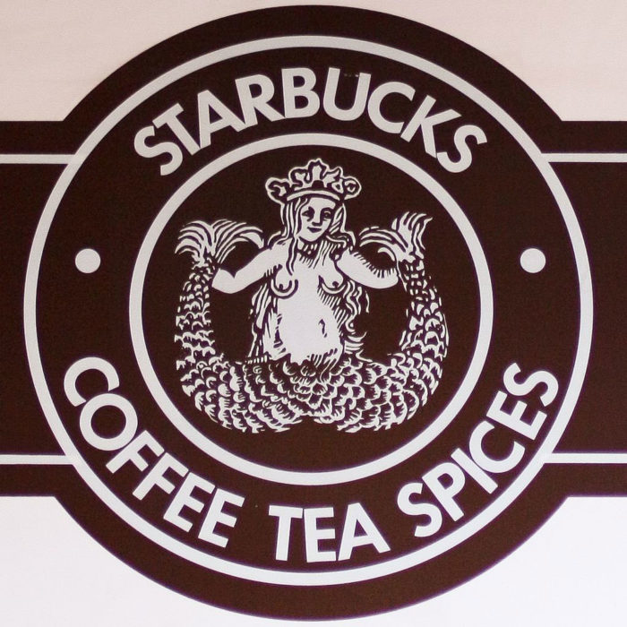
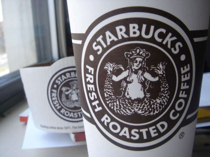
Years Active: 1971-1987
Design Description: A brown, detailed siren with exposed breasts and a fully visible twin tail. The image had a rough, woodcut aesthetic. Text reading “Starbucks Coffee, Tea, and Spices” wrapped around the circular border.
Color Scheme: Brown and white. That’s it.
Designer: Terry Heckler of Heckler Associates
Context: The founders wanted something that captured Seattle’s maritime heritage. They found a 16th-century Norse woodcut of a siren and adapted it. Coffee wasn’t even the main focus yet.
Cultural Significance: This raw, almost provocative design reflected the company’s humble Pike Place Market origins. It wasn’t trying to be corporate.
Second Starbucks Logo (1987-1992)
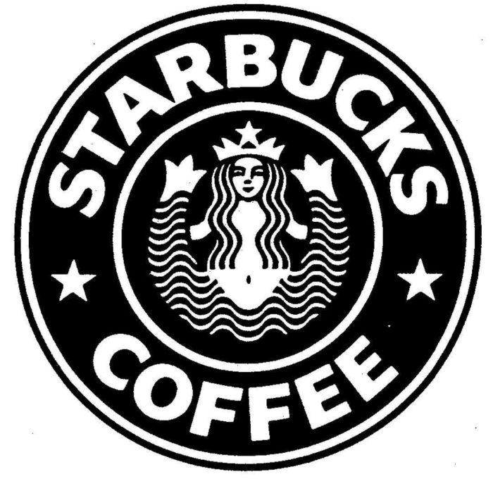
Years Active: 1987-1992
Design Description: The siren got a makeover. Longer hair strategically covered her chest. The design shifted to green and black. Text changed to just “Starbucks Coffee.”
Color Scheme: Starbucks Green and black
Designer: Terry Heckler (revision)
Context: Howard Schultz bought the company and had expansion plans. The original was too risque for mainstream America. Changes were practical, not artistic.
Key Changes from Previous: Color shift from brown to green. Modesty updates. Simplified text. Cleaner overall appearance.
Third Starbucks Logo (1992-2011)
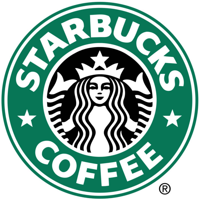
Years Active: 1992-2011
Design Description: Zoomed-in view of the siren. Her navel disappeared. The twin tails became more abstract, almost like decorative elements framing her face. Cleaner lines throughout.
Color Scheme: Green, black, and white
Context: Starbucks went public in 1992. They needed something that worked at every size, from tiny cups to highway billboards. The design got friendlier and more approachable.
Key Changes from Previous: Cropped composition. Removed navel. Softened facial features. More abstract tail treatment.
Current Starbucks Logo (2011-Present)
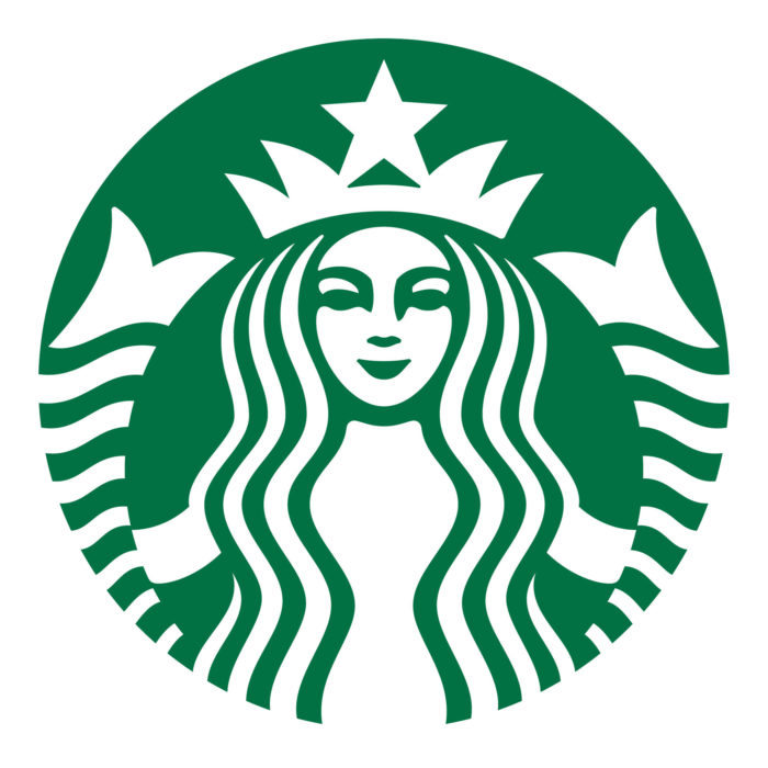
Years Active: 2011-present
Design Description: The siren breaks free from her circle. No text at all. Just the green figure on white (or reversed). The brand became confident enough to drop its own name.
Color Scheme: Single-color Starbucks Green (or white on green)
Designer: Lippincott and Starbucks Global Creative
Context: The company had expanded beyond coffee into food, merchandise, and entertainment. Dropping “coffee” from the logo made strategic sense.
Key Changes from Previous: Removed outer ring. Removed all text. Enlarged siren. Subtle refinements to facial features for warmth.
Cultural Significance: This move put Starbucks in rare company. Only a few brands can rely purely on a symbol. Think Nike. Think Apple. That’s the league they were aiming for.
What Do the Design Elements of the Starbucks Logo Mean?
The siren represents seduction and allure. But not in a creepy way. It’s about the irresistible pull of coffee.
Seattle’s founders picked her because of the city’s port history. Sirens, mermaids, the sea. It all connected.
Why Did Starbucks Choose These Specific Colors?
The signature green wasn’t random. Understanding color psychology explains a lot here.
Starbucks Green
- Hex: #00704A
- Pantone: 3425 C
- Symbolic meaning: Growth, freshness, prosperity
- Psychological impact: Calming, inviting, suggests natural quality
Green also distances Starbucks from competitors. Most coffee brands lean into browns and reds. Starbucks went another direction entirely.
This choice helped them stand out among green logos in the food industry while avoiding the typical coffee color palette.
What Typography Style Is Used in the Starbucks Logo?
Here’s the thing. The current logo has no typography at all.
Previous versions used a custom serif font called Freight Sans for supporting materials. The circular text in older logos featured a modified serif with subtle curves.
The decision to remove text entirely was bold. Most brands would never dare.
What Are the Hidden Meanings in the Starbucks Logo?
The twin tails aren’t just decorative. In mythology, the twin-tailed siren (sometimes called Melusine) symbolizes transformation and duality.
Some see the symmetry as representing balance. Others point to the crown suggesting premium quality.
The siren’s face has been subtly adjusted over time to appear more welcoming. Her smile got warmer. Her eyes got softer. These weren’t accidents.
How Does the Starbucks Logo Compare to Competitor Logos?
Most coffee chains stick to predictable designs. Browns. Coffee cups. Steam wisps. Beans.
Starbucks ignored all of that.
Dunkin’ uses bold sans-serif text in orange and pink. Tim Hortons features a straightforward wordmark. Costa Coffee includes a coffee bean graphic. Peet’s Coffee shows roasting imagery.
Starbucks is the outlier. A mythical creature with no coffee imagery whatsoever. When you look at typical fast food logos, Starbucks clearly aimed for something more sophisticated.
This differentiation strategy worked brilliantly. The logo reads as premium without saying “premium” anywhere.
What Are the Technical Specifications of the Starbucks Logo?
Official Color Codes:
Primary Color – Starbucks Green
Secondary Color – Black
- Hex: #000000
- RGB: (0, 0, 0)
- CMYK: (0, 0, 0, 100)
Accent Color – White
- Hex: #FFFFFF
- RGB: (255, 255, 255)
- Used for reversed applications
Dimensions and Proportions:
- Aspect ratio: 1:1 (perfect circle base)
- Minimum size: 0.5 inches (print), 50 pixels (digital)
- Clear space: Equal to the width of the siren’s crown on all sides
- The logo is built as vector graphics for infinite scalability
What Cultural Impact Has the Starbucks Logo Had?
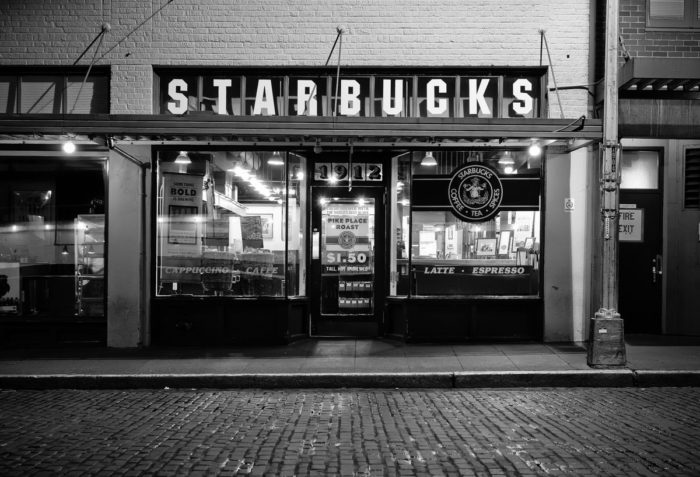
The siren has become a cultural shorthand. She represents urban life, coffee addiction, millennial spending habits (fairly or not), and global capitalism all at once.
Artists parody her constantly. She shows up in political commentary, memes, and street art worldwide.
The logo’s focal point design makes it instantly recognizable even when heavily modified or partially obscured.
Few corporate symbols generate this much cultural conversation. Love it or hate it, the siren matters.
How Does the Starbucks Logo Fit Into the Overall Brand Identity?
The siren anchors everything Starbucks does visually. Packaging, store design, app interface, merchandise. All of it traces back to her.
The brand guidelines establish strict rules about how green gets used, what fonts pair with the logo, and how much white space surrounds the mark.
This approach to storytelling through design keeps every customer touchpoint feeling connected.
The logo doesn’t exist alone. It’s part of a system that includes photography style, illustration guidelines, voice and tone, and even music selection in stores.
How Should the Starbucks Logo Be Used?
Official Usage Guidelines:
Do:
- Use official logo files from Starbucks brand portal
- Maintain minimum clear space requirements
- Use approved color variations only (green, black, white)
- Scale proportionally without distortion
Don’t:
- Rotate or tilt the logo
- Add effects like shadows, glows, or gradients
- Change the colors
- Combine with other logos without approval
- Use outdated versions
Where to Access Official Logos: Licensed partners can access files through the Starbucks partner portal. Public use requires written permission from Starbucks legal team.
Trademark Protection: The siren is heavily protected intellectual property. Starbucks actively pursues unauthorized usage. Parody has some legal protection, but commercial infringement does not.
Their brand style guide runs over 100 pages. They’re serious about consistency.
FAQ on The Starbucks Logo
What Does the Starbucks Logo Represent?
The Starbucks logo represents the twin-tailed siren from maritime mythology. She symbolizes the seductive allure of coffee and Seattle’s seafaring history.
The founders connected their Pike Place Market origins to ocean trade routes that brought coffee beans to port cities.
Why Is There a Mermaid on the Starbucks Logo?
The creature is actually a siren, not a mermaid. Sirens appear in Norse and Greek mythology as alluring figures.
Terry Heckler found her in a 16th-century woodcut. The founders loved how she connected coffee’s exotic origins to Pacific Northwest maritime culture.
Who Designed the Original Starbucks Logo?
Terry Heckler of Heckler Associates created the original 1971 design. He adapted a historic Norse woodcut illustration.
Lippincott handled the 2011 redesign. They worked alongside the Starbucks Global Creative team to refine the siren’s features and remove all text.
When Did Starbucks Change Their Logo?
Starbucks has updated their company emblem four times. Major redesigns happened in 1987, 1992, and 2011.
Each logo evolution simplified the visual identity. The 2011 version dropped the wordmark entirely, leaving just the iconic green siren.
What Is the Creature in the Starbucks Logo Called?
She’s called a siren or Melusine. This twin-tailed mermaid figure appears throughout European folklore.
Some call her a mermaid, but sirens have two tails. The distinction matters to mythology enthusiasts and brand historians who study the psychology of shapes in logo design.
Why Is the Starbucks Logo Green?
Howard Schultz introduced the green color palette in 1987 when he acquired the company. Green suggests growth, freshness, and prosperity.
It also differentiated Starbucks from competitors using brown and red. The specific shade is Pantone 3425.
Has the Starbucks Logo Always Looked the Same?
Not even close. The original 1971 design was brown, detailed, and showed the siren’s full body with exposed features.
Each redesign cropped tighter and simplified details. The logo history shows a clear path toward minimalist design principles.
What Do the Two Tails in the Starbucks Logo Mean?
The twin tails reference the Melusine legend. In mythology, she represents transformation and duality.
Some interpret the balance of the tails as representing harmony. Others see them as purely decorative elements framing the circular logo composition.
Why Did Starbucks Remove the Name from Their Logo?
By 2011, brand recognition was strong enough. The siren alone communicated Starbucks without words.
Dropping “Starbucks Coffee” also freed the company to expand beyond coffee. Their brand identity now includes food, merchandise, and entertainment ventures.
Can I Use the Starbucks Logo for My Project?
Probably not without permission. The siren is a registered trademark with strong legal protection.
Starbucks Corporation actively pursues unauthorized commercial use. Parody might have some protection, but check with a lawyer first. Their brand trademark guidelines are strict.
Conclusion
The Starbucks logo proves that smart brand evolution beats complete reinvention. Four decades of careful refinement turned a detailed woodcut into a globally recognized symbol.
That twin-tailed siren now ranks among the most iconic corporate marks in existence.
What makes it work? Strong logo design principles combined with consistent application. The green mermaid imagery communicates premium coffee culture without saying a word.
Few brands achieve this level of visual identity recognition. Howard Schultz understood something important. Sometimes removing elements strengthens a trademark design more than adding them.

Renowned for his expertise in logo design and visual branding, Bogdan has developed a multitude of logos for various clients.
His skills extend to creating posters, vector illustrations, business cards, and brochures. Additionally, Bogdan's UI kits were featured on marketplaces like Visual Hierarchy and UI8.
He also wrote in the past years on sites like Design Your Way, WebDesignerDepot, WPDean, Designmodo, Speckyboy, Slider Revolution, and more.
- 10 Best Shopify Plus Agencies for Ecommerce Design and Development - 15 October 2026
- The Framer Logo History, Colors, Font, And Meaning - 14 October 2026
- 9 Best Motion Graphics Companies for Startups - 14 October 2026

Bogdan Sandu is a seasoned designer who has been designing websites since 2008. Renowned for his expertise in logo design and visual branding, Bogdan has developed a multitude of logos for various clients. His skills extend to creating posters, vector illustrations, business cards, and brochures. Additionally, Bogdan's UI kits were featured on marketplaces like Visual Hierarchy and UI8. He also wrote in the past years on sites like Design Your Way, WebDesignerDepot, WPDean, Designmodo, Speckyboy, Slider Revolution, and more.
You Might Also Like