The NASA logo stands as one of the most recognized symbols in human history. It represents more than a government agency. It carries the weight of exploration, scientific achievement, and collective human ambition.
Within aerospace branding, NASA’s visual identity set the standard that private space companies now follow. The agency was established in 1958, and since then, it has used three primary logo versions.
The current insignia features a blue sphere, stars, a red chevron, and an orbital path. James Modarelli designed the original “meatball” logo in 1959. Richard Danne and Bruce Blackburn created the “worm” logotype in 1975.
What Is the NASA Logo?
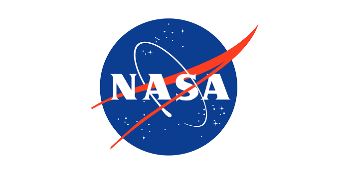
The NASA logo is an official insignia featuring a blue circular sphere with white stars, a red chevron, and an orbital element. James Modarelli designed this emblem in 1959. It symbolizes aeronautics, space exploration, and scientific discovery through distinct visual elements.
Design Type: Combination mark (emblem with integrated wordmark)
Primary Elements: Blue sphere representing Earth’s atmosphere, white stars depicting space, red V-shaped chevron symbolizing aeronautics, white orbital path, and NASA lettering
Official Introduction Date: 1959 (original), retired 1975-1992, reinstated 1992
Designer: James Modarelli, NASA Lewis Research Center
Trademark Status: Protected under 14 CFR 1221, restricted to official NASA use and licensed partners
Color Palette: NASA Blue (Hex: #0B3D91), NASA Red (Hex: #FC3D21), White (Hex: #FFFFFF)
Usage Context: Spacecraft, mission patches, official documents, press materials, merchandise through licensed vendors, digital platforms
How Has the NASA Logo Evolved Over Time?
NASA’s visual identity has shifted between two distinct designs since 1959. The agency started with the detailed “meatball” insignia.
Then came a modernist “worm” logotype in 1975. The original returned in 1992. And now, both marks serve different purposes.
Original NASA Insignia – The Meatball (1959-1975)
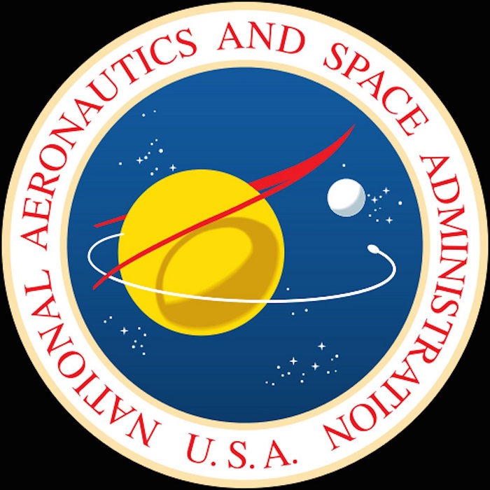
Years Active: 1959-1975 (first run)
Design Description: A blue circle contains white stars scattered across the field. A red chevron cuts through the center. A white orbital path wraps around. The letters N-A-S-A appear in white across the middle.
Color Scheme: Blue, red, and white (reflecting American national colors)
Designer: James Modarelli
Context: Created just one year after NASA’s founding. The Space Race was heating up. America needed a symbol that projected technological ambition and national pride.
Key Changes from Previous: This was the first official logo. The NASA seal existed separately for formal documents.
Cultural Significance: This mark appeared on Mercury, Gemini, and Apollo spacecraft. It was on the suits of astronauts who walked on the Moon.
The NASA Worm (1975-1992)
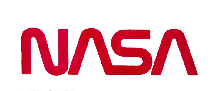
Years Active: 1975-1992 (primary use), 2020-present (secondary use)
Design Description: A sleek, continuous letterform spelling NASA. The letters connect fluidly. No circular emblem. No representational imagery. Just pure typography.
Color Scheme: NASA Red (primary), sometimes rendered in white or black for specific applications
Designer: Richard Danne and Bruce Blackburn of Danne & Blackburn
Context: Part of the Federal Graphics Improvement Program under Nixon. The goal was modernizing government visual identity. NASA wanted something that looked forward, not backward.
Key Changes from Previous: Eliminated all pictorial elements. Stripped away the sphere, stars, and chevron. Reduced the identity to pure letterforms.
Cultural Significance: Appeared on Space Shuttle missions. Won design awards. Became a case study in minimalist design within government agencies.
The Meatball Returns (1992-Present)
Years Active: 1992-present
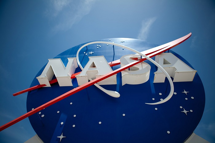
Design Description: Same core design as 1959 with minor refinements for digital reproduction. Cleaner lines. Better color consistency across media.
Color Scheme: Official NASA Blue, NASA Red, White
Context: Administrator Dan Goldin brought back the original. There was nostalgia for the Apollo era. The worm felt too corporate for an agency built on wonder.
Key Changes from Previous: Return to illustrative, symbolic imagery. The worm was officially retired (until 2020 when it returned for special Crew Dragon and Artemis missions).
Cultural Significance: Represents a return to NASA’s exploratory roots. Now associated with Mars rovers, ISS operations, and the Artemis program.
What Do the Design Elements of the NASA Logo Mean?
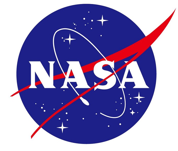
Every component of NASA’s meatball insignia carries specific meaning. The blue sphere represents planets and the possibility of travel between them.
Stars indicate space exploration goals. The red chevron is an aeronautics symbol. The orbital ring shows spacecraft movement around celestial bodies.
Why Did NASA Choose These Specific Colors?
NASA Blue
- Hex: #0B3D91
- Pantone: 286 C
- Symbolic meaning: Represents the unknown depths of space and Earth’s atmosphere
- Psychological impact: Conveys trust, stability, and infinite possibility
- Brand connection: Links to sky, ocean, and the vastness being explored
NASA Red
- Hex: #FC3D21
- Pantone: Warm Red C
- Symbolic meaning: Represents aeronautics heritage and dynamic forward motion
- Psychological impact: Suggests energy, courage, and action
- Brand connection: Ties to American identity and pioneering spirit
White
- Hex: #FFFFFF
- Symbolic meaning: Purity, precision, and the clarity of scientific pursuit
- Psychological impact: Creates contrast and legibility
- Brand connection: Represents the stars themselves
What Typography Style Is Used in the NASA Logo?
The meatball uses a custom sans-serif letterform for “NASA” that was hand-drawn by Modarelli. It has no official font equivalent.
The letters are bold with consistent stroke weight. They read clearly at small sizes.
The worm logotype uses a completely custom design. Those connected, rounded letters have no commercially available match. Danne & Blackburn created them specifically for this project.
What Are the Hidden Meanings in the NASA Logo?
The red chevron does double duty. It represents both a wing (aeronautics) and an upward-pointing arrow (aspiration, launch).
The orbital path doesn’t just circle randomly. It suggests satellites, space stations, and the continuous nature of exploration.
Some see the overall composition as an eye looking outward. That wasn’t stated by Modarelli, but the interpretation stuck with many viewers over the decades.
How Does the NASA Logo Compare to Competitor Logos?
NASA’s meatball is detailed and symbolic. SpaceX uses stark simplicity with just a wordmark and stylized X.
Blue Origin goes minimal with a feather symbol. ESA employs a modern abstract approach. NASA’s logo carries more visual information than almost any major aerospace competitor.
The meatball’s complexity actually sets it apart. While tech company logos trend toward flat, simple marks, NASA keeps its illustrative heritage. This works because the agency isn’t selling products. It’s representing human achievement.
Private space companies optimize for merchandise and app icons. NASA optimizes for legacy and gravitas.
What Are the Technical Specifications of the NASA Logo?
Official Color Codes:
Primary – NASA Blue
Secondary – NASA Red
- Hex: #FC3D21
- RGB: (252, 61, 33)
- CMYK: (0, 90, 86, 0)
- Pantone: Warm Red C
Accent – White
- Hex: #FFFFFF
- RGB: (255, 255, 255)
- CMYK: (0, 0, 0, 0)
Dimensions and Proportions:
- Aspect ratio: 1:1 (circular insignia)
- Minimum size: 0.5 inches (print), 50 pixels (digital)
- Clear space: Equal to the height of the “N” in NASA on all sides
- Official guidelines available through NASA Graphics Standards Manual
What Cultural Impact Has the NASA Logo Had?
The NASA meatball appears on clothing worldwide. People who have no connection to aerospace wear it as a fashion statement.
It signals optimism about the future. It represents a time when governments invested in pure exploration.
The worm’s revival in 2020 sparked genuine excitement. Designers celebrated its return. That a government logotype could generate headlines says something about its cultural weight.
How Does the NASA Logo Fit Into the Overall Brand Identity?
NASA’s brand guidelines extend far beyond the logo. The agency maintains consistent colors across facilities, vehicles, and publications.
Mission patches follow specific design rules. Partner co-branding has strict requirements.
The meatball anchors everything. It appears on buildings, rockets, spacesuits, and websites. The worm now serves special missions (think retro appeal for launches). Together, they create a layered identity that honors history while pushing forward.
How Should the NASA Logo Be Used?
Official Usage Guidelines:
- The NASA insignia is protected by law (14 CFR 1221)
- Unauthorized commercial use is prohibited
- Licensed merchandise requires formal NASA approval
- Editorial and educational use permitted with proper attribution
Do’s:
- Use official artwork from NASA’s media resources
- Maintain proper clear space
- Reproduce in approved color combinations only
- Contact NASA Communications for commercial licensing
Don’ts:
- Alter colors, proportions, or elements
- Use on products implying NASA endorsement without approval
- Combine with other logos without permission
- Create derivative versions
Where to Access Official Logos: NASA’s official media library at nasa.gov provides vector files for press and educational purposes. Commercial requests go through the Office of Communications.
FAQ on The NASA Logo
What Does NASA Stand For in the Logo?
NASA stands for National Aeronautics and Space Administration. The letters appear in white across the center of the circular insignia.
The agency formed in 1958. The logo came one year later, embedding the acronym into a symbolic design representing American space exploration.
Why Is the NASA Logo Called the Meatball?
Employees nicknamed it the “meatball” because of its round, dense appearance. The circular shape packed with stars, chevron, and orbital path looked hefty compared to sleeker logo design principles of the era.
The name stuck. It’s now official shorthand within the agency.
Who Designed the Original NASA Logo?
James Modarelli created the meatball in 1959 while working at NASA’s Lewis Research Center. He designed it internally, not through an outside agency.
Richard Danne and Bruce Blackburn designed the worm logotype in 1975. Both marks remain iconic today.
What Are the Official NASA Logo Colors?
NASA Blue carries hex code #0B3D91. NASA Red uses #FC3D21. White completes the color palette.
These colors follow strict Pantone specifications. Blue is 286 C. Red is Warm Red C. Consistency matters across all applications.
Can I Use the NASA Logo on Products or Merchandise?
Not without permission. The NASA insignia is protected under federal regulations (14 CFR 1221).
Commercial use requires licensing through NASA’s Office of Communications. Educational and editorial use is generally permitted with proper credit. Always check current guidelines first.
What Is the NASA Worm Logo?
The worm is a streamlined logotype introduced in 1975. Just red letterforms. No imagery. The connected, rounded letters spelled NASA in a continuous stroke.
It was retired in 1992 but returned in 2020 for special missions like Crew Dragon launches.
Why Did NASA Bring Back the Original Meatball Logo?
Administrator Dan Goldin reinstated the meatball in 1992. The worm felt too corporate. Too cold.
NASA wanted warmth and nostalgia. The meatball connected to Apollo, to Moon landings, to public wonder. Sometimes heritage beats modernization.
What Does the Red Chevron in the NASA Logo Represent?
The V-shaped red chevron symbolizes aeronautics. It represents a wing in motion, pointing upward.
This connects NASA’s aviation roots to its space mission. The chevron creates movement within the static circular frame. It suggests launch trajectory and forward progress.
Is the NASA Logo Copyrighted or Trademarked?
The NASA insignia is protected by federal statute, not standard trademark law. It falls under government insignia protections.
Unauthorized use on commercial products is illegal. This protection is stronger than typical trademark registration. Violations can result in legal action.
Where Can I Download the Official NASA Logo Files?
NASA provides official vector graphics through their media resources at nasa.gov. Press and educational users can access high-resolution files there.
For commercial licensing requests, contact NASA Communications directly. Don’t pull logos from random websites.
Conclusion
The NASA logo demonstrates how effective visual identity transcends trends. Sixty-plus years later, the meatball still works.
Its staying power comes from thoughtful color theory application and clear visual hierarchy. Every element serves a purpose.
The blue sphere, red chevron, and orbital path communicate mission and ambition without words. That’s rare in government branding.
Whether on a spacecraft headed to Mars or a t-shirt at a gift shop, this insignia carries weight. It represents human curiosity at its best. Few marks achieve that kind of lasting emphasis in public consciousness.

Renowned for his expertise in logo design and visual branding, Bogdan has developed a multitude of logos for various clients.
His skills extend to creating posters, vector illustrations, business cards, and brochures. Additionally, Bogdan's UI kits were featured on marketplaces like Visual Hierarchy and UI8.
He also wrote in the past years on sites like Design Your Way, WebDesignerDepot, WPDean, Designmodo, Speckyboy, Slider Revolution, and more.
- Canva vs PowerPoint: Which Is Better for Presentations? - 22 September 2026
- How to Install Fonts on Mac (Step-by-Step Guide) - 20 September 2026
- From Mockup to Code: How AI-Augmented Development Speeds Up the Design Handoff - 19 September 2026

Bogdan Sandu is a seasoned designer who has been designing websites since 2008. Renowned for his expertise in logo design and visual branding, Bogdan has developed a multitude of logos for various clients. His skills extend to creating posters, vector illustrations, business cards, and brochures. Additionally, Bogdan's UI kits were featured on marketplaces like Visual Hierarchy and UI8. He also wrote in the past years on sites like Design Your Way, WebDesignerDepot, WPDean, Designmodo, Speckyboy, Slider Revolution, and more.
You Might Also Like