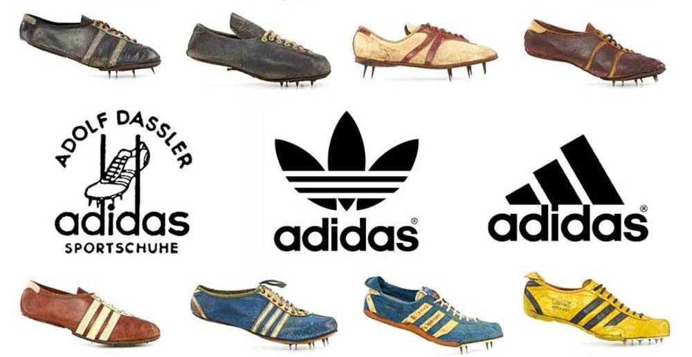
The Adidas Logo stands as one of the most recognizable brand marks in global sportswear. Three simple stripes. That’s all it took to build an empire.
Founded in 1949 by Adolf “Adi” Dassler in Herzogenaurach, Germany, Adidas has cycled through several logo versions. The current three-stripe mountain design debuted in 1991, though the company uses multiple logos depending on product lines.
What makes a logo stick in people’s minds for decades? Adidas figured it out early. The brand sits alongside Nike and Puma as the dominant force in athletic branding, with its visual identity appearing on everything from World Cup jerseys to hip-hop album covers.
What is the Adidas Logo?
The Adidas Logo features three parallel stripes arranged in various configurations depending on the specific brand division. Introduced originally in 1949, the stripes were designed by founder Adi Dassler himself. The symbol represents mountain peaks, challenges to overcome, and athletic achievement.
Design Type: Combination mark (symbol plus wordmark)
Primary Elements:
- Three parallel stripes (angled or horizontal depending on version)
- Custom wordmark reading “adidas” in lowercase
- Trefoil shape for Originals line
- Mountain/triangle formation for Performance line
Official Introduction Date: 1949 (original three stripes), 1971 (Trefoil), 1991 (Mountain/Performance logo)
Designer: Adi Dassler (original), various internal teams for subsequent versions
Trademark Status: The three stripes are registered trademarks in most countries worldwide. Adidas actively defends this mark in court regularly.
Color Palette:
- Primary Black: #000000
- Primary White: #FFFFFF
- Accent colors vary by product line and campaign
Usage Context: Athletic footwear, apparel, equipment, digital platforms, retail environments, sponsorship materials, and licensed merchandise
How Has the Adidas Logo Evolved Over Time?
The Adidas Logo has gone through five major redesigns since 1949. Each version reflected changing market conditions and brand positioning.
The stripes remained constant. Everything else shifted around them.
Original Adidas Logo (1949-1971)
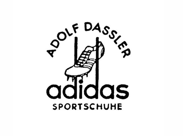
Years Active: 1949-1971
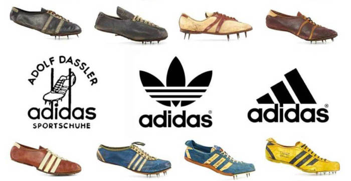
Design Description: The first logo was straightforward. Three stripes appeared on shoes, with “adidas” written in a simple, curved script. No fancy mountain shapes or trefoil patterns yet.
Color Scheme: Black stripes on white background, though colors varied based on shoe design
Designer: Adi Dassler
Context: Post-war Germany was rebuilding. Adi had split from his brother Rudolf (who founded Puma), and needed a distinctive mark. He bought the three-stripe trademark from Finnish sports company Karhu for two bottles of whiskey and about 1,600 euros equivalent.
Cultural Significance: These stripes appeared at the 1954 World Cup when Germany won wearing Adidas boots. That victory cemented the brand’s reputation.
Trefoil Logo (1971-1991)
Years Active: 1971-present (now used for Originals line only)
Design Description: Three leaf-shaped segments connected at the base, with the three stripes integrated into the upper portion. The “adidas” wordmark sat below in a custom sans-serif typeface.
Color Scheme: Primarily black on white, though the Trefoil appeared in various colors
Key Changes from Previous: First time Adidas had a proper symbol beyond just the stripes. The Trefoil gave the brand a distinct icon.
Context: Adidas was expanding beyond athletics into lifestyle fashion. The Trefoil represented diversity and the three landmasses where Adidas products were sold at the time.
Cultural Significance: Run-DMC’s “My Adidas” in 1986 turned this logo into a hip-hop icon. Suddenly the Trefoil meant street credibility.
Mountain Logo (1991-Present)
Years Active: 1991-present (Performance line)
Design Description: Three slanted bars forming a mountain or triangle shape. The stripes lean to the right at an angle, creating upward momentum.
Color Scheme: Black primary, with white often used for contrast
Key Changes from Previous: Sharper, more aggressive angles replaced the rounded Trefoil. This version screamed “athletic performance” rather than lifestyle.
Context: Nike was dominating the performance market. Adidas needed something that felt modern and competitive.
Designer: Peter Moore contributed to this era’s design direction
Cultural Significance: This became the face of Adidas sponsorships in major sports leagues and international competitions.
Badge of Sport Logo (2000s Refinement)
Years Active: Early 2000s-present
Design Description: A cleaner version of the Mountain logo with more precise geometry. The “adidas” wordmark uses ITC Avant Garde Gothic.
Key Changes: Minor refinements to proportions and spacing. The stripes became more standardized across applications.
Current Multi-Logo System
Today, Adidas runs three logos simultaneously:
- Performance (Mountain): Athletic gear and professional sponsorships
- Originals (Trefoil): Heritage and lifestyle products
- Style (Three Stripes text): Fashion-forward collections
It’s actually pretty unusual for a major brand to maintain multiple active logos. Most companies push for unified identity.
What Do the Design Elements of the Adidas Logo Mean?
Every element in the Adidas Logo carries specific meaning tied to athletic achievement and brand heritage.
The three stripes symbolize a mountain. Climbing toward goals.
Overcoming challenges. Pretty straightforward stuff, but it works.
Why Did Adidas Choose These Specific Colors?
Understanding color psychology explains the Adidas palette choice.
Black (#000000)
- Symbolic meaning: Power, sophistication, authority
- Psychological impact: Creates strong contrast, feels premium
- Brand connection: Matches athletic intensity and professional sports environments
White (#FFFFFF)
- Symbolic meaning: Purity, cleanliness, simplicity
- Psychological impact: Clean, fresh, modern
- Brand connection: Works on any product color, maintains visibility
The black logo approach gives Adidas maximum flexibility. Their mark works on a neon running shoe just as well as a classic leather sneaker.
Sometimes they flip it. White logos on dark products maintain that same impact.
What Typography Style Is Used in the Adidas Logo?
The Adidas wordmark uses a modified version of ITC Avant Garde Gothic.
All lowercase letters. This was unusual when they adopted it.
The typography feels approachable rather than corporate. No shouting, no aggressive capitals.
Readability stays high even at small sizes. The letterforms have good spacing and clear shapes.
Over the years, the font weight has been adjusted slightly, but the core character remains the same geometric sans-serif style.
What Are the Hidden Meanings in the Adidas Logo?
The Trefoil’s three leaves originally represented three continents: Europe, North America, and Asia.
Some people see the Mountain logo as a pyramid, suggesting stability and achievement.
The stripes themselves started as functional elements. They reinforced the shoe’s structure before becoming the brand’s signature.
Adi Dassler never publicly stated deep philosophical intentions. He wanted stripes that looked good and held the shoe together. Sometimes the best designs come from practical origins.
How Does the Adidas Logo Compare to Competitor Logos?
Among shoe brand logos, Adidas holds a unique position. The three stripes offer instant recognition without relying on complex imagery.
Nike’s swoosh is simpler. One curved line.
The Puma logo uses an animal mascot, which is a completely different approach.
Comparative Analysis:
Adidas vs. Nike: Nike went abstract with the swoosh. Adidas kept geometric repetition. Both work, but Adidas stripes are easier to apply to product design without a separate logo placement.
Adidas vs. Reebok: Interesting comparison since Adidas owned Reebok from 2006 to 2021. Reebok’s vector mark is more aggressive and angular. The Adidas stripes feel more established.
Adidas vs. Under Armour: Under Armour’s interlocking U and A feels tech-focused and American. Adidas maintains European heritage with cleaner geometry.
Adidas vs. New Balance: New Balance uses the “NB” monogram in a more traditional arrangement. Less distinctive from a distance than the three stripes.
The real advantage Adidas has? Those stripes become part of the product itself. The logo is the design is the product.
What Are the Technical Specifications of the Adidas Logo?
Official Color Codes:
Primary Black
Primary White
- Hex: #FFFFFF
- RGB: (255, 255, 255)
- CMYK: (0, 0, 0, 0)
Dimensions and Proportions:
- Aspect ratio varies by logo version (Trefoil is roughly 1:1, Mountain is approximately 1.2:1)
- Minimum size: 10mm width for print applications
- Clear space: Equal to the height of the “a” in the wordmark on all sides
- The three stripes maintain consistent angle (approximately 17 degrees) in the Mountain version
File Formats:
Official assets are provided in vector formats (AI, EPS, SVG) and raster formats (PNG, JPG) for different applications.
What Cultural Impact Has the Adidas Logo Had?

The three stripes crossed from athletic wear into music, fashion, and street culture.
Run-DMC’s 1986 deal with Adidas was the first non-athlete endorsement in sportswear history.
That changed everything. Suddenly sneaker brands cared about cultural relevance beyond sports.
The Trefoil became a symbol of hip-hop authenticity. The stripes showed up in music videos, on album covers, in fashion shows.
Kanye West’s Yeezy partnership pushed Adidas into luxury streetwear territory. Even after that partnership ended in 2022, the brand had established credibility in spaces beyond traditional athletics.
How Does the Adidas Logo Fit Into the Overall Brand Identity?
The logo works as one piece of a larger system. It connects to color choices, typography standards, photography style, and brand voice.
Every sponsored athlete, every retail store, every advertisement follows consistent brand guidelines.
The three-stripe pattern extends beyond the logo into product design. You’ll see it on shoe sides, jacket sleeves, and track pants.
This integration makes Adidas products recognizable even without the wordmark visible. The stripes themselves communicate brand identity.
How Should the Adidas Logo Be Used?
Official Usage Guidelines:
Do:
- Use official logo files from Adidas brand portal
- Maintain minimum clear space around the logo
- Use approved color combinations only
- Scale proportionally without distortion
Don’t:
- Alter the stripe angles or spacing
- Place the logo on busy backgrounds without proper contrast
- Combine elements from different logo versions
- Use the logo without proper licensing for commercial purposes
Accessing Official Logos:
Licensed partners and media can access official assets through Adidas Group’s brand portal. Unauthorized commercial use of the three stripes trademark can result in legal action.
Trademark Protection:
Adidas aggressively protects the three-stripe mark. They’ve filed lawsuits against companies using similar stripe patterns, even when the stripes number more or fewer than three. The company considers any parallel stripe design on athletic products a potential infringement.
If you’re designing anything in the sportswear space, be aware that stripe patterns can get you into trouble. Adidas doesn’t mess around with this stuff.
FAQ on The Adidas Logo
What Do the Three Stripes Mean in the Adidas Logo?
The three stripes represent a mountain. Climbing. Overcoming obstacles.
Adi Dassler originally added them to reinforce shoe structure. They became the brand’s visual identity almost by accident.
Today they symbolize athletic achievement and the challenges athletes face in competition.
Who Designed the Original Adidas Logo?
Founder Adolf “Adi” Dassler created the original three-stripe design in 1949 in Herzogenaurach, Germany.
He purchased the stripe concept from Finnish company Karhu Sports. The trefoil version came later from internal design teams in 1971.
Why Does Adidas Use Multiple Logos?
Adidas runs three distinct logos for different product lines. The trefoil marks heritage and lifestyle products through Adidas Originals.
The mountain logo appears on performance athletic gear. A simplified three-stripe wordmark covers fashion collections.
Each serves a specific market segment.
When Was the Adidas Trefoil Logo Created?
The trefoil symbol debuted in 1971. It featured three leaf shapes representing the continents where Adidas sold products.
This became the primary corporate mark until 1991. Now it lives exclusively on the Adidas Originals line for retro and streetwear products.
What Is the Difference Between Adidas Performance and Originals Logos?
The Performance logo shows three slanted bars forming a mountain shape. Sharp angles. Forward momentum.
The Originals trefoil has rounded, flower-like segments. It feels nostalgic and connects to 1970s and 1980s heritage products like the Superstar and Gazelle sneakers.
Why Is Adidas Always Written in Lowercase?
The lowercase wordmark creates an approachable, friendly brand voice. No shouting.
It also references Adi Dassler’s humble origins in post-war Germany. The German sportswear company chose accessibility over corporate intimidation in their typography elements.
How Did Adidas Acquire the Three Stripes Trademark?
Adi Dassler bought the trademark from Karhu Sports in the early 1950s. The price? Two bottles of whiskey and roughly 1,600 euros.
Best deal in sportswear history. That simple purchase built a global brand identity worth billions.
What Official Colors Does the Adidas Logo Use?
Black and white dominate the official color palette. Primary black provides contrast and authority.
White offers flexibility across product colors. Campaign-specific accent colors appear seasonally, but the core identity stays monochromatic for maximum brand recognition.
Is the Adidas Three Stripes Logo Trademarked?
Yes. Adidas holds registered trademarks for the three-stripe design worldwide.
They actively defend it in court against any company using similar parallel stripe patterns on athletic products. Even four stripes or two stripes have triggered lawsuits from the brand.
What Does the Adidas Mountain Logo Represent?
The mountain shape symbolizes goals and challenges ahead. Each stripe represents a step toward achievement.
Introduced in 1991, this version targeted serious athletes. It replaced the lifestyle-focused trefoil as the primary corporate identity mark for performance products.
Conclusion
The Adidas Logo proves that simple design endures. Three stripes purchased for whiskey became a global symbol worth billions.
From Herzogenaurach to FIFA World Cup stadiums, the mark traveled everywhere. Run DMC brought it to hip-hop. Kanye West pushed it into luxury streetwear.
Whether you recognize the trefoil on Superstar sneakers or the mountain badge on Bayern Munich jerseys, the visual identity stays consistent.
Adi Dassler built something lasting. The brand continues sponsoring Real Madrid, producing Samba classics, and defending that trademark in courts worldwide. Few sportswear logos carry this kind of cultural weight.

Renowned for his expertise in logo design and visual branding, Bogdan has developed a multitude of logos for various clients.
His skills extend to creating posters, vector illustrations, business cards, and brochures. Additionally, Bogdan's UI kits were featured on marketplaces like Visual Hierarchy and UI8.
He also wrote in the past years on sites like Design Your Way, WebDesignerDepot, WPDean, Designmodo, Speckyboy, Slider Revolution, and more.
- 10 Best Shopify Plus Agencies for Ecommerce Design and Development - 15 October 2026
- The Framer Logo History, Colors, Font, And Meaning - 14 October 2026
- 9 Best Motion Graphics Companies for Startups - 14 October 2026

Bogdan Sandu is a seasoned designer who has been designing websites since 2008. Renowned for his expertise in logo design and visual branding, Bogdan has developed a multitude of logos for various clients. His skills extend to creating posters, vector illustrations, business cards, and brochures. Additionally, Bogdan's UI kits were featured on marketplaces like Visual Hierarchy and UI8. He also wrote in the past years on sites like Design Your Way, WebDesignerDepot, WPDean, Designmodo, Speckyboy, Slider Revolution, and more.
You Might Also Like