Imagine transforming your projects with fonts so captivating, they turn mere text into art. The right font does more than just communicate; it captivates, leaving an indelible mark on the viewer.
In the world of graphic design, selecting the perfect typeface can make or break your design. From Google Fonts to the vast selection on Adobe Fonts, the variety is endless. But how do you choose the right one?
Typography isn’t just about picking something that looks good. It’s about finding unique type designs that convey your message effectively. Whether you’re after modern typefaces for a sleek look or vintage fonts for a nostalgic feel, this article is your guide.
You’ll discover examples of cool fonts that stand out, learn how to pair fonts for the best effect, and see how different font styles can enhance your projects. By the end, you’ll have a toolbox of trendy fonts ready to elevate your designs.
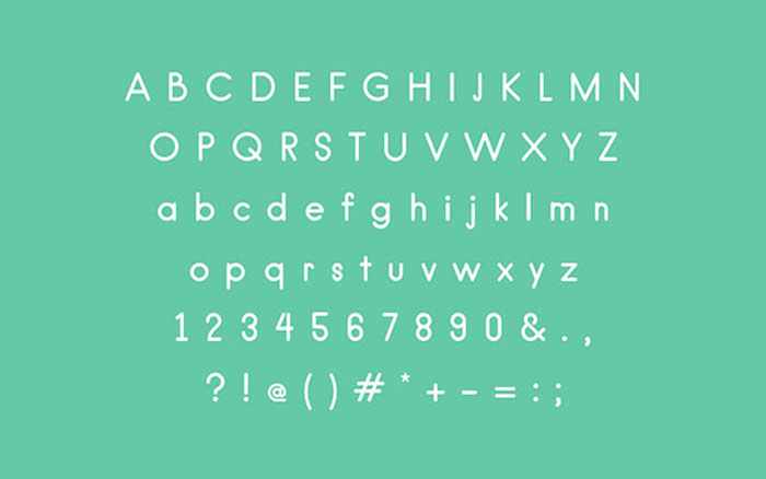
100 cool fonts to download
Kano – Download
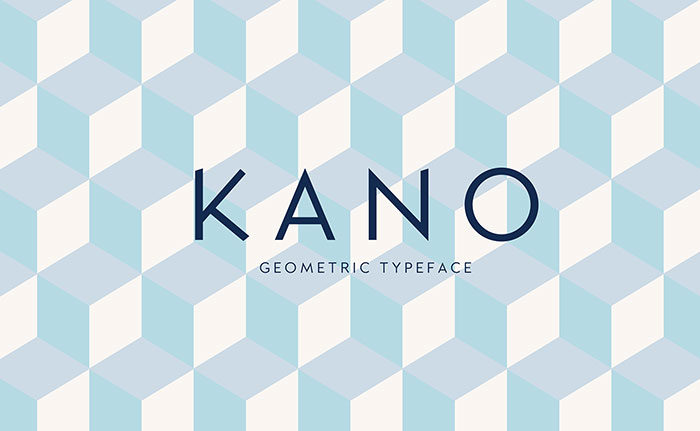
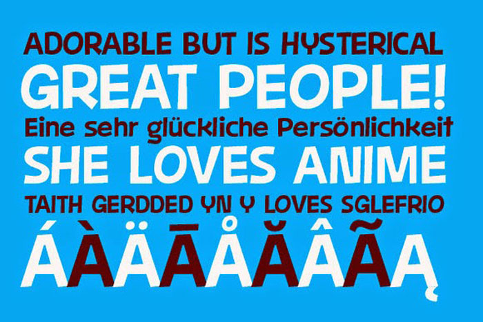
“Kano” is an uppercase and lowercase display typeface, with a geometric structure and a sharp edge point, making it one of the best fonts for logos, posters, and other typographic works. Kano is free for personal & commercial use.
Margot
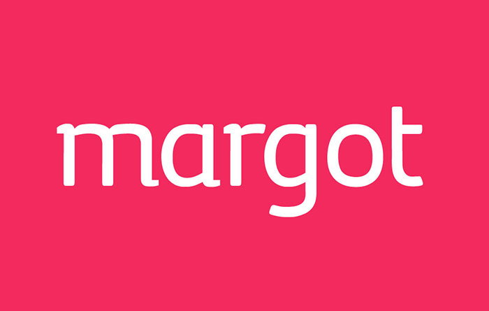
Margot is an adorable type family designed and optimized for its use in large sizes. Margot is vibrant, cheerful, perfectly suited for a great variety of typographical purposes. This makes it one of the great free typefaces for you.
Echowarp
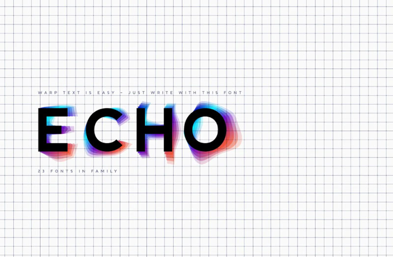
Introducing Echowarp is an unusual COLORED font family. The main idea of this font is that a colored echo spreads and fades from minimalistic letters to the sides.
Distorted letters give the effect of temporary refraction. The originality of this family is primarily suitable for a bold design.
And if you add a random distortion in a graphics program to the finished heading written in this font, the inscription will turn into an absolutely unique and inimitable one.
The futuristic set has 23 fonts in the family! Do not limit your imagination, because the font opens up a huge space for creative experiments.
Mosk – Download
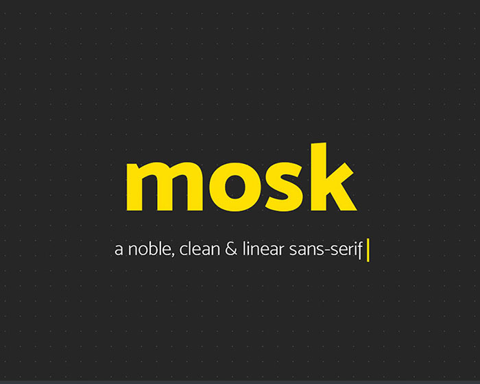
Mosk is a typeface family that consists of lowercase letters and edited versions in the uppercase version, for your logos and designs, Mosk makes great display fonts.
Campton
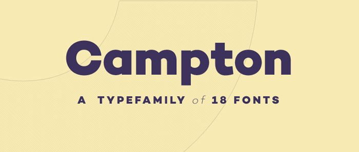
Campton is a cool text which is one of the best free fonts online. It is a simple sans serif with a geometric skeleton, based on the mid to early twentieth-century visual trend of achieving neutrality. Although, there are a lot of typefaces focusing on similar principles, tries to find its niche in the field of anonymous typefaces by combining simplicity with a subtle friendliness.
It is perfectly suited for graphic design application ranging from editorial and corporate design via web and interaction design through to product design.
Geonica – Geometric Sans Serif Font
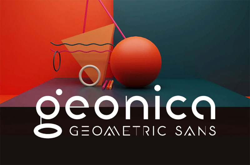
Geonica is minimalistic geometric sans serif font. The font includes stylistic alternates and ligatures. Geonica is suitable for the design on the theme of architecture, game industry, minimalism etc.
Moderne Sans
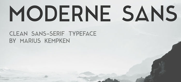
Moderne Sans is a clean sans-serif font style free for you to download, created by Marius Kempken. Inspired by the great 1920s font families.
Densia Sans
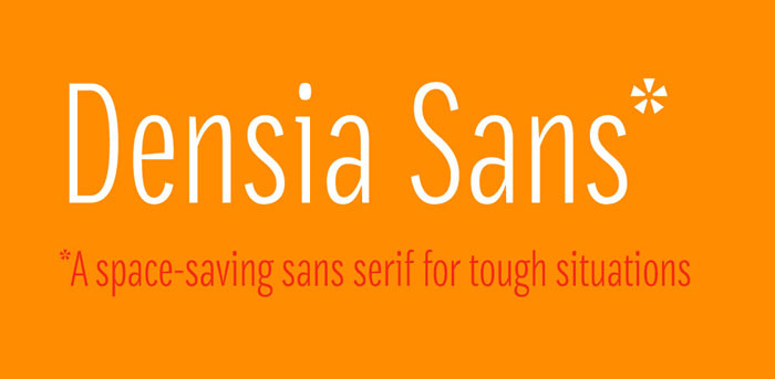
Denisa Sans is an economic sans serif, designed to be used in sizes from 6 to 14 points. Its tall x-height and narrow width make it the best font to use whenever there’s very limited space.
Not only it is space-saving, Denisa Sans features a complete set of 820 glyphs, including small caps, case-sensitive forms, proportional and tabular figures, superiors, inferiors, and fractions. Also, its character set supports over 30 languages.
Duma
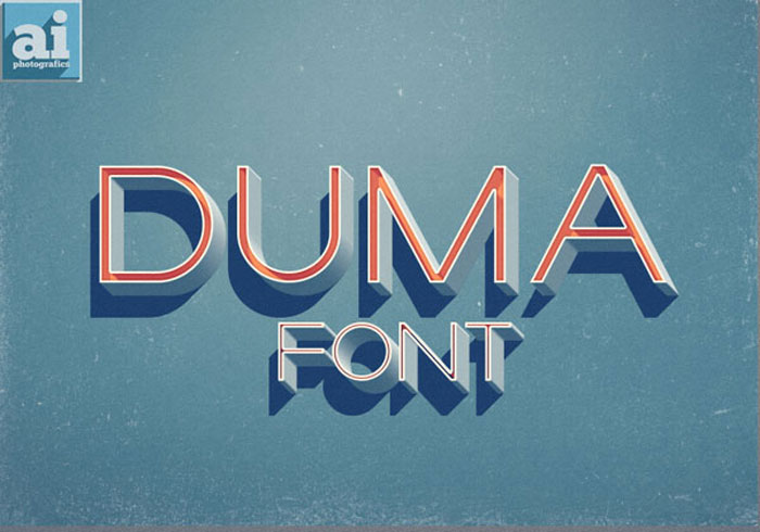
DUMA is one of the coolest fonts available. It is characterized with long legs and very extended. Each character was individually made in Illustrator using basic geometric shapes.
The HUGE Font Bundle
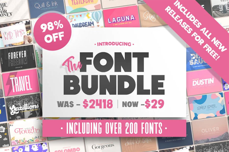
Introducing the MASSIVE Salt & Pepper Designs Font Bundle including a whopping 446 fonts over 258 different products. This monster pack includes every single font we have ever created over the past two years and is valued at a staggering $2859. This huge collection can be purchased for a limited period for ONLY $29, exclusively at CreativeMarket.com! Perfect for use on Procreate, Canva, Cricut, Photoshop, Illustrator, Silhouette and so many more programs.
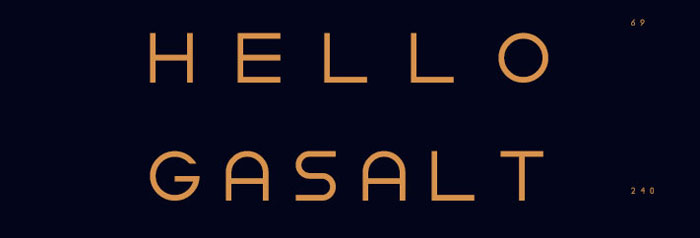
Gaspar
Simplifica
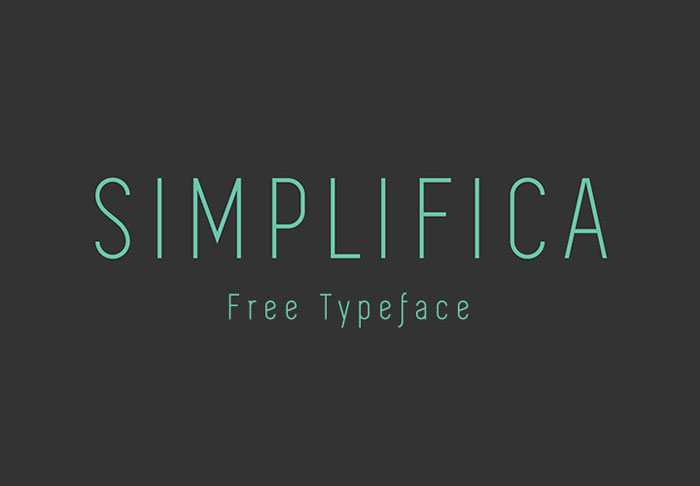
Another one of these cool free fonts is Simplified. It is a slightly condensed sans-serif typeface featured with a uniform and thin line width. Its high positioned caps-height and ascender make it one of the top fonts for legibility. A fine, simple and clear font that you can’t miss.
Amsterdam
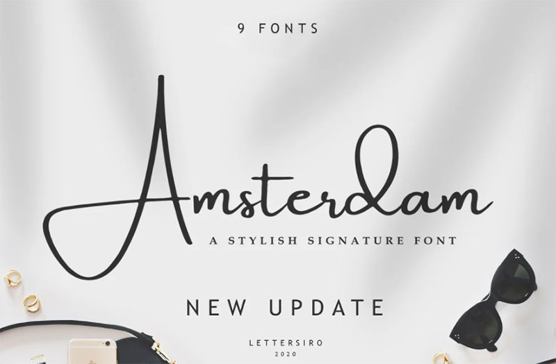
The Amsterdam font is a simple and classy font, comes with 8 Elegant Variations, OpenType features such as stylistic alternates, initial and final form, and ligatures. We keep this font looks elegant, classy, readable, stylish, catchy, and easy to use.
The Amsterdam Font is a great choice for watermarking on photography, signature or signature logo design, quotes, album cover, business cards, and many other design projects. From business cards to photo watermarks, The Amsterdam is here to elevate your work to the highest level
Source Serif Pro
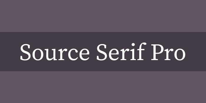
Source Serif Pro is a cool serif typeface in the transitional style, designed to complement Source Sans. Their close companionship is achieved by a careful match of letter proportions and typographic color.
While designed to harmonize with its serif-less counterpart, Source Serif often takes its own direction, in part because the two are inspired by different historical precedents.
Source Serif is loosely based on the work of Pierre Simon Fournier, and many idiosyncrasies typical to Fournier’s designs (like the bottom serif on the b or the middle serif on the w) are also found in Source Serif. Without being a pure historical revival, Source Serif takes cues from the Fournier model and reworks it for a modern age. Add this great option to your serif font list.
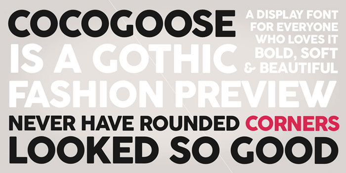
Cocogoose
Creative Vintage Font Duo
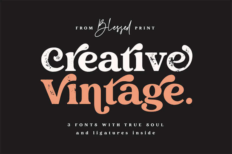
introducing Creative Vintage – a modern serif with vintage charm, fashion look, and retro yet modern style.
Three fonts that fit perfectly with each other:
Work fast using integrated OPENTYPE features. Just add PLUS (+) after any letter and get an alternate instantly. This feature works on most applications (Templett, Coral and others)
Creative Vintage Regular: Opentype Serif font with clean shapes and accurate kerning. It includes ligatures and alternates with a total amount of 669 PUA encoded glyphs.
Creative Vintage Draft: Modern Serif with chunky imperfect edges and shabby appearance. This font is a strict copy of everything from the regular version including glyphs names, kerning, and ligatures, so you are worry-free to change the style on the go. Alternates appear automatically when you type plus after any letter or even ligature.
Fabulous Scrip: Modern calligraphy script with straight appearance. It comes with 3 weights (thin, regular, and bold). All glyphs, ligatures, and alternates are PUA encoded. Elegant swashes are integrated into letters. This scrip has all the required Opentype features. Simply type numbers after any letter or [ before and in the end ] to get long lines.
All fonts include OTF & TTF. There is a help file with explanations, examples, and tutorials.
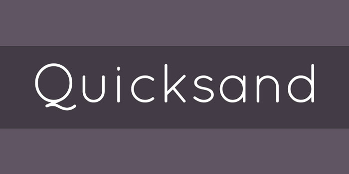
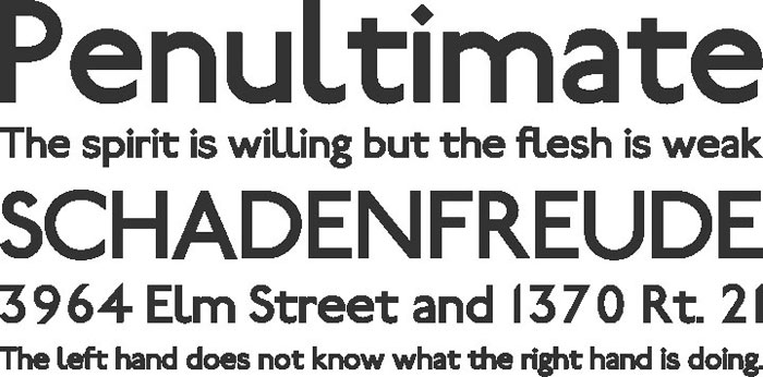
Quicksand
UGO
Losta Masta
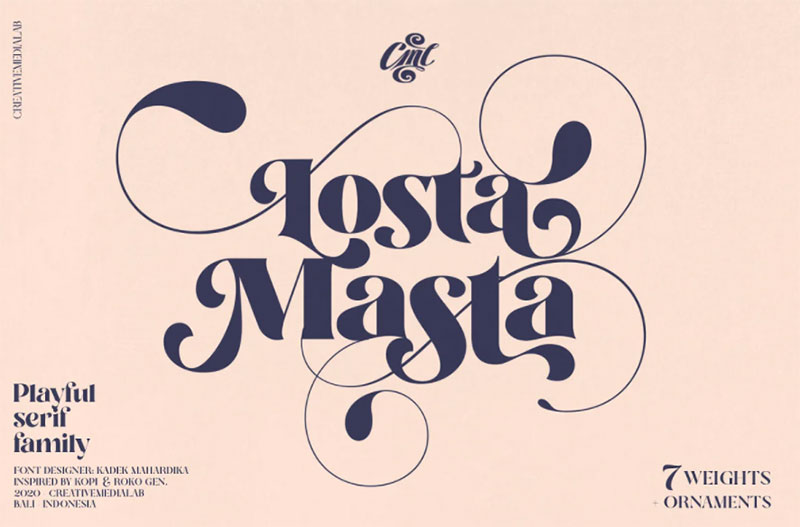
Unique, playful, and versatile serif family with 40+ ligatures and 100+ alternates can combine to get curves and beautiful shapes just in seconds.
Type the words and Add the unique shapes from the Losta Masta ornament to get a more stunning display.
This font is suitable for many design forms, such as magazines, postcards, logos, DIY Projects, invitation cards, quotes, vintage look design, an old classic, the 60s, 70s, 80s, wedding projects and much more.
We recommend using Adobe Illustrator or Photoshop.
Encode Sans
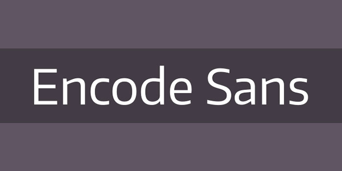
The Encode Sans family is a versatile workhorse. Featuring a huge range of weights and widths, it’s ready for all kind of typographic challenges. It also includes Tabular and Old Style figures, as well as full set of Small Caps and other Open Type features. A good font family for every designer.
Bernier
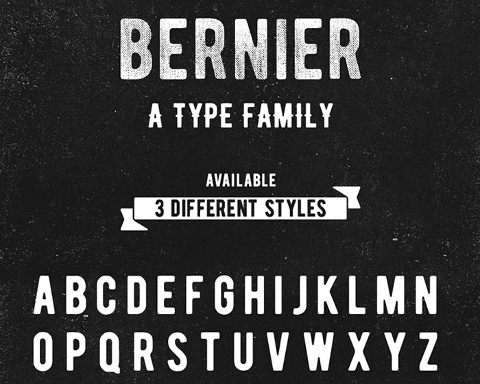
Bernier is a small but cool type family created by Ryan Pyae. Bernier has three different styles and it is the perfect text font for vintage or old school designs.
Gasalt
Railway
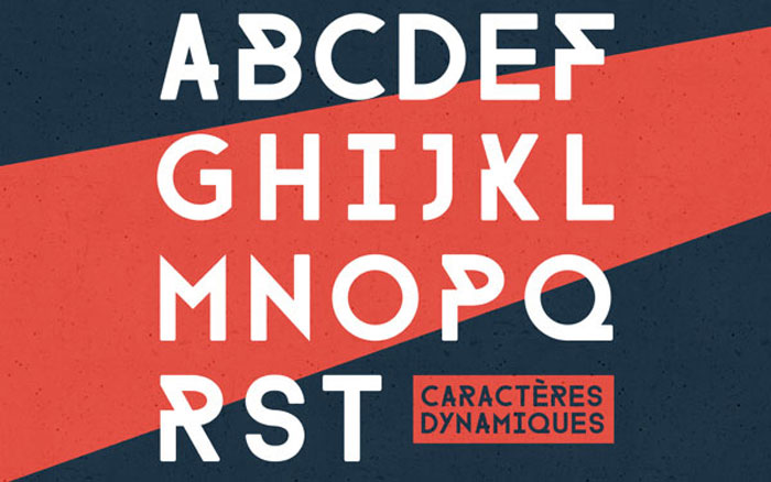
FARRAY
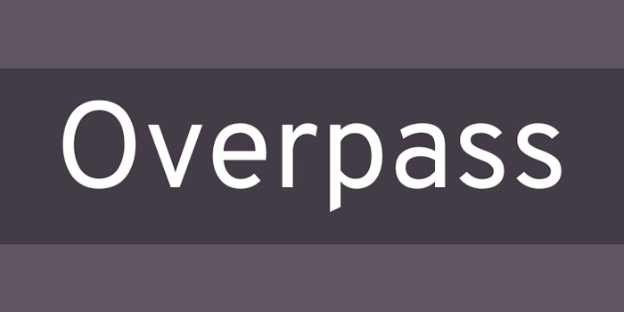
Overpass
Sant Joan Despí
Streetwear
Streetwear is bold and stylish retro inspired script typeface which makes it one of the best fonts for logos, posters, branding, packaging and t-shirt design. It looks like the 1960s and 70s fashion and sport-related typeface, unique and fun at the same time. You can access Streetwear’s alternate characters by using an OpenType savvy programs such as Adobe Illustrator and InDesign. If you want more fonts for logos, you should check out another article of mine.
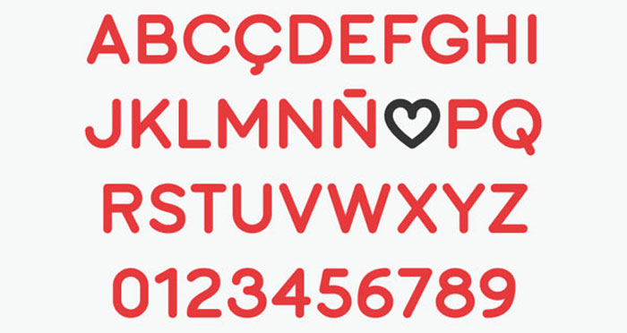
Rose
Graviola Regular
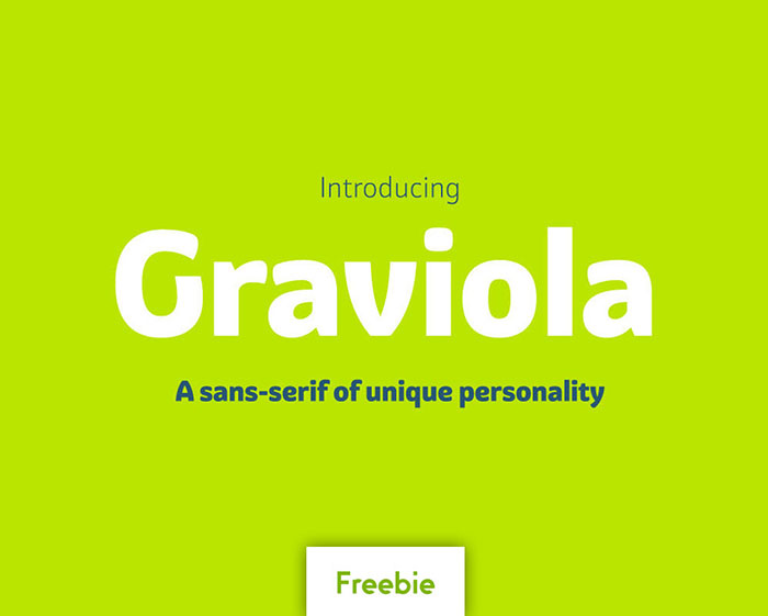
With semi-rounded terminals, Graviola is a soft and friendly font design. The font contains 533 glyphs, supporting more than 40 languages. Stylistic sets provide alternates in two groupings (a, v, w, y and G, g, &).
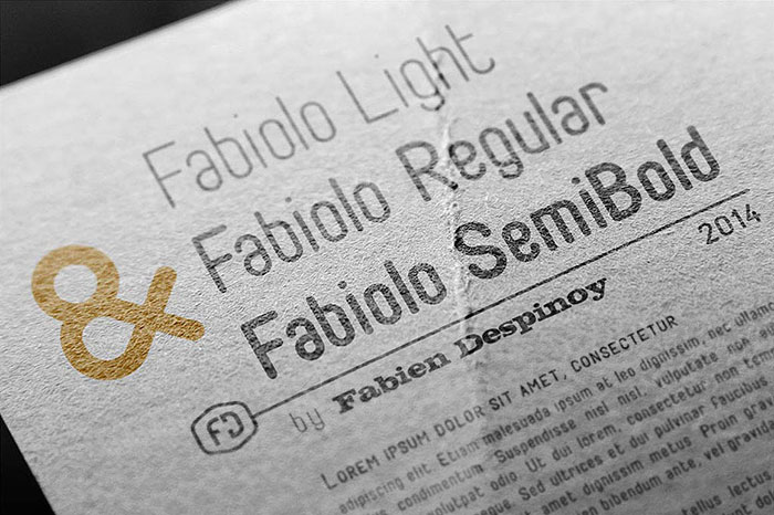
Fabiolo
Anurati
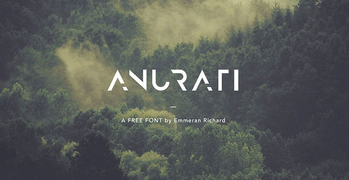
Anurati is a cool futuristic font the author worked on during the making of his website. Originally made to be free, this great online text makes way for the creativity of each and every one.
109 Professional, Premium Fonts with Extended License (Premium)
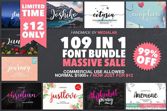
Your typeface toolbox is about to get a massive expansion. With this fabulous font bundle, you’ll get 109 typefaces in 75 unique font families, for 1 low price. With so much variety, you can work with virtually any client of yours, as well as pick up new ones. That means putting together everything from T-shirts to totes to invitations. If you’re looking for a selection of cool text fonts, this one is for you!
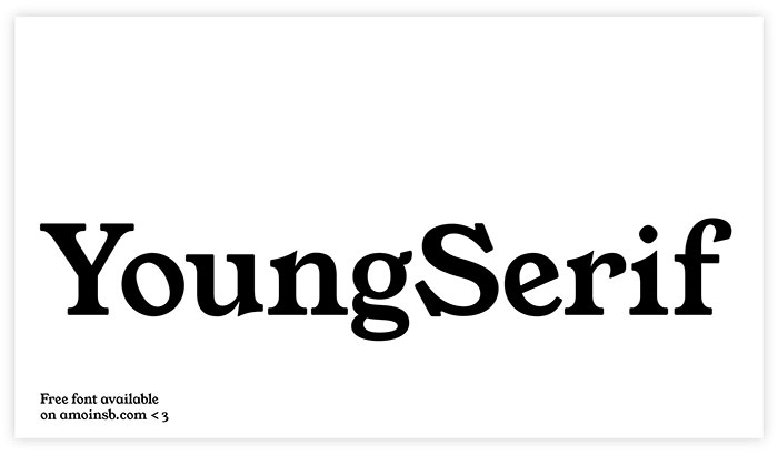
Young Serif
Fonesia Free Font
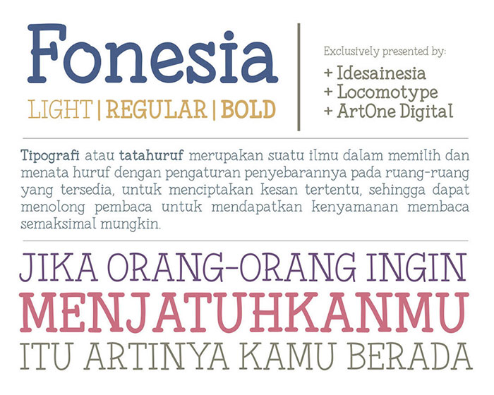
Fonesia family comes in three different variants: Light, Regular and Bold. For this initial release, it still carries a standard glyph: uppercase, lowercase, numbers, punctuation and some symbols. This awesome font was created by Arwan Sutanto and makes cool fonts for logos and headers.
Soria
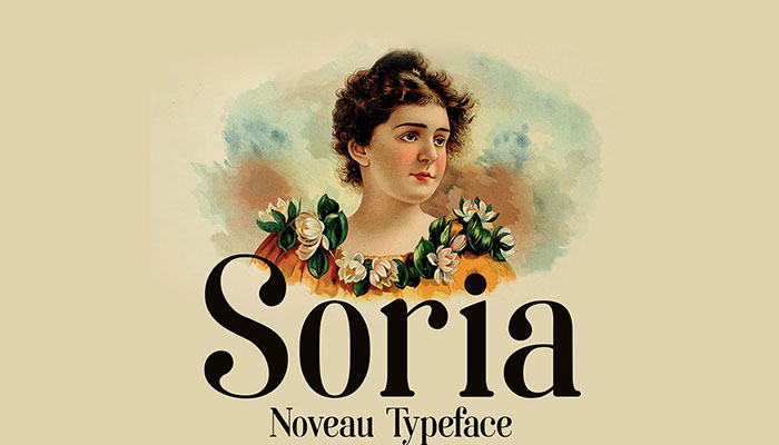
Soria has been created under art nouveau influence and the Didot fonts, as a result, we have a cool letter font that we can use for display texts.
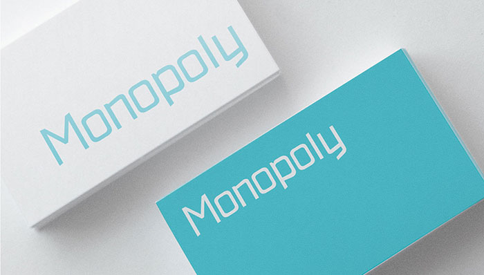
Monopoly
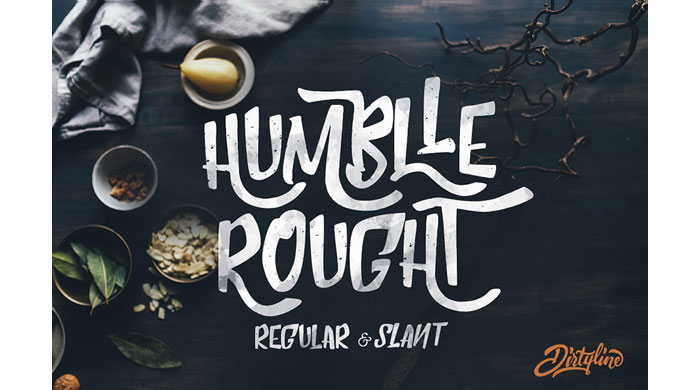
Humblle Rought
Are these cool free fonts enough for you?
No? Read on.
Five
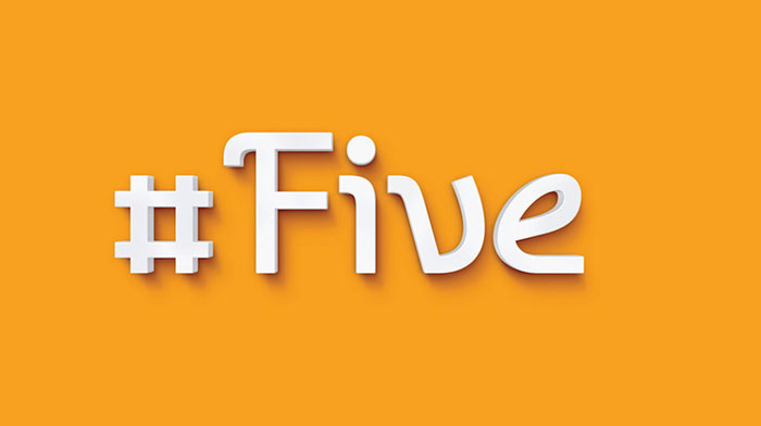
Another one of these cool fonts is Five, a contemporary display mono-weight typeface with a light retro accent. It designed in two styles – Regular and Oblique. The framework of the glyphs gives the opportunity to make a lot of ligatures. I think, Five make good fonts for expressive typography work such as headlines, posters, small texts. it looks excellent in a large size.
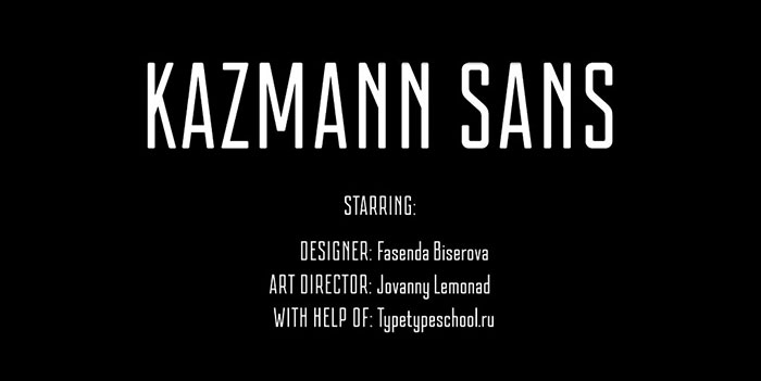
Kazmann Sans
Luxia
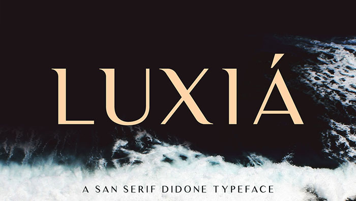
Lucia is a modern san-serif done with a splash of lavish text characters.
Now Font Family
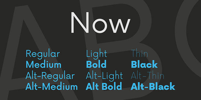
Now Alt Typeface is a simple geometric typeface by Alfredo Marco Pradil. Now Typeface is open source which makes it one of the cool free fonts to add to your collection. Now Alt is an alternate version of the Now typeface.
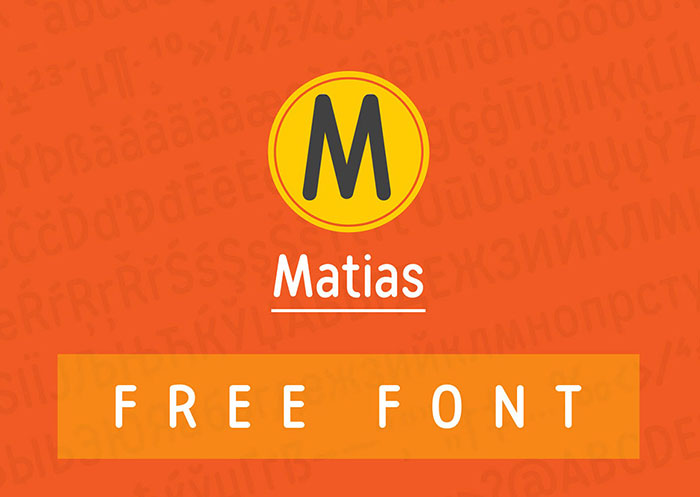
Matias
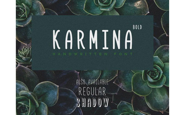
Karmina Bold
Sail
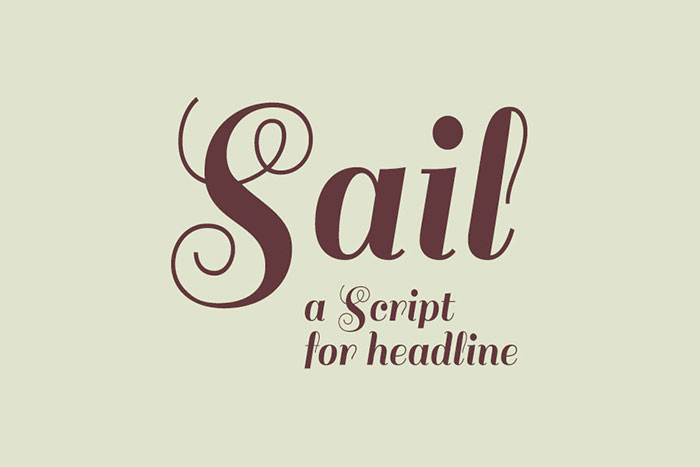
Sail Font is a Didot script for the headline, display, and poster use. A fresh air comes to all the glyphs, its windy uppercases make it one of the great graphic design fonts for display texts and web navigation. Elegant swashes and a clean lowercases also make it suitable for larger paragraphs.
Fina – ultra-thin, modern font
Meet Fina – a beautiful, thin, modern font suited for all kind of creative design works. It’s also a great design font for headlines: capital letters are with dots and points and lowercase is without them.
BONKERS
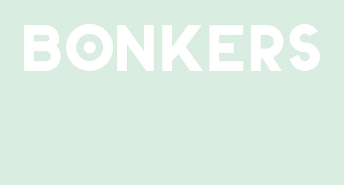
BONKERS is a strong font which was designed for headlines, poster, title, etc. It’s free for personal use. Commercial options and lowercase will follow in the future.
Caslon OS
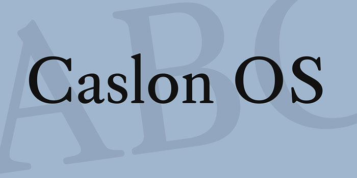
Caslon OS is a cool typography recreation and a combination of the old Caslon typefaces in the style and interpretation of Alfredo Marco Pradil.
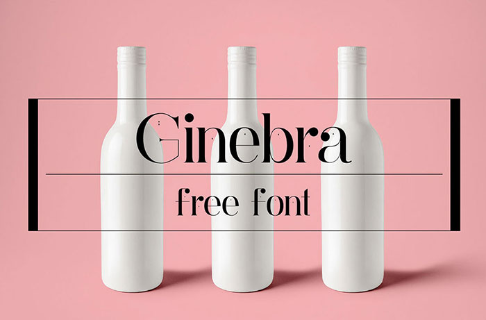
Ginebra
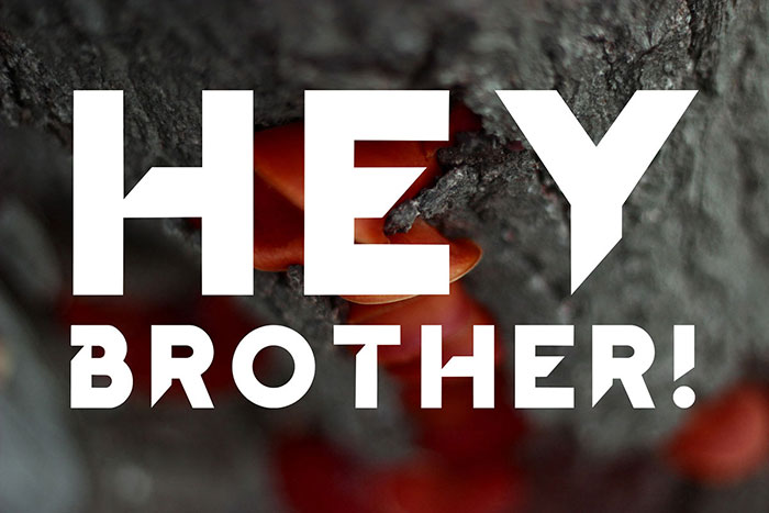
Hey Brother
Qanelas Soft: 3 Free font weights
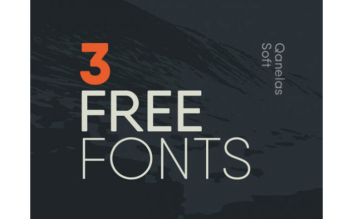
This freebie contains great fonts of UltraLight, Medium and ExtraBold weights that you can use for personal and commercial purposes, in accordance with the terms contained into the License Agreement that comes with the package.
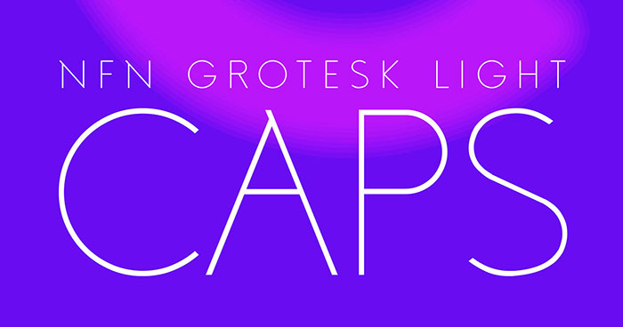
Grotesk Light
You should check out the remaining cool free fonts. They’re amazing.
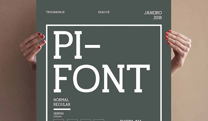
Pifont
Reglo
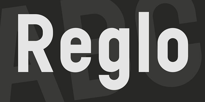
Reglo Bold is a geometric Sans designed by Sebastien Sanfilippo. This mega cool text was initially designed for the identity of Radio Panik with Open Source Publishing.
Elder Display
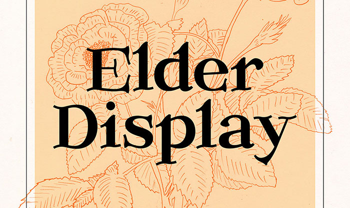
Elder is the style of a Transitional font with uppercase, lowercase, old style numbers and some punctuation.
Chau Philomene One
Simple
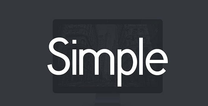
A new free font called Simple. I realized it inspired by great fonts and I tried to make it the more readable as possible, in simplicity. It has two weights: Regular and light. Simple has a clear and uncluttered appearance, making it a great font for logo designs.
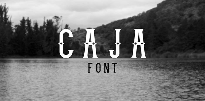
Caja
Gen
Something Wild
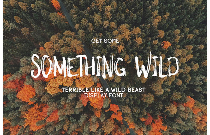
This cool fond has a gorgeous handwritten design and a genuine wild spirit. Just the right thing for you if you want to add some raw feeling to your design! The font comes in all popular formats.
Kust
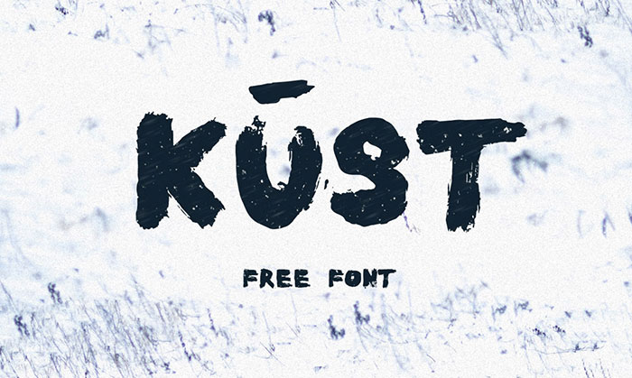
The new Kust is a fancy font with a handwritten appearance, written by Ieva Mezule, the fashion designer, and painter. 80 characters, every letter has a unique structure, with a distorted look. The letters were drawn on hard paper with a thick brush using pure black ink. The presentation was made by images taken by Krisjanis Mezulis, and the painting that’s in the middle was painted by Ieva
Fibon Sans – Regular Weight Free
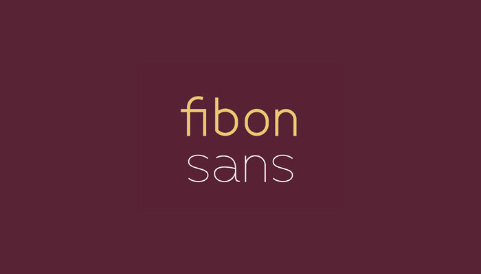
Fibon Sans is a balanced, low contrast, geometric and highly legible typeface with cool letters well suited for any display or text use. Its curves make it a dynamic typeface, ideal for those who want to add a modern touch to their compositions. Fibon Sans is an excellent choice for logotypes, magazines, blogs, presentations and many more.
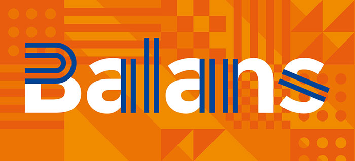
Balans
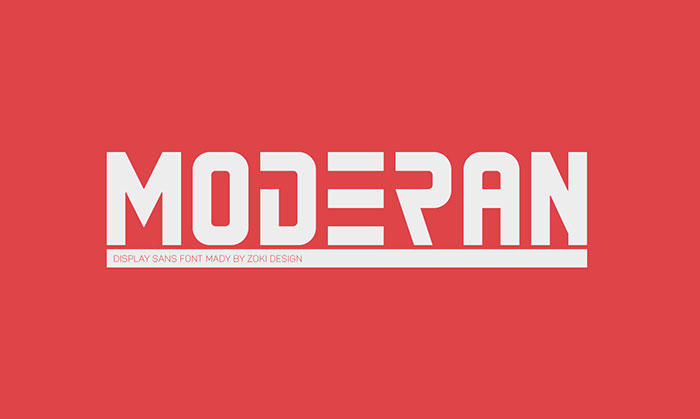
Moderan
Cenotaph Titling
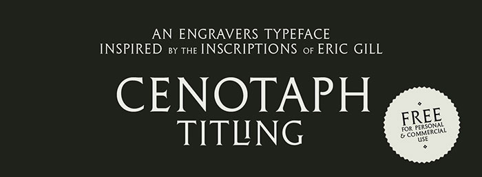
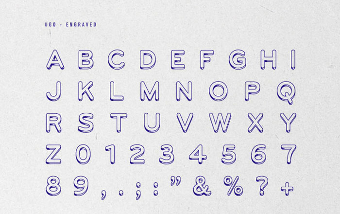
Cenotaph has an engraved-style letter symbol which draws reference from inscriptions done by Eric Gill – most notably in the vertical stem in the ‘U’. In OpenType format, it contains 10 discretionary ligatures useful for stylistic and practical spacing purposes, as well as 3 alternate ampersands and proportional old style numerals.
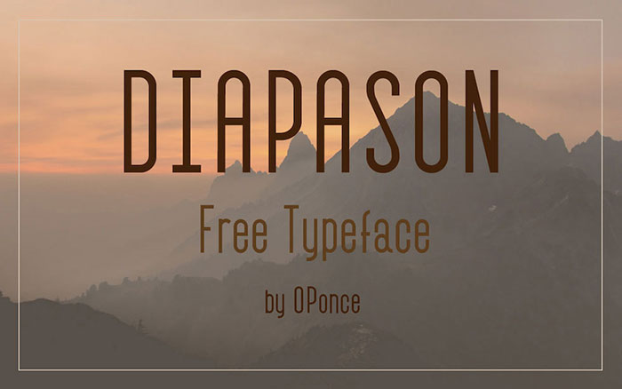
Diapason
Sk-Modernist
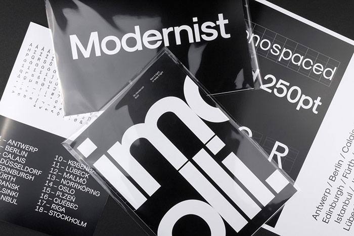
Sk-Modernist is a minimalist and clean typeface which eschews complicated forms. The aim of the typeface was to create an amalgamation of a modern Grotesk, like Helvetica, with a simpler geometric style, like Avant Garde.
Sk-Modernist has been designed specifically for the digital age, each letterform being optically adjusted using a mathematical system rather than the traditional typographer’s eye. This approach has resulted in a typeface that displays exceptionally well in digital mediums. It is one of the best modern fonts for website design.
Want to see more cool fonts?
Read on.
Cloud Sans
Cloud, a humanist sans serif typeface with a bit of grotesque structure. These font designs are suited for all purposes. Contains 5 weights with suitable italic. Light & Bold are available for free!
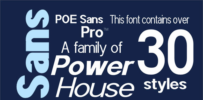
POE Sans Pro
Bender
The Bender font family contains some cool logo fonts. It was created in Russia especially for graphic designers. Thanks to the unique form of signs, fonts of the given family it is possible to type texts, to do logos or headings. Great graphics fonts for every designer.
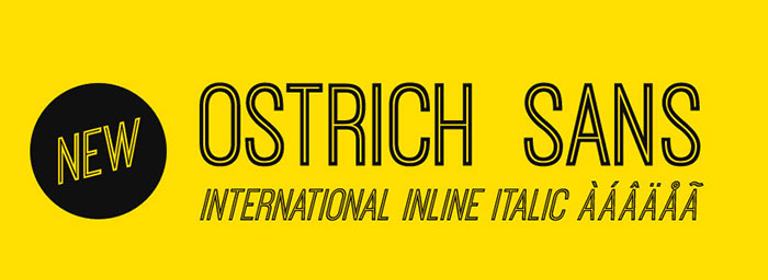
Ostrich Sans
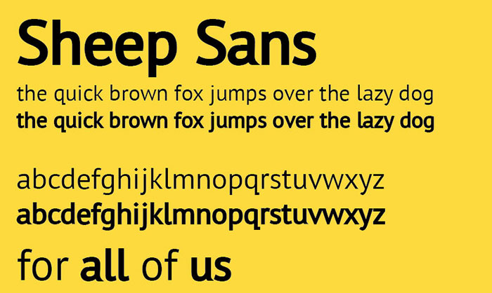
Sheep Sans
Cabin
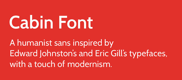
The Cabin Font is a humanist sans inspired by Edward Johnston’s and Eric Gill’s typefaces, with a touch of modernism. Cabin’s cool text incorporates modern proportions, optical adjustments, and some elements of the geometric sans.
Pier
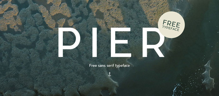
Pier is a modern and structured typography. The idea was to create a slightly off geometric text font that would look as well big or very small. It was made to fit your everyday designs and text needs.
Moon
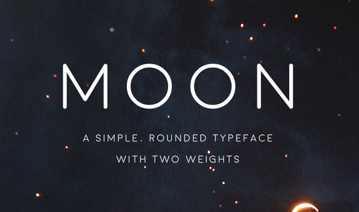
A new FREE rounded, simple, space-ie choice of free font families entitled Moon, with both thin and bold variations, free for personal use only.
Shihan
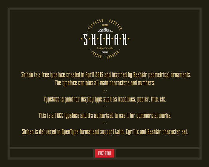
Shihan is a free font for designer use, created in April 2015 and inspired by Bashkir geometrical ornaments. This is a FREE typeface and it’s authorized to use it for commercial works. Shihan is delivered in an OpenType format and support basic Latin, Cyrillic, and Bashkir character set.
Ailerons
Ailerons were inspired by aircraft models from the 40s. This exciting font was designed for an experimental project of air models and now is available for personal use.
Viga
Viga is a cool font design, sans-serif, with a good performance on screen. Its anatomy gives it a great personality and also makes it useful for reading on screen.
Nickainley Script
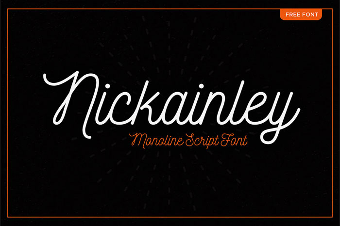
Another one of the cool free fancy handwriting fonts from this article is Nickainley. Nickainley is a Monoline Script font. handwriting font with a touch of classic and vintage. in uppercase, lowercase characters, numeral, and punctuation. Can be used for various purposes, such as logos, badges, wedding invitations, t-shirts, letterhead, signage, labels, news, posters, badges etc.
Gen
Geomanist
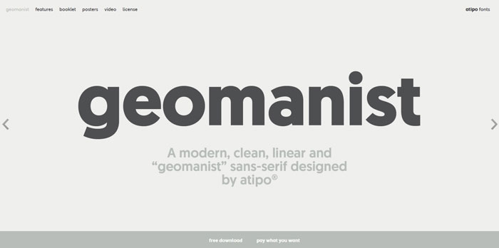
Germans, a new sans serif font created by fonts designer atipostudio. download regular weight for free.
Mesmerize
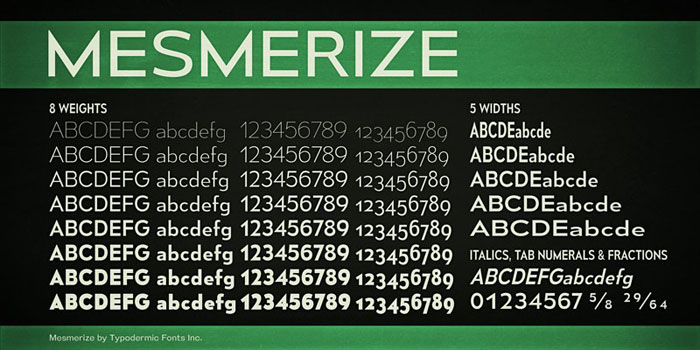
Mesmerize is a low x-height sans-serif family of super cool fonts with 80 styles. There are 8 weights, 5 widths, and italics. The capital I will automatically be replaced by a serifed I when followed by a lowercase l. In OpenType savvy applications, you can access old-style numerals, tabular lining numerals, and tabular old-style numerals.
Keep Calm
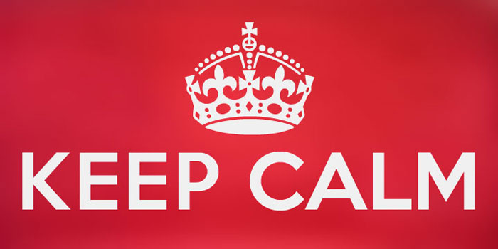
Keep Calm is a family of fonts developed from the now famous World War 2 poster that was designed in 1939 but never issued, then rediscovered in 2000. As well as the original Keep Calm font, the Medium weight of the poster which can be downloaded free for personal use, three new weights are available from K-Type – Book (regular), Heavy and Light – and each comes with a complementary Italic. It’s a cool bold font which has become very popular in recent years.
Leto Text Sans
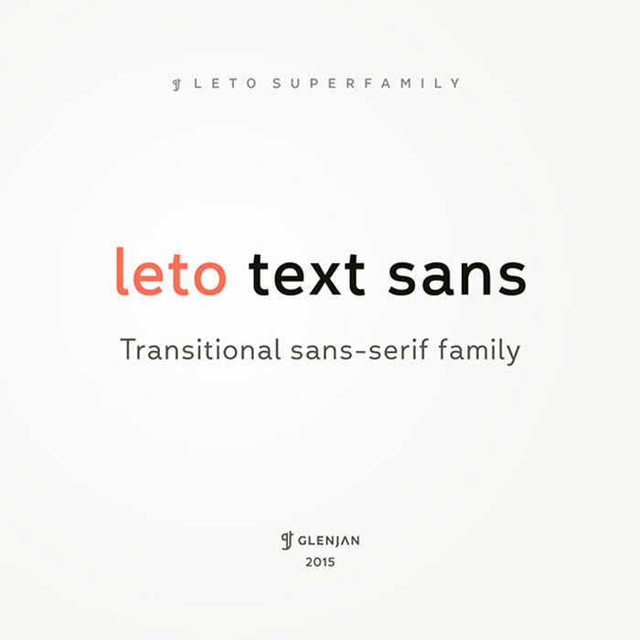
Leto Text Sans is transitional sans-serif type family in 9 styles – 4 weights with italics and free Defect style to add to your collection of downloadable cool fonts.
Gidole
Gidole is an open source modern DIN to add to your font lists. It was created by Andreas Larsen in 2015. Currently, only regular weight but more weights are in the pipeline along with full greek + Cyrillic support.
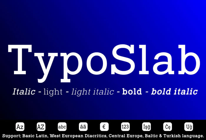
Typo Slab
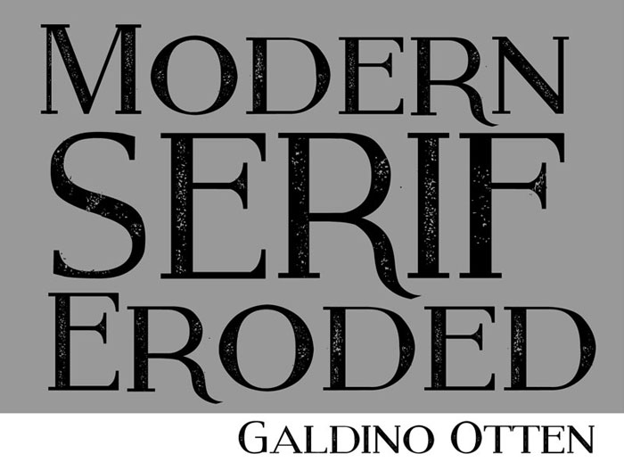
Modern Serif Eroded
Cathedral
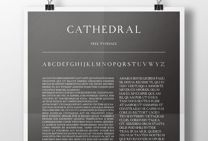
Cathedral can be included in the group of transitional character, indicating the transition from the ancient to the modern Roman. It’s one of the cool typefaces in this article that I like using often.
Chubby
Simply Rounded
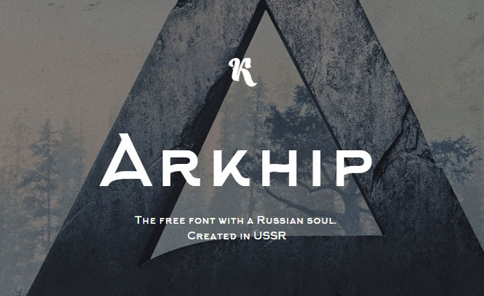
Arkhip
Retro
Retro family fonts selection was designed as a result of love for typography and especially in the time of 20th century. As an experimental design, this font is given to the the public for free and for any use.
Blogger Sans
Blogger Sans was designed by Sergiy Tkachenko as the FirstSiteGuide’s custom typeface, created primarily for the use in headlines of the website. This interesting font draws inspiration from the clarity and legibility of the popular font Dosis with an additional support of the lost Cyrillic languages.
The bolder weights are lighter and softer. The following elements (-b-d-h-k-p-q-y-) are shorter, thus the headlines and subheads could be put in the dense line spacing. In addition, the outline of the Blogger Sans is more smooth with better eligibility.
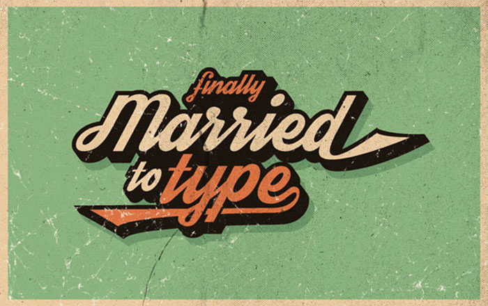
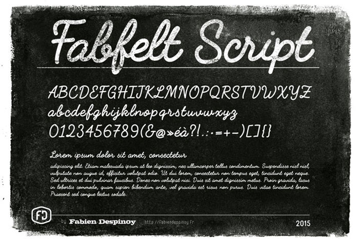
Fabfelt Script
Bakersfield
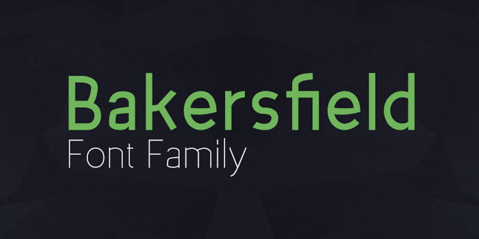
Bakersfield draws inspiration from 1920s geometric-style typefaces by having clean and highly legible forms constructing the type. The family is characterized by excellent legibility both in print and on the web, a well-finished geometric design, highly precise kerning.
The font’s various weights give it the power to fit in any type of design, web, print, motion graphics, and make it perfect for headlines and corporate design via web and interaction design through to product design. One of the best modern typefaces for business use.
Althea
Althea is a ligature-free, modern upright cursive typeface with proportional lining figures and with cool letters. If you have a passion for interesting fonts, this one is for you.
Drugs font family
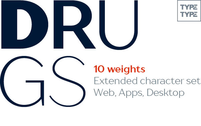
Font family Drugs – these amazing fonts are specifically designed for the pharmaceutical industry and for household chemicals. Then to make a text layout for a package of any medicine, toothpaste or laundry detergent? The answer is – Drugs. Font family has a range of unique fonts ranging from thin to black font and can be used on any surface: paper, cardboard, metal, glass, and others.
MAXWELL
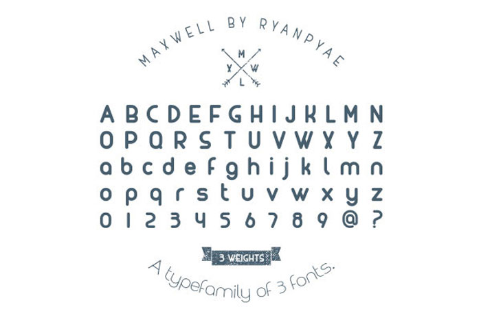
MAXWELL make great design fonts, applicable for any type of graphic art. (web, print, motion graphics etc and perfect for headlines and logotypes/ wordmarks)
Mexe
Mexe is another one of these amazing strong fonts. It was designed for specific headlines, to comic books and the Cyrillic alphabet containing.
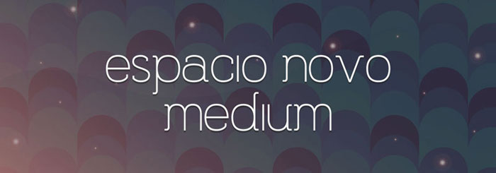
Espacio Novo
Uni Sans

Uni Sans is another one of these cool font styles for Photoshop or Illustrator and you can use it to create cool font designs
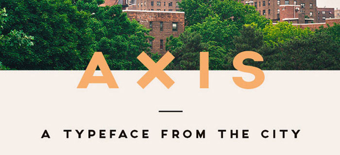
Axis
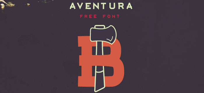
Aventura
Montserrat
Often compared to Proxima Nova for its charming utility, Montserrat is a unique font, loved by many web and UI designers.
Rund-Grotesk
The Rund-Grotesk is a geometrical cool font with some typical classic shapes and characters. With its short descender and a large x-height, it develops a special appearance. Especially the lower case letters support the classical look since some glyphs resemble old blackletter typefaces.
The Rund Grotesk’s character set supports all central and some eastern European languages. Modern glyphs like the @ or the € symbol were added so it fits the today’s usage. With three weights, light, medium and bold and furthermore the italics it is an amazing font for headlines and small paragraphs.
Zona Pro
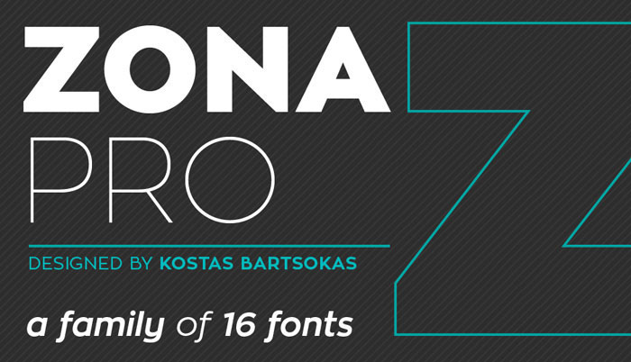
Besides being one of the cool fonts in this article, Zona Pro is a versatile geometric sans-serif type family of 8 weights plus matching italics. Zona Pro draws inspiration from 1920s geometric-style typefaces by having clean and highly legible forms constructing the type.
The heavier weights feature a slight variance in the stroke widths, resulting in a grotesque-ish and distinctive personality. Zona Pro has been designed to be an elegant, modern and multi-functional typeface which makes it one of the best fonts ever for both editorial and display settings.
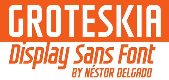
Groteskia
Aaram
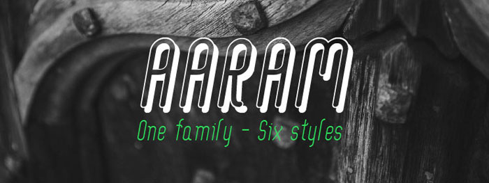
Aaram is a unique font family, that comes in six gorgeous styles to choose from. Aaram is one of the best typefaces for screen use but it’ll look fantastic in print too.
Rabiola
Cooper Hewitt
Cooper Hewitt, is a contemporary sans serif and one of the cool new fonts in this article, with characters composed of modified-geometric curves and arches. Initially commissioned by Pentagram to evolve his Polaris Condensed typeface, Chester Jenkins created a new digital form to support the newly transformed museum.
Atletico
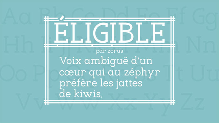
Eligible
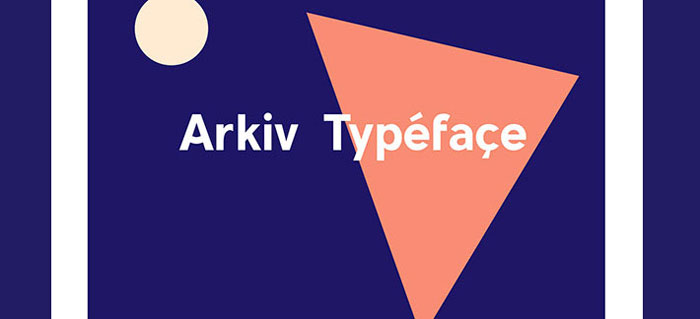
Arkiv
Ahellya
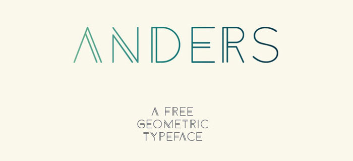
Anders
Hanken
Mockup
Meticulous Ariel
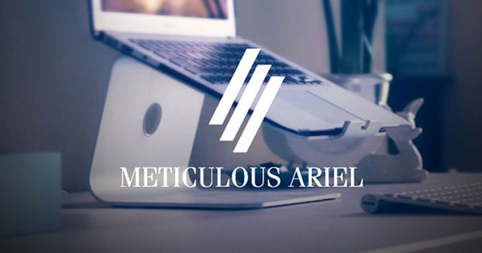
Meticulous Ariel is a fashion font. Meticulous Ariel Typeface is the best font ever for popular fashion magazines and super luxury brands.
FAQ On Examples Of Cool Fonts
What makes a font “cool”?
A cool font grabs attention. It blends artistic fonts with functional design, ensuring readability while standing out. Think modern typefaces or decorative fonts.
Cool fonts convey a specific mood or style, making them perfect for logos, headlines, and branding. Explore Google Fonts or Adobe Fonts for some striking options.
Where can I find free cool fonts?
For free cool fonts, Google Fonts is a go-to resource. Font Squirrel offers a curated selection of commercial-use fonts. Dafont has a vast library of unique type designs. These platforms provide stylish fonts for any project, from web design to print.
How do I pair cool fonts effectively?
Pairing fonts involves combining a bold font with a minimalist font for contrast. Use a serif font for headings and a sans-serif font for body text. Tools like Canva offer font pairing suggestions, helping you create harmonious and visually appealing designs.
Are there cool fonts suitable for professional use?
Absolutely. Many elegant fonts and professional fonts are perfect for business. Adobe Fonts and Google Fonts have extensive libraries of trendy fonts that are both stylish and suitable for professional contexts. These fonts balance creativity and readability.
Can cool fonts be used for body text?
While display fonts shine in headlines, some cool fonts are readable enough for body text. Choose minimalist fonts or elegant fonts that maintain readability at smaller sizes. Font Squirrel offers a variety of modern typefaces suitable for longer passages.
How can I customize cool fonts?
Customization involves tweaking the font’s size, weight, and spacing. Tools like Adobe Illustrator allow for detailed adjustments. You can create custom fonts by modifying existing creative typefaces. This makes your design unique while still being rooted in popular styles.
What are the best cool fonts for web design?
For web design, Google Fonts offers many web fonts that load quickly and look great. Sans-serif fonts like Roboto and Open Sans are popular for their readability. Handwritten fonts and script fonts can add a personal touch when used sparingly.
How do cool fonts impact user experience?
Cool fonts enhance user experience by making content engaging. They guide the reader’s eye and create a visual hierarchy. Using creative typefaces strategically can reduce bounce rates and improve readability, making your design more effective and user-friendly.
What are some cool fonts for logos?
Bold fonts and decorative fonts are ideal for logos. Behance showcases many designs using vintage fonts and handwritten fonts. A well-chosen font can define a brand’s identity, making it memorable and distinct in the marketplace.
Are there trends in cool fonts?
Yes, font trends evolve. Currently, minimalist fonts and script fonts are popular. Retro fonts and handwritten fonts are making a comeback. Keep an eye on Typography Guru and Behance to stay updated with the latest in font trends and innovations.
Conclusion
Selecting the right typeface can transform your design from ordinary to extraordinary. In this article, we explored examples of cool fonts that can elevate your projects. From modern typefaces to vintage fonts, each font brings its own flavor and style.
Understanding the impact of typography is crucial. Trendy fonts not only enhance aesthetics but also improve readability and user engagement. Whether you need decorative fonts for a bold statement or minimalist fonts for a clean look, the right choice can make all the difference.
By leveraging resources like Google Fonts, Adobe Fonts, and Font Squirrel, you can access a vast library of unique type designs. Experiment with font pairing, customize your typefaces, and keep up with font trends to stay ahead in your design game.
Explore, experiment, and let your creativity shine. The right font can be the key to unlocking the full potential of your design.
If you liked this article about cool fonts, you should check out this article about what font PayPal uses.
There are also similar articles discussing what font McDonald’s uses, what font Star Wars uses, what font The New York Times uses, and Minecraft fonts.
And let’s not forget about articles on Metallica font, Money fonts, what font YouTube uses, and what font CNN uses.
Renowned for his expertise in logo design and visual branding, Bogdan has developed a multitude of logos for various clients.
His skills extend to creating posters, vector illustrations, business cards, and brochures. Additionally, Bogdan's UI kits were featured on marketplaces like Visual Hierarchy and UI8.
He also wrote in the past years on sites like Design Your Way, WebDesignerDepot, WPDean, Designmodo, Speckyboy, Slider Revolution, and more.
- Timeless Open Sans Font Pairing for Any Project - 22 July 2026
- Pantone to HEX converter - 21 July 2026
- The Retool Logo History, Colors, Font, And Meaning - 20 July 2026
Bogdan Sandu is a seasoned designer who has been designing websites since 2008. Renowned for his expertise in logo design and visual branding, Bogdan has developed a multitude of logos for various clients. His skills extend to creating posters, vector illustrations, business cards, and brochures. Additionally, Bogdan's UI kits were featured on marketplaces like Visual Hierarchy and UI8. He also wrote in the past years on sites like Design Your Way, WebDesignerDepot, WPDean, Designmodo, Speckyboy, Slider Revolution, and more.
You Might Also Like