A sportswear brand once spent $25 million turning two decathletes into household names, then watched one of them miss the Olympic team five weeks before Barcelona.
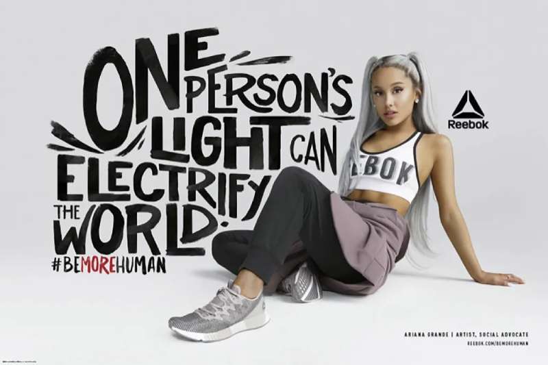
Reebok ads hold more of those stories than almost any athletic brand. Freestyle aerobics print work, the Pump’s direct attacks on Nike, Terry Tate tackling coworkers at Super Bowl XXXVII, Be More Human posters cropped mid-effort.
This page covers the campaigns by name, with the agency, year and market behind each one.
What you get:
- The campaign timeline from 1982 to 2024
- Layout, typography and palette decisions in the print work
- Agencies, directors and taglines, credited
- Takeaways you can apply to your own layouts
Reebok advertising spans 44 years, 8 lead agencies and 12 flagship campaigns, from the Freestyle aerobics push in 1982 to “Sport Is Everything” in November 2024. The work runs on three repeating devices: athlete-led storytelling, blunt competitor comparison, and comic exaggeration.
This page covers the campaigns by name, with the agency, year and market behind each one. It also breaks down the layout, type and color decisions that made the print work land.
Reebok Advertising at a Glance
Reebok has advertised at scale since 1982, working primarily with Chiat/Day, Arnell Group, mcgarrybowen and Venables Bell & Partners. Its best-known campaigns are The Pump, Dan & Dave and Terry Tate: Office Linebacker. The visual signature combines the Vector logo, saturated red, and a wide geometric wordmark.
| Attribute | Value |
|---|---|
| First major campaign | Reebok Freestyle aerobics advertising, 1982 |
| Lead agencies | Chiat/Day (1992-1993), Arnell Group (2002-2004), mcgarrybowen (2004-2007), DDB Worldwide (2009), Venables Bell & Partners (2014-2018) |
| Best-known taglines | “Reeboks let U.B.U.” (1988), “Pump up and air out” (1989), “I Am What I Am” (2005), “Run Easy” (2007), “Be More Human” (2015) |
| Primary media | TV, print, out-of-home, Super Bowl, digital film |
| Awards | Cannes Lions Golden Lion (2003), 2 Silver Cannes Lions and 2 Bronze Clio Sport (2015), ISPO Gold (2016) |
| Visual signature | Vector logo, red accent, custom wordmark based on Motter Tektura |
Which Reebok Ad Campaigns Are the Most Famous?
Six Reebok campaigns carry lasting recognition: Freestyle aerobics advertising (1982), The Pump (1989-1995), Dan & Dave (1992), Terry Tate: Office Linebacker (2003), I Am What I Am (2005) and Be More Human (2015). Each one shifted the brand’s target audience and its art direction at the same time.
Freestyle and the Aerobics Era (1982-1987)

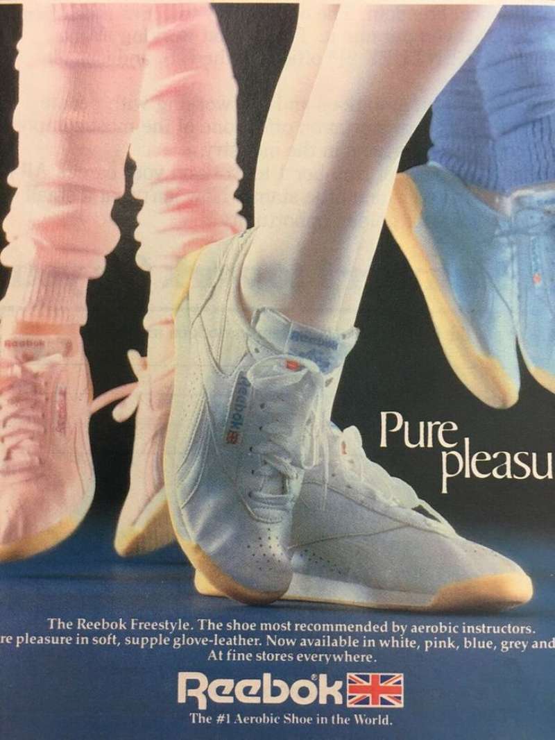
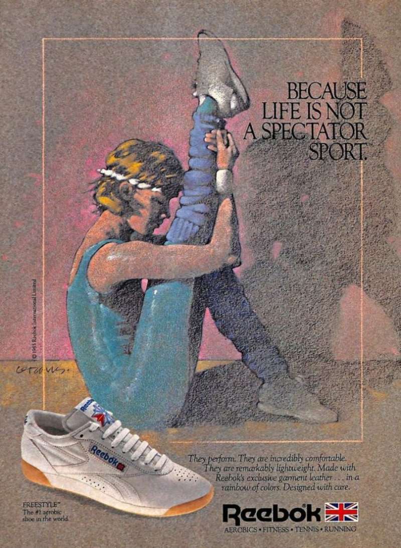
Reebok’s revenue climbed from $3.5 million in 1982 to $12.8 million in 1983 on the back of the Freestyle, according to Sneaker Freaker.
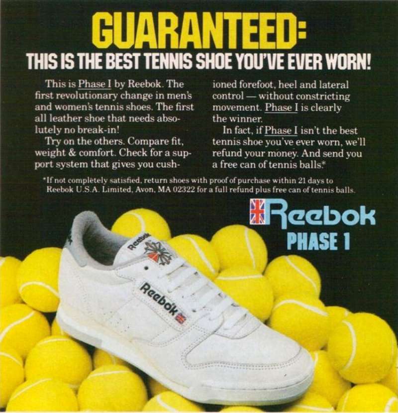
The advertising defined the shoe as “simple elegance” and aimed it squarely at women in aerobics classes, a market Nike had written off.
- Copy device: product-benefit lines, no athlete endorsement
- Palette: pastel leather colorways shot on white, which is why the layouts read closer to minimalist design than to sports advertising
The Pump: “Pump Up and Air Out” (1989-1995)

The tactic: name the competitor. Dominique Wilkins ended one 1989 spot with a direct address to Michael Jordan, telling him to pump up and air out.
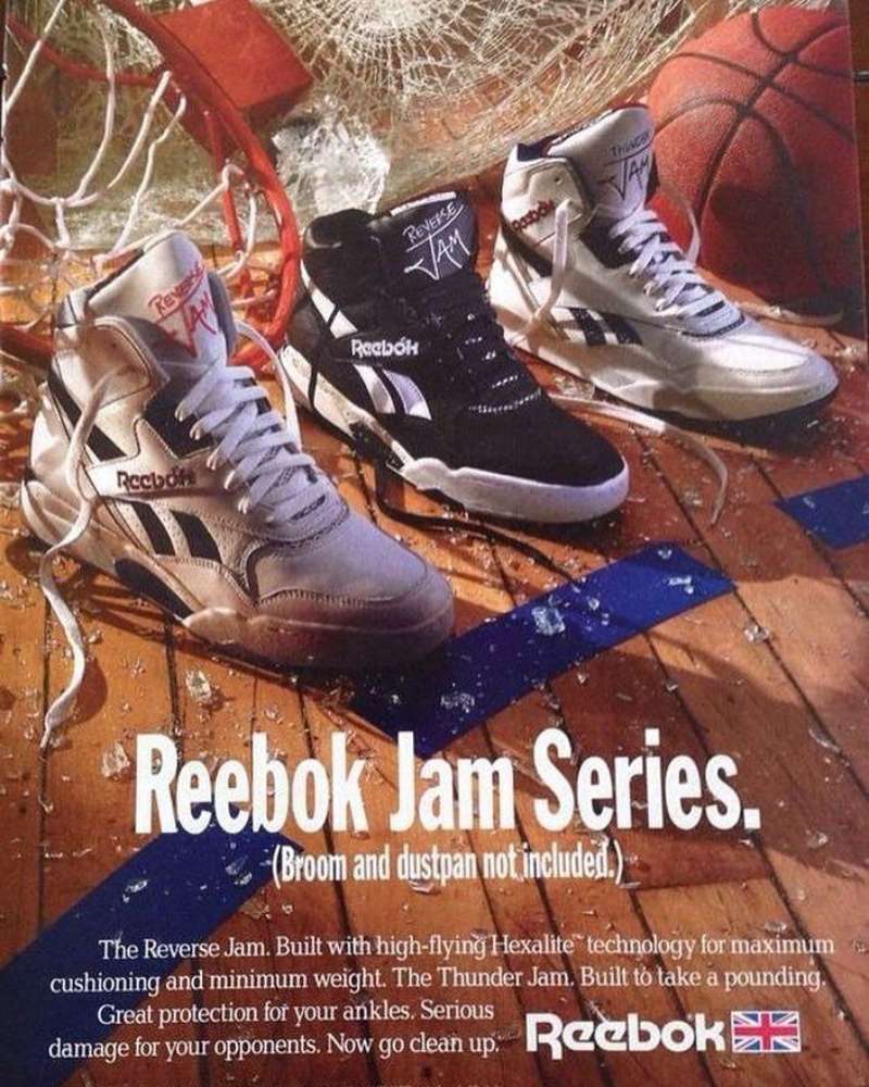
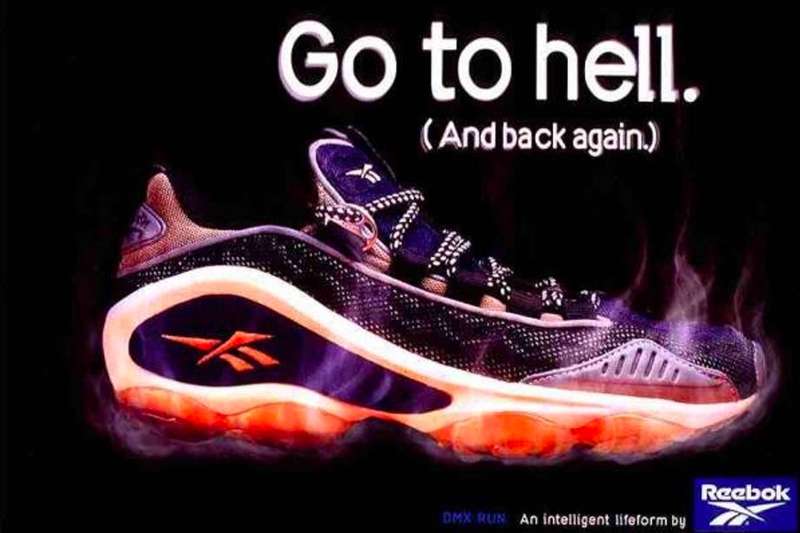
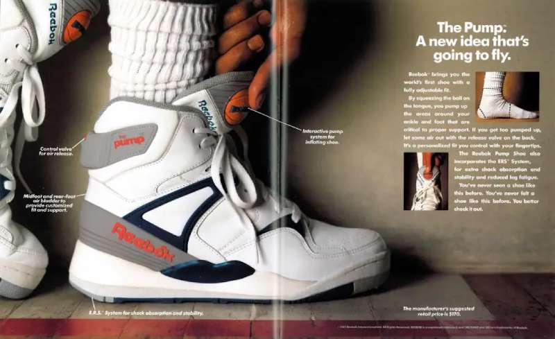
The layout: the inflation button sat at the optical center of nearly every print execution, so the focal point was a mechanism rather than a face.
The number: the Pump launched November 24, 1989 at $170, a price the size? archive notes was deliberately set to confer status.
A banned bungee-jumping spot showed a Nike wearer falling out of his shoes. Sales went up anyway.
Dan & Dave (1992)

The most expensive misfire in sports advertising history.
Chiat/Day built an eight-month campaign around decathletes Dan O’Brien and Dave Johnson, asking who would be the world’s greatest athlete. It debuted during Super Bowl XXVI on January 26, 1992.
Reebok spent roughly $25 million, a sum equal to its entire marketing budget the previous year (ESPN 30 for 30). O’Brien then failed to clear a height in the pole vault at the U.S. trials and never made the team.
Terry Tate: Office Linebacker (2003-2005)

Arnell Group created it, Rawson Marshall Thurber directed it, and Lester Speight played the linebacker who tackles coworkers for office infractions.
- First aired at Super Bowl XXXVII, January 2003
- Won the Cannes Lions Golden Lion and was named Most Likeable Ad of 2003 by USA Today
- Drove over 7 million downloads from Reebok.com, years before YouTube existed
- Only 55% of polled viewers connected the ad to Reebok
Nine episodes exist in total, including a UK-produced spot called Late Lunch from January 2005.
I Am What I Am (2005-2010)

mcgarrybowen handled Reebok globally from 2004 to 2007, and this was the flagship. The campaign ran black-and-white portraits of Allen Iverson, Jay-Z, 50 Cent, Yao Ming, Lucy Liu and Christina Ricci with the tagline set small under the subject.
The casting mixed athletes, rappers and actors in the same visual system, which was unusual for a footwear brand in 2005 and worth studying alongside other famous brand ambassadors.
Reebok relaunched it in 2010 for a 15-20 age bracket, with Derrick Rose, John Tavares and Matthew Stafford.
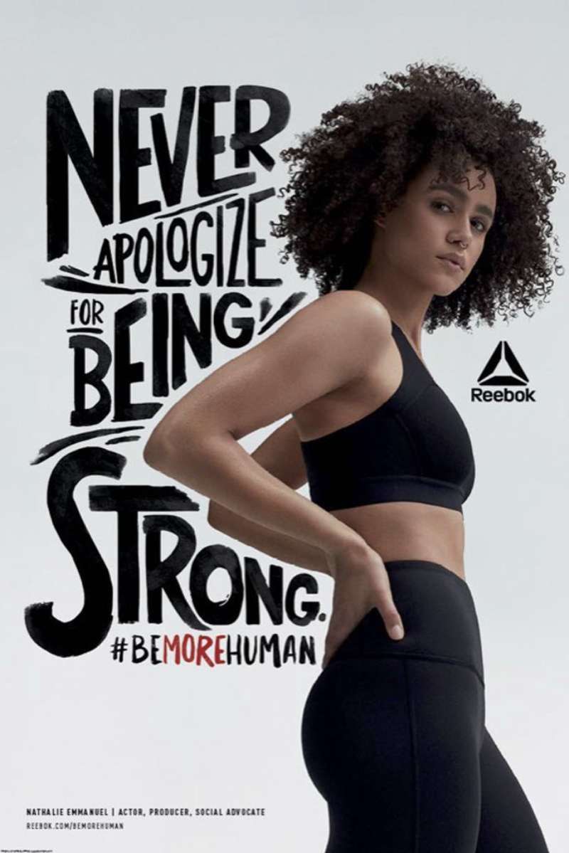
Be More Human (2015-2018)
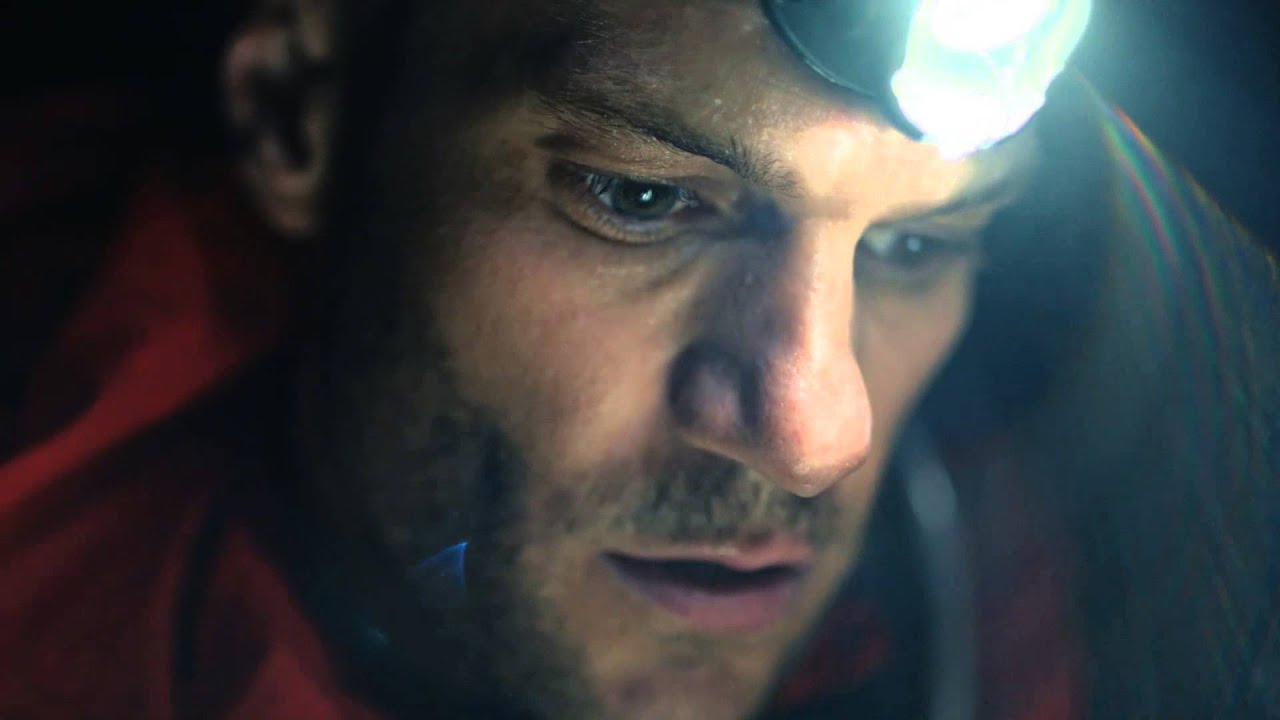
Venables Bell & Partners built the platform around a 60-second film, “Freak Show,” directed by AG Rojas and aired during the Super Bowl XLIX pre-game show on February 1, 2015.
It picked up two Silver Cannes Lions and two Bronze Clio Sport awards in 2015, plus an ISPO Gold in multichannel marketing the following year.
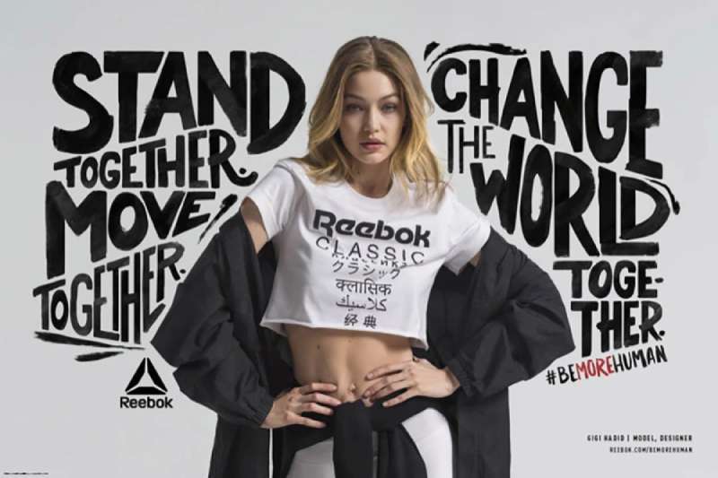
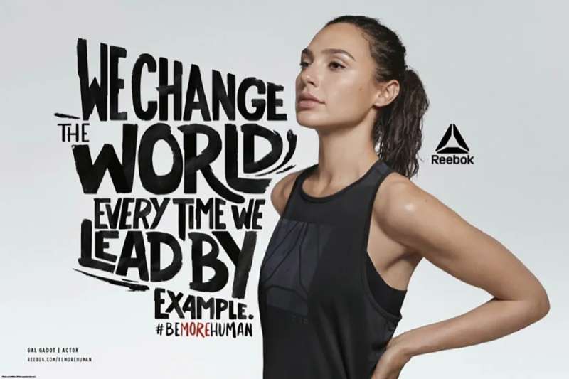
The out-of-home posters cropped bodies mid-effort against flat black, with the Delta symbol locked bottom right.
Reebok Print Ads for Classic Footwear
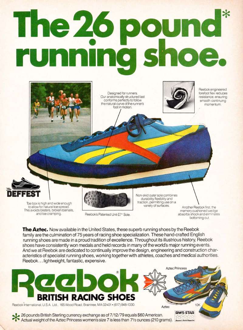
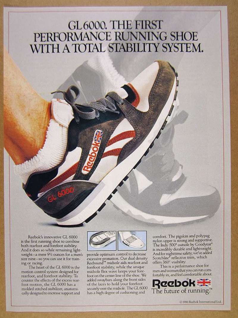
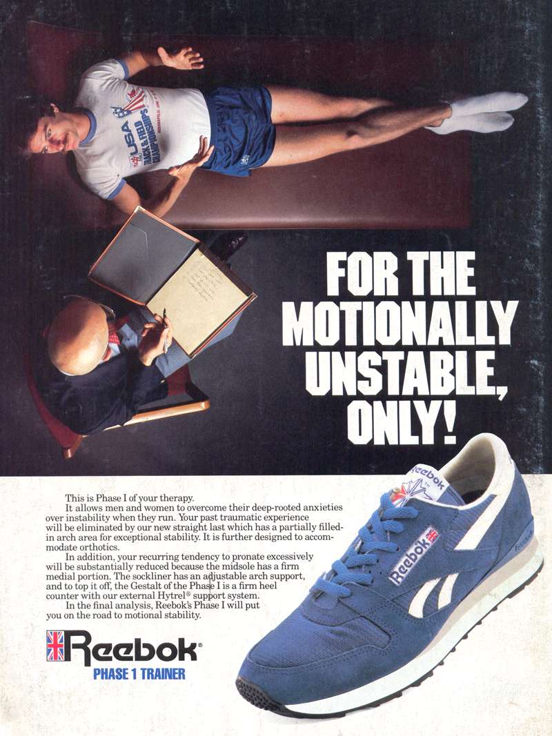
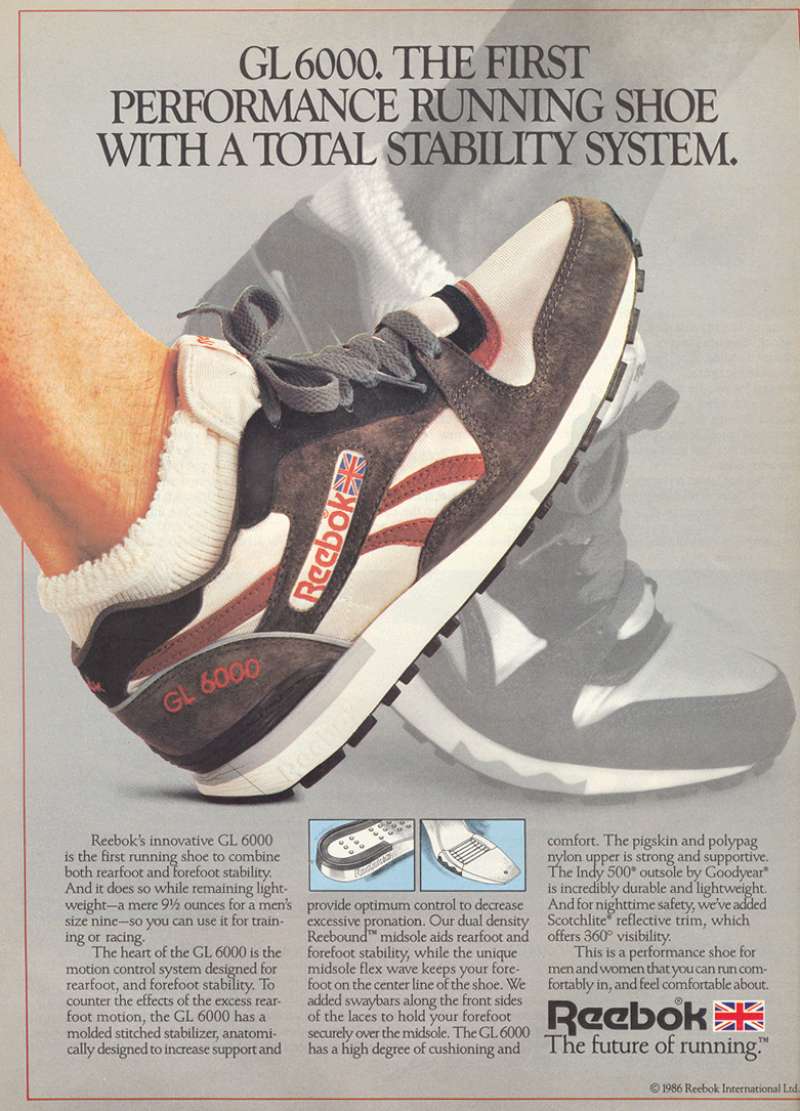
Product-led print for the Classic Leather, Club C and Instapump Fury runs on a different set of rules than the athlete work.
- Shoe photographed in three-quarter view, filling roughly 60% of the page
- Headline set flush left, one weight, no italic
- Vector logo bottom right at small scale
The 2018 “90s Roots” campaign by Intermarketing Agency pulled directly from the Reebok product archive across retail, out-of-home and experiential, including a custom retro arcade game.
How Do Reebok Print Ads Work Visually?
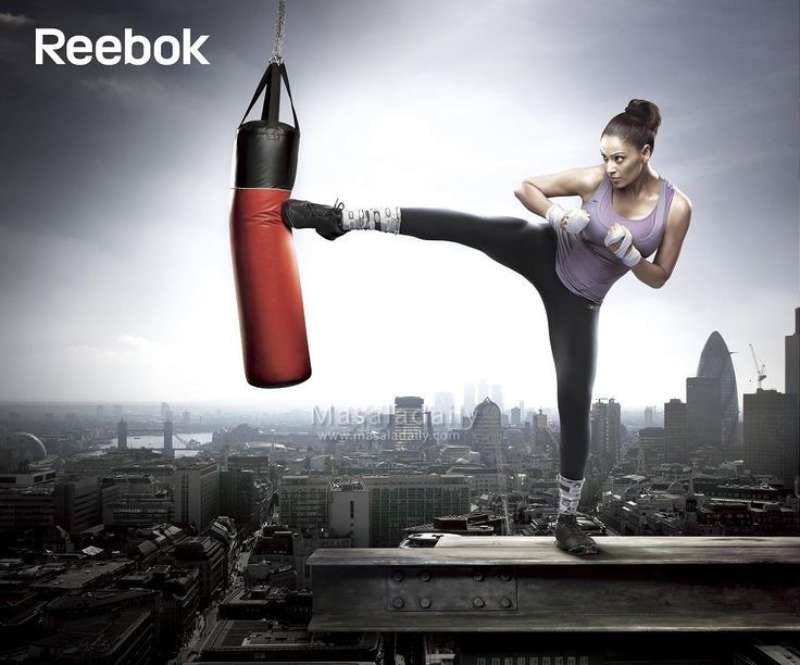
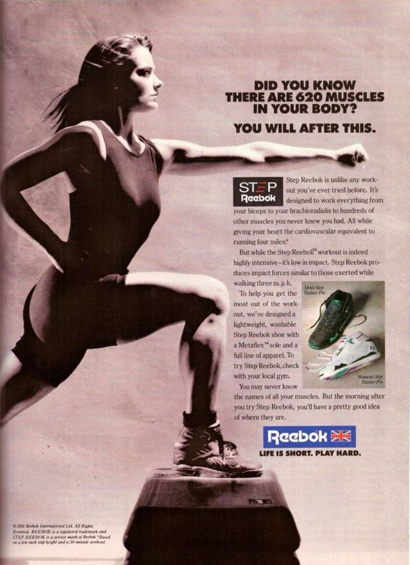
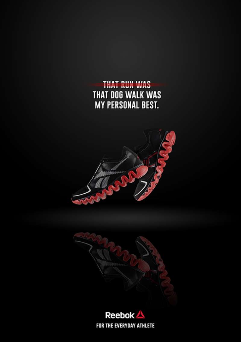
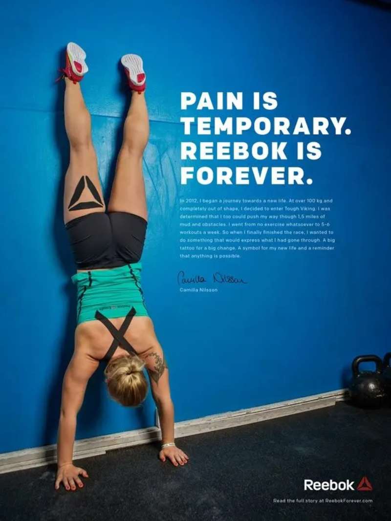
Reebok print ads use a two-zone layout: a large uncropped product or body image occupying the upper two thirds, and a compressed copy block below the optical center. The palette rarely exceeds three values. Red carries emphasis, black carries type, white carries everything else.
The wordmark is the anchor. Reebok’s classic logotype is a custom drawing based on Motter Tektura, a geometric face from the 1970s, and the brand later built a proprietary font from those same shapes.
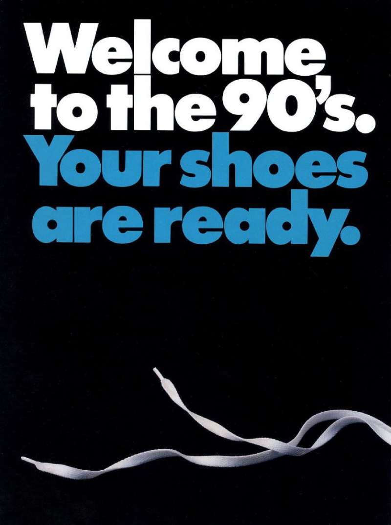
That geometry decides the rest of the page. When the headline is set in the same wide sans-serif font family, the layout holds together with almost no other structure.
Where the ads succeed: generous white space around a single subject, which keeps the visual hierarchy obvious at billboard distance.
Where they slip: the mid-2000s Rbk work stacked too many logos, taglines and product callouts into one frame, and the color palette expanded past what the grid could carry.
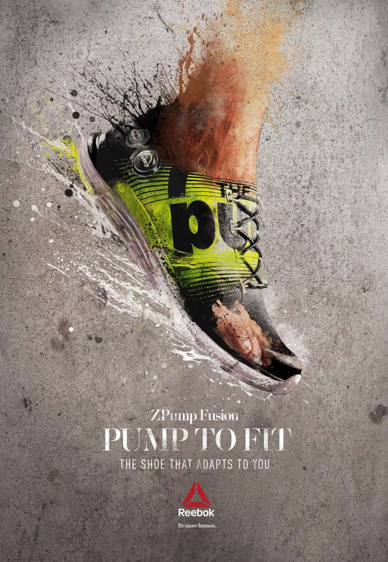
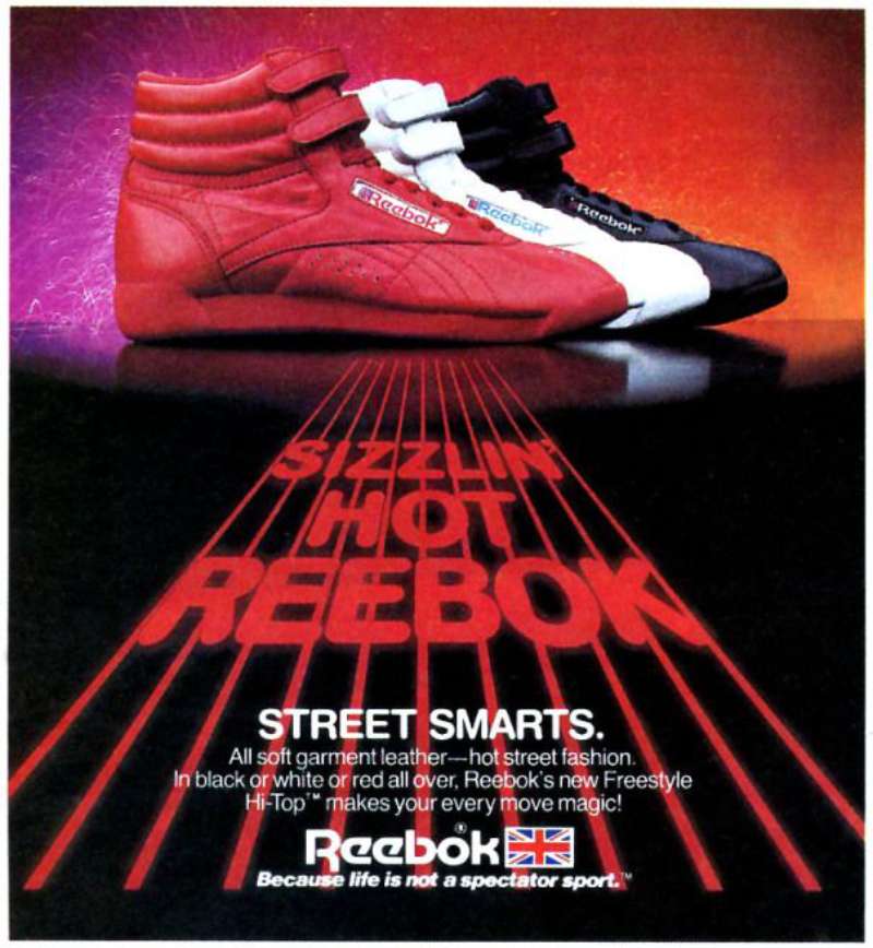
The Pump-era work is the strongest case study in contrast as a hierarchy tool. Orange inflation ball, black leather, white ground. Three elements, no ambiguity.
How Do Reebok TV Commercials Differ From Its Print Ads?
Reebok TV commercials lead with narrative and humor. Print leads with product. The television work between 1989 and 2005 built characters and running jokes, while print in the same period stayed almost entirely silent and product-first.
Terry Tate: Office Linebacker (2003, Arnell Group, dir. Rawson Marshall Thurber). Mockumentary framing, handheld camera, a 300-pound linebacker enforcing coffee-pot etiquette at a fictional firm called Felcher & Sons.
Belly’s Gonna Get Ya (2000, UK). A man is chased through a city by a giant human belly. ITV viewers voted it the 10th best advert of all time in a 2005 program.
Freak Show (2015, Venables Bell & Partners, dir. AG Rojas). Sixty seconds cut between a mother, a firefighter, a chef and a warehouse worker mid-workout, with no product hero shot until the final frame.
Sport Is Everything (2024, Authentic Brands Group in-house). A 60-second anthem featuring Angel Reese, Justin Fields, Shakur Stevenson and Suryakumar Yadav, released across Hulu, ESPN, NBC and Paramount on November 12, 2024.
The film work leans on pacing and sound design in ways the print grid cannot, which is why Reebok’s storytelling reputation rests almost entirely on its commercials.
How Has Reebok Advertising Evolved Since 1982?
Reebok advertising has moved through four distinct phases: aerobics and women’s fitness (1982-1988), competitor-attack basketball advertising (1989-1995), celebrity and street culture (2002-2010), and functional fitness (2014-2021). Each shift arrived with a new agency and a redrawn logo.
| Decade | Strategic shift | Representative campaign |
|---|---|---|
| 1980s | Women’s aerobics, product-benefit copy | Freestyle (1982), “Reeboks let U.B.U.” (1988) |
| 1990s | Direct attacks on Nike, technology hero | The Pump, Dan & Dave (1992), Planet Reebok (1993) |
| 2000s | Humor, hip-hop casting, early viral video | Terry Tate (2003), I Am What I Am (2005) |
| 2010s | CrossFit and functional fitness | Be More Human (2015) |
| 2020s | Heritage revival under new ownership | Sport Is Everything (2024) |
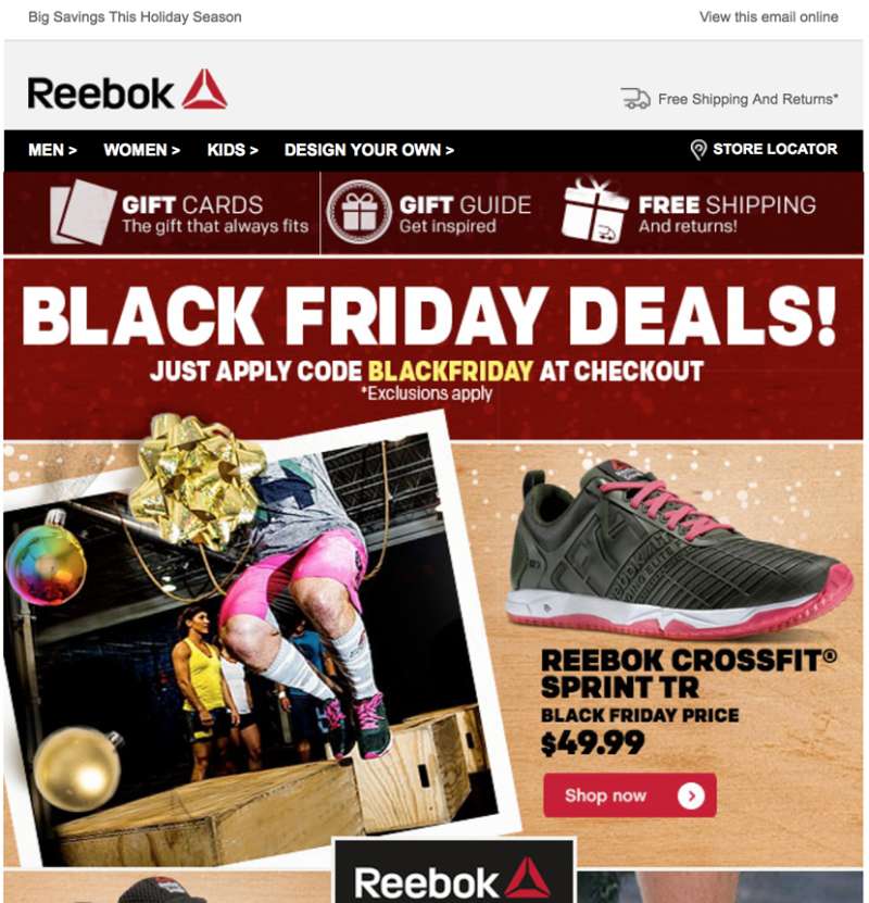
The visual identity tracked those pivots closely. Reebok dropped the Union Jack in 1986, ran the Vector through the 1990s, replaced it with the red Delta in 2014, and revived the Vector in November 2019 after conceding that consumers still identified with the older mark.
One evolution was forced rather than chosen. In September 2011 the FTC required Reebok to pay $25 million in consumer refunds over EasyTone and RunTone advertising that claimed walking in the shoes was proven to tone buttocks 28% more than regular sneakers.
Roughly 315,000 refund checks were mailed in August 2012. Reebok’s fitness-claim advertising has been noticeably more conservative since.
Which Agencies Created Reebok Advertising?
Eight agencies have led Reebok advertising since 1992. Chiat/Day created Dan & Dave in 1992. Arnell Group created Terry Tate in 2003. mcgarrybowen created I Am What I Am in 2005. Venables Bell & Partners created Be More Human in 2015.
| Agency | Years | Campaign |
|---|---|---|
| Chiat/Day (New York) | 1992-1993 | “Dan & Dave” |
| Arnell Group | 2002-2004 | “Terry Tate: Office Linebacker” |
| mcgarrybowen | 2004-2007 | “I Am What I Am,” “Run Easy” |
| DDB Worldwide | 2009-2011 | “Your Move,” women’s fitness work |
| Venables Bell & Partners | 2014-2018 | “Be More Human” |
Peter Arnell ran creative direction on the Terry Tate series and also developed the Yao Ming line and the fashion-oriented Rbk sub-brand for Reebok.
Regional work has been split off repeatedly. WPP subsidiary Soho Square handled Asia Pacific markets including Japan, Korea, Australia, India and China, while Intermarketing Agency ran Reebok Classic across Western Europe in 2018.
Since the Authentic Brands Group acquisition in 2021, campaign credits list an internal team rather than an outside shop, which changes how the brand typography and art direction get governed across markets.
What Can Designers Learn From Reebok Ads?
Reebok’s advertising archive offers five transferable lessons: anchor the layout on a mechanism, hold the type to one family, name the competitor when the product justifies it, keep the palette to three values, and never let the concept outrun the brand.
- Lead with the product mechanism, not the logo. The Pump’s orange inflation ball did more identification work than the wordmark ever did.
- Limit the palette to two colors plus black. Red, white, black carried Reebok print through three decades.
- Set the headline in one weight of the brand face. Mixed weights broke the Rbk-era layouts, and tight kerning on a wide geometric face fails fast at small sizes.
- Place the copy block below the optical center. Every strong Reebok page does this, which is also why the grid systems underneath them look almost identical from 1985 to 2015.
- Check that the brand survives the joke. Terry Tate won a Golden Lion and 45% of viewers still could not name the advertiser.
- Pick display type that holds at 40 feet. The same logic that drives the best fonts for advertising applies to every Reebok billboard in the archive.
That last point is the one most worth taking. A campaign that is remembered without the brand attached is a campaign that spent someone’s budget building someone else’s category.
How Do Reebok Ads Compare to Puma and New Balance Ads?
Reebok, Puma and New Balance occupy three different advertising positions. Reebok sells transformation through effort. Puma sells speed and celebrity. New Balance sells craft and understatement. The design consequences are visible in the first second of any print execution.
Puma runs high-saturation color, motion blur and celebrity crops, and the work usually carries more visual energy per page than Reebok’s. Compare the palette decisions in Puma ads against Reebok’s three-value discipline and the difference is immediate.
New Balance goes the other direction. Muted grays, editorial photography, small type, almost no headline. The restraint in New Balance ads makes Reebok’s Pump-era work look loud by comparison, which it was, deliberately.
Adidas sits closest to Reebok structurally, partly because it owned the brand from 2005 to 2021. The shared trait across Adidas ads and Reebok’s own is a locked logo position and a refusal to crop the mark.
Reebok’s real differentiator is humor. No other athletic brand has built a nine-episode comedy series as a footwear campaign and then won Cannes for it.
What Makes Reebok Advertising Work?
Reebok advertising works when the product does something visible and the layout gets out of its way.
The Freestyle sold a material. The Pump sold a button. Both were photographed large, lit hard, and left alone on the page with a headline in one weight and a wordmark small in the corner.
The campaigns that stumbled did the opposite. They built a character or a rivalry so entertaining that the shoe became optional, and the audience walked away remembering the joke instead of the brand.
The archive is worth studying for that tension alone. Restraint on the page, risk in the concept, and a clear-eyed sense of which one the product can actually carry.
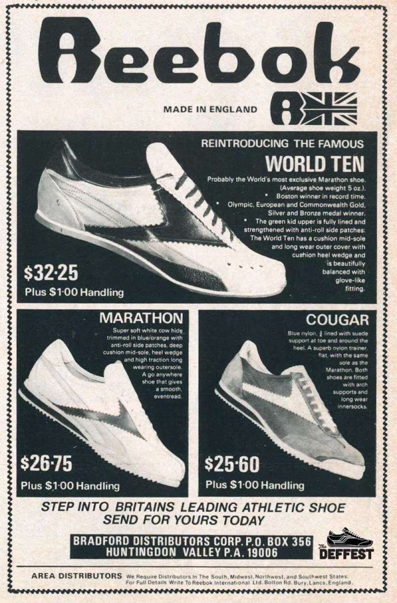
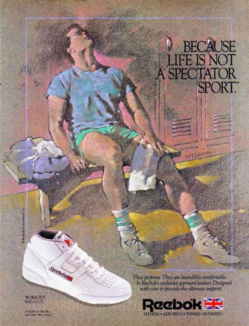
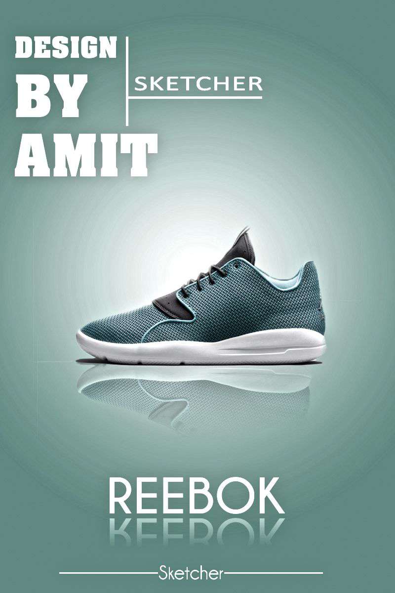
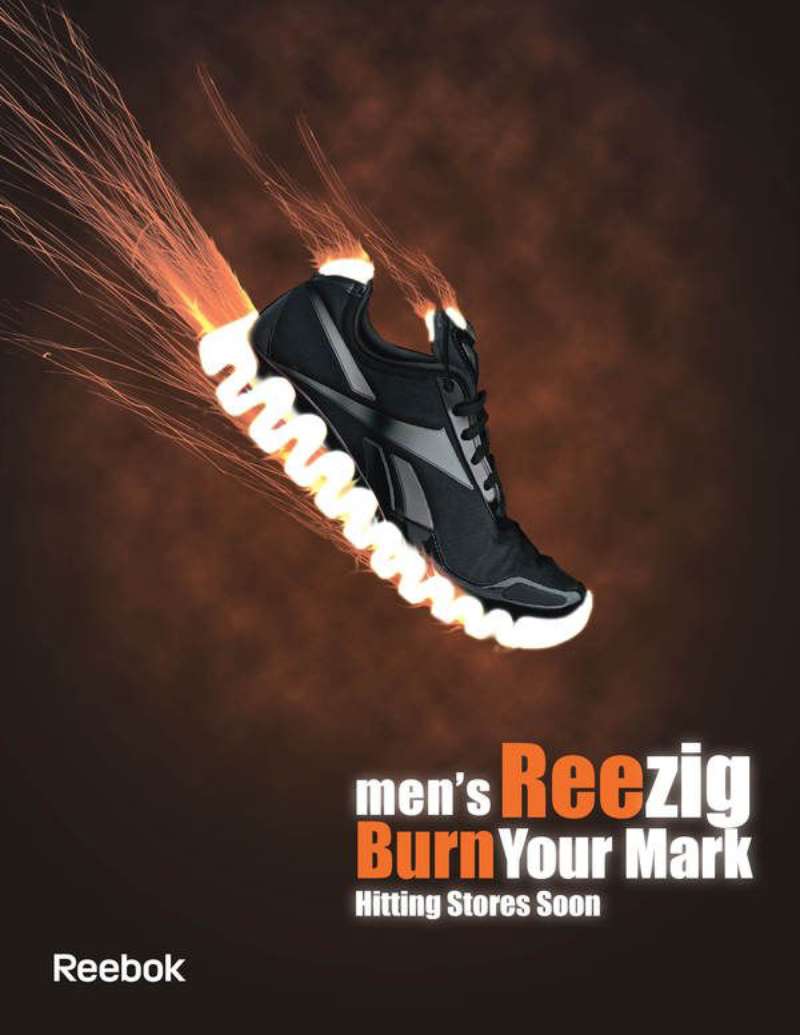
Reebok Ads Examples
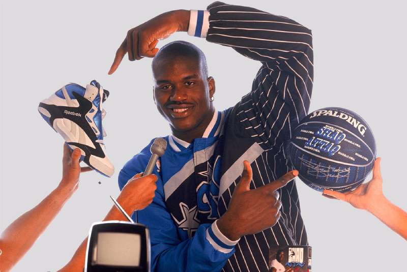
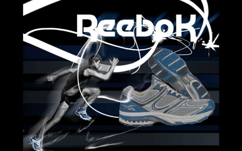
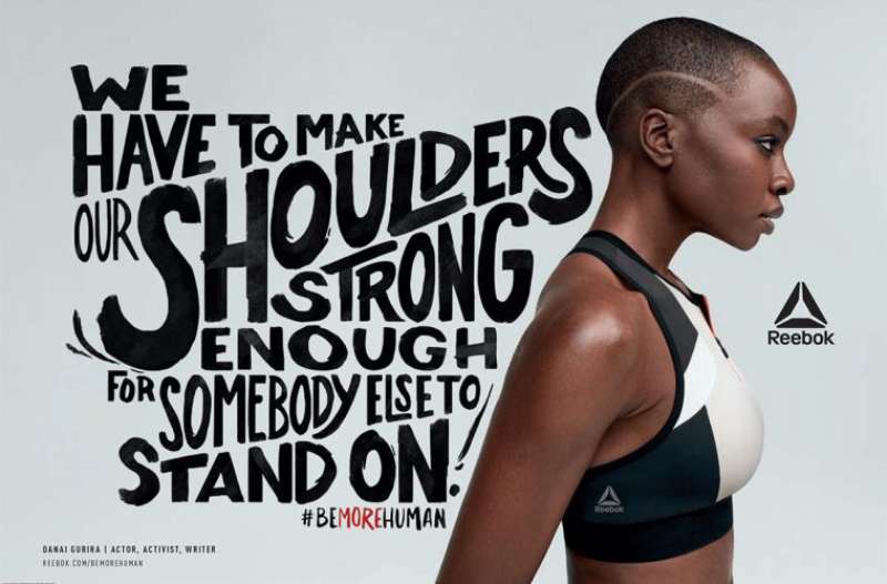
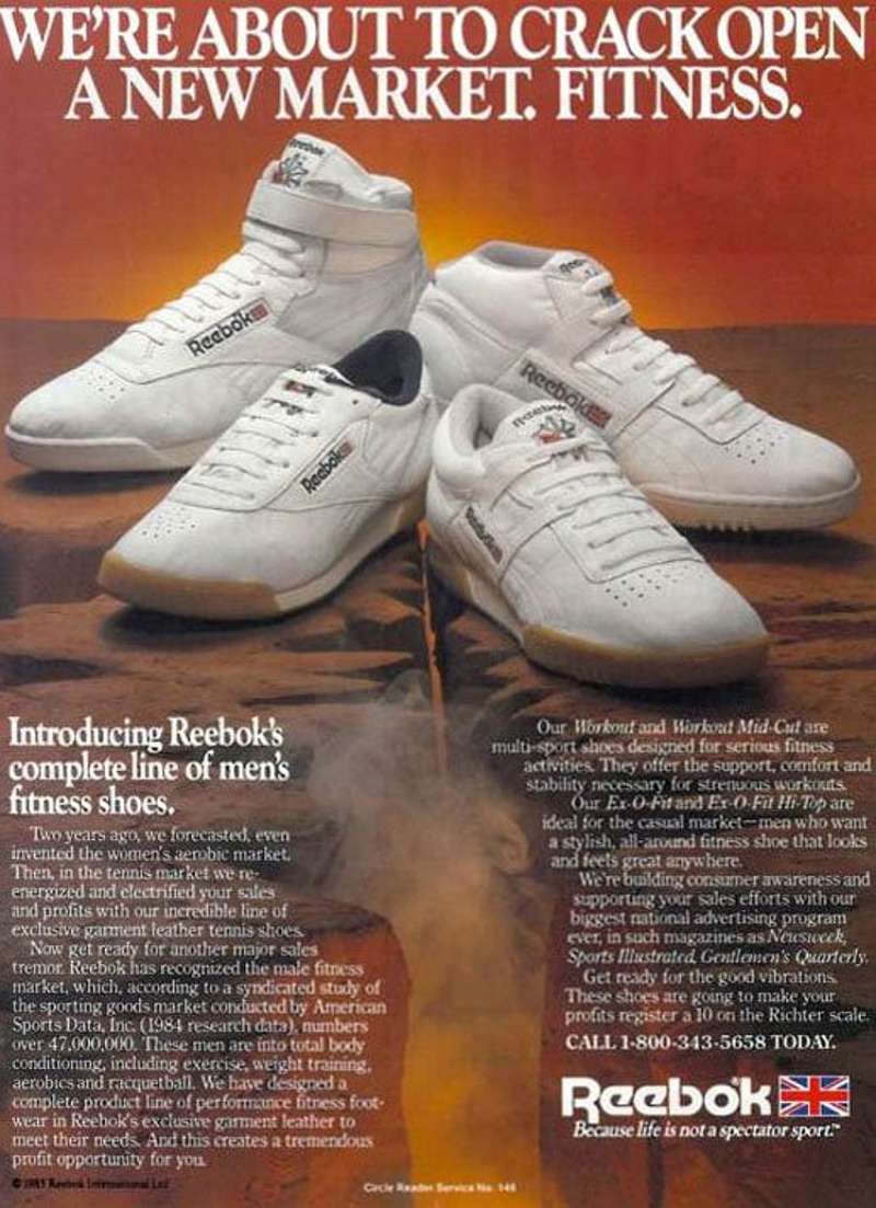


FAQ on Reebok Ads
What is the most famous Reebok tagline?
“I Am What I Am,” launched in 2005 through mcgarrybowen, carries the widest recognition.
Close behind sit “Reeboks let U.B.U.” from 1988 and “Pump up and air out” from the Pump era.
Where does the Reebok name come from?
The rhebok, an African antelope known for speed.
The company traded as J.W. Foster and Sons from 1895 and adopted the Reebok name in 1958, which explains the animal reference in early brand copy.
What typeface is used in Reebok advertising?
A custom wordmark drawn from Motter Tektura, a geometric face from the 1970s.
Reebok later built a proprietary font on those same shapes, so the headline typeface in most print work matches the logo geometry directly.
Which Reebok ads have won Cannes Lions?
Terry Tate: Office Linebacker took a Golden Lion in 2003.
Be More Human collected two Silver Lions and two Bronze Clio Sport awards in 2015, then an ISPO Gold for multichannel marketing the following year.
Has Reebok ever been sued over an ad claim?
Yes. The FTC filed a complaint in September 2011 over EasyTone and RunTone advertising.
Reebok paid $25 million in refunds after claiming the shoes were proven to tone buttocks 28% more than regular sneakers.
How much does Reebok spend on advertising?
MediaRadar puts recent digital spend at under $100 million annually, across fewer than 50 media properties.
That is a fraction of the 1990s peak, when a single Olympic campaign consumed roughly $25 million.
Why did the Delta logo replace the Vector in Reebok ads?
Reebok repositioned as a pure fitness brand around CrossFit and Spartan Race in 2014.
The red Delta signaled physical, mental and social change. It lasted five years before the evolution of logos circled back to the Vector in November 2019.
What colors dominate Reebok print advertising?
Red, black and white, with the red reserved for accent rather than field.
The 1980s Freestyle work is the exception. Pastel leather colorways were photographed against white, giving the layouts a softer register than anything the brand ran afterward.
Did Reebok advertise during the Olympics?
Heavily, in 1992. The Dan & Dave campaign debuted at Super Bowl XXVI in January and ran for eight months into the Barcelona Games.
It remains one of the longest Olympic ad campaigns any brand has attempted.
Are Reebok print ads still being produced?
Rarely in magazines. Out-of-home and streaming carry the budget now.
The 2024 “Reemake Everything” relaunch in Mexico ran across digital and OOH placements, while “Sport Is Everything” went out through Hulu, ESPN, NBC and Paramount.
Conclusion
Reebok ads reward close reading more than most sneaker advertising, mostly because the brand kept changing what it wanted to be.
Chiat/Day chased athletic credibility. Arnell Group chased laughs. Venables Bell & Partners chased the CrossFit gym.
Each shift left a mark on the art direction, and the Vector logo survived all of it apart from the five Delta years.
Study the Instapump Fury and Club C print work for clean examples of product-led composition and disciplined out-of-home layout.
Study Dan & Dave for the opposite lesson: how far a campaign can travel on a premise that reality refuses to confirm.
Authentic Brands Group now writes the next chapter in-house, with “Sport Is Everything” as its opening statement.

Renowned for his expertise in logo design and visual branding, Bogdan has developed a multitude of logos for various clients.
His skills extend to creating posters, vector illustrations, business cards, and brochures. Additionally, Bogdan's UI kits were featured on marketplaces like Visual Hierarchy and UI8.
He also wrote in the past years on sites like Design Your Way, WebDesignerDepot, WPDean, Designmodo, Speckyboy, Slider Revolution, and more.
- The Windsurf Logo History, Colors, Font, And Meaning - 10 October 2026
- How to Remove Background From Product Photos (No Photoshop) - 10 October 2026
- How Designers can Build a Stronger Online Creative Identity - 9 October 2026

Bogdan Sandu is a seasoned designer who has been designing websites since 2008. Renowned for his expertise in logo design and visual branding, Bogdan has developed a multitude of logos for various clients. His skills extend to creating posters, vector illustrations, business cards, and brochures. Additionally, Bogdan's UI kits were featured on marketplaces like Visual Hierarchy and UI8. He also wrote in the past years on sites like Design Your Way, WebDesignerDepot, WPDean, Designmodo, Speckyboy, Slider Revolution, and more.
You Might Also Like