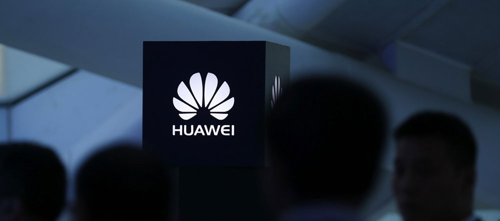
The Huawei logo stands as one of the most recognizable symbols in global telecommunications. It represents a Chinese technology giant that has grown from a small equipment manufacturer into a world leader in smartphones, 5G infrastructure, and cloud computing.
Founded in 1987 by Ren Zhengfei in Shenzhen, China, the company has built its visual identity around a distinctive red flower symbol. This emblem has undergone three major redesigns since its creation.
The current version, introduced in 2018, features eight stylized petals arranged in a radial pattern above the wordmark. Interbrand, the global brand consultancy, handled the significant 2006 redesign that shaped much of what we see today.
Red has remained the primary color throughout the brand’s history, reflecting Chinese cultural values of luck and prosperity. The logo communicates growth, innovation, and upward momentum through its sun-like arrangement.
What is the Huawei Logo?
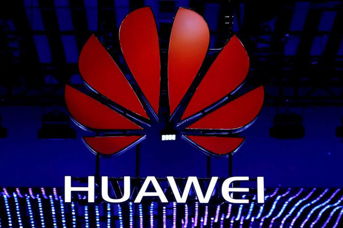
The Huawei logo is a combination mark featuring eight red petal-shaped elements arranged symmetrically above the company name. Introduced in its current flat form in 2018, this design evolved from Interbrand’s 2006 work. It symbolizes a blooming flower, reflecting the Chinese meaning of “Hua” in Huawei, and represents growth, vitality, and technological progress.
Design Type
Combination mark featuring an abstract symbol with wordmark
Primary Elements
- Flower Symbol: Eight stylized petals in radial arrangement
- Wordmark: “HUAWEI” in uppercase custom sans-serif lettering
- Color Application: Red symbol with black or white text depending on background
Official Introduction Dates
- Original Design: 1987
- Major Redesign: 2006 (by Interbrand)
- Current Version: 2018
Designer/Agency
- Original: Huawei internal team
- 2006 Redesign: Interbrand
- 2018 Refinement: Huawei in-house design team
Trademark Status
Registered globally in multiple classifications. The flower symbol alone (UK00002421758) and the combination mark with text (UK00002403001) hold separate trademark protections. Registered primarily in Class 9 covering computer hardware, software, and digital communications.
Color Palette
- Huawei Red: #CF0A2C
- Dark Gunmetal: #232527
Usage Context
Products, packaging, retail stores, digital platforms, marketing materials, corporate communications, and device interfaces across the Mate, P series, and other product lines.
How Has the Huawei Logo Evolved Over Time?
The Huawei logo has gone through three distinct phases since 1987. Each version built upon the core flower concept while adapting to changing design trends.
The original featured 15 thin rays. The 2006 update reduced these to 8 wider petals with a 3D effect. The 2018 version stripped away dimension for a flat, modern look.
Original Huawei Logo (1987-2006)
Years Active: 1987-2006
Design Description: The first logo featured 15 thin, elongated red rays emanating from an invisible center point. Below sat the text “Huawei Technologies” in a classic serif-influenced typeface. The rays resembled both a blooming flower and the rising sun.
Color Scheme: Bright, warm red (#ED1C24) with black text
Designer: Huawei internal team
Context: Created when Huawei was primarily a telephone switch manufacturer. The design reflected the company’s Chinese heritage and ambition. The rising sun imagery conveyed optimism and the phrase “sunrise in the east.”
Key Characteristics: Many thin petals, text included “Technologies,” serif-influenced font, bright red shade
Cultural Significance: Directly referenced Chinese symbolism. The character “Hua” in Huawei means flower. This early version made that connection explicit through its petal count and arrangement.
Redesigned Huawei Logo (2006-2018)
Years Active: 2006-2018
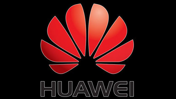
Design Description: Interbrand transformed the logo dramatically. The 15 thin rays became 8 wider, petal-shaped segments with rounded tips. A 3D gradient effect added depth and dimension. “Technologies” was dropped, leaving just “HUAWEI” in all capitals.
Color Scheme: Red with gradient highlights creating three-dimensional appearance, black wordmark
Designer: Interbrand (global brand consultancy)
Context: Huawei was expanding beyond telecom infrastructure into consumer electronics. The modernized look signaled global ambitions and technological sophistication. This version coincided with their push into smartphones and tablets.
Key Changes from Previous: Reduced petal count (15 to 8), wider petals with sharper angles, 3D gradient effect, removed “Technologies” from wordmark, switched to Handel Gothic Bold font
Cultural Significance: Balanced Chinese symbolism with Western design sensibilities. The cleaner look helped the brand appeal to international markets while maintaining its core identity.
Current Huawei Logo (2018-Present)

Years Active: 2018-present
Design Description: The 2018 refresh embraced flat design principles. Gradients and 3D effects were removed entirely. The eight petals retained their shape but now appear as solid, two-dimensional forms. The wordmark received subtle refinements, particularly to the letter “E.”
Color Scheme: Cooler, slightly darker red (#CF0A2C) with Dark Gunmetal text (#232527)
Designer: Huawei in-house design team
Context: Launched alongside the P20 and P20 Pro smartphones. The simplified aesthetic aligned with industry-wide minimalist design trends. It also improved scalability across digital platforms and small screen displays.
Key Changes from Previous: Removed 3D gradient effect, shifted to cooler red shade, refined letterforms (especially “E”), adopted flat design language
Cultural Significance: Represents Huawei’s maturity as a global technology leader. The restrained approach mirrors premium brands while maintaining instant recognizability.
What Do the Design Elements of the Huawei Logo Mean?
Every element in the Huawei logo carries specific meaning. The flower shape connects to the company name itself.
The Chinese character “Hua” translates to flower, while “Wei” means achievement or splendid act. Combined, they suggest “Chinese achievement” or “splendid China.”
The eight petals radiate outward like a blooming chrysanthemum, a flower native to East Asia with deep cultural roots.
What Does the Flower Symbol Represent?
The flower symbol carries multiple layers of meaning rooted in Chinese culture and the company’s mission.
Chrysanthemums represent longevity and nobility in Chinese tradition. The upward-facing petals suggest a rising sun, symbolizing new beginnings and eastern heritage.
The radial arrangement also resembles electromagnetic waves emanating from a source. This visual metaphor fits perfectly for a telecommunications company. It suggests connectivity, signal transmission, and global reach.
Understanding the psychology of shapes helps explain why the rounded petals work. Curved forms feel organic and approachable, softening what could otherwise be a cold, technical brand image.
Why Did Huawei Choose These Specific Colors?
Huawei Red (#CF0A2C)
- Pantone: PMS 186 C
- Symbolic Meaning: Luck, prosperity, celebration, energy
- Psychological Impact: Commands attention, creates urgency, conveys passion
- Brand Connection: Red holds profound significance in Chinese culture. It appears at weddings, festivals, and celebrations. For Huawei, it roots the brand in its heritage while projecting confidence.
This shade sits among other red logos in the tech space, but Huawei’s specific hue has evolved. The pre-2018 version used a brighter, warmer red. The current shade feels more sophisticated and subdued.
Dark Gunmetal (#232527)
- Pantone: PMS 426 C
- Symbolic Meaning: Power, sophistication, professionalism
- Psychological Impact: Grounds the vibrant red, adds seriousness, suggests premium quality
- Brand Connection: The near-black provides contrast and legibility while avoiding the harshness of pure black
The interplay between these two colors follows established color psychology principles. Red captures attention and emotion while the dark text anchors the brand in professionalism.
What Typography Style Is Used in the Huawei Logo?
The wordmark uses a custom sans-serif font that has evolved with each redesign.
From 2006 to 2018, the logo used Handel Gothic Bold. This typeface featured a distinctive quirk: the letter “E” appeared semicircular, almost like an upside-down “U.”
The 2018 update refined this. Strokes became thinner. The rounded “E” gained two straight angles, creating a more conventional appearance while retaining some uniqueness.
All letters appear in uppercase, creating a uniform baseline and strong visual hierarchy. The clean, geometric forms complement the flower symbol without competing for attention.
What Are the Hidden Meanings in the Huawei Logo?
Look closer at the flower symbol. The white space at its center forms an invisible circle, representing unity and completeness.
The eight petals hold significance too. Eight is considered extremely lucky in Chinese culture because it sounds similar to the word for prosperity.
Some observers note the petals resemble segments of a sliced fruit, suggesting sharing and distribution. Others see it as hands reaching toward a common center, symbolizing collaboration. Whether these interpretations were intentional or emergent, they reinforce the brand’s values.
How Does the Huawei Logo Compare to Competitor Logos?
Among tech company logos, Huawei’s stands out for its organic, nature-based imagery. Most competitors favor abstract geometry or lettermarks.
Samsung uses an oval wordmark. Apple has its iconic fruit silhouette. Xiaomi employs a rounded square. Huawei’s blooming flower feels warmer and more culturally specific.
Comparative Analysis
Huawei vs. Apple: Both use nature-derived symbols. Apple’s bitten fruit is Western and instantly universal. Huawei’s flower carries Eastern cultural weight that may not translate as immediately in Western markets.
Huawei vs. Samsung: Samsung’s blue oval is corporate and neutral. Huawei’s red flower projects more personality and cultural identity. Samsung aims for global anonymity while Huawei embraces its origins.
Huawei vs. Xiaomi: Both Chinese brands take different approaches. Xiaomi’s orange rounded square feels modern and startup-like. Huawei’s flower appears more established and traditional, befitting its longer history.
Huawei vs. OnePlus: OnePlus uses a minimalist “1+” mark in red. It shares Huawei’s color choice but opts for abstract simplicity over symbolic depth.
The flower gives Huawei immediate differentiation. No other major smartphone brand uses floral imagery as its primary identifier.
What Are the Technical Specifications of the Huawei Logo?
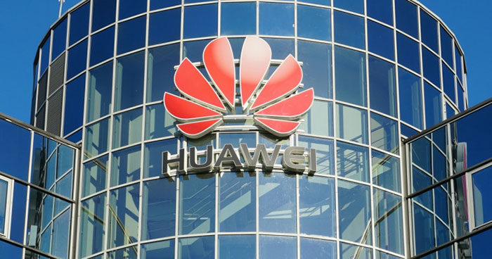
Official Color Codes
Primary Color: Huawei Red
Secondary Color: Dark Gunmetal
- Hex: #232527
- RGB: (35, 37, 39)
- CMYK: (74, 66, 62, 69)
- Pantone: PMS 426 C
Alternate Applications:
- White wordmark on dark backgrounds
- Single-color applications in either red or black
- Reversed versions for special contexts
Dimensions and Proportions
Aspect Ratio: The complete logo (symbol plus wordmark) maintains consistent proportions across all applications. The flower symbol width roughly equals the wordmark width.
Clear Space: Huawei’s brand guidelines specify minimum clear space around the logo equal to the height of the letter “H” in the wordmark on all sides.
Minimum Size: For print, the logo should not appear smaller than 10mm in width. Digital applications require minimum 50 pixels wide for legibility.
Symbol-to-Text Relationship: The flower symbol sits directly above the wordmark, centered. The vertical spacing between them remains proportionally consistent regardless of scale.
What Cultural Impact Has the Huawei Logo Had?
The Huawei logo has become shorthand for Chinese technological achievement on the global stage. It appears in over 170 countries.
The flower symbol has transcended its corporate origins. It now represents the broader debate about technology, globalization, and geopolitics.
For better or worse, this logo sparks immediate recognition and strong reactions. That kind of brand awareness takes decades to build.
How Does the Huawei Logo Fit Into the Overall Brand Identity?
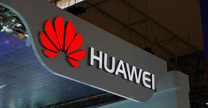
The logo anchors a comprehensive visual system that extends across all Huawei touchpoints. From product packaging to retail stores, the flower symbol creates consistency.
Sub-brands like the Mate series and P series incorporate the main logo while developing their own supplementary identities. The “Make It Possible” tagline often accompanies the logo in marketing materials.
Device interfaces carry the logo in boot screens and system settings. Retail environments use the red color extensively in signage and displays. Corporate communications maintain the same visual language across reports, presentations, and digital platforms.
This consistency follows sound graphic design principles that build recognition through repetition.
How Should the Huawei Logo Be Used?
Official Usage Guidelines
Do:
- Use official logo files from authorized sources
- Maintain specified clear space around the logo
- Use approved color combinations only
- Keep proportions intact when scaling
- Follow minimum size requirements
Don’t:
- Alter colors, proportions, or arrangement
- Add effects, shadows, or outlines
- Place on busy backgrounds that reduce legibility
- Combine with other logos without authorization
- Use on promotional merchandise without permission
Accessing Official Logos
Partners and authorized resellers can access logo files through Huawei’s partner portal. Media inquiries can obtain press-ready assets from Huawei’s corporate communications department.
Licensing Information
The Huawei trademark policy explicitly prohibits unauthorized use. You cannot incorporate any Huawei trademarks into product names, company names, domain names, or marketing materials without written permission.
Licensees receive specific trademark policies within their agreements. Those without explicit guidance must follow the general trademark policy published on Huawei’s legal pages.
Trademark Protection
Huawei actively protects its intellectual property worldwide. The company monitors for trademark infringement and takes legal action against unauthorized use. Both the flower symbol alone and the combination mark with text hold registered protection.
Any use of Huawei trademarks or similar imitations without authorization may constitute trademark infringement or unfair competition under applicable laws.
FAQ on The Huawei Logo
What Does the Huawei Logo Mean?
The Huawei logo meaning connects directly to the company name. “Hua” translates to flower in Chinese, while “Wei” means achievement.
The eight red petals represent growth, prosperity, and technological progress. The radial arrangement suggests electromagnetic waves, fitting for a telecommunications leader.
Why Is the Huawei Logo Red?
Red holds deep significance in Chinese culture. It symbolizes luck, prosperity, and celebration.
For this Chinese tech company, the color roots the brand in its heritage. Red also commands attention and conveys passion, aligning with color theory principles used in corporate branding.
Who Designed the Huawei Logo?
The original 1987 design came from Huawei’s internal team. Interbrand, the global brand consultancy, handled the major 2006 redesign.
The current 2018 version was refined by Huawei’s in-house designers. Each iteration shaped the Huawei brand identity we recognize today.
When Was the Huawei Logo Created?
The first Huawei emblem appeared in 1987 when Ren Zhengfei founded the company in Shenzhen, China.
Major updates followed in 2006 and 2018. The logo evolution mirrors the company’s growth from telephone switch manufacturer to global smartphone leader.
What Font Does Huawei Use in Its Logo?
From 2006 to 2018, Huawei used Handel Gothic Bold. This typeface featured a distinctive semicircular “E.”
The 2018 refresh introduced a refined custom font with thinner strokes. The rounded “E” gained straighter angles while maintaining brand recognition.
How Has the Huawei Logo Changed Over Time?
Three major versions exist. The 1987 original had 15 thin rays resembling a rising sun.
The 2006 Huawei logo redesign reduced petals to eight with 3D effects. The 2018 update embraced flat design, removing gradients entirely.
What Are the Official Huawei Logo Colors?
The official Huawei brand colors include Huawei Red (Hex #CF0A2C, Pantone PMS 186 C) and Dark Gunmetal (Hex #232527, Pantone PMS 426 C).
These colors form the core color palette across all Huawei visual identity applications.
Where Can I Download the Official Huawei Logo?
Official Huawei logo download options exist through partner portals. Authorized resellers access brand assets via Huawei’s business platforms.
Media professionals can request press-ready files from corporate communications. Unauthorized use of the Huawei trademark violates intellectual property policies.
What Does the Flower Symbol Represent?
The flower symbol represents a blooming chrysanthemum, native to East Asia. It symbolizes vitality, unity, and upward momentum.
Eight petals hold cultural significance since eight sounds similar to “prosperity” in Chinese. The design embodies the company’s mission and values.
Is the Huawei Logo Trademarked?
Yes. Huawei Technologies Co. Ltd. holds registered trademarks globally. Both the flower symbol alone and the combination mark with wordmark have separate protections.
The company actively enforces brand trademark protection against unauthorized corporate logo usage worldwide.
Conclusion
The Huawei logo tells the story of a global technology company through simple yet powerful visual elements. From its 1987 origins to the current flat design, every change reflects strategic brand evolution.
Eight petals. Two colors. One wordmark. That is all it takes to achieve worldwide brand recognition.
The flower

Renowned for his expertise in logo design and visual branding, Bogdan has developed a multitude of logos for various clients.
His skills extend to creating posters, vector illustrations, business cards, and brochures. Additionally, Bogdan's UI kits were featured on marketplaces like Visual Hierarchy and UI8.
He also wrote in the past years on sites like Design Your Way, WebDesignerDepot, WPDean, Designmodo, Speckyboy, Slider Revolution, and more.
- The Arc Browser Logo History, Colors, Font, And Meaning - 14 September 2026
- From Information to Persuasion: A Practical Framework for Strategic Presentation Design - 14 September 2026
- Canva vs Photoshop: When Does Each Make Sense? - 12 September 2026

Bogdan Sandu is a seasoned designer who has been designing websites since 2008. Renowned for his expertise in logo design and visual branding, Bogdan has developed a multitude of logos for various clients. His skills extend to creating posters, vector illustrations, business cards, and brochures. Additionally, Bogdan's UI kits were featured on marketplaces like Visual Hierarchy and UI8. He also wrote in the past years on sites like Design Your Way, WebDesignerDepot, WPDean, Designmodo, Speckyboy, Slider Revolution, and more.
You Might Also Like