


The Barcelona logo history and what the symbol means
When we talk about football, we can’t stop mentioning one of the best clubs in the world. FC Barcelona is one of the most productive and recognized organizations when it comes to sports. The number of fans around the world is worth admiring, and everyone defends the Barcelona logo with their hearts.
For a fan who has been admiring them for a while, the story of its creation may not be anything new, but if we are starting to know the Barça, we need to review it. This Spanish club was founded on November 29, 1899. It all began a few days before when Hans Gamper published in a newspaper his intention to form a football club.
At the time, 11 people responded to the invitation, being enough to create the FC Ball. Over time, the fame of the club was consolidated and elements that represented their culture and beliefs were added. An example is the motto “More than a club”, which transcends by meaning that Barcelona has a strong influence in different fields, not only in sports.
Let’s see what the FCB logo symbolizes, and how that has served to become a benchmark for Catalans.
Key takeaways
- Crest Origin and Evolution: The current Barcelona crest dates from 1910, following a competition, and has only had minor adjustments since. It includes symbols like the St. George’s Cross and the colors blue and red, maintaining its essence over time.
- Symbolic Elements: The logo includes the St. George’s Cross to represent Catalonia and its patron saint, and the red stripe flag on a gold background, known as La Senyera, for its Catalan roots.
- Color Significance: The club’s colors, blue and red, known as “Blaugrana,” have been a part of the logo since its inception and are believed to be inspired by FC Zurich or a tribute to two of Barça’s first players, Arthur, and Ernest Witty.
- Logo Redesign Competition: After a crisis in 1908, a competition led by Joan Gamper, the club’s founder, resulted in a new logo designed by Carles Comamala, who was a medical student, amateur artist, and Barcelona player. This logo has been tweaked slightly over the years but retains its original elements.
Symbolism in the Barça logo
The current crest that represents the club dates from 1910. Its choice was through a competition, and its design remains faithful since then, only applying slight touch-ups over time.
The upper part has a strong connection with its origin since it has the St. George’s Cross. In this way, Catalonia is represented with its patron, and the city of Barcelona, since the cross is also part of the city’s flag.
On the other hand, the lower quarters are more recognizable in the world of football, since they have a ball and the characteristic colors that give life to the club. The ball is essential for what it represents at the sports level.
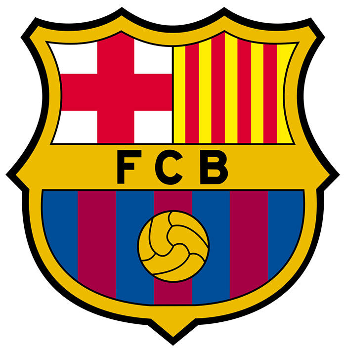
Finally, after several aesthetic changes, we arrived at the current Barcelona logo. This is relatively new, being its last modification made in 2002 by Claret Serrahima. Let’s analyze each part of it in more detail.
– The font: The letter used is called Interstate Bold. Its Sans Serif style makes it easy to read, as well as being very customizable. Authorship is recognized to Tobias Frere -Jones, who presented the font with Font Bureau.
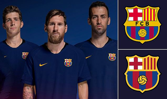
– The colors: first came the flannel, and then the shield adopted its style. The lower part is covered in stripes of blue and red colors, which come from the first uniform worn by FC athletes. In Catalonia, this combination is known as “Blaugrana”, so many times the club is referred to by this name.
The origins of the colors are not entirely clear. Many people believe that they are adopted from FC Zurich created by Gamper, while others indicate that it is a tribute to two of Barça’s first players, Arthur, and Ernest Witty since those were the colors of the school where they studied (Merchant Taylors).
– Left upper quarter: as we mentioned previously, as part of the Catalan culture, the St. George’s Cross has been added, to honor its patron.
– Upper right quarter: FC Barcelona logo continues with the tributes to its Catalan origin. This time it is La Senyera, the red stripe flag on a gold background. Legend has it that King Wilfred the Hairy designed it in the ninth century to be used on the battlefield.
– Center: the passion they feel for football at FC Barcelona is undeniable. The central logo is the representation of a soccer ball, while the upper crest is in honor of its sporting facet.
The logo development to the present
![]()
The club has frequently updated its logo, but the essence remains virtually intact. It is curious that in its beginnings, they did not have their own identity, and for at least 11 years, they simply limited themselves to using the coat of arms of the city of Barcelona.
Colors are an example of what has been maintained over time, although its location has changed. The flannel of the selection already used the bars in blue and red, but the shorts were white.
At first, to make themselves known to the rest of the world, the Barcelona FC logo used several traditional elements of the city and had a style more adapted to the time. The shape of the emblem was in diamond, and it was divided into 4 sections. Outside, the emblem was surrounded by a laurel branch and a palm branch, and at the top of the diamond, a palm crown with a bat gave it the final touch.
Since then we could find St. George’s Cross and La Senyera. We already reviewed the meaning of these symbols, so let’s talk about those that no longer exist. The laurel represented peace, while the palm was friendship. On the other hand, the bat and the crown, however strange they may seem, are traditional symbols of the counts of Barcelona.
This first version of the emblem lasted until 1910, where it was decided to change the logo after a crisis in 1908.
1910 aspirations
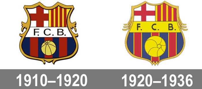
The founder, Joan Gamper, managed to save the club from a crisis that almost leads them to close. To commemorate this, it was decided to create a new logo that symbolized what they were aspiring to be as a club.
The way to make it as authentic as possible was through a competition. The board of directors of FC Barcelona organized an internal competition for the different members to apply for a logo design. Who would say that the medical student and amateur artist CarlesComamala, would be the winner of the contest? Of course, he also had a brilliant career as a Barcelona player between 1903 and 1912, but his legacy would last for the next decades.
Originally, the design retained the colors blue and red, the St. George’s Cross and La Senyera. The form was maintained, and some tweaks were simply applied in 1920 and 1936 to modernize it.
The changes motivated by Franco’s dictatorship
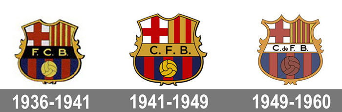
Franco’s times were not good in general for Spain. With him taking the power in 1939, a set of rules that limited foreign contact in the country were implemented, such as that no name could include words in a language other than Spanish. Additionally, the dictatorship tried to eliminate all traces of Catalan culture, so their symbols and words were banned.
These dictatorial laws caused the club to have to change virtually the entire logo. First, it stopped being called Football Club Barcelona to be Club de Fútbol Barcelona, which changed the acronym of FCB to CFB.

The Senyera was replaced by the national flag of Spain, which has the same colors, but the orientation of the stripes is horizontal.
It was not until 1949 that the club was able to use the four vertical bars again, in the middle of a political environment that was calmer (and of course, for the 50th anniversary of its foundation).
Returned to Barcelona logo after Franco
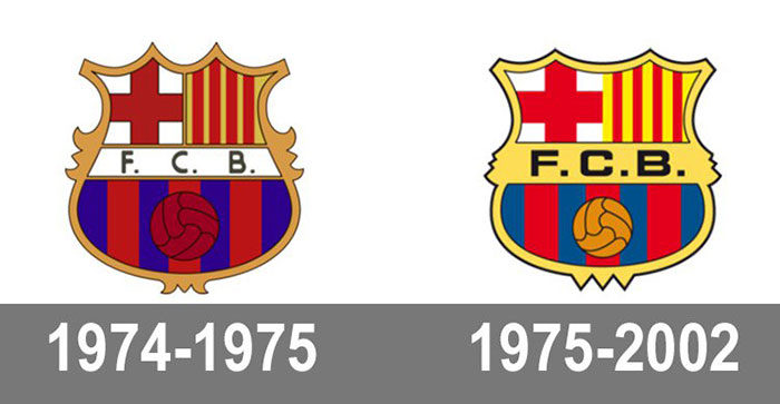
With the fall of Franco, the club was finally able to adopt its precious emblem back in 1974. This, in effect, was the design inspired by the original 1910, but with a couple of changes in the crest. Other minor changes were made in 1975 and 1982. Finally, it would remain this way until 2002.
The modern passion for the Barcelona logo
Finally, we reach the modern era of FC Barcelona. The logo goes through the latest changes to date by the hand of designer Claret Serrahima.
To give it an attractive appearance for the new millennium, the lines were retouched so that they were cleaner and softer, a couple of elements that overloaded the design (points between the letters) were removed, more emphasis was placed on the graphic part by reducing the font size, and pointed corners were greatly reduced.
This change was necessary to be able to adapt to the new formats that were emerging with the digital era since it allowed it to be easily edited without losing quality.
And this has been a bit of the history of the changes to one of the most recognized logos in the world. The past of the club is much more extensive (It is not for less, with more than a century since its foundation), but all that has forged one of the most powerful clubs today.
Barcelona logo is nothing more than the visual expression of what they wanted to achieve, and that little by little it would become reality, bringing the name of its origins to the top.
FAQ about the Barcelona logo
What does the Barcelona logo represent?
The “crest” or “badge,” which is another name for the Barcelona logo, contains a number of images that stand for the club’s identity and heritage.
The St. George cross and the Catalan flag, which stand for Barcelona and the club’s Catalan origin, are displayed in the top part of the logo.
The ball and the blaugrana stripes, which stand for the club’s skill and fashion in football, are displayed on the bottom half.
When was the Barcelona logo first used?
The Barcelona logo has undergone numerous changes since it was first used in 1910. In 2002, the present style was unveiled.
What is the meaning behind the blaugrana stripes?
The blue and red blaugrana stripes correspond to the hues of the Catalan flag. Since the club’s inception in 1899, the stripes have been an integral feature of the Barcelona jersey.
Who designed the Barcelona logo?
Carles Comamala, one of the club’s founders, created the first Barcelona logo. The Catalan graphic artist Claret Serrahima was responsible for the current layout.
What is the font used in the Barcelona logo?
A specially created typeface named “FC Barcelona” was utilized to create the Barcelona logo. It is utilized in all official communications and branding because it was developed exclusively for the club.
Can the Barcelona logo be used without permission?
No, the Barcelona logo cannot be used without the club’s consent as it is a recognized trademark. Legal action may be taken if the logo is used without permission.
Has the Barcelona logo ever been changed significantly?
The Barcelona logo has undergone a number of changes over the years, but the fundamental layout and symbols have not changed. The logo had the most important update in 2002, when it was made simpler and more contemporary.
If you enjoyed reading this article about the Barcelona logo, you should read these as well:
- The Pepsi Logo: The old, the new, its meaning and history
- Round logos showcase: 23 Circular logos to inspire you
- The Adidas logo: What makes it so special
Bogdan Sandu, a seasoned designer with 15 years of diverse experience, has been designing websites since 2008.
Renowned for his expertise in logo design and visual branding, Bogdan has developed a multitude of logos for various clients.
His skills extend to creating posters, vector illustrations, business cards, and brochures. Additionally, Bogdan's UI kits were featured on marketplaces like Visual Hierarchy and UI8.
Latest posts by Bogdan Sandu (see all)
- Spread Joy: Happy Color Palettes for Uplifting Designs - 24 April 2024
- The Konami Logo History, Colors, Font, And Meaning - 23 April 2024
- Summer Color Palettes for Hot Designs: 40 Examples - 23 April 2024