The Ahrefs logo represents one of the most recognized brands in digital marketing and search engine optimization.
Founded in 2010 by Ukrainian programmer Dmitry Gerasimenko, Ahrefs has grown from a simple backlink analysis tool into a comprehensive SEO platform used by companies like Facebook, Adobe, and Netflix.
The platform’s visual identity centers around its distinctive wordmark, which combines bold geometric typography with a memorable orange and blue color scheme.
The name itself derives from the HTML anchor tag “href,” with the addition of an “A” at the beginning symbolizing the company’s aspirations for industry leadership.
The logo has undergone refinement since its initial introduction, evolving from a pixelated geometric style to a cleaner, more polished design while maintaining its core brand elements.
What is the Ahrefs Logo?
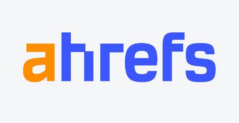
The Ahrefs logo is a wordmark-style design featuring lowercase geometric sans-serif lettering in a distinctive orange and blue color palette, introduced in its current form around 2015. The design emphasizes the stylized orange “A” as the primary brand identifier, with the remaining letters rendered in blue to create visual hierarchy and memorability.
Design Type: Wordmark with combination mark elements
Primary Elements: The logo consists of lowercase letterforms with geometric construction. The most distinctive feature is the orange “A” that opens the wordmark, followed by blue letters that spell out “hrefs.” The original version featured pixel-style elements, while the current iteration presents cleaner, more refined contours.
Official Introduction Date: The company was founded in 2010, with the current logo design introduced approximately in 2015 during a brand refinement.
Designer/Agency: The logo was developed internally as part of the company’s brand identity system. Specific designer credits are not publicly documented.
Trademark Status: Ahrefs Pte Ltd maintains trademark protection for its brand identity. The company is headquartered in Singapore.
Color Palette:
- Primary Orange: #FF7A59 (RGB: 255, 122, 89)
- Primary Blue: #2F5BEA (approximate, RGB: 47, 91, 234)
- The combination creates high contrast and energy
Usage Context: The logo appears across the Ahrefs platform dashboard, marketing materials, blog content, Chrome extension, WordPress plugin, social media channels, and educational resources like Ahrefs Academy.
How Has the Ahrefs Logo Evolved Over Time?

The Ahrefs logo has undergone strategic refinement from its original pixel-based design to a more polished modern wordmark, maintaining brand continuity while adapting to contemporary design standards.
The evolution reflects the platform’s growth from a specialized backlink checker to a comprehensive SEO suite with features like Content Explorer and Site Audit.
Original Ahrefs Logo (2010-2015)
Years Active: 2010-2015 (approximate)
Design Description: The original logo featured lowercase geometric lettering with a distinctive pixel-style aesthetic. The letterforms had a blocky, digital appearance that evoked early web design and coding culture.
Color Scheme: White, orange, and blue in two primary configurations. One version displayed a white wordmark with an orange “A” on a solid blue background. The alternative showed blue lettering on a white background with the “A” highlighted in orange.
Designer: Developed internally by the founding team
Context: The pixel aesthetic reflected the technical nature of the tool and resonated with the developer and SEO professional audience who were early adopters. The design connected visually to HTML coding and web infrastructure.
Key Changes from Previous: As the inaugural design, this established the core brand elements including the orange “A” identifier and the blue supporting color.
Cultural Significance: The pixelated style was popular among tech startups during the early 2010s, representing digital craftsmanship and technical expertise.
Refined Ahrefs Logo (2015-Present)
Years Active: 2015-Present
Design Description: The current logo maintains the lowercase wordmark structure but with refined, streamlined contours. The pixel pattern was removed from most characters, with only subtle geometric elements remaining in the “h” character’s upper right corner as a nod to the original design.
Color Scheme: The orange “A” (#FF7A59) paired with blue lettering (#2F5BEA) remains the signature combination. The colors became more standardized with specific hex values for consistency across digital and print applications.
Designer: Updated internally as part of brand maturation
Context: The refinement coincided with Ahrefs’ expansion into a full-featured SEO platform, including the launch of Content Explorer (which analyzes over 1 billion pages). The cleaner design reflected the platform’s evolution and growing user base.
Key Changes from Previous: Smoother letterforms, removal of most pixel elements, more precise color specifications, improved scalability across different sizes and contexts.
Cultural Significance: The evolution demonstrates the platform’s commitment to staying current while maintaining brand recognition. The design balances technical credibility with modern professionalism.
What Do the Design Elements of the Ahrefs Logo Mean?

The Ahrefs logo design centers on the concept of hyperlinks and web connectivity, with the orange “A” symbolizing access and the wordmark referencing the HTML anchor tag that powers the internet’s link structure.
The geometric construction suggests precision and data analysis, while the lowercase treatment conveys approachability and modern digital culture.
Why Did Ahrefs Choose These Specific Colors?
Orange (#FF7A59):
The vibrant orange serves as the brand’s primary accent color, positioned exclusively on the opening “A” character. Orange in color psychology represents energy, enthusiasm, and creativity.
This choice reflects Ahrefs’ dynamic approach to SEO analysis and innovation. The specific shade is bright enough to capture attention without overwhelming, making it perfect for dashboard interfaces and marketing materials.
Blue (#2F5BEA):
The blue serves as the foundation color for the remaining letterforms, establishing trust, stability, and reliability. These qualities are critical for an analytics platform where users depend on accurate data for business decisions.
The specific shade balances professionalism with approachability, avoiding the corporate sterility of navy while maintaining credibility.
What Typography Style Is Used in the Ahrefs Logo?
The Ahrefs wordmark employs a custom geometric sans-serif font with bold weight and lowercase letterforms.
The typeface shares characteristics with fonts like Mynotrade or RBNo3.1 but appears to be a proprietary design. The geometric construction features consistent stroke weights and angular terminals that create a technical, modern aesthetic. The lowercase treatment maintains readability while projecting contemporary digital culture rather than corporate formality.
The bold weight ensures visibility across various sizes, from favicon to billboard.
What Are the Hidden Meanings in the Ahrefs Logo?
The name “Ahrefs” directly references the HTML anchor tag “<a href>” used to create hyperlinks on web pages.
This isn’t subtle – it’s a deliberate declaration of the platform’s focus on backlink analysis and link structure. The orange “A” functions as both the first letter and a visual symbol for “access” or “analysis,” positioning the brand as the gateway to understanding website link profiles. The geometric, almost architectural quality of the letterforms suggests structured data and systematic analysis, core to what the platform delivers.
How Does the Ahrefs Logo Compare to Competitor Logos?

The Ahrefs logo distinguishes itself through bold color contrast and geometric simplicity compared to competitors like SEMrush (which uses blue and orange in different proportions) and Moz (which features a friendly rounded character mascot).
While many SEO tools opt for corporate blue or green color schemes, Ahrefs’ vibrant orange accent creates immediate recognition. The wordmark-only approach contrasts with icon-heavy competitors, projecting confidence and directness. The geometric sans-serif styling aligns with tech company logos trends while maintaining distinctive character through the orange “A” treatment.
The design is more minimal than Salesforce logo or HubSpot logo approaches, focusing brand equity entirely on the typographic treatment.
What Are the Technical Specifications of the Ahrefs Logo?
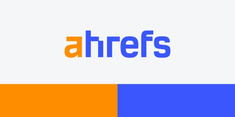
Official Color Codes:
- Primary Orange:
- Hex: #FF7A59
- RGB: (255, 122, 89)
- CMYK: (0, 52, 65, 0)
- Pantone: Approximate PMS 2024 C
- Primary Blue:
- Hex: #2F5BEA (approximate)
- RGB: (47, 91, 234)
- CMYK: (80, 61, 0, 8)
- Pantone: Approximate PMS 2727 C
Dimensions and Proportions:
The logo maintains a horizontal rectangular format with the width approximately 5-6 times the height. Minimum size requirements ensure the wordmark remains legible, typically no smaller than 120 pixels wide for digital applications or 1 inch for print. Clear space specifications follow standard brand guidelines, maintaining breathing room equivalent to the height of the “A” character around all sides.
Official usage guidelines prohibit alterations, filters, or effects to the logo files.
What Cultural Impact Has the Ahrefs Logo Had?
The Ahrefs logo has become a status symbol within the SEO and digital marketing community, with branded merchandise being highly sought after by industry professionals.
The distinctive orange “A” functions as a badge of expertise, appearing in conference presentations, case studies, and professional portfolios as shorthand for serious SEO work. The logo’s visibility in tools like Chrome extensions and WordPress plugins has made it a daily fixture for thousands of marketers. Its clean, modern design has influenced other SaaS branding in the marketing technology space, demonstrating how technical tools can maintain approachable visual identities.
How Does the Ahrefs Logo Fit Into Overall Brand Identity?

The logo serves as the anchor point for a comprehensive brand system that extends across product interfaces, educational content, and marketing touchpoints.
The orange and blue color palette creates consistency across the platform’s dashboard, where data visualizations and interface elements echo the logo colors. The geometric typography style influences the entire design system, from button shapes to chart elements. The brand maintains a technical-but-accessible voice that the logo visually reinforces.
Educational initiatives like Ahrefs Academy and the company blog maintain the visual language, creating a cohesive experience from first touchpoint to daily platform use.
How Should the Ahrefs Logo Be Used?

Official Usage Do’s and Don’ts:
Do:
- Use official logo files from the Ahrefs media kit
- Maintain proper clear space around the logo
- Use approved color versions (full color, monochrome, or white)
- Ensure adequate contrast with backgrounds
- Download files from https://ahrefs.com/logo or https://ahrefs.com/media-kit
Don’t:
- Alter colors, proportions, or letterforms
- Add effects, filters, or shadows
- Rotate or distort the logo
- Place on busy backgrounds without proper contrast
- Use low-resolution or unofficial versions
Where to Access Official Logos:
Official logo assets are available through the Ahrefs media kit at https://ahrefs.com/media-kit. The company provides PNG and SVG formats with transparent backgrounds. Primary logo versions include full color, monochrome (for technical constraints), and white (for dark backgrounds).
Licensing Information:
The Ahrefs logo and brand assets are proprietary to Ahrefs Pte Ltd. Usage rights are granted for legitimate business purposes such as blog posts, case studies, and partner materials. Commercial use requires proper context and should not imply endorsement without permission. Press and media usage is permitted when covering the company or its products.
Trademark Protection Details:
Ahrefs maintains trademark protection for its brand identity and logo design. The company enforces its intellectual property rights to prevent misuse or brand confusion. Partners and affiliates receive specific guidelines for approved usage scenarios.
FAQ About the Ahrefs Logo
When was the Ahrefs logo created?
The original Ahrefs logo was created in 2010 when Dmitry Gerasimenko founded the company. The logo featured a distinctive pixel-style geometric design that reflected early 2010s tech aesthetics. The current refined version was introduced around 2015 as the platform expanded beyond basic backlink analysis.
Who designed the Ahrefs logo?
The Ahrefs logo was developed internally by the founding team rather than commissioned from an external design agency. Dmitry Gerasimenko, as founder and CEO, oversaw the brand identity development. The design evolved organically with the company rather than through a formal branding process with professional designers.
What do the colors in the Ahrefs logo mean?
The orange color (#FF7A59) on the “A” represents energy, innovation, and the dynamic nature of SEO analysis. The blue (#2F5BEA) conveys trust, reliability, and stability – critical attributes for an analytics platform. Together, the colors create high contrast and memorability while balancing enthusiasm with professionalism.
How many times has the Ahrefs logo been redesigned?
The Ahrefs logo has undergone one major refinement since its 2010 introduction. The original featured prominent pixel-style elements throughout all characters. The current version, introduced around 2015, streamlined the design by removing most pixel elements while maintaining the signature orange “A” and blue letterforms. The core brand identity has remained remarkably consistent.
Where can I download the official Ahrefs logo?
Official Ahrefs logo files are available at https://ahrefs.com/logo and https://ahrefs.com/media-kit. The company provides vector graphics in SVG format and raster files in PNG format, all with transparent backgrounds. Multiple versions are available including full color, monochrome, and white variations for different usage contexts.
Is the Ahrefs logo trademarked?
Yes, the Ahrefs logo and brand identity are trademarked and protected intellectual property of Ahrefs Pte Ltd. The company maintains trademark registration to prevent unauthorized use and brand confusion. Users should follow official brand guidelines when incorporating the logo into legitimate business contexts.
What font is used in the Ahrefs logo?
The Ahrefs logo uses a custom geometric sans-serif typeface that appears to be proprietary. The design shares characteristics with fonts like Mynotrade or RBNo3.1, featuring bold weight, lowercase letterforms, and geometric construction. The typeface emphasizes technical precision while maintaining approachability through its rounded geometric shapes and consistent stroke weights.
Why did Ahrefs choose “href” for their logo name?
The name “Ahrefs” directly references the HTML anchor tag “<a href>” used to create hyperlinks on web pages. This naming choice immediately communicates the platform’s core function: analyzing backlinks and website link structures. By adding “A” to “hrefs,” the founders declared their ambition for leadership in link analysis tools from day one.
Conclusion
The Ahrefs logo exemplifies effective logo design principles through its memorable simplicity, strategic color usage, and clear connection to brand purpose.
The orange “A” has become instantly recognizable within the SEO industry, functioning as shorthand for professional-grade backlink analysis and comprehensive website optimization. The geometric sans-serif typography projects technical competence while remaining approachable, and the refined evolution from pixel-style origins to clean modern lines demonstrates the brand’s growth alongside the SEO industry itself. As Ahrefs continues expanding its platform capabilities and global reach, the logo remains a constant anchor point – a fitting metaphor for a tool built on understanding the web’s link structure.

Renowned for his expertise in logo design and visual branding, Bogdan has developed a multitude of logos for various clients.
His skills extend to creating posters, vector illustrations, business cards, and brochures. Additionally, Bogdan's UI kits were featured on marketplaces like Visual Hierarchy and UI8.
He also wrote in the past years on sites like Design Your Way, WebDesignerDepot, WPDean, Designmodo, Speckyboy, Slider Revolution, and more.
- The Windsurf Logo History, Colors, Font, And Meaning - 10 October 2026
- How Designers can Build a Stronger Online Creative Identity - 9 October 2026
- Minecraft Font Generator - 8 October 2026

Bogdan Sandu is a seasoned designer who has been designing websites since 2008. Renowned for his expertise in logo design and visual branding, Bogdan has developed a multitude of logos for various clients. His skills extend to creating posters, vector illustrations, business cards, and brochures. Additionally, Bogdan's UI kits were featured on marketplaces like Visual Hierarchy and UI8. He also wrote in the past years on sites like Design Your Way, WebDesignerDepot, WPDean, Designmodo, Speckyboy, Slider Revolution, and more.
You Might Also Like