Ever noticed how a single logo can instantly bring a brand to mind? From the iconic swoosh of Nike to the golden arches of McDonald’s, logos are the silent ambassadors of brands. But what makes a logo effective and memorable? The secret lies in understanding the different types of logos and choosing the right one for your brand identity.
In this article, we’ll explore the fascinating world of logo design, uncovering the nuances between a wordmark, pictorial mark, abstract mark, and many more.
You’ll learn how to craft a minimalist logo that speaks volumes with simplicity, or how to use a mascot logo to add a friendly face to your brand.
By the end of this guide, you’ll be equipped with the knowledge to distinguish between different logo styles and understand the strategic thought behind each design choice.
Dive in and discover how to create a visual identity that stands out in a crowded market.
Table of contents
- Wordmark Logos (Logotypes)
- Lettermark and Monogram Logos
- Brand Marks and Pictorial Logos
- Abstract Logo Marks
- Mascot Logos
- Emblem Logos
- Combination Marks
- Dynamic and Adaptive Logos
- Specialized Logo Types
Wordmark Logos (Logotypes)
Imagine you’re walking down the street, and you see those familiar golden arches. Instantly, you know it’s McDonald’s.
That’s the power of a wordmark logo. It’s all about using text-only design, but in a way that’s totally unique. Think about how just the name “Google” in its colorful letters is enough for recognition.
Wordmark logos are all about the font, color, and style of the text. They transform a simple company name into a recognizable brand. It’s like giving a plain t-shirt a whole new vibe with just a splash of paint.
Ideal Use Cases
Now, let’s talk about when to use these types of logos.
- Brands with distinctive names: If your brand name is catchy or unique, a wordmark logo is like a spotlight on a stage.
- It’s perfect for turning that name into an iconic symbol.
- Simplified branding approach: When you want to keep it clean and simple, wordmark logos are the way to go. They’re like that classic little black dress – never out of style and works for almost every occasion.
Wordmark logos are not just about looking good; they’re about making a mark. In the world of logo design, where first impressions matter, these types of logos are like a firm handshake – confident and memorable.
They’re a key player in graphic design and a crucial part of a brand’s corporate identity. When done right, they can make a brand name synonymous with its product or service – just like how we say “Just Google it.”
Lettermark and Monogram Logos
Lettermark Logos

Ever caught a glimpse of IBM’s logo? That’s a classic example of a lettermark logo.
It’s all about using initials to represent a brand. Think of it as the nickname of logos – short, sweet, and super memorable.
Why Lettermark?
- Perfect for long brand names: Imagine trying to fit ‘International Business Machines’ on a tiny logo. IBM sounds way cooler, right? That’s the charm of lettermark logos.
- Super versatile: Whether it’s a business card or the side of a skyscraper, these logos fit just right.
Monogram Logos
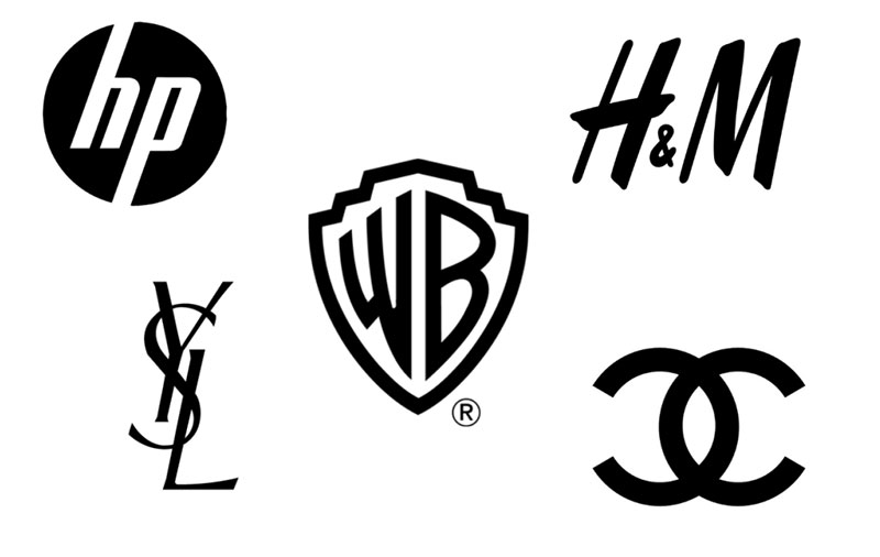
Now, let’s talk about the stylish cousin of lettermark logos – monogram logos. Picture Louis Vuitton’s LV or Chanel’s interlocking Cs.
These logos intertwine letters to create a symbol that screams luxury and elegance.
Crafting Elegance
- Interlacing letters for a luxurious feel: It’s like a designer touch to the alphabet, turning letters into a work of art.
- Historical and exclusive brand image: Monograms have this old-world charm, making them perfect for brands that want to showcase legacy and exclusivity.
Both lettermark and monogram logos bring a unique flavor to the table. They’re not just about looking good; they tell a story, build a brand’s identity, and make a lasting impression.
Whether you’re a tech giant or a high-end fashion label, these types of logos can be your secret weapon in the world of branding and corporate identity.
Brand Marks and Pictorial Logos
Brand Marks
Okay, think of Apple’s apple or Twitter’s bird. These icons are more than just cool drawings. They’re brand marks – logos that use an image to make you think of a brand in a snap.
The Magic of Images
- Icon or symbol-based: It’s like playing Pictionary with brand identities. The game is to create an image that sticks.
- Representation of brand through imagery: A good brand mark says a lot without words. It’s the visual version of a catchy tune.
Pictorial Logos

These are like snapshots from the real world, turned into logo gold. Think of the red Target bullseye or the Starbucks mermaid.
Visual Storytelling
- Real-world object representation: It’s like taking a thing – a fruit, an animal, anything really – and making it the face of your brand.
- Instant brand recognition through visuals: These logos are like celebrities of the brand world. One glance, and you know who you’re dealing with.
Both brand marks and pictorial logos are heavy hitters in the types of logos league. They’re not just about being pretty; they’re about telling a story, creating an identity, and making a brand pop in a world full of words.
Whether it’s a swoosh or a shell, these logos are the silent ambassadors of brands, speaking volumes without uttering a single word.
Abstract Logo Marks
Ever stared at a logo and thought, “What in the world is that?” But somehow, it just feels right?
Welcome to the realm of abstract logo marks. This is where shapes and forms come together in a kind of visual poetry that’s open to interpretation.
Beyond the Literal
- Non-representational forms: It’s not about showing a thing, but about conveying a vibe. Like Nike’s swoosh – it’s not just a checkmark, it’s motion, it’s progress, it’s ‘just do it.’
- Conveying brand values abstractly: These logos are like visual riddles. Each curve and angle is a clue to what the brand stands for.
Application
Abstract logos aren’t just artsy doodles. They’ve got a job to do, and they do it well across various industries.
Versatile Storytellers
- Versatility across industries: From tech giants to fashion labels, these logos fit in everywhere but still stand out. They’re like chameleons, but cooler.
- Unique brand identity creation: When you want your brand to be a one-of-a-kind, an abstract logo is like your own secret handshake. It’s unique, memorable, and all you.
Abstract logo marks are the rebels of the types of logos world. They break the rules, ditch the obvious, and make you think. They’re not just logos; they’re mini masterpieces of graphic design.
Mascot Logos
Ever seen a logo and felt like it was smiling back at you? That’s the magic of mascot logos. We’re talking about those friendly faces that become the face of a brand.
Like the cheerful Michelin Man or the cool KFC Colonel. They’re not just logos; they’re like buddies you could hang out with.
Characters with Charm
- Character-based design: It’s like giving your brand a personality that walks and talks. These logos are characters – sometimes quirky, sometimes classy – but always memorable.
- Emotional connection with the audience: Mascot logos are like the mascots at sports games; they pump up the crowd and make everyone feel part of the team.
Usage Considerations
Mascot logos are superstars in the types of logos world, but they need the right stage to shine.
Finding the Perfect Fit
- Targeting specific demographics: It’s about knowing your crowd. A cool skateboarder dude for a skate brand, a cuddly animal for a kid’s product – it’s all about relatability.
- Enhancing brand personality: A mascot can take a brand’s personality and turn it up to eleven. It’s like having a brand ambassador who’s always in character.
Mascot logos are like the life of the party in the branding world. They make corporate identity fun and approachable. They’re not just part of the brand; they are the brand, in a way that no other types of logos can be.
Emblem Logos
Step into the world of emblem logos, where every design feels like a crest or a badge from a bygone era.
Think of the classic Harley-Davidson logo or the one for the Harvard University. These aren’t just logos; they’re like mini coats of arms for brands, rich with history and meaning.
A Blend of Tradition and Style
- Text within a symbol or crest: It’s like wrapping your brand name in a fancy frame. The text and the emblem come together to tell a story.
- Traditional and professional appearance: Emblem logos have this old-school charm. They make a brand look established, serious, and trustable.
Suitable Industries
Emblem logos are like a fine suit – they don’t fit every occasion but when they do, they make a statement.
Finding Their Home
- Educational institutions, sports teams: These places often have a legacy, a history they’re proud of. Emblem logos are perfect for telling those stories.
- Brands seeking a classic image: If a brand wants to scream “heritage” and “quality,” an emblem logo is like shouting it from the rooftops.
Emblem logos stand out in the bustling city of types of logos. They bring a touch of class, a dash of history, and a whole lot of personality. They’re not just about looking good; they’re about creating a sense of belonging and prestige.
Combination Marks
Alright, let’s talk about combination marks. This is where things get really interesting in the world of types of logos. Imagine taking a pinch of imagery and mixing it with a dash of text.
What you get is a combination mark – a logo that’s a bit of both worlds. It’s like the burger and fries of the logo universe; both parts are great on their own, but together, they’re a powerhouse.
A Fusion of Elements
- Integration of text and symbol: Think of Adidas or Lacoste. The text and the symbol come together to create a full picture. It’s like they’re buddies, each telling a part of the story.
- Versatility in branding: These logos are super flexible. You can use them together or separately and they still make sense. It’s like having two tools in one.
Advantages
Combination marks are like Swiss Army knives in the types of logos toolbox. They’ve got a lot going for them.
Dual Power
- Comprehensive brand representation: With both text and symbol, these logos tell you the whole story. It’s like getting the full picture at a single glance.
- Recognition with or without text: Whether you see just the symbol or just the text, you’ll still know the brand. It’s like recognizing a friend, whether they’re in a costume or just chilling in a t-shirt.
Combination marks are the all-rounders in the logo league. They’re adaptable, versatile, and super effective at making a brand memorable.
In the ever-evolving landscape of graphic design and corporate identity, these logos are like a secret weapon. They adapt, they fit in, and they stand out, all at the same time.
Dynamic and Adaptive Logos
Dynamic Logos
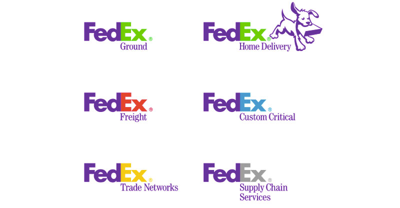
Let’s dive into the exciting world of dynamic logos. These are the chameleons in the types of logos. They change, they adapt, they play with colors and shapes. It’s like they have a life of their own.
Always on the Move
- Evolving design for diverse applications: Think of Google’s logo. It changes for special events, holidays, you name it. It’s never static, always surprising.
- Reflecting brand flexibility: These logos are a shout-out to the brand’s adaptability and modern approach. They’re like saying, “Hey, we can keep up with the times!”
Adaptive Logos
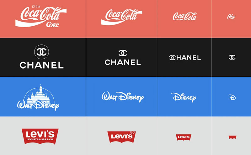
Now, let’s talk about their close cousins – adaptive logos. These guys are the masters of fitting in. Different contexts? No problem. They tweak, adjust, and fit right in.
Context is King
- Contextual logo variations: It’s all about where the logo shows up. An app icon? A billboard? Each spot gets its own version. It’s like having different outfits for different occasions.
- Meeting diverse branding needs: Adaptive logos are like social butterflies. They adapt to the setting while keeping the brand’s core identity intact.
Dynamic and adaptive logos are like the cool kids in the types of logos school. They’re all about movement, change, and keeping things fresh. In the fast-paced world of graphic design and corporate identity, these logos are always one step ahead, making sure the brand stays relevant and engaging.
Specialized Logo Types
Negative Space Logos
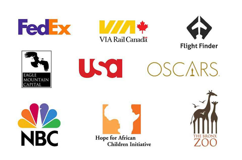
Ever looked at a logo and then saw something hidden in it, like a secret message? That’s the fun of negative space logos.
They play a game of hide and seek with your eyes. It’s not just about what you see; it’s about what you discover.
Hidden Gems
- Creative use of space for dual imagery: FedEx is a classic example. Once you see that arrow between the ‘E’ and ‘x’, you can’t unsee it. It’s a clever trick that makes the logo memorable.
- Subtle and clever design approach: These logos are like visual puzzles. They’re smart, they’re slick, and they add a layer of intrigue to a brand’s identity.
3D Logos
Moving on to 3D logos, these are the ones that pop! They jump out at you, adding depth and dimension to the design. They’re like the action heroes of the types of logos world.
Bringing Depth to Design
- Adding depth and dimension: Think of the realism in the Superman logo. It’s not just a flat design; it’s got depth, making it more impactful.
- Modern and impactful visual effect: 3D logos bring a contemporary feel to a brand. They’re flashy, they’re cool, and they make a statement.
Animated Logos

And then, there are animated logos. They’re not just static images; they move, they change, they tell a story in a few seconds.
Logos in Motion
- Bringing logos to life through animation: Google’s Doodle is a great example. It’s not just a logo; it’s a short, engaging story that changes regularly.
- Use in digital and multimedia platforms: In a world where everything’s going digital, animated logos are like a breath of fresh air. They grab attention and make a brand stand out in the digital space.
Specialized logo types like negative space, 3D, and animated logos are the artists in the types of logos gallery.
They bring innovation, creativity, and a touch of magic to branding and corporate identity. They’re not just about looking good; they’re about creating an experience, a moment of surprise, or a burst of delight.
FAQ on Logo Types
What are the main types of logos?
Logos come in various forms, including wordmarks, lettermarks, pictorial marks, abstract marks, mascot logos, emblem logos, and combination marks. Each type has its unique style and use case. For instance, a wordmark focuses on typography, while a pictorial mark uses a graphic image.
How do I choose the right type of logo for my brand?
Consider your brand’s identity and target audience. A mascot logo adds personality, ideal for family-oriented brands. A minimalist logo suits tech companies. Reflect on what your brand represents and select a logo type that aligns with your core values and message.
What is a wordmark logo?
A wordmark logo uses stylized text to represent the brand. It’s a clean and straightforward design that focuses on the company’s name, often using unique typography to make the brand memorable. Think of Google or Coca-Cola; their logos are purely text-based but instantly recognizable.
Can a logo be both a wordmark and a pictorial mark?
Yes, this is known as a combination mark. It blends text and a graphic symbol, providing versatility. You can use the elements together or separately. This duality offers flexibility across different mediums, from business cards to billboards.
What is the benefit of using an abstract mark?
An abstract mark uses geometric shapes to convey a brand’s values and essence. It’s versatile and unique, not tied to a specific image. This allows for a broad interpretation and can make your logo stand out as distinctive and memorable.
Why are mascot logos effective?
Mascot logos feature illustrated characters, making them engaging and approachable. They create a strong brand personality, fostering a connection with the audience. Think of the KFC Colonel or the Michelin Man; these mascots are memorable and humanize the brand.
How do emblem logos differ from other types?
Emblem logos integrate text within a symbol or icon, often resembling badges or seals. They convey tradition and authority, making them popular among schools, organizations, and sports teams. Their intricate designs can be visually striking and authoritative.
What should I consider when designing a minimalist logo?
Focus on simplicity and clarity. A minimalist logo should use clean lines, basic shapes, and a limited color palette. The goal is to communicate your brand’s message quickly and effectively, without unnecessary detail. It’s about making a bold statement with less.
How does a dynamic logo work?
A dynamic logo can change appearance while maintaining a core element. It adapts to different contexts and uses, making it versatile and modern. This flexibility allows the logo to stay fresh and relevant, keeping the brand image engaging and up-to-date.
Why might a brand choose a vintage logo design?
Vintage logos evoke nostalgia and a sense of heritage. They often feature intricate details and classic typography. This style can attract customers who value tradition and quality. It’s a great way to convey a timeless brand identity that feels established and trustworthy.
What Are the Different Types of Logos?
In the logo universe, you’ve got a few main players. There are wordmarks, think Google; lettermarks like IBM; brand marks, like Apple’s apple; pictorial logos, like Twitter’s bird; abstract marks, Nike’s swoosh; mascots, like Tony the Tiger; emblems, think Harley-Davidson; and combination marks, like Adidas. Each has its own vibe and use, defining distinct logo styles within the broader category..
How Do I Choose the Right Type of Logo for My Brand?
It’s all about your brand’s personality and story. If you’re starting fresh and need a unique name, a business name generator can be a helpful tool.
Once you have a name, consider its style and character. A wordmark might be perfect for a unique brand name. Got a long name? Try a lettermark. Want to be iconic? Pictorial or abstract marks are your go-to. It’s like picking the right outfit that fits your brand’s character.
What Makes a Logo Design Effective?
A killer logo is memorable, simple, and timeless. It should capture your brand’s essence in a glance. Think about versatility, too – your logo needs to look good on everything from a business card to a billboard. It’s like creating a signature style that’s unmistakably yours. In the age of tech, crafting a standout logo is easier with AI Logo Generators, lightening the logo creation load.
Conclusion
Understanding the types of logos is crucial for creating a strong visual identity. Each logo type, from wordmarks and lettermarks to pictorial marks and mascot logos, offers unique ways to represent your brand’s essence.
A well-chosen logo style can elevate your brand, making it memorable and engaging. Think about how a minimalist logo can communicate modernity and efficiency, while a vintage logo evokes nostalgia and trust.
Considering terms like brand identity and visual identity ensures your logo not only looks good but also aligns with your marketing strategy. Incorporating LSI keywords and semantically relevant keywords such as graphic design, logo creation, and custom logo can enhance your content’s visibility and relevance.
Ultimately, the right logo type reflects your brand’s story and values, connecting with your audience on a deeper level. Choose wisely, and your logo will be a powerful symbol of your brand’s identity.

Renowned for his expertise in logo design and visual branding, Bogdan has developed a multitude of logos for various clients.
His skills extend to creating posters, vector illustrations, business cards, and brochures. Additionally, Bogdan's UI kits were featured on marketplaces like Visual Hierarchy and UI8.
He also wrote in the past years on sites like Design Your Way, WebDesignerDepot, WPDean, Designmodo, Speckyboy, Slider Revolution, and more.
- Beyond the Studio: I Tested 5 Modern Tools to Generate Ad Creatives in Minutes - 26 August 2026
- UI Color Schemes Generator - 25 August 2026
- Beyond the Portfolio: What Makes a Designer Stand Out Internationally - 25 August 2026

Bogdan Sandu is a seasoned designer who has been designing websites since 2008. Renowned for his expertise in logo design and visual branding, Bogdan has developed a multitude of logos for various clients. His skills extend to creating posters, vector illustrations, business cards, and brochures. Additionally, Bogdan's UI kits were featured on marketplaces like Visual Hierarchy and UI8. He also wrote in the past years on sites like Design Your Way, WebDesignerDepot, WPDean, Designmodo, Speckyboy, Slider Revolution, and more.
You Might Also Like