
What font does Medium use on its website?
In the realm of visual storytelling, typography wields the quiet power to breathe life into words.
Imagine a world where ‘the Medium font’ doesn’t simply convey a message but instead, captivates an audience with its poised medium weight, its unspoken strength that commands the sweet spot between delicate and bold.
This is the crucible where legibility meets aesthetics, and where every typeface, every glyph, becomes a cornerstone of graphic design.
Discover the transformative prowess of the Medium font as it navigates the intricate dance of print design fonts and digital typesetting.
By venturing with me, unravel the subtle intricacies of font selection that resonate with your brand’s voice—swaying effortlessly between typographic harmony and practical functionality.
Embark on this exploration to master the artistry behind font pairing and user interface fonts, crafted to elevate your brand’s identity.
You will emerge not just with theoretical knowledge but equipped to harness the nuanced dominion of the Medium font—a tool sharpened by clarity, enriched by purpose, and revered by designers.
Fonts that Medium use on its website
The application fonts on our today’s rich displays look fantastic between Android robots, San Francisco on iPhones and Macs, and Segoe UI on Windows. However, it is much more popular in native smartphone apps to rely on them for displaying interfaces but less so on the internet.
Medium uses some fonts on its website. Most of the body text in fonts called Charter(serif) and Kievit(without a serif) on the Medium website is also available with Noe and Marath Sans. The font named Fell is used for headings and titles for the media, Helvetica and Sohne are subheadings for the subheadings. Georgia and Cambria are also several other fonts used on their website.
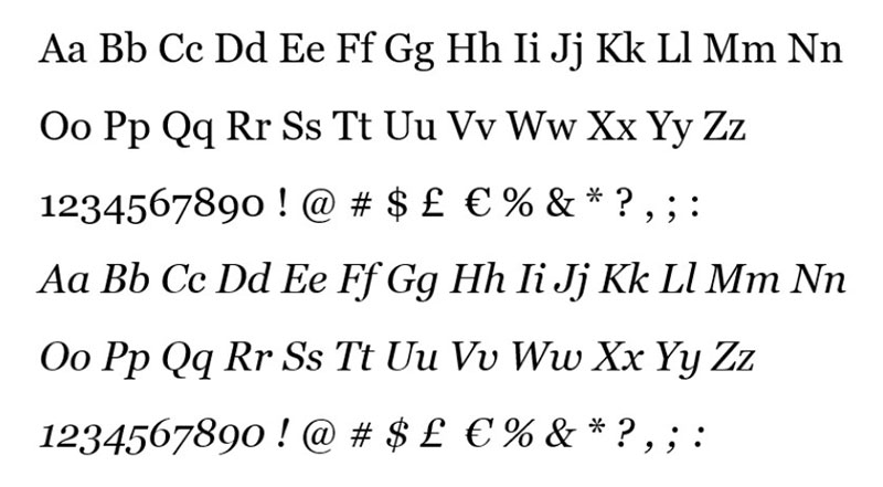
Charter
Matthew Carter’s Charter was established in the 1980s. The font was utilized to understand the limitations of low and mid-resolution power output devices; hence the squared serifs and economies of diagonals and curves. However, the design was an immediate success on its own merits. It is a very nice daily style for a range of uses, including books and handbooks. Charter provides limited sets of caps, extensions, and replacements to make it more flexible and usable.
Noe
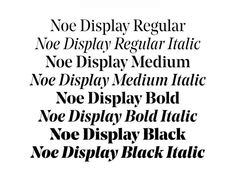
Noe Show talks with consistency and trust, but it’s not just yelling. His intense drive is tempered by grace. The messages in Noe are eye-catching and separate themselves from the material of tales, to avoid distracting the readers where the writing stops and the platform starts.
The four weights of Noe Show have an almost constant weight of the hairline, raising the overall contrast as stems thicken from normal to black, with a variety of dramatic effects. This shoe style is characterized by the sparkle and bite.
Marath Sans
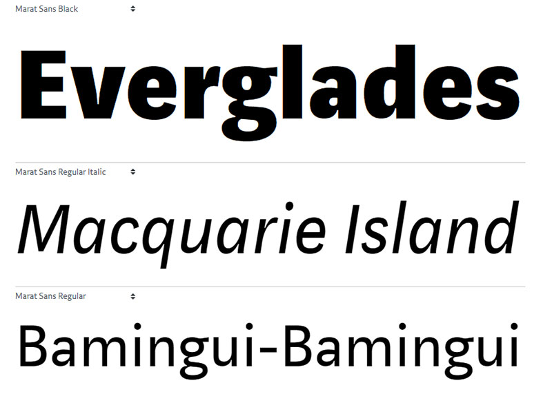
Marat Sans is a clean, but dynamic font without serif, mixing very realistic logical and humanist ideas. It is characterized by a positive personality and a decent reading. There was a mistake. Marat Sans, a gentle and elegant serif typeface, is the ideal companion for Marat.
Used for headlines, pull caps, and story quotations, together with friend Charter. It appears among others on Medium’s website in settings, accounts, alerts, and metadata.
Kievit
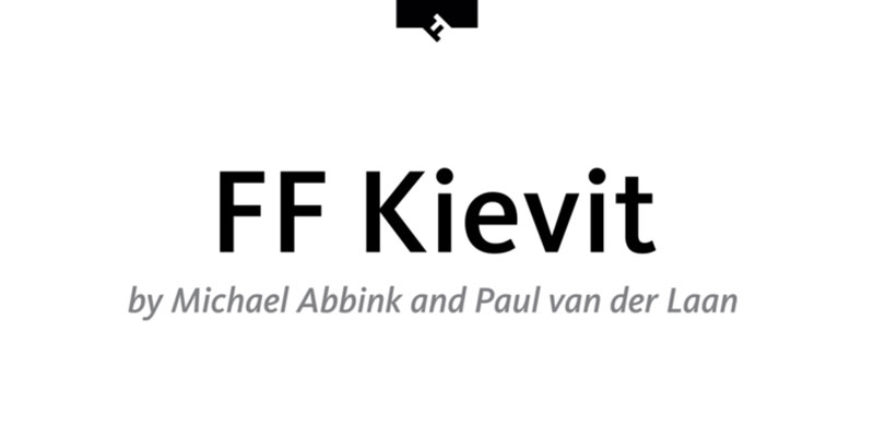
This was developed through FontFont in 2001 by the American designer Michael Abbink. The 9-size family is suitable for advertisement and packaging, book text, emblem, branding and design, small text, road finding & signage, and site and screen design and contains Italic texts (including italics).
FF Kievit provides comprehensive presentational assistance with characteristics such as ligatures, small capitals, alternative characters, case-sensitive shapes, fractions, and super—and subscript characters. It comes with a full range of figure set options—old-style and lining figures, each in tabular and proportional widths. The typeface family also supports the Cyrillic and Greek writing systems, as well as Latin-based languages. FF Kievit received several awards: the Bukva: Raz award in 2001 and the ISTD award in 2001.
Fell
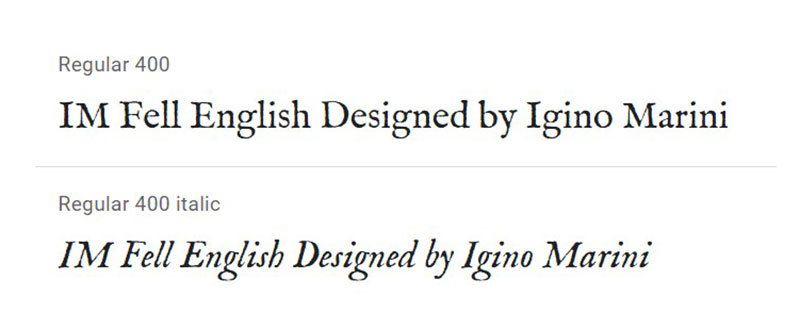
John Fell, an Oxford bishop of the 17th century, took their name from the Fell Forms. He not just to develop a remarkable set of types of printing, but also began one of the most significant adventures in the history of typography.
Sohne
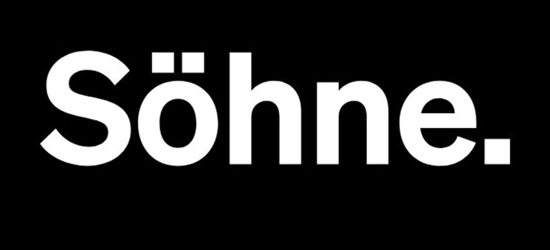
Söhne was designed by Kris Sowersby and published in 2019 by Klim Type Foundry as a sans-serif typeface. Sowersby describes it as “the memory of Akzidenz-Grotesk framed through Helvetica’s reality.” The family comes with matching italics in eight weights. A condensed version (Söhne Schmal), a large version (Söhne Breit), and a monospaced version (Söhne Mono) are also available.
Helvetica
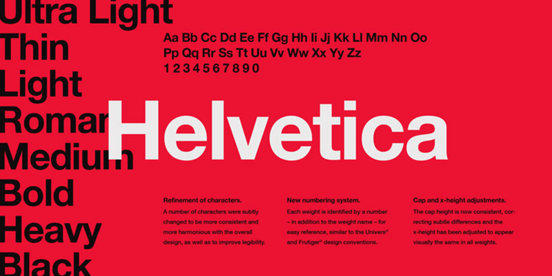
A commonly used sans-serif typeface, created in 1957 by Swiss typeface designer Max Miedinger with input from Eduard Hoffmann, is Helvetica or Neue Haas Grotesk. Helvetica is a neo-grotesque style, one of which is inspired by the popular Akzidenz-Grotesk typeface of the 19th century and other German and Swiss styles. Helvetica is constructed as a powerful central series, modified and added later with simplified and expanded shapes and extreme weights, a method that matches technical constraints and marketing philosophy of Linotype, but which resulted in a family of weights that were not as well organized as they should have been.
Georgia
Georgia is a typeface resonant with typographic personality, albeit inspired by the need for – and providing – clarity at low resolutions on the screen. The face exudes a sense of friendliness even at small sizes; a feeling of warmth that many might claim has been eroded from Times New Roman by overuse.
This is as much evidence of the talent of the designer of the typeface, Matthew Carter, as it is of any intrinsic nature of the design of the face because the tiny pixel spaces of the screen can be a harrowing canvas for any designer of the type. Carter has effectively succeeded in developing a typeface family in Georgia that blends high readability with character and charm.
Cambria
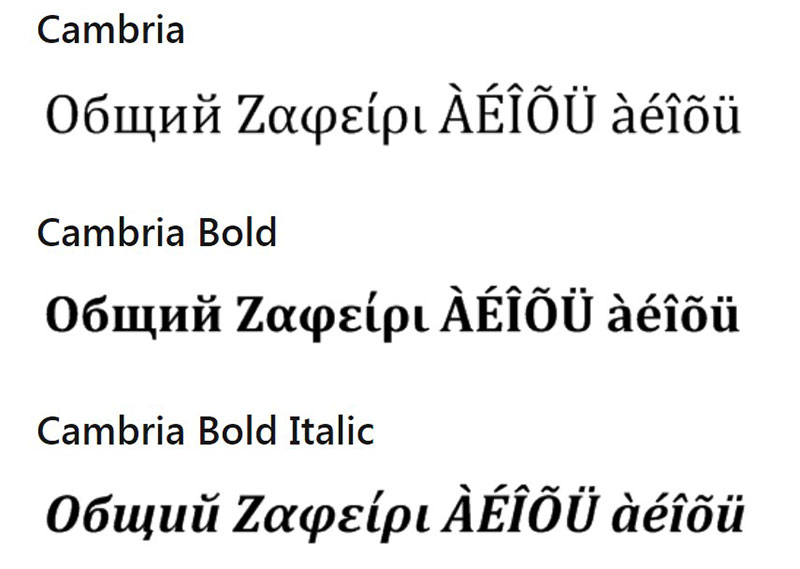
The Cambria has been intended to look excellent when written in small sizes for on-screen reading. It has spacing and proportions that are very consistent. Diagonal and vertical hairlines and serifs are relatively strong, whereas horizontal serifs are small and are intended to highlight rather than stand out stroke ends. In italics, where the lowercase characters are subdued in style to be at their best as word-image components, this concept is most evident.
Over the years, the business itself has gone through a lot of changes, but they’re still going strong. There is a never-ending source of fascinating material, with potentially over 100,000 writers on the web creating content every day.
Fonts play an important role in the design. Before you get to read the text, they set the tone, elicit emotions, and help shape an opinion. They are hidden visual communication agents working with the viewer’s subconscious.
FAQ On The Medium Font
What is the Medium font?
Oh, the Medium font—it’s not just a mid-weight variety in a font family. It strides confidently between light and bold, offering a harmonious balance. Perfect for conveying messages with subtlety, it’s a common choice in the design toolkit for both print and web typography.
How does the Medium font influence readability?
Medium fonts are like your morning coffee, just the right strength. Not too light, never overbearing—these fonts facilitate reading by providing legible and readable text crucial in user interface design and extended content strategy. They’re the typographic bridge to clarity.
Can the Medium font be used for both print and digital media?
Absolutely. Like a chameleon, it adapts—resonating as well in print design as in digital realms. A versatile player, the Medium font ensures visual communication is consistent across responsive designs, adapting to both screen resolutions and paper textures.
What are the best practices for pairing the Medium font with other typefaces?
Think of font pairing as a dinner date; harmony is key. Pair a Medium font with a contrasting light or bold counterpart to create a dynamic hierarchy.
This typographic harmony elevates the design principles underlying your project, resulting in a visually appealing brand identity.
Where can I find and download the Medium font?
To secure a legit Medium font, navigate trusted avenues. Entities like Google Fonts or Adobe Fonts offer a variety of download options. Always ensure you comply with the font licensing to keep things above board.
Are there specific Medium fonts that are better for web use than others?
For the web, legibility is reigning monarch. Fonts like Helvetica Medium or Arial Medium have a storied reputation for readability and performance across different devices. Pair them with CSS font properties to ensure a seamless digital experience.
How do I decide if a Medium font is the right choice for my design?
Evaluate your brand guidelines and the message you intend to impart. A Medium font should complement the tone—assertive yet inviting. Consider its application across various touchpoints; a trial in design software could seal the decision.
What are the licensing requirements for using the Medium font in commercial projects?
Navigating the fine print is crucial. Review the licensing agreement associated with the Medium font you select. Some may allow commercial use at no cost, while others might demand a fee. Ignorance isn’t bliss here—it’s legal peril.
How does the Medium font affect the overall aesthetic of a project?
Medium fonts have a bearing akin to a well-tailored blazer—polished but not overdressed.
Their presence commands attention without overpowering, contributing to a font aesthetic of sophistication and authority, thus enhancing the overall visual communication of your project.
Why is the Medium font often recommended for UI/UX design?
In the UI/UX arena, functionality marries beauty. The Medium font is the perfect mediator—accessible, legible, and versatile.
It scales well across devices, contributes to a cohesive layout, and means your user’s journey is as smooth as silk.
Conclusion
And so we anchor at journey’s end, the port where the Medium font bids us a bold yet courteous farewell. We’ve navigated the nuanced waters of typography, charting a course through the bustling trade routes of graphic design, user interface, and readable content.
We’ve touched upon the sanctity of brand identity; recognized the robust versatility that this font offers across numerous platforms, digital and print alike; and emphasized the sheer importance of a meticulously considered font pairing. The Medium font stands as a beacon, illuminating the design landscape with unwavering presence, unfazed by ever-shifting trends.
Remember, the wise choice of a Medium font is not merely a decision; it’s a declaration—a visual whisper exalting clarity, accessibility, and an unwavering commitment to typographic excellence. As you step forth, ready to embolden text and enliven pages, let the Medium font be your steadfast ally in crafting legacies in letters.
If you liked this article about the Medium font, you should check out this article about the YouTube font.
There are also similar articles discussing the CNN font, the Twitch font, the Reddit font, and the Netflix font.
And let’s not forget about articles on the Minecraft font, the Disney font, the Slack font, and the Instagram font.
Bogdan Sandu, a seasoned designer with 15 years of diverse experience, has been designing websites since 2008.
Renowned for his expertise in logo design and visual branding, Bogdan has developed a multitude of logos for various clients.
His skills extend to creating posters, vector illustrations, business cards, and brochures. Additionally, Bogdan's UI kits were featured on marketplaces like Visual Hierarchy and UI8.
Latest posts by Bogdan Sandu (see all)
- The Sega Logo History, Colors, Font, And Meaning - 19 April 2024
- Light Up Your Designs with These Light Color Palettes - 19 April 2024
- How to Measure Brand Loyalty Effectively - 19 April 2024