The Skoda logo stands as one of the most recognizable symbols in European automotive branding. This winged arrow emblem represents over a century of Czech engineering and manufacturing heritage.
Currently, the logo features a simplified green winged arrow design introduced in 2022. Skoda Auto, founded in 1895 as Laurin & Klement, has gone through roughly seven major logo redesigns. The brand sits within the Volkswagen Group portfolio, competing alongside other European marques in the global market.
What makes this logo interesting is how it balances tradition with modern simplicity. The current iteration strips away three-dimensional effects while keeping the core winged arrow that customers have recognized for decades.
What is the Skoda Logo?

The Skoda logo is a stylized winged arrow symbol rendered in “Emerald Green,” officially introduced in its current form in 2022. Designed in collaboration with the agency Scher, the emblem represents speed, precision, and forward movement while honoring the brand’s Czech heritage.
Design Specifications:
- Design Type: Combination mark (symbol with separate wordmark)
- Primary Elements: Winged arrow symbol, “SKODA” wordmark in custom typography
- Official Introduction Date: August 2022
- Designer/Agency: Scher agency in collaboration with Skoda’s internal design team
- Trademark Status: Registered trademark of Skoda Auto a.s.
- Color Palette: Emerald Green (primary), Black, White
- Usage Context: Vehicles, dealerships, digital platforms, marketing materials, merchandise
How Has the Skoda Logo Evolved Over Time?
The Skoda logo has transformed dramatically since the company’s founding in 1895.
From ornate Victorian-era crests to today’s clean digital-first design, each version reflected its era’s aesthetic values.
The winged arrow first appeared in 1926 and has remained the core symbol through multiple refinements.
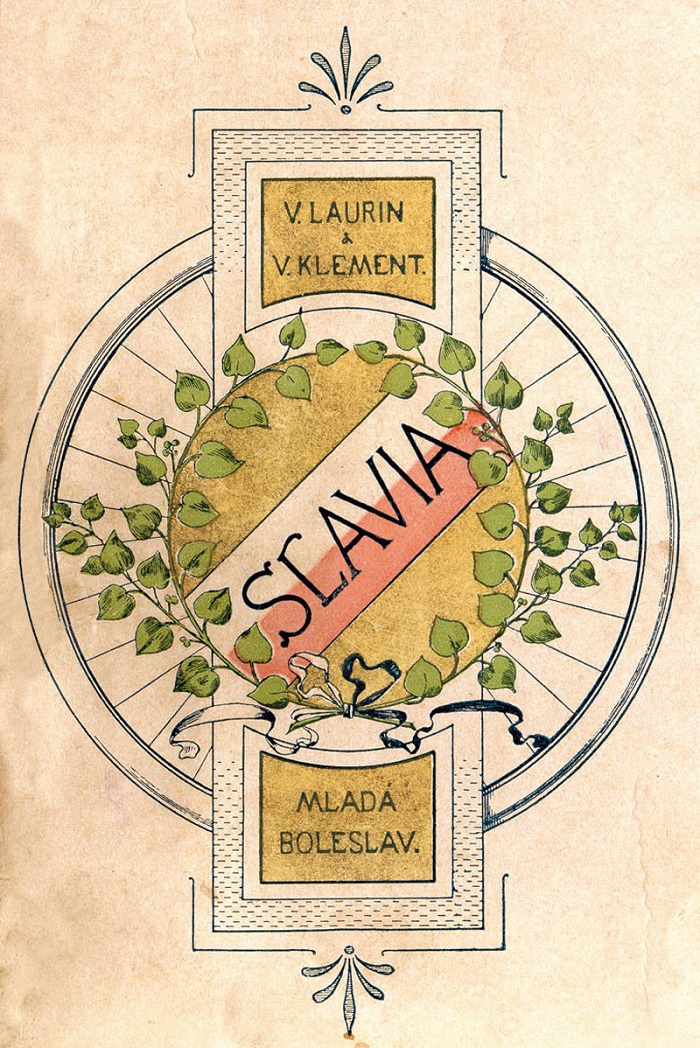
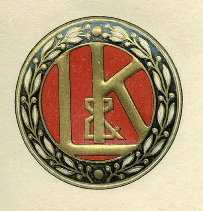
Original Laurin & Klement Logo (1895-1905)
- Years Active: 1895-1905
- Design Description: Circular emblem featuring the founders’ initials “L&K” surrounded by laurel wreaths
- Color Scheme: Black and gold
- Designer: Unknown, likely commissioned locally
- Context: Vaclav Laurin and Vaclav Klement founded the company as a bicycle manufacturer in Mlada Boleslav
- Key Changes from Previous: First logo, established brand identity
- Cultural Significance: Represented the craftsmanship tradition of Bohemian manufacturing
Early Skoda Emblem (1926-1933)
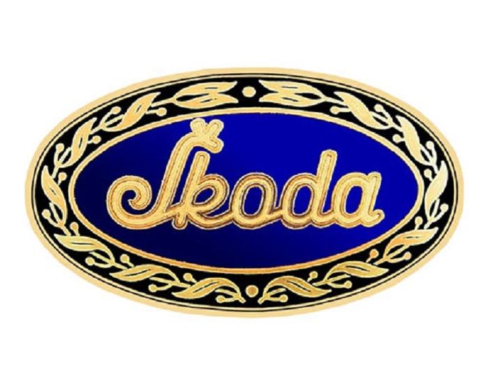
- Years Active: 1926-1933
- Design Description: First appearance of the winged arrow, enclosed in a circle with “SKODA” text
- Color Scheme: Blue and white
- Designer: Commercial director Tomas Maglic credited with the concept
- Context: The Skoda Works acquired Laurin & Klement, requiring new branding
- Key Changes from Previous: Complete departure from L&K identity, introduction of arrow motif
- Cultural Significance: The arrow symbolized progress and industrial might of interwar Czechoslovakia
Post-War Skoda Logo (1933-1991)
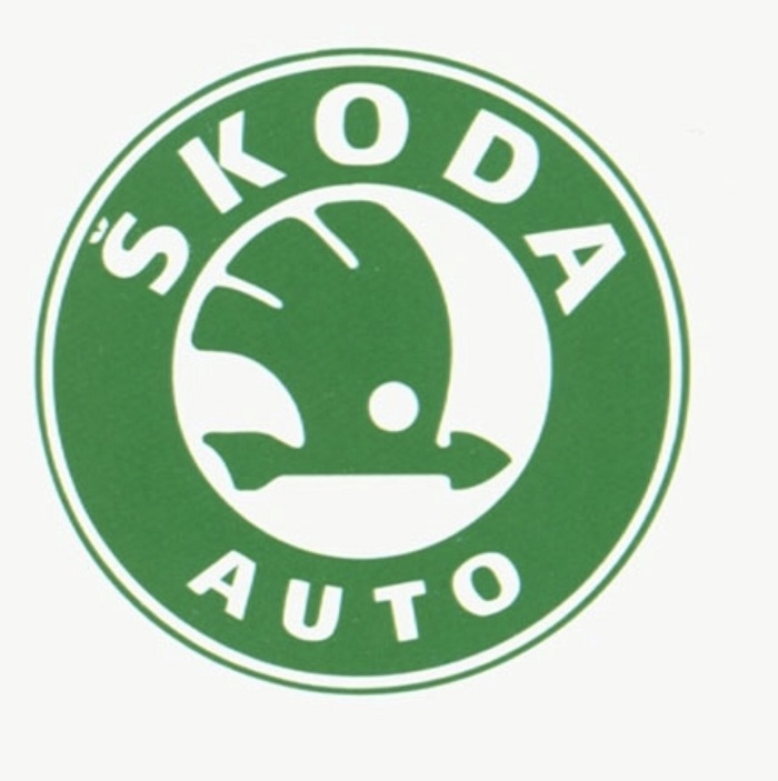
- Years Active: 1933-1991
- Design Description: Refined winged arrow within a circular border, featuring a stylized eye or feathered wing
- Color Scheme: Various iterations in blue, green, and chrome
- Designer: Internal design team
- Context: Survived World War II and the communist era, becoming a symbol of Eastern Bloc automotive production
- Key Changes from Previous: More detailed feathering on the wing, three-dimensional rendering
- Cultural Significance: Represented affordable mobility for citizens of socialist Czechoslovakia
Volkswagen Era Logo (1991-2022)
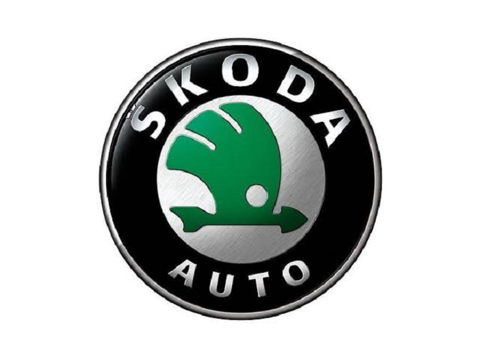
- Years Active: 1991-2022
- Design Description: Modernized winged arrow with black outline and green fill, featuring chrome effects
- Color Scheme: “Skoda Green” with black and chrome accents
- Designer: Updated through collaboration with Volkswagen Group design
- Context: Volkswagen acquired Skoda in 1991, triggering brand modernization
- Key Changes from Previous: Cleaner lines, standardized green color, removal of circular border
- Cultural Significance: Marked Skoda’s transition from budget Eastern European brand to respected global competitor
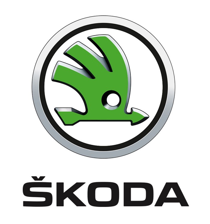
Current Digital-First Logo (2022-Present)
- Years Active: 2022-Present
- Design Description: Flat, two-dimensional winged arrow in solid Emerald Green, separate “SKODA” wordmark
- Color Scheme: Emerald Green (primary)
- Designer: Scher agency
- Context: Part of broader brand refresh aligned with electric vehicle push
- Key Changes from Previous: Removed chrome effects, flattened design, simplified geometry, new shade of green
- Cultural Significance: Signals Skoda’s commitment to sustainability and digital transformation
What Do the Design Elements of the Skoda Logo Mean?
The winged arrow carries layered meanings developed over nearly a century.
The arrow represents speed, precision engineering, and forward momentum.
The wing symbolizes freedom, lightness, and the aspiration to rise above competition.
Together, these elements suggest a vehicle that moves swiftly and gracefully.
Why Did Skoda Choose These Specific Colors?
Green has defined Skoda’s identity since the 1990s. The color connects to themes of nature, sustainability, and Czech landscapes.
According to color psychology, green suggests growth, harmony, and environmental awareness.
The 2022 refresh introduced “Emerald Green” as a bolder, more electric shade.
- Emerald Green: Hex #1E5029 – Symbolizes sustainability, nature, and Czech heritage. Creates feelings of balance and renewal.
- Black: Hex #000000 – Used for contrast and text, represents sophistication and premium positioning.
- White: Hex #FFFFFF – Applied in reversed applications, suggests clarity and modernity.
What Typography Style Is Used in the Skoda Logo?

Skoda uses a custom sans-serif font called “Skoda Next” for its wordmark.
The letterforms feature geometric construction with slightly rounded terminals.
This typography approach improves readability on digital screens and small applications.
Previous versions used bolder, more industrial typefaces. The current font feels approachable yet confident.
What Are the Hidden Meanings in the Skoda Logo?
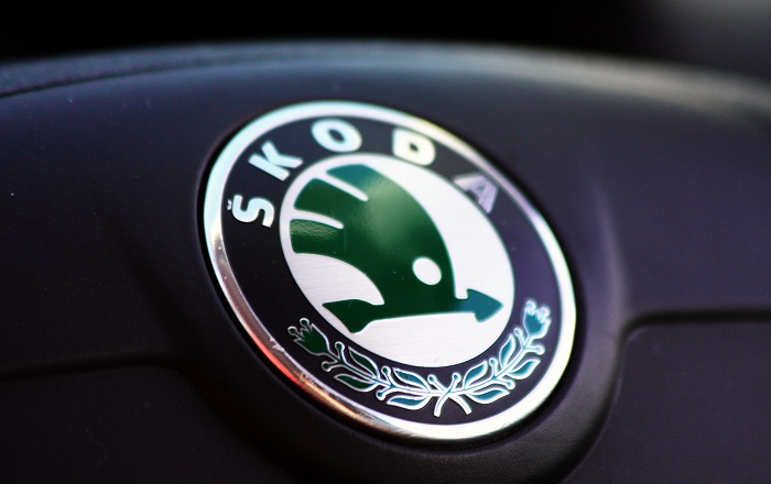
Some observers see an eye within the arrow’s design. This was likely intentional in earlier versions, suggesting watchfulness and precision.
The five feathers on the wing have been interpreted as representing the five continents where Skoda operates.
Others note the arrow points diagonally upward, suggesting both forward movement and improvement.
The design team has stated the simplicity allows customers to project their own meanings onto the symbol.
How Does the Skoda Logo Compare to Competitor Logos?
Among car logos, Skoda occupies interesting middle ground.
It avoids the aggressive chrome of German luxury brands while maintaining more character than minimalist electric vehicle startups.
The winged arrow remains distinctive against circular badges and shield shapes used by competitors.
Volkswagen Group siblings like SEAT and Audi use completely different design languages. Skoda’s symbol connects it to heritage brands while the flat execution keeps it current.
Toyota and Honda use more abstract symbols. BMW and Mercedes rely on circular badges. Skoda’s directional arrow creates immediate differentiation at highway speeds.
The green color also sets it apart. Most competitors use silver, blue, or black. This makes Skoda instantly identifiable in dealership rows and parking lots. Looking at green logos across industries, Skoda owns this color space in automotive.
What Are the Technical Specifications of the Skoda Logo?
Official Color Codes:
- Emerald Green (Primary)
- Hex: #1E5029
- RGB: (30, 80, 41)
- CMYK: (85, 35, 95, 35)
- Pantone: 3435 C
- Black (Secondary)
- Hex: #000000
- RGB: (0, 0, 0)
- CMYK: (0, 0, 0, 100)
- White (Accent)
- Hex: #FFFFFF
- RGB: (255, 255, 255)
- CMYK: (0, 0, 0, 0)
Dimensions and Proportions:
- Aspect Ratio: The symbol fits within a square bounding box; the wordmark uses a separate horizontal orientation
- Minimum Size Requirements: Symbol minimum 10mm height for print, 40px for digital
- Clear Space: Minimum clear space equals the height of the letter “S” in the wordmark on all sides
- Official Usage: Available in vector graphics formats through official brand portal
What Cultural Impact Has the Skoda Logo Had?
The Skoda logo carries different meanings across regions.
In Central Europe, it represents national pride and industrial heritage. Czech citizens see it as proof of domestic engineering excellence.
In Western Europe, the brand overcame decades of jokes about communist-era quality. The modern logo helped signal transformation.
The winged arrow appears on everything from rally cars to family SUVs. This versatility demonstrates its design strength.
How Does the Skoda Logo Fit Into the Overall Brand Identity?
The logo anchors a complete identity system.
Skoda’s brand guidelines specify how the symbol interacts with photography, typography, and color.
The Emerald Green extends beyond the logo into interior accents, marketing materials, and dealership design.
Vehicle design echoes the arrow’s forward-leaning stance. The brand’s “Simply Clever” tagline complements the logo’s practical elegance.
Digital applications drive current brand decisions. The flat logo works across app icons, social media profiles, and vehicle displays.
How Should the Skoda Logo Be Used?
Official Usage Guidelines:
- Do: Use official files from the brand portal, maintain minimum clear space, apply on approved background colors
- Don’t: Stretch or distort proportions, add effects like shadows or gradients, combine with other logos without approval, alter the Emerald Green color
Accessing Official Logos:
- Corporate users can access files through Skoda’s media portal
- Dealers receive brand assets through Volkswagen Group distribution channels
- Press materials available through Skoda’s media relations department
Licensing Information:
- The winged arrow and “SKODA” wordmark are registered trademarks
- Unauthorized commercial use is prohibited
- Fan or editorial use typically permitted under fair use principles
- Merchandise licensing handled through official Skoda channels
Trademark Protection:
- Protected across all major markets globally
- Active enforcement against counterfeit products
- Registration covers automotive and related goods categories
FAQ on The Skoda Logo
What Does the Skoda Logo Represent?
The Skoda logo represents speed, precision, and Czech automotive heritage. The winged arrow symbol suggests forward movement and aspiration.
It connects to the brand’s industrial roots in Mlada Boleslav. The design reflects over a century of engineering tradition from this European automobile manufacturer.
When Was the Current Skoda Logo Introduced?
Skoda Auto unveiled its current logo in August 2022. This version features a flat, digital-first design in Emerald Green.
The brand refresh coincided with Skoda’s push into electric vehicles. It marked a significant departure from the chrome-heavy logo design used since 1991.
Why Is the Skoda Logo Green?
Green connects Skoda to nature, sustainability, and Czech landscapes. The color choice distinguishes it from competitors who favor silver or blue.
The current Emerald Green shade feels bolder than previous versions. It signals environmental awareness while maintaining strong color palette recognition across markets.
What Is the Winged Arrow Symbol in the Skoda Logo?
The winged arrow first appeared in 1926. Commercial director Tomas Maglic introduced it after Skoda Works acquired Laurin & Klement.
The arrow suggests speed and direction. The wing represents freedom and lightness. Together they create a distinctive brand symbol recognized worldwide.
Who Designed the Skoda Logo?
The current version came from Scher agency working with Skoda’s internal team. Earlier versions evolved through various designers over decades.
The original winged arrow concept belongs to Tomas Maglic from the 1920s. No single designer owns the complete logo evolution story.
How Many Times Has the Skoda Logo Changed?
Skoda has undergone roughly seven major logo redesigns since 1895. The brand started as Laurin & Klement with a completely different emblem.
Major shifts happened in 1926, 1933, 1991, and 2022. Each change reflected broader shifts in brand style guide thinking and company ownership.
What Does the Skoda Emblem Symbolize?
The emblem carries layered meanings. Speed. Progress. Industrial might. Some see an eye within the design, suggesting precision and watchfulness.
Five feathers on the wing reportedly represent five continents. The vehicle badge connects Bohemian manufacturing heritage to modern global ambitions.
Is the Skoda Logo Trademarked?
Yes. Skoda Auto a.s. holds registered trademarks for both the winged arrow and wordmark. Protection covers all major global markets.
The Volkswagen Group actively enforces against counterfeits. Unauthorized commercial use of this automotive branding will trigger legal action.
What Font Does Skoda Use in Its Logo?
Skoda uses a custom typeface called “Skoda Next” for its wordmark. The letterforms feature geometric construction with rounded terminals.
This approach improves digital readability. Previous versions used heavier industrial fonts that worked better on physical hood ornaments than screens.
Where Can I Download the Official Skoda Logo?
Corporate users access files through Skoda’s official media portal. Dealers receive assets via Volkswagen Group distribution channels.
Press materials come through media relations. The brand provides multiple formats for different applications. Always use official sources for accurate brand identity representation.
Conclusion
The Skoda logo tells a story of transformation. From Laurin & Klement’s bicycle shop in Bohemia to a respected member of the Volkswagen Group portfolio, the visual identity has evolved while keeping its core symbol intact.
That winged arrow still works. It scales from the Skoda Octavia’s grille to tiny app icons without losing recognition.
The 2022 refresh proves the brand understands modern design demands. Flat graphics. Digital-first thinking. Sustainable messaging through Emerald Green.
Few logo design principles matter more than consistency paired with adaptability. Skoda Auto has mastered both.

Renowned for his expertise in logo design and visual branding, Bogdan has developed a multitude of logos for various clients.
His skills extend to creating posters, vector illustrations, business cards, and brochures. Additionally, Bogdan's UI kits were featured on marketplaces like Visual Hierarchy and UI8.
He also wrote in the past years on sites like Design Your Way, WebDesignerDepot, WPDean, Designmodo, Speckyboy, Slider Revolution, and more.
- The Windsurf Logo History, Colors, Font, And Meaning - 10 October 2026
- How to Remove Background From Product Photos (No Photoshop) - 10 October 2026
- How Designers can Build a Stronger Online Creative Identity - 9 October 2026

Bogdan Sandu is a seasoned designer who has been designing websites since 2008. Renowned for his expertise in logo design and visual branding, Bogdan has developed a multitude of logos for various clients. His skills extend to creating posters, vector illustrations, business cards, and brochures. Additionally, Bogdan's UI kits were featured on marketplaces like Visual Hierarchy and UI8. He also wrote in the past years on sites like Design Your Way, WebDesignerDepot, WPDean, Designmodo, Speckyboy, Slider Revolution, and more.
You Might Also Like