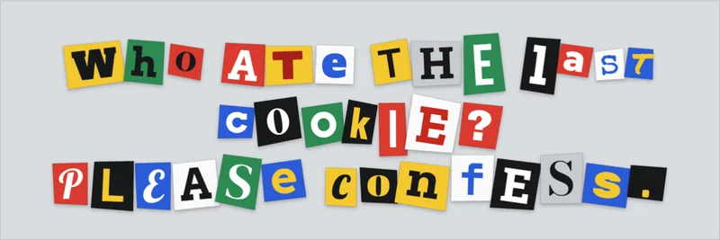
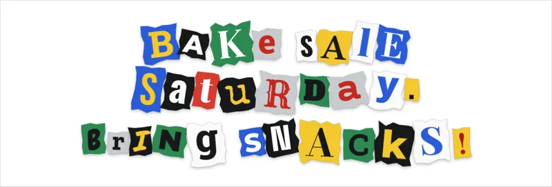
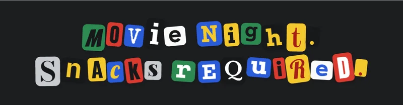
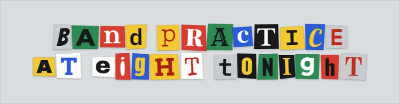
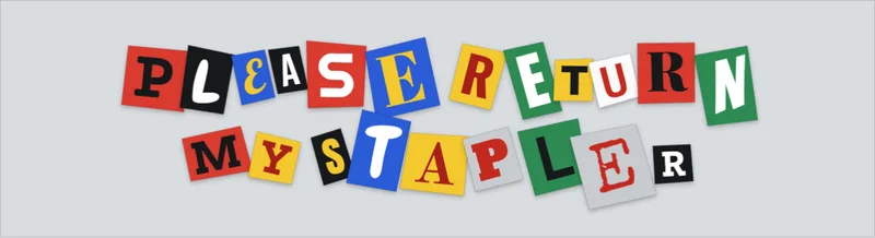
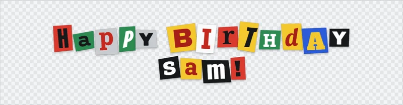
This ransom note font generator turns any message into a row of paper cut-outs, and every letter gets its own typeface, size, color and tilt, as if each one had been snipped from a different magazine. What you get is an image or vector file, not plain text. That is why the styling disappears when you copy and paste into a plain-text field.
Designers use the effect on posters, party invitations and zine covers. Everything runs in your browser, with no sign up and no watermark, and the typed text never leaves your device.
The mix draws from 26 open-license font families in five styles (serif, sans, slab, display and mono), seven flat paper colors and three edge cuts. A seed number drives every random choice, so a layout you like can be rebuilt exactly.
How does a ransom note font generator randomize each letter?
Every letter is rolled separately. Font, size, paper color, ink color, tilt and a small offset are all picked per character, then the whole line is drawn as one image.
Variables changed per letter
| Setting | What it controls |
|---|---|
| Chaos | How far tiles tilt, drift off the baseline and vary in size |
| Letter size | The base size every tile starts from, from 48 to 200 px |
| Tile gap | The space between neighboring cut-outs, from 0 to 40 px |
| Paper shadow | How strongly each scrap lifts off the background |
| Letter case | Mixed, as typed, all upper or all lower |
| Paper edge | Scissors cut, torn or rounded corners |
| Paper colors and font styles | Which of the seven papers and five font styles may appear |
The font pool does most of the work. It pairs heavy display faces with a typewriter face (Anton, Abril Fatface, Special Elite and Lobster are among them). Most are free Google Fonts that suit display work, and that variety is a big part of why the mix looks like it came from different sources. Neighboring letters never share the same font or paper color when more than one is switched on.
What the seed does
Behind all the randomness sits a seed, a plain number that drives every choice. Shuffle rolls a new seed and a new layout. Type a number into the seed field to return to a layout you saved earlier.
Click any letter to lock it. A locked tile keeps its font, paper and ink through every later shuffle, so you can keep the good letters and keep rolling the rest. If you edit the text, a lock stays only while the letter at that position is unchanged. Copy link stores the seed and settings in the address, but not the locks, so lock your favorites again after you reopen it.
Keep chaos moderate on long words, because heavy tilt makes tiles collide and hurts legibility. If a font file fails to load, the browser falls back to a system font and the variety flattens out.
Input and output
Typed text goes in with line breaks kept, up to 90 characters over four lines, and long lines wrap by word. What comes out depends on the format you pick.
| Format | Type | Good for |
|---|---|---|
| PNG, 1x to 4x | Raster | Screens, social posts, transparent overlays |
| SVG | Vector | Resizing and recoloring in a vector app |
| Copy image | Raster, clipboard | Pasting straight into a design file or chat |
Choose SVG when the lettering will be resized, because vector files stay sharp where raster files do not. PNG is fine for screens. The Clear background exports a transparent PNG, so the note can sit on any photo or color.
In the SVG, each letter is its own group of live text with its fonts linked online. In a vector app you can move or recolor any letter, and retyping works too. Outline the text before you send the file to a printer.
How to make a ransom note text image, step by step
It goes quickly in a browser generator. The manual route in an image editor takes far longer.
Using this generator
- Type or paste the text in the Message box.
- Press Shuffle until the mix reads clearly.
- Click any letter you like to lock it, then shuffle again to re-roll the rest.
- Set the look: chaos, tile gap, paper edge, letter case, and the paper colors and font styles you want.
- Pick a background and export. Choose grey, white, dark or clear, then download a PNG or SVG.
Finish the wording before you start locking, since a changed letter drops its lock.
Building the effect manually in an image editor
The manual route asks for many fonts in varied sizes, so add a varied set of typefaces to Photoshop before you start. Each letter then needs its own text layer, a shape or selection for the paper scrap, a torn edge made with a mask or brush, and often a paper texture on top.
That is worth it for a single hero image. It is painful for anything past a short phrase.
Generator or installable ransom note font?
For a one-off graphic, use a generator. If the text has to stay editable in your layout software, an installable font makes more sense. Each route breaks in its own way.
Installable ransom note fonts worth knowing
Ransom, made by The Font Bureau for Microsoft in 1992, ships four styles (Regular, Bold, Bold Italic and Italic). Drunken Hour, by Jakob Fischer, mixes upper and lower case and adds automatic ligatures for double letters and common letter pairs, which need an OpenType-aware app to work. Both are commercial fonts.
File format deserves a glance before you buy, because OpenType and TrueType handle features differently.
Where generators and fonts differ
A font maps each character to one glyph, so every "e" looks identical. Microsoft's own page for Ransom suggests writing in one variant, then swapping overused letters for other variants by hand. A generator does that swap for every letter automatically.
The generator route never repeats a letterform and needs no install, so the image is ready to post. The catch is that the output is an image, so the text is no longer editable as live text (the SVG is the exception, since its letters stay live text).
An installable font keeps the text live in your layout and works offline in any app that accepts the font. Repeated letters will repeat, though, and the paper blocks are not included. For one poster, use a generator. For a template your team edits every week, buy or install a font.
Why ransom note text will not copy and paste as styled text
Plain text stores characters, not fonts, so per-letter styling disappears the moment you paste into a bio or comment box. The receiving field gets the letter "e", and which "e" appears depends on the font on the other end.
| Workaround | Works in | Catch |
|---|---|---|
| Upload the PNG or SVG | Any platform that accepts images | Text is not selectable or searchable |
| Install a ransom note font | Apps that accept font files | Viewers without the font see a fallback |
| Paste lookalike Unicode characters | Bios, captions, short posts | Breaks searching and screen readers |
Copy-paste "fancy text" swaps letters for characters from the Mathematical Alphanumeric Symbols block. Those characters are meant for mathematics, and the W3C's MathML specification advises against using them to style ordinary prose, because search and assistive technology treat them as math symbols.
Skip the lookalike route for anything a reader has to act on. Post the image, and put the readable words in the caption.
Can you use ransom note fonts commercially?
Yes, provided each font's license allows it. All 26 families here come from Google Fonts, which publishes them as open source and free to use commercially, in logos, print, websites and apps. Most use the SIL Open Font License, and a few (Roboto Slab, Permanent Marker and Special Elite) use the Apache License 2.0. The check still has to be made font by font, not tool by tool.
| Source | License | Commercial use |
|---|---|---|
| Google Fonts | Open source, mostly OFL, some Apache | Yes, including logos, print, web, apps |
| Paid ransom fonts | Foundry license | Buy the tier that matches the use |
| Free-download libraries | Varies per font | Check every file |
Under the OFL, design work with an OFL font needs no extra permission, and logos, posters and signage are included. Artwork made with the font stays yours and is not subject to the OFL. The one thing you cannot do is sell the font file on its own. That matters if you plan to bundle fonts into a download pack. Selling prints or posters made with them is a different thing and is fine.
Open each font's license file, match its wording to your use, and keep it with the project. How font licensing works covers the details. If a font's license is unclear, replace it with a collection of fonts with a free commercial-use license and move on.
Where ransom note lettering works and where it fails
Short, loud, decorative text is where this style earns its place. Long copy is a bad fit, and so is anything that has to stay readable for every user.
Where it works
- Event posters
- Party invitations
- Zine and album covers
- Props for film or games
- Social graphics
Treat the lettering as the headline and pair it with a calmer typeface from a list of poster fonts that hold up beside loud headlines.
Where it fails
The W3C's WCAG 2 criterion 1.4.5 (Level AA) says to use real text instead of pictures of text, because people cannot change how text looks inside an image. A decorative poster is a different case, but a web heading built from a PNG is not.
Long copy is the next problem. The ransom note effect is widely treated as a typesetting mistake, the kind made when untrained users mix styles just because they can. Slide decks do not fare much better.
Image-only text has its own issue. Screen readers cannot read text inside an image unless a text alternative is provided, and WCAG 1.1.1 (Level A) requires one that serves the equivalent purpose. If readability for everyone matters, start the body copy from typefaces chosen for accessibility and keep the ransom lettering to a single line.
Strengths and limits at a glance
| Strengths | Limits |
|---|---|
| Recognized at a glance | Weak for long copy |
| Free tool and open-license fonts | Image output is not live text |
| No design software required | Needs alt text to be accessible |
Ransom Note Font Generator FAQ
What is the ransom note effect in typography?
Cram too many typefaces next to each other and you get the ransom note effect. The name comes from notes built from letters cut out of magazines and newspapers so the writer's handwriting could not be traced. Typographers use the term as a put-down for poor layout, which is why designers use it on purpose only for short, decorative lines.
Can ransom note text be animated?
Not in this tool, which exports still images. Save a few shuffles as PNGs and show them one after another in a video editor at two or three frames per second for a jittery cut-out look. Keep the pace slow, because fast flicker is uncomfortable for many viewers.
Is this ransom note generator free?
Yes. It runs in your browser, needs no account and adds no watermark, and your text is not uploaded anywhere. The fonts are open-license families from Google Fonts.
Can I make the ransom note effect in Word or Google Docs?
Yes, by hand. Select each letter, change its font and size, pick a color, then add shading behind it for the paper block. Anything past a short phrase gets slow, because every letter is a separate edit.
Do ransom note fonts support accented or non-Latin letters?
Check the font's character set before committing. Microsoft's Ransom lists only code page 1252 Latin 1 and Mac Roman, so Cyrillic, Greek and other scripts have no glyphs in it. This generator accepts Latin letters, numbers, punctuation and common accented characters, and drops anything else.
Getting ransom note lettering print-ready
Divide an export's pixel width by 300 and you get the largest print width, in inches, that stays sharp. Adobe's Photoshop help treats 300 pixels per inch as the usual standard for high-quality prints.
That makes canvas width the first setting to fix. A 1600 px canvas exported at 4x gives 6400 px, enough for about 21 inches. The tool caps an export at roughly 14 million pixels, so a tall note may export a little under the scale you picked, and it tells you when that happens.
Past that size, SVG removes the pixel limit. Because the SVG links its fonts online, outline the text in a vector editor before sending files to print. So set the canvas width for the print size first, export SVG (outline the text) or PNG at 4x, and check the smallest letter at print size.
Screens typically show somewhere around 72 to 96 pixels per inch in design software, so a clean screen preview proves little. Zoom to 400% to judge the real result, and read how print resolution differs from screen resolution before sending files to a printer.
More free font generators
Want another look? Try the neon font generator for glowing tube lettering or the Death Note font generator for scratchy notebook handwriting.